Transforming Energy Consumption Analytics: Creating Dynamic AI Dashboards That Drive Sustainability
The Evolution of Energy Consumption Monitoring
The landscape of energy monitoring has undergone a remarkable transformation, shifting from traditional manual methods to sophisticated AI-powered visual dashboards. This evolution is reshaping how organizations understand, manage, and optimize their energy consumption while driving forward sustainability initiatives.
The Evolution of Energy Consumption Monitoring
The traditional approach to energy monitoring has historically involved manual meter readings, periodic reporting, and reactive responses to consumption spikes. Today's organizations are rapidly transitioning to AI chart generators and visual dashboards that transform raw energy data into actionable intelligence.

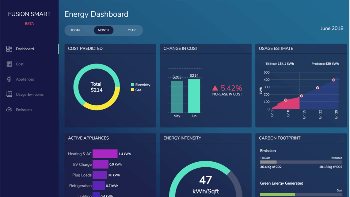
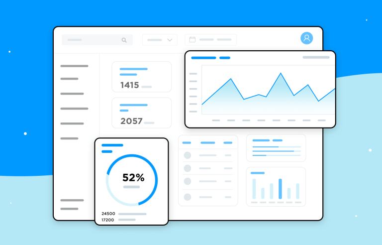
Modern AI-powered energy dashboard displaying multiple consumption metrics in real-time
Key Challenges in Energy Analysis
- Data Volume and Complexity: Organizations generate massive amounts of energy consumption data across numerous devices, systems, and locations.
- Pattern Recognition: Identifying meaningful patterns, seasonal variations, and anomalies within consumption data requires sophisticated analysis.
- Stakeholder Communication: Translating complex energy metrics into comprehensible insights for different organizational roles presents significant communication challenges.
- Predictive Capabilities: Anticipating future consumption patterns and optimizing energy usage proactively rather than reactively.
The Impact of Visual Dashboards
Visual dashboards are revolutionizing sustainability initiatives by transforming abstract energy data into clear, actionable visualizations that drive decision-making. These dynamic interfaces enable:
- ✓ Real-time monitoring of consumption patterns across facilities
- ✓ Immediate anomaly detection to prevent energy waste
- ✓ Data-driven optimization of energy-intensive processes
- ✓ Clear progress tracking toward sustainability goals
The growing importance of real-time energy consumption visibility has been accelerated by corporate Environmental, Social, and Governance (ESG) strategies. Organizations now recognize that combining interactive visualizations for data exploration with energy monitoring creates a powerful tool for achieving sustainability objectives while optimizing operational costs.
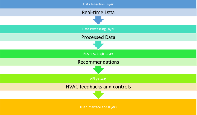
Essential Components of Effective AI Energy Dashboards
Creating effective energy consumption dashboards requires strategic selection of metrics and visualization components. The most impactful dashboards integrate several key elements that transform raw data into actionable intelligence.
Critical Metrics and KPIs
The most essential energy consumption metrics to visualize in your dashboard:
Hierarchical Data Structures
Effective energy dashboards implement intuitive hierarchical data structures that accommodate multiple energy sources and consumption points. This organization allows users to navigate from high-level overviews to granular details.
A well-designed hierarchical data structure for energy consumption visualization:
flowchart TD
    A[Enterprise-Wide Energy View] --> B[Building 1]
    A --> C[Building 2]
    A --> D[Building 3]

    B --> E[Floor 1]
    B --> F[Floor 2]

    E --> G[HVAC Systems]
    E --> H[Lighting]
    E --> I[Equipment]

    G --> J[Air Handlers]
    G --> K[Chillers]

    style A fill:#FF8000,color:white
    style B fill:#FFA64D,color:white
    style C fill:#FFA64D,color:white
    style D fill:#FFA64D,color:white
    style E fill:#FFB366,color:black
    style F fill:#FFB366,color:black
    style G fill:#FFC080,color:black
    style H fill:#FFC080,color:black
    style I fill:#FFC080,color:black
    style J fill:#FFCC99,color:black
    style K fill:#FFCC99,color:black
Visualization Techniques for Consumption Patterns
Comparing actual versus target consumption patterns is essential for identifying improvement opportunities. Strategic visualization approaches include:
Time Series Comparisons
Line charts with overlaid target thresholds that highlight deviations from expected consumption patterns across time periods.
Variance Indicators
Visual markers that instantly communicate the magnitude and direction of deviations from target consumption levels.
Performance Gauges
Radial or linear gauges that position current consumption within a spectrum from optimal to problematic performance.
Forecast Projections
Predictive visualizations that extend current consumption trends to anticipate future performance against targets.
Structuring Dashboard Sections for Different Stakeholders
Effective energy dashboards cater to the distinct information needs of various stakeholders across the organization:
| Stakeholder | Primary Metrics | Visualization Focus |
|---|---|---|
| Executive Leadership | Cost trends, ESG performance, ROI on initiatives | High-level summaries, trend indicators, financial impact |
| Facility Managers | Real-time consumption, system performance, anomalies | Detailed operational views, maintenance alerts, optimization opportunities |
| Sustainability Teams | Carbon emissions, efficiency metrics, green initiatives impact | Progress toward goals, initiative tracking, certification metrics |
| Finance Department | Cost per unit, budget variance, forecasted expenses | Cost attribution, savings opportunities, budget alignment |
The integration of carbon footprint calculations alongside traditional energy metrics has become increasingly critical for comprehensive sustainability reporting. Modern dashboards leverage AI powered growth charts to demonstrate progress toward emissions reduction targets while maintaining operational efficiency.
Data Visualization Principles for Energy Consumption Analysis
Effective energy consumption dashboards rely on strategic visualization principles that transform complex data into immediately comprehensible insights. These principles guide how information is organized, presented, and highlighted.
Color-Coding Strategies
Strategic color-coding instantly communicates energy efficiency levels and performance statuses without requiring in-depth analysis:
Example of color-coded energy efficiency visualization using the traffic light system with numerical thresholds
Effective Color-Coding Guidelines
- Consistency: Maintain uniform color meanings across all dashboard elements (e.g., red always indicates problematic consumption).
- Accessibility: Ensure color schemes remain distinguishable for users with color vision deficiencies.
- Progressive intensity: Use color intensity variations to indicate severity levels within a category.
- Limited palette: Restrict the color palette to 5-7 distinct colors to prevent cognitive overload.
- Cultural relevance: Consider cultural color associations that might affect interpretation by global teams.
Temporal Visualization Techniques
Effective temporal visualizations are critical for identifying consumption patterns, trends, and anomalies across various time scales:
Example of multi-scale temporal energy consumption visualization:
Heat Maps and Geospatial Representations
Heat maps provide powerful visual tools for comparing energy consumption across facilities, departments, or building zones. These representations enable quick identification of consumption hotspots and optimization opportunities.
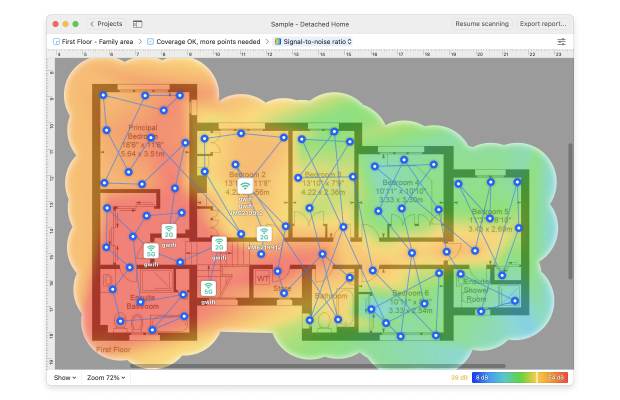
Building floor plan heat map showing energy consumption intensity across different zones
Creating Visual Hierarchies for Cost-Saving Opportunities
Effective dashboards prioritize and highlight cost-saving opportunities through deliberate visual hierarchies that direct attention to the most impactful potential improvements.
Recommended visual hierarchy for highlighting cost-saving opportunities:
flowchart TD
    A[Cost-Saving Opportunities] --> B[High Impact]
    A --> C[Medium Impact]
    A --> D[Low Impact]

    B --> E[Quick Wins]
    B --> F[Strategic Investments]

    C --> G[Maintenance Optimizations]
    C --> H[Operational Adjustments]

    D --> I[Long-term Considerations]

    E --> J[HVAC Scheduling: $45K/yr]
    E --> K[Lighting Controls: $32K/yr]

    F --> L[Chiller Replacement: $120K/yr]

    style A fill:#FF8000,color:white
    style B fill:#FF4500,color:white
    style C fill:#FFB366,color:black
    style D fill:#FFCC99,color:black
    style E fill:#FF6347,color:white
    style F fill:#FF6347,color:white
    style J fill:#FF4500,color:white,stroke-width:3px
    style K fill:#FF4500,color:white,stroke-width:3px
    style L fill:#FF4500,color:white,stroke-width:3px
Balancing Comprehensive Data with Clarity
The most effective energy dashboards strike a careful balance between comprehensive data inclusion and clear, actionable insights:
Clarity-Enhancing Techniques
- Progressive disclosure of information (from summary to detail)
- Consistent labeling and annotation practices
- Strategic use of negative space to prevent visual clutter
- Contextual filtering that displays only relevant metrics
- User-controlled complexity levels for different stakeholder needs
Common Clarity Compromisers
- Excessive decimal precision in metrics
- Overlapping data points without interactive separation
- Inconsistent scale usage across related visualizations
- Unnecessary 3D effects that distort perception
- Inadequate context for interpreting variation significance
Implementing these visualization principles ensures that energy consumption data becomes immediately actionable rather than merely informative. Organizations can leverage ai-powered bar chart generators to quickly transform complex energy data into clear visual representations that highlight cost-saving opportunities and progress toward sustainability goals.
Building Interactive Dashboard Elements
Interactive elements transform static energy consumption data into dynamic, explorable information landscapes. These features empower users to investigate patterns, isolate anomalies, and generate insights tailored to specific analytical needs.
Dynamic Filtering Capabilities
Interactive filtering allows users to isolate specific energy sources, timeframes, or consumption patterns for detailed investigation:
Interactive filtering panel for isolating specific energy consumption patterns
Essential Filter Types
- Temporal filters: Date ranges, time-of-day selectors, seasonal comparisons
- Source-based filters: Energy source types (electricity, gas, renewable), utility providers
- Organizational filters: Departments, facilities, business units, production lines
- Performance-based filters: Efficiency ratings, variance thresholds, anomaly severity
- Contextual filters: Weather conditions, occupancy levels, production volumes
Drill-Down Functionality
Drill-down capabilities allow users to navigate from high-level summaries to granular details when investigating consumption anomalies or optimization opportunities:
Drill-down navigation path for energy consumption investigation:
flowchart TD
    A[Enterprise Overview: 15% above target] --> B[Building 3: 32% above target]
    B --> C[Floor 2: 47% above target]
    C --> D[HVAC System: 62% above target]
    D --> E[Air Handler Unit 4: 85% above target]
    E --> F[Anomaly: Stuck Damper Position]

    style A fill:#FFB366,color:black
    style B fill:#FF9933,color:black
    style C fill:#FF8000,color:white
    style D fill:#FF6600,color:white
    style E fill:#FF4000,color:white
    style F fill:#FF0000,color:white,stroke-width:3px
This navigational structure enables users to quickly identify the root causes of energy consumption anomalies and take targeted corrective action.
Comparative Views
Interactive comparative views allow users to benchmark current performance against historical data, industry standards, or specific targets:
Multi-dimensional comparative view of energy performance:
Alert Visualization Systems
Effective alert visualization systems proactively notify users of threshold breaches, anomalous patterns, or optimization opportunities:
Critical Alert
Data Center 2 HVAC consumption exceeds threshold by 45% for 3 consecutive hours
Warning Alert
Building 3 weekend standby power 22% above normal baseline
Opportunity Alert
Solar generation peak coincides with manufacturing schedule - load shift opportunity
Interactive "What-If" Scenario Modeling
Interactive scenario modeling tools allow users to explore the potential impacts of various energy optimization strategies before implementation:
Interactive "What-If" scenario modeling interface for HVAC scheduling optimization
Building these interactive elements into energy dashboards transforms passive monitoring into active energy management. Using ai tools for excel charts can help organizations transition from static spreadsheet-based reporting to dynamic, interactive dashboards that drive continuous energy optimization.
AI-Powered Features That Enhance Energy Dashboards
Artificial intelligence transforms energy consumption dashboards from passive monitoring tools into proactive optimization platforms. These AI capabilities enable predictive insights, automated pattern recognition, and contextual recommendations that drive significant energy savings.
Predictive Consumption Forecasting
AI-powered predictive models analyze historical consumption data alongside contextual factors to forecast future energy needs with remarkable accuracy:
Predictive energy consumption forecasting with confidence intervals:
These forecasts enable proactive energy management strategies, such as:
- Adjusting HVAC setpoints ahead of anticipated demand peaks
- Scheduling energy-intensive operations during predicted low-rate periods
- Optimizing renewable energy storage charging/discharging cycles
- Planning maintenance activities during optimal consumption windows
- Advanced budgeting and resource allocation for energy expenses
Automated Anomaly Detection
AI algorithms continuously monitor consumption patterns to identify unusual deviations that may indicate equipment malfunctions, inefficiencies, or optimization opportunities:

AI-powered anomaly detection highlighting unusual consumption patterns with automated classification
Common Anomaly Detection Methods
- Statistical process control: Monitors for deviations beyond established control limits
- Machine learning clustering: Identifies consumption patterns that don't align with learned normal behavior
- Deep learning autoencoders: Learns complex normal patterns and flags reconstruction errors
- Seasonal decomposition: Separates trend, seasonal, and residual components to identify irregular patterns
- Contextual analysis: Evaluates consumption against expected patterns based on multiple contextual variables
AI-Generated Optimization Recommendations
Advanced AI systems not only detect issues but also generate specific recommendations for energy optimization:
HVAC Scheduling Optimization
AI analysis detected sub-optimal start/stop times for Building 2 HVAC systems based on occupancy patterns.
Recommendation:
Adjust weekday start times from 6:00 AM to 7:30 AM based on actual first occupancy trends. Estimated savings: 42,500 kWh annually ($5,100).
Demand Response Opportunity
AI forecast predicts grid capacity constraints tomorrow between 2-5 PM with high compensation rates available.
Recommendation:
Shift 30% of production load to evening hours (6-9 PM) to participate in utility demand response program. Estimated earnings: $3,200 for single event.
Natural Language Generation for Pattern Explanation
AI-powered natural language generation (NLG) systems translate complex energy patterns into simple, understandable explanations:
AI-Generated Pattern Explanation
Summary: Data Center cooling energy consumption has increased by 18% over the past two weeks despite consistent IT load.
Analysis: The increase appears to correlate with a gradual rise in condenser approach temperature (3.2°F above normal) and reduced chilled water delta-T (9.2°F vs. typical 12°F). These patterns suggest developing scaling issues in the condenser water system rather than increased cooling demand.
Recommendation: Schedule chemical treatment and cleaning of the condenser water loop during the next scheduled maintenance window. Based on similar historical patterns, this intervention should restore normal efficiency and reduce cooling energy consumption by 14-17%.
Machine Learning for Energy-Operations Correlations
Advanced machine learning algorithms identify non-obvious correlations between operational activities and energy consumption patterns:
AI-identified correlations between operations and energy consumption:
flowchart LR
    A[Production Schedule] -->|0.82 correlation| B[Evening Peak Demand]
    C[Maintenance Activities] -->|0.64 correlation| D[Weekend Baseload]
    E[Outdoor Temperature] -->|0.91 correlation| F[Cooling Energy]
    G[Meeting Room Bookings] -->|0.58 correlation| H[Floor-level HVAC Load]
    I[IT Deployment Cycles] -->|0.77 correlation| J[Data Center Cooling]
    K[Cleaning Schedule] -->|0.43 correlation| L[Night Lighting Load]

    style A fill:#FFC080,color:black
    style B fill:#FF8000,color:white
    style C fill:#FFC080,color:black
    style D fill:#FF8000,color:white
    style E fill:#FFC080,color:black
    style F fill:#FF8000,color:white
    style G fill:#FFC080,color:black
    style H fill:#FF8000,color:white
    style I fill:#FFC080,color:black
    style J fill:#FF8000,color:white
    style K fill:#FFC080,color:black
    style L fill:#FF8000,color:white
These AI-powered features transform energy dashboards from passive monitoring tools into intelligent systems that continuously identify optimization opportunities. PageOn.ai's visualization platform makes it easy to incorporate these advanced AI capabilities into energy consumption dashboards, enabling organizations to achieve significant energy savings while simplifying the complex task of energy management.
Integration Strategies for Comprehensive Energy Intelligence
Creating truly comprehensive energy intelligence requires strategic integration of multiple data sources and systems. These integration strategies elevate energy dashboards from isolated monitoring tools to central components of an organization's operational intelligence framework.
Connecting IoT Sensor Data
Modern energy management leverages networks of IoT sensors to capture real-time consumption data at granular levels:
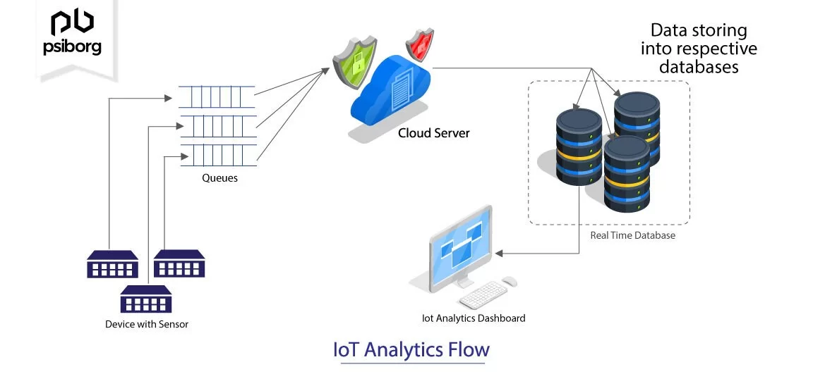
IoT sensor network architecture for real-time energy data collection and visualization
IoT Integration Best Practices
- Data buffering mechanisms: Implement edge computing capabilities to maintain data continuity during connectivity interruptions
- Multi-level aggregation: Structure data collection with hierarchical rollups from device to system to facility level
- Standardized data protocols: Utilize open standards like MQTT, BACnet, or Modbus for maximum interoperability
- Calibration verification: Implement automated sensor drift detection and calibration monitoring
- Security by design: Ensure encrypted data transmission and proper authentication throughout the IoT ecosystem
Incorporating Weather Data
Weather conditions significantly impact energy consumption patterns, making weather data integration essential for proper contextualization and normalization:
Correlation between outdoor temperature and energy consumption:
Weather data integration enables critical functionality including:
- Weather-normalized energy consumption benchmarking
- Proactive HVAC adjustments based on weather forecasts
- Identification of building envelope performance issues
- More accurate anomaly detection with weather context
- Optimized renewable energy forecasting and integration
Visualizing Energy and Production Integration
Integrating energy consumption data with production output enables organizations to visualize and optimize energy efficiency per unit produced:
Energy consumption per production unit over time:
Carbon Market Integration for ROI Calculations
Integrating carbon market pricing data enables organizations to visualize the financial implications of energy decisions in carbon-constrained economies:
Carbon-Aware ROI Calculation Components
- Direct energy cost savings: Traditional reduction in utility expenses
- Carbon credit generation: Value of carbon credits generated through verified reductions
- Compliance cost avoidance: Reduction in carbon taxes or compliance expenses
- Green premium market value: Additional product value from reduced carbon intensity
- Risk mitigation valuation: Reduced exposure to future carbon price increases
Creating Unified Views Across Multiple Facilities
Unified dashboards that integrate data from multiple facilities enable consistent management practices and comparative performance analysis:
Unified multi-facility dashboard with performance comparison and drill-down capabilities
Implementing these integration strategies creates comprehensive energy intelligence dashboards that provide a complete picture of organizational energy consumption patterns and opportunities. PageOn.ai's visualization platform simplifies the complex process of integrating these diverse data sources into cohesive, actionable dashboards.
Case Studies: Transformative Energy Dashboard Implementations
Examining successful energy dashboard implementations across different sectors provides valuable insights into best practices and achievable outcomes. These case studies highlight how organizations have leveraged visual analytics to drive significant energy optimization and sustainability improvements.
Manufacturing Sector: Energy Per Production Unit
Automotive Components Manufacturer
A global automotive parts manufacturer implemented an energy dashboard that visualized energy consumption per production unit across 12 facilities.
Challenge
Production variability made it difficult to properly benchmark energy performance across facilities with different output volumes and product mixes.
Solution
Created a normalized energy intensity dashboard that calculated and visualized kWh per standardized production unit while accounting for product complexity factors.
Results
- 17% reduction in energy per production unit within 14 months
- Best practices identified and shared across facilities based on dashboard insights
- $4.3M annual energy cost savings across the manufacturing network
- Enhanced competitive position through reduced product carbon footprint
Commercial Real Estate: Heat Mapping Energy Consumption
Premium Office Tower Portfolio
A commercial real estate management company developed detailed heat map visualizations of energy consumption across multiple high-rise properties.
Challenge
Disparate tenant activities created highly variable energy profiles, making it difficult to identify inefficiencies versus legitimate high-consumption use cases.
Solution
Implemented floor-by-floor and zone-level heat mapping dashboards that normalized consumption based on tenant type, occupancy patterns, and space function.

Results
- Identified and resolved 23 significant HVAC distribution issues
- Achieved 21% energy reduction in common areas through visualization-driven optimizations
- Improved ENERGY STAR scores by an average of 12 points across the portfolio
- Enhanced tenant satisfaction through improved comfort and reduced energy costs
Data Centers: Real-Time PUE Visualization
Cloud Services Provider
A major cloud infrastructure provider implemented real-time Power Usage Effectiveness (PUE) visualization dashboards across their global data center network.
Challenge
Rapidly changing IT loads and environmental conditions created complex energy efficiency dynamics that were difficult to optimize without real-time visibility.
Solution
Developed comprehensive PUE dashboards with real-time efficiency metrics, cooling system performance visualization, and AI-driven optimization recommendations.
Results
- Average PUE improved from 1.38 to 1.22 across the data center network
- Real-time anomaly detection prevented 7 potential cooling failures
- Annual energy cost reduction of approximately $18.5M
- Elimination of 32,000 metric tons of CO2 emissions annually
Healthcare Facilities: Balancing Critical Power With Optimization
Regional Hospital Network
A healthcare system with 8 hospitals implemented specialized energy dashboards designed to balance critical power reliability with energy optimization objectives.
Challenge
Hospital environments require absolute power reliability for critical care areas while still facing pressure to reduce energy costs and carbon footprints.
Solution
Created specialized dashboards that segmented and visualized energy usage by criticality zones, enabling targeted optimization in non-critical areas while ensuring reliability metrics in critical zones.
Results
- Maintained 100% uptime for critical care power systems
- Reduced non-critical area energy consumption by 23%
- Improved backup generator testing efficiency by 18%
- Achieved $3.2M annual energy cost savings across the hospital network
Educational Campuses: Gamification For Energy Reduction
University campuses have successfully implemented energy dashboards with gamification elements to engage students and faculty in energy conservation efforts:

Gamified energy dashboard for university residence hall competition
These case studies demonstrate the transformative potential of well-designed energy consumption dashboards across diverse sectors. By visualizing the right metrics in meaningful ways, organizations can drive significant energy savings while advancing sustainability objectives. PageOn.ai's visualization platform offers the flexibility to create similar customized dashboards for any organization's specific energy management needs.
Implementation Roadmap and Best Practices
Successfully implementing an AI-powered energy consumption dashboard requires a structured approach. The following roadmap outlines key steps and best practices to ensure your dashboard delivers maximum value and user adoption.
Establishing Baseline Requirements
Begin by establishing clear requirements through comprehensive stakeholder interviews and needs analysis:
Stakeholder requirement gathering process:
flowchart TD
    A[Identify Key Stakeholders]-->B[Conduct Interviews]
    B-->C[Document Current Challenges]
    C-->D[Define Success Metrics]
    D-->E[Prioritize Dashboard Features]
    E-->F[Validate Requirements]
    F-->G[Create Functional Specifications]

    B-->H[Executive Leadership]
    B-->I[Facility Management]
    B-->J[Sustainability Team]
    B-->K[Finance Department]
    B-->L[Operations Team]

    style A fill:#FF8000,color:white
    style B fill:#FF8000,color:white
    style C fill:#FF8000,color:white
    style D fill:#FF8000,color:white
    style E fill:#FF8000,color:white
    style F fill:#FF8000,color:white
    style G fill:#FF8000,color:white
    style H fill:#FFB366,color:black
    style I fill:#FFB366,color:black
    style J fill:#FFB366,color:black
    style K fill:#FFB366,color:black
    style L fill:#FFB366,color:black
Key Questions for Stakeholder Interviews
- What energy-related decisions do you currently make, and what information guides those decisions?
- Which metrics would most help you understand and improve energy performance?
- What analytical capabilities would enable better energy optimization in your area?
- How frequently do you need to access and review energy data?
- What visualization formats would make complex energy data most actionable for you?
- How do you currently measure success in energy management?
Prototyping Dashboard Layouts
Create iterative dashboard prototypes to refine the visual communication of energy data before full implementation:
Step 1: Low-fidelity wireframe sketches to establish information hierarchy

Step 2: High-fidelity interactive prototype for stakeholder testing
Prototyping Best Practices
- Start with low-fidelity wireframes to focus on information architecture
- Use real data (even if limited) in prototypes to ensure relevance
- Test multiple layout options with actual end users
- Create task-based scenarios to validate dashboard usability
- Document and address usability friction points before full development
Iterative Testing and Refinement
Implement a structured testing and refinement process to ensure dashboard elements effectively communicate energy insights:
Iterative dashboard testing and refinement process:
graph TD
    A[Initial Design Implementation] --> B[Expert Review]
    B --> C[Usability Testing]
    C --> D[Data Validation Testing]
    D --> E[Performance Testing]
    E --> F[Refinement Based on Feedback]
    F --> G{Meet Requirements?}
    G -->|No| C
    G -->|Yes| H[Deployment]
    H --> I[Ongoing Evaluation]
    I --> F

    style A fill:#FFC080,color:black
    style B fill:#FFC080,color:black
    style C fill:#FFC080,color:black
    style D fill:#FFC080,color:black
    style E fill:#FFC080,color:black
    style F fill:#FF8000,color:white
    style G fill:#FF8000,color:white
    style H fill:#FF8000,color:white
    style I fill:#FF8000,color:white
Each testing phase should focus on specific aspects of dashboard effectiveness:
| Testing Phase | Focus Areas | Success Criteria |
|---|---|---|
| Expert Review | Visualization best practices, information hierarchy, technical accuracy | Adherence to visualization standards, accurate representation of energy concepts |
| Usability Testing | Intuitive navigation, clear data interpretation, task completion efficiency | Task completion rates, time-to-insight metrics, user confidence ratings |
| Data Validation Testing | Accuracy of calculations, data transformation integrity, real-time update verification | Zero discrepancies with source systems, consistent calculation results |
| Performance Testing | Load times, refresh rates, mobile responsiveness, scalability with data volume | Sub-3-second loading times, smooth interactions across device types |
Balancing Automated and Manual Analysis
Effective energy dashboards strike a careful balance between automated insights and manual analysis capabilities:
Automated Analysis Features
- Anomaly detection with alert generation
- Pattern recognition in consumption data
- Predictive forecasting of consumption trends
- Automated report generation and distribution
- Pre-calculated KPIs and performance metrics
Manual Analysis Capabilities
- Custom data exploration and filtering tools
- Data export functionality for offline analysis
- Annotation capabilities for collaborative insights
- Customizable visualization options
- User-defined thresholds and monitoring parameters
Deployment Strategies for Adoption
A phased deployment strategy maximizes user adoption and ensures dashboard implementation success:
Phased dashboard deployment strategy:
flowchart LR
    A[Phase 1: Pilot Deployment] --> B[Phase 2: Core Stakeholder Rollout]
    B --> C[Phase 3: Organization-Wide Access]
    C --> D[Phase 4: External Partner Integration]

    A --> A1[Single facility focus]
    A --> A2[Core metrics only]
    A --> A3[Key stakeholder training]

    B --> B1[Multi-facility expansion]
    B --> B2[Enhanced feature set]
    B --> B3[Success story documentation]

    C --> C1[Full feature activation]
    C --> C2[Self-service training resources]
    C --> C3[Automated insights enabled]

    D --> D1[Supplier performance integration]
    D --> D2[Regulatory reporting automation]
    D --> D3[Public sustainability reporting]

    style A fill:#FF8000,color:white
    style B fill:#FF8000,color:white
    style C fill:#FF8000,color:white
    style D fill:#FF8000,color:white
    style A1 fill:#FFB366,color:black
    style A2 fill:#FFB366,color:black
    style A3 fill:#FFB366,color:black
    style B1 fill:#FFB366,color:black
    style B2 fill:#FFB366,color:black
    style B3 fill:#FFB366,color:black
    style C1 fill:#FFB366,color:black
    style C2 fill:#FFB366,color:black
    style C3 fill:#FFB366,color:black
    style D1 fill:#FFB366,color:black
    style D2 fill:#FFB366,color:black
    style D3 fill:#FFB366,color:black
Critical Success Factors for Adoption
- Executive sponsorship: Visible support from leadership demonstrates organizational commitment
- Training programs: Structured education on dashboard usage tailored to different user roles
- Early success stories: Documented examples of dashboard-driven improvements
- Integration with workflows: Embedding dashboard access within existing operational processes
- Continuous improvement: Regular updates based on user feedback and evolving requirements
- Performance recognition: Acknowledging and rewarding dashboard-driven optimization efforts
Following this implementation roadmap helps ensure that your energy consumption dashboard delivers maximum value and achieves widespread adoption. PageOn.ai provides the tools and capabilities needed to quickly prototype, test, and deploy sophisticated energy dashboards that follow these best practices.
Future Trends in AI Energy Dashboard Development
The field of energy consumption visualization and analysis continues to evolve rapidly. Emerging technologies and methodologies promise to further enhance the capabilities and impact of AI-powered energy dashboards in the coming years.
Digital Twin Integration
Digital twin technology is transforming energy visualization by creating virtual replicas of physical energy systems and buildings:

Digital twin visualization with real-time energy flow and predictive modeling capabilities
Digital Twin Dashboard Capabilities
- Real-time system simulation: Visualize energy flows and system performance in a 3D virtual environment
- Predictive maintenance visualization: Highlight potential failure points before they occur based on performance data
- "What-if" scenario modeling: Test configuration changes virtually before implementation
- System optimization recommendations: AI-generated suggestions based on digital twin simulations
- Training and familiarization: Virtual environment for staff to understand complex energy systems
Blockchain-Verified Energy Attribution
Blockchain technology is enabling unprecedented transparency and verification in energy consumption reporting:
Blockchain-based energy verification and attribution flow:
flowchart LR
    A[Energy Generation] -->|Verified Production| B[Blockchain Ledger]
    C[Energy Consumption] -->|Verified Usage| B
    B --> D[Immutable Energy Record]
    D --> E[Visualization Dashboard]
    E --> F[Auditable Green Claims]
    E --> G[Carbon Credit Verification]
    E --> H[Regulatory Compliance]

    style A fill:#82C13F,color:black
    style B fill:#324BD9,color:white
    style C fill:#FF8000,color:white
    style D fill:#324BD9,color:white
    style E fill:#FF8000,color:white
    style F fill:#82C13F,color:black
    style G fill:#82C13F,color:black
    style H fill:#82C13F,color:black
Blockchain integration enables dashboard features such as:
- Verified renewable energy certificate (REC) tracking and visualization
- Transparent carbon offset validation and progress monitoring
- Automated regulatory compliance reporting with immutable audit trails
- Peer-to-peer energy trading visualization and optimization
- Supply chain energy attribution with verified provenance
Augmented Reality Interfaces
Augmented reality (AR) is creating new possibilities for on-site energy system monitoring and visualization:
Augmented reality interface showing energy consumption data overlaid on physical equipment
AR Energy Visualization Applications
- In-situ equipment monitoring: View real-time performance metrics overlaid on physical equipment
- Guided optimization: Step-by-step visual guidance for energy system adjustments
- Thermal mapping: Visualize heat signatures to identify energy losses and inefficiencies
- Maintenance workflows: Interactive procedures with energy impact analysis
- Training scenarios: Simulation of energy system operations and emergency responses
Voice-Interactive Dashboard Components
Voice interaction is emerging as a powerful interface for energy dashboard navigation and analysis:
Example Voice-Interactive Queries
"Show me yesterday's energy consumption compared to last week"
Dashboard responds with comparative visualization of daily vs. weekly patterns
"Identify the highest energy consuming equipment in Building 3"
System presents ranked visualization of equipment energy usage with drill-down options
"Calculate potential savings if we reduce HVAC run time by 30 minutes"
Dashboard displays scenario analysis with projected financial and energy impact
Cross-Organizational Benchmarking
Standardized visualization formats are enabling more powerful cross-organizational energy performance benchmarking:
Cross-organizational energy performance benchmarking:
Cross-organizational benchmarking advances include:
- Standardized energy performance metrics across industries
- Anonymous peer comparison dashboards with percentile rankings
- Industry-specific best practice visualization libraries
- Automated competitive positioning analysis for sustainability reporting
- Collaborative improvement communities built around shared visualization formats
These emerging trends represent the future of energy consumption visualization and analysis. Organizations that incorporate these advanced capabilities into their energy dashboards will gain significant advantages in efficiency, sustainability, and operational excellence. PageOn.ai's visualization platform is continuously evolving to incorporate these cutting-edge capabilities, ensuring that organizations can leverage the latest innovations in energy dashboard technology.
Measuring Dashboard Effectiveness and ROI
Quantifying the impact and return on investment of energy dashboard implementations is essential for justifying resources and ensuring continuous improvement. A structured approach to measurement enables organizations to demonstrate concrete value and optimize dashboard functionality over time.
Key Metrics for Evaluating Impact
Comprehensive evaluation requires measuring both direct energy impacts and broader operational improvements:
Key performance indicators for dashboard effectiveness:
Quantifying Time Savings
Automated visual analytics generate significant time savings compared to traditional manual reporting methods:
Time savings from automated visual analytics vs. manual reporting:
Calculating Labor Cost Savings
To quantify the financial impact of time savings:
- Calculate total monthly time savings across all roles (e.g., 120 hours/month)
- Determine blended hourly labor rate for involved personnel (e.g., $65/hour)
- Multiply monthly time savings by hourly rate (e.g., 120 × $65 = $7,800/month)
- Project annual labor cost savings (e.g., $7,800 × 12 = $93,600/year)
- Add value of improved decision quality and faster response times
Tracking Decision Quality Improvements
Enhanced data visualization leads to measurable improvements in energy-related decision quality:
Reduced Decision Latency
Average time from issue detection to corrective action reduced by 76% (from 8.2 days to 2.0 days)
Optimization Opportunity Capture
Percentage of identified energy optimization opportunities acted upon increased from 34% to 82%
Decision Confidence Rating
Self-reported confidence in energy management decisions increased from 5.8 to 8.9 on a 10-point scale
Measuring Adoption Rates
User engagement metrics provide valuable insights into dashboard effectiveness and organizational integration:
Dashboard adoption metrics over 12 months:
Key adoption metrics to track include:
- Active user percentage across targeted roles and departments
- Session frequency, duration, and engagement patterns
- Feature utilization rates (which visualizations are most/least used)
- Export and sharing activities (indicating information distribution)
- User satisfaction scores from periodic feedback surveys
- Training completion rates and proficiency assessments
Calculating Direct Cost Savings
The ultimate measure of dashboard effectiveness is direct cost savings attributed to dashboard-driven insights:
Energy cost savings by optimization category:
Case Example: Manufacturer ROI Calculation
A global manufacturer implemented an AI-powered energy dashboard across 5 production facilities with the following results after 12 months:
- Energy consumption reduction: 14.2% (8.6 million kWh)
- Direct energy cost savings: $946,000
- Labor time savings: 1,840 hours ($119,600)
- Carbon emissions reduction: 3,870 metric tons CO2e
- Maintenance cost reduction from predictive alerts: $215,000
- Total annual savings: $1,280,600
With implementation costs of $360,000, the ROI was 256% in the first year, with a payback period of 3.4 months.
Implementing a comprehensive measurement framework ensures that energy dashboard investments deliver maximum value. These metrics not only justify the initial investment but also guide continuous improvement efforts to enhance dashboard effectiveness over time. PageOn.ai's platform includes built-in analytics that make it easy to track these key performance indicators and demonstrate clear ROI from your energy dashboard implementation.
Transform Your Energy Data Visualization with PageOn.ai
Turn complex energy consumption data into beautiful, interactive dashboards that drive sustainable decision-making and operational efficiency. PageOn.ai's intuitive tools make it easy to create professional-grade visualizations without specialized technical expertise.
Start Creating with PageOn.ai TodayFinal Thoughts on Energy Dashboard Development
As organizations increasingly prioritize sustainability and energy efficiency, the importance of effective energy consumption visualization cannot be overstated. Well-designed AI-powered dashboards transform complex energy data into actionable intelligence that drives meaningful improvements in both operational efficiency and environmental impact.
The journey to creating impactful energy dashboards involves careful attention to data visualization principles, stakeholder needs, and interactive functionality. By focusing on clear communication of patterns and insights rather than simply displaying data, organizations can create tools that genuinely influence behavior and decision-making.
As visualization technologies continue to evolve, the integration of AI capabilities, predictive analytics, and immersive interfaces will further enhance the power and accessibility of energy dashboards. Organizations that embrace these advanced visualization approaches position themselves for sustained competitive advantage in an increasingly energy-conscious business landscape.
Whether you're just beginning your energy dashboard journey or looking to enhance existing visualization capabilities, the principles and practices outlined in this guide provide a foundation for success. With tools like PageOn.ai, creating sophisticated energy consumption visualizations is more accessible than ever, enabling organizations of all sizes to transform their approach to energy management and sustainability.
You Might Also Like
How to Design Science Lesson Plans That Captivate Students
Create science lesson plans that captivate students with hands-on activities, clear objectives, and real-world applications to foster curiosity and critical thinking.
How to Write a Scientific Review Article Step by Step
Learn how to write a review article in science step by step. Define research questions, synthesize findings, and structure your article for clarity and impact.
How to Write a Self-Performance Review with Practical Examples
Learn how to write a self-performance review with examples and tips. Use an employee performance review work self evaluation sample essay to guide your process.
How to Write a Spec Sheet Like a Pro? [+Templates]
Learn how to create a professional spec sheet with key components, step-by-step guidance, and free templates to ensure clarity and accuracy.