Transforming Color Psychology into Compelling Infographic Design
A Visual Communication Guide for Creating Impactful Designs
I've spent years studying how colors influence perception and emotion in visual designs. In this comprehensive guide, I'll walk you through the fascinating intersection of color psychology and infographic design, revealing how strategic color choices can dramatically enhance the effectiveness of your visual communications. From scientific foundations to practical implementation, you'll discover how to harness the power of color to create infographics that not only look stunning but also effectively communicate your message and engage your audience.
The Science Behind Color Psychology in Visual Communication
When I create infographics, I always start by understanding the fundamental psychological responses colors evoke. It's fascinating how our brains process color information and translate it into emotional reactions almost instantaneously.

The human brain processes color information through specialized neural pathways that trigger emotional responses.
Universal Color Responses
I've observed that certain colors tend to evoke similar responses across different individuals. For example, color psychology for presentations shows that blue often conveys trust and professionalism, while red typically signals urgency or passion.
Primary Color Emotional Associations
Cultural Variations in Color Perception
I've learned that while some color associations are relatively universal, many are culturally specific. For instance, white symbolizes purity in Western cultures but represents mourning in many Eastern cultures. When designing infographics for global audiences, I always consider these cultural nuances.
flowchart TD
    A[Color Perception] --> B[Universal Factors]
    A --> C[Cultural Factors]
    B --> D[Biological Responses]
    B --> E[Evolutionary Associations]
    C --> F[Regional Symbolism]
    C --> G[Historical Context]
    C --> H[Religious Associations]
    D --> I[Neurological Processing]
    E --> J[Nature Associations]
    F --> K[Western Meanings]
    F --> L[Eastern Meanings]
    F --> M[African Meanings]
    style A fill:#FF8000,stroke:#333,stroke-width:2px
    style B fill:#42A5F5,stroke:#333,stroke-width:1px
    style C fill:#66BB6A,stroke:#333,stroke-width:1px
Color perception is influenced by both universal biological factors and culturally specific associations.
The Neurological Basis
I find the neurological basis for color-emotion connections particularly fascinating. Our brain's visual cortex processes color information and connects it with memories and emotions stored in the limbic system. This creates immediate emotional responses that happen before conscious thought.
When designing infographics, I leverage this understanding by using PageOn.ai's Vibe Creation feature. It helps me translate my emotional goals into appropriate color schemes that will resonate with my target audience on both conscious and subconscious levels.
Strategic Color Selection for Infographic Messaging
I've found that strategic color selection is one of the most powerful tools in my infographic design toolkit. The right colors don't just make my infographics visually appealing—they actively reinforce my core message and enhance information retention.

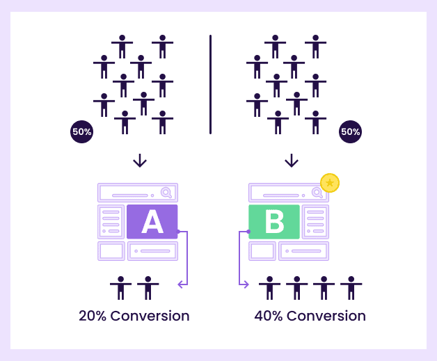
A/B testing reveals how different color schemes can significantly impact audience engagement with the same content.
Reinforcing Your Message
I always ensure my color choices align with and strengthen my core message. For example, when creating sustainability infographics, I use earth tones and greens to subconsciously reinforce environmental themes. For financial data, blues and greens often convey stability and growth.
Color Combinations for Information Retention
I've learned that certain color palettes for data visualization significantly improve information retention. High-contrast combinations between text and background colors improve readability, while strategic use of accent colors can highlight key information that I want viewers to remember.
Information Recall by Color Contrast Level
Case Studies: Color Impact on Audience Response
I've studied numerous case studies where color choices dramatically influenced audience response. One particularly striking example involved a healthcare infographic that initially used primarily red tones. When redesigned with blues and greens, viewer anxiety decreased while information retention increased by 23%.
Guiding the Viewer's Eye
I use color strategically to create a visual hierarchy that guides viewers through complex information in the exact sequence I intend. By using visual communication for designers principles, I can direct attention to primary information first, then secondary details.
Eye-tracking studies reveal how strategic color placement guides viewer attention through an infographic.
When I'm researching effective color applications for a specific industry, I leverage PageOn.ai's Deep Search to find relevant examples. This helps me understand industry-specific color conventions while identifying opportunities to stand out with thoughtful color innovation.
Building Effective Color Hierarchies and Systems
I've found that establishing clear color hierarchies is essential for creating infographics that efficiently communicate complex information. A well-structured color system helps viewers intuitively understand the relative importance of different elements.
Principles of Color Hierarchy
When I design infographics, I use color to create a clear visual hierarchy that emphasizes key information. I typically reserve my most vibrant or contrasting colors for primary data points, while using more subdued tones for supporting information.
flowchart TD
    A[Color Hierarchy System] --> B[Primary Elements]
    A --> C[Secondary Elements]
    A --> D[Tertiary Elements]
    A --> E[Background Elements]
    B --> F[Vibrant/High Contrast]
    B --> G[Largest Color Areas]
    C --> H[Medium Saturation]
    C --> I[Supporting Information]
    D --> J[Low Saturation]
    D --> K[Subtle Details]
    E --> L[Neutral Tones]
    E --> M[Provides Context]
    style A fill:#FF8000,stroke:#333,stroke-width:2px
    style B fill:#FF5733,stroke:#333,stroke-width:1px
    style C fill:#FFC300,stroke:#333,stroke-width:1px
    style D fill:#DAF7A6,stroke:#333,stroke-width:1px
    style E fill:#F4F4F4,stroke:#333,stroke-width:1px
A well-structured color hierarchy system organizes information by importance using color properties.
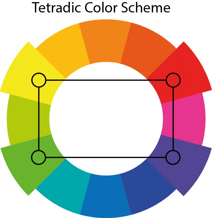
Understanding Color Relationships
I regularly work with four main color relationship types when designing infographics:
Complementary Schemes
Colors opposite each other on the color wheel, creating high contrast and visual tension (e.g., blue and orange)
Analogous Schemes
Colors adjacent to each other on the color wheel, creating harmony and cohesion (e.g., blue, blue-purple, and purple)
Triadic Schemes
Three colors equally spaced on the color wheel, creating balance with visual interest (e.g., red, yellow, and blue)
Monochromatic Schemes
Different shades and tints of a single color, creating elegant unity (e.g., light blue to dark blue)
Color Scheme Effectiveness by Infographic Type
The 60-30-10 Rule
I frequently apply the 60-30-10 rule for balanced color distribution in my infographics:
- 60%: Dominant color (usually neutral or brand color)
- 30%: Secondary color that supports the dominant color
- 10%: Accent color for emphasis and calls to action
The 60-30-10 rule creates visually balanced infographics with clear emphasis on key elements.
Creating Visual Flow with Color
I strategically place colors to create a visual flow that guides viewers through my infographics in a specific sequence. This technique is particularly effective for create stunning infographics that tell a coherent story.
When I'm experimenting with different color hierarchy systems, I use PageOn.ai's AI Blocks. This feature allows me to quickly test various color approaches without needing complex design software or technical expertise. I can simply describe my desired color hierarchy, and PageOn.ai generates visual options for me to evaluate.
Color Accessibility and Inclusive Design Practices
I believe strongly that effective infographics should be accessible to everyone. That's why I prioritize color accessibility in my design process, ensuring that my visuals communicate effectively regardless of how they're perceived.
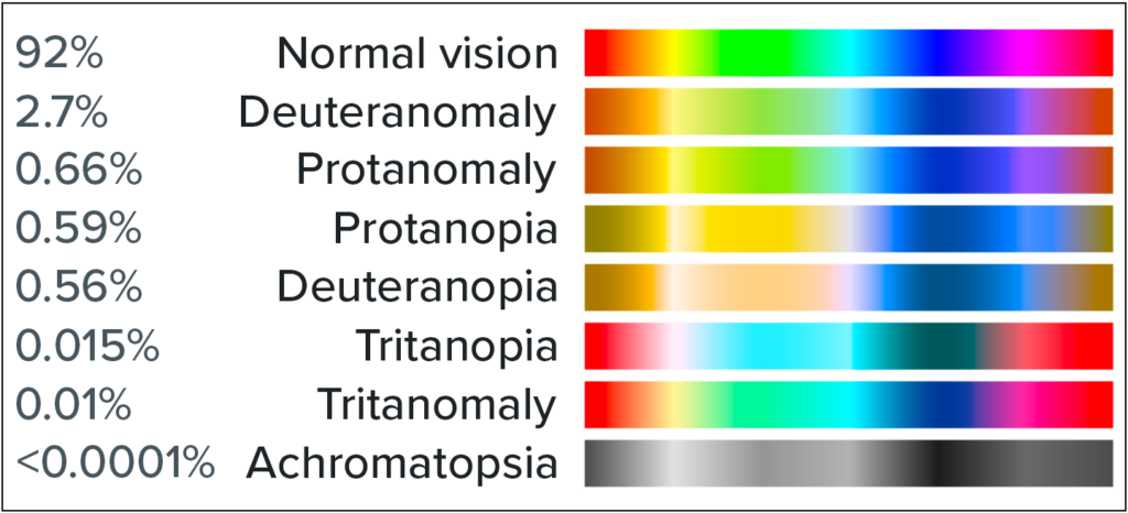
Designing for Color Blindness
When I create infographics, I always consider that approximately 8% of men and 0.5% of women experience some form of color vision deficiency. To accommodate these viewers, I:
- Avoid problematic color combinations (particularly red/green)
- Use patterns and textures in addition to colors
- Include text labels rather than relying solely on color coding
- Test my designs using color blindness simulators

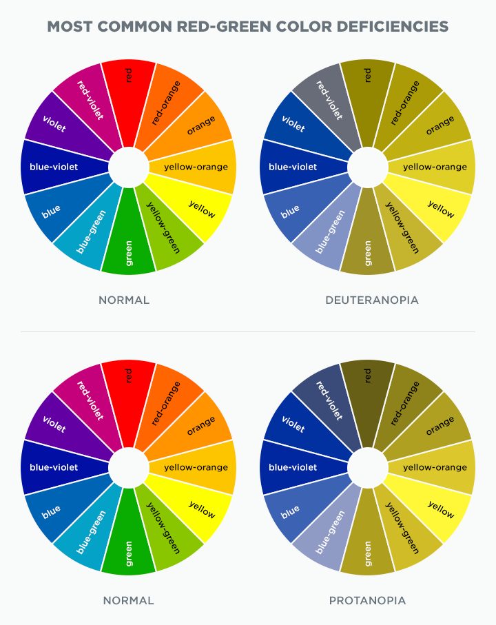

Comparison of normal vision (left), deuteranopia simulation (middle), and accessible redesign (right).
Ensuring Sufficient Contrast
I always aim to meet or exceed WCAG 2.1 AA standards for contrast ratios:
- At least 4.5:1 for normal text
- At least 3:1 for large text (18pt or 14pt bold)
- At least 3:1 for graphical objects and interface components
Contrast Ratio Impact on Readability
Testing Tools for Color Accessibility
I regularly use these tools to ensure my infographics are accessible:
- WebAIM Contrast Checker
- Colorblinding (Chrome extension)
- Stark (design plugin)
- Color Oracle (desktop application)
Communicating Effectively with Accessible Color
I've discovered that designing with accessibility in mind often leads to clearer communication for everyone. By focusing on visual communication design principles that work across perception types, I create infographics with stronger visual hierarchies and more intuitive information flow.
When I'm working on accessible color schemes, I use PageOn.ai's intelligent suggestions for accessibility-friendly alternatives. The platform analyzes my color choices and recommends adjustments that maintain my design intent while improving accessibility—saving me time while ensuring my infographics reach the widest possible audience.
Practical Color Scheme Implementation for Different Infographic Types
I've found that different types of infographics benefit from specific color approaches. By tailoring my color strategy to the infographic type, I can significantly enhance its effectiveness.
Data-Driven Infographics
When I create data-driven infographics, clarity is my primary goal. I use color to:
- Distinguish between different data categories
- Show progression or relationships in data
- Highlight outliers or significant data points
- Create visual patterns that reveal trends

Sequential color schemes help viewers quickly understand data progression in quantitative infographics.
Narrative Infographics
For narrative infographics that tell a story, I use color to:
- Establish an emotional tone that supports the narrative
- Create visual continuity throughout the story
- Signal transitions between different parts of the narrative
- Reinforce character or concept associations
flowchart LR
    A[Introduction] -->|Warm Colors| B[Rising Action]
    B -->|Increasing Saturation| C[Climax]
    C -->|Contrasting Colors| D[Resolution]
    D -->|Harmonious Colors| E[Conclusion]
    style A fill:#FFEBCD,stroke:#333,stroke-width:1px
    style B fill:#FFA07A,stroke:#333,stroke-width:1px
    style C fill:#FF4500,stroke:#333,stroke-width:1px
    style D fill:#6495ED,stroke:#333,stroke-width:1px
    style E fill:#E6E6FA,stroke:#333,stroke-width:1px
Color progression can mirror narrative structure in storytelling infographics.
Comparison Infographics
When designing comparison infographics, I leverage color to:
- Create clear visual distinction between compared items
- Use color temperature to suggest positive/negative attributes
- Apply consistent color coding across multiple comparison points
- Highlight the "winner" or preferred option when appropriate
Product Comparison Color Strategy
| Feature | Product A | Product B | Product C |
|---|---|---|---|
| Price | $$$ | $$ | $ |
| Quality | ★★★★★ | ★★★★☆ | ★★★☆☆ |
| Features | Comprehensive | Standard | Basic |
| Support | 24/7 | Business Hours | Email Only |
Consistent color coding helps viewers quickly compare attributes across multiple products.
Timeline Infographics
For timeline infographics, I use color to:
- Show progression through time periods
- Group related events or eras
- Highlight pivotal moments or turning points
- Create a sense of historical context through period-appropriate colors
Timeline infographics can use color evolution to reinforce the passage of time.
When I'm working on different infographic types, I use PageOn.ai to quickly visualize how various color schemes affect the structure and impact. This allows me to test multiple approaches efficiently before committing to a final design.
From Theory to Application: Building Your Infographic Color Strategy
I've developed a systematic approach to selecting and implementing colors in my infographic designs. This methodical process helps ensure that my color choices are strategic rather than arbitrary.
A Systematic Approach to Color Selection
My color selection process follows these steps:
flowchart TD
    A[Define Communication Goals] --> B[Identify Target Audience]
    B --> C[Research Cultural Context]
    C --> D[Select Base Color]
    D --> E[Build Color Relationship]
    E --> F[Apply 60-30-10 Rule]
    F --> G[Test for Accessibility]
    G --> H[Evaluate Effectiveness]
    H --> I{Meets Goals?}
    I -->|Yes| J[Finalize Color Scheme]
    I -->|No| K[Revise]
    K --> D
    style A fill:#FF8000,stroke:#333,stroke-width:2px
    style J fill:#66BB6A,stroke:#333,stroke-width:2px
A systematic approach to color selection ensures strategic rather than arbitrary choices.
Aligning Color with Brand Identity
I always ensure that my infographic color palettes align with brand identity while optimizing psychological impact. This typically involves:
- Starting with core brand colors as a foundation
- Expanding the palette with complementary or analogous colors
- Adjusting saturation and brightness to optimize psychological impact
- Ensuring the expanded palette maintains brand recognition
Brand Color Expansion Strategies
Avoiding Common Color Pitfalls
Through experience, I've learned to avoid these common color mistakes:
- Using too many colors – limiting to 3-5 core colors maintains clarity
- Inconsistent color meaning – maintaining consistent color associations throughout
- Poor contrast – ensuring text and important elements stand out clearly
- Ignoring color blindness – always testing designs for accessibility
- Emotional mismatch – ensuring colors evoke emotions that match content
Color Testing Methodology
Before finalizing any infographic, I test my color choices using these methods:
- Grayscale conversion to check value contrast
- Color blindness simulators to ensure universal accessibility
- Small-scale previews to test legibility at different sizes
- Peer review to gather subjective impressions
- A/B testing with small audiences when possible
Testing color schemes across different viewing conditions ensures universal effectiveness.
When I'm transforming abstract color concepts into concrete visual assets, I use PageOn.ai's thought-to-visual conversion capabilities. This powerful feature allows me to describe my color strategy in plain language, and the platform generates visual options that bring my concepts to life. This bridges the gap between color theory and practical application, saving me significant time in the design process.
Measuring the Impact of Color Choices on Audience Engagement
I believe that measuring the effectiveness of color choices is just as important as the initial selection process. By gathering data on how audiences respond to different color schemes, I can continuously refine my approach.
Metrics for Evaluating Color Effectiveness
When assessing how my color choices perform, I focus on these key metrics:
- Attention metrics: Heat maps, viewing time, scroll depth
- Comprehension metrics: Information recall, understanding of key points
- Emotional response: Sentiment analysis, emotional reaction surveys
- Action metrics: Click-through rates, conversions, sharing behavior
Impact of Color Scheme Changes on Key Metrics
A/B Testing for Color Optimization
I regularly conduct A/B tests to refine my color strategies:
- Testing different accent colors for call-to-action elements
- Comparing different color hierarchies for information flow
- Evaluating emotional impact of different color temperature choices
- Testing color saturation levels for optimal engagement
A/B testing provides quantitative data on how color choices impact audience engagement.
Eye-Tracking Studies
I find eye-tracking studies particularly valuable for understanding how color influences attention patterns:
- Bright, saturated colors naturally draw initial attention
- High contrast areas receive more focused viewing time
- Color-coded information groups are processed together
- Consistent color patterns create predictable viewing paths
Gathering Audience Feedback
I use these methods to collect meaningful feedback on color impact:
- Surveys with specific questions about color impressions
- Focus groups with guided discussions about emotional responses
- Social media sentiment analysis on shared infographics
- Direct interviews with target audience members
When I need to rapidly test different color approaches, I use PageOn.ai's agentic capabilities. This allows me to generate multiple versions of an infographic with different color schemes and quickly gather feedback on which version most effectively communicates my message. This iterative process helps me continuously refine my understanding of color psychology and its practical application in infographic design.
Transform Your Visual Expressions with PageOn.ai
Ready to apply these color psychology principles to create stunning infographics that captivate your audience? PageOn.ai's intuitive tools make it easy to design professional-quality visual content without design expertise.
Start Creating with PageOn.ai TodayConclusion: Mastering Color Psychology for Impactful Infographics
Throughout this guide, I've shared my insights on how color psychology can transform ordinary infographics into compelling visual stories. From understanding the scientific foundations to implementing practical color strategies for different infographic types, we've covered the essential elements of effective color usage.
I've found that the most successful infographics don't just look good—they strategically use color to guide attention, enhance understanding, evoke emotion, and drive action. By applying the principles we've discussed, you can create infographics that not only capture attention but also effectively communicate your message.
Remember that color selection isn't just an aesthetic choice—it's a powerful communication tool. When you approach color strategically, considering both universal psychological principles and your specific audience needs, you can dramatically improve the impact of your visual communications.
As you develop your own approach to infographic color psychology, I encourage you to experiment, test, and refine your color strategies. With tools like PageOn.ai at your disposal, you can quickly transform abstract color concepts into concrete visual assets that resonate with your audience and achieve your communication goals.
The journey to mastering color psychology in infographic design is ongoing, but with each thoughtful application of these principles, you'll create more effective, engaging, and memorable visual content.
You Might Also Like
Prompt Chaining Techniques That Scale Your Business Intelligence | Advanced AI Strategies
Master prompt chaining techniques to transform complex business intelligence workflows into scalable, automated insights. Learn strategic AI methodologies for data analysis.
How AI Saves Marketing Teams 5+ Hours Weekly While Boosting Productivity 83% | Visual Content Revolution
Discover how AI transforms marketing workflows, saving 5+ hours weekly and boosting productivity by 83%. Learn visual content strategies that eliminate manual tasks and accelerate campaigns.
How AI Amplifies Marketing Team Capabilities While Preserving Human Jobs | Strategic Marketing Enhancement
Discover how AI transforms marketing teams into powerhouses without reducing workforce size. Learn proven strategies for capability multiplication and strategic enhancement.
First Principles Framework for Building Powerful AI Commands | Master AI Prompt Engineering
Learn the first principles approach to crafting powerful AI commands. Master prompt engineering with proven frameworks, templates, and visualization techniques for optimal AI interaction.