Mastering MCP Server Configuration: Building Interactive Dashboards for Seamless Management
A comprehensive guide to creating powerful visualization tools for MCP server environments
Effective management of MCP servers requires robust monitoring and configuration tools. This guide explores how to build interactive dashboards that provide real-time insights, simplify complex configurations, and enhance overall system management through powerful visualizations.
Understanding MCP Server Dashboard Fundamentals
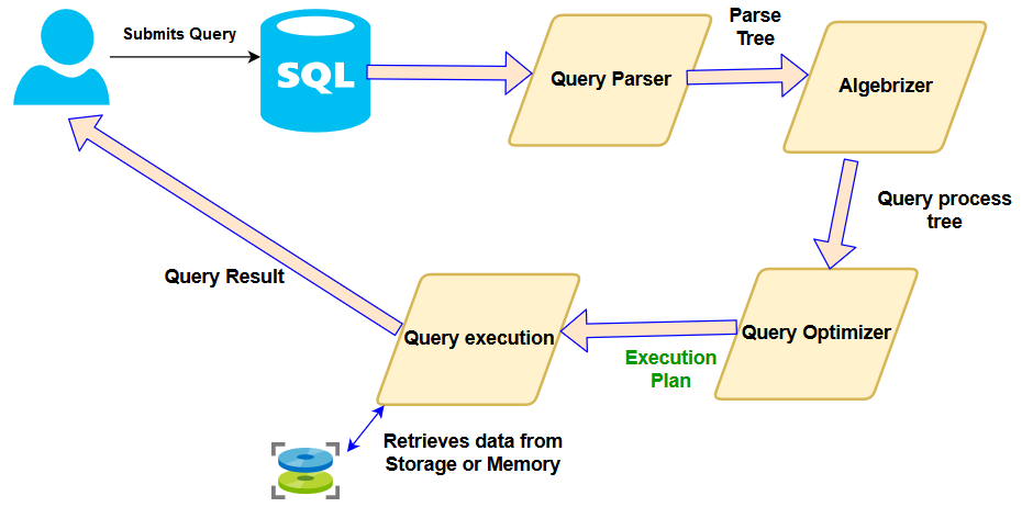
MCP (Multi-Configuration Platform) servers require specialized dashboards to effectively monitor and manage their complex environments. Before building your dashboard, it's essential to understand the core architecture and monitoring requirements.
MCP Server Architecture Overview
The diagram below illustrates the typical components of an MCP server environment that should be represented in your dashboard:
                    flowchart TD
                      Client[Client Applications] --> API[API Gateway]
                      API --> Auth[Authentication Service]
                      API --> WM[Workspace Manager]
                      WM --> S1[Server Instance 1]
                      WM --> S2[Server Instance 2]
                      WM --> S3[Server Instance N]
                      S1 --> DB[(Database)]
                      S2 --> DB
                      S3 --> DB
                      S1 --> FS[File Storage]
                      S2 --> FS
                      S3 --> FS
                      API --> Config[Configuration Service]
                      Config --> S1
                      Config --> S2
                      Config --> S3

                      style API fill:#FF8000,stroke:#333,stroke-width:1px
                      style WM fill:#FF8000,stroke:#333,stroke-width:1px
                      style Config fill:#FF8000,stroke:#333,stroke-width:1px
When designing your MCP dashboard, you need to focus on several key data points that provide actionable insights into server health and performance. These metrics form the foundation of any effective monitoring solution.
Essential Metrics for MCP Server Monitoring
| Metric Category | Key Indicators | Visualization Type | Refresh Rate |
|---|---|---|---|
| System Resources | CPU, Memory, Disk I/O, Network | Line charts, Gauges | 5-30 seconds |
| Workspace Activity | Active connections, Throughput, Error rates | Bar charts, Heat maps | 30-60 seconds |
| Configuration Status | Version, Last updated, Validation status | Status cards, Timeline | On change |
| Security | Authentication attempts, Permission changes | Alert logs, Donut charts | Real-time |
Understanding the relationship between workspaces and server instances is crucial when designing your dashboard. Each workspace operates within the context of server instances, and your dashboard should clearly visualize these connections to facilitate effective management.
Important Dashboard Integration Considerations
According to Plaid's MCP server documentation, dashboard MCP servers only work with production data and require approval for production access with at least one product. This highlights the importance of designing your dashboard with production-grade security and performance in mind from the start.
When planning your MCP dashboard implementation, be aware of current limitations in dashboard technology and available support channels. Many MCP server dashboard solutions are under active development, which means you should design with flexibility to accommodate future changes and improvements.
Designing Intuitive MCP Dashboard Layouts
An effective MCP dashboard layout organizes information logically, making it easy for users to find critical data and take action when needed. The design should balance comprehensive monitoring with simplicity to avoid overwhelming users.
Logical Dashboard Organization
Here's an example of how to organize metrics into logical groups for efficient monitoring:

Color-coding is essential for quick status assessment. Implement a consistent color system across your dashboard to indicate different states and severity levels. This allows operators to identify issues at a glance without reading detailed metrics.
Color Coding System for Status Indicators
Responsive design is crucial for MCP dashboards, as administrators may need to monitor systems from various devices. Your layout should adapt seamlessly to different screen sizes while maintaining usability and information hierarchy.
Responsive Layout Adaptation
                    flowchart TD
                        A[Dashboard Layout] --> B{Device Detection}
                        B -->|Desktop| C[Full Layout\nMulti-column\nDetailed Metrics]
                        B -->|Tablet| D[Adaptive Layout\nTwo-column\nSelected Metrics]
                        B -->|Mobile| E[Simplified Layout\nSingle-column\nCritical Metrics Only]

                        C --> F[Interactive Controls\nExpanded View]
                        D --> G[Interactive Controls\nCompact View]
                        E --> H[Essential Controls\nTouch-optimized]

                        style A fill:#FF8000,stroke:#333,stroke-width:1px
                        style F fill:#e6f7ff,stroke:#333,stroke-width:1px
                        style G fill:#e6f7ff,stroke:#333,stroke-width:1px
                        style H fill:#e6f7ff,stroke:#333,stroke-width:1px
Workspace management interfaces should be structured intuitively, allowing users to quickly navigate between different workspaces and understand their relationships with server instances. Consider using AI-powered organizational charts to visualize complex workspace hierarchies and relationships.
Incorporating user feedback mechanisms directly into your dashboard design allows for continuous improvement based on real user experiences. Consider adding rating systems for dashboard components, allowing users to flag confusing elements, or implementing A/B testing for new visualization approaches.
Essential Visualization Components for MCP Monitoring
Effective MCP monitoring requires specialized visualization components that present complex server data in an intuitive, actionable format. These components form the core of your monitoring dashboard.
Real-time Server Status Indicators
Status indicators provide at-a-glance information about server health:
Performance trend visualization is crucial for understanding system behavior over time and identifying potential issues before they become critical. Using data visualization charts that show historical patterns alongside real-time data provides valuable context for administrators.
Resource Utilization Trends
Workspace utilization maps provide a visual representation of active connections and traffic patterns across your MCP environment. These maps help identify bottlenecks, usage patterns, and potential capacity issues.
Workspace Utilization Heatmap

Configuration change logs with visual differentiators help administrators track modifications to server settings over time. These visualizations highlight what changed, when it changed, and who made the change.
Alert Visualization System
An effective alert system uses visual hierarchies to communicate priority levels:
When designing visualization components, consider using business intelligence dashboard templates as starting points. These templates offer proven layouts and visualization combinations that can be adapted to MCP server monitoring needs.
Advanced Configuration Management Features
Advanced configuration management is essential for maintaining reliable MCP server environments. Visual tools can significantly simplify complex configuration tasks and reduce the risk of errors.
Visual Configuration Editor Workflow
                    flowchart LR
                        A[Select Configuration] --> B[Visual Editor]
                        B --> C{Validation}
                        C -->|Valid| D[Save Changes]
                        C -->|Invalid| E[Error Feedback]
                        E --> B
                        D --> F[Deploy]
                        F --> G[Verify]

                        style B fill:#FF8000,stroke:#333,stroke-width:1px
                        style C fill:#FF8000,stroke:#333,stroke-width:1px
                        style E fill:#ffcccc,stroke:#333,stroke-width:1px
Version control visualization helps administrators track configuration changes over time, understand the evolution of server settings, and quickly identify when and why specific changes were made.
Configuration Version Timeline
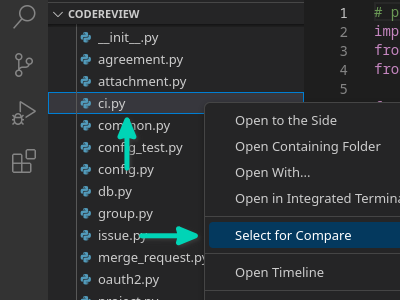
Configuration comparison tools are crucial for identifying differences between server configurations. These tools can highlight changes between versions, environments, or server instances, making it easier to troubleshoot issues or standardize configurations.
Configuration Comparison Tool
Template systems for rapid deployment enable administrators to create and apply standardized configurations across multiple server instances. These templates can include best practices, security baselines, and optimized settings for specific use cases.
Configuration Template Usage
Workflow visualization for approval processes and change management helps enforce governance policies and ensures that configuration changes follow established procedures. These visualizations can show the current status of change requests, approval chains, and implementation timelines.
When designing configuration management tools, consider incorporating event planning templates concepts to help schedule and coordinate configuration changes, especially for complex updates that require coordination across multiple teams or systems.
Integrating Data Sources for Comprehensive Monitoring
Comprehensive MCP server monitoring requires integration with multiple data sources to provide a complete view of system health and performance. Effective dashboards combine these sources into unified visualizations.
MCP Data Source Integration Architecture
                    flowchart TD
                        A[MCP Server Logs] --> P[Data Processing Layer]
                        B[System Metrics] --> P
                        C[Database Metrics] --> P
                        D[Network Monitoring] --> P
                        E[User Activity] --> P
                        F[External APIs] --> P

                        P --> V[Visualization Layer]

                        V --> G[Real-time Dashboards]
                        V --> H[Historical Analysis]
                        V --> I[Alerting System]
                        V --> J[Reporting Engine]

                        style P fill:#FF8000,stroke:#333,stroke-width:1px
                        style V fill:#FF8000,stroke:#333,stroke-width:1px
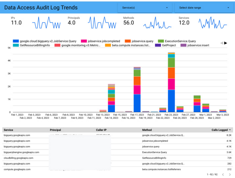
Real-time log analysis is crucial for identifying issues as they occur. Your dashboard should connect directly to MCP server logs and present meaningful visualizations that highlight patterns, errors, and unusual activities.
Log Analysis Visualization
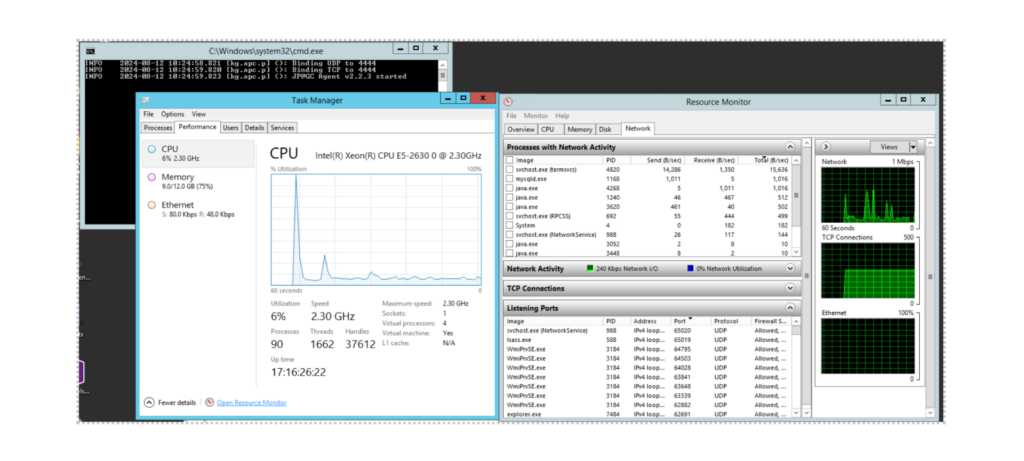
External monitoring tools and APIs can provide additional context and specialized metrics that enhance your MCP dashboard. Integration with these tools allows for a more comprehensive view of your environment.
External Monitoring Integration
Database connection visualizers help monitor data flow and identify potential bottlenecks or issues with database interactions. These visualizations can show connection pools, query performance, and transaction volumes.
Database Connection Visualization
User activity heat maps provide insights into how users interact with your MCP environment. These visualizations can reveal usage patterns, peak activity times, and potential areas for optimization.
System-wide health indicators aggregate data from multiple sources to provide a holistic view of your MCP environment. These indicators can help administrators quickly assess overall system health and identify areas that require attention.
Building Interactive Control Elements
Interactive control elements transform passive monitoring dashboards into powerful management tools. These elements allow administrators to take action directly from the dashboard interface, streamlining workflows and reducing response times.
Drag-and-Drop Configuration Builder
Modern MCP dashboards can include intuitive drag-and-drop interfaces for building server configurations:
Visual workflow designers enable administrators to create automation sequences for common tasks or complex operations. These tools can significantly reduce the time required to implement changes and minimize the risk of errors.
Visual Workflow Designer
                    flowchart LR
                        Start(Start) --> Check{Check Server\nStatus}
                        Check -->|Online| Backup[Backup Config]
                        Check -->|Offline| Notify[Notify Admin]
                        Backup --> Update[Update Config]
                        Update --> Test{Test Config}
                        Test -->|Success| Deploy[Deploy Changes]
                        Test -->|Failure| Rollback[Rollback Changes]
                        Rollback --> Notify
                        Deploy --> Monitor[Monitor Performance]
                        Monitor --> End(End)

                        click Backup callback "Backup Configuration"
                        click Update callback "Update Configuration"
                        click Deploy callback "Deploy Changes"
                        click Rollback callback "Rollback Changes"

                        style Start fill:#FF8000,stroke:#333,stroke-width:1px
                        style End fill:#FF8000,stroke:#333,stroke-width:1px
                        style Backup fill:#e6f7ff,stroke:#333,stroke-width:1px,stroke-dasharray: 5 5
                        style Update fill:#e6f7ff,stroke:#333,stroke-width:1px,stroke-dasharray: 5 5
                        style Deploy fill:#e6f7ff,stroke:#333,stroke-width:1px,stroke-dasharray: 5 5
                        style Rollback fill:#e6f7ff,stroke:#333,stroke-width:1px,stroke-dasharray: 5 5
Interactive server restart and maintenance scheduling tools help administrators plan and execute maintenance activities with minimal disruption. These tools can include scheduling calendars, impact assessments, and notification systems.
Maintenance Scheduling Interface
User permission management interfaces with visual role mapping help administrators understand and configure access controls for MCP environments. These interfaces can visualize role hierarchies, permission inheritance, and access patterns.
Visual Permission Management
Workspace creation wizards with visual progress tracking guide administrators through the process of setting up new workspaces. These wizards can include validation checks, configuration recommendations, and clear visualizations of progress and completion status.
When designing interactive control elements, consider leveraging website page builders concepts to create intuitive, drag-and-drop interfaces that simplify complex configuration tasks and reduce the learning curve for new administrators.
Implementing Real-World MCP Dashboard Solutions
Real-world MCP dashboard implementations offer valuable insights into effective design approaches, common challenges, and practical solutions. Examining these implementations can help you avoid pitfalls and adopt proven strategies.
Case Study: Web Dashboard for MCP Servers
A recent implementation showcased on Reddit provides an excellent example of a comprehensive web dashboard for managing multiple MCP servers and workspaces. This solution features an intuitive server configuration interface and workspace management tools that simplify complex administration tasks.
MCP Dashboard Implementation Approaches
| Implementation | Key Features | Technology Stack | Best For |
|---|---|---|---|
| Streamlit Live Agent Dashboard | Real-time agent monitoring, Interactive controls, Python integration | Python, Streamlit, Convex MCP | Data science teams, Python-based environments |
| Web-Based MCP Manager | Multi-server management, Workspace creation, Configuration tools | JavaScript, React, Node.js | Enterprise environments, Multiple server deployments |
| Plaid Dashboard MCP Server | Production data integration, Financial service APIs, Security controls | Proprietary Plaid technology | Financial services, Production environments |
| Open-Source MCP Monitor | Community-driven features, Extensible plugins, Customizable views | Various (Go, Python, JavaScript) | Cost-sensitive deployments, Community support |
Streamlit implementations for live agent dashboards offer a rapid development approach for MCP monitoring. These implementations leverage Python's data science ecosystem to create interactive visualizations and controls.
Implementation Success Factors
Best practices from successful MCP dashboard implementations include focusing on user experience, optimizing performance, integrating multiple data sources, implementing robust security controls, ensuring scalability, and providing customization options. These practices help create dashboards that are both powerful and usable in real-world environments.
Optimizing Dashboard Performance and Security
Dashboard performance and security are critical considerations for MCP environments. Optimizing these aspects ensures that your dashboard remains responsive and secure, even under heavy load or during security incidents.
Data Refresh Strategy Comparison
| Refresh Strategy | Server Load Impact | Data Freshness | Best Use Cases |
|---|---|---|---|
| Real-time Streaming | High | Immediate | Critical monitoring, Alert dashboards |
| Periodic Polling | Medium | Seconds to minutes | General monitoring, System status |
| On-Demand Refresh | Low | User-initiated | Configuration management, Reports |
| Cached with Background Updates | Low to Medium | Minutes (configurable) | High-traffic dashboards, Historical data |
Secure authentication and authorization frameworks are essential for protecting MCP dashboards from unauthorized access. These frameworks should include multi-factor authentication, role-based access controls, and secure session management.
Security Framework Architecture
                    flowchart TD
                        User[User] --> Auth[Authentication Layer]
                        Auth --> MFA{Multi-Factor\nAuthentication}
                        MFA -->|Verified| RBAC[Role-Based Access Control]
                        MFA -->|Failed| Reject[Access Denied]

                        RBAC --> Dashboard[Dashboard Access]
                        Dashboard --> R1[Read-Only View]
                        Dashboard --> R2[Editor View]
                        Dashboard --> R3[Administrator View]

                        R1 --> Audit[Audit Logging]
                        R2 --> Audit
                        R3 --> Audit

                        style Auth fill:#FF8000,stroke:#333,stroke-width:1px
                        style RBAC fill:#FF8000,stroke:#333,stroke-width:1px
                        style Audit fill:#FF8000,stroke:#333,stroke-width:1px
Role-based dashboard views ensure that users only see the information and controls relevant to their responsibilities. These views can be customized based on user roles, permissions, and specific needs.
Role-Based Access Distribution
Audit logging visualizations help security teams monitor dashboard usage and identify potential security incidents. These visualizations can show login attempts, configuration changes, and other security-relevant events.
Security Audit Visualization
Encryption status indicators provide visual confirmation that sensitive configuration data is properly protected. These indicators can show encryption levels, certificate status, and potential security vulnerabilities.
Testing and Quality Assurance for MCP Dashboards
Thorough testing and quality assurance are essential for ensuring that MCP dashboards function correctly, provide accurate information, and deliver a positive user experience. Implementing robust testing frameworks helps identify and resolve issues before they impact users.
Test Coverage Map
Visual test coverage maps help identify areas of your dashboard that require additional testing:

User experience testing frameworks with visual feedback help identify usability issues and areas for improvement. These frameworks can include heatmaps of user interactions, task completion rates, and satisfaction metrics.
User Experience Testing Results
Performance benchmarking visualizations help identify performance bottlenecks and optimize dashboard responsiveness. These visualizations can show load times, resource usage, and other performance metrics across different conditions.
Performance Benchmark Visualization
Automated testing visualization for continuous integration helps monitor the health of your testing pipeline and identify issues early in the development process. These visualizations can show test results, coverage trends, and integration status.
Automated Testing Pipeline
                    flowchart LR
                        Code[Code Changes] --> Build[Build Process]
                        Build --> UnitTest[Unit Tests]
                        UnitTest --> IntTest[Integration Tests]
                        IntTest --> E2E[End-to-End Tests]
                        E2E --> Perf[Performance Tests]
                        Perf --> Security[Security Scans]
                        Security --> Report[Test Reports]
                        Report --> Deploy[Deployment]

                        style UnitTest fill:#FF8000,stroke:#333,stroke-width:1px
                        style IntTest fill:#FF8000,stroke:#333,stroke-width:1px
                        style E2E fill:#FF8000,stroke:#333,stroke-width:1px
                        style Perf fill:#FF8000,stroke:#333,stroke-width:1px
                        style Security fill:#FF8000,stroke:#333,stroke-width:1px
Visual regression testing tools help identify unintended changes to the dashboard UI. These tools can compare screenshots of the dashboard before and after changes, highlighting visual differences that might indicate bugs or regressions.
Future-Proofing Your MCP Dashboard Implementation
Future-proofing your MCP dashboard ensures that it remains valuable and effective as technology evolves and requirements change. Implementing flexible, adaptable designs helps extend the lifespan of your dashboard investment.
Modular Dashboard Architecture
                    flowchart TB
                        Core[Core Dashboard Framework] --> M1[Monitoring Module]
                        Core --> M2[Configuration Module]
                        Core --> M3[Reporting Module]
                        Core --> M4[User Management Module]
                        Core --> M5[Future Modules...]

                        M1 --> C1[Component 1.1]
                        M1 --> C2[Component 1.2]
                        M1 --> C3[Component 1.3]

                        M2 --> C4[Component 2.1]
                        M2 --> C5[Component 2.2]

                        style Core fill:#FF8000,stroke:#333,stroke-width:1px
                        style M5 fill:#e6f7ff,stroke:#333,stroke-width:1px,stroke-dasharray: 5 5
API version compatibility indicators help administrators understand which dashboard features are compatible with different API versions. These indicators can show compatibility status, deprecation warnings, and upgrade recommendations.
API Compatibility Matrix
| Dashboard Feature | API v1.0 | API v2.0 | API v3.0 |
|---|---|---|---|
| Basic Monitoring | ✓ Full Support | ✓ Full Support | ✓ Full Support |
| Advanced Metrics | ✗ Not Supported | ✓ Full Support | ✓ Full Support |
| Configuration Editor | ⚠ Limited | ✓ Full Support | ✓ Full Support |
| Workspace Management | ✗ Not Supported | ⚠ Limited | ✓ Full Support |
| AI-Assisted Insights | ✗ Not Supported | ✗ Not Supported | ✓ Full Support |
Visualization frameworks that adapt to evolving MCP server capabilities ensure that your dashboard can take advantage of new features and data points as they become available. These frameworks should be designed with flexibility and extensibility in mind.
Feature Adoption Timeline
Feature flagging systems for gradual rollout allow you to introduce new dashboard elements incrementally, minimizing disruption and allowing for targeted testing. These systems can include A/B testing capabilities to evaluate the effectiveness of new features.
Feedback collection mechanisms help inform future dashboard iterations by gathering insights from users about what works well and what could be improved. These mechanisms can include surveys, feedback forms, usage analytics, and direct user interviews.
Transform Your MCP Server Configuration Dashboards with PageOn.ai
Create stunning, interactive visualizations that make complex server data easy to understand. Build dashboards that not only monitor but actively improve your MCP environment management.
Start Creating with PageOn.ai TodayConclusion: Building Your MCP Dashboard Journey
Creating effective MCP server configuration dashboards requires a thoughtful approach to design, visualization, and functionality. By implementing the strategies and best practices outlined in this guide, you can build dashboards that not only monitor your environment but actively enhance your ability to manage and optimize it.
Remember that dashboard development is an iterative process. Start with the core components that provide the most value, then expand and refine based on user feedback and evolving requirements. Focus on creating visualizations that transform complex data into actionable insights, and build interactive controls that streamline common management tasks.
As MCP server technology continues to evolve, your dashboard approach should evolve with it. By building on a foundation of modular components, responsive design, and user-centered thinking, you can create dashboards that remain valuable and effective for years to come.
You Might Also Like
How to Design Science Lesson Plans That Captivate Students
Create science lesson plans that captivate students with hands-on activities, clear objectives, and real-world applications to foster curiosity and critical thinking.
How to Write a Scientific Review Article Step by Step
Learn how to write a review article in science step by step. Define research questions, synthesize findings, and structure your article for clarity and impact.
How to Write a Self-Performance Review with Practical Examples
Learn how to write a self-performance review with examples and tips. Use an employee performance review work self evaluation sample essay to guide your process.
How to Write a Spec Sheet Like a Pro? [+Templates]
Learn how to create a professional spec sheet with key components, step-by-step guidance, and free templates to ensure clarity and accuracy.