The Power of White Space: Creating Professional Infographics That Breathe and Communicate
Transforming empty space into a strategic design element
I've learned through years of design experience that white space isn't simply empty – it's one of the most powerful tools in creating infographics that not only look professional but also effectively communicate complex information. In this guide, I'll walk you through how to master white space and layout techniques to elevate your infographic designs.
Understanding White Space in Infographic Design
When I first started creating infographics, I made the common mistake of trying to fill every inch of the canvas. I've since learned that white space (or negative space) isn't just empty area—it's a strategic design element that gives your content room to breathe. In my experience, white space is as important as the content itself.
White space serves multiple psychological functions in information processing. When I create infographics with adequate breathing room, I notice viewers can process information more efficiently and retain it longer. This is because our brains naturally seek patterns and organization—white space helps create those patterns by separating and highlighting important elements.
The Psychological Impact of White Space
I've found that balancing information density with visual clarity is one of the most challenging aspects of infographic design. Too much information creates cognitive overload, while too little fails to deliver value. White space helps me strike this balance by creating stunning infographics that are both information-rich and visually digestible.
One of my favorite tools for optimizing white space distribution is PageOn.ai's AI Blocks feature. It automatically analyzes my content and suggests optimal spacing arrangements based on the type of information I'm presenting. This has saved me countless hours of manual adjustments while ensuring my infographics maintain professional quality.
Fundamental Layout Principles for Infographic Success
In my years of design work, I've found that strong layout principles form the foundation of effective infographics. Let me share some of the core principles I rely on.
Implementing Grid Systems

I always start my infographic designs with a grid system. Grids provide structure and organization that make the final product feel cohesive and professional. When I implement presentation layout design techniques, I typically use either a column-based grid (great for vertical scrolling) or a modular grid (perfect for complex information with multiple entry points).
flowchart TD
    A[Select Grid System] --> B{Type of Infographic}
    B -->|Statistical| C[Column Grid]
    B -->|Process| D[Modular Grid]
    B -->|Timeline| E[Linear Grid]
    B -->|Comparison| F[Split Grid]
    C --> G[Apply Rule of Thirds]
    D --> G
    E --> G
    F --> G
    G --> H[Establish Visual Flow]
    H --> I[Create Focal Points]
    I --> J[Balance White Space]
The Rule of Thirds and Golden Ratio
I've discovered that applying the rule of thirds or golden ratio to my infographic layouts creates naturally balanced compositions. By dividing my canvas according to these principles, I can place key elements at intersection points to draw the viewer's eye to important information.

Creating Visual Flow
One of the most important aspects of my infographic design process is establishing a clear visual flow. I use directional cues, alignment, and strategic spacing to guide the viewer's journey through the information in a logical sequence. This ensures they absorb the content in the intended order and don't miss critical points.
When I need inspiration for effective layouts, I use PageOn.ai's Deep Search feature to find examples that match my content needs. This helps me discover proven layout patterns that I can adapt to my specific information requirements.
White Space Techniques for Different Infographic Types
Through my design career, I've learned that different types of infographics require different approaches to white space. Let me share the specific techniques I use for various formats.
| Infographic Type | White Space Strategy | Key Benefits |
|---|---|---|
| Statistical | Isolate key numbers with generous surrounding space; group related statistics | Emphasizes important data points; prevents number fatigue |
| Process | Consistent spacing between steps; clear pathways between connected elements | Clarifies sequence; improves flow comprehension |
| Comparison | Equal spacing for compared elements; clear central dividing space | Facilitates side-by-side analysis; highlights differences |
| Timeline | Consistent intervals between time points; breathing room around date markers | Enhances chronological clarity; improves time perception |
| Geographic | Clean borders around map elements; balanced spacing for supporting data | Maintains map integrity; integrates location data effectively |
Statistical Infographics
When I create infographic data visualizations, I focus on using white space to highlight key numbers and comparisons. I've found that isolating important statistics with generous surrounding space makes them stand out and increases their impact. For dense statistical infographics, I create breathing room between different data points to prevent information overload.
Process Infographics
Process Infographic White Space Example
flowchart LR
    subgraph "Effective White Space"
    A[Research] -.-> B[Analysis]
    B -.-> C[Design]
    C -.-> D[Review]
    D -.-> E[Publish]
    end
    subgraph "Poor White Space"
    F[Research]-->G[Analysis]-->H[Design]-->I[Review]-->J[Publish]
    end
For process infographics, I ensure there's consistent spacing between steps and clear pathways between connected elements. This spatial clarity helps viewers understand the sequence and relationships between different stages.
PageOn.ai's Vibe Creation feature has been invaluable in helping me adapt spacing based on infographic purpose. It analyzes my content and suggests spacing approaches that align with the specific goals of my infographic, whether I'm explaining a complex process or highlighting key statistics.
Typography and White Space: The Critical Relationship
In my design practice, I've found that typography and white space are inseparably linked. The way text breathes on the page dramatically impacts how information is received and processed.

Line Spacing (Leading)
This paragraph has tight leading (line spacing). The lines are compressed together, making it harder to read large amounts of text. I avoid this in my infographics except for very short phrases where space is at a premium.
Leading: 1.0 (tight)
This paragraph has standard leading. It provides adequate space between lines for comfortable reading. I typically use this for body text in my infographics when I need to balance readability with space efficiency.
Leading: 1.5 (standard)
This paragraph has generous leading. The extra space between lines creates a more luxurious, easy-to-read experience. I use this for important text or when I want to create a sense of sophistication.
Leading: 2.0 (generous)
I've learned that proper line spacing is essential for optimal readability. Too little space between lines creates visual tension and makes text difficult to follow, while too much space can disconnect related content. For most infographics, I aim for a leading value between 1.4 and 1.6 times the font size.
Paragraph Spacing and Hierarchical Structure
Creating distinct information blocks through paragraph spacing is another technique I regularly employ. When I separate paragraphs with adequate white space, I create clear divisions that help viewers mentally organize the information. This is particularly important in visual communication for designers working with complex topics.
Typography Spacing Hierarchy
I pay special attention to the hierarchical spacing between headings, subheadings, and body text. By creating a consistent spacing pattern where headings have more space above them than below, I establish a clear visual hierarchy that helps viewers navigate through the information logically.
One of my favorite PageOn.ai features is its ability to suggest ideal typography spacing based on content type. When I input my infographic content, it analyzes the structure and purpose, then recommends appropriate spacing values for different text elements. This ensures my typography breathes properly regardless of the subject matter.
Color and Contrast in Relation to White Space
I've discovered that color choices dramatically influence how white space is perceived in infographics. The relationship between color and space is one of the most powerful tools in my design arsenal.
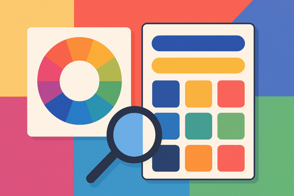
Color's Impact on Spatial Perception
Cool colors recede
Blues and greens create the perception of more space and distance.
Warm colors advance
Reds and oranges appear closer and can make space feel tighter.
Neutral colors balance
Grays and tans create neutral spatial perception.
When creating professional visual presentation in powerpoint or infographics, I'm always mindful of how color affects the perception of space. Darker colors tend to make spaces feel smaller, while lighter colors expand the perceived space. I use this principle strategically to create depth and focus in my infographics.
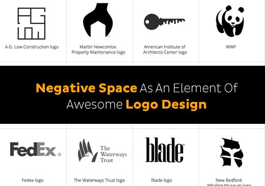
Using Negative Space Creatively
One of my favorite techniques is using negative space to create meaningful shapes that enhance branding or reinforce key messages. By carefully arranging positive elements, I can create recognizable forms in the white space between them, adding an extra layer of visual interest and meaning to my infographics.
Creating "Active" White Space
I've learned to distinguish between passive white space (the natural gaps between elements) and active white space (intentionally designed empty areas that contribute to the narrative). When I create active white space, I'm deliberately using emptiness to direct attention, create emphasis, or suggest movement.
PageOn.ai's ability to generate complementary color schemes that enhance spatial perception has been a game-changer for my workflow. Instead of spending hours testing different color combinations, I can quickly generate harmonious palettes that work with my white space strategy to create cohesive, professional infographics.
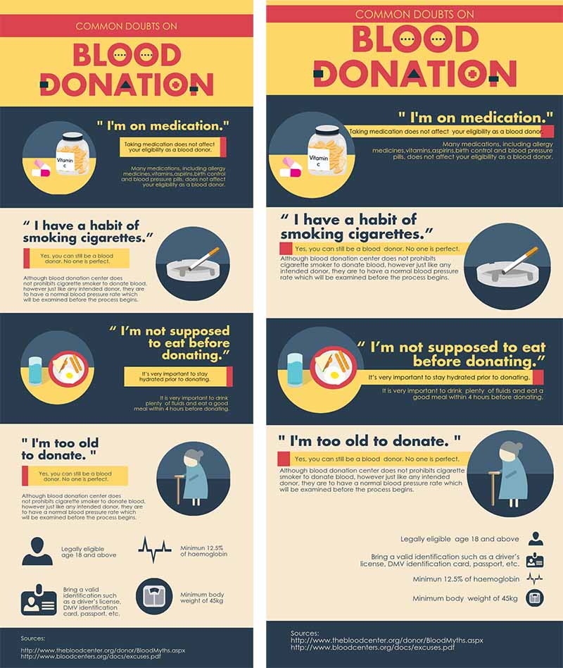
Common White Space Mistakes and How to Avoid Them
Throughout my design career, I've made (and corrected) many white space mistakes. Let me share the most common pitfalls I've encountered and how I now avoid them.

The Overcrowding Temptation
The Mistake:
I used to feel compelled to fill every available space with content, believing it would provide more value. This "horror vacui" (fear of empty space) led to cluttered, overwhelming infographics that failed to communicate effectively.
My Solution:
Now I follow the "less is more" principle. I prioritize information ruthlessly, focusing on what's truly essential. I remind myself that white space isn't wasted space—it's working hard to make the important elements stand out. When I feel the urge to add more, I step back and ask, "Will this addition improve understanding or just fill space?"
Common White Space Mistakes
Inconsistent Spacing
Another mistake I've learned to avoid is inconsistent spacing. When spacing between similar elements varies without reason, it creates visual confusion and undermines the professional quality of the infographic. I now establish spacing rules at the beginning of my design process and stick to them throughout.
Ignoring Margins and Boundaries
Early in my career, I often extended content too close to the edges of my infographics, creating a cramped feeling. I've since learned the importance of respecting margins and boundaries. Proper margins frame the content and give it room to breathe, similar to the matting around artwork.
Poor Grouping
Ineffective use of proximity is another common mistake I've corrected in my work. When related elements aren't visually grouped through appropriate spacing, viewers struggle to understand relationships between information. I now use the principles of proximity and similarity to clearly establish connections between related content.
PageOn.ai's layout analysis feature has been incredibly helpful in identifying and correcting spacing issues in my infographics. It automatically detects inconsistencies, crowding, and poor grouping, then suggests specific adjustments to improve the visual hierarchy and overall effectiveness of the design.
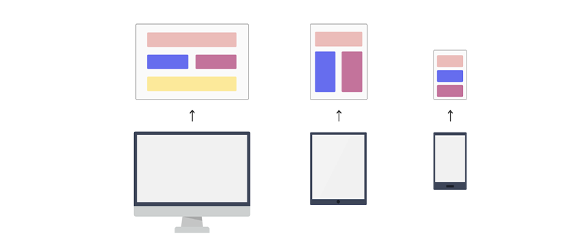
Responsive White Space: Designing for Multiple Platforms
As my infographics are increasingly viewed across various devices, I've had to develop strategies for maintaining effective white space regardless of screen size or orientation.
flowchart TD
    A[Infographic Design] --> B{Screen Size?}
    B -->|Desktop| C[Maintain Full White Space]
    B -->|Tablet| D[Adjust Grid to 8-column]
    B -->|Mobile| E[Simplify to 4-column]
    C --> F[Standard Margins: 60px]
    D --> G[Reduced Margins: 40px]
    E --> H[Minimal Margins: 20px]
    F --> I[Preserve Visual Hierarchy]
    G --> I
    H --> I
    I --> J[Prioritize Key Content]
    J --> K[Test Across Devices]
Adapting for Different Screen Sizes
When designing responsive infographics, I focus on maintaining the integrity of white space as elements reflow and resize. Rather than simply shrinking everything proportionally, I make strategic decisions about which spaces to preserve and which can be reduced while still maintaining clarity.
| Device | White Space Approach | Key Considerations |
|---|---|---|
| Desktop | Full white space implementation; generous margins and padding | Focus on optimal reading experience and visual hierarchy |
| Tablet | Moderate reduction in margins; maintain internal spacing | Balance between content density and readability |
| Mobile | Vertical reflow; reduced but consistent spacing | Prioritize content; eliminate non-essential elements |
| Optimized for fixed dimensions; consider bleed areas | Resolution requirements; color space differences |
Mobile-First Considerations
I've adopted a mobile-first approach to infographic spacing, starting with the most constrained environment and then expanding the design for larger screens. This ensures that the essential information remains clear and accessible even on small displays, while additional white space and refinements can enhance the experience on larger screens.
Print vs. Digital Requirements
When designing infographics that will be used in both digital and print formats, I pay special attention to how white space translates between mediums. Print often requires higher resolution and different color spaces, while digital allows for interactive elements but must account for varying screen sizes.
PageOn.ai has been instrumental in helping me maintain proper spacing across different publishing formats. Its responsive preview feature lets me see how my infographics will appear across various devices, allowing me to make targeted adjustments to preserve the integrity of my white space strategy regardless of where the content is viewed.
Testing and Optimizing White Space in Infographics
The final and perhaps most crucial step in my white space mastery journey has been developing a systematic approach to testing and optimization. I've learned that even small spacing adjustments can significantly impact how information is received.
A/B Testing for Optimal Spacing
I regularly conduct A/B tests with different spacing arrangements to determine which approach leads to better engagement and comprehension. By creating variants with different white space distributions and testing them with real users, I can make data-driven decisions about my infographic layouts.
A/B Testing Results: White Space Impact
Eye-Tracking Insights
Eye-tracking studies have revolutionized my understanding of how white space influences information consumption. By observing how viewers' eyes move through my infographics, I can identify areas where spacing adjustments would improve the natural flow of attention and enhance comprehension of key points.
Gathering User Feedback
Direct feedback from users has been invaluable in refining my white space approach. I regularly ask viewers specific questions about clarity, flow, and focus to understand how my spacing decisions affect their experience. This qualitative data complements the quantitative insights from A/B testing and eye-tracking.
Iterative Design Process
I've embraced an iterative approach to white space refinement, making incremental improvements based on testing results and feedback. This continuous optimization has led to significantly more effective infographics over time, as each iteration builds on lessons learned from previous designs.
PageOn.ai's analytics integration has been particularly helpful in measuring the effectiveness of my spacing choices. By connecting my infographics to performance metrics, I can see how different white space strategies impact engagement, comprehension, and conversion rates. This data-driven approach takes the guesswork out of white space optimization and helps me create increasingly effective infographics.
Transform Your Visual Expressions with PageOn.ai
Ready to master white space and create professional infographics that truly communicate? PageOn.ai's intelligent design tools can help you perfect your layout, optimize your spacing, and create visually stunning infographics that engage your audience and convey complex information with clarity.
Conclusion: The Ongoing Journey of White Space Mastery
Throughout my design career, I've come to appreciate white space as perhaps the most undervalued yet powerful tool in infographic design. The strategic use of emptiness creates structure, enhances meaning, and transforms cluttered information into clear communication.
As I continue to refine my approach to white space, I'm constantly discovering new techniques and insights. The principles I've shared in this guide have evolved through years of practice, testing, and learning from both successes and failures.
I encourage you to view white space not as an afterthought but as a fundamental design element that deserves careful consideration from the earliest stages of your infographic creation process. By mastering the strategic use of white space, you'll create infographics that not only look professional but also communicate with remarkable clarity and impact.
Tools like PageOn.ai have transformed how I approach white space in my designs. With features that analyze content, suggest optimal spacing, and help maintain consistency across different formats, PageOn.ai makes it easier than ever to create infographics that breathe and communicate effectively.
Remember, effective white space isn't about following rigid rules—it's about understanding the psychological principles of visual perception and applying them thoughtfully to your specific content and audience. As you develop your own approach to white space, stay curious, keep testing, and never stop refining your visual communication skills.
You Might Also Like
Prompt Chaining Techniques That Scale Your Business Intelligence | Advanced AI Strategies
Master prompt chaining techniques to transform complex business intelligence workflows into scalable, automated insights. Learn strategic AI methodologies for data analysis.
The Science Behind Success: How AI-Powered Content Creation Delivers 25% Higher Success Rates
Discover why AI users report 25% higher content success rates. Learn proven strategies, productivity gains, and competitive advantages of AI-powered content creation.
Transforming Marketing Teams: From AI Hesitation to Strategic Implementation Success
Discover proven strategies to overcome the four critical barriers blocking marketing AI adoption. Transform your team from hesitant observers to strategic AI implementers with actionable roadmaps and success metrics.
Visualizing Electronics Fundamentals: ROHM's Component Guide for Beginners to Experts
Explore ROHM's electronics basics through visual guides covering essential components, power semiconductors, sensors, automotive applications, and design resources for all skill levels.