Transforming Online Reputation Management Through Visual Dashboards
Revolutionizing how businesses monitor, analyze, and improve their online presence using visual data
The Evolution of Online Reputation Management
Online reputation management has undergone a significant transformation in recent years, evolving from manual processes to sophisticated visual dashboard systems. These advancements have revolutionized how businesses monitor and respond to customer sentiment across the digital landscape.
The Journey from Manual to Automated Monitoring

- 2000s: Manual monitoring of limited review platforms and social media
- 2010s: Basic aggregation tools with simple metrics and limited visualization
- 2015+: Multi-platform integration with automated alerts and basic sentiment analysis
- 2020+: AI-powered visual dashboards with predictive analytics and comprehensive data visualization
Current Challenges in Multi-Platform Management
Today's businesses face the overwhelming task of monitoring reviews across more than 40 different platforms simultaneously. Without visual dashboard solutions, this creates several critical challenges:
flowchart TD
    A[Fragmented Reviews] -->|Causes| B[Data Silos]
    B -->|Leads to| C[Delayed Response Times]
    C -->|Results in| D[Missed Opportunities]
    D -->|Creates| E[Reactive Strategy]

    F[Visual Dashboard] -->|Provides| G[Unified View]
    G -->|Enables| H[Proactive Monitoring]
    H -->|Supports| I[Timely Engagement]
    I -->|Enables| J[Strategic Planning]

    style F fill:#FF8000,stroke:#FF8000,color:#FFFFFF
    style G fill:#FF8000,stroke:#FF8000,color:#FFFFFF
    style H fill:#FF8000,stroke:#FF8000,color:#FFFFFF
    style I fill:#FF8000,stroke:#FF8000,color:#FFFFFF
    style J fill:#FF8000,stroke:#FF8000,color:#FFFFFF
The Visual Revolution in Reputation Management
Visual dashboards have transformed reputation management workflows by consolidating vast amounts of data into digestible visualizations that enable quick interpretation and action. This shift represents a fundamental change in how businesses approach reputation management.
According to industry leaders in reputation management, modern dashboards can aggregate reviews from over 40 different sources worldwide, providing comprehensive coverage that was previously impossible to achieve through manual methods.
Key Benefits of Visual Dashboards:
- Immediate visualization of sentiment trends across platforms
- Real-time alerts for reputation threats or opportunities
- Comparative analysis against competitors
- Performance tracking across multiple locations or business units
- Streamlined workflow for review response management

The Data-Decision Connection
The critical relationship between visual data interpretation and strategic decision-making cannot be overstated. When reputation data is presented visually, patterns become immediately apparent, allowing for faster and more informed decisions. This visual approach to data visualization charts transforms abstract numbers into actionable insights that drive meaningful business improvements.
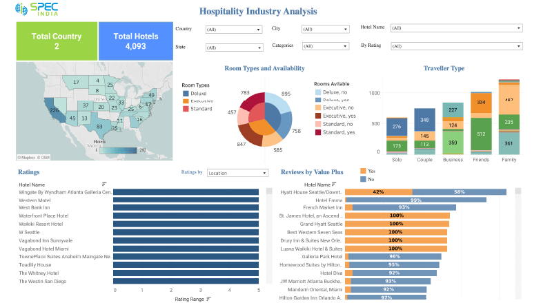
Essential Components of an Effective Reputation Dashboard
A powerful reputation management dashboard combines several critical visualization elements that work together to provide a comprehensive view of your online presence. Each component serves a specific purpose in translating complex data into actionable insights.
Core Dashboard Components
The following elements form the foundation of an effective reputation management visual system:
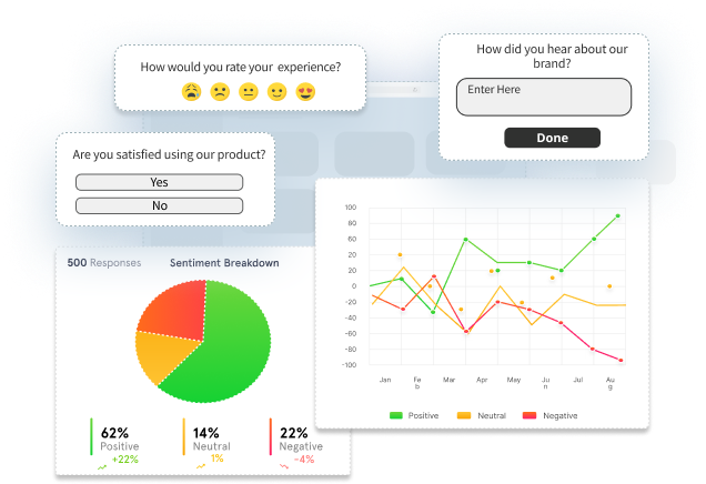
1. Real-time Sentiment Analysis Visualization
Effective sentiment analysis visualization transforms customer emotions into actionable intelligence through:
- Color-coded sentiment indicators (positive, neutral, negative)
- Emotional intelligence mapping that goes beyond basic sentiment
- Contextual understanding of language nuances
- Trend indicators showing sentiment movement over time
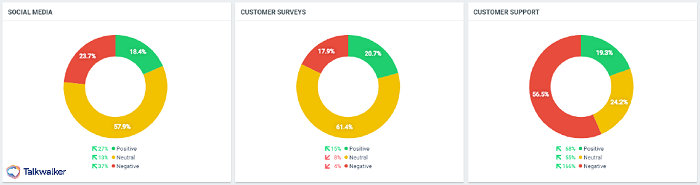
2. Review Source Aggregation Displays
Comprehensive dashboards allow users to visualize performance across multiple review platforms in one unified interface. This aggregation enables:
Platform-specific visualizations help identify which channels are most impactful for your business, allowing for targeted engagement strategies where they matter most. By tracking comparison chart creation tools, businesses can better understand their performance across different platforms.
3. Trend Analysis Charts
Trend analysis visualizations reveal patterns over time that might otherwise remain hidden in raw data. When properly displayed, these trends enable proactive management rather than reactive responses.
4. Competitor Comparison Visualizations
Contextualizing your reputation against competitors provides crucial perspective. Effective dashboards offer side-by-side comparisons that highlight relative performance and competitive advantages.
graph TD
    A[Your Brand] -->|Compare| B[Sentiment Scores]
    A -->|Compare| C[Review Volume]
    A -->|Compare| D[Response Times]
    A -->|Compare| E[Key Themes]

    B --- F[Competitor 1]
    C --- F
    D --- F
    E --- F

    B --- G[Competitor 2]
    C --- G
    D --- G
    E --- G

    style A fill:#FF8000,stroke:#FF8000,color:#FFFFFF
5. Customer Engagement Metrics

Tracking your team's engagement with customer feedback through visual metrics provides accountability and highlights opportunities for improvement.
- Average response time visualizations
- Resolution rate dashboards
- Team performance comparisons
- Customer satisfaction with responses
- Engagement coverage (percentage of reviews receiving responses)
These components work together to create a comprehensive visual understanding of your online reputation landscape. By leveraging interactive data visualization tools, businesses can quickly identify patterns and trends that would be difficult to spot in raw data.
Leveraging AI for Predictive Reputation Analytics
Artificial intelligence is transforming reputation management from a reactive to a proactive discipline. By incorporating AI into visual dashboards, businesses can anticipate trends, identify emerging issues, and take preemptive action to protect and enhance their online reputation.
Sentiment Trajectory Forecasting
AI-powered predictive models can analyze historical patterns in customer sentiment and forecast future trajectories. These visual trendlines help businesses understand not just where they stand today, but where their reputation is likely heading tomorrow.
Content Analysis and Satisfaction Drivers
Advanced AI can analyze review content to identify specific factors driving customer satisfaction or dissatisfaction. When visualized, these insights reveal:
- Key themes mentioned across positive reviews
- Common complaints or pain points
- Emerging topics that may indicate new trends
- Correlation between specific experiences and overall ratings
Using interactive visualizations for data exploration allows teams to drill down into these factors and understand the root causes behind reputation changes.
Visual Alert Systems
AI-powered alert systems can identify potential reputation threats before they escalate into significant problems. These systems use pattern recognition to detect anomalies that may indicate emerging issues.
flowchart LR
    A[Review/Mention Data] --> B[AI Analysis Engine]
    B --> C{Threat Detection}
    C -->|High Priority| D[Red Alert]
    C -->|Medium Priority| E[Yellow Alert]
    C -->|Low Priority| F[Green Monitor]

    D --> G[Immediate Response Required]
    E --> H[Investigate Within 24hrs]
    F --> I[Regular Monitoring]

    style B fill:#FF8000,stroke:#FF8000,color:#FFFFFF
    style C fill:#FF8000,stroke:#FF8000,color:#FFFFFF
Pattern Recognition Visualizations
AI can identify hidden correlations in customer feedback data that humans might miss. When visualized, these patterns reveal valuable insights about the customer experience.
PageOn.ai's Deep Search Integration
PageOn.ai's Deep Search capability allows for automatic integration of relevant review data into visual reports. This powerful feature enables businesses to:
Automated Data Collection
Continuously gather and update review data from across the web without manual intervention.
Intelligent Categorization
Automatically classify and tag reviews based on content, sentiment, and relevance.
Contextual Understanding
Recognize the true meaning behind customer comments beyond simple keyword matching.
Visual Report Generation
Transform raw feedback data into compelling visual narratives that highlight key insights.
By leveraging AI for predictive analytics, businesses can transform their approach to reputation management from reactive to proactive, identifying opportunities and addressing challenges before they impact the bottom line.
Creating Actionable Insights Through Visual Storytelling
Visual storytelling transforms complex reputation data into compelling narratives that drive action. When properly executed, these visualizations communicate not just what is happening with your online reputation, but why it matters and what you should do about it.
Transforming Complex Data into Clear Visuals
Effective visual storytelling requires:
- Simplification of complex metrics into intuitive visuals
- Clear hierarchy of information with emphasis on key insights
- Consistent visual language across all dashboard elements
- Contextual annotations that explain significance
- Progression from data to insight to recommended action
Executive Dashboards: Reputation at a Glance
Executive dashboards provide high-level reputation health indicators that allow leadership to quickly assess performance without getting lost in details.
Using PageOn.ai's AI Blocks for Modular Dashboards
PageOn.ai's AI Blocks feature enables the creation of modular, customizable reputation metrics displays that can be tailored to specific business needs.
flowchart TB
    A[Master Dashboard] --> B[Sentiment Block]
    A --> C[Source Block]
    A --> D[Comparison Block]
    A --> E[Response Block]

    B --> F[Detailed Sentiment View]
    C --> G[Platform Breakdown]
    D --> H[Competitor Analysis]
    E --> I[Team Performance]

    style A fill:#FF8000,stroke:#FF8000,color:#FFFFFF
    style B fill:#FFB74D,stroke:#FF8000
    style C fill:#FFB74D,stroke:#FF8000
    style D fill:#FFB74D,stroke:#FF8000
    style E fill:#FFB74D,stroke:#FF8000
With AI Blocks, organizations can create customized dashboard modules that focus on their specific reputation priorities. This modular approach allows for flexible reconfiguration as business needs evolve.
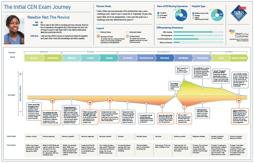
Visual Customer Journey Maps
Customer journey maps visually connect reputation touchpoints across the entire customer experience, helping identify where reputation issues originate and how they impact the customer relationship.
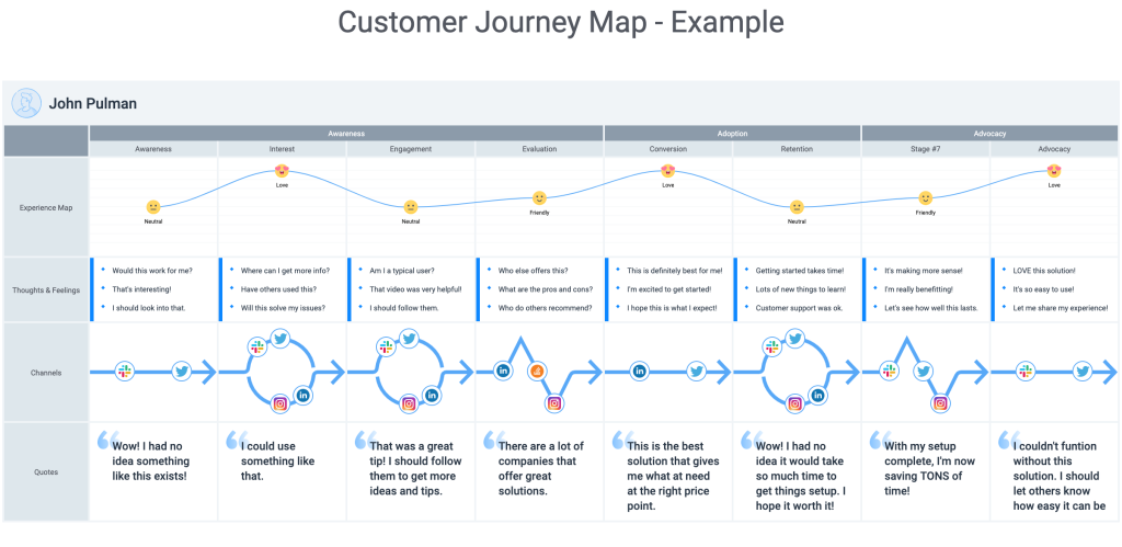
These journey maps reveal how reputation is formed across multiple interactions, not just at the review stage. By visualizing this journey, businesses can identify critical moments where reputation is at risk or can be enhanced.
Creating Shareable Visual Reports
Effective visual reports facilitate alignment across teams by providing a common understanding of reputation status, goals, and required actions.
Marketing Team Focus
- Brand perception trends
- Messaging effectiveness
- Competitive positioning
Operations Team Focus
- Service quality indicators
- Process improvement opportunities
- Staff performance metrics
Executive Team Focus
- Overall reputation health
- ROI of reputation initiatives
- Strategic reputation threats
By creating role-specific visual reports that highlight the most relevant reputation metrics for each audience, businesses can ensure that insights drive appropriate action at every level of the organization.
Through effective visual storytelling, reputation data becomes more than just information—it becomes a compelling narrative that inspires action and drives meaningful improvement in the customer experience. Creating these visualizations is significantly easier with organizational chart online tools that help structure and present information effectively.
Case Studies: Visual Dashboard Transformation
These real-world examples demonstrate how businesses across various industries have leveraged visual dashboards to transform their approach to reputation management and achieve measurable results.
Hospitality Chain: 78% Increase in Response Rates
Challenge:
A 15-location hospitality chain struggled to monitor and respond to reviews across multiple platforms, with inconsistent response rates averaging below 30%.
Solution:
Implemented a centralized visual dashboard that aggregated reviews from 12 platforms, with color-coded response status indicators and performance metrics by location.
Results:
- Response rate increased from 30% to 78% within 3 months
- Average response time decreased from 72 hours to 8 hours
- Overall rating improved by 0.8 points across all locations
- Standardized response quality across the brand
Retail Brand: Sentiment-Guided Turnaround
Challenge:
A multi-channel retail brand faced declining customer sentiment and sales, with no clear understanding of the underlying causes.
Solution:
Created a visual sentiment analysis dashboard that identified specific product lines, store locations, and service elements driving negative sentiment.
Results:
- Identified that 68% of negative reviews mentioned product quality issues in a specific supplier's items
- Switched suppliers for problematic product lines
- Sentiment score increased from 2.5 to 4.3 over 12 months
- Same-store sales increased 12% year-over-year following improvements
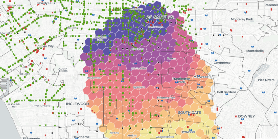
Medical Practice: Location-Based Expansion
Challenge:
A growing medical practice needed to determine optimal locations for three new facilities based on market demand and competitive landscape.
Solution:
Developed a location-based reputation visual analytics dashboard that mapped competitor ratings, patient sentiment, and underserved areas.
Results:
- Identified three target locations with high demand and lower competitor ratings
- New locations achieved 85% capacity within 6 months (vs. industry average of 12-18 months)
- Maintained consistent 4.8/5.0 rating across all new locations
- Dashboard guided continuing service improvements based on competitive analysis
Restaurant Group: Operational Improvements Through Visual Pattern Analysis
Challenge:
A 12-location restaurant group struggled with inconsistent customer reviews, with particular concerns about service speed during peak hours.
Solution:
Implemented a visual pattern analysis dashboard that correlated review sentiment with specific operational factors, including time of day, staffing levels, and menu items ordered.
Results:
- Identified that service speed complaints spiked between 6-8pm when staffing was misaligned with customer volume
- Optimized staffing schedules based on visual pattern data
- Service speed rating improved from 2.8 to 4.2
- Overall satisfaction rating increased from 3.6 to 4.3
Using PageOn.ai's Vibe Creation for Reputation Clarity
Challenge:
An e-commerce company had accumulated thousands of product reviews with no clear way to extract actionable insights for product development.
Solution:
Utilized PageOn.ai's Vibe Creation feature to transform unstructured review data into clear visual patterns showing customer priorities and pain points.
Results:
- Transformed 10,000+ reviews into 8 key customer priorities with visual indicators
- Identified 3 critical product improvements that addressed 72% of negative feedback
- New product version saw a 46% reduction in support tickets
- Average product rating increased from 3.7 to 4.6
These case studies demonstrate that visual dashboards for reputation management deliver tangible business results across industries. By transforming complex reputation data into clear, actionable visualizations, organizations can identify improvement opportunities, respond more effectively to customer feedback, and ultimately enhance both reputation and business performance.
Implementation Strategies for Visual Reputation Management
Successfully implementing a visual reputation management system requires strategic planning, careful platform selection, and effective team training. This step-by-step guide will help you build a comprehensive dashboard that delivers actionable insights.
Implementation Roadmap
flowchart TD
    A[Assessment] -->|Identify Needs| B[Platform Selection]
    B -->|Configure| C[Data Integration]
    C -->|Set Up| D[Dashboard Design]
    D -->|Deploy| E[Team Training]
    E -->|Monitor| F[Continuous Improvement]

    style A fill:#FFB74D,stroke:#FF8000
    style B fill:#FFB74D,stroke:#FF8000
    style C fill:#FFB74D,stroke:#FF8000
    style D fill:#FFB74D,stroke:#FF8000
    style E fill:#FFB74D,stroke:#FF8000
    style F fill:#FFB74D,stroke:#FF8000
1. Building Your Dashboard Architecture
Stage 1: Assessment
- Identify key review platforms for your industry
- Document current response processes and timeframes
- Determine key metrics to track (response time, sentiment trends, etc.)
- Set goals for dashboard implementation (e.g., 90% response rate)
Stage 2: Platform Selection
- Evaluate reputation management platforms based on:
- Data visualization capabilities
- Platform coverage (number of review sites monitored)
- Integration with existing systems
- Customization options
- Cost structure
2. Integrating Review Platforms
Creating a unified visual interface requires proper integration of multiple review platforms into your dashboard system.
Integration Methods:
- Direct API connections to major platforms (Google, Yelp, TripAdvisor)
- Email forwarding for platforms without APIs
- Web scraping services for platforms with limited access
- Manual input options for offline feedback

Integration Checklist:
Data Elements to Capture:
- Full review text
- Rating/score
- Reviewer name/ID
- Date and time
- Platform source
- Location (for multi-location businesses)
Integration Configuration:
- Update frequency (real-time vs. periodic)
- Historical data import (last 12-24 months)
- Data normalization rules (standardizing formats)
- Error handling procedures
- Rate limit considerations
3. Setting Up Automated Visual Alerts and Reports
Automated alerts and reports ensure that critical reputation issues are addressed promptly and key stakeholders stay informed.
Alert Configuration:
- Negative reviews (1-2 star) – immediate notification
- Sentiment decline (significant drop in average) – daily alert
- Review volume spikes – same-day notification
- Competitor rating changes – weekly update
- Response time threshold violations – daily report
Scheduled Reports:
- Daily response team performance dashboard
- Weekly location-based performance comparison
- Monthly executive summary with key reputation metrics
- Quarterly trend analysis with recommendations
- Annual competitive landscape review
4. Training Teams to Interpret Visual Reputation Insights

Training Components:
- Dashboard orientation and navigation training
- Interpreting visual sentiment data correctly
- Understanding trend indicators and forecasts
- Establishing standardized response protocols
- Running and customizing reports for different stakeholders
- Translating insights into action plans
5. Measuring Dashboard Effectiveness
Establishing key performance indicators helps evaluate the impact of your visual reputation management system.
Dashboard Success Metrics:
| Metric | Description | Target |
|---|---|---|
| Response Rate | Percentage of reviews that receive a response | 95%+ |
| Response Time | Average time to respond to reviews | < 24 hours |
| Sentiment Improvement | Overall sentiment score trend | +0.5 points within 6 months |
| User Adoption | Dashboard login frequency by team members | 3+ sessions per week |
| Issue Resolution | Percentage of identified issues that lead to operational changes | 70%+ |
Successful implementation of a visual reputation management system requires careful planning, appropriate tool selection, and ongoing optimization. By following these strategies, organizations can create powerful dashboards that transform reputation data into actionable insights and drive meaningful business improvements.
Future Directions in Visual Reputation Management
The field of visual reputation management is evolving rapidly, with emerging technologies and approaches promising even more powerful insights and capabilities. Understanding these future directions helps organizations prepare for the next generation of reputation visualization.
Emerging AI Visualization Techniques
Advanced AI visualization approaches are enabling deeper understanding of customer sentiment through:
- Emotion spectrum visualization that goes beyond basic positive/negative classification
- Contextual language models that understand cultural and industry-specific nuances
- Causal relationship mapping that shows how different factors influence sentiment
- Automated insight generation that highlights key patterns without human analysis

Integration of Voice and Video Review Analysis
As voice and video reviews become more common, visual dashboards are evolving to incorporate these rich media formats into comprehensive reputation insights.
flowchart LR
    A[Video Review] --> B[Video Analysis AI]
    C[Voice Review] --> D[Speech Analysis AI]

    B --> E{Extraction Engine}
    D --> E

    E --> F[Sentiment Scores]
    E --> G[Content Themes]
    E --> H[Emotional Cues]
    E --> I[Visual Signals]

    F & G & H & I --> J[Integrated Dashboard]

    style E fill:#FF8000,stroke:#FF8000,color:#FFFFFF
    style J fill:#FF8000,stroke:#FF8000,color:#FFFFFF
Next-generation dashboards will process verbal tone, facial expressions, and video context in addition to text, creating a more complete understanding of customer sentiment. This multi-modal analysis provides richer insights than text alone.
Predictive Modeling Visualizations
Future reputation dashboards will incorporate sophisticated predictive models that visualize potential reputation impacts before they occur. These models analyze historical patterns and external factors to forecast how specific events or decisions might affect your online reputation.
Mobile-First Dashboard Designs
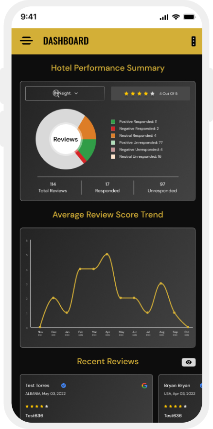
Mobile-First Features:
- Context-aware visualizations that adapt to screen size and orientation
- Priority-based information display that shows critical metrics first
- Touch-optimized interfaces for drilling into detailed data
- Real-time notifications with action capabilities
- Voice-controlled dashboards for hands-free operation
- Location-aware displays that highlight nearby review activity
Using PageOn.ai's Agentic Capabilities for Reputation Visualization
PageOn.ai's advanced agentic capabilities represent the cutting edge of reputation management visualization, enabling users to transform their intentions into sophisticated visual expressions with minimal effort.
Agentic Visualization Transformation
Input Intent
User expresses desire to understand key factors driving negative reviews
Visual Reality
Comprehensive causal analysis diagram showing relationship between operational factors and negative sentiment
PageOn.ai's agentic capabilities allow users to express what they want to understand about their reputation data in natural language. The system then automatically creates the most appropriate visualizations to answer those questions, without requiring technical knowledge of data visualization techniques.
As these technologies mature, reputation management dashboards will become increasingly intelligent, intuitive, and predictive. Organizations that embrace these advanced visualization approaches will gain significant competitive advantages through deeper customer understanding and more proactive reputation management.
Transform Your Reputation Management with PageOn.ai
Turn complex reputation data into clear, actionable insights with powerful visual dashboards that help you understand, manage, and improve your online presence.
Start Creating with PageOn.ai TodayYou Might Also Like
How to Design Science Lesson Plans That Captivate Students
Create science lesson plans that captivate students with hands-on activities, clear objectives, and real-world applications to foster curiosity and critical thinking.
How to Write a Scientific Review Article Step by Step
Learn how to write a review article in science step by step. Define research questions, synthesize findings, and structure your article for clarity and impact.
How to Write a Self-Performance Review with Practical Examples
Learn how to write a self-performance review with examples and tips. Use an employee performance review work self evaluation sample essay to guide your process.
How to Write a Spec Sheet Like a Pro? [+Templates]
Learn how to create a professional spec sheet with key components, step-by-step guidance, and free templates to ensure clarity and accuracy.