Transforming Value Propositions into Visual Clarity
A Modern Approach to Creating Crystal Clear Audience Value Propositions
In today's visually-driven world, traditional text-heavy value propositions often fail to engage audiences effectively. I'll show you how to transform complex value propositions into compelling visual narratives that resonate deeply with your target audience and drive meaningful engagement.
The Anatomy of Compelling Value Propositions
When I create value propositions for clients, I always start by breaking down the fundamental components that make them effective. A truly compelling value proposition must communicate what you offer, who it's for, and why it matters—all within seconds of engagement.
The essential components of an effective value proposition visualized
Why Traditional Text-Based Propositions Often Fail
In my experience, traditional text-heavy value propositions struggle to connect with modern audiences for several key reasons:
- Information overload causes cognitive fatigue
- Lack of visual hierarchy makes prioritizing benefits difficult
- Text-only formats fail to trigger emotional responses
- Abstract concepts remain difficult to grasp without visual anchors
The Psychology Behind Visual Processing
Our brains process visual information 60,000 times faster than text. When I incorporate visual elements into value propositions, I'm leveraging this innate cognitive advantage. Visual information is not only processed more quickly but also retained longer in memory—a critical factor for impactful product presentations that truly resonate.
Text vs. Visual Information Processing
Common Pitfalls in Value Communication
Through my work with clients, I've identified several common mistakes that create confusion rather than clarity:
| Pitfall | Impact | Visual Solution |
|---|---|---|
| Industry Jargon | Creates barriers to understanding | Simple icons and universal visual metaphors |
| Feature Overload | Dilutes core message | Visual hierarchy highlighting primary benefits |
| Generic Claims | Fails to differentiate | Specific visual comparisons and data visualizations |
| Misaligned Benefits | Doesn't address actual pain points | Visual mapping of pain points to solutions |
By understanding these foundational aspects, we can begin to transform traditional value propositions into visual experiences that truly connect with audiences. The key is to maintain crystal clarity while adding visual elements that enhance—rather than distract from—your core message.
Audience-Centric Value Mapping
Before I can create a compelling visual value proposition, I need to deeply understand who I'm speaking to. Audience-centric value mapping is the process of aligning your visual strategy with the specific needs, pain points, and aspirations of your target audience.
Developing Comprehensive Buyer Personas
Effective buyer personas go beyond basic demographics to capture the psychological and emotional drivers behind purchasing decisions. When creating interactive content for marketing strategy, I always start with a detailed persona development process.
Buyer Persona Development Process
flowchart TD
    A[Collect Demographic Data] --> B[Identify Pain Points]
    B --> C[Map Decision Journey]
    C --> D[Discover Content Preferences]
    D --> E[Determine Visual Preferences]
    E --> F[Create Visual Persona Profile]
    style A fill:#FFF5E6,stroke:#FF8000
    style B fill:#FFF5E6,stroke:#FF8000
    style C fill:#FFF5E6,stroke:#FF8000
    style D fill:#FFF5E6,stroke:#FF8000
    style E fill:#FFF5E6,stroke:#FF8000
    style F fill:#FFE0B2,stroke:#FF8000,stroke-width:2px
Extracting Actionable Insights from Pain Points
Pain points are the gateway to creating value propositions that truly resonate. I've found that categorizing audience pain points helps create more targeted visual solutions:
Financial Pain Points
Concerns about costs, budgets, and ROI that can be addressed through clear cost-benefit visualizations.
Process Pain Points
Frustrations with current workflows that can be visualized through before-and-after process diagrams.
Productivity Pain Points
Time management challenges that can be illustrated through time-saving comparisons and efficiency metrics.
Support Pain Points
Concerns about assistance and guidance that can be addressed through visual support journey maps.
Translating Customer Challenges into Visual Storytelling
I've discovered that the most effective visual value propositions tell a story that places the customer at the center. This storytelling approach transforms abstract pain points into concrete visual narratives that resonate on both rational and emotional levels.
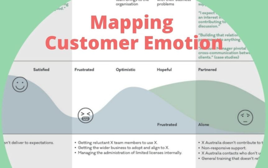
Customer-centric visual storytelling framework
Using AI Blocks for Audience Insight Visualization
When working with complex audience data, I rely on PageOn.ai's AI Blocks to transform scattered insights into coherent visual frameworks. This powerful feature allows me to:
- Create modular visual representations of audience segments
- Map pain points directly to visual solution components
- Build interactive decision trees based on audience preferences
- Generate visual comparisons between different audience needs
AI Blocks for Audience Insight Organization
flowchart LR
    A[Raw Audience Data] --> B[AI Blocks Processing]
    B --> C{Insight Categories}
    C --> D[Demographic Insights]
    C --> E[Behavioral Insights]
    C --> F[Preference Insights]
    D --> G[Visual Value Canvas]
    E --> G
    F --> G
    style A fill:#F5F5F5,stroke:#BDBDBD
    style B fill:#FFE0B2,stroke:#FF8000,stroke-width:2px
    style C fill:#FFF5E6,stroke:#FF8000
    style G fill:#FFE0B2,stroke:#FF8000,stroke-width:2px
By placing audience needs at the center of our visual strategy, we create value propositions that don't just communicate benefits—they demonstrate a deep understanding of the specific challenges our audience faces. This audience-centric approach forms the foundation for visual expressions that truly connect and convert.
From Text to Visual Expression
Converting text-based value propositions into compelling visual expressions is where the magic happens. I've developed a systematic approach to this transformation process that ensures clarity while maximizing impact.
Breaking Down Complex Value Propositions
The first step in my process is deconstructing complex value propositions into their core components. This allows me to identify which elements are best communicated visually versus textually.
Deconstructing a value proposition into visual components
When creating visually appealing presentations, I focus on identifying the following components that can be transformed into visual elements:
- Core benefit statements - These become central visual focal points
- Supporting evidence - Transformed into charts, graphs, or data visualizations
- Process descriptions - Converted to flow diagrams or sequential illustrations
- Comparative advantages - Visualized through side-by-side comparisons
- Emotional appeals - Expressed through imagery that evokes the desired feeling
Eliminating Jargon Through Visual Metaphors
Industry jargon often creates barriers to understanding. I've found that visual metaphors provide an elegant solution by making complex concepts instantly accessible. For example, instead of describing "integrated omnichannel capabilities," a visual showing interconnected platforms with seamless data flow communicates the concept more effectively.
Effectiveness of Visual Metaphors vs. Text Descriptions
Creating Hierarchical Visual Structures
Not all benefits carry equal weight with your audience. I use hierarchical visual structures to ensure primary benefits receive the most attention while supporting points remain visible but secondary.
Hierarchical Value Proposition Structure
flowchart TD
    A[Primary Benefit] --> B[Supporting Point 1]
    A --> C[Supporting Point 2]
    A --> D[Supporting Point 3]
    B --> E[Evidence 1.1]
    B --> F[Evidence 1.2]
    C --> G[Evidence 2.1]
    D --> H[Evidence 3.1]
    D --> I[Evidence 3.2]
    style A fill:#FF8000,stroke:#E67300,color:#FFFFFF,stroke-width:2px
    style B fill:#FFE0B2,stroke:#FF8000
    style C fill:#FFE0B2,stroke:#FF8000
    style D fill:#FFE0B2,stroke:#FF8000
    style E fill:#FFF5E6,stroke:#FFE0B2
    style F fill:#FFF5E6,stroke:#FFE0B2
    style G fill:#FFF5E6,stroke:#FFE0B2
    style H fill:#FFF5E6,stroke:#FFE0B2
    style I fill:#FFF5E6,stroke:#FFE0B2
Using Vibe Creation for Visual Narratives
One of my favorite features of PageOn.ai is its Vibe Creation capability, which has transformed how I develop visual personal brand stories and value propositions. This innovative tool allows me to:
- Input text-based value propositions and receive visual concept suggestions
- Experiment with different aesthetic approaches without design expertise
- Maintain brand consistency across various visual expressions
- Quickly generate multiple visual interpretations for testing

PageOn.ai's Vibe Creation interface transforming text into visual concepts
The transformation from text to visual expression isn't just about making things look pretty—it's about fundamentally changing how your audience processes and retains your value proposition. By applying these techniques, you can create visual expressions that communicate with clarity and impact that text alone simply cannot achieve.
The Visual Value Canvas Framework
After years of refining my approach to visual value propositions, I've developed the Visual Value Canvas Framework—a comprehensive methodology for building compelling visual value propositions that resonate with audiences at both rational and emotional levels.

The Visual Value Canvas Framework
Step-by-Step Methodology
Let me walk you through my process for building a comprehensive visual value proposition:
Visual Value Canvas Process
flowchart TD
    A[1. Audience Analysis] --> B[2. Pain Point Mapping]
    B --> C[3. Solution Visualization]
    C --> D[4. Benefit Hierarchy]
    D --> E[5. Evidence Integration]
    E --> F[6. Emotional Connection]
    F --> G[7. Call to Action]
    G --> H[8. Testing & Refinement]
    style A fill:#FFF5E6,stroke:#FF8000
    style B fill:#FFF5E6,stroke:#FF8000
    style C fill:#FFF5E6,stroke:#FF8000
    style D fill:#FFF5E6,stroke:#FF8000
    style E fill:#FFF5E6,stroke:#FF8000
    style F fill:#FFF5E6,stroke:#FF8000
    style G fill:#FFF5E6,stroke:#FF8000
    style H fill:#FFF5E6,stroke:#FF8000
Each step in this process builds upon the previous one, creating a cohesive visual narrative that guides your audience from problem awareness to solution understanding.
Balancing Emotional Appeal with Rational Benefits
The most effective visual value propositions strike a careful balance between emotional appeal and rational benefits. I use a strategic approach to visual elements that addresses both the logical and emotional decision-making factors:
Rational Elements
- Data visualizations showing quantifiable benefits
- Process diagrams illustrating efficiency improvements
- Comparison charts highlighting competitive advantages
- Timeline visualizations showing implementation stages
- ROI calculators with visual output
Emotional Elements
- Imagery evoking desired emotional states
- Color psychology to trigger specific feelings
- Visual metaphors that resonate with core values
- Before/after scenarios highlighting transformation
- Testimonial visualizations with human connection
Ensuring Eighth-Grade Comprehension Through Visual Clarity
As I learned from Salesforce's research on customer value propositions, writing for an eighth-grade reading level ensures accessibility. The same principle applies to visual elements. I ensure visual clarity by:
- Using universally recognized visual symbols and icons
- Limiting the number of elements in each visual to prevent cognitive overload
- Employing clear visual hierarchy to guide attention
- Ensuring text elements within visuals are concise and simple
- Testing visuals with diverse audience samples to confirm understanding
Visual Complexity vs. Audience Comprehension
Testing and Iterating Visual Value Propositions
No visual value proposition is perfect on the first attempt. I use a systematic testing approach to refine and optimize:
- Initial concept testing - Getting early feedback on visual direction
- Comprehension testing - Ensuring the message is clearly understood
- A/B testing - Comparing multiple visual approaches
- Eye-tracking analysis - Understanding visual attention patterns
- Conversion testing - Measuring impact on desired actions
The Visual Value Canvas Framework provides a structured approach to creating value propositions that leverage the power of visual communication. By following this methodology, you can transform abstract concepts into concrete visual expressions that resonate deeply with your target audience.
Case Studies: Visualization Transformations
Throughout my career, I've witnessed remarkable transformations when companies shift from text-heavy value propositions to visual-first approaches. Let me share some compelling examples that demonstrate the power of visual value propositions.
Case Study 1: SaaS Platform Conversion Rate Improvement
Before and after the visual value proposition transformation
A B2B SaaS platform was struggling with low conversion rates despite having a strong product offering. Their text-heavy value proposition focused on technical features and industry jargon that failed to connect with decision-makers.
We transformed their approach by:
- Creating a visual process flow showing time savings at each stage
- Developing an interactive ROI calculator with visual output
- Building before/after visual scenarios specific to their industry
- Designing a visual comparison highlighting competitive advantages
Results After Visual Transformation
Case Study 2: Healthcare Solution Clarity Improvement
A healthcare technology provider was struggling to communicate their complex value proposition to hospital administrators. Their traditional approach relied heavily on technical specifications and clinical terminology.
Healthcare solution visualization showing patient flow optimization
Our visual transformation approach included:
- Creating a patient journey map highlighting intervention points
- Developing data visualizations showing outcome improvements
- Building an interactive cost-saving calculator with visual output
- Designing before/after scenarios of hospital workflows
The results were impressive:
- Sales team reported 72% improvement in prospect understanding
- Presentation-to-proposal conversion increased by 45%
- Sales cycle shortened by 33%
- Customer onboarding satisfaction scores improved by 58%
Using PageOn.ai's Deep Search for Industry Examples
When developing these visual value propositions, PageOn.ai's Deep Search feature proved invaluable. It allowed me to:
- Discover relevant industry examples of successful visual value propositions
- Analyze competitors' visual approaches and identify opportunities
- Find data points and statistics to incorporate into visualizations
- Identify emerging visual trends within specific sectors
PageOn.ai's Deep Search interface for finding industry examples
These case studies demonstrate that the shift to visual value propositions isn't just an aesthetic choice—it's a strategic decision that can dramatically improve business outcomes. By learning from these examples and leveraging tools like PageOn.ai, you can create visual value propositions that truly resonate with your target audience.
Implementation Strategies Across Channels
Creating a compelling visual value proposition is only the first step. The next challenge is implementing it effectively across various channels and contexts. I've developed strategies to ensure consistency while optimizing for different platforms.
Adapting Visual Value Propositions for Different Platforms
Each platform has unique requirements and audience expectations. I tailor visual value propositions accordingly while maintaining core messaging:
Website Homepage
Hero section with primary visual value proposition, animated elements to draw attention, and clear hierarchy.
Social Media
Simplified, high-impact visuals with minimal text, optimized for quick scrolling and mobile viewing.
Presentations
Progressive reveal of visual elements with narrative structure, interactive components for engagement.
Email Marketing
Lightweight visual elements that load quickly, with fallbacks for email clients that block images.
Maintaining Consistency While Optimizing for Channels
Consistency across channels is crucial for brand recognition and message reinforcement. I use these strategies to maintain consistency while adapting to different formats:
Visual Value Proposition Adaptation Framework
flowchart TD
    A[Core Visual Value Proposition] --> B[Visual Asset Library]
    B --> C[Channel-Specific Adaptations]
    C --> D[Website]
    C --> E[Social Media]
    C --> F[Presentations]
    C --> G[Sales Materials]
    C --> H[Email Marketing]
    D --> I[Full Experience]
    E --> J[Simplified Version]
    F --> K[Interactive Version]
    G --> L[Detailed Version]
    H --> M[Lightweight Version]
    style A fill:#FF8000,stroke:#E67300,color:#FFFFFF,stroke-width:2px
    style B fill:#FFE0B2,stroke:#FF8000,stroke-width:2px
    style C fill:#FFF5E6,stroke:#FF8000
I've found that creating a centralized visual asset library with modular components allows for consistent yet flexible implementation across channels.
Integration Techniques for Various Contexts
Integrating visual value propositions effectively requires tailoring your approach to specific contexts:
| Context | Integration Technique | Key Considerations |
|---|---|---|
| Website | Progressive disclosure, animated reveals | Load time, mobile responsiveness |
| Sales Presentations | Interactive elements, customizable components | Presenter control, audience engagement |
| Social Media | Platform-specific formats, motion graphics | Aspect ratios, sound-off viewing |
| Print Materials | QR codes to interactive experiences | Print quality, readability |
Using PageOn.ai's Agentic Capabilities for Multi-Format Adaptation
When implementing visual value propositions across multiple channels, I leverage PageOn.ai's Agentic capabilities to streamline the process:
PageOn.ai's multi-format adaptation interface
This powerful feature allows me to:
- Create once and adapt automatically to multiple formats
- Preview how visual value propositions will appear across different channels
- Maintain brand consistency while optimizing for platform requirements
- Generate channel-specific assets from a single master visual proposition
By implementing these strategies, you can ensure your visual value proposition maintains its impact and clarity across all customer touchpoints, creating a cohesive and compelling brand experience.
Measuring Impact and Refining Approach
The most effective visual value propositions evolve through continuous measurement and refinement. I've developed a systematic approach to evaluating performance and making data-driven improvements.
Key Metrics for Evaluating Effectiveness
When measuring the impact of visual value propositions, I focus on these critical metrics:
Key Performance Indicators for Visual Value Propositions
For each of these metrics, I establish baseline measurements before implementing visual value propositions, then track changes over time to quantify impact.
A/B Testing Methodologies for Visual Communication
A/B testing is particularly valuable for refining visual value propositions. My approach includes:
A/B Testing Process for Visual Value Propositions
flowchart TD
    A[Identify Testing Variables] --> B[Create Variant Designs]
    B --> C[Define Success Metrics]
    C --> D[Implement Split Testing]
    D --> E[Collect & Analyze Data]
    E --> F[Apply Insights]
    F --> G[Iterate & Retest]
    G -.-> A
    style A fill:#FFF5E6,stroke:#FF8000
    style B fill:#FFF5E6,stroke:#FF8000
    style C fill:#FFF5E6,stroke:#FF8000
    style D fill:#FFF5E6,stroke:#FF8000
    style E fill:#FFF5E6,stroke:#FF8000
    style F fill:#FFF5E6,stroke:#FF8000
    style G fill:#FFF5E6,stroke:#FF8000
When testing visual value propositions, I focus on isolating specific variables such as:
- Visual hierarchy and element placement
- Color schemes and emotional triggers
- Level of detail and complexity
- Abstract vs. concrete visual metaphors
- Static vs. interactive elements
Gathering and Implementing Audience Feedback
Quantitative data is valuable, but qualitative audience feedback provides essential context. I use these methods to gather rich feedback:
Moderated User Testing
Observe users interacting with visual value propositions while thinking aloud to identify pain points and moments of confusion.
Heat Map Analysis
Track where users look and click to understand which visual elements attract attention and which are overlooked.
Sentiment Analysis
Analyze emotional responses to different visual approaches to determine which creates the strongest positive connection.
Comprehension Testing
Ask users to explain the value proposition in their own words to assess how well the visual elements communicate the intended message.
Tools and Approaches for Continuous Improvement
To facilitate ongoing refinement of visual value propositions, I rely on these tools and approaches:
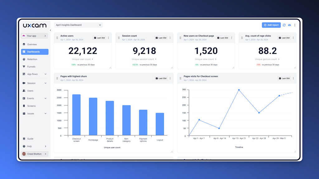
Analytics dashboard for tracking visual value proposition performance
The most effective approach combines multiple data sources:
- Analytics Integration - Connect visual value proposition performance to business outcomes
- Regular Audit Cycles - Schedule periodic reviews to ensure continued relevance
- Competitor Monitoring - Track changes in competitor visual approaches
- Trend Analysis - Identify emerging visual communication patterns in your industry
- Cross-Functional Input - Gather insights from sales, customer service, and product teams
By implementing a robust measurement and refinement process, you can ensure your visual value propositions continue to evolve and improve over time, maintaining their effectiveness as audience preferences and market conditions change.
Transform Your Value Propositions with PageOn.ai
Ready to create crystal clear visual value propositions that captivate your audience and drive meaningful engagement? PageOn.ai provides all the tools you need to transform complex ideas into compelling visual narratives—no design expertise required.
Start Creating with PageOn.ai TodayConclusion: The Future of Visual Value Communication
Throughout this guide, I've shared my approach to transforming traditional value propositions into visual experiences that resonate deeply with modern audiences. As we look to the future, the importance of visual communication will only continue to grow.
The most successful organizations will be those that master the art and science of visual value propositions—creating experiences that communicate clearly, connect emotionally, and convert effectively. By applying the frameworks, techniques, and insights I've shared, you can develop visual value propositions that truly set your brand apart.
Remember that creating crystal clear audience value propositions is not a one-time project but an ongoing process of refinement and optimization. As audience preferences evolve and new visual communication technologies emerge, continue to test, learn, and adapt your approach.
With tools like PageOn.ai, you now have the capability to create sophisticated visual value propositions without specialized design expertise. The power to transform complex ideas into compelling visual narratives is at your fingertips—it's time to put it to use.
I encourage you to start small, measure results, and build on your successes. The journey toward visual clarity begins with a single step—transforming one key value proposition into a visual experience that resonates with your audience.
The future of business communication is visual. Are you ready to lead the way?
You Might Also Like
Revolutionizing Document Conversion: Drag-and-Drop Solutions for Workflow Efficiency
Discover how drag-and-drop document conversion solutions transform workflow efficiency, reduce errors, and save 60%+ time. Learn implementation strategies and future trends.
Interactive Web Parts That Transform Knowledge Sharing | PageOn.ai
Discover how interactive web elements create engaging learning experiences. From infographics to knowledge graphs, learn how to transform static content into dynamic knowledge sharing tools.
PowerPoint Compatibility Solutions: Cross-Version Presentation Success Guide
Discover effective solutions for PowerPoint compatibility issues across versions. Learn to preserve animations, formatting, and graphics while ensuring seamless cross-platform presentation success.
Transforming IT Support: Visual AI Solutions for Employee Help Desk Without the Wait
Discover how visual AI transforms traditional IT help desks into efficient support systems that eliminate wait times and boost productivity with interactive visual troubleshooting solutions.