Typography Best Practices: The Art of Selecting Fonts for Enhanced Visual Messaging
Understanding Typography's Role in Communication
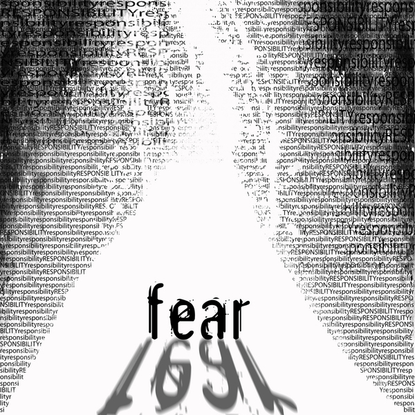
I've always believed that typography is the silent powerhouse of visual design. The fonts we choose can make or break our message, influencing not just how our content looks, but how it's perceived, processed, and remembered by our audience.
Understanding Typography's Role in Communication
In my years of design experience, I've come to understand that typography is far more than just selecting pretty fonts. It's a fundamental element that silently influences how audiences perceive, process, and engage with our visual messages. When I select a typeface, I'm not just making an aesthetic choice—I'm establishing the tone, personality, and clarity of the entire communication.
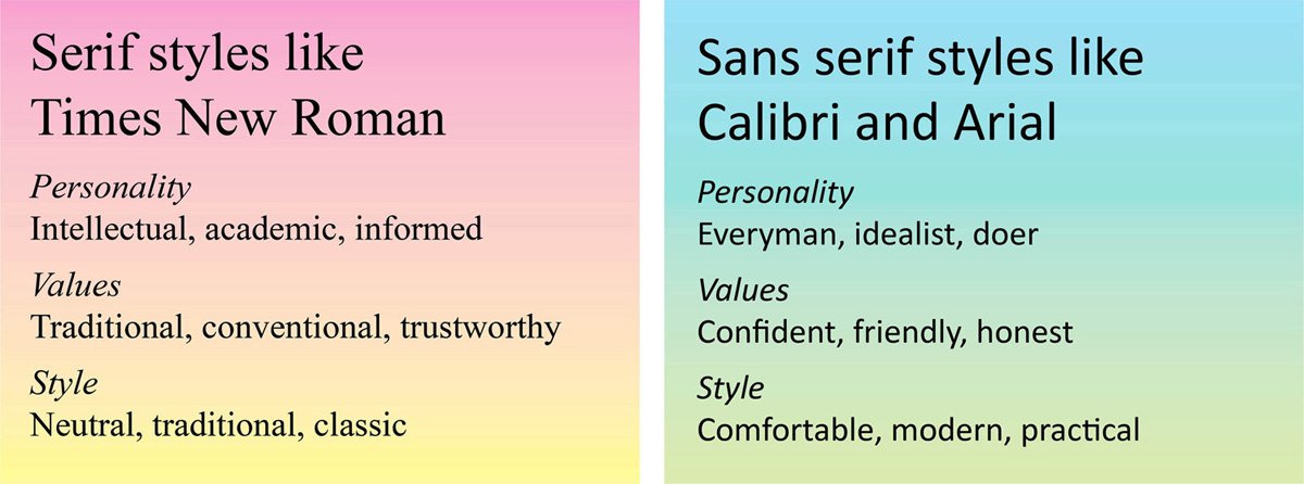
Typography acts as the silent influencer in visual design. The right font choice can dramatically impact how your message is received. For example, visual communication design principles show that serif fonts often convey tradition and reliability, while sans-serif fonts project modernity and cleanness.
Psychological Impact of Typography
The psychological impact of fonts extends beyond mere aesthetics:
flowchart TD
    A[Typography Selection] --> B[Psychological Impact]
    B --> C[Trust & Credibility]
    B --> D[Emotional Response]
    B --> E[Brand Perception]
    B --> F[Message Retention]
    C --> G[User Action]
    D --> G
    E --> G
    F --> G
I've found that the balance between aesthetic appeal and functional communication is crucial. A beautiful font that's difficult to read defeats the purpose of communication. As visual communication for designers emphasizes, legibility should never be sacrificed for style.
Typography also forms a cornerstone of brand identity and recognition. Think about how instantly recognizable Coca-Cola's script is, or the clean simplicity of Apple's font choices. These typographic decisions aren't random—they're strategic elements that contribute to the overall brand experience.
Font Classification and Characteristics
Understanding font categories has been essential to my design process. Each classification carries distinct characteristics and historical context that influence how they function in different contexts. For beginners exploring typography for beginners, knowing these distinctions is the first step toward making informed choices.
Major Font Categories
Understanding the characteristics and appropriate uses of different font categories:
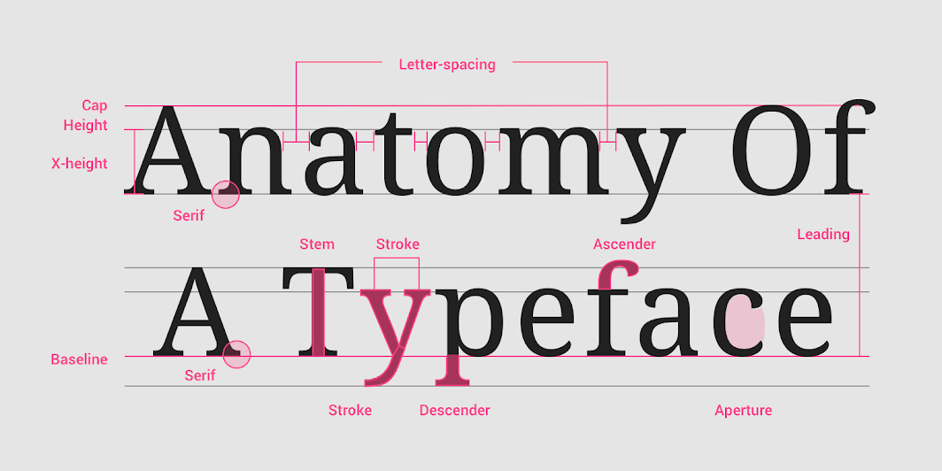
When I'm working with typography, I pay close attention to its anatomy. Understanding kerning (the space between character pairs), leading (line spacing), and x-height (the height of lowercase letters) helps me make precise adjustments that improve readability. These seemingly small details can dramatically impact how text flows and how easily it can be read.
Different font structures affect legibility and readability in various ways. For instance, I've noticed that fonts with a larger x-height tend to be more legible at smaller sizes, which is crucial for mobile interfaces. Meanwhile, fonts with distinct character shapes help readers distinguish letters more quickly, reducing cognitive load.
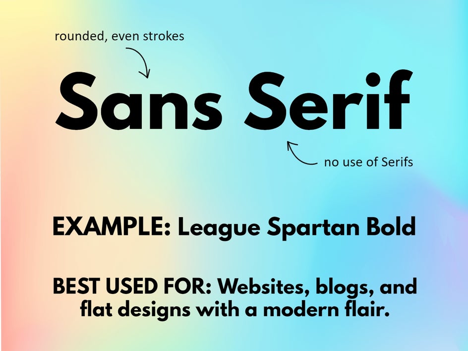
The emotional associations of different font styles are fascinating to explore. In my design work, I've found that serif fonts like Times New Roman often convey tradition, respectability, and formality. Sans-serif fonts like Helvetica project clarity, objectivity, and modernity. Script fonts evoke elegance and creativity, while display fonts can express uniqueness and personality. For those interested in contemporary options, modern fonts for designers offers excellent insights into current typographic trends.
Strategic Font Pairing Techniques
I've always found that the art of font pairing can elevate a design from good to exceptional. When I combine typefaces thoughtfully, I create visual interest while maintaining harmony—a delicate balance that takes practice to master.
The classic serif + sans-serif pairing approach remains one of my favorites for optimal contrast. As noted by typography experts, "Pairing a serif font with a sans-serif font creates a nice contrast and adds visual interest." This combination works because it creates distinction while maintaining compatibility—the serif font often works beautifully for headings, while the sans-serif ensures readability in body text.
Font Pairing Relationship Map
Understanding how different font categories work together:
flowchart TD
    A[Font Pairing Strategies] --> B[Complementary]
    A --> C[Contrasting]
    A --> D[Concordant]
    B --> E[Similar mood/era]
    B --> F[Same designer]
    C --> G[Serif + Sans-serif]
    C --> H[Different weights]
    C --> I[Size contrast]
    D --> J[Same font family]
    D --> K[Different weights/styles]
    style A fill:#FF8000,color:#fff
    style B fill:#66BB6A,color:#fff
    style C fill:#42A5F5,color:#fff
    style D fill:#EC407A,color:#fff
Creating visual hierarchy through strategic font pairings has been crucial in my design practice. I use contrasting fonts to guide the viewer's eye and establish a clear order of information. For instance, a bold sans-serif heading immediately draws attention, while a more neutral serif for body text encourages sustained reading.
When considering complementary versus contrasting font combinations, I assess the project's goals. Complementary pairings (fonts with similar characteristics) create a cohesive, harmonious look ideal for elegant or traditional designs. Contrasting combinations (fonts with different characteristics) generate energy and visual interest, perfect for contemporary or dynamic projects.
Maintaining harmony while incorporating variety is the true challenge. I follow a simple rule: vary one or two attributes (weight, style, size) while keeping others consistent. This approach ensures distinction without discord. Using PageOn.ai's AI Blocks, I can experiment with different font combinations instantly, seeing how they interact before committing to a design direction. This visual feedback loop has dramatically improved my typography decision-making process.
Context-Specific Typography Considerations
Throughout my career, I've learned that typography must always be tailored to its context. The perfect font choice for one medium might fail completely in another, which is why understanding the specific requirements of different environments is essential.
Typography Requirements by Medium
Comparing key considerations across different contexts:
Digital and print typography have fundamentally different requirements. In my digital designs, I prioritize screen readability, considering factors like pixel rendering and backlit displays. I typically choose sans-serif fonts at appropriate sizes and ensure sufficient contrast. For print, I have more flexibility with serif fonts and finer details, as print resolution exceeds that of most screens.
Typography for different viewing distances requires careful consideration. When designing signage that will be viewed from afar, I select highly legible fonts with strong forms and avoid thin strokes or decorative elements. As noted in research on visual communication in media design, "Sans-serif fonts like Arial or Helvetica are known for their readability and clarity, making them ideal for signage."
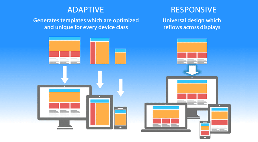
Device-specific considerations for responsive typography have become increasingly important in my work. I design with flexibility in mind, using relative units (em, rem) rather than fixed pixel sizes, and test across multiple devices. This ensures that typography remains effective regardless of screen size or resolution.
Accessibility considerations in font selection are non-negotiable for me. I ensure sufficient contrast between text and background, avoid fonts with similar letter forms (like I, l, and 1), and maintain adequate font sizes for readability. Using PageOn.ai's Deep Search has transformed how I identify context-appropriate fonts for specific projects, allowing me to filter options based on precise requirements like legibility at small sizes or suitability for dyslexic readers.
Color, Contrast, and Spacing in Typography
In my design practice, I've found that typography extends far beyond font selection. The relationship between typography and color, contrast, and spacing dramatically impacts how effectively a message is communicated.
The relationship between font choice and color selection is symbiotic. I've noticed that thinner fonts often need stronger color contrast to maintain legibility, while bolder fonts can work with more subtle contrast ratios. When working with colored backgrounds, I'm particularly careful about font weight and style selection.
Typography Spacing Elements
Understanding the critical spacing elements in typography:
flowchart TD
    A[Typography Spacing] --> B[Kerning]
    A --> C[Tracking]
    A --> D[Leading]
    A --> E[Margins]
    A --> F[Paragraph Spacing]
    B --> G[Character Pair Adjustments]
    C --> H[Overall Letter Spacing]
    D --> I[Line Height]
    E --> J[Text Block Boundaries]
    F --> K[Space Between Paragraphs]
    style A fill:#FF8000,color:#fff
Contrast affects readability across different mediums in ways that continue to surprise me. For digital screens, I aim for a contrast ratio of at least 4.5:1 for body text (WCAG AA standard), while print often allows for slightly less contrast. When designing for older audiences or accessibility needs, I increase this ratio to 7:1 (WCAG AAA standard).
Strategic use of white space has become one of my most powerful typographic tools. I've found that generous margins and line spacing improve comprehension and reduce reading fatigue. White space isn't empty space—it's an active design element that gives content room to breathe and helps direct the reader's attention.
Finding optimal letter spacing and line height for different applications requires both technical knowledge and aesthetic judgment. For body text, I typically set line height (leading) between 1.4 and 1.6 times the font size, adjusting based on line length and font characteristics. PageOn.ai's visual tools have been invaluable for visualizing typography color schemes across different backgrounds, allowing me to test and refine contrast relationships before implementation.
Typography Best Practices for Different Communication Goals
I've learned that effective typography must align with specific communication objectives. Different goals require different typographic approaches, and understanding these nuances has helped me create more purposeful designs.
Font Selection by Communication Goal
Recommended font characteristics for different communication objectives:
For quick information scanning, I prioritize fonts that optimize for glanceability. Sans-serif fonts with open counters (the enclosed spaces in letters like 'e' or 'a'), distinct character shapes, and slightly increased spacing work best. I also implement clear hierarchies with substantial size and weight differences between headings and body text.
Typography choices for emotional storytelling require a different approach. Here, I often select fonts with more character and personality. Serif fonts can lend gravitas and tradition to serious narratives, while carefully chosen script or display fonts can evoke specific emotional qualities for more expressive content.
When creating persuasive messaging, I've found that font selection significantly impacts credibility and trust. Clean, professional fonts that balance distinctiveness with familiarity tend to perform best. For high-stakes persuasive content, I avoid extremes—neither too conventional nor too unusual—to maintain authority while capturing attention.
Typography for data visualization presents unique challenges. I select highly legible, space-efficient fonts that don't compete with the data itself. Sans-serif fonts typically excel here, and I'm careful to maintain consistent typography across all chart elements. Using PageOn.ai's Vibe Creation feature has transformed how I align typography with specific communication objectives, allowing me to generate cohesive typographic systems that reinforce the emotional and functional goals of each project.
Common Typography Mistakes and How to Avoid Them
Throughout my design career, I've made—and subsequently learned from—numerous typography mistakes. Recognizing these common pitfalls has helped me develop more effective typographic solutions.

One of the most frequent mistakes I see is overusing decorative or script fonts in functional contexts. While these fonts can be beautiful, they often sacrifice readability for style. I now limit decorative fonts to short headings or accent text, and never use them for body copy or interface elements where quick comprehension is essential.
Common Typography Mistakes
Frequency and impact of typical typography errors:
Ignoring readability in favor of aesthetic appeal is a trap I've fallen into myself. I've learned that even the most beautiful typography fails if it can't be easily read. Now I test all my typographic choices with actual content and real users, ensuring that my designs remain functional while still being visually appealing.
Poor contrast choices that hinder comprehension are surprisingly common. I've seen many designs with text colors that are too similar to their backgrounds, particularly problematic for users with visual impairments. I now regularly check contrast ratios using tools that measure against WCAG accessibility standards.
Inconsistent typography systems across communications can severely undermine brand identity and user experience. I now develop comprehensive typography style guides for all projects, ensuring consistent application of fonts, sizes, weights, and spacing. PageOn.ai has been instrumental in helping identify and correct typography inconsistencies across projects, providing automated analysis of typographic patterns and flagging deviations from established standards.
Measuring Typography Effectiveness
As a designer who values both creativity and results, I've found that measuring the effectiveness of typography choices is essential for continuous improvement. Objective evaluation helps me refine my approach and create more impactful designs.
Typography Testing Methods
A systematic approach to evaluating typography effectiveness:
flowchart TD
    A[Typography Evaluation] --> B[Quantitative Methods]
    A --> C[Qualitative Methods]
    B --> D[A/B Testing]
    B --> E[Analytics]
    B --> F[Eye Tracking]
    C --> G[User Interviews]
    C --> H[Expert Reviews]
    C --> I[Comprehension Testing]
    D --> J[Conversion Rate]
    D --> K[Time on Page]
    E --> L[Bounce Rate]
    E --> M[Scroll Depth]
    G --> N[Preference Feedback]
    G --> O[Readability Perception]
    style A fill:#FF8000,color:#fff
    style B fill:#42A5F5,color:#fff
    style C fill:#66BB6A,color:#fff
User testing methods for typography evaluation have been invaluable in my process. I conduct readability tests where participants read text set in different typefaces and measure both speed and comprehension. I also use preference testing to gather subjective feedback on how typography affects perception of the content and brand.

Analytics for measuring typography performance in digital environments has transformed how I evaluate my work. I track metrics like time on page, bounce rate, and conversion rate when testing different typography options. For text-heavy pages, I pay particular attention to scroll depth and reading completion rates as indicators of readability and engagement.
A/B testing approaches for font selection have yielded surprising insights in my projects. By creating variants with different typography choices but identical content, I can measure which options perform better against specific goals. These tests often reveal that subtle typographic changes can have significant impacts on user behavior and perception.
Gathering qualitative feedback on typography choices complements the quantitative data. I conduct interviews and surveys to understand how typography affects emotional response and brand perception. PageOn.ai's agentic capabilities have revolutionized how I optimize typography based on performance data, automatically analyzing patterns across multiple metrics and suggesting typographic refinements that align with successful patterns.
Future Trends in Typography for Visual Communication
As someone passionate about typography, I'm constantly watching for emerging trends and technologies that will shape the future of visual communication. The typography landscape continues to evolve in exciting ways that expand our creative possibilities.

Variable fonts and their expanding applications represent one of the most significant advancements I've seen in typography. Unlike traditional fonts with fixed weights and styles, variable fonts exist on a continuum of properties that can be precisely adjusted. This technology allows for more nuanced typography and dramatically reduced file sizes for web applications—a win for both aesthetics and performance.
Typography Trend Adoption
Projected adoption rates of emerging typography technologies:
Typography in motion and interactive environments fascinates me as screens become our primary reading medium. Kinetic typography—text that moves or changes—can direct attention, express emotion, and enhance understanding in ways static text cannot. I'm exploring how subtle animations can improve readability and engagement without becoming distracting.
AI-assisted typography selection and optimization is transforming my workflow. Machine learning algorithms can now analyze content, context, and audience to recommend optimal typography choices. These tools don't replace designer judgment but enhance it by processing vast amounts of data about typographic performance and preferences.
Custom typography as a brand differentiator continues to gain importance in an increasingly homogenized digital landscape. I'm seeing more companies invest in bespoke fonts that perfectly express their brand personality and function optimally across all applications. PageOn.ai stays ahead of typography trends with continuous AI learning, analyzing millions of design examples to identify emerging patterns and predict which typographic approaches will resonate with audiences in the future.
Transform Your Typography with PageOn.ai
Ready to elevate your visual communication with perfect typography? PageOn.ai's intelligent tools help you select, pair, and optimize fonts that truly enhance your message.
Start Creating with PageOn.ai TodayBringing It All Together
Throughout this exploration of typography best practices, I've shared insights on how font selection directly impacts the effectiveness of visual communication. From understanding the psychological impact of different font styles to mastering the art of font pairing, these principles form the foundation of compelling visual messaging.
The strategic application of typography—considering context, accessibility, and communication goals—transforms ordinary content into powerful visual experiences. As we've seen, even subtle typographic choices can dramatically affect how audiences perceive, process, and respond to our messages.
As typography continues to evolve with new technologies and trends, tools like PageOn.ai make it easier than ever to create typographically sophisticated designs. By leveraging AI-powered features for font selection, pairing, and optimization, you can ensure your typography not only looks beautiful but effectively communicates your message with clarity and impact.
You Might Also Like
The AI Superpower Timeline: Visualizing US-China AI Race & Tech Developments
Explore the narrowing US-China AI performance gap, historical milestones, technical battlegrounds, and future projections in the global artificial intelligence race through interactive visualizations.
Unleashing the Power of Agentic Workflows: Visual Clarity for Complex AI Processes
Discover how to transform complex agentic workflows into clear visual representations. Learn to design, implement and optimize AI agent processes with PageOn's visualization tools.
How 85% of Marketers Transform Content Strategy with AI Visual Tools | PageOn.ai
Discover how 85% of marketers are revolutionizing content strategy with AI tools, saving 3 hours per piece while improving quality and output by 82%.
The Meta-Mind Advantage: How Self-Aware AI Strategy Defines Market Leadership in 2025
Discover why metacognitive AI strategy separates industry leaders from followers in 2025. Learn frameworks for building self-aware AI implementation that drives competitive advantage.