The Visual Evolution of US Trade Balance
Mapping a Century of Economic Transformation
From manufacturing powerhouse to service economy leader, the United States has experienced dramatic shifts in its trade relationships and balance. This visual journey explores a century of economic transformation through innovative data visualizations, revealing the complex interplay of tariffs, deficits, and global competition that shaped America's economic position.
The Shifting Landscape of US Trade (1920s-2020s)
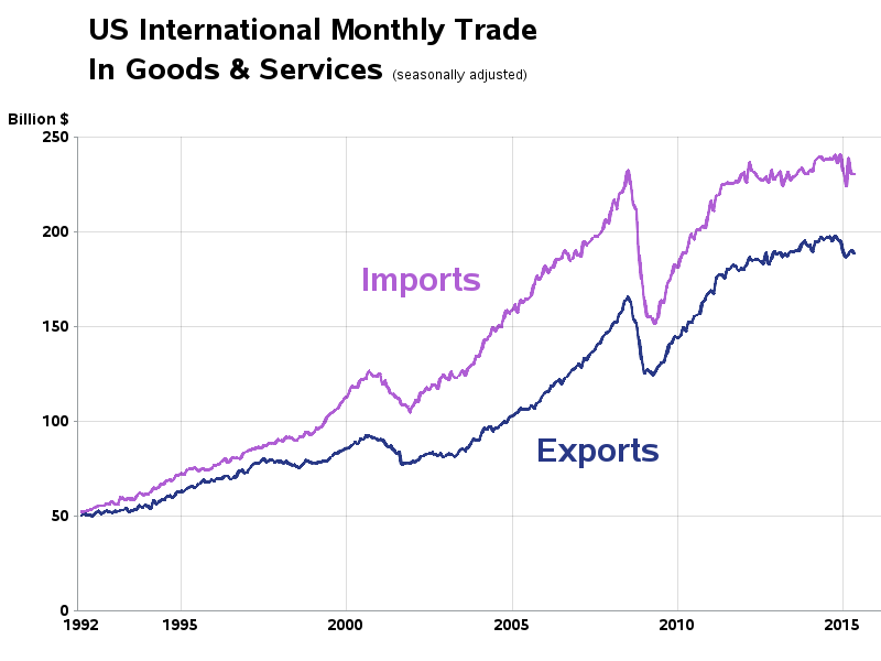
Over the past century, the United States trade balance has undergone dramatic transformations that reflect broader economic, political, and technological changes. Once a manufacturing powerhouse with consistent trade surpluses, the U.S. transitioned to persistent trade deficits beginning in the 1970s, signaling fundamental shifts in global economic dynamics.
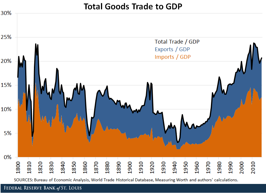
A century of U.S. trade balance evolution showing the dramatic shift from surplus to deficit in the 1970s.
U.S. Trade Balance as Percentage of GDP (1920-2020)
This visualization highlights the dramatic shift from trade surplus to persistent deficit.
Key Turning Points
- Post-World War I manufacturing dominance (1920s)
- Great Depression and Smoot-Hawley tariff impacts (1930s)
- Post-World War II economic boom and Marshall Plan (1940s-50s)
- Rise of global competition and oil price shocks (1970s)
- Plaza Accord and manufacturing outsourcing (1980s-90s)
- China's entry into WTO and accelerated deficits (2000s)
- Digital trade and services expansion (2010s-present)
Evolution of Trade Composition
The changing composition of U.S. trade reflects the nation's economic evolution from manufacturing powerhouse to service economy leader. This shift is particularly visible when exploring free history presentation templates that visually document this transformation.
Trade Composition Evolution
How U.S. exports shifted from goods to services over a century
flowchart TB
    1920s["1920s-1950s"] --> |"Industrial Revolution Legacy"| Manufacturing["Manufacturing Dominance
(80% of Exports)"]
    Manufacturing --> |"Rising Competition"| 1970s["1970s-1990s"]
    1970s --> |"Outsourcing"| Mixed["Mixed Economy
(50% Manufacturing, 50% Services)"]
    Mixed --> |"Digital Revolution"| 2000s["2000s-Present"]
    2000s --> |"Technology & IP Growth"| Services["Services Dominance
(65% of Value)"]
    Services --> |"4th Industrial Revolution"| Future["Future Trends
Digital Trade & Data"]
    classDef orange fill:#FFF2E6,stroke:#FF8000,stroke-width:2px
    classDef blue fill:#E6F7FF,stroke:#0099FF,stroke-width:2px
    class Manufacturing,Mixed,Services orange
    class 1920s,1970s,2000s,Future blue
The visualization methods used to track and report trade have also evolved significantly. Modern data analytics allow for more nuanced understanding of trade flows, enabling more sophisticated strategic planning for both businesses and policymakers navigating the global economy 2025 landscape.
Tariff Policies Through Visual Analysis
Tariff policies have significantly shaped U.S. trade patterns throughout the past century. From the protectionist measures of the early 20th century to the liberalization efforts of the post-war era and recent revival of tariff strategies, these policies provide critical context for understanding trade balance evolution.

Comparative visualization of major U.S. tariff regimes and their economic impacts, 1920-2020.
Average U.S. Tariff Rates by Era
This chart illustrates how tariff rates have fluctuated throughout different policy periods.
The Smoot-Hawley Tariff Effect
The Smoot-Hawley Tariff of 1930 remains one of the most studied tariff policies in economic history. Introduced during the Great Depression, it raised duties on over 20,000 imported goods to record levels, averaging 45-50%. The visualization below captures its catastrophic effects:
Smoot-Hawley Tariff Effects
The cascading economic consequences of protectionist policy
flowchart TD
    SH[Smoot-Hawley
Tariff Act 1930] --> TR[Tariff Rates
Increased 45-50%]
    TR --> |"Global Response"| RET[Retaliatory Tariffs
from Trading Partners]
    TR --> |"Domestic Effect"| IP[Import Prices
Increased]
    RET --> |"Export Impact"| EXD[U.S. Exports
Declined 61%]
    IP --> |"Consumption Effect"| CD[Consumer Demand
Decreased]
    CD --> |"Production Impact"| PD[Production
Decreased]
    EXD --> EMP[Unemployment
Increased]
    PD --> EMP
    EMP --> |"Economic Impact"| GD[Depression
Deepened]
    GD --> |"Policy Response"| RTAA[Reciprocal Trade
Agreements Act 1934]
    RTAA --> |"Long-term Effect"| GATT[Foundation for
GATT/WTO System]
    classDef orange fill:#FFF2E6,stroke:#FF8000,stroke-width:2px
    classDef red fill:#FFEEEE,stroke:#FF6666,stroke-width:2px
    classDef green fill:#F0F8F0,stroke:#66BB6A,stroke-width:2px
    class SH,TR,IP,RET orange
    class EXD,CD,PD,EMP,GD red
    class RTAA,GATT green
GATT/WTO Evolution
The General Agreement on Tariffs and Trade (GATT) and its successor, the World Trade Organization (WTO), fundamentally transformed the global trading system. This transformation can be effectively communicated using 4 Ps of marketing frameworks that emphasize the evolution of global trade policy positioning.
Modern Tariff Conflicts
Recent years have seen a resurgence in tariff usage as a trade policy tool, particularly in the U.S.-China trade relationship. These modern tariff strategies have significantly impacted global supply chains and trade flows.
Before-and-after visualization of U.S.-China trade flows following 2018-2020 tariff implementation.
The Deficit Phenomenon: Beyond the Numbers
The U.S. trade deficit has been a persistent economic feature since the 1970s, yet its causes, effects, and implications remain widely misunderstood. Effective visualizations can help unpack the complex factors contributing to trade imbalances and their relationship to broader economic indicators.
Multi-layered visualization of U.S. trade deficit components and contributing factors in the modern economy.
Comparative Trade Position Analysis
This radar chart compares key trade metrics across major economies, highlighting the distinctive characteristics of the U.S. trade position.
Deficit-Domestic Economy Relationship
The relationship between trade deficits and domestic economic indicators like GDP growth, employment, and inflation is complex and often counterintuitive. Modern analysis using advanced generative AI market report tools can help identify these non-obvious correlations.
Deficit-Domestic Economy Relationship
How trade deficits interact with key domestic economic indicators
flowchart TB
    TD[Trade Deficit
Increases]

    subgraph Conventional View
    TD -->|"Traditional View"| NE[Negative Effect
on Economy]
    NE --> J1[Job Losses in
Import-Competing Sectors]
    NE --> MO1[Money Flowing
Out of Country]
    end

    subgraph Modern Economic Analysis
    TD -->|"Modern Analysis"| CONS[Higher Consumption
Possibilities]
    TD -->|"Capital Account Effect"| INV[Capital Inflows
for Investment]
    TD -->|"Currency Effect"| DOL[Dollar Strength/
Reserve Currency Status]

    CONS --> WEL[Consumer Welfare
Increases]
    INV --> GRO[Economic Growth
Potential]
    DOL --> BOW[Global Borrowing
Advantage]
    DOL --> INFL[Lower Inflation
Pressure]
    end

    subgraph Balanced Perspective
    WEL & GRO & BOW & INFL ----> BAL[Complex Trade-offs
Sector-Specific Impacts]
    J1 & MO1 ----> BAL
    end

    classDef orange fill:#FFF2E6,stroke:#FF8000,stroke-width:2px
    classDef red fill:#FFEEEE,stroke:#FF6666,stroke-width:2px
    classDef blue fill:#EFF8FF,stroke:#3B82F6,stroke-width:2px
    classDef green fill:#F0F8F0,stroke:#66BB6A,stroke-width:2px
    classDef purple fill:#F5F3FF,stroke:#8B5CF6,stroke-width:2px

    class TD orange
    class NE,J1,MO1 red
    class CONS,WEL blue
    class INV,GRO green
    class DOL,BOW,INFL,BAL purple
Deficit Financing Mechanisms
Understanding how the U.S. finances its persistent trade deficits is crucial to grasping their long-term implications. The unique role of the dollar as the world's primary reserve currency creates monetary dynamics not seen in other economies.
Visual breakdown of how the U.S. trade deficit is financed through global capital flows and the dollar's reserve currency status.
Potential Deficit Reduction Strategies
Various approaches to address the U.S. trade deficit have been proposed, each with different implications for domestic and global economies. Scenario modeling can help visualize potential outcomes.
Impact of Deficit Reduction Strategies
Comparing projected outcomes of different trade deficit reduction approaches.
Global Competition: Visualizing Changing Partners
The landscape of U.S. trading partners has transformed dramatically over the past century, with significant geopolitical and economic implications. Visualization tools can effectively capture these evolving relationships, highlighting the rise and fall of key partners and changing competitive dynamics.

Geographic visualization depicting the evolution of U.S. trading partners from 1920 to 2020, with line thickness indicating trade volume.
Top U.S. Trading Partners: 1950 vs. 2020
This comparative chart reveals the dramatic shift in the U.S. trading landscape over 70 years.
Sector-Specific Competition
Global competition varies significantly across different industrial sectors, with the U.S. maintaining strong positions in some areas while facing intense competition in others. These competitive dynamics can be modeled using intelligent agents industry ecosystem approaches to visualize complex multi-dimensional relationships.
Visual mapping of U.S. competitive position across key industrial sectors relative to global competitors.
The Rise of Emerging Economies
Emerging economies have fundamentally transformed the global trading system and U.S. trade relationships over the past decades. These shifts have created both challenges and opportunities for U.S. businesses and policymakers.
Emerging Economies' Impact on U.S. Trade
How developing economies have reshaped global trade flows
flowchart TD
    EM[Emerging
Market Growth] --> LABOR[Lower Labor
Costs]
    EM --> MCLASS[Growing Middle
Class Consumers]
    EM --> TECH[Technology
Adoption & Innovation]

    LABOR -->|"Manufacturing
Shift"| USDEF[U.S. Trade Deficit
Expansion]
    LABOR -->|"Supply Chain
Reconfiguration"| GVC[Global Value
Chains]

    MCLASS -->|"Market
Opportunity"| USEXP[U.S. Exports
Growth Potential]
    MCLASS -->|"Consumer Goods
Demand"| COMP[Global Resource
Competition]

    TECH -->|"Innovation
Competition"| IP[Intellectual Property
Challenges]
    TECH -->|"Digital
Trade"| SERV[Services Trade
Expansion]

    USDEF & GVC & USEXP & COMP --- FUT[Future U.S.
Trade Dynamics]
    IP & SERV --- FUT

    classDef orange fill:#FFF2E6,stroke:#FF8000,stroke-width:2px
    classDef blue fill:#EFF8FF,stroke:#3B82F6,stroke-width:2px
    classDef green fill:#F0F8F0,stroke:#66BB6A,stroke-width:2px
    classDef purple fill:#F5F3FF,stroke:#8B5CF6,stroke-width:2px

    class EM orange
    class LABOR,MCLASS,TECH blue
    class USDEF,USEXP,GVC,COMP,IP,SERV green
    class FUT purple
Comparative Strengths and Weaknesses
Understanding the relative competitive position of the U.S. versus key trading partners requires analysis across multiple dimensions including innovation, infrastructure, workforce skills, and policy environments.
Competitive Position Analysis: U.S. vs. Key Trading Partners
This radar chart highlights relative competitive strengths and weaknesses across critical economic dimensions.
Technological Impact on Trade Visualization
Technology has fundamentally transformed both the composition of trade and how trade data is visualized and understood. Digital trade components, including services, intellectual property, and data flows, now constitute a growing share of overall trade value and present unique visualization challenges.
Visual representation of the growing share of digital components in overall U.S. trade, 1990-2020.
U.S. Trade Composition: Digital vs. Physical
This chart shows the changing composition of U.S. trade value over time.
Technological Impact on Trade Patterns
Technological advancements have fundamentally reshaped global trade flows and logistics, from containerization to e-commerce and just-in-time manufacturing. These changes have accelerated in recent decades with digital platforms further transforming trade dynamics.
Technological Transformation of Trade
How innovations have reshaped global trade patterns
flowchart TB
    subgraph 1950s-1970s
    CONT[Containerization
Revolution]
    JET[Jet Air Transport]
    end

    subgraph 1980s-2000s
    EDI[Electronic Data
Interchange]
    JIT[Just-In-Time
Manufacturing]
    COMM[E-Commerce
Emergence]
    end

    subgraph 2000s-Present
    BLOC[Blockchain & Smart
Contracts]
    CLOUD[Cloud Computing
& API Integration]
    IOT[Internet of Things
Supply Chain]
    AI[AI & Predictive
Analytics]
    end

    CONT --> INFR[Infrastructure
Standardization]
    JET --> SPEED[Speed & Range
Expansion]

    INFR --> GLO[Global Supply
Chain Formation]
    SPEED --> GLO

    EDI --> INFO[Information
Digitization]
    JIT --> EFF[Efficiency &
Cost Reduction]
    COMM --> DIR[Direct Consumer
Market Access]

    INFO & EFF & DIR --> TRANS[Trade Volume
Expansion]

    TRANS --> MOD[Modern Digital
Trade Ecosystem]

    BLOC & CLOUD & IOT & AI --> FUT[Future Trade
Transformation]

    MOD --> FUT

    classDef orange fill:#FFF2E6,stroke:#FF8000,stroke-width:2px
    classDef blue fill:#EFF8FF,stroke:#3B82F6,stroke-width:2px
    classDef green fill:#F0F8F0,stroke:#66BB6A,stroke-width:2px
    classDef purple fill:#F5F3FF,stroke:#8B5CF6,stroke-width:2px
    classDef yellow fill:#FFFBEB,stroke:#F59E0B,stroke-width:2px

    class CONT,JET orange
    class EDI,JIT,COMM blue
    class BLOC,CLOUD,IOT,AI green
    class INFR,SPEED,INFO,EFF,DIR yellow
    class GLO,TRANS,MOD,FUT purple
Supply Chain Transformations
Global supply chains have undergone significant restructuring due to technological advancements, geopolitical pressures, and efficiency needs. Visualization tools help illuminate these complex adaptations and their impact on trade flows.

Visual representation of how supply chains evolved from linear models to dynamic networked systems, highlighting key technological enablers.
Future Projection Visualizations
Emerging technologies including AI, blockchain, 3D printing, and the Internet of Things (IoT) are poised to further transform global trade patterns and monitoring capabilities. Scenario-based visualizations can help anticipate these changes.
Emerging Technologies' Projected Impact on Trade
This radar chart shows how different technologies are expected to transform various aspects of global trade.
Creating Effective Trade Balance Narratives
Transforming complex trade data into compelling visual stories requires both technical skill and communication strategy. The most effective visualizations distill complex economic relationships into intuitive formats that engage different audience types while maintaining accuracy and context.
Techniques for transforming complex trade data into compelling visual narratives for different audiences.
Case Study Examples
Several groundbreaking visualizations have significantly influenced public understanding of trade balance dynamics by making complex data accessible to broad audiences. These case studies demonstrate effective approaches for different contexts.
Visualization Impact on Audience Understanding
How different visualization approaches affect comprehension and engagement across audience types.
Avoiding Misrepresentations
Trade balance visualizations can easily distort understanding if not carefully designed. Common pitfalls include misleading scales, missing context, inappropriate chart types, and selective data presentation that can create false impressions.
Common Visualization Pitfalls
Guidelines for avoiding misrepresentations in trade data visualization
flowchart TB
    VIZ[Trade Balance
Visualization]

    subgraph Common Pitfalls
    SCALE[Misleading Scale
Selection]
    AXIS[Truncated Axis]
    TYPE[Inappropriate
Chart Type]
    CONT[Missing Context]
    SELECT[Cherry-Picked
Time Periods]
    end

    subgraph Best Practices
    FULL[Show Full Context
& Time Series]
    ZERO[Include Zero
in Scales]
    COMP[Add Comparative
Metrics]
    ANN[Use Annotations
for Context]
    MULTI[Show Multiple
Perspectives]
    end

    VIZ --- Common Pitfalls
    VIZ --- Best Practices

    SCALE --- |Leads to| PERC[Perception
Distortion]
    AXIS --- |Leads to| PERC
    TYPE --- |Leads to| MIS[Misunderstanding
of Trends]
    CONT --- |Leads to| MIS
    SELECT --- |Leads to| BIAS[Biased
Narrative]

    FULL --- |Creates| BAL[Balanced
Perspective]
    ZERO --- |Creates| BAL
    COMP --- |Creates| CLAR[Clarity &
Accuracy]
    ANN --- |Creates| CLAR
    MULTI --- |Creates| TRUST[Trustworthy
Representation]

    classDef orange fill:#FFF2E6,stroke:#FF8000,stroke-width:2px
    classDef red fill:#FFEEEE,stroke:#FF6666,stroke-width:2px
    classDef green fill:#F0F8F0,stroke:#66BB6A,stroke-width:2px
    classDef blue fill:#EFF8FF,stroke:#3B82F6,stroke-width:2px

    class VIZ orange
    class SCALE,AXIS,TYPE,CONT,SELECT,PERC,MIS,BIAS red
    class FULL,ZERO,COMP,ANN,MULTI,BAL,CLAR,TRUST green
    class Common Pitfalls,Best Practices blue
Building Interactive Elements
Interactive visualizations allow users to explore multifaceted trade relationships from different angles, making complex data more accessible and personalized. Modern visualization tools enable rich interaction that deepens understanding.
Interactive dashboard design enabling exploration of multifaceted trade relationships through filtering, comparison, and drill-down functionality.
Communication Strategies for Different Audiences
Effective trade balance visualizations must adapt to the specific needs, expertise level, and interests of different audience types. Communication strategies should vary accordingly while maintaining accuracy.
| Audience | Key Interests | Visualization Approach | Format Recommendations |
|---|---|---|---|
| Policymakers | Policy impacts, international context, long-term trends | Comparative metrics, scenario modeling, regional breakdowns | Interactive dashboards with drill-down capability, briefing-friendly visuals |
| Business Leaders | Sector-specific impact, competitive positioning, opportunity areas | Industry benchmarking, market opportunity mapping, risk visualization | Decision-support visualizations, strategic mapping tools |
| General Public | Personal impact, relatable examples, clear conclusions | Narrative-driven visualization, relatable analogies, simplified metrics | Interactive explainers, animated transitions, guided exploration |
| Academic/Experts | Methodological transparency, underlying data access, nuanced analysis | Multiple variables, statistical rigor, downloadable datasets | Complex interactive tools, underlying methodology documentation |
Transform Complex Trade Data into Compelling Visualizations
PageOn.ai makes it simple to create sophisticated trade balance visualizations that tell powerful data stories. Whether you're analyzing historical trends, mapping global relationships, or presenting complex economic data, our intuitive tools help you communicate with clarity and impact.
Start Creating Powerful Trade Visualizations TodayNavigating the Future of Trade Visualization
As the U.S. trade balance continues to evolve in response to global economic shifts, technological advancement, and policy changes, effective visualization tools become increasingly vital for understanding these complex dynamics. The century-long journey from manufacturing powerhouse to service economy leader illustrates the importance of contextual, accurate, and engaging visual representations.
For economists, policymakers, business leaders, and everyday citizens, visualizing trade data effectively creates shared understanding and facilitates more informed decision-making. By leveraging modern visualization techniques and tools like PageOn.ai, complex trade relationships become accessible, enabling deeper insights into how tariffs, deficits, and global competition have shaped—and continue to shape—America's economic position in the world.
As we look toward the future, the continued integration of advanced data visualization, interactive exploration tools, and narrative-driven approaches will be essential for navigating the increasingly complex landscape of global trade relationships and their impact on domestic economies.
You Might Also Like
How to Design Science Lesson Plans That Captivate Students
Create science lesson plans that captivate students with hands-on activities, clear objectives, and real-world applications to foster curiosity and critical thinking.
How to Write a Scientific Review Article Step by Step
Learn how to write a review article in science step by step. Define research questions, synthesize findings, and structure your article for clarity and impact.
How to Write a Self-Performance Review with Practical Examples
Learn how to write a self-performance review with examples and tips. Use an employee performance review work self evaluation sample essay to guide your process.
How to Write a Spec Sheet Like a Pro? [+Templates]
Learn how to create a professional spec sheet with key components, step-by-step guidance, and free templates to ensure clarity and accuracy.