Transform Raw Text Data into Compelling Charts: How AI is Revolutionizing Data Visualization
The Evolution of Data Visualization: From Manual Charting to AI-Powered Automation
I've watched the world of data visualization transform dramatically over the years. What once required hours of meticulous work with specialized tools has now become an almost instantaneous process, thanks to the power of artificial intelligence. In this guide, I'll walk you through how AI is bridging the gap between raw text data and compelling visual storytelling, and how you can leverage these innovations to transform your own data visualization workflow.
The Evolution of Data Visualization
I've witnessed the fascinating journey of data visualization throughout history. From the painstaking hand-drawn charts of the 18th century to today's sophisticated AI-powered tools, the evolution has been remarkable. For centuries, creating a single chart might have taken days of careful measurement and artistic skill.
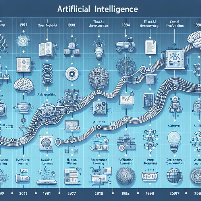
Even with the advent of digital tools like Excel in the 1980s, the process remained labor-intensive. I remember spending hours manually entering data, formatting cells, and tweaking design elements just to create a basic bar chart. The technical barriers were significant—you needed specialized knowledge of software, data structure principles, and design fundamentals.
Today, AI create charts from text technology has fundamentally changed this landscape. What once took hours can now be accomplished in seconds, with AI bridging the gap between raw textual data and polished visual representations. This transformation addresses a critical need in our data-saturated world: the ability to quickly convert information into visual insights without technical barriers.
The Data Visualization Timeline
Below is the evolution of data visualization technologies over time:
                    flowchart LR
                        A[Hand-drawn Charts
18th-19th Century] -->|"Early Computers"| B[Digital Spreadsheets
1980s-1990s]
                        B -->|"Web Technologies"| C[Interactive Dashboards
2000s-2010s]
                        C -->|"Machine Learning"| D[AI-Powered Visualization
2020s]
                        style A fill:#FFF5E6,stroke:#FF8000
                        style B fill:#FFF5E6,stroke:#FF8000
                        style C fill:#FFF5E6,stroke:#FF8000
                        style D fill:#FFEDD5,stroke:#FF8000,stroke-width:3px
Understanding Text-to-Chart AI Technology
When I first encountered text-to-chart AI technology, I was amazed by its apparent simplicity—you input text, and out comes a chart. But beneath this simple interface lies sophisticated technology combining natural language processing (NLP), machine learning, and data visualization principles.
Text-to-Chart AI Process Flow
The journey from raw text to finished visualization:
                    flowchart TD
                        A[Raw Text Input] -->|"NLP Processing"| B[Data Extraction]
                        B -->|"Pattern Recognition"| C[Identify Relationships & Trends]
                        C -->|"Classification"| D[Chart Type Selection]
                        D -->|"Rendering"| E[Visual Output]
                        subgraph "AI Processing Layer"
                            B
                            C
                            D
                        end
                        style A fill:#FFF5E6,stroke:#FF8000
                        style B fill:#F3F4F6,stroke:#4B5563
                        style C fill:#F3F4F6,stroke:#4B5563
                        style D fill:#F3F4F6,stroke:#4B5563
                        style E fill:#FFEDD5,stroke:#FF8000
Here's how I've come to understand the process:
- Natural Language Processing: The AI first parses your text using NLP techniques to identify potential data points, categories, and numerical values. It distinguishes between descriptive text and actual data.
- Pattern Recognition: Next, algorithms detect relationships within the extracted data—correlations, trends, hierarchies, and comparisons that might exist.
- Chart Type Selection: Based on the data structure and relationships identified, the AI determines which visualization format will best represent the story in your data—whether that's a bar chart for comparisons, a line chart for trends over time, or a pie chart for showing parts of a whole.
The most sophisticated AI chart generators don't just mechanically convert numbers into visuals—they understand context. For example, when I mention "increasing sales over the last four quarters," the AI recognizes this as time-series data best suited for a line chart and automatically structures it accordingly.
What makes modern text-to-chart AI truly remarkable is its ability to handle ambiguity and incomplete information. When my data description lacks specificity, the AI makes intelligent assumptions based on common data visualization best practices and can even prompt me for clarification on critical details.
Key Benefits of AI-Powered Chart Creation
In my experience working with teams across various departments, I've witnessed firsthand how AI-powered chart creation delivers transformative benefits that extend far beyond mere convenience.
Dramatic Time Reduction
What used to take me hours—collecting data, structuring it in spreadsheets, and designing charts—now takes seconds. I simply describe the data story I want to tell, and the AI handles the rest.
Democratized Data Visualization
I've seen team members with zero technical background create professional-quality visualizations through natural language descriptions. This democratization means insights are no longer bottlenecked by technical skill.
Enhanced Accuracy
AI systems apply consistent data visualization best practices, avoiding common human errors like inappropriate scales or misleading chart types that can distort data interpretation.
Visual Brand Consistency
Our organization's data visualization charts now maintain consistent styling across all departments and presentations, strengthening our brand identity and making materials instantly recognizable.
Perhaps most importantly, I've found that eliminating the technical friction in creating visualizations means we actually use data more frequently in our decision-making. When insights are just a conversation away, data naturally becomes more central to our workflow.
Real-World Applications Across Industries
Throughout my career, I've seen AI-powered chart creation transform workflows across diverse industries, each with their unique visualization needs and challenges.
Business Intelligence
Financial analysts at major corporations are using text-to-chart AI to transform quarterly reports into actionable visual insights within minutes rather than days.
Example: "Show me a comparison of Q3 revenue across all product lines with year-over-year growth percentages" instantly generates a dual-axis chart highlighting both absolute values and growth trends.
Education
I've worked with educators who use AI chart generation to help students visualize complex concepts without requiring them to master technical tools first.
Example: A history teacher describing population shifts during the Industrial Revolution can instantly create migration flow diagrams that make abstract concepts concrete for visual learners.
Research
Academic researchers are using AI to quickly convert study findings into publication-ready visualizations that meet journal standards without requiring graphic design expertise.
Example: Describing experimental results in natural language and receiving journal-quality figures with proper error bars, statistical annotations, and formatting.
Healthcare
Medical professionals are leveraging ai-powered bar chart generators to visualize patient data and treatment outcomes for better clinical decision-making.
Example: Converting patient recovery metrics across different treatment protocols into clear comparative visualizations that help identify the most effective approaches.
What fascinates me most is how these applications cross traditional boundaries between technical and non-technical roles. Marketing teams that once relied heavily on design departments can now independently create data-driven visual content for campaigns. Sales representatives can generate custom client-specific visualization on the fly during meetings. The technology is essentially removing gatekeepers from the data visualization process.
PageOn.ai's Approach to Text-to-Chart Transformation
In my exploration of AI visualization tools, I've found that PageOn.ai takes a uniquely conversational approach to chart creation that feels distinctly different from traditional data visualization workflows.
PageOn.ai's Text-to-Chart Workflow
How PageOn.ai transforms your natural language into visualization:
                    flowchart TD
                        A[User Conversation] -->|"Vibe Creation"| B[Intent Understanding]
                        B --> C[AI Blocks System]
                        C --> D[Deep Search]
                        D --> E[Chart Generation]
                        E --> F[Refinement Loop]
                        F -->|"Feedback"| A
                        style A fill:#FFF5E6,stroke:#FF8000
                        style B fill:#FFF5E6,stroke:#FF8000
                        style C fill:#FFF5E6,stroke:#FF8000
                        style D fill:#FFF5E6,stroke:#FF8000
                        style E fill:#FFF5E6,stroke:#FF8000
                        style F fill:#FFF5E6,stroke:#FF8000
Vibe Creation Interface
Rather than starting with structured data input forms, PageOn.ai lets me have a natural conversation about what I want to visualize. I can say something as vague as "I want to show how our customer satisfaction scores have been trending upward since we launched the new product" and the system understands the intent.
AI Blocks System
What I find particularly powerful is how PageOn.ai breaks down complex visualizations into modular components through its AI Blocks system. This allows for building sophisticated multi-layer charts without requiring technical knowledge of data structures or visualization libraries.
Deep Search Capabilities
One feature that sets PageOn.ai apart is its Deep Search functionality. When I'm creating a chart about market trends, the system can automatically enhance my visualization with relevant contextual information—pulling in industry benchmarks or related metrics that I might not have thought to include.
This contextual intelligence means my charts tell more complete stories, with the AI acting as both a visualization tool and a research assistant.

The agentic process that PageOn.ai employs is particularly impressive when dealing with vague data descriptions. Rather than simply returning an error or generic chart, the system engages in a clarification dialogue, asking smart questions to refine understanding before generating the visualization. This collaborative approach results in charts that truly capture the intended data narrative, even when my initial description lacks precision.
I've used PageOn.ai to transform complex data narratives about customer journey analytics into clear funnel visualizations that highlight conversion bottlenecks, and to create multi-faceted competitive analysis charts that would have previously required custom programming. The system's ability to handle these complex scenarios while maintaining an intuitive interface makes it particularly valuable for cross-functional teams.
Best Practices for Optimal AI Chart Generation
Through my experience working with various text-to-chart AI systems, I've developed some best practices that consistently lead to better visualization outcomes. These approaches help bridge the gap between what you want and what the AI delivers.
Structuring Your Text Data
- • Be explicit about data categories and values when possible (e.g., "Sales in Q1: $10,000, Q2: $12,500...")
- • Clearly indicate time periods or sequence for trend data
- • Specify measurement units to ensure accurate labeling
- • Group related data points together in your description
Providing Clear Context
- • State the purpose of your visualization upfront
- • Identify your target audience and their familiarity with the subject
- • Explain what insight or conclusion you want viewers to draw
- • Mention any specific formatting or style requirements
Refining and Iterating
I've learned that the best results often come from an iterative approach. My first AI-generated chart is rarely the final version. Instead, I use it as a starting point and provide specific feedback:
- "The chart looks good, but can we emphasize the contrast between Q1 and Q4 more clearly?"
- "I like the overall structure, but let's switch from a stacked bar to grouped bars for better comparison."
- "This works well, but can we add a trend line showing the moving average?"
This conversational refinement process helps the AI understand my specific visualization needs better with each iteration. I've found that ai tools for excel charts and other specialized visualization platforms become more attuned to my preferences over time, creating a personalized experience.
Ethical Considerations
As with any AI-powered tool, I'm always mindful of ethical considerations in automated visualization. It's important to:
- Verify the accuracy of AI-generated visualizations against source data
- Ensure charts don't inadvertently misrepresent data through inappropriate scales or chart types
- Consider accessibility needs in color choices and chart complexity
- Maintain transparency about data sources and any limitations in the visualization
Future Directions in AI-Powered Data Visualization
As I look toward the horizon of AI-powered data visualization, I see several exciting developments that will further transform how we create and interact with charts and graphs.
The Evolution of AI Visualization Capabilities
From basic automation to intelligent collaboration:
                    flowchart LR
                        A[Basic Chart
Generation] --> B[Predictive
Visualization]
                        B --> C[Real-time
Data Integration]
                        C --> D[Immersive
AR/VR Visualization]
                        D --> E[Autonomous
Reporting Systems]
                        style A fill:#FFF5E6,stroke:#FF8000
                        style B fill:#FFF5E6,stroke:#FF8000
                        style C fill:#FFF5E6,stroke:#FF8000
                        style D fill:#FFF5E6,stroke:#FF8000
                        style E fill:#FFEDD5,stroke:#FF8000,stroke-width:3px
Predictive Visualization
Beyond simply representing existing data, next-generation AI visualization tools will incorporate predictive analytics to forecast future trends and visualize potential scenarios. I'm particularly excited about how this will transform strategic planning, allowing teams to visualize multiple future states based on different variables.
Live Data Integration
The integration of AI visualization with live data sources will enable real-time chart updates that automatically adjust as new information becomes available. Imagine describing a visualization once, then having it continuously update as your database or API feeds refresh—creating living documents rather than static reports.

AR/VR Visualization
I believe the convergence of AR/VR technologies with AI chart generation will create immersive data experiences where users can literally walk through their data landscapes. Text prompts will generate not just flat charts but navigable 3D data environments that reveal insights impossible to see in traditional visualizations.
Collaborative AI
Future visualization systems will support multi-user collaboration where team members can collectively refine data representations through natural language. These collaborative AIs will understand different stakeholder perspectives and create visualizations that address various needs simultaneously.
Autonomous Reporting
Perhaps most transformative will be fully autonomous data reporting systems that continuously monitor data sources, identify significant patterns or anomalies, and proactively generate relevant visualizations without human prompting. These systems will function as always-on data analysts, surfacing insights that might otherwise go unnoticed.
The implications for business intelligence are profound—shifting from manual report creation to an environment where the most relevant visualizations find you based on your role and current priorities.
Getting Started with AI Chart Generation
If you're ready to dive into the world of AI-powered chart creation, I've put together a step-by-step guide based on my own experience to help you get started quickly and avoid common pitfalls.
1. Define Your Visualization Purpose
Before diving into chart creation, I always ask myself these key questions:
- What specific insight am I trying to communicate?
- Who is my target audience and what is their familiarity with this data?
- What decisions or actions should this visualization inform?
- What format will this visualization be consumed in? (presentation, report, dashboard)
2. Prepare Your Data Description
When describing your data for AI chart generation, clarity is key. Here's my template for effective data descriptions:
Template:
"I need a [chart type if known] showing [primary metric] across [categories/time periods]. The data includes [list key data points]. The purpose is to highlight [specific insight or comparison]. The audience is [description of viewers]. Important aspects to emphasize are [key features]."
Example:
"I need a chart showing monthly revenue from January through June 2023. The data includes: Jan: $45,000, Feb: $48,500, Mar: $52,000, Apr: $49,800, May: $53,200, Jun: $58,500. The purpose is to highlight our Q2 growth acceleration. The audience is our executive team. Important aspects to emphasize are the growth rate change between Q1 and Q2."
3. Common Pitfalls to Avoid
❌ Being too vague
"Show me sales data" provides insufficient context for meaningful visualization.
✓ Being specific
"Show me monthly sales data for our top 3 products during Q1 2023 with year-over-year comparison."
❌ Overcomplicating
Requesting too many metrics or comparisons in a single visualization.
✓ Focusing on one story
Creating multiple simple charts rather than one complex visualization.
4. Measuring Visualization Effectiveness
After creating your chart, I recommend evaluating its effectiveness with these criteria:
- Clarity Test: Can someone understand the main point within 5 seconds?
- Accuracy Check: Does the visualization faithfully represent the underlying data?
- Actionability: Does the visualization enable better decision-making?
- Memorability: Will the key insights stick with viewers after they've moved on?
Transform Your Visual Expressions with PageOn.ai
Ready to revolutionize how you create charts from raw text data? PageOn.ai's intuitive interface and powerful AI capabilities make visualization effortless, regardless of your technical background.
Start Creating with PageOn.ai TodayEmbracing the Future of Data Visualization
As we've explored throughout this guide, the ability to transform raw text data into compelling charts through AI represents a fundamental shift in how we approach data visualization. I've personally seen how this technology democratizes access to powerful visual communication tools, regardless of technical background or design experience.
The future of data storytelling lies in these conversational interfaces that allow us to express what we want to see and have AI handle the technical implementation. PageOn.ai stands at the forefront of this revolution, offering an intuitive platform that combines natural language processing with sophisticated visualization capabilities.
Whether you're a business analyst looking to streamline reporting workflows, an educator wanting to make data more accessible to students, or a researcher aiming to communicate findings more effectively, AI-powered chart creation tools offer unprecedented efficiency and accessibility. I encourage you to explore these capabilities and discover how they can transform your approach to data visualization.
You Might Also Like
10 Hidden Google Workspace Marketplace Gems for Transforming Your Presentations
Discover 10 powerful Google Workspace Marketplace add-ons that will revolutionize how you create, deliver, and collaborate on presentations. Unlock hidden gems for presenters.
Maximizing Conversion: Strategic Free Trial Design for AI Presentation Platforms
Discover proven strategies for designing effective free trials for AI presentation platforms. Learn how to balance feature access, create compelling user journeys, and drive conversions.
Interactive Web Parts That Transform Knowledge Sharing | PageOn.ai
Discover how interactive web elements create engaging learning experiences. From infographics to knowledge graphs, learn how to transform static content into dynamic knowledge sharing tools.
Transforming Content Discovery: Filtered Views and Metadata for Better Organization
Discover how filtered views and metadata can revolutionize content discovery and organization. Learn implementation strategies and visualization techniques with PageOn.ai.