Beyond Static Slides: Transforming Business Presentations with Dynamic Timeline and Chart Elements
The Evolution of Business Presentation Visuals
In today's business environment, static slides no longer capture attention or effectively communicate complex information. I've seen firsthand how modern presentations have evolved to meet higher expectations through dynamic visual elements that transform data into compelling stories.
The Evolution of Business Presentation Visuals
When I look back at how business presentations have transformed over the years, the contrast is striking. Traditional static slides with bullet points and basic charts have given way to dynamic, interactive visual experiences that engage audiences on multiple levels.
The psychology behind this shift is compelling. Our brains process visual information 60,000 times faster than text, making well-designed visual elements crucial for effective communication in time-constrained business environments. I've found that when complex data is presented visually, retention rates increase by up to 65%.
Timeline and chart elements have evolved from simple graphics to sophisticated storytelling tools. What was once a basic arrow with dates has transformed into interactive timelines that reveal layers of information and context with each interaction.
This evolution has created a new requirement for business professionals: data visualization literacy. Today's executives and managers need to understand not just the data itself, but how to present it visually for maximum impact. Those who master these skills gain a significant advantage in communicating complex ideas clearly and persuasively.
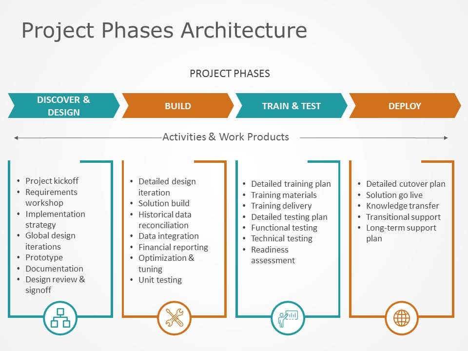
Essential Timeline Elements for Impactful Business Storytelling
Interactive Timeline Fundamentals
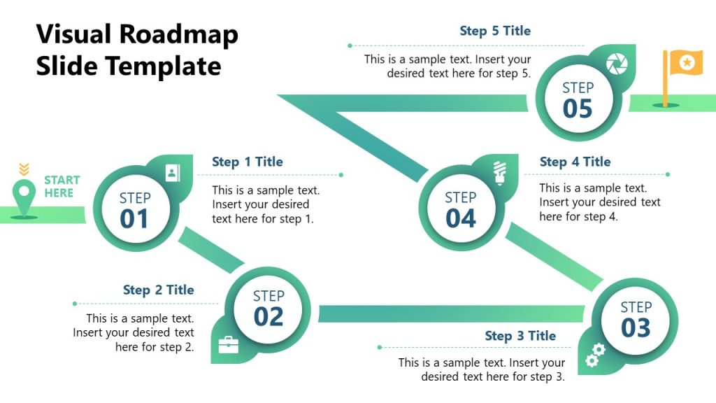
In my experience creating business presentations, I've found that interactive timelines are particularly effective for telling compelling business narratives. The key elements that make timelines engaging include clickable sections that reveal additional milestone details, progress trackers that visualize completion status, and strategic color-coding for categorization.
Interactive Timeline Components
flowchart LR
    A[Timeline Base] --> B[Clickable Milestones]
    A --> C[Progress Indicators]
    A --> D[Color Categories]
    B --> E[Detail Panels]
    B --> F[Supporting Media]
    C --> G[Percentage Complete]
    C --> H[Status Indicators]
    D --> I[Department Codes]
    D --> J[Priority Levels]
    style A fill:#FF8000,stroke:#333,stroke-width:2px
    style B fill:#FFB366,stroke:#333,stroke-width:1px
    style C fill:#FFB366,stroke:#333,stroke-width:1px
    style D fill:#FFB366,stroke:#333,stroke-width:1px
I've created timelines in Google Slides that transform static presentations into dynamic stories. By implementing clickable elements, my audiences can explore details at their own pace, creating a more engaging and personalized experience.
Timeline Types and Their Business Applications
| Timeline Type | Best Business Use Case | Key Elements |
|---|---|---|
| Chronological | Company history, market evolution | Date markers, historical context, milestone achievements |
| Project Management | Development cycles, campaign execution | Dependencies, critical paths, resource allocation |
| Strategic Roadmap | Product planning, organizational vision | Future milestones, decision points, growth indicators |
| Comparative | Competitive analysis, before/after scenarios | Parallel tracks, contrast indicators, outcome metrics |
Customization Techniques for Audience-Specific Timelines
I've learned that effective timelines must be tailored to their specific audience. For executive presentations, I focus on simplification, highlighting only the most critical milestones and outcomes. When presenting to clients, I emphasize value delivery points and ROI markers. For team presentations, I include more granular details about responsibilities and deadlines.
Pro Tip: Audience-Centric Design
I always consider my audience's decision-making needs when designing timelines. Executives typically need high-level strategic views, while operational teams benefit from detailed implementation timelines. Creating modular timeline elements allows me to quickly adapt a single presentation for different audiences.
Chart Elements That Transform Complex Business Data into Clear Insights
Creating stunning data visuals in presentations requires understanding which chart types best communicate different kinds of business information. I've found that choosing the right visualization is as important as the data itself.
Bar and Column Charts: Beyond the Basics
Bar and column charts are presentation workhorses, but I've discovered that with strategic enhancements, they can communicate much more than simple comparisons. By implementing segmented bars for multi-variable analysis and progressive bars for goal tracking, these familiar charts become powerful business storytelling tools.
Market Position Comparison: Segmented Bar Chart
Line and Area Charts for Trend Visualization
When presenting trend data in my business presentations, I rely on line and area charts to tell compelling stories about performance over time. Multi-line charts are particularly effective for competitive analysis, while shaded areas help emphasize significant business periods.
Performance Trends with Forecast Projection
Pie and Donut Charts: When and How to Use Them Effectively
While often overused, I've found that pie and donut charts have their place in business presentations when used appropriately. They excel at showing proportional relationships, particularly for market share visualization and budget allocations. The key is limiting segments to 5-7 for maximum clarity.
Marketing Budget Allocation
Common Pie Chart Pitfalls to Avoid
- Too many segments (limit to 5-7 for clarity)
- Similar colors that are difficult to distinguish
- Using 3D effects that distort proportions
- Comparing multiple pie charts side by side
- Using for time-series data (use line charts instead)
Integration Strategies: Combining Timelines and Charts for Maximum Impact
My most successful business presentations combine multiple visualization types to tell a comprehensive story. By integrating timelines with charts, I create a powerful narrative that connects events with their measurable impacts.
Hybrid Visualization Techniques

Timeline-chart overlays are particularly effective for showing performance metrics at key milestones. I've used this approach when presenting marketing campaign results, overlaying a timeline of campaign activities with performance metrics at each stage.
Gantt charts with embedded performance indicators provide another powerful hybrid visualization. By incorporating progress bars, color-coding, and data markers within Gantt chart elements, I can communicate both timeline and performance information in a single visual.
Dashboard Integration Approach
flowchart TD
    A[Central Timeline] --> B[KPI Dashboard]
    A --> C[Resource Allocation]
    A --> D[Risk Indicators]
    B --> E[Performance Charts]
    B --> F[Goal Trackers]
    C --> G[Team Utilization]
    C --> H[Budget Consumption]
    D --> I[Issue Flags]
    D --> J[Mitigation Status]
    style A fill:#FF8000,stroke:#333,stroke-width:2px
    style B fill:#FFB366,stroke:#333,stroke-width:1px
    style C fill:#FFB366,stroke:#333,stroke-width:1px
    style D fill:#FFB366,stroke:#333,stroke-width:1px
Interactive Elements that Enhance Comprehension
I've found that PowerPoint data storytelling becomes significantly more effective when incorporating interactive elements. Click-to-reveal data points on timelines allow me to progressively disclose information, keeping audiences engaged while preventing information overload.
Drill-down capabilities provide another layer of interactivity, allowing me to start with high-level summary charts and then reveal detailed analysis when needed. This approach works particularly well for executive presentations, where I can begin with the big picture and then provide supporting details as questions arise.
Animated transitions between timeline phases and corresponding metrics help audiences understand cause-and-effect relationships. When I present product launch timelines, for example, I use subtle animations to connect launch activities with resulting sales or adoption metrics, making the relationship between actions and outcomes crystal clear.
Design Principles for Professional Timeline and Chart Elements
Color Psychology and Branding Considerations
When designing professional visual presentations in PowerPoint, I pay careful attention to color selection. Strategic use of color helps direct attention to key data points and create visual hierarchy within complex visualizations.
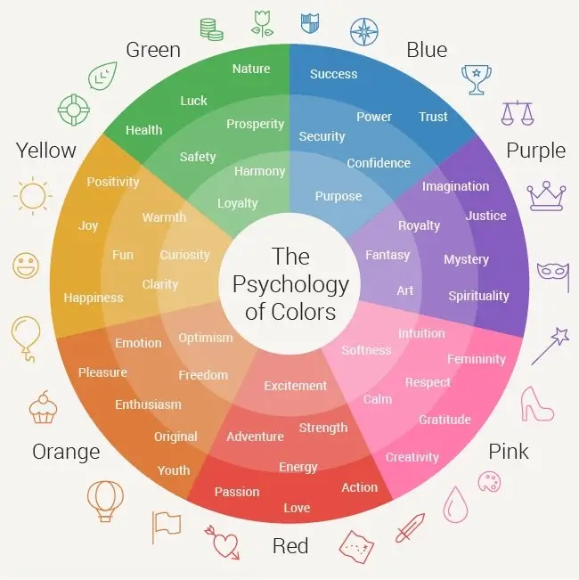
I always ensure my timeline and chart elements maintain brand-consistent visual language. This doesn't mean every chart must use only brand colors, but rather that the overall palette should complement and reinforce brand identity. For client-facing presentations, this visual consistency builds trust and recognition.
Accessibility considerations are equally important. I design with color-blind audience members in mind by avoiding problematic color combinations (particularly red/green) and ensuring sufficient contrast between elements. When possible, I use patterns or labels to supplement color coding, ensuring information is accessible to all audience members.
Typography and Labeling Best Practices
Effective Typography Hierarchy
- Use consistent font families throughout
- Create clear size distinction between titles, labels, and values
- Bold weights for key metrics and important data points
- Regular weights for supporting information
- Limit to 2-3 font sizes per visualization
Strategic Labeling Approaches
- Direct labels on chart elements when space permits
- Legends for multiple data series with clear color coding
- Annotations for highlighting specific insights
- Consistent placement of axis labels and titles
- Simplified values (e.g., "$4.2M" instead of "$4,235,687")
I've found that establishing a clear font hierarchy dramatically improves data scanning efficiency. By using consistent size and weight differences between titles, labels, and values, I create a natural visual flow that guides the audience through the information.
My labeling strategy focuses on reducing cognitive load. I place direct labels on chart elements when space allows, eliminating the need for the audience to look back and forth between the visualization and a legend. For complex visualizations, I use indirect labels with clear visual connections to their corresponding data points.
White Space and Layout Considerations
One of the most common mistakes I see in business presentations is data overload. I prevent this by using strategic spacing between elements, allowing each piece of information room to breathe. This intentional use of white space not only improves aesthetics but significantly enhances comprehension.
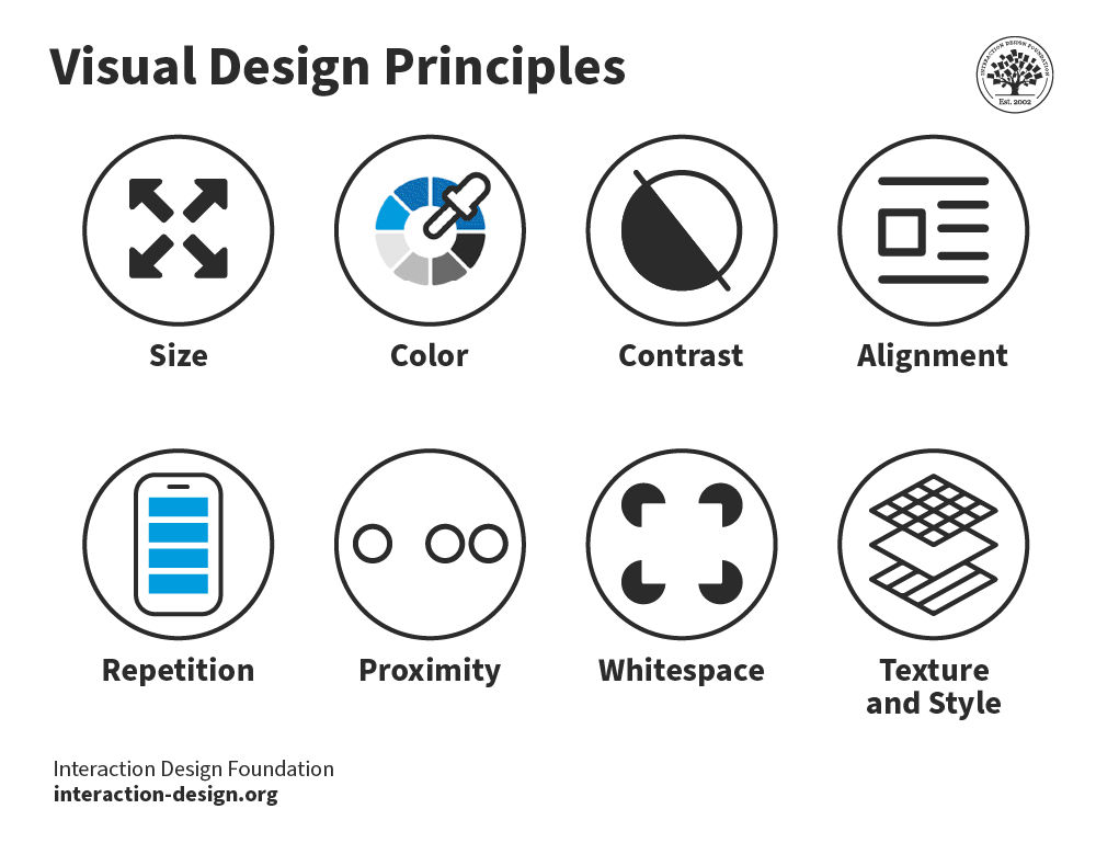
I group related timeline elements for logical flow, creating visual clusters that help audiences understand relationships between different pieces of information. This approach is particularly effective for complex project timelines with multiple workstreams or dependencies.
Creating visual hierarchy through thoughtful arrangement is essential for guiding audience attention. I place the most important elements in prominent positions (typically top-left for Western audiences) and use size, color, and positioning to establish a clear visual hierarchy that directs the viewer's eye through the information in the intended sequence.
From Static to Dynamic: Creating Interactive Business Presentations
Software Capabilities and Limitations
In my experience creating interactive business presentations, I've explored the capabilities and limitations of various software platforms. Native PowerPoint and Google Slides offer surprising interactive functionality through hyperlinks, triggers, and animations. These built-in features allow for basic interactivity without requiring additional tools.
| Platform | Interactive Strengths | Limitations |
|---|---|---|
| PowerPoint | Triggers, animations, morph transitions, zoom features | Limited data connectivity, no true drill-down capability |
| Google Slides | Collaborative editing, linking between slides, Q&A features | Fewer animation options, limited custom interactions |
| Third-Party Tools | Advanced interactivity, data integration, custom animations | Learning curve, compatibility issues, often require subscriptions |
| HTML5/Web-Based | Maximum interactivity, responsive design, live data connections | Technical knowledge required, hosting considerations |
For more advanced functionality, I often turn to third-party tools and plugins. These extensions significantly enhance what's possible within PowerPoint and Google Slides, enabling features like real-time data connections and advanced interactive elements.
When maximum interactivity is required, HTML5 and web-based presentation options offer the most flexibility. While these require more technical knowledge, they enable truly dynamic presentations with responsive design and live data connections.
Practical Implementation Techniques
Creating Clickable Timeline Elements
flowchart TD
    A[Create Base Timeline] --> B[Add Shapes for Milestones]
    B --> C[Create Detail Slides]
    C --> D[Add Hyperlinks to Shapes]
    D --> E[Create Return Links]
    E --> F[Add Visual Indicators]
    F --> G[Test Navigation Flow]
    style A fill:#FFD9B3,stroke:#333,stroke-width:1px
    style B fill:#FFD9B3,stroke:#333,stroke-width:1px
    style C fill:#FFD9B3,stroke:#333,stroke-width:1px
    style D fill:#FFD9B3,stroke:#333,stroke-width:1px
    style E fill:#FFD9B3,stroke:#333,stroke-width:1px
    style F fill:#FFD9B3,stroke:#333,stroke-width:1px
    style G fill:#FFD9B3,stroke:#333,stroke-width:1px
I've developed a step-by-step process for creating clickable timeline elements in my presentations. Starting with a base timeline design, I add distinct shapes for each milestone, create detailed content slides, and then connect everything with hyperlinks. Adding visual indicators helps audiences understand which elements are interactive.
For linking charts to supporting data, I use a similar approach. I create hyperlinked areas within charts that connect to slides with detailed analysis. This allows me to keep my main presentation slides clean and focused while providing access to deeper information when needed.
Transition effects play an important role in enhancing data storytelling. I use subtle animations to reveal data progressively, helping audiences process information in manageable chunks. For timelines, I often use morph transitions to create smooth movements between different timeline views or levels of detail.
Future-Proofing Presentations for Different Delivery Contexts
My presentation designs must work effectively in multiple delivery contexts. When designing for both in-person and virtual presentations, I create alternative navigation paths that work well in each environment. For virtual presentations, I include more self-guided elements and clear navigation cues.

Creating presentation elements that work across devices is increasingly important. I design with responsive principles in mind, ensuring that interactive elements remain functional on tablets and even smartphones. This often means simplifying complex interactions and ensuring touch targets are sufficiently large.
Export considerations are crucial for sharing and distribution. I always test how interactive elements behave when presentations are exported to different formats or viewed on different platforms. When necessary, I create alternative versions optimized for specific distribution channels.
Case Studies: Timeline and Chart Elements in Action
Marketing Campaign Performance Visualization
One of my most successful visualization projects involved creating an interactive timeline for a multi-channel marketing campaign. By integrating the campaign timeline with key performance indicators, we transformed a complex set of activities and results into a clear, compelling narrative.
Campaign Performance by Channel
The presentation included A/B test results visualization using comparative charts, showing how different creative approaches performed across channels. This side-by-side comparison made it immediately clear which strategies were most effective.
We also incorporated ROI representation across campaign phases, using a combination of timeline elements and financial metrics. This allowed stakeholders to see not just when activities occurred, but their financial impact over time.
Product Development Lifecycle Presentation
For a major product launch, I created a comprehensive visualization that tracked milestones with embedded resource allocation charts. This allowed executives to see not just what was happening when, but how resources were distributed across different workstreams.
Feature development timelines were integrated with user adoption metrics, creating a clear picture of which features drove the most engagement. This insight proved invaluable for prioritizing future development efforts.
The presentation also included version release history with performance improvement metrics. By visualizing how each release affected key performance indicators, we created a compelling narrative about the product's evolution and impact.
Financial Performance Storytelling
Quarterly Performance with Industry Comparison
For investor presentations, I developed quarterly performance timelines with trend analysis that highlighted our company's growth trajectory. By comparing our performance to industry benchmarks, we created a compelling narrative about our competitive positioning.
We focused on investor-focused chart elements that highlight growth stories, using consistent visual language to emphasize positive trends. This approach helped secure additional funding by making our financial narrative both clear and compelling.
Risk visualization techniques were incorporated for executive presentations, using color-coding and probability indicators to communicate potential challenges. This balanced approach—showing both opportunities and risks—built credibility with senior leadership.
Practical Implementation Guide with PageOn.ai
Streamlining the Creation Process
Creating professional timeline and chart elements traditionally requires significant design skill and time investment. With PageOn.ai, I've been able to dramatically streamline this process through intelligent automation and intuitive design tools.
PageOn.ai Timeline Creation Workflow
flowchart LR
    A[Input Data/Requirements] --> B[PageOn.ai Processing]
    B --> C[Template Selection]
    C --> D[Customization]
    D --> E[Visual Refinement]
    E --> F[Export & Integration]
    style A fill:#FFD9B3,stroke:#333,stroke-width:1px
    style B fill:#FF8000,stroke:#333,stroke-width:2px
    style C fill:#FFD9B3,stroke:#333,stroke-width:1px
    style D fill:#FFD9B3,stroke:#333,stroke-width:1px
    style E fill:#FFD9B3,stroke:#333,stroke-width:1px
    style F fill:#FFD9B3,stroke:#333,stroke-width:1px
Converting complex data sets into presentation-ready visuals becomes remarkably simple with PageOn.ai's intelligent processing. I simply provide my raw data, and the platform suggests appropriate visualization types based on the data structure and my communication goals.
I've found that customizing timeline templates through simple voice or text commands is particularly powerful. Rather than manually adjusting every design element, I can describe the changes I want—"make the milestone markers orange and increase their size"—and PageOn.ai implements them instantly.
Maintaining visual consistency across multiple presentation slides has always been challenging. PageOn.ai solves this by automatically applying consistent styling to all timeline and chart elements, ensuring a professional, cohesive look throughout the presentation.
Intelligent Data Integration Techniques
One of the most powerful features I've discovered is PageOn.ai's ability to automate chart updates from live data sources. By connecting my presentation to current data, my visualizations remain accurate without manual updates—a game-changer for recurring presentations.
The platform's smart timelines adjust to presentation context, automatically highlighting relevant sections based on the audience or presentation goals. When presenting to executives, for example, the timeline emphasizes strategic milestones, while the same timeline adjusts to show more tactical details for team presentations.
I particularly value PageOn.ai's ability to generate complementary visuals that enhance timeline narratives. When I create a product development timeline, the system automatically suggests supporting charts that illustrate relevant metrics like resource utilization or feature adoption rates.
Collaboration and Iteration Strategies
Modern presentation development rarely happens in isolation. PageOn.ai facilitates team-based timeline development workflows, allowing multiple contributors to work on different aspects of the same presentation simultaneously, with changes syncing in real-time.
Version control for evolving presentation narratives ensures that I can experiment with different approaches without fear of losing previous work. This encourages creative exploration and allows me to easily revert to earlier versions if needed.
Stakeholder feedback integration for timeline refinement streamlines the review process. Feedback can be provided directly within the platform, with suggested changes automatically implemented or presented as options. This collaborative approach results in stronger, more effective visualizations that truly meet stakeholder needs.
Transform Your Business Presentations with PageOn.ai
Stop struggling with complex design tools and time-consuming manual updates. Create professional, dynamic timeline and chart elements that captivate your audience and clearly communicate your business story.
Start Creating with PageOn.ai TodayYou Might Also Like
Streamlined Visual Creation: The Essential Minimalist Creator's Toolkit That Actually Works
Discover how to build a truly minimalist creator's toolkit that delivers results. Learn to overcome creative bottlenecks and build sustainable workflows that boost productivity without sacrificing quality.
Mapping the Architecture of Legal Reasoning: Visualizing Precedent, Analogy, and Case Law Application
Explore how precedent, analogy, and case law application form the foundation of judicial practice, with visual frameworks that transform abstract legal concepts into clear decision pathways.
Transforming Legal Reasoning: Visual Approaches to Modern Jurisprudence | PageOn.ai
Discover how visual approaches are revolutionizing legal reasoning in modern jurisprudence. Learn practical tools, methodologies, and technological innovations for enhanced legal analysis.
Optimizing AI Model Costs: Balancing Performance with Resource Requirements
Discover practical strategies for AI model cost optimization while maintaining high performance. Visual frameworks for balancing computational efficiency with powerful AI capabilities.