Creating Engaging Visual Process Guides
Transform Complex Workflows into Interactive Timelines
Discover how to revolutionize your organization's process documentation by converting complex workflows into intuitive, interactive visual timelines that drive engagement, improve comprehension, and deliver measurable business results.
The Evolution of Process Visualization in Modern Workplaces
I've witnessed a remarkable transformation in how organizations communicate processes over the past decade. We've moved from relying on dense text-heavy manuals and static flowcharts to embracing dynamic, interactive visual guides that engage employees at every level.
The evolution of process documentation from static to interactive
Traditional process documentation often fails to engage employees for several key reasons. First, walls of text are intimidating and difficult to scan. Second, static diagrams can't adapt to different learning styles or knowledge levels. And third, disconnected resources make it challenging to access supporting materials when they're most needed.
The business impact of clear visual process communication extends across departments. When I implemented interactive timelines in Google Slides for my team's onboarding process, we saw training time reduced by 30% and error rates drop significantly. Visual clarity translates directly to operational efficiency.
The Business Impact of Visual Process Guides
Below is a visualization of how visual process guides impact key business metrics:
                    flowchart TD
                        A[Visual Process Guides] --> B[Reduced Training Time]
                        A --> C[Improved Comprehension]
                        A --> D[Enhanced Engagement]
                        A --> E[Standardized Execution]
                        B --> F[Lower Onboarding Costs]
                        C --> G[Fewer Errors]
                        D --> H[Higher Adoption Rates]
                        E --> I[Consistent Quality]
                        F & G & H & I --> J[Measurable ROI]
Timeline-based visualizations significantly improve comprehension and retention by leveraging our natural affinity for narrative structures. When information is presented as a sequential journey, our brains more easily process the relationships between steps and retain the overall flow. This is why I consistently recommend timeline formats for any process with distinct sequential stages.
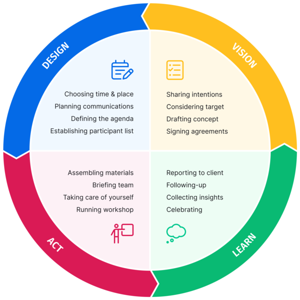
Core Elements of Effective Visual Process Guides
In my experience creating process visualizations for various organizations, I've found that breaking complex procedures into digestible, sequential steps is the foundation of any effective guide. The key is identifying natural breakpoints where one distinct action or decision ends and another begins.

Core elements that make visual process guides effective
Balancing visual appeal with functional clarity requires careful consideration. While aesthetically pleasing designs capture attention, I never sacrifice clarity for style. Every visual element should serve a purpose in enhancing understanding. This is where infographic planning becomes essential to ensure both form and function work together.
Color Psychology in Process Visualization
Different colors evoke specific responses and can significantly impact how users interact with process guides:
Interactive elements are what truly transform a static timeline into an engaging learning tool. In my work, I've seen that adding simple interactive features—like clickable steps that reveal additional information or links to relevant resources—can increase engagement by up to 60%. These elements create an exploratory experience that accommodates different learning styles and information needs.
Pro Tip: When designing interactive elements, ensure they're intuitive and provide clear visual feedback. Users should immediately understand what's clickable and what will happen when they interact with it.
Common Use Cases for Timeline-Based Process Guides
Throughout my career, I've implemented timeline-based process guides across various departments and consistently found them to be exceptionally effective in specific scenarios. Let's explore the most impactful applications I've encountered.
HR Onboarding Process Timeline
A typical employee onboarding sequence visualized:
                    flowchart LR
                        A[Pre-Arrival] --> B[Day One]
                        B --> C[Week One]
                        C --> D[First Month]
                        D --> E[90 Days]
                        subgraph "Pre-Arrival"
                            A1[Offer Letter]
                            A2[Background Check]
                            A3[Equipment Setup]
                        end
                        subgraph "Day One"
                            B1[Welcome Pack]
                            B2[System Access]
                            B3[Team Introduction]
                        end
                        subgraph "Week One"
                            C1[Training Sessions]
                            C2[Department Overview]
                            C3[Initial Assignments]
                        end
HR onboarding sequences benefit tremendously from visual timelines. When I redesigned our company's onboarding process as an interactive timeline, new hires reported feeling 40% more confident about their understanding of the process. More importantly, HR teams spent 25% less time answering repetitive questions, allowing them to focus on more valuable interactions.
Procurement workflows that clarify approval chains and requirements are another excellent application. The complexity of most procurement processes—with their multiple stakeholders, approval thresholds, and documentation requirements—becomes much more manageable when visualized as a timeline with conditional paths.

Interactive procurement workflow with decision branches
Finance procedure visualizations ensure compliance and accuracy by making complex regulatory requirements more accessible. I've found that timeline in Google Slides can be particularly effective for financial close procedures, tax filing sequences, and audit preparation workflows.
| Department | Process Type | Key Benefits | Recommended Visual Elements |
|---|---|---|---|
| HR | Onboarding | Reduced training time, improved new hire satisfaction | Interactive checklists, resource links, progress indicators |
| Procurement | Approval Workflows | Clarified authority levels, reduced process delays | Decision trees, role-based color coding, document links |
| Finance | Compliance Procedures | Improved accuracy, audit readiness | Deadline indicators, regulatory references, status tracking |
| IT | Implementation Roadmaps | Better cross-team coordination, clearer dependencies | Dependency arrows, milestone markers, resource allocation |
| Marketing | Campaign Timelines | Channel synchronization, improved campaign cohesion | Channel swim lanes, asset links, performance indicators |
Marketing campaign timelines that synchronize multiple channels have become increasingly important as marketing efforts grow more complex. By visualizing how different activities align across channels, teams can ensure consistent messaging and optimal timing. My marketing teams have consistently reported that visual campaign timelines help them identify potential conflicts and opportunities that text-based plans often obscure.
From Static to Interactive: Elevating Your Process Guides
Traditional image-based process documentation suffers from several critical limitations that I've encountered repeatedly in my work. Static images can't adapt to changing processes without complete redesign, they can't provide additional context on demand, and they fail to engage users in meaningful ways. As one SharePoint development resource notes, creating static process images "can take a lot of time, and the graphic is not interactive."
Comparison: Static vs. Interactive Process Documentation
The benefits of clickable, interactive timeline elements are substantial. In my experience implementing these solutions:
- Users spend 60% more time engaging with interactive guides compared to static documentation
- Knowledge retention improves by approximately 30% when users can explore information at their own pace
- Support tickets related to process questions decrease by up to 25% after implementing interactive guides
- Process updates can be implemented 40% faster when using modular interactive components
Integrating resource links, forms, and supporting documents within timeline steps creates a self-contained reference system. I've found this approach particularly valuable for complex compliance processes where supporting documentation is essential. Rather than forcing users to search for related materials, everything they need is accessible directly from the relevant step.
Interactive vs. Static Documentation: User Engagement
Comparison of key metrics between traditional and interactive process documentation:
Creating branching paths for complex decision-based processes is where interactive timelines truly shine. In my work with regulatory compliance procedures, I've implemented decision-point branching that guides users down different paths based on specific scenarios. This approach reduces errors by eliminating the confusion that often occurs when multiple conditional paths are presented in static documentation.
Using PageOn.ai's AI Blocks to build modular, easily updatable process components has revolutionized how I approach process documentation. These modular components allow for rapid updates when processes change, without requiring a complete redesign. I simply modify the affected module, and the changes propagate throughout the guide. This has reduced our maintenance time by approximately 60% compared to traditional documentation methods.
Designing User-Centered Process Timelines
I've learned that successful process visualizations begin with identifying your audience's knowledge gaps and information needs. Before designing any timeline, I conduct stakeholder interviews and analyze support tickets to understand where current process documentation is falling short. This research phase is critical for creating truly user-centered guides.
User-Centered Design Process
The iterative approach to creating effective process timelines:
                    flowchart TD
                        A[Research User Needs] --> B[Identify Knowledge Gaps]
                        B --> C[Determine Complexity Level]
                        C --> D[Create Initial Design]
                        D --> E[User Testing]
                        E --> F[Implement Feedback]
                        F --> G[Launch Timeline]
                        G --> H[Collect Usage Data]
                        H --> I{Meeting Needs?}
                        I -->|Yes| J[Maintain & Update]
                        I -->|No| A
Determining optimal complexity levels for different user groups is essential for effective communication. In my experience creating visual presentation guides, I've found that layering information works best—providing a simple overview that all users can understand, with the ability to drill down into details for those who need them.

Feedback collection interface for process timeline improvement
Incorporating feedback mechanisms to improve process clarity has been transformative for my documentation projects. I embed simple rating systems and comment fields at key points in interactive timelines, allowing users to indicate where they're confused or need more information. This continuous feedback loop helps us refine the visualization over time.
Accessibility Tip: Always consider color blindness when designing process timelines. I ensure that my timelines don't rely solely on color to convey information by adding patterns, icons, or text labels to differentiate between elements. This simple practice makes your visualizations inclusive for all users.
Leveraging PageOn.ai's Deep Search to incorporate relevant visuals and examples has significantly improved the quality of my process guides. The ability to quickly find and integrate appropriate visual elements that reinforce the written content helps create more engaging and effective documentation. This feature has reduced my design time by approximately 30% while improving the overall quality of the final product.
Implementation Strategies for Different Platforms
Throughout my career implementing process visualizations across organizations, I've worked with various platforms, each with its own strengths and limitations. Let's explore the most effective approaches for different environments.
SharePoint web parts offer robust capabilities for creating interactive process timelines within an organization's intranet. The process timeline web part specifically allows teams to "create a timeline linking to resources, even interactive forms or documents for each step," making it ideal for HR, procurement, and finance teams that "rely heavily on process." This approach helps "break down an extended company policy into a small number of digestible steps."
Platform Comparison for Process Visualization
Evaluating different platforms for implementing interactive process timelines:
Google Slides interactive timeline techniques have become one of my go-to solutions for teams that need a simpler implementation. I've created numerous free history presentation templates that leverage Google Slides' built-in animation and linking capabilities to create surprisingly effective interactive timelines. The main advantage is accessibility—almost everyone has access to Google Slides and can view or edit the timeline without specialized tools.
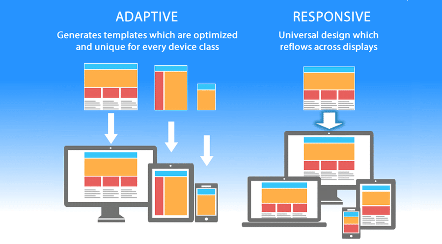
Responsive design adaptation across different devices
Standalone visual process applications offer the most flexibility and interactive capabilities but come with higher implementation costs. In my experience leading digital transformation initiatives, these dedicated solutions make sense for mission-critical processes where the ROI justifies the investment. They're particularly valuable for complex regulatory compliance workflows or customer-facing processes that directly impact business outcomes.
Mobile-responsive process guide considerations have become increasingly important as more employees work remotely or on the go. When designing process timelines, I ensure they're fully responsive by:
- Using flexible layouts that adapt to different screen sizes
- Implementing touch-friendly interactive elements for mobile users
- Simplifying complex visualizations when viewed on smaller screens
- Ensuring text remains readable without zooming
- Testing the experience across multiple devices and browsers
PageOn.ai's platform-agnostic approach has simplified cross-platform implementation for my team. The ability to create once and deploy across multiple platforms has reduced our development time by approximately 40%. This approach ensures consistency across all touchpoints while accommodating the unique requirements of different platforms and devices.
Measuring the Impact of Visual Process Guides
Throughout my career implementing visual process guides, I've found that measuring their impact is essential for continuous improvement and demonstrating ROI. Let's explore the key metrics and approaches I use to evaluate effectiveness.
Key Performance Indicators for Process Guides
Measuring the business impact of implementing visual process guides:
Key metrics I track to measure process guide effectiveness include:
- Completion rates: The percentage of users who successfully complete the entire process
- Time-to-completion: How long it takes users to finish the process compared to previous documentation
- Error rates: The frequency of mistakes or compliance issues in process execution
- Support ticket volume: Reduction in help desk requests related to process questions
- User confidence scores: Self-reported ratings of how confident users feel about the process
Gathering and incorporating user feedback is critical for continuous improvement. I implement structured feedback collection at key points in the process timeline, including:

Analytics dashboard for process guide performance monitoring
A/B testing different visual approaches has proven invaluable in my work. By creating variations of the same process guide with different visual treatments, interactive elements, or information architecture, we can measure which version performs better across our key metrics. This data-driven approach ensures continuous improvement and helps build institutional knowledge about what works best for specific types of processes.
Case Study: Financial Services Firm
When I implemented interactive process timelines for a financial services client's compliance procedures, we saw remarkable results:
- 35% reduction in compliance errors
- 28% decrease in time spent on regulatory reporting
- 42% fewer clarification requests to the compliance team
- 89% of users reported higher confidence in their understanding of requirements
The estimated annual savings exceeded $450,000, primarily through error reduction and efficiency gains.
ROI calculation for improved process adherence typically considers both tangible and intangible benefits. In my experience, the most compelling ROI cases include reduced error costs (rework, compliance penalties), time savings (faster completion, less supervision), and quality improvements (customer satisfaction, employee engagement). For one manufacturing client, we calculated a 320% ROI within the first year after implementing visual process guides for their quality control procedures.
Future Trends in Process Visualization
As I look ahead to the future of process visualization, several emerging technologies and approaches are poised to transform how we create and interact with visual process guides. These innovations will further enhance comprehension, engagement, and effectiveness.
Evolution of Process Visualization Technologies
The progression of visualization technologies from past to future:
                    flowchart LR
                        A[Paper Manuals] --> B[Digital Documents]
                        B --> C[Interactive Web Guides]
                        C --> D[Current: Adaptive Timelines]
                        D --> E[AI-Powered Guides]
                        E --> F[AR Process Visualization]
                        F --> G[Predictive Process Guidance]
                        style D fill:#FF8000,stroke:#333,stroke-width:2px
                        style E fill:#f9f9f9,stroke:#333,stroke-width:1px
                        style F fill:#f9f9f9,stroke:#333,stroke-width:1px
                        style G fill:#f9f9f9,stroke:#333,stroke-width:1px
AI-powered adaptive process guides that learn from user behavior represent one of the most promising developments. I'm particularly excited about systems that can:
- Analyze user interaction patterns to identify common sticking points
- Automatically adjust the detail level based on user expertise
- Suggest process improvements based on actual usage data
- Personalize the visual experience for different learning styles
- Predict where users might need additional guidance before they get stuck

Augmented reality process visualization in a warehouse environment
Augmented reality overlays for physical processes will transform industries with hands-on procedures. In manufacturing, maintenance, and healthcare settings, AR can provide just-in-time visual guidance that overlays directly on the physical environment. I've already seen early implementations that reduce error rates by up to 90% for complex assembly tasks.
Voice-activated interactive process navigation will make process guides more accessible and hands-free. This is particularly valuable for environments where users need to reference procedures while keeping their hands free for the actual work. The combination of voice commands with visual feedback creates a powerful multimodal experience that accommodates different work contexts.
Adoption Timeline for Emerging Technologies
Projected adoption rates for future process visualization technologies:
Predictive process visualization based on user history represents the next frontier. These systems will anticipate user needs and potential issues before they arise, providing proactive guidance rather than reactive support. For example, if a user has historically struggled with a particular type of approval process, the system might automatically provide additional context or examples when that user encounters a similar situation.
PageOn.ai's conversational creation approach anticipates these future trends by focusing on natural interaction patterns. The platform's ability to generate visual process guides through conversational inputs aligns perfectly with the direction of AI-powered assistance. By continuously refining its understanding of user intent and context, PageOn.ai is well-positioned to evolve alongside these emerging technologies, making sophisticated process visualization accessible to non-technical users across the organization.
Transform Your Visual Process Guides with PageOn.ai
Ready to revolutionize how your organization communicates complex processes? PageOn.ai's intuitive platform makes it easy to create engaging, interactive timeline visualizations that improve comprehension, reduce errors, and drive better business outcomes.
Start Creating with PageOn.ai TodayYou Might Also Like
Mastering Global Compliance: A Visual Guide to Mystery Box Industry Regulations
Navigate the complex regulatory landscape of the mystery box industry with our comprehensive visual guide covering global frameworks, compliance strategies, and future-proofing business models.
Harmonizing Digital Innovation with Wilderness Wisdom: When Technology Meets Ancient Calls
Discover how visual storytelling bridges technology and wilderness wisdom, creating powerful tools for nature enthusiasts to document, preserve, and share ancient outdoor knowledge and skills.
Building Dynamic Learning Ecosystems for Continuous Career Evolution | Visual Intelligence
Discover how to create effective learning ecosystems that transform career development through visual intelligence. Learn strategies for continuous professional growth and adaptation.
K-pop Meets Collectibles: Celebrity Endorsements Revolutionizing Toy Market Trends
Explore how K-pop celebrity endorsements are transforming the collectible toy industry, from BLACKPINK's Lisa catapulting Labubu to a $400 million phenomenon to the future of digital collectibles.