Strategic Infographic Planning: Transforming Complex Ideas into Visual Narratives That Connect
Discover how to craft compelling visual stories that engage audiences and communicate complex information with clarity and impact
In a world overflowing with information, the ability to transform complex ideas into clear, engaging visual narratives has become an essential skill. I'll guide you through the strategic planning process that turns information overload into powerful visual stories that resonate with your audience and drive meaningful action.
The Evolution of Visual Storytelling Through Infographics
I've witnessed a remarkable shift in how we communicate complex information over the past decade. The traditional approach of text-heavy reports and documents has given way to strategic visual narratives that engage audiences in more meaningful ways. This evolution isn't just about aesthetics—it's about effectiveness.
Infographics have emerged as powerful bridges between complex information and audience engagement. They transform data-heavy content into digestible visual stories that capture attention in our increasingly crowded digital landscape. As attention spans shrink and information volume grows, create stunning infographics that cut through the noise and deliver your message with clarity and impact.
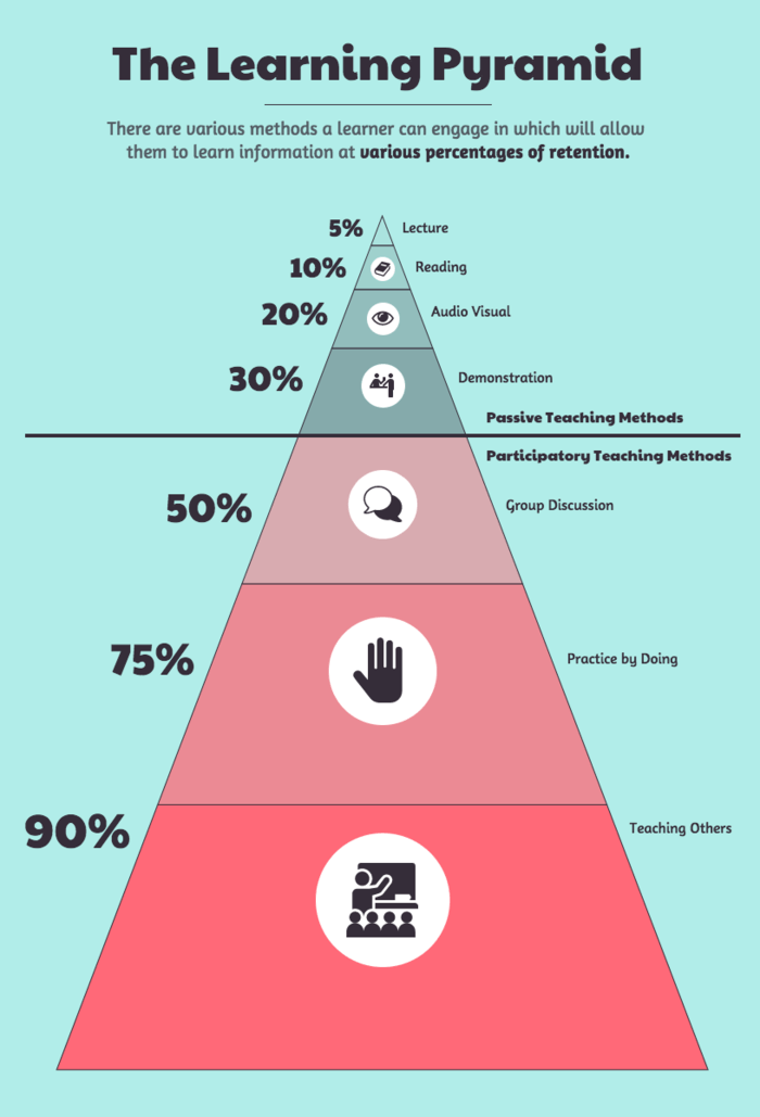
Information Retention Rates by Medium
The psychology behind visual storytelling is compelling—viewers retain 65% more information when it's presented visually compared to text alone:
In today's landscape, brands are strategically using infographics to cut through information overload. They're not just presenting data—they're telling stories that connect emotionally with audiences while delivering clear insights. The most successful organizations recognize that visual content strategy mapping is essential for communicating effectively in a visually-oriented world.
Core Elements of Strategic Visual Storytelling
When I create effective infographics, I focus on establishing clear narrative structures that guide viewers through information logically and intuitively. The best visual stories have a defined beginning, middle, and end that leads the audience through a journey of understanding.

Creating visual hierarchies is essential for prioritizing key messages without overwhelming your audience. I carefully consider how to use size, color, contrast, and positioning to direct attention to the most important elements first, then guide viewers through secondary and tertiary information.
The Balance of Elements in Effective Infographics
Finding the right balance between data visualization and narrative elements is critical for maximum impact:
flowchart TD
    A[Strategic Infographic] --> B[Data Visualization]
    A --> C[Narrative Elements]
    A --> D[Design Elements]
    B --> B1[Charts & Graphs]
    B --> B2[Data Points]
    B --> B3[Comparisons]
    C --> C1[Story Arc]
    C --> C2[Context]
    C --> C3[Call to Action]
    D --> D1[Color Psychology]
    D --> D2[Typography]
    D --> D3[Visual Metaphors]
    style A fill:#FF8000,stroke:#EA580C,color:#fff
    style B fill:#FFEDD5,stroke:#FB923C
    style C fill:#FFEDD5,stroke:#FB923C
    style D fill:#FFEDD5,stroke:#FB923C
Color psychology plays a crucial role in reinforcing core messages. I strategically select colors that evoke the right emotional responses and align with the content's purpose. For instance, blues convey trust and stability, while oranges communicate energy and enthusiasm.
The "less is more" principle is fundamental when integrating text within visuals. I've found that infographic data visualizations work best when text is concise and purposeful, allowing the visual elements to carry the primary narrative load. Every word should earn its place on the infographic.
Key Principle: Visual Metaphors
Visual metaphors create immediate understanding by connecting abstract concepts to familiar imagery. When I designed a cybersecurity infographic, representing data protection as a shield instantly communicated the protective function to viewers without requiring lengthy explanation.
The Pre-Creation Planning Process
I've learned that successful infographics begin with thorough audience analysis. Before creating a single visual element, I invest time in understanding who will be viewing the infographic and what their specific needs and preferences are. This analysis shapes every subsequent design decision.
Setting clear goals is equally important. I always define measurable outcomes for each infographic project: Is the primary purpose to educate? Persuade? Drive a specific action? These goals inform both content and design choices throughout the creation process.
Message Distillation Framework
I use this framework to identify and refine the most essential points for my infographics:
flowchart TD
    A[All Available Content] --> B{Essential to
Core Message?}
    B -->|Yes| C[Keep]
    B -->|No| D[Remove]
    C --> E{Supports
Visual Story?}
    E -->|Yes| F[Prioritize]
    E -->|No| G[Downgrade or
Remove]
    F --> H{Can be
Visualized?}
    H -->|Yes| I[Include in
Visual Form]
    H -->|No| J[Include as
Minimal Text]
    style A fill:#f5f5f5,stroke:#d1d5db
    style B fill:#FFEDD5,stroke:#FB923C
    style C fill:#f5f5f5,stroke:#d1d5db
    style D fill:#f5f5f5,stroke:#d1d5db
    style E fill:#FFEDD5,stroke:#FB923C
    style F fill:#f5f5f5,stroke:#d1d5db
    style G fill:#f5f5f5,stroke:#d1d5db
    style H fill:#FFEDD5,stroke:#FB923C
    style I fill:#FF8000,stroke:#EA580C,color:#fff
    style J fill:#FF8000,stroke:#EA580C,color:#fff
Content auditing is a critical step I never skip. I methodically review existing content to identify opportunities for visual transformation. This involves categorizing information, identifying relationships between concepts, and determining which elements would benefit most from visual representation.
Finally, I develop storyboards that map the viewer's journey through the information. This planning tool helps me visualize the flow before committing to design, ensuring a logical progression that builds understanding. Storytelling with data becomes much more effective when the narrative arc is carefully planned in advance.
Planning Tip: The 5-Second Test
During the planning phase, I apply the 5-second test to my storyboards. If someone looking at the rough layout can't grasp the main message within 5 seconds, I need to simplify and clarify further. This early testing saves significant revision time later in the process.
From Complexity to Clarity: Visual Structure Frameworks
I've found that the narrative arc approach is one of the most versatile frameworks for infographic design. By structuring information with a clear beginning (introduction to the topic), middle (exploration of key concepts), and end (conclusion or call to action), I create a cohesive visual story that feels complete and satisfying.
Comparison frameworks are particularly effective when I need to highlight contrasts or transformations. Before/after visualizations, side-by-side comparisons, and matrices all help audiences quickly grasp differences and similarities between concepts, approaches, or time periods.
Visual Structure Framework Selection Guide
Choosing the right framework depends on your content type and communication goals:
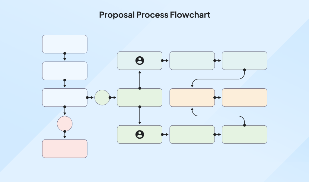
Process visualization frameworks transform multi-step procedures into clear visual flows. I use these when explaining sequences, workflows, or methodologies. By visually connecting steps and indicating direction, I help viewers understand not just individual components but how they relate to create a complete process.
Hierarchical frameworks organize information by importance visually. These are ideal for showing organizational structures, taxonomies, or priority rankings. The visual arrangement immediately communicates relative importance and relationships between elements.
Geographic and temporal frameworks map concepts across space and time, respectively. I use geographic frameworks for regional comparisons or location-based data, while temporal frameworks excel at showing evolution, trends, and historical context. PowerPoint data storytelling often benefits from these frameworks when presenting changes over time or geographic distributions.
Framework Selection Tip
I've found that hybrid frameworks often yield the best results. For instance, combining a process visualization with hierarchical elements allows me to show both sequence and relative importance simultaneously. Don't feel constrained to use only one framework type.
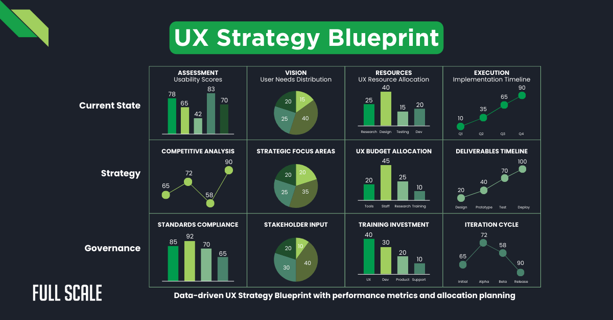
Data Visualization Strategies for Compelling Storytelling
Selecting the right chart type is fundamental to effective data storytelling. I match specific data stories to their ideal visual representations: bar charts for comparisons, line charts for trends over time, pie charts for proportions (used sparingly), and scatter plots for correlations. The right choice makes insights immediately apparent.
Chart Selection Decision Tree
Use this flowchart to determine the most effective visualization for your data:
flowchart TD
    A[What are you trying to show?] --> B{Comparison?}
    A --> C{Relationship?}
    A --> D{Distribution?}
    A --> E{Composition?}
    A --> F{Trend?}
    B --> B1{Between items
or categories?}
    B1 -->|Yes| B2[Bar Chart]
    B1 -->|No| B3{Over time?}
    B3 -->|Yes| B4[Line Chart]
    C --> C1{Between
variables?}
    C1 -->|Yes| C2[Scatter Plot]
    C1 -->|No| C3{Network?}
    C3 -->|Yes| C4[Network Diagram]
    D --> D1{Single
variable?}
    D1 -->|Yes| D2[Histogram]
    D1 -->|No| D3[Box Plot]
    E --> E1{Parts of
a whole?}
    E1 -->|Yes| E2{How many
segments?}
    E2 -->|Few| E3[Pie Chart]
    E2 -->|Many| E4[Treemap]
    F --> F1{Over time?}
    F1 -->|Yes| F2[Line Chart]
    F1 -->|No| F3[Sparklines]
    style A fill:#FF8000,stroke:#EA580C,color:#fff
    style B fill:#FFEDD5,stroke:#FB923C
    style C fill:#FFEDD5,stroke:#FB923C
    style D fill:#FFEDD5,stroke:#FB923C
    style E fill:#FFEDD5,stroke:#FB923C
    style F fill:#FFEDD5,stroke:#FB923C
Highlighting key insights within data visualizations is essential for guiding interpretation. I use techniques like color emphasis, annotations, callouts, and size differentiation to draw attention to the most significant data points. This strategic highlighting ensures viewers don't miss crucial information.
I'm careful to avoid common data visualization pitfalls that confuse rather than clarify. These include 3D effects that distort perception, misleading scales that exaggerate differences, cluttered designs that overwhelm, and poor color choices that fail to distinguish between data points or create false hierarchies.
Annotation Impact on Comprehension
Strategic annotations significantly improve audience understanding:
Creating visual context is crucial for helping audiences understand the significance of numbers. I incorporate benchmarks, historical comparisons, and real-world analogies to give meaning to data. Without this context, even the most accurate visualization can fail to convey true significance and impact.
Design Elements That Enhance Information Clarity
Typography choices can make or break an infographic's effectiveness. I select fonts that support rather than compete with visual elements, maintaining a consistent hierarchy with no more than 2-3 font families per design. Sans-serif fonts typically work best for data-heavy infographics due to their clean readability.

Icon and symbol systems create visual shorthand for complex concepts. I develop consistent, intuitive icon sets that reduce cognitive load by representing ideas instantly recognizable to the target audience. These visual cues help viewers navigate information more efficiently.
Color Psychology in Information Design
Strategic color choices evoke specific emotions and associations:
Spatial relationships are powerful tools for showing connections between concepts. I use proximity, alignment, and grouping to visually communicate how elements relate to each other. These subtle design decisions guide viewers in making correct associations and understanding information hierarchy.
Visual metaphors make abstract concepts immediately graspable. When I need to explain complex or unfamiliar ideas, I connect them to familiar imagery that resonates with the audience's existing knowledge. This creates an "aha" moment of understanding that text alone rarely achieves.
Color systems that code information and guide the viewer's journey are essential to my design approach. I develop consistent color schemes where each hue serves a specific purpose: highlighting key insights, distinguishing categories, indicating relationships, or signaling actions. This systematic use of color creates visual coherence and enhances comprehension.
Design Principle: Consistency Creates Clarity
I maintain strict visual consistency throughout my infographics. When similar elements (like data points, categories, or concepts) appear multiple times, I ensure they're represented with consistent visual treatment. This dramatically reduces cognitive load, allowing viewers to focus on content rather than deciphering changing visual codes.
From Static to Interactive: Expanding Your Visual Storytelling
I carefully consider when to incorporate interactive elements into my infographic strategy. Interactive features are most valuable when dealing with multi-layered data, complex relationships, or when audience exploration enhances understanding. Not every infographic benefits from interactivity—sometimes a well-designed static visual is more effective.
Creating layered information that rewards deeper exploration is a powerful approach for complex topics. I structure interactive infographics with an accessible surface layer that communicates essential messages, while allowing interested viewers to drill down into supporting details, methodology, or additional context.
Interactive vs. Static Engagement Metrics
Comparison of user engagement across different content types:
Animation techniques that reveal information progressively can significantly enhance comprehension. I use motion to show sequence, cause-and-effect relationships, or transformation. Thoughtfully paced animations guide viewers through complex information in digestible steps, preventing cognitive overload.
Designing for different platforms while maintaining visual coherence is increasingly important in our multi-device world. I create modular infographics with responsive layouts that adapt gracefully to various screen sizes and interaction methods, from desktop to mobile.
Building modular infographics that can be repurposed across channels maximizes the value of visual content. I design with modularity in mind, creating components that can function both within the complete infographic and as standalone visuals for social media, presentations, or other contexts.
Interactive Design Tip
When designing interactive infographics, I follow the principle of "obvious interactivity." Elements that can be clicked, hovered, or manipulated should provide clear visual affordances—subtle animations, familiar UI patterns, or explicit instructions—to ensure users know how to engage with the content.
Measuring Success and Optimizing Visual Content
I track key metrics beyond basic views to evaluate infographic performance comprehensively. Depending on the goals, I measure time spent engaging with the content, scroll depth, interaction rates with specific elements, social sharing, lead generation, and conversion actions prompted by the visual content.
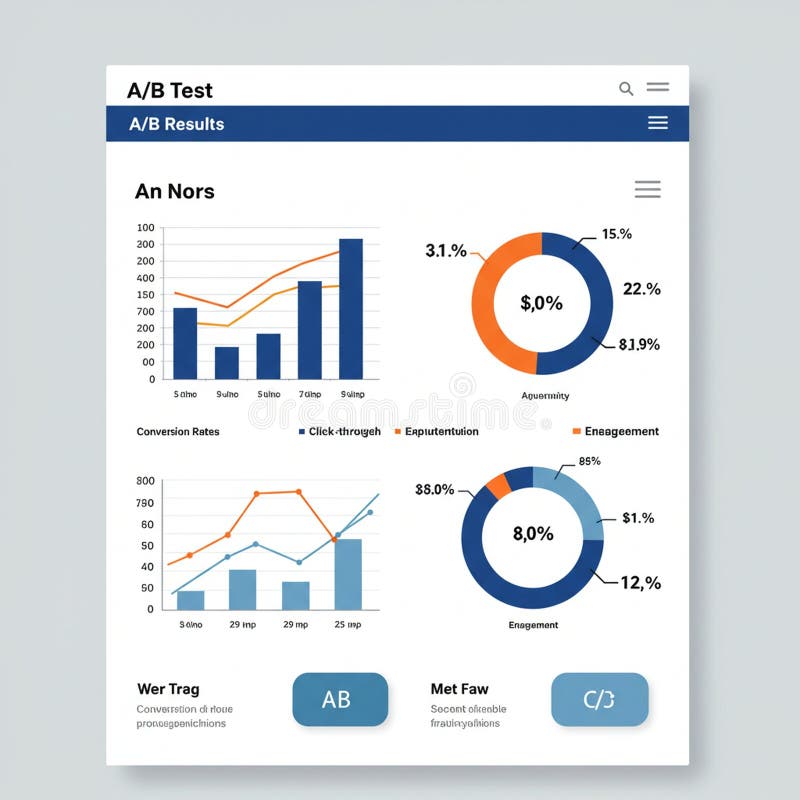
A/B testing approaches for visual storytelling elements yield valuable optimization insights. I test variations in layout, color schemes, data visualization types, narrative structures, and calls-to-action to identify which versions most effectively achieve communication goals with the target audience.
Infographic Optimization Framework
A systematic approach to continuous improvement:
flowchart LR
    A[Create Initial
Infographic] --> B[Define Key
Performance Metrics]
    B --> C[Gather
User Data]
    C --> D[Analyze
Performance]
    D --> E{Meeting
Goals?}
    E -->|Yes| F[Scale and
Repurpose]
    E -->|No| G[Identify
Improvement Areas]
    G --> H[Design
Variations]
    H --> I[A/B Test]
    I --> C
    style A fill:#f5f5f5,stroke:#d1d5db
    style B fill:#f5f5f5,stroke:#d1d5db
    style C fill:#FFEDD5,stroke:#FB923C
    style D fill:#FFEDD5,stroke:#FB923C
    style E fill:#FFEDD5,stroke:#FB923C
    style F fill:#FF8000,stroke:#EA580C,color:#fff
    style G fill:#f5f5f5,stroke:#d1d5db
    style H fill:#f5f5f5,stroke:#d1d5db
    style I fill:#FFEDD5,stroke:#FB923C
Gathering qualitative feedback on comprehension and engagement provides context for quantitative metrics. I conduct user interviews, surveys, and usability testing to understand how audiences interpret and interact with infographics, revealing insights that numbers alone can't capture.
Iterative improvement processes for visual content strategy ensure continuous evolution. I establish regular review cycles where performance data and audience feedback inform refinements to both specific infographics and overall visual communication approaches.
Building a visual content library that supports long-term storytelling goals creates cumulative impact. I develop systems for organizing, tagging, and repurposing visual assets, creating a growing collection of components that can be adapted for future needs while maintaining brand and narrative consistency.
Case Studies: Strategic Infographics That Transformed Communication
I've seen remarkable results when healthcare organizations simplified complex medical information through visual storytelling. One medical center transformed their patient education materials into clear infographic sequences explaining treatment protocols. This visual approach reduced patient anxiety, increased treatment adherence by 28%, and decreased follow-up calls with questions by 41%.
A tech company case study demonstrated how visualizing product benefits increased conversion by 37%. By replacing feature-focused text descriptions with a visual story that showed the product solving real user problems, the company dramatically improved both comprehension and emotional connection with potential customers.
Case Study Impact Comparison
Results before and after implementing strategic infographics:
A non-profit example showed how using infographics drove 45% higher donation rates. By visually illustrating both the problem they addressed and the impact of donations, they created an emotional connection that motivated action. The visual format also proved highly shareable, expanding their reach organically.
A government agency success story demonstrated improving public program participation through visual clarity. Complex eligibility requirements and application processes were transformed into step-by-step visual guides, resulting in a 44% increase in successful applications and a 38% reduction in submission errors.
A corporate strategy visualization aligned teams across five departments by creating a unified visual understanding of goals and interdependencies. This shared visual reference point improved cross-functional collaboration, reduced misalignment issues by 62%, and accelerated implementation timelines by nearly a month.
Implementing Your Visual Storytelling Strategy
Building the right team is essential for effective infographic creation. I've found that the most successful visual storytelling initiatives combine skills from different disciplines: data analysis to identify key insights, editorial expertise to craft the narrative, design talent to create visual solutions, and subject matter experts to ensure accuracy and relevance.

Technology and tools that support strategic visual content development have evolved significantly. I leverage specialized platforms for different aspects of the process: data analysis tools to identify patterns, visualization software to create compelling charts and diagrams, design applications for layout and aesthetics, and collaboration tools to facilitate team input throughout the creation process.
Visual Content Production Workflow
A streamlined process for sustainable infographic creation:
flowchart TD
    A[Strategy & Planning] --> B[Content Research]
    B --> C[Data Analysis]
    C --> D[Story Development]
    D --> E[Visual Design]
    E --> F[Review & Feedback]
    F --> G{Approved?}
    G -->|No| E
    G -->|Yes| H[Publication]
    H --> I[Distribution]
    I --> J[Performance Analysis]
    J --> K[Optimization]
    K --> A
    style A fill:#FFEDD5,stroke:#FB923C
    style B fill:#f5f5f5,stroke:#d1d5db
    style C fill:#f5f5f5,stroke:#d1d5db
    style D fill:#FFEDD5,stroke:#FB923C
    style E fill:#FFEDD5,stroke:#FB923C
    style F fill:#f5f5f5,stroke:#d1d5db
    style G fill:#f5f5f5,stroke:#d1d5db
    style H fill:#f5f5f5,stroke:#d1d5db
    style I fill:#f5f5f5,stroke:#d1d5db
    style J fill:#FFEDD5,stroke:#FB923C
    style K fill:#FFEDD5,stroke:#FB923C
Workflow optimization for sustainable visual content production is critical for organizations committed to ongoing visual storytelling. I establish clear processes, templates, and guidelines that maintain quality while reducing production time. This systematic approach transforms infographic creation from a series of one-off projects to a scalable content program.
Integration with broader content marketing initiatives ensures visual storytelling supports overall communication goals. I align infographic topics and distribution with content calendars, campaign themes, and audience journeys, creating cohesive experiences across touchpoints rather than isolated visual pieces.
Future-proofing your visual storytelling approach as technologies evolve requires both flexibility and core principles. I focus on building foundational visual communication skills and strategies that transcend specific tools, while staying adaptable to emerging formats like augmented reality, interactive 3D, and other immersive visual experiences.
Implementation Insight
The most successful visual storytelling implementations I've seen start small but think big. Begin with a focused pilot project to demonstrate value, refine your process, and build internal capabilities. Use these early wins to secure buy-in for more ambitious visual communication initiatives, gradually expanding your approach across the organization.
Transform Your Visual Expressions with PageOn.ai
Ready to create strategic infographics that turn complex ideas into compelling visual stories? PageOn.ai provides the intuitive tools and frameworks you need to plan, design, and optimize visual content that connects with your audience and drives results.
Start Creating with PageOn.ai TodayFinal Thoughts: The Future of Strategic Visual Storytelling
As we look ahead, I see strategic visual storytelling becoming even more central to effective communication. The organizations that master the art and science of transforming complex ideas into clear, compelling visual narratives will have a significant advantage in capturing attention, building understanding, and inspiring action.
The principles we've explored in this guide—from audience-centered planning and clear visual frameworks to thoughtful data visualization and measured optimization—provide a foundation for creating infographics that truly connect. But the most powerful visual stories emerge when these principles are applied with creativity, purpose, and a deep understanding of both your content and your audience.
I encourage you to begin implementing these strategies in your next visual storytelling project. Start with thorough planning, focus on clarity over complexity, and continually refine your approach based on audience feedback and performance data. With practice and persistence, you'll develop the ability to transform even the most complex information into visual narratives that inform, engage, and inspire.
Remember that effective visual storytelling is both an art and a science—it requires creativity and intuition balanced with strategic thinking and analytical rigor. By bringing these elements together, you can create infographics that don't just present information, but tell stories that truly matter to your audience.
You Might Also Like
How AI Amplifies Marketing Team Capabilities While Preserving Human Jobs | Strategic Marketing Enhancement
Discover how AI transforms marketing teams into powerhouses without reducing workforce size. Learn proven strategies for capability multiplication and strategic enhancement.
Prompt Chaining Techniques That Scale Your Business Intelligence | Advanced AI Strategies
Master prompt chaining techniques to transform complex business intelligence workflows into scalable, automated insights. Learn strategic AI methodologies for data analysis.
Creating Visual AI Ethics Frameworks: A Leadership Guide for Modern Business | PageOn.ai
Discover how to develop comprehensive visual AI ethics frameworks for your organization. This guide helps business leaders translate complex ethical principles into clear visual guidelines.
Transform Your AI Results by Mastering the Art of Thinking in Prompts | Strategic AI Communication
Master the strategic mindset that transforms AI interactions from fuzzy requests to crystal-clear outputs. Learn professional prompt engineering techniques that save 20+ hours weekly.