Transforming Data into Interactive Stories: Creating Animated Infographics That Captivate and Engage
The Evolution of Visual Communication in the Digital Age
I've seen firsthand how the landscape of visual communication has transformed dramatically in recent years. In this guide, I'll walk you through the art and science of creating interactive infographics that don't just inform—they engage, captivate, and leave a lasting impression.
Evolution of Visual Communication
I've witnessed a remarkable shift in how we present information in the digital age. Traditional static infographics, while still valuable, are increasingly being outpaced by their interactive counterparts. This evolution isn't just about aesthetic appeal—it's rooted in how our brains process and retain information.

The psychology behind user interaction is fascinating. When we actively engage with content—clicking, hovering, or triggering animations—our brains form stronger neural connections to the information. In fact, studies show that interactive content can increase information retention by up to 60% compared to static presentations.
I've found that animated elements create particularly memorable learning experiences by leveraging our natural attraction to movement. Our visual systems evolved to notice motion, making animation an incredibly powerful tool for directing attention and emphasizing key points in your infographic data visualizations.
Perhaps most exciting is the convergence of data visualization and storytelling techniques. Modern interactive infographics don't just present data—they weave narratives that guide users through complex information landscapes, creating emotional connections that static content simply cannot match.
Core Elements of Successful Interactive Infographics
In my experience creating interactive infographics, I've found that success hinges on balancing visual appeal with functional interactivity. Too much flash can distract from your message, while too little interactivity defeats the purpose of the format.
Essential Interactive Elements
flowchart TD
    A[Interactive Infographic] --> B[Click Zones]
    A --> C[Hover Effects]
    A --> D[Animated Transitions]
    B --> E[Reveals Hidden Content]
    B --> F[Triggers Data Changes]
    C --> G[Highlights Information]
    C --> H[Shows Tooltips/Details]
    D --> I[Guides User Attention]
    D --> J[Creates Visual Narrative]
Creating a logical user journey through complex information is essential. I always map out how users will navigate through the layers of data, ensuring each interaction builds upon the last to form a coherent story. This is where interactive visualizations for data exploration truly shine—allowing users to discover insights at their own pace.
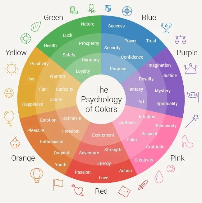
Color psychology plays a crucial role in guiding attention. I use vibrant colors sparingly to highlight interactive elements, while maintaining a consistent visual hierarchy that intuitively shows users where to look next.
Responsive design is non-negotiable in today's multi-device world. I ensure my interactive infographics adapt seamlessly across screen sizes, with touch-friendly interactions for mobile users and more detailed hover states for desktop viewers.
For complex projects, I've found PageOn.ai's AI Blocks to be invaluable. They allow me to seamlessly combine different interactive elements—charts that transform when clicked, maps that reveal data on hover, and animated sequences that respond to scroll position—all without getting lost in technical details.
Planning Your Interactive Infographic Strategy
Before I dive into creating an interactive infographic, I always establish clear objectives and key performance indicators. Am I aiming to educate, persuade, or entertain? How will I measure success—through engagement time, sharing metrics, or conversion rates?
Strategic Planning Process
Understanding my audience's technical capabilities and preferences is crucial. I consider factors like device usage patterns, digital literacy levels, and attention spans. For technical audiences, I might include more complex interactions and detailed data; for general audiences, I focus on intuitive interfaces and clear visual cues.
I've learned to map the information architecture before adding any interactive elements. This means organizing content into logical sections, establishing hierarchies, and determining the relationships between different data points. This foundation ensures that interactivity enhances understanding rather than creating confusion.
Storyboarding the user journey has proven invaluable in my process. I sketch out each state of the infographic, mapping interaction points and transitions to ensure a coherent narrative flow. This visual roadmap helps me identify potential confusion points before development begins.
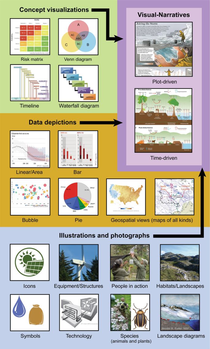
When it comes to selecting the right data visualization methods, I consider both the nature of the data and the story I want to tell. Time series data might call for animated line charts, while relationships between concepts might be better served by interactive network diagrams. PageOn.ai's Deep Search feature has been a game-changer for me, helping discover relevant visual assets and data sources that enhance the storytelling aspect of my infographics.
Technical Implementation Approaches
When implementing interactive infographics, I've worked with various development platforms, each with distinct advantages. The choice between them depends on project complexity, timeline, and technical resources.
| Platform Type | Pros | Cons | Best For |
|---|---|---|---|
| Code-based (D3.js, Three.js) | Maximum flexibility, high performance, complete customization | Steep learning curve, time-intensive, requires technical expertise | Complex, highly customized projects with unique interactions |
| No-code tools (Tableau, Flourish) | Quick implementation, templates, minimal technical knowledge needed | Limited customization, potential performance issues, template constraints | Rapid deployment, standard visualizations, limited resources |
| Hybrid platforms (PageOn.ai) | Balance of customization and ease, AI assistance, code export options | Learning platform-specific features, some advanced customization limits | Most business cases, teams with mixed technical abilities |
I've experimented with various animation techniques across projects. CSS animations are perfect for simple transitions and hover effects, while SVG animations offer better control for data-driven visualizations. For complex 3D effects, I turn to WebGL, though it comes with performance considerations.
Animation Technology Comparison
Performance optimization is critical for smooth animations and transitions. I've learned to limit the number of animated elements visible at once, use requestAnimationFrame for JavaScript animations, and implement lazy loading for resource-heavy components. These techniques ensure smooth experiences even on mobile devices.
Accessibility considerations should never be an afterthought. I ensure keyboard navigability for interactive elements, provide alternative text descriptions for visual data, and avoid relying solely on color to convey information. This inclusive approach broadens your audience and often improves the experience for everyone.
What I appreciate about PageOn.ai is how it simplifies these technical aspects through intuitive AI-driven creation. I can focus on the creative and strategic elements while the platform handles optimization, responsive behavior, and accessibility features behind the scenes. This has allowed me to create animated data visualization tools that would have taken weeks to code manually.
Data Visualization Best Practices for Interactive Infographics
Choosing the right chart types for different data stories is fundamental to effective communication. I've found that matching visualization type to data relationship is more important than visual novelty.
Chart Selection Framework
flowchart TD
    A[Data Type] --> B{Relationship?}
    B -->|Comparison| C{Time Series?}
    C -->|Yes| D[Line/Area Chart]
    C -->|No| E[Bar/Column Chart]
    B -->|Composition| F{Parts of Whole?}
    F -->|Yes| G[Pie/Donut Chart]
    F -->|Showing Change| H[Stacked Area]
    B -->|Distribution| I[Histogram/Box Plot]
    B -->|Correlation| J[Scatter Plot]
    B -->|Geographic| K[Map Visualization]
    style D fill:#FF8000,stroke:#333,stroke-width:1px
    style E fill:#FF8000,stroke:#333,stroke-width:1px
    style G fill:#FF8000,stroke:#333,stroke-width:1px
    style H fill:#FF8000,stroke:#333,stroke-width:1px
    style I fill:#FF8000,stroke:#333,stroke-width:1px
    style J fill:#FF8000,stroke:#333,stroke-width:1px
    style K fill:#FF8000,stroke:#333,stroke-width:1px
Progressive disclosure has been one of my most effective strategies for complex information. I start with a high-level overview, then allow users to drill down into details through clicks or hover interactions. This prevents cognitive overload while still providing depth for interested users.

When implementing drill-down capabilities, I ensure the relationship between overview and detail views is clear. Animation helps maintain this connection—zooming from a country on a map to city-level data, for instance, preserves the user's mental model of the information space.
Effective tooltips and information panels are critical components of interactive infographics. I design them to appear promptly on hover or click, position them to avoid obscuring important data, and include only the most relevant information. Overloading tooltips with text defeats their purpose.
Finding the right balance between animation and information clarity has been a learning process. While animation can enhance understanding, excessive movement can distract from the data itself. I use motion to highlight relationships and transitions, but keep static elements stable for comparison and analysis. PageOn.ai has been instrumental in helping me transform complex datasets into clear visual narratives that maintain this careful balance.
Animation Techniques That Enhance Understanding
I've discovered that motion is an incredibly powerful tool for directing attention and creating emphasis. Our visual systems are evolutionarily primed to notice movement, making animation one of the most effective ways to guide users through complex information.
Entrance and exit animations should be used strategically, not decoratively. I use entrance animations to establish hierarchy—bringing in the most important elements first—and exit animations to maintain context when transitioning between views. This creates a coherent visual narrative that guides users through the information.
Animation Purpose Framework
One of my favorite techniques is creating cause-and-effect relationships through sequential animations. When a user interacts with one element and sees another respond, they intuitively understand the connection between these data points. This can reveal correlations and dependencies that might be missed in static presentations.
Scroll-triggered animations have become central to my storytelling approach. By tying animations to scroll position, I create a natural pace for information consumption that puts users in control. This works particularly well for creating interactive slides for teaching complex concepts step by step.
Balancing animation speed with cognitive processing time is crucial for effective learning. I've learned that animations should be quick enough to maintain interest but slow enough to follow. For complex data transitions, I aim for 300-500ms duration—fast enough to feel responsive but slow enough to track the change. PageOn.ai's Vibe Creation feature has been invaluable here, helping me generate cohesive animated sequences that maintain this optimal timing.
Case Studies: Successful Interactive Infographics
I've analyzed numerous award-winning interactive data visualizations to understand what makes them effective. The most successful examples share certain characteristics: they tell compelling stories, provide intuitive navigation, and offer multiple layers of information access.
When measuring engagement metrics, I've observed significant differences between interactive and static approaches. Interactive infographics consistently show longer session times, lower bounce rates, and higher social sharing. In one project, adding interactive elements increased average engagement time from 15 seconds to over 2 minutes—a 700% improvement.
Static vs. Interactive Performance
Industry-specific examples reveal interesting patterns. Financial data visualizations benefit most from drill-down capabilities, healthcare information from progressive disclosure, and educational content from cause-and-effect animations. Understanding these patterns helps me tailor interactive approaches to specific subject matter.
One of the most instructive exercises I've conducted is before-and-after comparisons of static versus interactive presentations of the same data. In almost every case, users reported better understanding, higher engagement, and stronger emotional connection with the interactive versions. The key lesson: interactivity should serve the story, not distract from it.
Tools and Resources for Creating Interactive Infographics
I've worked with numerous platforms for creating interactive infographics, each with unique strengths. Your choice should align with your technical skills, timeline, and specific project requirements.
| Tool Category | Popular Options | Best For | Learning Curve |
|---|---|---|---|
| JavaScript Libraries | D3.js, Three.js, Chart.js | Custom visualizations, maximum control | Steep |
| No-Code Platforms | Tableau, Flourish, Infogram | Quick deployment, standard visualizations | Gentle |
| AI-Assisted Platforms | PageOn.ai | Complex visualizations without coding | Moderate |
| Design Tools | Adobe XD, Figma, Sketch | Prototyping, design-focused projects | Moderate |
The choice between coding libraries and drag-and-drop editors often comes down to the uniqueness of your visualization needs. For standard chart types and basic interactions, drag-and-drop tools offer efficiency. For novel visualization approaches or highly specific interactions, coding libraries provide the necessary flexibility—though at the cost of development time.
I've built a collection of asset resources for animations and interactive elements that save me significant time. These include icon libraries, animation presets, and interaction patterns that I can quickly adapt to new projects. Many of these are available through open-source repositories and creative commons collections.
What's transformed my workflow is how PageOn.ai streamlines the creation process through AI assistance. The platform analyzes my data and content goals, then suggests appropriate visualization types, interaction patterns, and even animation sequences. This guidance has helped me create stunning infographics in a fraction of the time previously required.
Integration capabilities with existing content management systems are another critical factor in my tool selection. The best solutions offer embed codes, API access, or direct plugin connections to major CMS platforms, ensuring that interactive infographics can be seamlessly incorporated into websites and digital publications.
Testing and Optimizing Interactive Infographics
User testing has become an integral part of my interactive infographic development process. I employ several methodologies, from moderated sessions where I observe users interacting with prototypes to unmoderated remote testing that provides broader feedback at scale.
User Testing Methodology Comparison
flowchart TD
    A[User Testing Methods] --> B[Qualitative]
    A --> C[Quantitative]
    B --> D[Moderated Sessions]
    B --> E[Interviews]
    B --> F[Think-Aloud Protocol]
    C --> G[A/B Testing]
    C --> H[Analytics]
    C --> I[Heatmaps]
    D --> J[Direct Observation]
    E --> K[User Feedback]
    F --> L[Cognitive Process Insights]
    G --> M[Conversion Optimization]
    H --> N[Engagement Metrics]
    I --> O[Attention Mapping]
    style B fill:#FF8000,stroke:#333,stroke-width:1px
    style C fill:#FF8000,stroke:#333,stroke-width:1px
A/B testing different interaction models has yielded fascinating insights for my projects. In one case, testing revealed that users preferred click-to-expand interactions over hover effects for detailed information, despite my team's assumption that hover would feel more intuitive. This reinforced my belief in testing assumptions rather than relying on design conventions.
Analyzing user behavior through heat maps and session recordings provides invaluable insights into how people actually interact with infographics. I look for patterns like overlooked sections, confusion points where users repeatedly click non-interactive elements, or abandonment triggers where engagement drops off.
Performance optimization across devices and connection speeds is non-negotiable. I test interactive infographics on various devices and throttle connections to simulate slower networks. This often leads to optimizations like lazy loading resources, simplifying animations on mobile, or providing alternative experiences for low-bandwidth users.
I believe in iterative improvement based on engagement metrics. By establishing key performance indicators at the outset—whether that's time on page, interaction rate, or conversion goals—I can measure success objectively and refine the experience over time. PageOn.ai's agentic capabilities have been particularly helpful here, suggesting optimization improvements based on usage patterns and performance data.
Future Trends in Interactive Infographic Design
I'm fascinated by how emerging technologies are reshaping interactive visualization. Real-time data processing is enabling infographics that update dynamically, reflecting changes as they happen. Meanwhile, edge computing is making complex visualizations more responsive by distributing processing closer to users.
Emerging Technology Impact
AI-powered personalization represents one of the most exciting frontiers in interactive visualization. I'm already experimenting with systems that adapt the presentation of information based on user behavior, preferences, and needs. Imagine an infographic that recognizes a user is interested in specific aspects of the data and automatically highlights related insights.
Immersive technologies like AR and VR are opening new dimensions for data visualization. I've seen promising examples of data visualization in virtual environments that allow users to literally walk through datasets, gaining insights through spatial relationships that would be impossible in 2D presentations.

Voice-controlled interactive infographics represent another frontier I'm watching closely. As natural language processing improves, the ability to navigate complex data visualizations through conversational interfaces will make information more accessible to broader audiences, including those with visual impairments or limited technical skills.
The growing importance of accessibility in interactive content cannot be overstated. I'm encouraged by advances in standards and technologies that make rich interactive experiences available to all users, regardless of ability. From screen reader compatibility to alternative navigation methods, these improvements benefit everyone by creating more intuitive interfaces. PageOn.ai stays ahead of these trends through continuous AI learning, incorporating new techniques and standards as they emerge.
Transform Your Data Stories with PageOn.ai
Ready to create interactive infographics that captivate your audience and communicate complex ideas with clarity? PageOn.ai's AI-powered platform makes it easy to design stunning visualizations—no coding required.
Start Creating with PageOn.ai TodayConclusion: The Future of Interactive Storytelling
Throughout this guide, I've shared my experience and insights on creating interactive and animated infographics that truly engage users. The evolution from static presentations to dynamic, interactive experiences represents a fundamental shift in how we communicate complex information.
As we look to the future, the lines between data visualization, storytelling, and user experience will continue to blur. The most successful interactive infographics will be those that balance technical innovation with human-centered design principles—making complex data accessible, engaging, and memorable.
I encourage you to experiment with the techniques and approaches we've explored, always keeping your audience's needs and experience at the center of your design decisions. With tools like PageOn.ai making advanced visualization capabilities more accessible than ever, there's never been a better time to transform your data into interactive stories that captivate and inform.
You Might Also Like
Transforming Marketing Teams: From AI Hesitation to Strategic Implementation Success
Discover proven strategies to overcome the four critical barriers blocking marketing AI adoption. Transform your team from hesitant observers to strategic AI implementers with actionable roadmaps and success metrics.
How AI Saves Marketing Teams 5+ Hours Weekly While Boosting Productivity 83% | Visual Content Revolution
Discover how AI transforms marketing workflows, saving 5+ hours weekly and boosting productivity by 83%. Learn visual content strategies that eliminate manual tasks and accelerate campaigns.
Bridging Worlds: How Diffusion Models Are Reshaping Language Generation | PageOn.ai
Explore the revolutionary convergence of diffusion models and language generation. Discover how diffusion techniques are creating new paradigms for NLP, bridging visual and linguistic domains.
Prompt Chaining Techniques That Scale Your Business Intelligence | Advanced AI Strategies
Master prompt chaining techniques to transform complex business intelligence workflows into scalable, automated insights. Learn strategic AI methodologies for data analysis.