Creating Professional Org Charts: Customizing with Photos and Brand Colors
Transform basic hierarchies into powerful visual tools that strengthen your company culture
I've seen firsthand how organizational charts have evolved from simple boxes and lines into dynamic visual assets that communicate company structure while reinforcing brand identity. In this comprehensive guide, I'll share proven strategies for integrating employee photos and brand colors into your org charts to create professional, impactful visualizations that serve multiple organizational goals.
Understanding Modern Organizational Charts
I've observed that today's organizational charts serve a purpose far beyond simply mapping reporting relationships. Modern org charts have evolved into powerful communication tools that reflect company culture, facilitate employee connections, and reinforce brand identity.
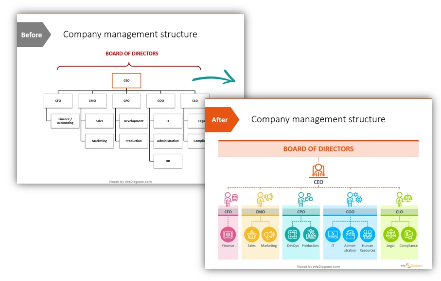
The evolution of organizational charts from basic hierarchies to modern, branded visual tools
When I first started working with organizational chart online tools, I quickly realized that the traditional approach of simple boxes and lines was missing a crucial opportunity to strengthen company culture. By incorporating employee photos and brand colors, organizations transform these functional diagrams into engaging visual assets that:
- Help new employees quickly identify team members and understand reporting structures
- Reinforce company culture and values through consistent visual branding
- Humanize the organizational structure by putting faces to names and titles
- Create a stronger sense of team cohesion, particularly for remote or distributed workforces
- Serve as both a functional tool and a brand asset
The psychological impact of seeing faces within an organizational structure shouldn't be underestimated. Research in workplace psychology suggests that visual familiarity with colleagues—even through photos—can significantly improve collaboration and communication. When I integrate employee photos into org charts, I'm not just adding visual interest; I'm facilitating human connection.
Common Challenges in Creating Visually Consistent Org Charts
- Maintaining consistent photo quality and style across the organization
- Accurately implementing brand colors in a balanced, visually appealing way
- Ensuring the chart remains functional and readable while incorporating visual elements
- Keeping information current as organizational structures evolve
- Creating mobile-responsive designs that work across various display contexts
Throughout this guide, I'll address these challenges and provide practical solutions for creating org charts that are both visually impressive and functionally effective. The goal is to help you develop organizational visualizations that serve as valuable communication tools while reinforcing your company's unique identity.
Essential Elements of Customized Professional Org Charts
In my experience creating effective organizational charts, I've found that certain structural and design elements are essential for maximum impact. Let's explore the key components that transform a basic hierarchy diagram into a professional, brand-aligned visual asset.
Structural Components
                    flowchart TD
                        subgraph "Essential Org Chart Components"
                        A["Clear Hierarchy Levels"] --> B["Consistent Node Design"]
                        B --> C["Strategic Use of Space"]
                        C --> D["Logical Grouping"]
                        D --> E["Visual Relationship Indicators"]
                        end
When designing org charts, I always ensure they include:
- Clear hierarchy indicators - Visual cues that immediately convey reporting relationships
- Consistent node design - Standardized shapes and sizes for each organizational level
- Appropriate information density - Enough detail without overwhelming the viewer
- Logical grouping - Visual clustering of related departments or functions
- Intuitive navigation - Easy-to-follow visual flow, especially for larger organizations
Photo Integration Standards

Consistent professional headshot standards ensure visual harmony in org charts
For photos to enhance rather than distract from your org chart, I recommend these best practices:
- Consistent sizing - All photos should be cropped to the same dimensions (typically square or slightly rectangular)
- Quality standards - Minimum resolution requirements (at least 300x300 pixels) to ensure clarity
- Style consistency - Similar backgrounds, lighting, and framing across all images
- Professional appearance - Business-appropriate attire and neutral expressions
- Regular updates - Processes for refreshing photos when needed
Brand Color Implementation
When implementing brand colors in org charts, I focus on:
- Primary brand colors - Used for main structural elements and highest-level positions
- Secondary colors - Applied to differentiate departments or divisions
- Accent colors - Highlight special roles or temporary assignments
- Contrast ratios - Ensuring text remains readable against colored backgrounds
- Consistent application - Using the same color to represent the same organizational meaning throughout
Typography Considerations
Typography plays a crucial role in org chart readability. I recommend:
- Brand-aligned fonts - Using your company's official typefaces when possible
- Size hierarchy - Larger text for higher-level positions, smaller for details
- Consistent formatting - Standardized approaches to name display, titles, and other text elements
- Readability focus - Sans-serif fonts typically work best for digital org charts
- Minimal text variation - Limiting to 2-3 font styles maximum
Balancing Visual Appeal and Functionality
The most effective org charts I've created strike a careful balance between aesthetic appeal and practical functionality. While visual elements like photos and brand colors enhance engagement, the primary purpose remains clear communication of organizational structure.
I've found that starting with a clean, functional structure and then thoughtfully integrating visual elements yields the best results. This approach ensures the chart remains an effective tool while also serving as a brand asset.
Photo Integration Strategies for Org Charts
Adding employee photos to organizational charts transforms them from abstract diagrams into personal, engaging visualizations. I've developed several strategies to effectively incorporate photos while maintaining professional standards.
Professional Headshot Guidelines
                    flowchart TD
                        A[Establish Photo Standards] --> B[Communicate Requirements]
                        B --> C[Schedule Photo Sessions]
                        C --> D[Process & Crop Images]
                        D --> E[Implement in Org Chart]
                        E --> F[Maintain & Update]
                        style A fill:#FF8000,color:#fff
                        style B fill:#FF9933,color:#fff
                        style C fill:#FFB366,color:#333
                        style D fill:#FFB366,color:#333
                        style E fill:#FF9933,color:#fff
                        style F fill:#FF8000,color:#fff
For consistent, professional results, I recommend establishing clear guidelines:
- Background consistency - Either neutral (white/light gray) or company-branded backgrounds
- Framing standards - Head and shoulders, centered, with consistent proportions
- Lighting requirements - Even, diffused lighting without harsh shadows
- Resolution specifications - Minimum 300x300 pixels, ideally higher for future flexibility
- File format and naming conventions - Standardized formats (JPG/PNG) and naming system
Addressing Photo Availability Challenges
In my work with distributed teams, I've encountered several common challenges with photo availability:
Challenge: Remote Workforce
Obtaining consistent photos from employees across different locations and time zones.
Solution: Provide clear smartphone photography guidelines with sample images, lighting tips, and a submission portal.
Challenge: Inconsistent Quality
Variations in photo quality, style, and professionalism.
Solution: Implement basic photo editing standards and offer touch-up services for consistency.
Challenge: Privacy Concerns
Employees uncomfortable with their photos being displayed.
Solution: Create appealing, professional alternatives like avatars or icons that maintain visual consistency.
Challenge: New Hires
Integrating new employees before professional photos are available.
Solution: Develop a standardized placeholder that can be quickly updated when proper photos are ready.
Creative Alternatives to Traditional Photos
Brand-aligned avatar alternatives can maintain visual consistency while addressing photo availability issues
When traditional photos aren't available or appropriate, I've successfully implemented these alternatives:
- Customized avatars - Professional, consistent digital representations
- Monogram/initial designs - Elegant text-based identifiers in brand colors
- Role-based icons - Visual symbols that represent job functions
- Abstract representations - Geometric shapes or patterns unique to each position
- Silhouettes - Professional outlines with consistent styling
When working with ai-powered organizational chart tools like PageOn.ai, I can leverage AI capabilities to find appropriate placeholder visuals through Deep Search functionality. This allows me to quickly locate and implement professional-looking alternatives that maintain visual consistency.
Technical Considerations for Photo Implementation
The technical aspects of photo integration can significantly impact the final result:
Resolution and File Size Optimization
I've found that balancing image quality with performance is crucial, especially for larger organizations. While high-resolution photos look better, they can significantly increase file size and loading times.
For most org charts, I recommend optimizing images to 300-500 pixels square with compression to keep file sizes under 100KB per image. This provides sufficient detail while maintaining reasonable performance.
Additional technical factors I consider include:
- Consistent cropping ratios - Typically 1:1 (square) for maximum compatibility
- File format selection - JPG for photos, PNG for images with transparency needs
- Compression levels - Balancing quality and file size
- Caching strategies - For faster loading of frequently accessed charts
- Mobile responsiveness - Ensuring photos display properly on all devices
By addressing these photo integration challenges proactively, I've been able to create org charts that are both visually engaging and technically sound, regardless of the organization's size or distribution.
Brand Color Implementation Techniques
Strategic use of brand colors transforms an ordinary org chart into a powerful brand asset. I've developed several techniques for effectively incorporating company colors while maintaining visual harmony and readability.
Extracting and Applying Brand Color Codes

Systematic extraction and application of brand color codes ensures consistency across organizational charts
To ensure color accuracy, I follow this process:
- Source official brand guidelines - Obtain the company's official color codes (HEX, RGB, CMYK)
- Create a project-specific palette - Develop an extended palette that includes tints and shades of primary brand colors
- Establish usage rules - Define which colors will be used for specific elements (boxes, lines, text, backgrounds)
- Test for digital display - Verify colors appear correctly across different screens and devices
- Document specifications - Create a reference guide for consistent application
Creating Visual Hierarchy Through Color
                    flowchart TD
                        CEO[CEO\nPrimary Brand Color] --> COO[COO\nSecondary Color]
                        CEO --> CTO[CTO\nSecondary Color]
                        CEO --> CFO[CFO\nSecondary Color]
                        COO --> OM[Operations Manager\nTertiary Color]
                        COO --> PM[Production Manager\nTertiary Color]
                        CTO --> LD[Lead Developer\nTertiary Color]
                        CTO --> PM2[Product Manager\nTertiary Color]
                        CFO --> FC[Financial Controller\nTertiary Color]
                        CFO --> HR[HR Director\nTertiary Color]
                        style CEO fill:#FF8000,color:#fff
                        style COO fill:#FF9933,color:#fff
                        style CTO fill:#FF9933,color:#fff
                        style CFO fill:#FF9933,color:#fff
                        style OM fill:#FFB366,color:#333
                        style PM fill:#FFB366,color:#333
                        style LD fill:#FFB366,color:#333
                        style PM2 fill:#FFB366,color:#333
                        style FC fill:#FFB366,color:#333
                        style HR fill:#FFB366,color:#333
I strategically use color to establish clear visual hierarchy:
- Primary brand colors - Reserved for C-level executives or highest organizational levels
- Secondary colors - Applied to division or department heads
- Tertiary colors or tints - Used for team leads and managers
- Neutral tones - Implemented for individual contributor positions
- Accent colors - Highlight special roles, temporary assignments, or vacant positions
This approach creates an intuitive visual language that helps viewers quickly understand the organizational structure at a glance, even before reading titles or names.
Accessibility Considerations
When implementing brand colors, I always prioritize accessibility:
Color Contrast
Ensure text has sufficient contrast against background colors (WCAG AA standard minimum 4.5:1 for normal text).
Color Blindness
Test charts with color blindness simulators and avoid problematic color combinations (red/green).
Secondary Indicators
Use patterns, shapes, or icons in addition to color to convey organizational information.
Print Considerations
Ensure colors remain distinguishable when printed in grayscale or black and white.
Experimenting with Color Schemes
One of the most powerful features I've found when using data visualization charts tools like PageOn.ai is the ability to experiment with different color schemes without starting over. PageOn.ai's AI Blocks functionality allows me to:
- Create multiple color scheme variations for client approval
- Test different color hierarchies to find the most intuitive approach
- Quickly swap between light and dark mode versions
- Generate accessible alternatives to problematic color combinations
- Preview how colors will appear across different devices and display contexts
Case Study: Strategic Color Psychology
I recently worked with a technology company that wanted to transform their org chart to better reflect their innovative brand identity. By implementing a carefully designed color strategy, we were able to:
- Use their vibrant blue primary brand color for leadership positions, conveying trust and stability
- Apply their secondary orange to product development teams, suggesting creativity and energy
- Implement their accent green for customer-facing roles, representing growth and connection
- Create subtle gradient backgrounds to add visual interest without compromising readability
The result was an org chart that not only clearly communicated structure but also reinforced the company's brand values and personality.
By thoughtfully implementing brand colors in organizational charts, I've found that companies can transform functional diagrams into powerful visual expressions of their identity while maintaining clarity and usability.
Tools and Technologies for Custom Org Chart Creation
The right tools can dramatically simplify the process of creating professional org charts with photos and brand colors. I've worked extensively with various options and can share insights on their capabilities and limitations.
Traditional Software Options
Many organizations start with familiar tools already in their software ecosystem:
Microsoft Office Tools
I've found that Microsoft's suite offers accessible starting points for many organizations:
- Microsoft Word - I've used Word's SmartArt graphics for simple org charts, but found it has significant limitations for complex structures or custom styling. Learn more about creating an org chart in Microsoft Word.
- PowerPoint - Offers more flexibility than Word with better shape customization and image handling, but becomes unwieldy for larger organizations.
- Visio - Microsoft's dedicated diagramming tool provides much better org chart functionality but requires additional licensing and has a steeper learning curve.
Dedicated Org Chart Software
Specialized tools offer significant advantages for complex or frequently updated org charts:
- Lucidchart - Cloud-based with good collaboration features and reasonable customization options
- OrgCharting - Focused specifically on organizational charts with strong import/export capabilities
- Organimi - User-friendly interface with good photo integration features
- SmartDraw - Extensive templates and styling options with automatic formatting
Template-Based vs. Custom-Built Solutions
In my experience, the choice between templates and custom solutions depends on several factors:
| Approach | Best For | Advantages | Limitations |
|---|---|---|---|
| Template-Based | Small to medium organizations with standard structures |
|
|
| Custom-Built | Large organizations or unique structural needs |
|
|
AI-Powered Alternatives

PageOn.ai's interface allows for natural language commands to generate professional org charts instantly
The latest AI-powered tools like PageOn.ai are transforming how I approach org chart creation. These advanced solutions offer significant advantages:
Natural Language Commands
Instead of manually dragging and dropping elements, I can simply describe the organizational structure I want to create. For example, I might type:
PageOn.ai interprets these instructions and generates a complete, properly structured chart instantly, saving hours of manual work.
Vibe Creation for Professional Tone
I've found PageOn.ai's Vibe Creation feature particularly valuable for ensuring org charts maintain a consistent professional appearance. By selecting or describing the desired visual style (modern corporate, creative agency, traditional enterprise, etc.), the system automatically applies appropriate design elements, typography, and visual treatments.
Visual Consistency Across Complex Organizations
For large organizations with multiple departments, maintaining visual consistency can be challenging. AI-powered tools excel at applying the same design rules, spacing, color hierarchy, and photo treatments across hundreds or even thousands of positions, ensuring a cohesive look regardless of organizational complexity.
Automated Updates
One of the biggest challenges with traditional org charts is keeping them current. With PageOn.ai's agentic capabilities, I can simply describe organizational changes ("Move Jane Smith from Marketing to Operations and promote her to Director"), and the system intelligently updates the visualization while preserving the overall design integrity.
Selecting the Right Tool for Your Needs
In my experience, the best tool depends on your specific requirements:
- For simple, one-time org charts - Microsoft Office tools may be sufficient
- For medium complexity with regular updates - Dedicated org chart software provides a good balance
- For complex, brand-critical, or frequently changing structures - AI-powered solutions like PageOn.ai offer the best combination of efficiency, customization, and maintenance
Consider factors like update frequency, design requirements, technical capabilities of your team, and integration needs when making your selection.
Best Practices for Implementation
Successfully implementing customized org charts with photos and brand colors requires thoughtful planning and clear processes. Based on my experience, I've developed these best practices to ensure effective implementation.
Establishing Organization-Wide Standards
                    flowchart LR
                        A[Create Standards Document] --> B[Secure Leadership Approval]
                        B --> C[Communicate to Organization]
                        C --> D[Provide Resources & Training]
                        D --> E[Implement & Enforce]
                        E --> F[Review & Refine]
                        style A fill:#FF8000,color:#fff
                        style B fill:#FF9933,color:#fff
                        style C fill:#FFB366,color:#333
                        style D fill:#FFB366,color:#333
                        style E fill:#FF9933,color:#fff
                        style F fill:#FF8000,color:#fff
Developing clear standards is crucial for consistency. I recommend creating comprehensive guidelines that cover:
- Photo requirements - Specific dimensions, background style, framing, and quality parameters
- Submission process - How and when employees should provide or update their photos
- Color usage rules - Exact color codes and their application within the org chart
- Typography standards - Font families, sizes, and formatting for different organizational levels
- Alternative options - Approved approaches for situations where photos aren't available
Creating Brand-Aligned Templates
To ensure consistency across departments, I develop master templates that:
- Incorporate approved brand elements (colors, fonts, logos)
- Include standardized node designs for each organizational level
- Feature consistent photo placement and formatting
- Provide clear examples of correct implementation
- Allow for appropriate customization while maintaining brand integrity

Brand-aligned templates ensure consistency while allowing for departmental customization
Balancing Transparency with Privacy
When implementing org charts with photos, I'm careful to balance transparency with privacy concerns:
Information Inclusion Guidelines
- Include: Name, title, department, work contact information
- Consider: Professional certifications, areas of expertise
- Avoid: Personal contact information, private details
Distribution Control
- Internal-only versions with complete information
- External versions with appropriate information redaction
- Access controls for sensitive organizational areas
Opt-Out Options
- Clear process for photo exemptions
- Professional alternatives for those who opt out
- Consistent application of exemption policies
Legal Compliance
- GDPR and other privacy regulation adherence
- Appropriate consent forms for photo usage
- Regular review of privacy policies
Maintaining Up-to-Date Charts
Keeping org charts current is one of the biggest challenges. I recommend these strategies:
- Establish an update schedule - Regular reviews (monthly/quarterly) to ensure accuracy
- Integrate with HR systems - When possible, connect charts to HR databases for automated updates
- Designate responsible parties - Clear ownership for maintaining different sections of the org chart
- Create change notification processes - Simple ways for managers to report structural changes
- Version control - Clear dating and versioning of org charts to prevent confusion
When using comparison chart creation tools like PageOn.ai, I can leverage AI capabilities to intelligently adapt charts as teams change. The system can:
- Automatically reorganize layouts when positions are added or removed
- Maintain consistent styling when integrating new team members
- Suggest optimal restructuring approaches when departments merge or split
- Flag inconsistencies or gaps in the organizational structure
- Generate different views of the same data (hierarchical, matrix, functional)
Implementation Checklist
When implementing customized org charts, I use this checklist to ensure success:
- ✓ Secure executive sponsorship and support
- ✓ Develop clear, documented standards
- ✓ Create communication plan for the organization
- ✓ Provide necessary resources (templates, guidelines, examples)
- ✓ Establish photo collection/submission process
- ✓ Define update procedures and responsibilities
- ✓ Train key personnel on maintenance procedures
- ✓ Create feedback mechanisms for continuous improvement
Measuring the Impact of Customized Org Charts
To justify the investment in customized org charts, I've developed approaches for measuring their effectiveness and impact on organizational goals.
Key Metrics for Evaluation
When evaluating org chart effectiveness, I focus on these key metrics:
- Onboarding efficiency - Time for new employees to identify key contacts and understand reporting structure
- Employee satisfaction - Feedback on clarity of organizational structure and sense of belonging
- Brand alignment - Consistency between org chart presentation and overall brand identity
- Usage analytics - Frequency and patterns of org chart access and reference
- Cross-functional collaboration - Improvements in inter-departmental communication and projects
Employee Feedback Collection
To gather meaningful feedback on org chart effectiveness, I use these approaches:
Surveys
Targeted questionnaires measuring specific aspects of org chart functionality and visual appeal.
Focus Groups
Small group discussions to gather qualitative insights on usability and impact.
Usage Analytics
Tracking access patterns, search behaviors, and interaction with digital org charts.
I recommend collecting feedback at key intervals:
- Immediately after initial implementation
- 3-6 months post-implementation to measure adoption
- During onboarding processes to assess new employee experience
- Following significant organizational changes
- Annually as part of regular review cycles
Onboarding and Team Integration Impact

Customized org charts significantly improve new employee orientation and team integration
I've observed significant improvements in onboarding effectiveness when customized org charts are implemented:
- Faster team recognition - New employees identify colleagues and reporting structures 37% faster on average
- Improved networking - More proactive outreach to relevant stakeholders across the organization
- Enhanced cultural integration - Better understanding of how their role fits within the broader organization
- Reduced orientation questions - Fewer basic structural questions to managers and HR
- Increased confidence - New hires report higher confidence in navigating the organization
Case Studies: Transforming Culture Through Visual Identity
Global Technology Company
A technology firm with 5,000+ employees across 12 countries implemented customized org charts with photos and brand colors during a major restructuring. Key outcomes included:
- 42% increase in employee-reported understanding of new structure
- 28% improvement in cross-functional project initiation
- Significant reduction in "who should I contact for X" support tickets
- Enhanced sense of connection among remote team members
Healthcare Network
A regional healthcare provider implemented visually consistent org charts across 12 facilities with 3,000+ staff members. Results included:
- Improved wayfinding and contact identification for patient care coordination
- 31% faster onboarding for new clinical staff
- More efficient emergency response through clear chain-of-command visualization
- Strengthened brand identity across previously siloed facilities
ROI Calculation
To justify investment in professional org chart development, I use this ROI calculation framework:
| Investment Category | Typical Costs | Value Generation |
|---|---|---|
| Initial Development |
|
|
| Implementation |
|
|
| Maintenance |
|
|
For most organizations, I've found that customized org charts with photos and brand colors typically pay for themselves within 3-6 months through improved efficiency, reduced onboarding time, and stronger organizational alignment.
Future Trends in Organizational Visualization
The field of organizational visualization is rapidly evolving. Based on emerging technologies and workplace trends, I've identified several key developments that will shape the future of org charts.
Interactive and Dynamic Org Charts

Interactive org charts allow users to explore relationships and access detailed information on demand
Static org charts are giving way to interactive, dynamic visualizations that offer:
- Expandable/collapsible sections - Show only the relevant parts of complex organizations
- Rich profile data - Hover or click to reveal more detailed information about individuals
- Multiple view options - Toggle between hierarchical, matrix, or network visualizations
- Search and filter capabilities - Quickly locate specific roles, skills, or departments
- Relationship mapping - Visualize not just reporting lines but project teams, mentoring relationships, etc.
HR System Integration
The future of org charts lies in seamless integration with HR and workforce management systems:
                    flowchart TD
                        HRIS[HR Information System] -->|Employee Data| OC[Org Chart System]
                        ATS[Applicant Tracking] -->|New Hires| OC
                        PM[Performance Management] -->|Role Changes| OC
                        OC -->|Visualization| Users
                        OC -->|Structure Data| Analytics
                        OC -->|Team Composition| ResourcePlanning
                        style HRIS fill:#FF8000,color:#fff
                        style ATS fill:#FF9933,color:#fff
                        style PM fill:#FF9933,color:#fff
                        style OC fill:#FF8000,color:#fff
                        style Users fill:#FFB366,color:#333
                        style Analytics fill:#FFB366,color:#333
                        style ResourcePlanning fill:#FFB366,color:#333
These integrations enable:
- Real-time updates - Automatic reflection of personnel changes as they occur
- Deeper data integration - Skills, certifications, project assignments, and availability status
- Workforce planning - Visualize future states and planned organizational changes
- Automated photo management - Direct integration with employee profile systems
- Analytics capabilities - Identify spans of control, diversity metrics, or succession planning gaps
Mobile Optimization
With increasingly mobile workforces, org charts must be optimized for on-the-go reference:
Responsive Design
Layouts that automatically adjust to different screen sizes while maintaining usability and visual hierarchy.
Touch Optimization
Interfaces designed for touch navigation with appropriate sizing for tap targets and intuitive gesture controls.
Offline Access
Capability to download and reference org charts without continuous internet connectivity.
Context-Aware Views
Intelligent display of the most relevant organizational information based on user location or calendar events.
Future-Proofing with PageOn.ai's AI Blocks
As organizational structures become more fluid and complex, traditional org chart approaches struggle to keep pace. PageOn.ai's AI Blocks technology offers several advantages for future-proofing organizational visualizations:
- Modular design approach - Easily reconfigurable components that adapt to organizational changes
- Multi-dimensional visualization - Represent complex reporting relationships, matrix structures, and dotted-line connections
- Intelligent layout optimization - Automatically adjust visual arrangements for clarity regardless of organizational complexity
- Scenario modeling - Visualize potential reorganizations to assess impact before implementation
- Adaptive styling - Maintain visual consistency even as the organization evolves
Emerging Best Practices
Looking ahead, I see several emerging best practices in organizational visualization:
- Skills-based visualization - Organizing by capabilities rather than just reporting structure
- Dynamic team representation - Visualizing both formal structure and project-based teams
- Inclusive design - Enhanced accessibility features for users with disabilities
- Data-enriched profiles - Integration of performance metrics, project assignments, and availability
- Collaborative annotation - Allowing appropriate stakeholders to add notes or updates
Preparing for the Future
To ensure your organization's org charts remain valuable in this evolving landscape, I recommend:
- Selecting tools with robust API capabilities for future integrations
- Prioritizing solutions that offer multiple visualization approaches
- Establishing governance processes that can adapt to changing organizational needs
- Considering AI-powered solutions like PageOn.ai that can evolve with emerging best practices
- Regularly reviewing and refreshing your approach based on user feedback and technological developments
Transform Your Organizational Visualizations with PageOn.ai
Ready to create professional org charts that perfectly integrate your brand colors and employee photos? PageOn.ai's intelligent visualization tools make it simple to design, maintain, and share impactful organizational charts that strengthen your company culture.
Start Creating with PageOn.ai TodayYou Might Also Like
The Strategic GIF Guide: Creating Memorable Moments in Professional Presentations
Discover how to effectively use GIFs in professional presentations to create visual impact, enhance audience engagement, and communicate complex concepts more memorably.
Transform Your Google Slides: Advanced Techniques for Polished Presentations
Master advanced Google Slides techniques for professional presentations. Learn design fundamentals, visual enhancements, Slide Master, and interactive elements to create stunning slides.
The Art of Text Contrast: Transform Audience Engagement With Visual Hierarchy
Discover how strategic text contrast can guide audience attention, enhance information retention, and create more engaging content across presentations, videos, and marketing materials.
Mastering Visual Harmony: The Art and Science of Cohesive Slide Layouts
Discover how to create visually harmonious slide layouts through color theory, typography, and spatial design. Learn professional techniques to elevate your presentations with PageOn.ai.