Mastering Visual Weight in Design
Creating Hierarchy, Balance, and Impact in Modern Design
I've always been fascinated by how certain elements in a design naturally draw our attention while others recede. This powerful principle of visual weight shapes our entire experience of design, whether we're conscious of it or not. Join me as we explore how to master this fundamental concept and transform your design approach.
The Fundamentals of Visual Weight in Design
When I first began studying design, I was struck by how some elements seemed to naturally command attention while others faded into the background. This phenomenon—what designers call visual weight—is the perceptual force or gravitational pull that elements exert on our attention.
Unlike physical weight, which is a measure of the force gravity exerts on an object, visual communication design works with visual weight—a measure of the force that an element exerts to attract the eye. On a two-dimensional surface like a screen or page, elements don't have mass, but they do have varying degrees of visual prominence.
This concept shapes user experience across multiple disciplines, from interior design to graphic design to web interfaces. The psychological foundation is rooted in how our brains process visual information—we're naturally wired to seek patterns, contrasts, and hierarchies to make sense of what we see.
The spectrum of visual weight from lightest (minimal attention) to heaviest (maximum attention)
The Relationship Between Visual Weight and Attention
I've found that understanding the relationship between visual weight and user attention is crucial for effective design. This diagram illustrates how different elements attract varying levels of attention:
                    flowchart TD
                        A[Visual Element] --> B{Visual Weight Factors}
                        B --> C[Size & Scale]
                        B --> D[Color Properties]
                        B --> E[Density & Complexity]
                        B --> F[Space & Position]
                        C --> G[Viewer Attention]
                        D --> G
                        E --> G
                        F --> G
                        G --> H[Visual Hierarchy]
                        classDef orange fill:#FF8000,stroke:#333,color:#fff
                        classDef blue fill:#42A5F5,stroke:#333,color:#fff
                        classDef green fill:#66BB6A,stroke:#333,color:#fff
                        class A,H orange
                        class B,G blue
                        class C,D,E,F green
With PageOn.ai's AI Blocks, I can quickly experiment with different visual weight variations without technical barriers. This allows me to rapidly prototype different approaches and see how adjusting various elements affects the overall visual hierarchy of my design.
Core Elements That Influence Visual Weight
Size and Scale
In my experience working with visual communication in media design, I've found that size is perhaps the most intuitive factor affecting visual weight. Larger elements naturally command more attention in a composition—it's why headlines are bigger than body text, and why feature images dominate web pages.
But size perception is always relative. An element that might seem large on a mobile screen could feel small when viewed on a billboard. This contextual dependency means we must always consider the viewing environment when planning our size hierarchies.
Strategic size contrasts create clear visual hierarchies that guide the viewer through content in the intended order. When I'm designing, I typically establish at least three distinct size levels to create primary, secondary, and tertiary points of interest.
Size hierarchy creates clear paths for the eye to follow
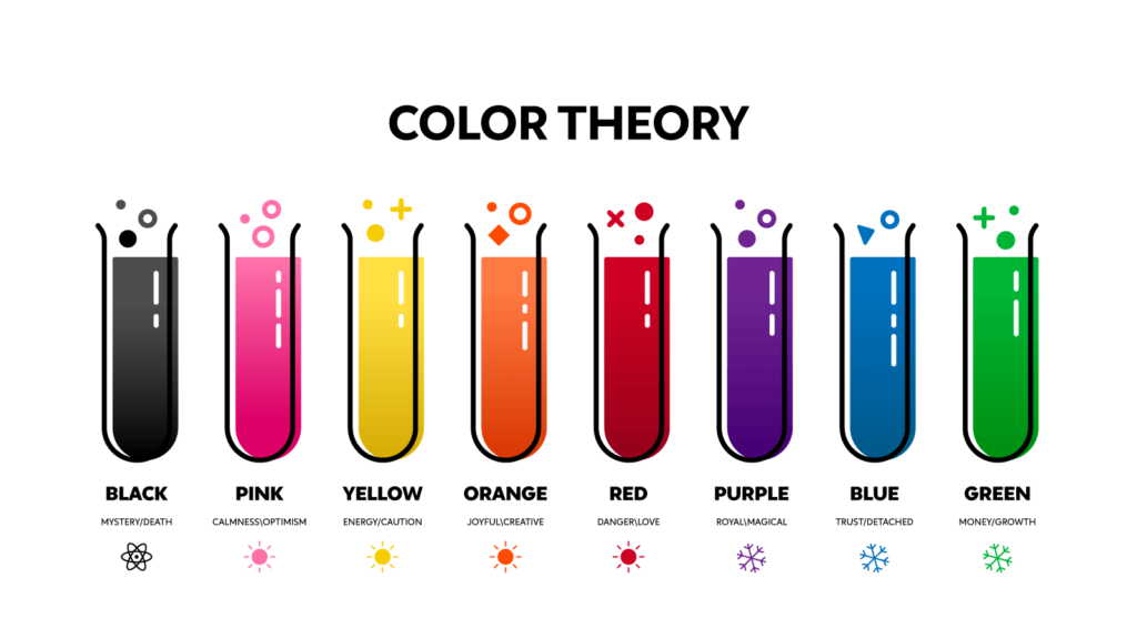
Color Properties
Color is a powerful tool in manipulating visual weight. I've observed that highly saturated colors tend to appear heavier and draw more attention than desaturated ones. A bright red element will command attention even if it's smaller than surrounding elements.
Similarly, color value (lightness/darkness) dramatically affects perceived weight. Darker elements typically feel heavier than lighter ones—this is why white space feels "empty" while dark text feels "substantial."
When working with symbol visuals in art and design, I've found that strategic color contrast can direct viewer attention precisely where I want it to go. PageOn.ai's Deep Search feature has been invaluable for finding color combinations that create optimal visual weight distribution in my designs.
Color Saturation Impact on Visual Weight
This chart illustrates how color saturation affects the perceived visual weight of elements:
Density and Complexity
I've noticed that intricate or detailed elements naturally attract more attention in a design. A complex illustration will draw the eye more than a simple shape, even if they occupy the same amount of space.
There's a direct relationship between element density and perceived visual weight. Packing more elements into a given space increases its visual gravity—think of a dense paragraph of text versus a few sparse lines.
The key is balancing complexity with simplicity to create dynamic yet harmonious designs. Too much complexity everywhere leads to visual chaos; strategic complexity creates focal points that guide the viewer through the experience.
Space and Positioning
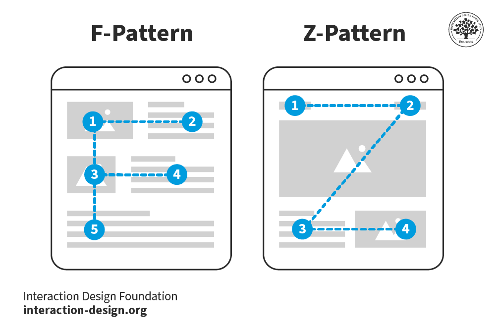
White space is not empty space—it's a powerful tool for enhancing the visual weight of surrounded elements. I often use generous white space around critical elements to increase their perceived importance.
Strategic positioning leverages natural viewing patterns like the F-pattern (for text-heavy content) or Z-pattern (for more visual content). Understanding these patterns helps me place high-visual-weight elements where they'll naturally receive attention.
I've found that isolation dramatically increases an element's visual weight. An object standing alone commands more attention than the same object surrounded by others—this is a principle I regularly apply when creating visually appealing presentations.
Common Reading Patterns and Strategic Positioning
Understanding how users naturally scan content helps me position elements with appropriate visual weight:
                    graph TD
                        subgraph "F-Pattern Reading"
                            F1[Top Horizontal Scan] --> F2[Partial Horizontal Scan]
                            F2 --> F3[Vertical Scan]
                        end
                        subgraph "Z-Pattern Reading"
                            Z1[Top Left] --> Z2[Top Right]
                            Z2 --> Z3[Bottom Left]
                            Z3 --> Z4[Bottom Right]
                        end
                        F3 -.-> P[Strategic Positioning]
                        Z4 -.-> P
                        P --> H[Higher Visual Weight at Pattern Start Points]
                        P --> M[Medium Visual Weight Along Pattern Lines]
                        P --> L[Lower Visual Weight in Pattern Dead Zones]
Creating Balanced Compositions Through Visual Weight
Visual equilibrium is essential for creating harmony in design. When I approach a new project, I always consider how visual weight will be distributed to achieve this balance. A composition without proper balance feels unstable and creates tension for the viewer—sometimes this is desirable for dramatic effect, but more often it's an obstacle to effective communication.

Symmetrical vs. Asymmetrical Balance: Different approaches to visual equilibrium
Types of Balance
I work with three primary types of balance in my designs:
- Symmetrical Balance: Elements are mirrored on either side of a central axis, creating a sense of formality and stability. This approach is excellent for corporate designs, official documents, or any context where trustworthiness is paramount.
- Asymmetrical Balance: Different elements with varying visual weights are arranged to create equilibrium without mirroring. This creates a more dynamic, engaging composition while maintaining harmony. I use this approach when I want to create more visual interest while preserving a sense of intentionality.
- Radial Balance: Elements radiate from a central point, creating a circular pattern of visual weight. This creates a sense of movement and is particularly effective for designs that need to convey energy or completeness.
Viewer Preference for Balance Types
Based on my research and experience, here's how different balance types perform with viewers:
Distributing Visual Weight Effectively
When distributing visual weight across a composition, I follow these principles:
- Consider the canvas as a whole: I visualize my design space as having a center of gravity and distribute elements to maintain equilibrium around that center.
- Use the rule of thirds: Placing high-visual-weight elements at intersection points of a nine-square grid creates natural balance while maintaining visual interest.
- Create counterbalance: A large, light-colored element can be balanced by a small, dark, or saturated element on the opposite side of the composition.
- Account for directional forces: Elements that suggest direction (like arrows or faces looking in a particular direction) create movement that affects visual balance.
Common Mistakes and How to Avoid Them
In my years of design experience, I've identified these common visual balance pitfalls:
- Bottom-heavy designs: Placing too much visual weight at the bottom creates a sense of being "stuck" or immobile. Balance heavy elements throughout the composition.
- Edge crowding: Pushing too many elements to the edges creates an empty center and feels unnatural. Ensure some visual weight occupies the central areas.
- Competing focal points: When multiple elements have equal visual weight, they compete for attention and create confusion. Establish a clear hierarchy.
- Ignoring negative space: Not accounting for the visual weight of empty space leads to cluttered designs. Embrace white space as an active design element.
PageOn.ai's Vibe Creation feature has been transformative for my workflow, allowing me to rapidly iterate through balanced layout options through simple conversation. I can describe the feeling I want to achieve, and the AI suggests multiple balanced compositions that achieve that emotional impact.
Visual Weight Techniques for Establishing Hierarchy
Creating clear focal points is essential for guiding the viewer's journey through a design. I approach every project by first identifying what information is most important and then using visual weight to create a natural path for the eye to follow.
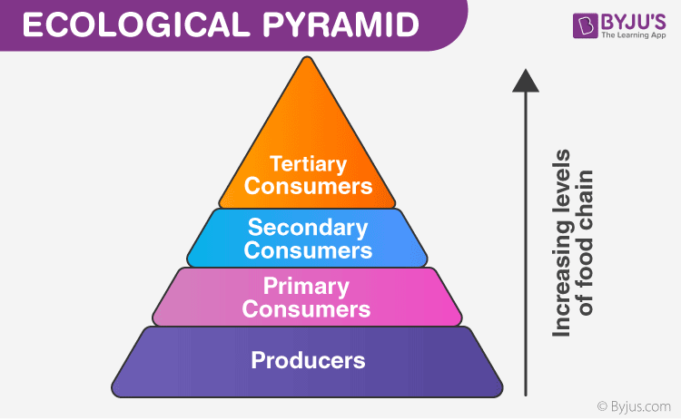
The hierarchy pyramid: organizing information by importance
Developing Information Hierarchy Levels
I typically work with three distinct levels of visual importance:
- Primary level: The most critical information that should be seen first. I give these elements the highest visual weight through size, color, contrast, positioning, or a combination of these factors.
- Secondary level: Supporting information that provides context or elaborates on the primary content. These elements have moderate visual weight—noticeable but not competing with primary elements.
- Tertiary level: Supplementary details, credits, technical information, etc. These have the lowest visual weight and are designed to be discovered rather than immediately noticed.
Visual Hierarchy Implementation
This diagram illustrates how I implement visual hierarchy using various techniques:
                    flowchart TD
                        H[Visual Hierarchy] --> P[Primary Level]
                        H --> S[Secondary Level]
                        H --> T[Tertiary Level]
                        P --> P1[Largest Size]
                        P --> P2[Highest Contrast]
                        P --> P3[Most Saturated Colors]
                        P --> P4[Strategic Position]
                        S --> S1[Medium Size]
                        S --> S2[Moderate Contrast]
                        S --> S3[Supporting Colors]
                        S --> S4[Secondary Position]
                        T --> T1[Smallest Size]
                        T --> T2[Lowest Contrast]
                        T --> T3[Neutral Colors]
                        T --> T4[Peripheral Position]
                        classDef primary fill:#FF8000,stroke:#333,color:#fff
                        classDef secondary fill:#42A5F5,stroke:#333,color:#fff
                        classDef tertiary fill:#66BB6A,stroke:#333,color:#fff
                        classDef header fill:#333,stroke:#333,color:#fff
                        class H header
                        class P,P1,P2,P3,P4 primary
                        class S,S1,S2,S3,S4 secondary
                        class T,T1,T2,T3,T4 tertiary
The Relationship Between Visual Weight and Information Priority
In my design practice, I've found that the relationship between visual weight and information priority must be deliberate and consistent. Users quickly learn the "rules" of a design system—if large, bold text always indicates a main heading, that pattern should be maintained throughout.
I use visual communication for designers principles to ensure that my visual hierarchy accurately reflects the actual importance of the information. Misalignment between visual weight and information priority creates confusion and frustrates users.
Practical Techniques for Emphasizing Crucial Information
These are my go-to techniques for creating emphasis while maintaining design cohesion:
- Typographic contrast: Using varying font weights, sizes, and styles to create clear hierarchical relationships.
- Color emphasis: Applying accent colors to draw attention to key information while keeping supporting content in more neutral tones.
- Spatial isolation: Surrounding important elements with white space to increase their visual prominence.
- Directional cues: Using lines, arrows, or arranged elements to guide the eye toward important information.
- Texture and depth: Adding subtle shadows or texture to create dimensional contrast that draws attention.
PageOn.ai has been instrumental in helping me transform abstract hierarchy concepts into clear visual structures. Its ability to understand the relative importance of different content elements and suggest appropriate visual treatments has streamlined my design process significantly.
Visual Weight Across Different Design Disciplines
Interior Design Applications
In my interior design projects, I've observed how visual weight dramatically influences spatial perception. A large, dark piece of furniture can "anchor" a room, while lighter elements create a sense of airiness and space.
Creating focal points in interior spaces follows many of the same principles as in 2D design, but with the added dimension of physical presence. I often use a statement piece—perhaps an artwork, architectural feature, or distinctive furniture item—as the primary visual weight element around which the rest of the space is balanced.
Balancing architectural elements with furnishings and decor requires careful consideration of visual weight. A room with dramatic architectural features (like exposed beams or a stone fireplace) needs furnishings with sufficient visual weight to maintain balance—otherwise, the space can feel lopsided or overwhelming.
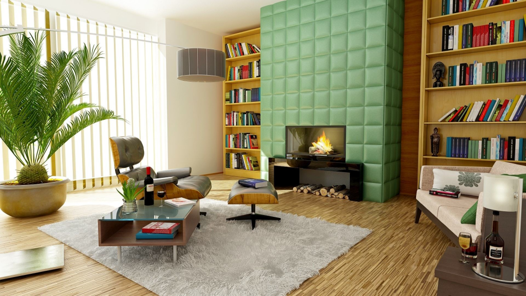
Visual weight distribution in interior spaces creates balance and directs attention
Graphic Design Implementations
In my graphic design work, I've found that visual weight considerations differ significantly between print and digital mediums. Print designs are static and viewed in their entirety, allowing for more complex visual weight relationships. Digital designs, especially on scrolling interfaces, must establish visual weight hierarchies that work both within the visible viewport and across the entire scrollable content.
Typography carries enormous visual weight implications. Different font families, weights, and styles communicate hierarchy and emphasis in subtle but powerful ways. I select typefaces not just for their aesthetic qualities but for their inherent visual weight characteristics—some fonts naturally command more attention than others even at the same size and color.
Visual Weight of Typography Elements
This chart compares the perceived visual weight of different typographic treatments:
Web and UI Design Strategies
Creating clear navigation pathways is one of my primary goals when applying visual weight principles to web and UI design. Users should intuitively understand where to look and what to click without conscious effort.
Information-dense interfaces present unique challenges. I use visual weight strategically to prevent cognitive overload—creating clear groupings, establishing distinct hierarchy levels, and using visual weight to distinguish between interactive and static elements.
Responsive design adds another dimension to visual weight considerations. A hierarchy that works perfectly on desktop might fall apart on mobile if not carefully planned. I design with flexible visual weight systems that maintain proper emphasis relationships across all device sizes.
PageOn.ai's Agentic capabilities have transformed how I approach UI mockups. I can now quickly transform wireframes based on visual weight principles, experimenting with different emphasis patterns to find the most intuitive user experience.
Responsive Visual Weight Adaptation
This diagram shows how visual weight relationships adapt across devices:
                    flowchart LR
                        subgraph Desktop
                            D1[Primary Element\nLarge Size] --> D2[Secondary Elements\nMedium Size]
                            D2 --> D3[Tertiary Elements\nSmall Size]
                        end
                        subgraph Tablet
                            T1[Primary Element\nReduced Size\nIncreased Contrast] --> T2[Secondary Elements\nCondensed]
                            T2 --> T3[Some Tertiary\nElements Hidden]
                        end
                        subgraph Mobile
                            M1[Primary Element Only\nFull Width] --> M2[Secondary Elements\nStacked Vertically]
                            M2 --> M3[Most Tertiary\nElements Hidden]
                        end
                        Desktop --> Tablet
                        Tablet --> Mobile
Advanced Visual Weight Techniques
Creating Visual Rhythm Through Repetition and Pattern
I've found that repetition of elements with similar visual weight creates a rhythm that guides the viewer through a design. This technique is particularly effective in multi-page layouts, where repeating visual weight patterns creates cohesion and predictability.
Pattern interruption—breaking an established visual rhythm with an element of contrasting weight—creates emphasis and surprise. I use this technique sparingly but strategically to highlight particularly important information.

Visual rhythm created through repetition with strategic pattern interruption
Using Contrast to Manipulate Visual Weight Dynamically
Contrast is perhaps the most powerful tool for controlling visual weight dynamically. I create contrast through:
- Size contrast: Juxtaposing large and small elements to make each appear more extreme than if viewed in isolation.
- Color contrast: Using complementary colors or dramatic value differences to create visual tension and emphasis.
- Textural contrast: Combining smooth and rough textures to create visual interest and direct attention.
- Conceptual contrast: Placing conceptually opposite elements near each other to heighten the impact of both.
Techniques for Creating Depth and Dimension
Adding depth to a two-dimensional design dramatically affects visual weight relationships. Elements that appear closer to the viewer typically have greater visual weight than those that recede into the background.
I create the illusion of depth through:
- Shadows and lighting effects: Creating the impression that elements exist in three-dimensional space.
- Overlapping elements: Establishing clear foreground/background relationships.
- Size gradation: Using the principle that larger objects appear closer to create depth.
- Atmospheric perspective: Reducing contrast and saturation for elements meant to appear further away.
Emotional Responses to Visual Weight Techniques
Different visual weight distributions evoke different emotional responses:
PageOn.ai's AI Blocks have been invaluable for experimenting with advanced visual weight techniques. The platform allows me to quickly test different approaches and visualize complex relationships without getting bogged down in technical execution.
Measuring and Testing Visual Weight Effectiveness
Tools and Methods for Evaluating Visual Hierarchy Success
I use several approaches to evaluate whether my visual weight decisions are achieving their intended purpose:
- Squint testing: Squinting at a design blurs the details and helps reveal the true visual hierarchy—what stands out when details are obscured.
- Grayscale conversion: Viewing designs in grayscale to ensure the hierarchy works without relying on color differences.
- Five-second tests: Showing the design briefly to test subjects and asking what they remember—this reveals what truly has the most visual weight.
- Distance testing: Viewing the design from various distances to ensure the hierarchy remains intact regardless of viewing conditions.

Heat map showing how visual weight influences user attention patterns
User Testing Approaches to Validate Visual Weight Decisions
When conducting user testing specifically focused on visual weight effectiveness, I employ these methods:
- Task completion testing: Asking users to complete specific tasks to see if they naturally follow the intended visual hierarchy.
- First-click testing: Analyzing where users click first when presented with a design—this reveals what truly has the highest visual weight.
- Comparative A/B testing: Testing different visual weight distributions to see which better achieves the design goals.
- Guided interviews: Having users describe what they notice first, second, etc., to map their actual perception against the intended hierarchy.
Analytics and Heat Mapping
For digital designs, I rely heavily on analytics and heat mapping tools to track actual user attention patterns:
- Eye-tracking studies: Though expensive, these provide the most accurate data on where users actually look and in what sequence.
- Click heat maps: Showing where users click most frequently, which correlates with perceived visual importance.
- Scroll maps: Revealing how far users scroll and where they tend to pause, indicating areas of high visual interest.
- Session recordings: Watching actual user interactions to see if they follow expected patterns based on visual weight distribution.
User Attention Distribution by Visual Weight Technique
Based on my research with heat mapping tools, here's how different visual weight techniques perform:
Iterative Refinement Techniques
Based on testing results, I follow this iterative refinement process:
- Identify discrepancies between intended and actual visual hierarchy.
- Isolate variables that may be causing confusion (competing elements, insufficient contrast, etc.).
- Make targeted adjustments to specific elements rather than wholesale changes.
- Retest with a small sample to verify improvements before finalizing changes.
- Document successful patterns for future reference and application.
PageOn.ai has revolutionized my testing workflow by allowing me to rapidly prototype and test different visual weight scenarios. I can quickly generate multiple variations with different emphasis patterns and test them with users to find the most effective approach.
Future Trends in Visual Weight Application
The Impact of Emerging Technologies
Several emerging technologies are transforming how we think about and apply visual weight principles:
- Augmented reality: Creating layered information experiences where visual weight must work across both physical and digital realms simultaneously.
- Variable fonts: Allowing more nuanced control of typographic weight along multiple axes, enabling more sophisticated hierarchies.
- Motion and microinteractions: Using subtle movement to influence visual weight without changing static properties.
- Context-aware interfaces: Dynamically adjusting visual weight based on user behavior, environment, or preferences.
Future interfaces will require sophisticated visual weight systems that work across multiple dimensions
Accessibility Considerations in Visual Weight Implementation
The future of visual weight must be inclusive. I'm increasingly focused on these accessibility considerations:
- Multiple modalities: Creating hierarchies that translate across visual, auditory, and tactile experiences.
- Adaptable contrast: Designing systems that can adjust visual weight relationships for users with different visual abilities.
- Non-color dependent hierarchies: Ensuring visual weight works effectively for users with color vision deficiencies.
- Reduced motion options: Providing alternatives for users who are sensitive to motion-based visual weight cues.
Cross-Cultural Perspectives on Visual Weight Perception
As design becomes increasingly global, I'm mindful that visual weight perception varies across cultures:
- Reading direction influences: Visual weight perception differs between left-to-right, right-to-left, and top-to-bottom reading cultures.
- Color symbolism variations: Colors carry different weight and significance across cultures, affecting hierarchy perception.
- Density preferences: Some cultures prefer information-dense designs while others value more white space.
- Contextual vs. direct communication: Visual hierarchy may need to be more explicit or more subtle depending on cultural communication norms.
AI-Enhanced Visual Weight Analysis
AI is transforming how we analyze and implement visual weight:
PageOn.ai is at the forefront of democratizing sophisticated visual weight implementation for designers of all skill levels. By combining AI-powered analysis with intuitive creation tools, it's making advanced visual hierarchy techniques accessible to everyone from beginners to experts.
I believe the future of visual weight lies in adaptive, context-aware systems that can dynamically adjust to user needs, cultural contexts, and accessibility requirements while maintaining the core principles that make visual hierarchy effective.
Transform Your Visual Expressions with PageOn.ai
Take your understanding of visual weight to the next level with PageOn.ai's powerful tools for creating stunning, balanced, and impactful designs. Experiment with visual hierarchies, test different weight distributions, and create compositions that naturally guide your audience's attention.
Start Creating with PageOn.ai TodayConclusion: The Enduring Power of Visual Weight
As we've explored throughout this guide, visual weight is far more than just a design principle—it's a fundamental aspect of how we perceive and process visual information. By mastering the art of visual weight distribution, we can create designs that not only look beautiful but also function effectively, guiding users through content in a natural, intuitive way.
From the basic elements that influence visual weight to advanced techniques for creating rhythm and emphasis, these principles apply across all design disciplines. Whether you're designing for print, web, mobile, or physical spaces, understanding how to manipulate visual weight will elevate your work from good to exceptional.
As design continues to evolve with new technologies and changing user expectations, the fundamentals of visual weight remain constant. Our brains are wired to seek order, hierarchy, and meaning in what we see—and thoughtful application of visual weight principles helps satisfy that innate desire for visual clarity.
I encourage you to experiment with the concepts we've discussed, using tools like PageOn.ai to quickly prototype and test different approaches. The more you practice working with visual weight, the more intuitive it becomes, until balanced, effective visual hierarchies become second nature in everything you create.
You Might Also Like
Building New Slides from Prompts in Seconds | AI-Powered Presentation Creation
Discover how to create professional presentations instantly using AI prompts. Learn techniques for crafting perfect prompts that generate stunning slides without design skills.
The AI-Powered Pitch Deck Revolution: A Three-Step Framework for Success
Discover the three-step process for creating compelling AI-powered pitch decks that captivate investors. Learn how to clarify your vision, structure your pitch, and refine for maximum impact.
Enhancing Audience Experience with Strategic Audio Integration | Create Immersive Brand Connections
Discover how strategic audio integration creates immersive brand connections across podcasts, streaming platforms, and smart speakers. Learn frameworks and techniques to transform your marketing.
The Art of Data Storytelling: Creating Infographics That Captivate and Inform
Discover how to transform complex data into visually compelling narratives through effective infographic design. Learn essential techniques for enhancing data storytelling with visual appeal.