The Art of Data Storytelling: Creating Infographics That Captivate and Inform
The Fusion of Visual Appeal and Data Communication
In today's data-driven world, I've discovered that the most powerful way to communicate complex information is through visually compelling narratives. When we combine the art of storytelling with the science of data visualization, we create infographics that not only inform but also captivate our audience.
The Fusion of Visual Appeal and Data Communication
I've always been fascinated by how visual storytelling transforms complex information into something accessible and engaging. When we combine the power of visuals with data, we create something truly remarkable - infographics that not only inform but also captivate.
The human brain processes visual information 60,000 times faster than text. This cognitive advantage is why infographics have become such a powerful medium for data communication. When I create data visualizations, I'm not just presenting numbers - I'm crafting a visual experience that makes complex concepts intuitive and memorable.
The evolution from static data presentations to engaging visual storytelling represents a fundamental shift in how we communicate information. Traditional data presentations often struggle to maintain audience attention and convey complex relationships. In contrast, storytelling with data creates a narrative journey that guides viewers through information in a structured, engaging way.
The Evolution of Data Presentation
The transition from traditional data presentation to modern visual storytelling has dramatically improved information retention and engagement:
One of the most significant challenges I've encountered is bridging the gap between complexity and clarity. Data often contains intricate relationships and nuanced insights that can be difficult to communicate effectively. This is where tools like PageOn.ai's AI Blocks become invaluable - they help structure data stories without requiring technical design expertise, making sophisticated data visualization accessible to everyone.
How Infographics Bridge Complexity and Clarity
The process of transforming complex data into clear visual narratives:
flowchart TD
    A[Raw Complex Data] --> B[Data Analysis & Insight Extraction]
    B --> C[Narrative Structure Development]
    C --> D[Visual Element Selection]
    D --> E[Layout & Flow Design]
    E --> F[Visual Hierarchy Implementation]
    F --> G[Engaging Infographic]
    style A fill:#f3f4f6,stroke:#d1d5db
    style G fill:#FF8000,stroke:#ea580c,color:white
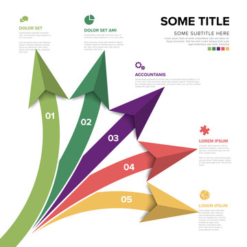
Essential Elements of Effective Data Storytelling Infographics
In my experience creating data visualizations, I've found that the most compelling infographics share several key elements. These components work together to transform raw data into a cohesive visual story that resonates with viewers.
Establishing a Clear Narrative Structure
Every effective infographic tells a story with a clear beginning, middle, and end. This narrative framework helps viewers process information sequentially and understand how different data points relate to one another. According to research on visual narratives, infographics that follow a logical story structure see significantly higher engagement and retention rates.

Balancing Emotional Appeal with Data-Driven Insights
The most effective data stories strike a delicate balance between emotional resonance and factual accuracy. While data provides the foundation, emotional elements help create connection and memorability. I've found that infographic data visualizations that incorporate relatable contexts or human elements alongside precise data points tend to have the greatest impact.
Visual Hierarchy Techniques
Effective visual hierarchy guides the viewer's journey through the infographic, ensuring they focus on the most important elements first. I achieve this through strategic use of size, color, contrast, and positioning. When designing infographics, I carefully consider how these elements work together to create a clear path for the viewer's eye to follow.
Elements of Visual Hierarchy
graph TD
    A[Visual Hierarchy] --> B[Size]
    A --> C[Color]
    A --> D[Contrast]
    A --> E[Position]
    A --> F[White Space]
    B --> G[Larger elements draw attention first]
    C --> H[Strategic color use highlights key data]
    D --> I[High contrast increases visual prominence]
    E --> J[Top/left elements seen first in Western cultures]
    F --> K[Strategic spacing isolates important elements]
    style A fill:#FF8000,stroke:#ea580c,color:white
    style B fill:#f97316,stroke:#ea580c,color:white
    style C fill:#f97316,stroke:#ea580c,color:white
    style D fill:#f97316,stroke:#ea580c,color:white
    style E fill:#f97316,stroke:#ea580c,color:white
    style F fill:#f97316,stroke:#ea580c,color:white
Color Psychology in Data Interpretation
Color choices significantly impact how viewers interpret data. Different colors evoke different emotions and associations, which can either enhance or interfere with data comprehension. For instance, I use blue to convey trust and stability, red for urgency or warning, and green for growth or positive outcomes. Understanding these associations helps me create stunning infographics that intuitively communicate data meaning.
Color Psychology in Data Visualization
Creating Seamless Flow Between Components
An effective infographic guides viewers smoothly from one element to the next, creating a cohesive experience. I achieve this by using consistent design elements, thoughtful transitions, and visual cues that connect related information. PageOn.ai's Vibe Creation feature is particularly helpful for establishing the right tone and emotional connection across all components of an infographic.
By incorporating these essential elements into my PowerPoint data storytelling and infographic designs, I create visual narratives that not only inform but also engage and inspire. The right balance of structure, emotion, hierarchy, color, and flow transforms raw data into a compelling story that resonates with viewers.
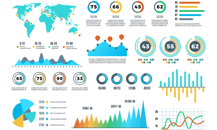
Visualization Techniques That Enhance Data Comprehension
Selecting the right visualization techniques is crucial for effective data storytelling. Through my experience, I've learned that different data types and stories require different visual approaches to maximize comprehension and impact.
Selecting the Appropriate Chart Types
One of the most important decisions in creating data visuals in presentation is choosing the right chart type for your data story. Different visualization formats serve different purposes and are suited to different types of data relationships.
| Chart Type | Best For | Strengths | Limitations |
|---|---|---|---|
| Bar Charts | Comparing values across categories | Easy to read, shows precise values | Limited for showing relationships or trends over time |
| Line Charts | Showing trends over time | Excellent for continuous data and trends | Can get cluttered with too many lines |
| Pie Charts | Showing composition or proportions | Visually shows part-to-whole relationships | Hard to compare segments, limited to few categories |
| Scatter Plots | Showing correlations between variables | Reveals patterns, clusters, and outliers | Requires understanding of statistical concepts |
| Heatmaps | Showing patterns across multiple variables | Great for complex data with multiple dimensions | Can be difficult for audiences to interpret initially |

Interactive Elements That Increase Engagement
Interactive infographics transform passive viewers into active participants, significantly increasing engagement and information retention. When I incorporate elements like hover effects, clickable sections, or animated transitions, I create an exploratory experience that encourages deeper interaction with the data.
Annotation Strategies
Thoughtful annotations can transform a basic chart into an insightful story. I use callouts, labels, and explanatory text to highlight key insights, provide context, and guide interpretation. The key is finding the right balance - enough annotation to illuminate important points without overwhelming the visual with excessive text.
Effectiveness of Different Annotation Techniques
The Power of Metaphorical and Contextual Visuals
Metaphorical visuals create instant understanding by connecting abstract concepts to familiar ideas. When I incorporate visual metaphors - like using a funnel to represent conversion processes or a bridge to illustrate connections - I create intuitive comprehension that transcends language barriers and technical expertise.
Chart Selection Strategy
Choosing between bar charts, line charts, and pie charts depends on the story you want to tell with your data. Bar charts excel at comparing discrete categories, line charts show trends over time, and pie charts display proportional relationships (though they should be used sparingly and only with few categories).
Chart Selection Decision Flow
flowchart TD
    A[What are you trying to show?] --> B{Comparing values?}
    B -->|Yes| C{Across time?}
    B -->|No| D{Showing parts of a whole?}
    C -->|Yes| E[Line Chart]
    C -->|No| F{How many categories?}
    D -->|Yes| G{How many segments?}
    D -->|No| H{Showing correlation?}
    F -->|Few| I[Bar Chart]
    F -->|Many| J[Horizontal Bar Chart]
    G -->|Few ≤5| K[Pie Chart]
    G -->|Many >5| L[Stacked Bar Chart]
    H -->|Yes| M[Scatter Plot]
    H -->|No| N{Multiple variables?}
    N -->|Yes| O[Heatmap]
    N -->|No| P[Consider different visualization]
    style A fill:#FF8000,stroke:#ea580c,color:white
    style E fill:#f97316,stroke:#ea580c,color:white
    style I fill:#f97316,stroke:#ea580c,color:white
    style J fill:#f97316,stroke:#ea580c,color:white
    style K fill:#f97316,stroke:#ea580c,color:white
    style L fill:#f97316,stroke:#ea580c,color:white
    style M fill:#f97316,stroke:#ea580c,color:white
    style O fill:#f97316,stroke:#ea580c,color:white
For complex data stories, I often combine multiple visualization types to create a comprehensive narrative. PageOn.ai's visualization tools make it easy to experiment with different options quickly, allowing me to find the most effective approach without technical limitations.
Accessibility should never be an afterthought in data visualization. I ensure my infographics are inclusive by using colorblind-friendly palettes, providing sufficient contrast, and including alternative text descriptions. These considerations ensure that my data stories are accessible to all viewers, regardless of their visual abilities.
From Raw Data to Compelling Visual Narrative
Transforming raw data into a compelling visual narrative is a structured process that requires both analytical and creative thinking. I've developed a systematic approach that ensures my infographics are both accurate and engaging.
The Pre-Visualization Process
Before creating any visual elements, I spend significant time analyzing the data and extracting meaningful insights. This critical first step involves identifying patterns, anomalies, and relationships within the data that will form the foundation of the story. I ask questions like: What surprising findings emerge from this data? What trends are most significant? What comparisons yield the most valuable insights?
The Data-to-Insight Process
flowchart LR
    A[Raw Data Collection] --> B[Data Cleaning]
    B --> C[Exploratory Analysis]
    C --> D[Pattern Identification]
    D --> E[Insight Extraction]
    E --> F[Story Formation]
    F --> G[Visual Planning]
    style A fill:#f3f4f6,stroke:#d1d5db
    style G fill:#FF8000,stroke:#ea580c,color:white
Storyboarding Techniques
Once I've identified the key insights, I create a storyboard that outlines the narrative flow of the infographic. This planning stage is crucial for determining how different elements will work together to tell a cohesive story. I sketch the layout, decide on the sequence of information, and plan transitions between different sections.

Defining Your Objective and Understanding Your Audience
Every effective infographic begins with a clear objective and a deep understanding of the target audience. I always ask: What specific action or understanding do I want to inspire? Who is my primary audience, and what is their existing knowledge level? What matters most to them about this topic? These considerations guide every design decision, from complexity level to visual style.
Audience Considerations in Data Visualization
Maintaining Data Integrity While Simplifying
One of the greatest challenges in data visualization is simplifying complex concepts without sacrificing accuracy. I follow several principles to maintain data integrity:
- Never distort proportions or scales to exaggerate differences
- Provide appropriate context for all data points
- Include clear labels and units of measurement
- Use consistent scales across comparable visualizations
- Acknowledge limitations or margins of error when relevant
PageOn.ai's agentic approach has revolutionized how I transform raw data inputs into structured visual stories. The platform intelligently analyzes data relationships and suggests optimal visualization approaches, saving time while ensuring the resulting infographics effectively communicate key insights.
Enhancing Visual Appeal Without Sacrificing Accuracy
Creating visually appealing infographics doesn't mean sacrificing data accuracy. In fact, thoughtful design enhances understanding by making information more accessible and engaging. I've developed strategies to balance aesthetic appeal with information integrity.
Design Principles That Complement Data
Effective infographic design serves the data rather than overshadowing it. I apply fundamental design principles that enhance comprehension while creating visual appeal:
Alignment
Creating visual order through consistent alignment helps viewers navigate information more easily and perceive relationships between elements.
Proximity
Grouping related elements together visually communicates their relationship and helps viewers understand information hierarchy.
Contrast
Strategic use of contrast directs attention to key information and creates visual interest while improving readability.
Repetition
Consistent use of colors, shapes, and styles creates cohesion and helps viewers quickly recognize related information across the infographic.

Typography Choices for Readability and Hierarchy
Typography plays a crucial role in creating clear information hierarchy and ensuring readability. I carefully select font families, sizes, weights, and spacing to guide viewers through the content. Typically, I limit infographics to 2-3 complementary fonts, using variations in weight and size to establish hierarchy.
Typography Impact on Readability
Balancing White Space and Information Density
White space (or negative space) is not empty space—it's a powerful design element that improves comprehension by giving visual elements room to breathe. I strategically use white space to:
- Create visual separation between distinct sections
- Highlight important data points or insights
- Improve overall readability and reduce cognitive load
- Guide the viewer's eye through the intended narrative flow
- Create a sense of visual sophistication and clarity
Creating Visual Consistency
Consistency across design elements creates a cohesive, professional appearance that enhances data comprehension. I maintain consistent color schemes, icon styles, chart formats, and typography throughout an infographic to create visual harmony.
PageOn.ai has been invaluable in helping me maintain design consistency while exploring creative approaches. The platform's design intelligence ensures that experimental elements still adhere to established visual guidelines, resulting in infographics that are both innovative and cohesive.
Case Studies: Successful Data Storytelling Through Infographics
Learning from successful examples is one of the best ways to improve your own data storytelling. I've analyzed numerous award-winning infographics to identify patterns and techniques that contribute to their effectiveness.
Analysis of Award-Winning Infographics
Award-winning infographics typically share several key characteristics: they present a clear narrative, use visuals that enhance rather than distract from the data, maintain a cohesive design language, and focus on a specific, well-defined message. Let's examine a few notable examples and their storytelling techniques.
Industry-Specific Examples
Different industries have unique data storytelling needs and approaches. Here are some examples of how various sectors effectively use infographics:
Healthcare
Healthcare infographics often use anatomical illustrations combined with data visualizations to explain medical concepts, treatment outcomes, or public health trends. They balance technical accuracy with accessibility for patients and the general public.
Finance
Financial infographics typically feature clean, professional designs with charts showing market trends, investment performance, or economic indicators. They often use conservative color schemes and emphasize precision in data presentation.
Environmental
Environmental infographics frequently incorporate natural imagery and use visualization techniques like maps, timelines, and comparative charts to illustrate climate data, conservation efforts, or sustainability metrics.
Technology
Tech industry infographics often feature modern, sleek designs with isometric illustrations, process flows, and comparison charts to explain complex systems, product features, or market adoption rates.
Before-and-After Transformations
Some of the most compelling case studies demonstrate the transformation of raw, complex data into clear, engaging visual narratives. These before-and-after examples highlight the power of thoughtful data visualization to improve comprehension and engagement.
Impact of Visual Transformation on Key Metrics
Measuring Engagement and Comprehension Improvements
Successful infographics don't just look good—they deliver measurable improvements in audience engagement and comprehension. Organizations that invest in quality data visualization often report significant increases in:
- Time spent engaging with content (often 2-3x longer than with text-only formats)
- Information recall (studies show up to 65% better retention with visual formats)
- Social media sharing rates (infographics are shared 3x more often than other content types)
- Conversion rates when calls-to-action are incorporated into the visual narrative
- Overall audience satisfaction and perception of content value
Many organizations have leveraged tools like PageOn.ai to transform their data communication strategies. The platform's intuitive design capabilities and AI-assisted visualization tools have enabled teams to create professional-quality infographics without specialized design expertise, democratizing data storytelling across departments and skill levels.
Practical Implementation Strategies
Creating effective data storytelling infographics requires both a strategic approach and the right tools. I've developed practical strategies that help streamline the process while maximizing impact.
Tools and Resources
The right tools can significantly impact the quality and efficiency of your infographic creation process. Here are some resources I've found invaluable:
Infographic Creation Workflow
flowchart TD
    A[Data Collection & Analysis] --> B[Story Development]
    B --> C[Visual Planning]
    C --> D[Design Implementation]
    D --> E[Review & Refinement]
    E --> F[Distribution]
    A1[Spreadsheets
Database Tools
Analytics Platforms] --> A
    B1[Mind Mapping Tools
Storyboarding Apps
PageOn.ai] --> B
    C1[Sketching Tools
Wireframing Apps
PageOn.ai] --> C
    D1[Design Software
Visualization Tools
PageOn.ai] --> D
    E1[Collaboration Platforms
Feedback Tools
A/B Testing] --> E
    F1[Content Management
Social Media
Email Platforms] --> F
    style A fill:#f3f4f6,stroke:#d1d5db
    style B fill:#f3f4f6,stroke:#d1d5db
    style C fill:#f3f4f6,stroke:#d1d5db
    style D fill:#f3f4f6,stroke:#d1d5db
    style E fill:#f3f4f6,stroke:#d1d5db
    style F fill:#f3f4f6,stroke:#d1d5db
While there are many specialized tools available, platforms like PageOn.ai have revolutionized the process by providing integrated environments where data analysis, storytelling, and visualization can all happen in one place. This integration significantly streamlines the workflow and reduces the technical barriers to creating professional infographics.
Collaborative Approaches
The best infographics often emerge from collaborative processes that bring together different perspectives and expertise. I've found that cross-functional collaboration between data analysts, subject matter experts, and designers leads to more comprehensive and effective visual stories.

Effective collaboration requires clear communication and a shared understanding of objectives. I recommend establishing a structured process that includes:
- Initial briefing to align on goals, audience, and key messages
- Data review sessions where analysts explain key findings and insights
- Story mapping workshops to develop the narrative structure
- Design review checkpoints throughout the creation process
- User testing with representatives from the target audience
Testing and Refining
Creating effective infographics is an iterative process. I always test my visualizations with representative users before finalizing them, gathering feedback on clarity, engagement, and effectiveness. This testing phase often reveals unexpected insights about how viewers interpret the visual elements.
Common Issues Identified During Testing
Distribution Strategies
Even the most brilliant infographic won't have impact if it doesn't reach its intended audience. I develop distribution strategies tailored to the specific audience and objectives of each infographic. This might include:
- Social media campaigns with platform-specific formatting
- Email marketing with teaser elements that drive to the full infographic
- Embedding interactive elements on relevant website pages
- Creating presentation versions for in-person or virtual meetings
- Developing print versions for physical distribution when appropriate
PageOn.ai has been particularly helpful for rapid prototyping and iteration. The platform's AI-powered tools allow me to quickly generate multiple concept variations, test different approaches, and refine the most promising directions without getting bogged down in technical details. This accelerated iteration process leads to more refined final products in less time.
The Future of Infographic Data Storytelling
The field of data visualization and infographic storytelling continues to evolve rapidly. As technology advances and audience expectations shift, I'm excited about several emerging trends that are reshaping how we create and consume visual data narratives.
Emerging Trends in Interactive and Immersive Visualization
Static infographics are increasingly giving way to interactive experiences that invite exploration and personalization. These interactive elements allow viewers to engage with data on their own terms, revealing additional layers of information based on their interests and questions.

Immersive technologies like augmented and virtual reality are opening new frontiers for data storytelling. These technologies allow for spatial data visualization that can provide intuitive understanding of complex relationships and patterns that might be difficult to perceive in traditional 2D formats.
AI-Assisted Data Storytelling
Artificial intelligence is transforming how we create infographics, from initial data analysis to final design implementation. AI tools can now:
- Automatically identify significant patterns and insights in complex datasets
- Suggest optimal visualization types based on data characteristics
- Generate draft designs that follow best practices in visual communication
- Personalize content based on viewer preferences and behavior
- Translate visual stories across languages and cultural contexts
AI Impact on Infographic Creation Process
Personalization in Data Presentation
The future of infographics includes increasingly personalized experiences that adapt to individual viewer preferences, knowledge levels, and information needs. These adaptive visualizations can present the same underlying data in different ways based on who is viewing them, creating more relevant and impactful experiences.
Cross-Platform and Responsive Design
As content consumption continues to fragment across devices and platforms, responsive infographic design becomes increasingly important. Future infographics will need to adapt seamlessly to different screen sizes and interaction modes, from desktop browsers to mobile apps to emerging platforms like wearables and smart displays.
Evolution of Data Storytelling Platforms
timeline
    title Evolution of Data Storytelling Tools
    section Early Era
        Static Charts : Basic visual representations
        Print Infographics : Design-focused static visuals
    section Digital Transition
        Interactive Web Graphics : Click and explore functionality
        Dashboard Tools : Customizable data views
    section Current Generation
        Cross-Platform Solutions : Responsive across devices
        AI-Assisted Design : Intelligent creation tools
    section Future (Emerging)
        Immersive Experiences : AR/VR data visualization
        Adaptive AI Systems : Content that evolves with user
        Integrated Ecosystems : Seamless multi-platform experiences
PageOn.ai is at the forefront of this evolution, leading the way in AI-powered visualization tools that make sophisticated data storytelling accessible to everyone. By combining intuitive design interfaces with powerful AI capabilities, PageOn.ai is democratizing the creation of compelling visual narratives, allowing anyone to transform complex data into clear, engaging stories without specialized technical skills.
Transform Your Visual Expressions with PageOn.ai
Ready to create compelling data stories that captivate your audience? PageOn.ai provides the tools you need to transform complex information into clear, engaging infographics—no design expertise required. Our AI-powered platform helps you discover insights, structure narratives, and create professional visualizations in minutes.
Start Creating with PageOn.ai TodayFinal Thoughts
The art of data storytelling through infographics represents a powerful fusion of analytical thinking and creative expression. As we've explored throughout this guide, effective infographics transform complex information into accessible, engaging visual narratives that captivate audiences and enhance understanding.
I've found that the most successful infographics balance visual appeal with data accuracy, creating experiences that are both beautiful and informative. By applying the principles and techniques we've discussed—from establishing clear narrative structures to leveraging appropriate visualization types to enhancing visual appeal without sacrificing accuracy—you can create infographics that not only communicate information but also inspire action.
As data continues to grow in volume and importance across all industries, the ability to transform that data into compelling visual stories becomes increasingly valuable. Tools like PageOn.ai are making this transformation more accessible than ever, democratizing data visualization and enabling anyone to create professional-quality infographics without specialized design skills.
I encourage you to experiment with these approaches in your own data storytelling journey. Start with a clear objective, understand your audience, extract meaningful insights from your data, and craft visual narratives that engage and inform. With practice and the right tools, you can master the art of creating infographics that truly captivate and inform.
You Might Also Like
Multi-Format Conversion Tools: Transforming Modern Workflows for Digital Productivity
Discover how multi-format conversion tools are revolutionizing digital productivity across industries. Learn about essential features, integration strategies, and future trends in format conversion technology.
The Art of Instant Connection: Crafting Opening Strategies That Captivate Any Audience
Discover powerful opening strategies that create instant audience connection. Learn visual storytelling, interactive techniques, and data visualization methods to captivate any audience from the start.
Transform Presentation Anxiety into Pitch Mastery - The Confidence Revolution
Discover how to turn your biggest presentation weakness into pitch confidence with visual storytelling techniques, AI-powered tools, and proven frameworks for pitch mastery.
Transform Raw Text Data into Compelling Charts: AI-Powered Data Visualization | PageOn.ai
Discover how AI is revolutionizing data visualization by automatically creating professional charts from raw text data. Learn best practices and real-world applications with PageOn.ai.