Maximizing Crypto Analysis with Free CoinCodex Chart Data
A Visual Guide to Transforming Raw Data into Powerful Insights
Introduction to CoinCodex as a Data Visualization Resource
I've spent years analyzing cryptocurrency markets, and I can confidently say that having access to comprehensive, reliable chart data is absolutely essential for making informed trading decisions. CoinCodex has emerged as one of the most valuable free resources in this space, providing extensive market data that can transform how we understand crypto movements.
In today's data-driven crypto landscape, having access to quality visualization tools isn't just helpful—it's necessary for survival. Whether you're a day trader, long-term investor, or market researcher, the ability to quickly interpret visual patterns can mean the difference between profit and loss.

CoinCodex currently tracks over 43,000 cryptocurrencies across more than 400 exchanges, making it one of the most comprehensive price tracking platforms available. What makes it particularly valuable is that much of this data is accessible for free, allowing analysts of all levels to benefit from professional-grade market information.
Throughout this guide, I'll show you exactly how to leverage CoinCodex's free chart data and transform it into powerful visualizations using PageOn.ai. By combining these two resources, you'll be able to create compelling visual narratives that reveal hidden patterns and opportunities in the crypto market.
Key Chart Data Types Available Through CoinCodex
Price Charts and Historical Data
One of CoinCodex's greatest strengths is its flexible price charting system. I've found that being able to quickly switch between different timeframes (24H, 7D, 1M, 3M, 6M, YTD, 1Y, 3Y, 5Y, ALL) gives me incredible perspective on market cycles that would be difficult to grasp otherwise.
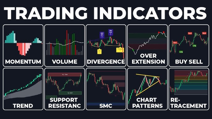
CoinCodex offers multiple chart types to suit different analysis styles:
- Candlestick charts - Perfect for technical analysis and identifying price patterns
- Line charts - Ideal for visualizing overall trends and price movements
- OHLC (Open-High-Low-Close) charts - Provides detailed price information for each time period
What I particularly value is the ability to export chart data as CSV files. This allows me to conduct deeper analysis in external tools or create custom visualizations that combine multiple data sources.
Market Performance Visualizations
Beyond simple price charts, CoinCodex provides valuable market performance metrics that help contextualize price movements:

Market capitalization charts are particularly useful for understanding a project's relative size and growth over time. I regularly use these visualizations to identify emerging projects that are gaining traction but haven't yet reached mainstream attention.
Trading volume data provides crucial insights into market liquidity and interest. By visualizing volume alongside price, we can identify whether price movements are supported by strong trading activity or if they might be short-lived anomalies.
Supply metrics visualizations help me understand tokenomics and potential inflation/deflation scenarios. By tracking circulating, total, and maximum supply over time, I can better predict how supply changes might impact price in the future.
Technical Analysis Indicators
CoinCodex offers a robust set of technical analysis tools that can be overlaid on price charts. I frequently use:
- Moving averages (simple and exponential) - For identifying trends and support/resistance levels
- RSI (Relative Strength Index) - For spotting overbought or oversold conditions
- MACD (Moving Average Convergence Divergence) - For identifying momentum shifts and potential trend changes
- Bollinger Bands - For measuring volatility and potential price targets
The platform's drawing tools allow me to add trend lines, Fibonacci retracements, and other custom annotations. These visual elements help identify key support and resistance levels that might not be obvious from the raw price data alone.
What sets CoinCodex apart is the ability to save custom indicator configurations. Once I've found a combination of indicators that works well for my analysis style, I can quickly apply it to different cryptocurrencies or timeframes without having to reconfigure everything.
Transforming Raw CoinCodex Data into Actionable Insights with PageOn.ai
While CoinCodex provides excellent raw data, transforming that data into compelling visual stories requires additional tools. This is where PageOn.ai comes in—I've found it to be the perfect companion for creating professional-grade crypto visualizations that communicate complex concepts clearly.
Converting Complex Crypto Data into Clear Visual Stories
One of my favorite approaches is to use PageOn.ai to transform CoinCodex's numerical data into visual narratives that tell a complete story. For example, I might create a dashboard that shows:
flowchart TD
    A[CoinCodex Raw Data] --> B[Extract & Process]
    B --> C[PageOn.ai Visualization]
    C --> D[Price Trends]
    C --> E[Volume Analysis]
    C --> F[Supply Metrics]
    C --> G[Market Sentiment]
    D & E & F & G --> H[Comprehensive Market Story]
With data visualization charts, I can combine price movements with trading volume, social sentiment, and on-chain metrics to create a holistic view of a cryptocurrency's performance. This multi-dimensional approach helps me spot correlations that might be missed when looking at isolated metrics.
PageOn.ai's intuitive interface makes it easy to create presentation-ready visualizations that clearly communicate market trends. Whether I'm preparing reports for clients or sharing insights with team members, these polished visuals help ensure my analysis is understood and acted upon.
Building Dynamic Comparative Analysis
One of the most powerful applications I've found is creating side-by-side comparisons of multiple cryptocurrencies. Using PageOn.ai's AI Blocks feature, I can craft visualizations that compare performance across different assets:
These comparative visualizations are invaluable for portfolio allocation decisions. By seeing how different assets perform relative to each other, I can make more informed choices about where to direct my investments.
Another powerful application is generating correlation charts between crypto assets and traditional markets. Using AI stock charting tools, I can visualize how Bitcoin correlates with assets like gold, the S&P 500, or even specific sectors like tech stocks. These insights help me understand how crypto fits into the broader financial ecosystem.
Automating Recurring Chart Creation
One of the biggest time-savers I've discovered is setting up templates for recurring reports. Using PageOn.ai, I've created templates for:
- Weekly market summaries that highlight key price movements and volume trends
- Monthly performance comparisons across different crypto sectors
- Quarterly portfolio reviews with performance attribution analysis
These templates can be dynamically updated with the latest CoinCodex data, ensuring my reports are always current without requiring hours of manual chart creation. This automation has freed up significant time that I can now dedicate to deeper analysis and strategy development.
By combining CoinCodex's comprehensive data with PageOn.ai's visualization capabilities, I've been able to create a powerful workflow that transforms raw market information into actionable insights. This approach has significantly improved my decision-making process and helped me identify opportunities I might otherwise have missed.
Advanced Chart Data Applications for Crypto Analysis
Once you've mastered the basics of working with CoinCodex data, there are several advanced applications that can take your analysis to the next level. I've developed these techniques over years of crypto market analysis and found them particularly valuable for identifying unique insights.
Sentiment Analysis Visualization
One of the most powerful approaches I've discovered is combining CoinCodex's Fear & Greed Index with price action. This creates a sentiment-based framework that can help identify potential market turning points:
I've noticed that extreme readings on the Fear & Greed Index often coincide with potential market reversals. By visualizing this relationship, I can identify moments when sentiment has potentially overshot fundamentals, creating contrarian trading opportunities.
Using data visualization graph tools, I also track sentiment shifts against major market events (regulatory announcements, protocol upgrades, etc.) to understand how news impacts market psychology. This helps me anticipate how similar events might affect prices in the future.
On-Chain Data Integration
Merging CoinCodex price data with blockchain metrics provides a multi-dimensional view of market activity. Some of the most valuable on-chain metrics I track include:
- Active addresses - Indicates network usage and adoption
- Transaction count - Shows network activity levels
- Exchange inflows/outflows - Helps identify potential accumulation or distribution patterns
- MVRV ratio - Market Value to Realized Value indicates potential over/undervaluation

By visualizing the relationship between on-chain activity and market performance, I can identify divergences that might signal upcoming price movements. For example, an increase in active addresses without a corresponding price increase might indicate building momentum before a breakout.
I've also built predictive models based on historical correlations between on-chain data and price movements. These models help me estimate potential price targets based on current on-chain metrics, providing a data-driven approach to price prediction.
Portfolio Performance Tracking
Developing personalized portfolio visualization dashboards has transformed how I manage my crypto investments. Using CoinCodex data and PageOn.ai's visualization tools, I've created dashboards that show:
Using comparison chart creation tools, I create risk assessment visualizations based on historical volatility metrics. These help me understand the risk profile of my portfolio and make adjustments to achieve my desired risk/reward balance.
Performance attribution visualizations are particularly valuable for understanding which assets are driving returns. By breaking down portfolio performance by asset, sector, and investment thesis, I can identify which strategies are working and which need refinement.
Best Practices for Working with CoinCodex Chart Data
Over the years, I've developed a set of best practices that help ensure my crypto data visualizations are accurate, insightful, and actionable. These approaches have saved me from countless errors and helped maximize the value I get from CoinCodex data.
Data Validation and Quality Control
The first rule of working with any financial data is verification. Even with a reliable source like CoinCodex, I always take these precautions:
flowchart TD
    A[Raw CoinCodex Data] --> B{Data Validation}
    B -->|Passed| C[Data Processing]
    B -->|Failed| D[Investigate Discrepancy]
    D --> E[Cross-Reference with Other Sources]
    E --> F{Resolved?}
    F -->|Yes| C
    F -->|No| G[Flag Data as Unreliable]
    C --> H[Create Visualization]
    H --> I[Review for Accuracy]
    I --> J[Share/Publish]
- Cross-reference critical data points with other sources like CoinMarketCap or CoinGecko
- Check for data gaps or anomalies that might indicate collection issues
- Verify time zone consistency when comparing data across different sources
- Be particularly cautious with low-liquidity assets where price data may be less reliable
I've learned to be aware of the limitations of free chart data. For instance, CoinCodex's free tier may have slightly delayed data for some metrics or limited historical depth for certain indicators. Understanding these constraints helps me design analyses that work within these boundaries.
Before creating any visualization, I implement basic data cleaning procedures: removing outliers that might skew results, normalizing data when comparing assets with different scales, and filling small gaps in time series data when appropriate.
Effective Chart Design Principles
Choosing the right chart type is crucial for effectively communicating insights. Here's my framework for selecting visualization types:
- Line charts - Best for showing trends over time and continuous data
- Bar charts - Ideal for comparing discrete categories or time periods
- Candlestick charts - Essential for detailed price action analysis
- Scatter plots - Perfect for identifying correlations between variables
- Heat maps - Great for visualizing performance across multiple assets or time periods

Color theory plays a crucial role in effective visualization. I use a consistent color palette across my charts, with specific meanings attached to each color:
- Green for positive returns or bullish indicators
- Red for negative returns or bearish indicators
- Blue/orange for neutral comparative data
- Purple for sentiment or social metrics
Visual hierarchy ensures the most important information stands out. I use techniques like size contrast, color intensity, and positioning to guide the viewer's attention to key insights first.
When designing for different audiences, I adjust the technical complexity accordingly. For technical traders, I include detailed indicators and annotations. For non-technical stakeholders, I focus on clear headlines, simplified charts, and explicit conclusions.
Responsible Data Interpretation
The most common pitfall I see in crypto chart analysis is confusing correlation with causation. Just because two metrics move together doesn't mean one causes the other. I always look for multiple confirming signals before drawing strong conclusions.
Another frequent mistake is over-fitting historical patterns. While chart patterns can repeat, market conditions evolve, and past performance doesn't guarantee future results. I maintain healthy skepticism about perfect historical analogues.
To ensure evidence-based decision making, I've developed a framework that requires multiple independent data points to confirm a thesis. This might include price action, on-chain metrics, sentiment indicators, and fundamental analysis all pointing to the same conclusion.
Future Trends in Crypto Data Visualization
The landscape of crypto data visualization is evolving rapidly, with new technologies and approaches emerging constantly. Based on my experience and industry observations, here are the key trends that I believe will shape the future of crypto analysis.
AI-Assisted Chart Analysis
The integration of artificial intelligence into chart analysis represents one of the most exciting developments in crypto visualization. PageOn.ai's AI features are at the forefront of this trend, offering capabilities that can transform how we analyze market data:

Using AI chart generators, we can now identify patterns that humans might miss. These systems can analyze thousands of historical chart formations and recognize subtle similarities to current market conditions, highlighting potential outcomes based on past performance.
Machine learning algorithms are increasingly being used to predict potential market movements based on historical patterns. While no prediction is guaranteed, these AI-powered forecasts provide an additional data point that can inform trading decisions.
One of the most practical applications I've found is automating routine analysis tasks. AI can monitor multiple assets simultaneously, alerting me to significant pattern formations, indicator crossovers, or unusual trading activity. This allows me to focus my attention on strategic decision-making rather than constantly scanning charts.
Interactive and Immersive Visualizations
Static charts are increasingly being replaced by interactive dashboards that allow for deeper exploration. These dynamic interfaces enable users to:
- Zoom in on specific time periods of interest
- Toggle between different indicators and overlays
- Drill down from high-level summaries to detailed data points
- Customize visualizations on the fly to test different hypotheses
3D visualizations are beginning to emerge as a way to represent multi-dimensional crypto data. These immersive charts can help users understand complex relationships between multiple variables that would be difficult to perceive in traditional 2D formats.
The future of crypto reporting lies in shareable, dynamic reports that update in real-time. Rather than sending static PDFs or images, analysts are increasingly creating interactive dashboards that recipients can explore themselves, with data that refreshes automatically as market conditions change.
Cross-Platform Data Integration
The most sophisticated crypto analysts are developing strategies for combining CoinCodex chart data with other financial and alternative data sources. This multi-source approach provides a more complete picture of market dynamics than any single platform can offer.
flowchart LR
    A[CoinCodex Price Data] --> D[Unified Data Lake]
    B[On-Chain Metrics] --> D
    C[Social Sentiment Data] --> D
    E[Macroeconomic Indicators] --> D
    F[News & Event Data] --> D
    D --> G[PageOn.ai Visualization Platform]
    G --> H[Interactive Dashboards]
    G --> I[Automated Reports]
    G --> J[Custom Visualizations]
    G --> K[AI-Powered Insights]
Building comprehensive market intelligence systems with unified visualizations allows for a holistic view of the crypto ecosystem. These systems can help identify correlations and causal relationships that might not be apparent when looking at isolated data sources.
Custom APIs are being developed to streamline data collection and visualization workflows. These interfaces allow for automated data gathering from multiple sources, ensuring that visualizations are always based on the most current information without requiring manual updates.
Conclusion: Leveraging Free Chart Data for Competitive Edge
Throughout this guide, we've explored the vast potential of combining CoinCodex's comprehensive free chart data with PageOn.ai's powerful visualization capabilities. The synergy between these platforms creates opportunities for crypto analysts at all levels to develop deeper insights and make more informed decisions.
The key benefits of this approach include:
- Cost-efficiency - Accessing professional-grade market data without expensive subscriptions
- Comprehensive coverage - Analyzing over 43,000 cryptocurrencies across 400+ exchanges
- Customization - Creating visualizations tailored to specific analysis needs and audiences
- Time savings - Automating recurring chart creation and report generation
- Enhanced insights - Discovering patterns and relationships that might be missed in raw data
To implement your own data visualization strategy using these tools, I recommend these action steps:
- Create a free account on CoinCodex to access their chart data and tracking features
- Identify the specific cryptocurrencies and metrics most relevant to your investment strategy
- Sign up for PageOn.ai to begin transforming raw data into compelling visualizations
- Start with basic charts and gradually incorporate more advanced visualization techniques
- Develop templates for recurring analyses to streamline your workflow
- Continuously refine your approach based on which visualizations provide the most actionable insights
In today's data-saturated crypto environment, the ability to quickly extract meaningful patterns from market information is invaluable. Visual data literacy—the skill to create, interpret, and act upon data visualizations—has become a critical competitive advantage for traders and investors.
By mastering the techniques outlined in this guide, you'll be well-positioned to identify opportunities others miss, make more confident trading decisions, and develop a deeper understanding of crypto market dynamics.
Remember that visualization is not just about creating pretty charts—it's about transforming complex data into clear, actionable insights. With practice and persistence, you'll develop a visual thinking approach to crypto analysis that can significantly enhance your market performance.
Transform Your Visual Expressions with PageOn.ai
Take your crypto data analysis to the next level with powerful AI-driven visualization tools that make complex information clear and actionable.
Start Creating with PageOn.ai TodayYou Might Also Like
Print vs Digital Design: Navigating Today's Hybrid Market Landscape
Explore the evolving relationship between print and digital design disciplines, with insights on market trends, strategic applications, and essential skills for cross-disciplinary designers.
The AI-Powered Pitch Deck Revolution: A Three-Step Framework for Success
Discover the three-step process for creating compelling AI-powered pitch decks that captivate investors. Learn how to clarify your vision, structure your pitch, and refine for maximum impact.
The AI Code Revolution: How Y Combinator Startups Are Building With LLM-Generated Software
Explore how 25% of Y Combinator startups are using AI to write 95% of their code, transforming startup economics and enabling unprecedented growth rates in Silicon Valley's top accelerator.
Optimizing Websites for AI Agent Interaction: The Ultimate Guide
Learn how to prepare your website for AI agents and assistants. Discover technical foundations, content optimization strategies, and task completion enhancements for the AI revolution.