Quick Tips for Transforming Converted Presentations into Polished Masterpieces
Master the art of fixing and enhancing presentations after conversion
I've spent years working with converted presentations, and I know the frustration of seeing perfectly designed slides turn into formatting nightmares after conversion. In this guide, I'll share my proven techniques for restoring and enhancing converted presentations, saving you hours of tedious work and helping you create professional, visually consistent decks.
Understanding the Challenges of Converted Presentations
I've found that when converting presentations between formats (like PDF to PowerPoint), several issues consistently arise. Whether you're working with convert PDF to editable PowerPoint tools or other conversion methods, these challenges can be frustrating.
Why Formatting Breaks During Conversion
In my experience, formatting issues occur because different presentation formats handle elements differently. PDF files, for instance, are primarily concerned with preserving visual appearance, while PowerPoint focuses on editability. This fundamental difference means that when converting between them:
- Text boxes may become static images
- Vector graphics might rasterize, losing quality
- Layered elements can flatten or reposition
- Custom fonts typically get substituted with standard alternatives
The Time Cost of Manual Fixes
I've calculated that manually fixing a typical 30-slide converted presentation takes approximately 2-3 hours for an experienced designer. This involves tedious work like realigning elements, reformatting text, and rebuilding graphics. When working with online presentation editors, these fixes can be even more challenging due to limited tool functionality.
My Pro Tip: Before diving into fixes, I always assess whether the presentation is worth repairing or if starting fresh might be more efficient. For presentations with fewer than 10 slides, rebuilding is often faster than extensive repairs.
How PageOn.ai Eliminates Conversion Headaches
I've found that PageOn.ai's intelligent visual restructuring capabilities can dramatically reduce post-conversion editing time. The platform uses AI to understand the intended structure of slides, automatically correcting common conversion issues:
flowchart TD
    A[Converted Presentation] --> B[PageOn.ai Processing]
    B --> C[Smart Text Recognition]
    B --> D[Visual Element Restoration]
    B --> E[Layout Structure Analysis]
    C --> F[Typography Normalization]
    D --> G[Image Quality Enhancement]
    E --> H[Slide Consistency Enforcement]
    F --> I[Polished Presentation]
    G --> I
    H --> I
    style B fill:#FF8000,stroke:#333,stroke-width:2px
    style I fill:#66BB6A,stroke:#333,stroke-width:2px
Essential First Steps After Converting a Presentation
When I receive a freshly converted presentation, I follow a systematic approach to quickly assess and prioritize my editing work. This methodical process helps me transform presentations efficiently using text to presentations tools and other editing solutions.

Performing a Quick Assessment
I always start by reviewing the entire presentation in slide sorter view to identify:
- Which slides survived the conversion relatively intact
- Slides with critical content but significant formatting issues
- Recurring problems that affect multiple slides
- Missing elements that need to be recreated
Identifying Priority Fixes
I use what I call the "40/80 approach" – identifying the 20% of fixes that will resolve 80% of the visual issues. This typically includes:
High Priority
- Title slide formatting
- Headline text alignment
- Key visual elements
- Critical data visualizations
Secondary Priority
- Body text formatting
- Background elements
- Transition effects
- Footer consistency
Creating a Consistent Visual Hierarchy
I've learned that establishing a clear visual hierarchy is essential for professional presentations. After conversion, I immediately define:
flowchart TD
    A[Visual Hierarchy Definition] --> B[Title Treatment]
    A --> C[Subtitle Styling]
    A --> D[Body Text Format]
    A --> E[Accent Elements]
    B --> F[Font: 28-32pt, Bold]
    C --> G[Font: 20-24pt, Semi-bold]
    D --> H[Font: 16-18pt, Regular]
    E --> I[Color: Primary Brand]
    style A fill:#FF8000,stroke:#333,stroke-width:2px
When working with course presentation tools, maintaining this hierarchy is particularly important for educational clarity.
Using PageOn.ai's Vibe Creation
I've discovered that PageOn.ai's Vibe Creation feature can dramatically speed up this process. It allows me to:
My PageOn.ai Workflow: I upload a reference image that captures my desired visual style, then ask PageOn.ai to "Create a cohesive vibe based on this reference for my entire presentation." Within seconds, it generates a consistent visual language that I can apply across all slides.
Fixing Text and Typography Issues
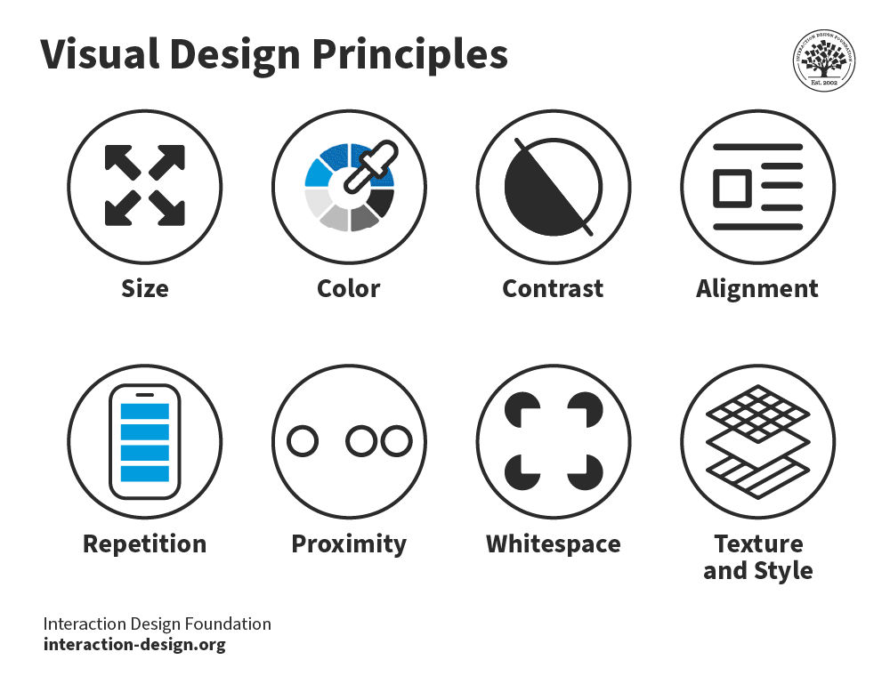
In my experience, typography problems are among the most common and visually disruptive issues in converted presentations. Here's how I approach fixing them:
Addressing Font Inconsistencies
When I'm working with converted presentations, I often notice that the original fonts have been substituted with standard system fonts. To fix this:
- I identify the original fonts if possible (from source files or brand guidelines)
- If the original fonts aren't available, I select visually compatible alternatives
- I create a font mapping table to ensure consistent replacements
- I apply global font changes rather than slide-by-slide fixes
Restoring Text Formatting
I've noticed that text formatting often suffers during conversion. To address this, I:
- Check for and fix inconsistent paragraph spacing
- Restore proper text alignment (left, center, right, justified)
- Correct line spacing and paragraph breaks
- Reapply bullet and numbering styles consistently
Repairing Broken Text Boxes
When working with multimedia presentations tools, I often encounter text boxes that have been broken or resized improperly during conversion. My repair process includes:
My Text Box Repair Checklist:
Text Overflow Issues:
- Resize boxes to fit content
- Adjust margins and padding
- Consider font size reduction if necessary
Positioning Problems:
- Realign to slide grid
- Maintain consistent margins
- Ensure proper spacing between elements
How PageOn.ai's AI Blocks Help
I've found that PageOn.ai's AI Blocks feature is incredibly effective for typography normalization. It can:
My PageOn.ai Typography Fix: I use the command "Normalize all typography according to brand guidelines" and PageOn.ai automatically identifies and fixes font inconsistencies, alignment issues, and text overflow problems across the entire presentation in seconds.
Restoring Visual Elements and Graphics
Visual elements often suffer the most during presentation conversion. I've developed several techniques to restore and enhance these crucial components.

Recovering Image Quality
When images lose resolution during conversion, I follow these steps:
- Identify images that need quality improvement
- Check if original high-resolution versions are available
- For irreplaceable images, use enhancement tools to improve clarity
- Adjust contrast, brightness, and sharpness to compensate for quality loss
- Consider artistic filters to mask resolution issues when appropriate
Repairing Broken Charts and Diagrams
Charts and diagrams often convert as static images, losing their editability. My approach to fixing them:
Option 1: Reconstruction
For critical data visualizations:
- Recreate from scratch using presentation software
- Match colors and styles to original
- Ensure data accuracy during recreation
Option 2: Enhancement
For less critical visuals:
- Improve image quality of the static version
- Add borders or background elements to frame properly
- Apply subtle drop shadows for visual distinction
Fixing Misaligned Visual Elements
Misalignment is a common issue in converted presentations. I use these techniques to restore proper positioning:
- Enable grid and guides in your presentation software
- Use alignment tools to snap elements to proper positions
- Group related elements to maintain their relative positioning
- Apply consistent margins and padding throughout the slide deck
Leveraging PageOn.ai's Deep Search
I've found PageOn.ai's Deep Search functionality to be invaluable for visual restoration:
My PageOn.ai Visual Enhancement Workflow: When I encounter a low-quality image or chart after conversion, I use PageOn.ai's Deep Search with a description of what the visual should represent. The AI instantly finds or generates a high-quality replacement that maintains the original's meaning while looking significantly better.
Rebuilding Slide Layouts and Structure
Maintaining consistent slide layouts is crucial for professional presentations. Here's how I approach rebuilding structure after conversion:
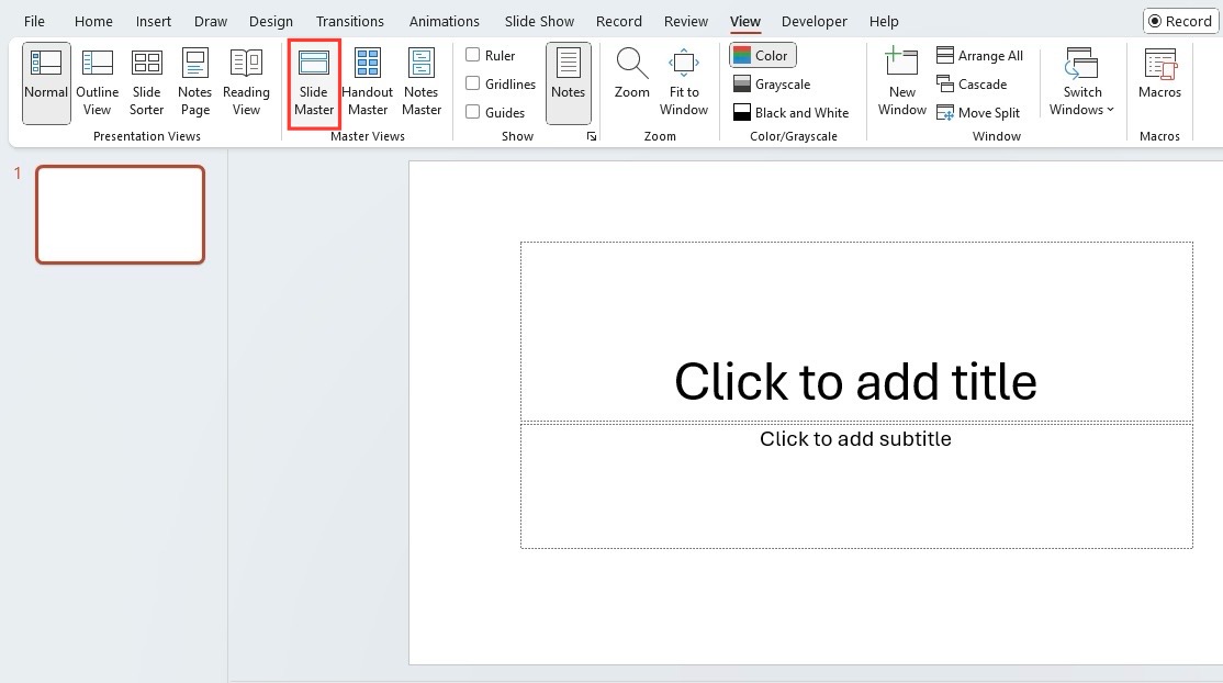
Recreating Master Slide Templates
Master slides are often lost during conversion. My process for rebuilding them:
flowchart TD
    A[Analyze Original Design] --> B{Identify Key Templates}
    B --> C[Title Slide]
    B --> D[Content Slide]
    B --> E[Data Visualization Slide]
    B --> F[Section Divider]
    C --> G[Create Master Templates]
    D --> G
    E --> G
    F --> G
    G --> H[Apply Templates to All Slides]
    H --> I[Fine-tune Individual Slides]
    style G fill:#FF8000,stroke:#333,stroke-width:2px
For each master template, I define:
- Background elements and styling
- Text placeholder positions and formatting
- Header and footer components
- Default color scheme and accent elements
Fixing Slide Transitions and Animations
Animations and transitions rarely survive conversion. When rebuilding them:
- I start with subtle, professional transitions between slides
- I prioritize animations that enhance understanding (e.g., sequential bullet point reveals)
- I ensure consistent animation timing and effects throughout
- I avoid excessive or distracting animations that detract from content
Ensuring Proper Aspect Ratios
Aspect ratio problems are common after conversion. My solutions include:
Aspect Ratio Correction Methods:
For 4:3 to 16:9:
- Reposition elements toward center
- Expand background elements
- Scale up key visuals
For 16:9 to 4:3:
- Compress horizontal spacing
- Reduce image sizes
- Reposition elements vertically
For Custom Ratios:
- Determine target display format
- Create custom slide size
- Adjust elements individually
How PageOn.ai Restructures Slides
I've been amazed by PageOn.ai's ability to automatically restructure slides:
My PageOn.ai Layout Command: "Restructure all slides to match the corporate template and ensure 16:9 aspect ratio." With this simple voice command, PageOn.ai analyzes my content, identifies the intended structure, and rebuilds each slide with proper formatting, spacing, and alignment.
Advanced Techniques for Presentation Enhancement
After addressing the fundamental conversion issues, I use these advanced techniques to transform basic slides into visually compelling stories:

Adding Modern Design Elements
To update the visual language of converted presentations, I incorporate:
Contemporary Visual Trends
- Subtle gradients instead of flat colors
- Light drop shadows for depth
- Rounded corners on containers and images
- Semi-transparent overlays for layered effects
- Minimalist icons and illustrations
Layout Modernization
- Asymmetrical layouts for visual interest
- Increased white space for breathing room
- Grid-based organization for cleaner alignment
- Full-bleed images for impact slides
- Split-screen layouts for comparisons
Incorporating Data Visualizations
I often find that converted presentations contain data in basic tables or text. I transform these into compelling visualizations:
When creating new visualizations, I follow these principles:
- Choose the visualization type that best suits the data story
- Maintain visual consistency with the presentation's color palette
- Simplify complex data to highlight key insights
- Use animation to build understanding sequentially when appropriate
Creating Visual Consistency
When combining slides from different sources, I use these techniques to create a unified look:
- Develop a unified color palette and apply it consistently
- Standardize icon styles and visual metaphors
- Create repeating visual motifs that appear throughout
- Apply consistent text treatment and alignment rules
- Use similar transition effects between all slides
Using PageOn.ai's Agentic Capabilities
I've found PageOn.ai's agentic capabilities particularly powerful for presentation transformation:
My PageOn.ai Enhancement Workflow: I start by asking PageOn.ai to "Transform this basic slide into a visual story with modern design elements." The AI analyzes the content, identifies the key message, and rebuilds the slide with compelling visuals, improved layout, and enhanced data representations—all while maintaining the original information.
Time-Saving Workflows for Batch Editing
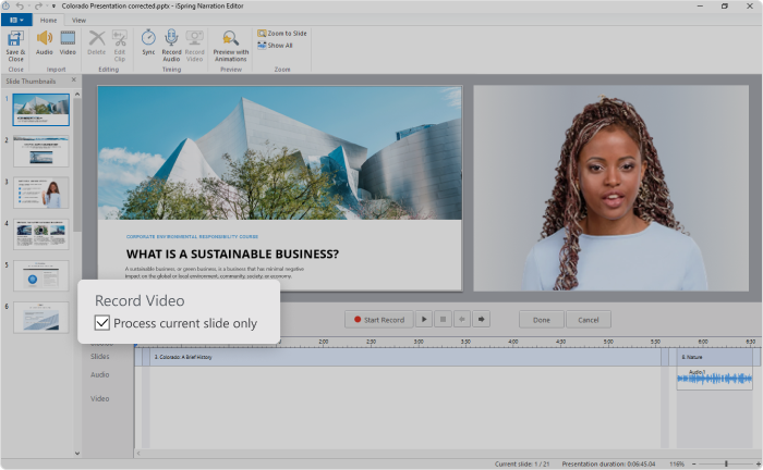
When working with large converted presentations, efficiency becomes crucial. I've developed these batch editing workflows to save time:
Setting Up Editing Templates
Before diving into individual slide fixes, I create editing templates for common issues:
flowchart TD
    A[Identify Common Issues] --> B[Create Fix Templates]
    B --> C[Text Formatting Template]
    B --> D[Image Enhancement Template]
    B --> E[Layout Correction Template]
    B --> F[Color Scheme Template]
    C --> G[Apply Templates in Batch]
    D --> G
    E --> G
    F --> G
    G --> H[Fine-tune Exceptions]
    style B fill:#FF8000,stroke:#333,stroke-width:2px
    style G fill:#FF8000,stroke:#333,stroke-width:2px
These templates allow me to apply consistent fixes across multiple slides with similar issues, dramatically reducing editing time.
Prioritizing Edits for Maximum Impact
I use the "visibility hierarchy" approach to prioritize my editing efforts:
Tier 1: High Visibility
- Title slide
- Agenda/overview slides
- Key message slides
- Executive summary
- Conclusion slides
Tier 2: Medium Visibility
- Section dividers
- Data visualization slides
- Case study highlights
- Process diagrams
Tier 3: Lower Visibility
- Supporting detail slides
- Backup slides
- Reference information
- Appendix materials
This approach ensures I invest my time where it will have the greatest impact on the presentation's effectiveness.
Automating Common Corrections
I leverage several automation techniques for repetitive fixes:
- Use find-and-replace for text formatting issues
- Create and apply custom styles for consistent text treatment
- Use slide master updates to fix recurring layout elements
- Batch process images with similar issues
- Create reusable design elements in a slide library
How PageOn.ai Applies Intelligent Fixes
PageOn.ai has transformed my batch editing workflow with its intelligent automation:
My PageOn.ai Batch Workflow: I simply tell PageOn.ai "Identify and fix all formatting inconsistencies across the presentation while maintaining the content." The AI analyzes the entire deck, categorizes similar issues, and applies appropriate fixes consistently—handling in minutes what would take hours manually.
Before You Present: Final Quality Checks
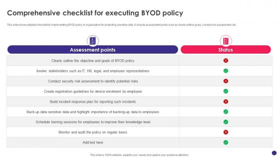
Before considering your edited presentation complete, I always perform these critical quality checks:
Essential Elements to Verify
My comprehensive pre-finalization checklist includes:
Final Quality Checklist:
Visual Checks:
- Consistent font usage across all slides
- Proper alignment of all elements
- Color scheme consistency
- Image and graphic quality
- Adequate contrast for readability
Functional Checks:
- All animations work as intended
- Transitions function smoothly
- Hyperlinks are functional
- Videos play correctly
- Interactive elements respond properly
Cross-Platform Compatibility
I always test presentations on multiple platforms to ensure they display correctly:
- Different versions of presentation software (PowerPoint 2016, 2019, 365, etc.)
- Alternative presentation applications (Keynote, Google Slides)
- Various operating systems (Windows, macOS, iOS, Android)
- Web-based presentation viewers
- Projection systems with different resolutions
Testing Interactive Elements
Interactive elements require special attention after editing converted presentations:
- Verify all hyperlinks open the correct destinations
- Test embedded videos in presentation mode
- Check that all buttons and triggers function properly
- Ensure custom animations sequence correctly
- Test any macros or advanced functionality
Using PageOn.ai for Quality Assessment
PageOn.ai has revolutionized my quality control process:
My PageOn.ai Quality Check: I ask PageOn.ai to "Perform a comprehensive quality assessment of this presentation." The AI quickly analyzes the entire deck, identifying inconsistencies, potential display issues, and areas for improvement—providing a detailed report that helps me ensure nothing is overlooked before the final presentation.
Transform Your Presentation Editing Process with PageOn.ai
Stop spending hours fixing conversion issues manually. PageOn.ai's intelligent visual tools can automatically restore formatting, enhance graphics, and create cohesive designs across your entire presentation in minutes.
Start Creating with PageOn.ai TodayFinal Thoughts: Mastering the Art of Presentation Transformation
Throughout my years of working with presentations, I've learned that converting and editing presentations doesn't have to be a frustrating experience. With the right approach and tools, you can transform even the most problematic converted decks into professional, visually stunning presentations.
The techniques I've shared in this guide have helped me save countless hours of tedious work. From quickly assessing and prioritizing fixes to leveraging automation for batch editing, these strategies can dramatically improve your efficiency and results.
What's most exciting is how AI-powered tools like PageOn.ai are revolutionizing this process. Tasks that once took hours can now be accomplished in minutes, with even better results. The intelligent visual restructuring, typography normalization, and quality assessment capabilities make it possible to transform presentations with unprecedented speed and precision.
I encourage you to apply these techniques to your next converted presentation project. Start with a systematic assessment, prioritize your edits for maximum impact, and leverage the power of modern tools to create truly exceptional results. Your audience will notice the difference, and you'll reclaim hours of valuable time in the process.
You Might Also Like
Decoding the Dollar's Unexpected Decline: Why It Dropped When Markets Expected a Rise
Explore the unusual phenomenon of the dollar's decline despite rising interest rates. Visualize market contradictions, economic forces, and investment implications of this rare currency behavior.
Platform-Specific Visual Strategies: Craft Content That Resonates Across Digital Channels
Discover proven platform-specific content strategies for Instagram, LinkedIn, and TikTok that maximize engagement. Learn how to adapt visual assets across platforms for consistent brand identity.
Transforming Collectible Experiences: From Blind Boxes to Theme Parks | Visual Storytelling Guide
Discover how collectible experiences have evolved from mystery blind boxes to immersive theme parks. Learn visual storytelling strategies to create compelling collectible ecosystems and experiences.
The Hidden Connection: How Government Borrowing Affects Your Mortgage and Savings
Discover how government borrowing directly impacts your mortgage rates and savings returns. Learn practical strategies to navigate this financial relationship and optimize your personal finances.
