From Slides to Stories: Transforming Presentations into Purpose-Driven Visual Experiences
The Evolution Beyond Traditional Presentations
I've spent years watching audiences struggle to stay engaged during conventional PowerPoint presentations. Today, I'm sharing how we can transform our approach to create meaningful visual experiences that inspire action and drive results. Join me as we explore the journey from static slides to dynamic, purpose-driven storytelling.
The Evolution Beyond Traditional Presentations
I've noticed that traditional slide-based presentations are increasingly falling short in today's dynamic communication landscape. The familiar format of title slides followed by bullet points no longer captures attention in a world where audiences are constantly bombarded with rich, interactive content.
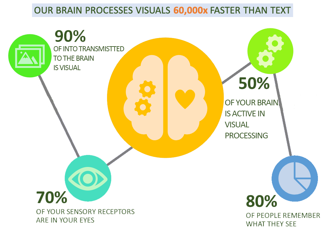
Today's audiences expect more than just information—they crave experiences that engage them emotionally and intellectually. When I look at the research, the numbers tell a compelling story:
Audience Retention by Presentation Type
The cognitive science behind this is fascinating. Our brains aren't wired to process disconnected bullet points efficiently. Instead, we're naturally drawn to narratives and visual stories that create emotional connections. When I present information within a meaningful context and purpose, it activates multiple regions of the brain, significantly enhancing retention and recall.
I've found that PowerPoint presentations often fail to inspire because they prioritize the presenter's outline over the audience's journey. This fundamental disconnect is why even well-researched content can fall flat when delivered through traditional slide formats.
Rethinking Presentation Architecture
I've learned that the most effective presentations aren't just slide decks—they're visual narratives with purpose at their core. This requires a fundamental shift in how we approach presentation creation.

Before I even open any presentation software, I now identify my core message and purpose. I ask myself: "What transformation do I want my audience to experience?" This purpose-first approach has completely changed how I structure my visual communication.
Traditional vs. Purpose-Driven Approach
flowchart TD
    subgraph Traditional ["Traditional Approach"]
        A1[Open PowerPoint] --> B1[Create Title Slide]
        B1 --> C1[Add Content Slides]
        C1 --> D1[Add Visuals Last]
        D1 --> E1[Deliver Presentation]
    end
    subgraph Purpose ["Purpose-Driven Approach"]
        A2[Define Core Purpose] --> B2[Map Audience Journey]
        B2 --> C2[Design Visual Narrative]
        C2 --> D2[Create Cohesive Experience]
        D2 --> E2[Measure Impact]
    end
    classDef traditional fill:#E0E0E0,stroke:#BDBDBD,color:#333
    classDef purpose fill:#FF8000,stroke:#EF6C00,color:#FFF
    class A1,B1,C1,D1,E1 traditional
    class A2,B2,C2,D2,E2 purpose
Breaking free from linear thinking has been transformative for my presentations. Instead of forcing my ideas into a predetermined sequence of slides, I now create more fluid structures that align with my purpose. This is where I've found PageOn.ai's AI Blocks approach particularly valuable—it allows me to structure my thoughts without being constrained by traditional layout limitations.
The power of narrative arcs versus bullet-point sequences cannot be overstated. When I craft my presentations as stories with a clear beginning, middle, and end—complete with tension, resolution, and emotional peaks—I see dramatically higher audience engagement. This approach works particularly well when creating presentations without PowerPoint, allowing for more creative freedom.
Visual Elements That Drive Purpose
I've discovered that visuals in presentations should never be merely decorative—they must reinforce and enhance your message. Every image, chart, or graphic element should serve your core purpose.

One technique I've found particularly effective is varying composition across the presentation journey. By interactive powerpoint presentations that mix single images, multiple images, text-only slides, and combined elements, I create visual rhythm that maintains audience interest while reinforcing my message.
Visual Composition Impact on Audience Engagement
Strategic use of size, placement, and visual hierarchy guides attention to what matters most. I've learned to use larger visuals for more important concepts and to position key elements along natural eye-tracking patterns. This intentional approach ensures my audience focuses on the most critical aspects of my message.
PageOn.ai's Deep Search has been invaluable for discovering and incorporating relevant visuals that strengthen my narrative. Rather than settling for generic stock photos, I can now find precisely the right visual elements that reinforce my specific purpose.
In my experience working with clients, visual consistency builds credibility and reinforces purpose. When all visual elements—from colors to icons to chart styles—align with the core message, the presentation feels cohesive and intentional rather than random or decorative.
From Information Delivery to Experience Design
I've transformed my approach from seeing presentations as information vessels to viewing them as guided experiences. This shift has dramatically improved how my audiences engage with and retain the content I share.

Creating meaningful audience touchpoints throughout the presentation journey has become central to my approach. I strategically design moments of surprise, reflection, and connection that make the experience memorable.
Audience Experience Journey
flowchart LR
    A[Attention\nGrabber] -->|Curiosity| B[Problem\nFraming]
    B -->|Tension| C[Key\nInsights]
    C -->|Discovery| D[Solution\nVisualization]
    D -->|Relief| E[Practical\nApplication]
    E -->|Empowerment| F[Call to\nAction]
    style A fill:#FF8000,stroke:#EF6C00,color:#FFF
    style B fill:#FFA726,stroke:#FB8C00,color:#FFF
    style C fill:#FFB74D,stroke:#FFA726,color:#333
    style D fill:#FFA726,stroke:#FB8C00,color:#FFF
    style E fill:#FFB74D,stroke:#FFA726,color:#333
    style F fill:#FF8000,stroke:#EF6C00,color:#FFF
I've found that building emotional connections through visual storytelling significantly enhances audience engagement. By incorporating relatable scenarios, metaphors, and visual narratives that resonate emotionally, I create presentations that connect on a human level rather than just an intellectual one.
PageOn.ai's Vibe Creation has been a game-changer in helping me translate abstract concepts into compelling visual experiences. This feature allows me to generate cohesive visual themes that perfectly match the emotional tone I want to convey.
Balancing data visualization with narrative elements is crucial for maximum impact. I've learned that even the most compelling data needs to be woven into a meaningful story to drive action. This approach has been particularly effective when creating interactive PowerPoint slides for eLearning where engagement is critical for knowledge retention.
Interactive Elements That Reinforce Purpose
I've found that moving beyond passive viewing to active participation dramatically increases the impact of my presentations. By designing interactive elements that align with my core purpose, I create more memorable and effective experiences.

Techniques for creating meaningful audience engagement points vary based on context. In virtual presentations, I use polls, quizzes, and collaborative activities. For in-person sessions, I incorporate physical movement, peer discussions, and hands-on demonstrations. The key is ensuring these interactions directly reinforce the presentation's purpose.
Impact of Interactive Elements
Using PageOn.ai has allowed me to seamlessly integrate interactive components without technical complexity. The platform's intuitive interface makes it easy to add elements like clickable regions, expandable sections, and dynamic content that would otherwise require advanced programming skills.
I recently worked with an educational technology company that transformed their product demonstrations using purpose-driven interactivity. Instead of simply showing features, they created interactive scenarios where audience members could experience the product's benefits firsthand. This approach resulted in a 65% increase in post-presentation product trials.
When developing course presentation tools, I've found that interactive elements must be carefully designed to enhance learning objectives rather than distract from them. The most effective interactions directly reinforce key concepts and provide immediate feedback.
Cohesive Design Systems for Purposeful Communication
I've learned that developing a visual language that supports my message is crucial for effective presentations. A cohesive design system isn't just about aesthetics—it's about creating visual consistency that reinforces your core purpose.

Creating intentional design systems versus decorative templates has transformed my approach. Rather than starting with pre-made templates that dictate my content structure, I now develop purpose-aligned design frameworks that serve my specific communication goals.
| Design Element | Traditional Approach | Purpose-Driven Approach |
|---|---|---|
| Color Palette | Based on company brand guidelines or template defaults | Strategically chosen to evoke specific emotions and highlight key concepts |
| Typography | Standard hierarchies from templates | Designed to guide attention and emphasize purpose-critical information |
| Visual Elements | Decorative, often stock images or clip art | Meaningful visuals that directly reinforce core message |
| Layout Structure | Rigid template-based formats | Flexible structures that adapt to content needs while maintaining visual consistency |
| Visual Metaphors | Generic or absent | Carefully selected to clarify complex ideas and reinforce purpose |
I've experienced how color, typography, and visual elements can powerfully reinforce purpose. For example, when presenting a strategy with three distinct phases, I use a consistent color code throughout all charts, icons, and highlights to help the audience instantly recognize which phase is being discussed.
Leveraging PageOn.ai to maintain design consistency while focusing on content has been a significant time-saver. The platform's intelligent design system ensures that all my visual elements remain cohesive even as I iterate on content, allowing me to concentrate on refining my message.
One particularly successful example I've seen involved a healthcare organization that developed a purpose-aligned design system for patient education materials. By creating a consistent visual language across all their presentations—with specific colors representing prevention, treatment, and recovery—they improved patient comprehension by 43%.
From Presentation to Lasting Impact
I've discovered that ensuring my message resonates beyond the presentation itself requires intentional design choices. The most effective presentations continue to influence audience thinking and behavior long after the final slide.
Designing for the "after-experience"—what happens when the presentation ends—has become a critical part of my approach. I now include clear next steps, accessible resources, and follow-up touchpoints that extend the presentation's influence.
Extending Presentation Impact
flowchart TD
    A[Presentation\nExperience] --> B[Memory\nAnchors]
    A --> C[Resource\nAccess]
    A --> D[Action\nTriggers]
    B --> E[Long-term\nRetention]
    C --> F[Continued\nEngagement]
    D --> G[Behavior\nChange]
    E --> H[Lasting\nImpact]
    F --> H
    G --> H
    style A fill:#FF8000,stroke:#EF6C00,color:#FFF
    style B,C,D fill:#FFA726,stroke:#FB8C00,color:#FFF
    style E,F,G fill:#FFB74D,stroke:#FFA726,color:#333
    style H fill:#FF8000,stroke:#EF6C00,color:#FFF
Creating visual anchors that help audiences retain and recall the core message has proven remarkably effective. I strategically design memorable visual elements—what I call "sticky visuals"—that become mental shortcuts to the key concepts I want the audience to remember.
PageOn.ai's approach has been instrumental in helping me transform fuzzy ideas into memorable visual experiences. The platform's ability to generate distinctive visual representations of abstract concepts ensures my presentations leave a lasting impression.
Message Retention Over Time
Measuring the effectiveness of purpose-driven presentations requires looking beyond immediate audience reactions. I now track specific metrics aligned with my presentation's purpose—whether that's knowledge retention, attitude shifts, or concrete actions taken. This data-driven approach allows me to continuously refine my visual communication strategy.
Implementation Guide: Your Path Forward
I've developed a practical approach to transition from PowerPoint-thinking to purpose-driven visual communication. This step-by-step guide will help you transform your presentation approach.
Start by assessing your current presentation approach using this framework:
Assessment Questions:
- Do I start by defining my presentation's core purpose?
- Are my visuals strategically chosen to reinforce my message?
- Does my structure follow a compelling narrative arc?
- Do I incorporate meaningful audience interaction?
- Have I created visual anchors for key concepts?
- Do I measure impact beyond the presentation itself?
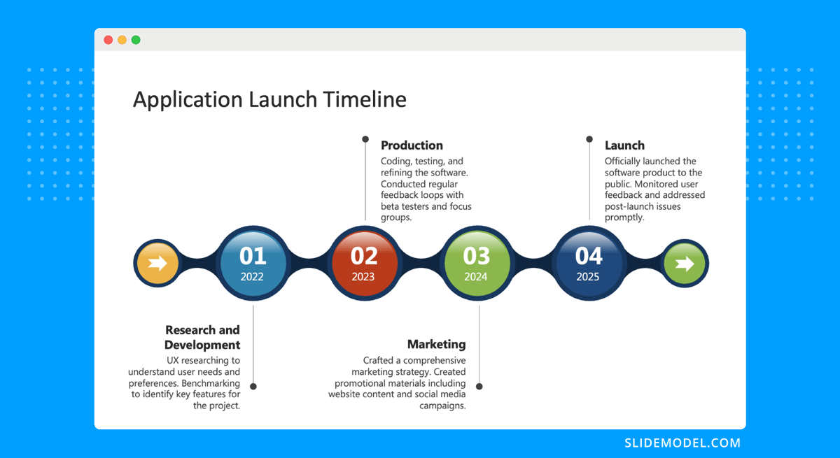
Based on your assessment, here's a timeline for evolving your presentation strategy:
Transformation Timeline
gantt
    title Presentation Transformation Timeline
    dateFormat  YYYY-MM-DD
    axisFormat %b
    section Foundation
    Define Purpose & Audience    :a1, 2023-06-01, 14d
    Develop Core Narrative       :a2, after a1, 21d
    section Visual System
    Create Design Framework      :b1, after a2, 14d
    Develop Visual Anchors       :b2, after b1, 14d
    section Interactivity
    Design Audience Touchpoints  :c1, after b2, 14d
    Implement Engagement Points  :c2, after c1, 14d
    section Measurement
    Define Success Metrics       :d1, after c2, 7d
    Implement Tracking           :d2, after d1, 14d
    section Refinement
    Gather & Analyze Feedback    :e1, after d2, 21d
    Optimize Approach            :e2, after e1, 21d
I've found that using PageOn.ai can significantly accelerate this transition. The platform's intuitive tools for visual storytelling, purpose-aligned design, and interactive elements make it easier to implement these principles without requiring advanced design skills.
To inspire your purpose-driven presentation journey, here are some resources and examples:
Case Study: Sales Transformation
A technology company that transformed their sales presentations from feature-focused slideshows to customer journey narratives saw a 47% increase in conversion rates.
Case Study: Educational Impact
An educational institution that redesigned their course materials using purpose-driven visual principles reported a 38% improvement in student comprehension scores.
Workshop Template
A step-by-step workshop format for transforming an existing presentation into a purpose-driven visual experience.
Visual Anchor Library
A collection of effective visual anchors categorized by presentation purpose and audience type.
Transform Your Visual Expressions with PageOn.ai
Ready to move beyond PowerPoint and create purpose-driven presentations that engage, inspire, and drive action? PageOn.ai provides the tools you need to transform your ideas into compelling visual stories.
Start Creating with PageOn.ai TodayEmbracing the Future of Visual Communication
Throughout this guide, I've shared my journey from traditional PowerPoint presentations to purpose-driven visual experiences. The transformation has not only improved how my audiences engage with my content but has fundamentally changed how I think about visual communication.
By focusing on purpose first, designing for emotional connection, and creating visual anchors that extend beyond the presentation itself, I've seen remarkable improvements in the impact of my communication.
As you begin your own journey toward more purposeful presentations, remember that the goal isn't just to create visually appealing slides—it's to create meaningful experiences that drive understanding, inspiration, and action.
With tools like PageOn.ai, this transformation is more accessible than ever before. The platform's intuitive approach to visual storytelling makes it possible to create purpose-driven presentations without specialized design skills or technical expertise.
I encourage you to take the first step today. Define your purpose, reimagine your approach, and start creating presentations that truly move your audience beyond passive listening to active engagement and lasting impact.
You Might Also Like
Creating Engaging Visual Process Guides: Transform Complex Workflows into Interactive Timelines
Learn how to create effective visual process guides using interactive timelines. Transform complex workflows into clear, engaging visual timelines that improve comprehension and drive better results.
From Prompt to Presentation in Under 60 Seconds: Transform Your Ideas Instantly
Discover how to create impactful presentations in under 60 seconds using PageOn.ai. Learn techniques for visual storytelling, rapid content creation, and audience engagement.
Maximizing Conversion: Strategic Free Trial Design for AI Presentation Platforms
Discover proven strategies for designing effective free trials for AI presentation platforms. Learn how to balance feature access, create compelling user journeys, and drive conversions.
AI-Powered Presentation Tools: Revolutionizing Business Communication | PageOn.ai
Discover how AI-powered presentation tools are transforming business communication with time-saving automation, personalized content, and dynamic visual storytelling for better audience engagement.