Strategic Contrast in E-Learning: Creating Visual Impact That Enhances Learning Outcomes
Understanding the Power of Strategic Contrast in E-Learning
In the world of e-learning design, contrast isn't just an aesthetic choice—it's a powerful tool that shapes how learners process, retain, and engage with content. I've found that when strategically implemented, contrast creates visual hierarchy, reduces cognitive load, and significantly improves learning outcomes.
Understanding the Power of Strategic Contrast in E-Learning
When I design e-learning experiences, I've discovered that contrast is far more than just an aesthetic principle—it's a fundamental cognitive tool. Contrast creates the visual hierarchy that guides learners through content, helping them distinguish between primary, secondary, and tertiary information at a glance.

Visual hierarchy created through strategic contrast guides the learner's eye path
The psychological impact of contrast on learning is profound. When I use contrast effectively, I can:
- Direct attention to key learning objectives
- Reduce cognitive load by clearly distinguishing between content types
- Improve information retention by emphasizing critical concepts
- Enhance engagement by creating visual interest
- Support accessibility needs through appropriate contrast ratios
Research suggests that a 3:1 luminance contrast value represents an ideal benchmark for text-background relationships. This isn't just about aesthetics—it's about visual communication design that respects how our brains process information.
I've found that contrast serves as what design experts call the "drama of design"—the visual tension that captures and maintains learner attention throughout the learning journey. When implemented thoughtfully, contrast doesn't just make e-learning materials look better—it makes them work better.
The Science Behind Visual Contrast and Learning
The effectiveness of contrast in e-learning isn't just intuitive—it's backed by cognitive science. Our brains are naturally wired to notice differences before similarities. This fundamental aspect of human perception makes contrast a powerful tool for learning design.
                    flowchart TD
                        A[Visual Stimulus] --> B[Pattern Recognition]
                        B --> C{Contrast Detection}
                        C -->|High Contrast| D[Rapid Processing]
                        C -->|Low Contrast| E[Increased Cognitive Load]
                        D --> F[Enhanced Retention]
                        E --> G[Reduced Learning Efficiency]
Neurological processing of contrast in learning environments
Recent research on color and contrast in e-learning design confirms that appropriate contrast between text and background significantly impacts readability and information retention. This is particularly important for reducing extraneous cognitive load—the mental effort expended on processing the presentation of material rather than the material itself.
I've observed that our brains process visual information hierarchically, from large to small features. Elements with strong contrast immediately capture attention because they're processed first in this visual hierarchy. This explains why:
Key Insight:
Foreground elements such as text or graphics with a contrasting background are visually more appealing as they are the first elements to catch the reader's attention—contrast is thus an important factor in the immediacy of recognition.
The challenge in e-learning design is finding the balance between sufficient contrast for accessibility and visual clarity while avoiding excessive contrast that could create visual fatigue or distraction. This balance is crucial for creating visually appealing presentations that also serve their educational purpose.
When I design with contrast in mind, I'm not just making aesthetic choices—I'm working with the brain's natural information processing mechanisms to create more effective learning experiences.
Essential Types of Contrast for Impactful E-Learning Design
Color Contrast
Color contrast is perhaps the most immediately noticeable form of contrast in e-learning design. When I work with color, I'm not just making aesthetic choices—I'm creating meaningful visual distinctions that guide the learner through content.
Accessibility considerations are paramount when working with color contrast. The Web Content Accessibility Guidelines (WCAG) recommend a minimum contrast ratio of 4.5:1 for normal text and 3:1 for large text. I always test my color combinations against these guidelines using contrast checker tools.
When searching for complementary color palettes that maintain proper contrast, I've found visual communication in media design principles extremely helpful. PageOn.ai's Deep Search feature has been invaluable for finding color combinations that are both aesthetically pleasing and functionally effective.
Typographical Contrast
Heading Text
Sans-serif, bold, larger size
Creates strong visual hierarchy
Body Text
Serif or Sans-serif, regular weight
Optimized for readability
Typographical contrast is essential for establishing content hierarchy. I typically use:
- Font size variations (larger for headings, smaller for body text)
- Weight contrast (bold for important information, regular for standard content)
- Complementary font pairings (often a sans-serif for headings with a highly readable serif or sans-serif for body text)
PageOn.ai's AI Blocks feature has revolutionized how I experiment with typography combinations. I can quickly test different pairings and see how they work together in context, saving countless hours of manual adjustments.
Spatial and Alignment Contrast

The impact of spatial contrast and white space on content clarity
White space (or negative space) is one of the most underutilized forms of contrast in e-learning design. Strategic use of space creates breathing room and helps learners focus on key content without feeling overwhelmed.
I've found that contrasting alignment patterns can effectively organize information on screen. For example, centering a heading while left-aligning body text creates a subtle but effective contrast that helps structure information. Similarly, using proximity and distance to group related concepts while separating distinct ideas helps learners mentally organize information—a key principle in visual communication for designers.
Implementing Strategic Contrast in E-Learning Materials
Successfully implementing contrast in e-learning design requires a systematic approach. I've developed a process that ensures contrast serves learning objectives rather than just aesthetic preferences.
                    flowchart TD
                        A[Identify Learning Objectives] --> B[Map Content Hierarchy]
                        B --> C[Establish Visual System]
                        C --> D{Apply Contrast Principles}
                        D --> E[Color Contrast]
                        D --> F[Typographical Contrast]
                        D --> G[Spatial Contrast]
                        E & F & G --> H[Test With Learners]
                        H --> I{Effective?}
                        I -->|Yes| J[Implement]
                        I -->|No| K[Refine]
                        K --> H
Strategic contrast implementation workflow for e-learning design
The first step is establishing a clear visual hierarchy that guides learners through content logically. This hierarchy should reflect the relative importance of different content elements and help learners understand what to focus on first.
Visual Hierarchy Checklist:
- ✓ Primary elements (key learning objectives) receive highest contrast
- ✓ Secondary elements (supporting information) use moderate contrast
- ✓ Tertiary elements (additional details) use subtle contrast
- ✓ Interactive elements clearly distinguished through contrast
- ✓ Consistent contrast patterns maintained throughout
Creating focal points through contrast is essential for directing attention to key learning objectives. I've found that using a combination of color, size, and position contrast can create powerful focal points that naturally draw the learner's eye.
One of the most important aspects of contrast implementation is chunking information to reduce cognitive overload. By using contrast to visually separate different concepts or information types, I help learners process information more efficiently.
PageOn.ai's Vibe Creation feature has been transformative for establishing cohesive yet contrasting visual systems. It helps me maintain consistent contrast patterns throughout the learning experience while still providing enough visual variety to keep learners engaged. This approach is particularly valuable for creating student presentations visual ideas that maintain professional quality while being easy to implement.
Common Contrast Pitfalls in E-Learning Design
Even with the best intentions, I've seen (and occasionally made) contrast mistakes that undermine learning objectives. Understanding these common pitfalls has helped me become more intentional about contrast decisions.
Over-Contrasting Elements
When too many elements compete for attention through high contrast, the result is visual clutter and confusion. This creates the opposite of the intended effect—learners struggle to identify what's truly important.
Insufficient Contrast
Inadequate contrast—particularly between text and background—creates accessibility issues and reduces readability for all learners. This often happens when aesthetic preferences override functional considerations.
Inconsistent Contrast Patterns
When contrast is applied inconsistently across an e-learning module, learners must repeatedly reorient themselves to understand the visual hierarchy. This disrupts the learning flow and increases cognitive load.
Purposeless Contrast
Contrast without a clear purpose—creating visual impact that doesn't serve learning objectives—can distract rather than enhance. Every contrast decision should support information processing.

Common contrast errors and their improved alternatives
One of the most valuable aspects of PageOn.ai's agentic capabilities is how it helps identify and resolve these contrast issues. The platform can analyze existing content and provide specific recommendations for improving contrast relationships—essentially functioning as an AI design consultant that understands both visual principles and learning objectives.
Contrast Audit Questions:
- ? Does the contrast hierarchy accurately reflect the importance of different content elements?
- ? Are all text elements meeting minimum contrast requirements for accessibility?
- ? Is contrast being used consistently to indicate similar types of information?
- ? Does the contrast between elements create clear visual pathways through the content?
- ? Are interactive elements clearly distinguished through appropriate contrast?
By regularly auditing my e-learning designs against these questions, I've been able to avoid many common contrast pitfalls and create more effective learning experiences.
Practical Applications: Case Studies in Effective Contrast
Nothing demonstrates the power of strategic contrast better than seeing it in action. I've analyzed several successful e-learning modules to identify how contrast principles contribute to their effectiveness.
Case Study 1: Corporate Compliance Training
A financial services company transformed their compliance training by implementing strategic contrast principles. By clearly distinguishing between must-know regulatory requirements (high contrast) and supplementary information (lower contrast), they reduced completion time by 22% while improving knowledge retention by 17%.

Before and after redesign using strategic contrast principles
Key improvements included color-coding information by priority, implementing consistent typographical hierarchy, and using spatial contrast to group related concepts.
Case Study 2: Higher Education Online Course
A university psychology department redesigned their introductory online course using contrast principles to improve student engagement and comprehension. Their approach focused on creating clear visual landmarks through contrasting section headers and consistent visual cues for different types of content.
The results were significant: improved completion rates, higher assessment scores, and substantially better student satisfaction ratings. Students specifically commented on how much easier it was to identify important concepts and follow the logical flow of information.
What's particularly interesting about these case studies is how contrast improvements affected learning outcomes across different contexts. The principles remain consistent, but the specific implementation varies based on learning objectives, audience, and content type.
PageOn.ai has proven invaluable for transforming existing low-contrast materials into visually impactful learning experiences. Its ability to analyze content structure and suggest appropriate contrast relationships has helped instructional designers without strong visual design backgrounds create more effective learning materials.
Tools and Techniques for Creating Effective Contrast
Creating effective contrast in e-learning design doesn't require advanced design skills—just the right tools and techniques. I've compiled a collection of resources that have helped me implement contrast principles more effectively.
Contrast Measurement Tools
WebAIM Contrast Checker
This free tool allows you to check the contrast ratio between any two colors against WCAG standards. It also provides pass/fail feedback for different text sizes.
Contrast Ratio: 4.5:1 minimum for normal text
Colour Contrast Analyser
A desktop application that allows you to check color contrasts against WCAG guidelines and simulate various types of color blindness.
Supports: Protanopia, Deuteranopia, Tritanopia
Adobe Color
This free color tool helps create accessible color combinations with sufficient contrast while maintaining aesthetic harmony.
Features: Color wheel, Accessibility tools, Color harmony rules
Stark Contrast Checker Plugin
A plugin for design tools like Figma and Sketch that checks contrast as you design, helping catch issues early in the process.
Integrates with: Figma, Sketch, Adobe XD
Contrast Templates and Frameworks
Sample contrast framework template for e-learning design
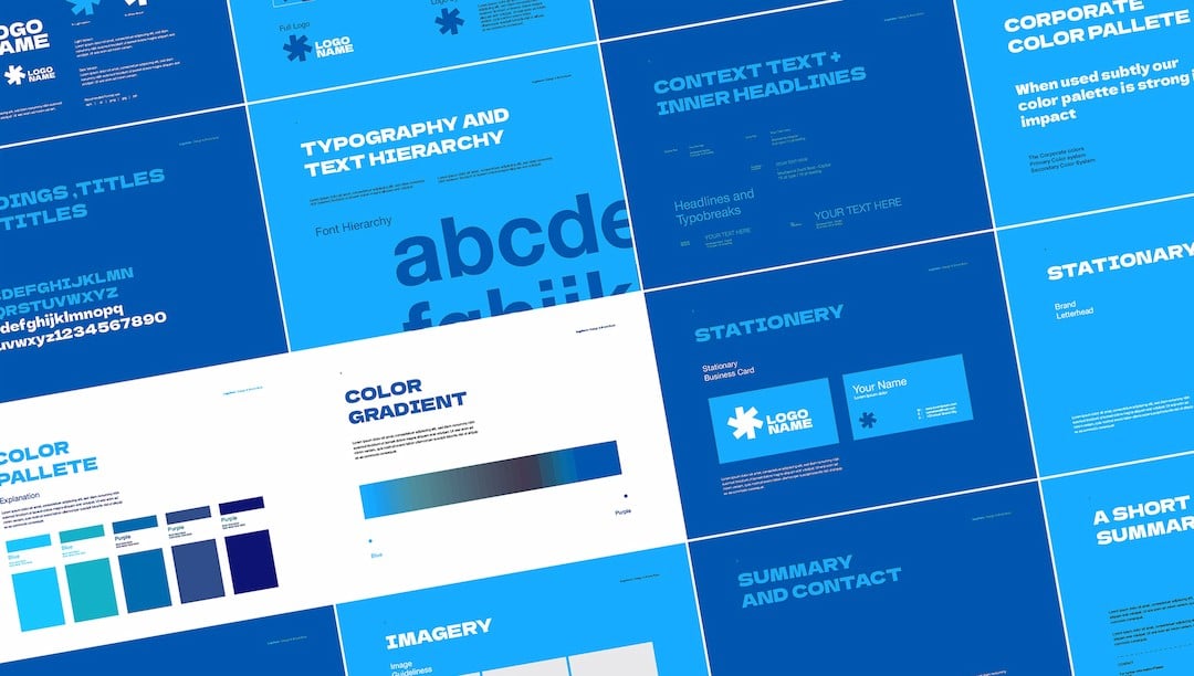
Establishing a consistent contrast system is much easier with a template or framework. I typically create a contrast style guide that includes:
- Color contrast relationships for different content types
- Typography scale with specified size and weight contrasts
- Spacing guidelines for creating effective spatial contrast
- Examples of proper contrast implementation for common elements
PageOn.ai has simplified the process of creating and maintaining strategic contrast through its intuitive interface and AI-powered suggestions. The platform analyzes content structure and automatically suggests appropriate contrast relationships based on content hierarchy.
Workflow Integration Tips:
- → Start with content hierarchy before making visual design decisions
- → Test contrast with actual users whenever possible
- → Create reusable contrast patterns for consistent implementation
- → Conduct regular contrast audits of existing materials
- → Use PageOn.ai to automate contrast suggestions based on content structure
By incorporating contrast considerations throughout the design process rather than as an afterthought, I've been able to create more effective and accessible e-learning experiences.
The Future of Contrast in Adaptive E-Learning Environments
The future of contrast in e-learning is moving toward greater personalization and adaptability. As technology evolves, we're seeing exciting possibilities for how contrast can be tailored to individual learner needs and preferences.
                    flowchart TD
                        A[Learner Profile] --> B{AI Analysis}
                        B --> C[Visual Preferences]
                        B --> D[Learning Style]
                        B --> E[Device Context]
                        B --> F[Accessibility Needs]
                        C & D & E & F --> G[Dynamic Contrast Engine]
                        G --> H[Personalized Contrast Settings]
                        H --> I[Optimized Learning Experience]
                        I --> J{Performance Monitoring}
                        J --> K[Continuous Optimization]
                        K --> B
The future of adaptive contrast in personalized e-learning
Personalized contrast settings based on learner preferences and needs represent one of the most promising developments. Imagine an e-learning platform that remembers each learner's optimal contrast settings or automatically adjusts based on their interaction patterns.
Dynamic contrast adjustments for different devices and viewing conditions will also become increasingly important as learners access content across multiple devices and environments. An e-learning module might automatically adjust contrast levels based on ambient light detection or screen type.
Conceptual interface for an adaptive contrast system
AI-driven contrast optimization for maximum learning impact is perhaps the most exciting frontier. PageOn.ai's agentic capabilities already hint at this future—the platform can analyze learner interaction data and suggest contrast adjustments that optimize for comprehension and retention.
Emerging research on contrast perception is also yielding valuable insights for e-learning design. Studies on how different demographic groups perceive contrast, the impact of contrast on cognitive load under various conditions, and the relationship between contrast and information processing speed are all informing more sophisticated approaches to contrast in digital learning environments.
As these technologies mature, we'll likely see e-learning experiences that dynamically adjust their visual presentation based on real-time feedback about learner engagement and comprehension. This adaptive approach to contrast will help ensure that each learner receives content in the most effective visual format for their unique needs.
Practical Implementation Guide: Creating Your Contrast Strategy
Creating an effective contrast strategy doesn't have to be overwhelming. I've developed a step-by-step process that helps instructional designers implement strategic contrast in their e-learning materials.
Step 1: Audit Existing Materials
Begin by evaluating your current e-learning content through the lens of contrast effectiveness:
- Identify areas where contrast is insufficient (e.g., text that's difficult to read)
- Note instances where contrast is excessive or distracting
- Evaluate whether the current contrast hierarchy reflects content priorities
- Check for consistency in how contrast is applied across similar elements
Use contrast checker tools to objectively measure text-background relationships against accessibility standards.
Step 2: Create a Contrast Style Guide
Develop a document that establishes contrast standards for your e-learning materials:
- Define color palettes with specified contrast relationships
- Establish typographical hierarchy with size and weight specifications
- Document spacing guidelines for creating effective white space
- Include examples of proper implementation for common elements
- Specify contrast requirements for interactive elements
This guide ensures consistency across modules and helps team members understand contrast expectations.
Sample contrast style guide for e-learning materials
Step 3: Balance C.R.A.P. Principles
Ensure that your contrast strategy works harmoniously with other design principles:
Contrast
Create visual interest and hierarchy through differences
Repetition
Maintain consistency for similar elements and patterns
Alignment
Create order and organization through proper positioning
Proximity
Group related items together, separate distinct concepts
These principles work together—contrast decisions should reinforce rather than conflict with other design elements.
Step 4: Test and Iterate
Validate your contrast choices with actual learners:
- Conduct usability testing with representative learners
- Gather feedback specifically about visual clarity and hierarchy
- Test with users who have different visual abilities
- Observe how effectively learners navigate and prioritize information
- Make iterative improvements based on feedback and observations
Testing reveals whether your contrast strategy is achieving its intended learning objectives.
PageOn.ai has revolutionized how I approach contrast in e-learning design. The platform allows me to rapidly prototype different contrast approaches and visualize their impact before implementation. This iterative process helps me find the optimal contrast strategy for each learning context.
By following this implementation guide, you can create a contrast strategy that not only looks professional but actively enhances the learning experience by guiding attention, reducing cognitive load, and improving information retention.
Transform Your Visual Expressions with PageOn.ai
Ready to revolutionize your e-learning materials with strategic contrast? PageOn.ai provides intelligent tools to create visually impactful learning experiences that enhance comprehension, reduce cognitive load, and improve retention. Start creating stunning visual expressions that communicate complex ideas with clarity and impact.
Final Thoughts on Strategic Contrast
Strategic contrast is more than just an aesthetic consideration—it's a fundamental tool for creating effective learning experiences. By thoughtfully implementing contrast principles, we can guide learner attention, reduce cognitive load, and improve information retention.
As we've explored throughout this guide, contrast works on multiple levels—color, typography, space, and alignment all contribute to creating meaningful visual distinctions that support learning objectives. The most effective e-learning designs use contrast purposefully and consistently to create clear visual hierarchies.
The future of contrast in e-learning is moving toward greater personalization and adaptivity. As tools like PageOn.ai continue to evolve, we'll see increasingly sophisticated approaches to contrast that respond to individual learner needs and preferences.
Whether you're redesigning existing materials or creating new e-learning content, I encourage you to approach contrast strategically. Consider not just how your design looks, but how contrast can be leveraged to create more effective, accessible, and engaging learning experiences. The visual impact you create today can transform learning outcomes tomorrow.
You Might Also Like
Revolutionizing Market Entry Presentations with ChatGPT and Gamma - Strategic Impact Guide
Learn how to leverage ChatGPT and Gamma to create compelling market entry presentations in under 90 minutes. Discover advanced prompting techniques and visual strategies for impactful pitches.
Mastering Visual Harmony: The Art and Science of Cohesive Slide Layouts
Discover how to create visually harmonious slide layouts through color theory, typography, and spatial design. Learn professional techniques to elevate your presentations with PageOn.ai.
Transform Your Presentations: Mastering Slide Enhancements for Maximum Impact
Learn how to elevate your presentations with effective slide enhancements, formatting techniques, and visual communication strategies that captivate audiences and deliver powerful messages.
The Strategic GIF Guide: Creating Memorable Moments in Professional Presentations
Discover how to effectively use GIFs in professional presentations to create visual impact, enhance audience engagement, and communicate complex concepts more memorably.