Transform Your Presentations: Mastering Slide Enhancements for Maximum Impact
Understanding the Psychology Behind Effective Visual Communication
I've spent years refining the art of presentation design, and I'm excited to share how you can transform ordinary slides into compelling visual stories. In this comprehensive guide, we'll explore the psychological foundations of visual communication, discover practical enhancement techniques, and learn how to create presentations that truly resonate with audiences.
Visual Communication Psychology
I've always been fascinated by how our brains process visual information. When I create presentations, I'm not just arranging text and images—I'm engaging with the fundamental cognitive processes that determine how my audience will receive, process, and remember my message.
Visual information processing in the brain affects how audiences retain presentation content
Visual Processing & Information Retention
Our brains process visual information 60,000 times faster than text. When I incorporate thoughtful visual elements, I'm not just making my slides prettier—I'm actively improving how well my audience will remember my key points. In fact, presentations with compelling visuals can increase retention by up to 42%.
Information Retention by Presentation Type
The following chart demonstrates how different presentation approaches affect audience retention:
Balancing Visual Elements for Optimal Cognitive Load
I've learned that finding the right balance between text, graphics, and white space is crucial. Too much information creates cognitive overload, while too little fails to engage. The ideal slide contains:
- No more than 6 bullet points per slide
- No more than 6 words per bullet (the 6x6 rule)
- At least 30% white space to allow visual breathing room
- A clear visual hierarchy that guides the eye
Elements of Cognitive Balance in Slides
This diagram illustrates the optimal balance of elements:
                    flowchart TD
                        A[Effective Slide] --> B[Visual Elements]
                        A --> C[Textual Content]
                        A --> D[White Space]
                        B --> B1[Images]
                        B --> B2[Charts]
                        B --> B3[Icons]
                        C --> C1[Headlines]
                        C --> C2[Key Points]
                        C --> C3[Supporting Data]
                        D --> D1[Margins]
                        D --> D2[Spacing Between Elements]
                        D --> D3[Visual Breathing Room]
                        style A fill:#FF8000,stroke:#333,stroke-width:2px,color:white
                        style B fill:#FFB366,stroke:#333,stroke-width:1px
                        style C fill:#FFB366,stroke:#333,stroke-width:1px
                        style D fill:#FFB366,stroke:#333,stroke-width:1px
Common Visual Pitfalls
In my experience, these are the most common visual mistakes that undermine presentation effectiveness:
Overcrowding
Trying to fit too much information on a single slide, creating visual chaos and cognitive overload.
Poor Contrast
Using color combinations that strain the eyes or make text difficult to read, especially in varied lighting conditions.
Inconsistent Design
Switching design elements, colors, or fonts throughout the presentation, creating a disjointed experience.
Decorative Distractions
Adding visual elements that don't support your message but compete for attention with important content.
When I use PageOn.ai to create my presentations, I benefit from its visual intelligence that automatically analyzes and optimizes visual hierarchies. The platform can identify when my slides are becoming overcrowded and suggest better arrangements for improved audience comprehension.
Essential Enhancement Techniques for Modern Presenters
I've found that mastering a few key enhancement techniques can dramatically elevate the quality and effectiveness of my presentations. These aren't just decorative tricks—they're strategic approaches to visual communication.
Consistent Visual Themes
I always establish a consistent visual theme that reinforces brand identity. This includes:

Consistent visual themes reinforce brand identity throughout the presentation
- A cohesive color palette (typically 2-3 primary colors and 2-3 accent colors)
- Consistent typography hierarchy (heading, subheading, body text)
- Uniform slide layouts that create a sense of continuity
- Recurring visual motifs that reinforce key themes
Color Psychology in Presentations
I strategically use colors to evoke specific emotional responses that align with my message:
Color Psychology in Presentations
When selecting colors, I consider both the emotional impact and the practical aspects of visibility. I've found that visual aids in presentations are most effective when they use color strategically rather than decoratively.
Typography as a Communication Tool
I've learned that typography is far more than just selecting a font. It's about using text visually to communicate hierarchy, emphasis, and meaning:
Font Pairing
I typically pair a distinctive heading font with a highly readable body font for contrast and clarity.
Text Hierarchy
I establish a clear size hierarchy (typically 3 levels) to guide the audience through the information.
Emphasis Techniques
I use bold, color, and spacing—rather than underlines or italics—to emphasize key points.
From Static to Dynamic with AI Blocks
One of my favorite techniques is transforming static slides into dynamic visual narratives. With PageOn.ai's AI Blocks, I can create modular visual components that build progressively to tell a story. This approach:
- Maintains audience attention through progressive disclosure
- Creates visual connections between related concepts
- Allows for flexible rearrangement of content based on audience needs
- Supports both linear and non-linear presentation styles
Dynamic Presentation Structure
This diagram shows how AI Blocks can create a dynamic presentation structure:
                    flowchart TD
                        A[Core Concept] --> B[Supporting Point 1]
                        A --> C[Supporting Point 2]
                        A --> D[Supporting Point 3]
                        B --> B1[Evidence Block]
                        B --> B2[Visual Example]
                        C --> C1[Case Study]
                        C --> C2[Data Visualization]
                        D --> D1[Practical Application]
                        D --> D2[Future Implications]
                        style A fill:#FF8000,stroke:#333,stroke-width:2px,color:white
                        style B fill:#FFB366,stroke:#333,stroke-width:1px
                        style C fill:#FFB366,stroke:#333,stroke-width:1px
                        style D fill:#FFB366,stroke:#333,stroke-width:1px
By implementing these essential enhancement techniques, I've been able to create presentations that not only look professional but also communicate more effectively. The key is to ensure every visual choice serves your message rather than simply decorating your slides.
Advanced Formatting Strategies That Captivate Audiences
I've discovered that the difference between a good presentation and a great one often lies in the advanced formatting strategies employed. These techniques go beyond basic design to create truly captivating visual experiences.
Purposeful Slide Transitions
I approach transitions not as decorative effects but as narrative tools. The right transitions can:
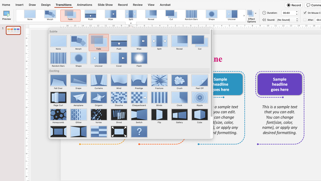
Purposeful slide transitions maintain narrative flow between key concepts
- Signal the relationship between ideas (continuation, contrast, cause/effect)
- Create a sense of progression through a complex topic
- Direct audience attention to specific elements as they appear
- Maintain the narrative flow without creating distractions
When creating visually appealing presentations, I've found that subtle transitions like fade, push, or morph are generally more effective than flashy ones like spinning or bouncing, which can distract from your content.
Custom Graphics and Diagrams
I regularly create custom graphics and diagrams to simplify complex information. This approach offers several advantages:
Uniqueness
Custom visuals stand out from generic stock images and create a memorable impression.
Precision
Tailored graphics can illustrate exactly the point you're making without extraneous details.
Consistency
Custom elements can maintain visual consistency with your overall design theme.
Ownership
Creating your own visuals eliminates copyright concerns and allows for unlimited modification.
Layout Optimization Techniques
I apply these advanced layout techniques to optimize the visual impact of my slides:
Layout Optimization Principles
                    flowchart TD
                        A[Optimal Layout] --> B[Rule of Thirds]
                        A --> C[Visual Direction]
                        A --> D[Focal Point]
                        A --> E[Negative Space]
                        B --> B1[Place key elements at intersection points]
                        C --> C1[Guide viewer's eye through content]
                        D --> D1[Create clear hierarchy of attention]
                        E --> E1[Use emptiness strategically]
                        style A fill:#FF8000,stroke:#333,stroke-width:2px,color:white
Data Visualization That Makes Numbers Meaningful
I've learned that effective data visualization is about making numbers tell a story, not just displaying them. When I present data, I focus on:
Effectiveness of Different Data Visualization Methods
- Choosing the right chart type for the specific data relationship I'm highlighting
- Simplifying visuals to focus on the key insight, not just raw numbers
- Using consistent color coding to help audiences track variables across multiple slides
- Adding contextual annotations that explain the significance of data patterns
Discovering Perfect Visual Assets
Finding the right visual assets can be challenging, but I've found PageOn.ai's Deep Search functionality to be incredibly helpful. It allows me to:
- Search for visuals based on conceptual descriptions rather than just keywords
- Filter results based on style, color scheme, and composition to match my presentation theme
- Discover unique visuals that haven't been overused in typical presentations
- Generate custom visual assets when I can't find exactly what I need
By implementing these advanced formatting strategies, I've been able to create presentations that not only convey information but truly captivate audiences and make complex ideas accessible and engaging.
Interactive Elements That Transform Passive Viewers Into Active Participants
I've found that the most engaging presentations are those that transform the audience from passive viewers into active participants. Interactive elements create a two-way experience that dramatically increases engagement and retention.
Clickable Elements for Audience Exploration
I regularly incorporate clickable elements that allow audiences to explore content at their own pace and based on their interests:

Interactive clickable elements encourage audience exploration and deeper engagement
Creating interactive PowerPoint slides for eLearning involves several key techniques:
Hyperlinked Objects
I create clickable shapes, images, or text that reveal additional information or navigate to related slides.
Hover States
I use visual cues that appear when hovering over interactive elements to signal clickability.
Layered Content
I organize information in layers that can be progressively revealed based on audience interest.
Knowledge Checks
I embed interactive quizzes or challenges that test comprehension and reinforce key points.
Audience Response Integration
I've found that incorporating audience response systems directly within my presentations creates powerful engagement opportunities:
Audience Response Flow
                    flowchart TD
                        A[Presenter Poses Question] --> B[Audience Responds via Mobile]
                        B --> C[Results Display in Real-Time]
                        C --> D[Presenter Addresses Results]
                        D --> E[Adjusts Presentation Path]
                        style A fill:#FF8000,stroke:#333,stroke-width:2px,color:white
                        style E fill:#FF8000,stroke:#333,stroke-width:2px,color:white
These systems allow me to:
- Collect real-time feedback that shapes the direction of my presentation
- Conduct live polls that make audiences feel invested in the content
- Gather anonymous questions that might not be asked in a traditional Q&A format
- Create friendly competition through quizzes or challenges that boost engagement
Branching Scenarios for Customized Experiences
One of my most effective interactive techniques is creating branching scenarios that allow for customized presentation paths:
Branching Presentation Structure
                        flowchart TD
                            A[Introduction] --> B{Audience Choice}
                            B -->|Technical Focus| C[Technical Deep Dive]
                            B -->|Business Focus| D[Business Case Studies]
                            B -->|Implementation Focus| E[Implementation Guide]
                            C --> F[Technical Q&A]
                            D --> F
                            E --> F
                            F --> G[Conclusion]
                            style A fill:#FF8000,stroke:#333,stroke-width:2px,color:white
                            style G fill:#FF8000,stroke:#333,stroke-width:2px,color:white
This approach allows me to:
- Adapt to different audience interests or expertise levels in real-time
- Create a sense of personalization even in large group settings
- Ensure the most relevant content is presented to each specific audience
- Make presentations reusable across different contexts by including multiple content paths
Building Interactivity with PageOn.ai
I've found PageOn.ai's conversational interface particularly valuable for building interactive elements without complex programming. The platform allows me to:
- Describe the interactive experience I want to create in natural language
- Generate functional interactive elements based on my descriptions
- Modify interactions through simple conversational commands
- Test interactive elements before finalizing the presentation
By incorporating these interactive elements, I've transformed my presentations from one-way information delivery into collaborative experiences that keep audiences engaged and dramatically increase information retention.
Multimedia Integration: Beyond Static Slides
I've discovered that integrating multimedia elements can transform a standard presentation into an immersive experience. When done thoughtfully, multimedia enhances rather than distracts from your core message.
Strategic Audio-Visual Integration
I've learned that elevating presentations with audio and visuals requires strategic planning:

Strategic multimedia integration enhances the presentation without overwhelming the audience
Purposeful Selection
I only include multimedia elements that directly enhance or clarify my message, not just for novelty.
Seamless Transitions
I ensure smooth transitions into and out of multimedia content to maintain presentation flow.
Technical Rehearsal
I always test multimedia elements in the actual presentation environment to prevent technical issues.
Effective Video Integration
When embedding video content, I follow these best practices:
- Keep videos concise (under 90 seconds) to maintain attention
- Embed videos directly into the presentation file when possible to avoid switching between applications
- Prepare backup links or files in case of technical difficulties
- Set videos to play automatically when appropriate, but always ensure manual controls are available
- Include captions or subtitles for accessibility and situations where audio might be unavailable
Strategic Animation Use
I use animation strategically to highlight—not overwhelm—important content:
Effective Animation Hierarchy
                    flowchart TD
                        A[Animation Purpose] --> B[Reveal Sequence]
                        A --> C[Highlight Key Points]
                        A --> D[Show Relationships]
                        A --> E[Demonstrate Process]
                        B --> B1[Progressive disclosure of complex information]
                        C --> C1[Draw attention to critical elements]
                        D --> D1[Visualize connections between concepts]
                        E --> E1[Show changes over time or steps]
                        style A fill:#FF8000,stroke:#333,stroke-width:2px,color:white
My animation principles include:
- Using consistent animation styles throughout the presentation
- Keeping animations simple and purposeful—avoid "animation for animation's sake"
- Using animation timing that feels natural and gives the audience time to process information
- Creating logical build sequences that support the narrative flow
Audio Elements That Enhance Without Competing
I incorporate audio elements carefully to complement rather than compete with my spoken delivery:
Effectiveness of Audio Element Types
My guidelines for audio integration include:
- Using background music only during breaks or as audience is entering/exiting
- Keeping sound effects subtle and relevant to the content
- Ensuring all audio is high-quality and properly normalized
- Always having a backup plan for presenting without audio if technical issues arise
Seamless Multimedia Integration with PageOn.ai
I've found PageOn.ai particularly helpful for multimedia integration because it allows me to:
- Access a library of pre-optimized multimedia elements that work seamlessly in presentations
- Edit and trim video or audio content directly within the platform
- Ensure consistent formatting and styling across all multimedia elements
- Preview how multimedia will appear and function in the final presentation
By thoughtfully integrating multimedia elements, I create presentations that engage multiple senses and dramatically increase audience attention and retention. The key is always ensuring that multimedia supports rather than overshadows your core message.
Accessibility and Universal Design Principles for Inclusive Presentations
I believe that truly effective presentations should be accessible to everyone. By implementing accessibility and universal design principles, I not only reach wider audiences but also create better presentations for all viewers.
Color Contrast for Universal Visibility
I always ensure my presentations meet color contrast guidelines to accommodate various visual abilities:
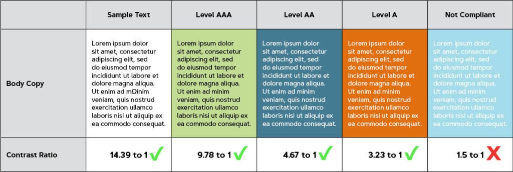
Proper color contrast ensures content visibility across all audience members
- I maintain a minimum contrast ratio of 4.5:1 for normal text and 3:1 for large text
- I avoid problematic color combinations (like red/green) that affect colorblind viewers
- I test my presentations using color contrast analyzers to verify accessibility
- I never rely on color alone to convey important information
Accessible Text Formatting
I format text with accessibility in mind:
Font Selection
I use sans-serif fonts like Arial or Calibri that are easier to read at various sizes and distances.
Font Size
I maintain minimum font sizes (24pt for headings, 18pt for body text) to ensure readability.
Text Alignment
I use left alignment for body text, which is easier to read than justified or centered text.
Line Spacing
I implement 1.15-1.5 line spacing to improve readability, especially for those with dyslexia.
Alt Text for Visual Elements
I create descriptive alt text for all visual elements to support screen reader users:
Alt Text Best Practices
                    flowchart TD
                        A[Effective Alt Text] --> B[Be Concise]
                        A --> C[Be Descriptive]
                        A --> D[Include Context]
                        A --> E[Avoid Redundancy]
                        B --> B1[Keep under 125 characters]
                        C --> C1[Describe visual content and purpose]
                        D --> D1[Explain why the image matters]
                        E --> E1[Don't repeat information already in text]
                        style A fill:#FF8000,stroke:#333,stroke-width:2px,color:white
Good alt text should:
- Describe both what the image shows and its purpose in the presentation
- Include any text that appears in charts, graphs, or infographics
- Convey the same information that a sighted user would get from the visual
- Follow a consistent format throughout the presentation
Screen Reader Compatibility
I structure my presentations to ensure screen reader compatibility:
- Using built-in heading styles rather than manually formatted text to create proper document structure
- Providing text alternatives for all non-text content
- Creating logical reading order that matches the visual layout
- Adding slide titles that are unique and descriptive
- Using built-in table structures rather than text boxes arranged to look like tables
Automated Accessibility Improvements
I leverage PageOn.ai's accessibility features to automatically enhance my presentations:
Accessibility Issues Detected by PageOn.ai
The platform helps me:
- Identify and fix accessibility issues I might have missed
- Generate appropriate alt text suggestions for images
- Verify color contrast ratios throughout my presentation
- Structure content for optimal screen reader compatibility
- Create accessible PDF versions of my presentations
By implementing these accessibility principles, I ensure my presentations reach the widest possible audience while also creating a better experience for everyone. Universal design doesn't just accommodate differences—it creates a superior product for all users.
From Theory to Practice: Creating Your Enhanced Presentation
I've found that the journey from understanding presentation principles to consistently creating exceptional presentations requires a systematic approach. Let me share how I turn theory into practice.
Developing a Systematic Approach
I've developed a methodical process for making excellent presentations consistently:

A systematic approach ensures consistent quality across all your presentations
Presentation Development Framework
                    flowchart TD
                        A[Content Planning] --> B[Visual Strategy]
                        B --> C[Initial Design]
                        C --> D[Enhancement Layer]
                        D --> E[Review & Testing]
                        E --> F[Refinement]
                        F --> G[Final Production]
                        A --> A1[Audience Analysis]
                        A --> A2[Core Message Definition]
                        A --> A3[Content Hierarchy]
                        B --> B1[Visual Theme Selection]
                        B --> B2[Color & Typography Decisions]
                        B --> B3[Layout Planning]
                        D --> D1[Interactive Elements]
                        D --> D2[Multimedia Integration]
                        D --> D3[Animation & Transitions]
                        E --> E1[Peer Review]
                        E --> E2[Technical Testing]
                        E --> E3[Accessibility Check]
                        style A fill:#FF8000,stroke:#333,stroke-width:2px,color:white
                        style G fill:#FF8000,stroke:#333,stroke-width:2px,color:white
Building Your Personal Enhancement Checklist
I've created a personalized enhancement checklist based on my presentation style:
My Presentation Enhancement Checklist
- Visual Hierarchy: Is there a clear visual path for the eye to follow?
- Cognitive Load: Have I simplified complex information appropriately?
- Consistency: Do all slides follow the established design system?
- Purpose: Does each visual element serve a clear purpose?
- Accessibility: Have I addressed color contrast, text size, and alt text?
- Engagement: Have I included elements that invite audience participation?
A/B Testing for Slide Effectiveness
I implement A/B testing methods to continuously improve my presentations:
A/B Testing Results for Presentation Elements
My A/B testing process includes:
- Creating alternative versions of key slides with different visual approaches
- Testing with small audiences before major presentations
- Collecting specific feedback on comprehension and engagement
- Measuring attention and retention through follow-up questions
- Documenting successful approaches for future presentations
Creating Reusable Templates
I develop templates that incorporate my most effective enhancement techniques:
Master Slide Templates
I create comprehensive master slide templates with consistent styling, placement guides, and color schemes.
Content Block Library
I maintain a library of successful content blocks (charts, diagrams, layouts) that can be repurposed.
Visual Asset Collection
I curate collections of visual assets organized by theme, style, and purpose for quick access.
Animation Presets
I save successful animation sequences as presets that can be applied consistently across presentations.
Transforming Vision into Reality with PageOn.ai
I leverage PageOn.ai's thought-to-visual capabilities to bridge the gap between my vision and the final presentation:
- Describing the visual concept I want in natural language
- Receiving multiple design options based on my description
- Refining generated visuals through conversational feedback
- Integrating the final visuals seamlessly into my presentation
This approach allows me to create sophisticated visuals even when I don't have advanced design skills or access to professional design software.
By implementing these practical strategies, I've been able to consistently create enhanced presentations that effectively communicate my message while engaging and inspiring my audiences. The systematic approach ensures that each presentation builds on previous successes while continuously improving.
Transform Your Visual Expressions with PageOn.ai
Ready to elevate your presentations from ordinary to extraordinary? PageOn.ai gives you the tools to create stunning visual stories that captivate audiences and communicate complex ideas with clarity and impact.
Start Creating with PageOn.ai TodayConclusion: Your Journey to Presentation Excellence
Throughout this guide, I've shared the techniques and strategies I've developed over years of creating impactful presentations. From understanding the psychology of visual communication to implementing interactive elements and ensuring accessibility, these approaches can transform how you connect with your audience.
Remember that great presentations aren't just about beautiful slides—they're about creating meaningful connections with your audience through thoughtful visual communication. By applying these enhancement techniques systematically, you'll not only create more visually appealing presentations but also more effective ones that achieve your communication goals.
As you continue your presentation journey, I encourage you to experiment with these techniques, develop your personal style, and continuously refine your approach. With tools like PageOn.ai to support your creative process, you have everything you need to create presentations that inform, engage, and inspire.
You Might Also Like
From Status Quo to Solution: Crafting the Perfect Pitch Narrative Arc | PageOn.ai
Learn how to transform your business presentations with powerful status quo to solution narratives. Discover visual storytelling techniques that captivate investors and stakeholders.
Visualizing Fluency: Transform English Learning for Non-Native Speakers | PageOn.ai
Discover innovative visual strategies to enhance English fluency for non-native speakers. Learn how to transform abstract language concepts into clear visual frameworks using PageOn.ai.
From Slides to Stories: Transform Presentations into Purpose-Driven Visual Experiences
Discover how to move beyond traditional PowerPoint presentations to create purpose-driven visual experiences that engage audiences, drive action, and leave lasting impact.
From Boardroom to Brilliance: Master Real Story Techniques for Corporate Speakers
Discover powerful real story techniques for corporate speakers that increase memorability by 22x. Learn authentic storytelling methods, visualization strategies, and delivery techniques for business impact.