The Strategic Blueprint: Creating Visual Harmony Through Intentional Icon Systems
Understanding the Foundation of Visual Consistency
I've spent years working with design systems, and if there's one thing I've learned, it's that visual consistency isn't just about aesthetics—it's about creating experiences that build trust and recognition. In this guide, I'll share my approach to developing icon systems that maintain harmony while serving distinct functional purposes across digital products.
Foundation of Visual Consistency
When I work with clients on establishing visual systems, I always begin by emphasizing that consistency isn't just a design preference—it's a business strategy. Visual consistency serves as the cornerstone of brand recognition, creating a cohesive experience that users can instantly identify and trust.

The Psychological Impact
I've observed that users form impressions within milliseconds of encountering a digital interface. When visual elements like icons maintain consistency, they create a sense of reliability and professionalism. This psychological response translates directly to user confidence and engagement with your product or service.
The Business Case for Consistency
In my experience working with growing brands, I've seen how visual content strategy mapping directly impacts key business metrics. Consistent visual systems have been shown to increase:
Common Challenges
Throughout my career, I've identified several recurring challenges that organizations face when implementing consistent visual systems:
- Decentralized design teams working in silos
- Inconsistent application of design guidelines across departments
- Rapid growth leading to fragmented visual assets
- Legacy systems with outdated visual elements
- Lack of clear governance for visual asset management
PageOn.ai Solution
I've found that PageOn.ai's Vibe Creation feature addresses these challenges by generating cohesive visual elements that maintain consistent styling across all touchpoints. This AI-powered approach ensures that even as your team scales, your visual language remains unified.
Anatomy of Effective Icon Systems
In my design practice, I've found that the most successful icon systems are built on a foundation of carefully considered components that work in harmony. Understanding these elements is essential for creating icons that feel like part of a cohesive family while still serving their individual purposes.
Core Components
flowchart TD
    A[Icon System] --> B[Stroke Weight]
    A --> C[Corner Radius]
    A --> D[Negative Space]
    A --> E[Proportions]
    B --> F[Consistent Line Thickness]
    C --> G[Unified Rounding Style]
    D --> H[Balanced White Space]
    E --> I[Standardized Size Ratios]
    style A fill:#FF8000,stroke:#333,stroke-width:2px,color:white
    style B fill:#FF9933,stroke:#333,stroke-width:1px
    style C fill:#FF9933,stroke:#333,stroke-width:1px
    style D fill:#FF9933,stroke:#333,stroke-width:1px
    style E fill:#FF9933,stroke:#333,stroke-width:1px
When designing icon systems, I pay particular attention to symbol visuals in art and design principles that have stood the test of time. These foundational elements create a visual language that users intuitively understand.
Essential Principles
Stroke Weight
I always ensure consistent stroke weight across all icons in a family. This subtle detail creates immediate visual harmony, even when icons represent vastly different concepts.
Corner Radius
In my experience, standardizing corner radii throughout an icon set instantly communicates belonging. Whether sharp, slightly rounded, or fully circular, this consistency is essential.
Negative Space
I've found that thoughtful use of negative space not only improves icon legibility but also creates a consistent visual rhythm across the entire system.
Proportion
Maintaining consistent proportional relationships between elements ensures that icons feel balanced and harmonious when placed side by side in an interface.
Balancing Distinctiveness with Unity
One of the greatest challenges I face when designing icon systems is striking the perfect balance between making each icon distinct enough to communicate its unique function while maintaining enough visual similarity to feel part of a cohesive family. This requires thoughtful consideration of visual communication design principles.
The Role of Metaphor and Symbolism
In my icon design work, I've discovered that effective icons tap into universal visual metaphors that users already understand. This symbolic language creates immediate recognition and reduces cognitive load, allowing users to navigate interfaces more intuitively.
PageOn.ai Solution
I've been impressed with how PageOn.ai's AI Blocks feature allows me to rapidly prototype icon families while maintaining visual relationships. The system intelligently applies consistent styling across new icons, ensuring they maintain family resemblance even as the system expands.
Strategic Approaches to Icon Selection
Through my experience leading design teams, I've developed a systematic approach to icon selection that balances functional requirements with aesthetic considerations. This framework helps ensure that every icon serves a clear purpose within the larger system.
Evaluation Criteria
When selecting icons for a project, I evaluate each candidate against these key criteria:
Decision Framework
I've developed a decision framework that helps determine when to use standard icons versus custom-designed elements:
flowchart TD
    A{Icon Selection Decision} --> B{Is function universally recognized?}
    B -->|Yes| C[Consider Standard Icon]
    B -->|No| D[Consider Custom Icon]
    C --> E{Does it match system style?}
    E -->|Yes| F[Use Standard Icon]
    E -->|No| G[Modify Standard Icon]
    D --> H{Is concept visualizable?}
    H -->|Yes| I[Design Custom Icon]
    H -->|No| J[Consider Text Label + Simple Icon]
    style A fill:#FF8000,stroke:#333,stroke-width:2px,color:white
    style F fill:#66BB6A,stroke:#333,stroke-width:1px
    style G fill:#FFCA28,stroke:#333,stroke-width:1px
    style I fill:#FFCA28,stroke:#333,stroke-width:1px
    style J fill:#EF5350,stroke:#333,stroke-width:1px
Contextual Considerations
My approach to icon selection always takes into account these key contextual factors:
Platform
I consider platform-specific conventions and constraints, as icons may need to conform to iOS, Android, or web platform guidelines.
Audience
I tailor icon selection to audience familiarity and expertise level, using more specialized icons for technical audiences and more universal symbols for general users.
Purpose
I evaluate whether the icon needs to navigate, inform, warn, or confirm, as each purpose demands different visual treatment and prominence.
Mapping User Journeys
One technique I've found invaluable is mapping user journeys to identify critical touchpoints where iconic representation can improve the experience. This process helps prioritize which functions deserve custom icon development and which can use standard solutions.
PageOn.ai Solution
I've leveraged PageOn.ai's Deep Search functionality to identify contextually appropriate icons based on user journey analysis. The system can suggest icons that not only match the functional requirements but also maintain visual consistency with the existing design system.
Styling Guidelines That Scale
In my years developing design systems, I've found that creating detailed styling guidelines is essential for maintaining consistency as teams and products grow. These guidelines serve as the single source of truth for how icons should appear across all touchpoints.
Comprehensive Style Guide Components
I always ensure my icon style guides include these critical components:
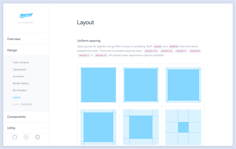
Grid System
I establish a clear grid system that defines how icons should be constructed, ensuring consistent proportions and alignment across the entire set.
Keyline Shapes
I define standard keyline shapes that serve as containers for icons, helping maintain consistent visual weight and proportion.
Stroke Specifications
I document precise stroke weights for different icon sizes, ensuring visual consistency when icons are displayed at various dimensions.
Corner Treatment
I specify standard corner radii and when to use rounded versus sharp corners, creating a consistent visual language.
Technical Specifications
My technical specifications cover these essential aspects of icon implementation:
| Specification | Details | Purpose |
|---|---|---|
| Size Variations | 16px, 24px, 32px, 48px | Ensures icons render clearly at all required dimensions |
| Padding | Minimum 2px on all sides | Prevents visual crowding and improves touch targets |
| Responsive Behavior | Scale at breakpoints: SM, MD, LG | Maintains optimal visibility across device sizes |
| File Format | SVG with optimized paths | Ensures scalability and minimizes file size |
Color Application Strategies
My approach to color in icon systems follows these proven strategies:
I've found that visual communication for designers often requires balancing these color approaches based on the specific context and goals of the project.
Accessibility Considerations
In my design practice, I ensure icon systems meet these accessibility standards:
- Sufficient color contrast (minimum 3:1 ratio for essential icons)
- Alternative text descriptions for all icons serving functional purposes
- Avoiding reliance on color alone to convey meaning
- Testing with screen readers and keyboard navigation
- Providing text labels alongside icons in complex interfaces
PageOn.ai Solution
I've found that PageOn.ai helps maintain styling consistency across multiple team members by providing a centralized platform where style guides are not just documented but actively enforced. The system can automatically apply established styling rules to new icons, ensuring they conform to guidelines regardless of who creates them.
Implementation Across Digital Touchpoints
Moving from theory to practice, I've developed strategies for implementing icon systems consistently across diverse digital environments. This phase is where many organizations struggle, as different platforms and teams can introduce inconsistencies if not properly coordinated.
Deployment Strategies
I implement these proven strategies to maintain consistency across platforms:
flowchart TD
    A[Icon System Implementation] --> B[Icon Library Repository]
    B --> C[Design System Integration]
    B --> D[Developer Documentation]
    B --> E[Quality Assurance Process]
    C --> F[Web Implementation]
    C --> G[Mobile Apps Implementation]
    C --> H[Marketing Materials]
    F --> I[Component Library]
    G --> J[Native UI Kits]
    H --> K[Brand Asset Portal]
    D --> L[Usage Guidelines]
    D --> M[Code Examples]
    D --> N[API Documentation]
    E --> O[Visual Regression Testing]
    E --> P[Accessibility Validation]
    E --> Q[Cross-Platform Review]
    style A fill:#FF8000,stroke:#333,stroke-width:2px,color:white
    style B fill:#FF9933,stroke:#333,stroke-width:1px
    style C fill:#66BB6A,stroke:#333,stroke-width:1px
    style D fill:#42A5F5,stroke:#333,stroke-width:1px
    style E fill:#EC407A,stroke:#333,stroke-width:1px
Technical Considerations
Based on my implementation experience, I recommend these technical approaches:
File Formats
I primarily use SVG for scalability and small file size, with PNG fallbacks for legacy system support. For animated icons, I prefer APNG or Lottie files depending on complexity.
Resolution Requirements
I ensure icons are designed at 1x, 2x, and 3x resolutions for non-vector formats, accounting for high-DPI displays and various device pixel ratios.
Performance Optimization
I implement icon sprites or icon fonts for web applications to reduce HTTP requests, and optimize SVG paths to minimize file size without sacrificing visual quality.
Delivery Methods
I use CDN-hosted icon libraries with versioning to ensure consistent delivery across all touchpoints, with appropriate caching strategies to balance performance and freshness.
Version Control and Asset Management
My approach to managing icon assets includes:

- Centralized repository with clear versioning and change logs
- Semantic versioning (major.minor.patch) for icon libraries
- Deprecation policies for icons being phased out
- Automated distribution to design tools and development environments
- Regular audits to identify inconsistencies or outdated assets
Quality Assurance Processes
I implement these QA processes to catch inconsistencies before they reach production:
I've found that visual communication in media design requires rigorous quality control to maintain consistency across multiple platforms and touchpoints.
PageOn.ai Solution
I use PageOn.ai to visualize icon implementation across different contexts before deployment. The platform allows me to create mockups showing how icons will appear in various environments, helping stakeholders understand the impact of the icon system and identify potential issues early in the process.
Measuring Success and Refining Your Approach
Throughout my career, I've learned that icon systems, like any design element, benefit from data-driven refinement. Establishing clear metrics and feedback loops allows for continuous improvement of the system over time.
Key Metrics for Evaluation
I track these essential metrics to evaluate the effectiveness of icon systems:
| Metric | Measurement Method | Target |
|---|---|---|
| Recognition Speed | Eye-tracking studies, timed identification tests | < 300ms for common icons |
| Task Completion Rate | User testing with specific tasks | > 95% success rate |
| Error Rate | Misclick analysis, confusion matrices | < 2% error rate |
| Consistency Score | Expert evaluation against style guide | > 90% adherence |
| User Satisfaction | Surveys, NPS for specific interfaces | > 4.5/5 rating |
User Testing Methodologies
I employ these specialized testing approaches for icon systems:
Icon Recognition Tests
I conduct timed tests where users identify the meaning of icons without context, helping isolate icons that may be confusing or ambiguous.
Contextual Icon Evaluation
I test icons within their intended interface context to ensure they make sense as part of the overall user experience.
Memory Recall Studies
I assess how well users remember icon meanings over time, which helps identify which icons create lasting mental models.
A/B Testing
I compare alternative icon designs for the same function to determine which version performs better in real-world usage.
Iterative Refinement Process
My approach to continuous improvement follows this cycle:
flowchart LR
    A[Collect Data] --> B[Analyze Patterns]
    B --> C[Identify Issues]
    C --> D[Prioritize Changes]
    D --> E[Implement Updates]
    E --> F[Validate Improvements]
    F --> A
    style A fill:#FF8000,stroke:#333,stroke-width:1px
    style B fill:#FF9933,stroke:#333,stroke-width:1px
    style C fill:#FFCC66,stroke:#333,stroke-width:1px
    style D fill:#66BB6A,stroke:#333,stroke-width:1px
    style E fill:#42A5F5,stroke:#333,stroke-width:1px
    style F fill:#AB47BC,stroke:#333,stroke-width:1px
Case Studies
Throughout my career, I've seen organizations transform their brands through strategic icon systems. One notable example is a financial services company that increased mobile app engagement by 34% after implementing a cohesive icon system that simplified complex financial concepts into intuitive visual metaphors.
PageOn.ai Solution
I leverage PageOn.ai's analytical capabilities to track visual consistency metrics across projects. The platform can analyze icon usage patterns, identify instances where guidelines aren't being followed, and provide actionable insights for improving system coherence. This data-driven approach helps teams make informed decisions about icon system refinements.
Future-Proofing Your Icon Strategy
As digital experiences continue to evolve, I believe icon systems must be designed with flexibility and adaptability in mind. A truly strategic approach anticipates future needs while maintaining a consistent visual language.
Building Flexibility into Your System
I recommend these approaches for creating adaptable icon systems:
Modular Components
I design icon systems with modular components that can be recombined to create new icons while maintaining visual consistency.
Scalable Architecture
I establish clear categorization systems that can accommodate new icon categories as products expand into new domains.
Parametric Design
I create parametric icon templates that allow for systematic variations while preserving core visual characteristics.
Balancing Timeless Design with Trends
I approach this balance by:
I've found that the most successful icon systems incorporate a core of timeless design principles while allowing for stylistic updates that keep the system feeling contemporary without requiring complete redesigns.
Governance Models for Maintaining Consistency
As teams scale, I implement these governance approaches:
- Designating icon system owners responsible for maintaining standards
- Establishing clear approval workflows for new icon additions
- Creating contribution guidelines for teams who need custom icons
- Implementing regular system audits and consistency checks
- Developing training materials to onboard new team members
Icon Usage in Emerging Interfaces
I'm actively exploring how icon systems need to adapt for:
flowchart TD
    A[Future Interface Considerations] --> B[Augmented Reality]
    A --> C[Virtual Reality]
    A --> D[Voice-Assisted Displays]
    A --> E[Ambient Computing]
    B --> B1[Spatial Icon Placement]
    B --> B2[Context-Aware Styling]
    C --> C1[3D Icon Representations]
    C --> C2[Interaction Feedback]
    D --> D1[Visual Confirmation Cues]
    D --> D2[Minimal Visual Language]
    E --> E1[Ambient Notification Icons]
    E --> E2[Environmental Integration]
    style A fill:#FF8000,stroke:#333,stroke-width:2px,color:white
I believe the next frontier for icon systems involves creating visual languages that work across dimensions and modalities, maintaining consistency even as interfaces become more immersive and ambient.
PageOn.ai Solution
I'm particularly excited about PageOn.ai's agentic capabilities for adapting icon systems to future applications. The platform can help visualize how icons might appear in emerging interfaces, generate variations optimized for different contexts, and even suggest new icon metaphors as technology evolves. This forward-looking approach helps ensure icon systems remain relevant and effective as digital experiences continue to transform.
Transform Your Visual Expressions with PageOn.ai
Ready to create consistent, strategic icon systems that elevate your brand and enhance user experience? PageOn.ai's powerful visualization tools make it easy to design, implement, and manage cohesive visual elements across all your digital touchpoints.
Start Creating with PageOn.ai TodayBringing It All Together
Throughout this guide, I've shared my approach to creating visual harmony through intentional icon systems. From establishing foundational principles to implementing governance models that scale, each element contributes to a cohesive visual language that strengthens brand recognition and enhances user experience.
As we've explored, strategic icon selection and styling isn't just about aesthetics—it's about creating a system that communicates clearly, builds trust, and adapts to evolving needs. By applying these principles and leveraging tools like PageOn.ai, your organization can develop icon systems that stand the test of time while remaining flexible enough to embrace new opportunities.
I encourage you to approach icon design with strategic intent, considering not just how icons look in isolation, but how they work together as part of a comprehensive visual system. The effort invested in creating this consistency will pay dividends in stronger brand recognition, improved user experiences, and more efficient design operations.
You Might Also Like
The Meta-Mind Advantage: How Self-Aware AI Strategy Defines Market Leadership in 2025
Discover why metacognitive AI strategy separates industry leaders from followers in 2025. Learn frameworks for building self-aware AI implementation that drives competitive advantage.
Creating Visual AI Ethics Frameworks: A Leadership Guide for Modern Business | PageOn.ai
Discover how to develop comprehensive visual AI ethics frameworks for your organization. This guide helps business leaders translate complex ethical principles into clear visual guidelines.
How 85% of Marketers Transform Content Strategy with AI Visual Tools | PageOn.ai
Discover how 85% of marketers are revolutionizing content strategy with AI tools, saving 3 hours per piece while improving quality and output by 82%.
First Principles Framework for Building Powerful AI Commands | Master AI Prompt Engineering
Learn the first principles approach to crafting powerful AI commands. Master prompt engineering with proven frameworks, templates, and visualization techniques for optimal AI interaction.