Visualizing Your Total Addressable Market
From Raw Data to Compelling Business Story
When I'm preparing a business strategy or investor presentation, I've found that few metrics are as powerful as a well-calculated and beautifully visualized Total Addressable Market (TAM). It's the foundation that validates your business opportunity and growth potential. In this comprehensive guide, I'll walk you through not just how to calculate your TAM accurately, but how to transform that data into compelling visual stories that resonate with stakeholders and investors.
Whether you're a startup founder seeking funding, a product manager launching a new offering, or a business strategist planning market expansion, mastering TAM visualization is essential for communicating your vision effectively. Let's dive into the fundamentals and work our way toward creating impactful visual representations of your market opportunity.
Understanding TAM Fundamentals
Total Addressable Market (TAM) represents the total revenue opportunity available if you achieved 100% market share for your product or service. It's essentially answering the question: "If every potential customer who could benefit from my solution purchased it, how large would that market be?"
TAM calculation is crucial for several reasons:
- It validates the size of your business opportunity to investors and stakeholders
- It guides resource allocation and strategic planning
- It provides context for realistic growth projections
- It helps identify the most valuable market segments to target
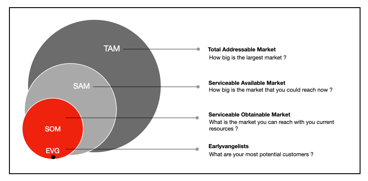
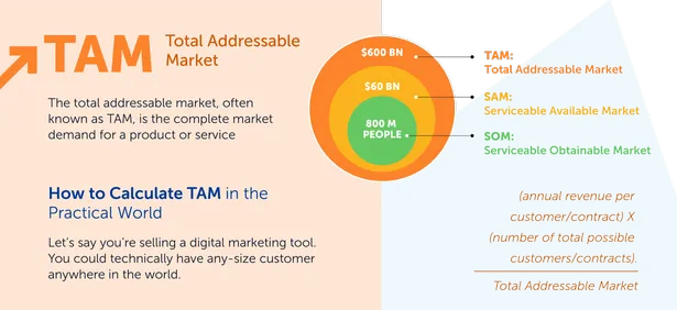
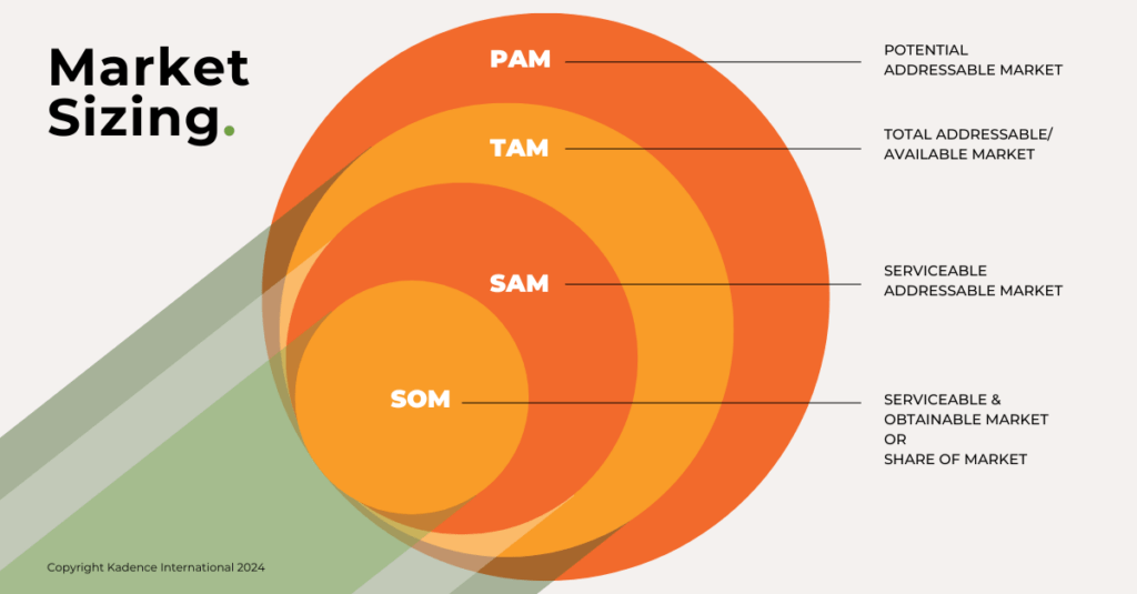
When I work with clients on market research reports, I always emphasize the distinction between TAM, SAM, and SOM:
- TAM (Total Addressable Market): The total revenue opportunity for your product/service if you captured 100% of the market
- SAM (Serviceable Available Market): The segment of TAM that you can realistically target with your current business model and capabilities
- SOM (Serviceable Obtainable Market): The portion of SAM that you can realistically capture in the near to medium term
TAM, SAM & SOM Relationship
Understanding these distinctions is vital when developing a strategic sales plan. While TAM provides the big-picture opportunity, SAM and SOM help set realistic expectations for near-term growth and resource requirements.
Three Proven Methodologies for TAM Calculation
In my experience working with startups and enterprises, I've found that there are three primary approaches to calculating TAM. Each has its strengths and ideal use cases. Let's explore them in detail.
A. Top-Down Approach
The top-down approach starts with industry-wide data and narrows down to the segments relevant to your business. This method works particularly well when reliable industry data is available and when explaining your market to investors who want to understand how you fit into the broader market landscape.
Top-Down TAM Calculation Process
                    flowchart TD
                        A[Total Industry Size] --> B[Filter by Geography]
                        B --> C[Filter by Customer Segment]
                        C --> D[Filter by Product Category]
                        D --> E[Your TAM]
                        style A fill:#FFE0B2,stroke:#FF8000
                        style B fill:#FFE0B2,stroke:#FF8000
                        style C fill:#FFE0B2,stroke:#FF8000
                        style D fill:#FFE0B2,stroke:#FF8000
                        style E fill:#FF8000,stroke:#FF8000,color:#FFFFFF
Formula:
TAM = Number of Potential Customers × Average Revenue Per Customer
When I use the top-down approach, I rely on these data sources:
- Industry reports from firms like Gartner, Forrester, or IDC
- Government census and economic data
- Trade association publications and statistics
- Public company financial reports and investor presentations
Using PageOn.ai's AI Blocks, I can visually represent the filtering process, showing stakeholders exactly how I arrived at my TAM calculation from the broader industry data.
B. Bottom-Up Approach
I find the bottom-up approach particularly compelling because it starts with what you know—your existing customers and their behaviors—and builds outward. This customer-centric method tends to yield more accurate and defensible TAM calculations.

Formula:
TAM = Sum of (Number of Accounts in Segment × Average Contract Value per Segment)
For example, if I'm calculating TAM for a SaaS product, I might segment the market like this:
| Segment | Number of Accounts | Average Contract Value | Segment TAM |
|---|---|---|---|
| SMB | 659 | $500 | $329,500 |
| Mid-Market | 166 | $2,000 | $332,000 |
| Enterprise | 175 | $5,000 | $875,000 |
| Total TAM | 1,000 | - | $1,536,500 |
Segment Distribution in Bottom-Up TAM
Using PageOn.ai's Deep Search, I can enrich this analysis with industry benchmarks that validate my assumptions about segment sizes and average contract values.
C. Value-Theory Approach
The value-theory approach focuses on the economic value your solution delivers to customers. This method is particularly useful for innovative products without clear market analogs or when developing a digital marketing pitch deck that emphasizes ROI.
Value-Theory TAM Calculation
                    flowchart TD
                        A[Identify Customer Problem] --> B[Quantify Economic Impact]
                        B --> C[Calculate Value of Solution]
                        C --> D[Determine Willingness to Pay]
                        D --> E[Multiply by Total Customers]
                        E --> F[Value-Based TAM]
                        style A fill:#FFE0B2,stroke:#FF8000
                        style B fill:#FFE0B2,stroke:#FF8000
                        style C fill:#FFE0B2,stroke:#FF8000
                        style D fill:#FFE0B2,stroke:#FF8000
                        style E fill:#FFE0B2,stroke:#FF8000
                        style F fill:#FF8000,stroke:#FF8000,color:#FFFFFF
For instance, if my software solution saves enterprise customers an average of 20 hours per week of manual work, I can calculate the value:
- 20 hours saved × $50/hour labor cost = $1,000/week in savings
- $1,000/week × 52 weeks = $52,000/year value created
- If customers are willing to pay 20% of value created = $10,400 potential annual contract value
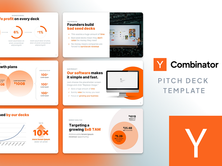
- With 500 potential enterprise customers = $5.2M TAM
Using PageOn.ai, I can create before/after visualizations that dramatically illustrate the value proposition and the resulting market opportunity. This approach is particularly effective when developing a business overview pitch deck for investors.
Data Collection and Analysis Strategies
The accuracy of your TAM calculation depends heavily on the quality of your data. I've developed a systematic approach to gathering and validating market intelligence that ensures my TAM figures stand up to scrutiny.
Critical Firmographic Factors

When collecting data for TAM calculation, I focus on these key firmographic dimensions:
- Industry: Specific vertical markets and sub-industries your solution serves
- Revenue: Annual revenue ranges that define your ideal customer profile
- Company Size: Employee count brackets that align with your solution's scalability
- Geographic Location: Regional, national, or global footprint based on your go-to-market capabilities
- Technology Stack: Existing systems and platforms your solution integrates with
Tools and Resources for Market Intelligence
Primary Research
- Customer interviews
- Competitor customer analysis
- Sales team feedback
- Product usage analytics
Secondary Research
- Industry reports
- Government databases
- Company financial filings
- Trade association data
Validating Assumptions
I've learned that the most common pitfall in TAM calculation is relying on unvalidated assumptions. Here's my process for testing and refining data accuracy:
Assumption Validation Process
                    flowchart LR
                        A[Initial Assumption] --> B{Validate}
                        B -->|Primary Research| C[Customer Feedback]
                        B -->|Market Testing| D[Sales Data]
                        B -->|Expert Input| E[Industry Analysis]
                        C --> F[Refined Assumption]
                        D --> F
                        E --> F
                        F --> G[TAM Calculation]
                        style A fill:#FFE0B2,stroke:#FF8000
                        style F fill:#FFE0B2,stroke:#FF8000
                        style G fill:#FF8000,stroke:#FF8000,color:#FFFFFF
PageOn.ai helps me transform complex market data into clear visual patterns, making it easier to spot inconsistencies and refine my assumptions. This visual approach is particularly valuable when developing market research reports that need to communicate complex data clearly.
Segmenting Your TAM for Greater Insight
I've found that segmenting TAM is what transforms it from a simple number into a strategic asset. Effective segmentation reveals where your greatest opportunities lie and how to prioritize your go-to-market efforts.
Customer Size Segmentation
Breaking down your market by customer size reveals important differences in buying behavior, sales cycles, and pricing expectations:
TAM Distribution by Customer Size
This visualization immediately shows that while the Enterprise segment represents the largest dollar value opportunity, the SMB segment offers the highest volume of potential customers. This insight helps inform my multi-segment marketing strategy.
Geographic Market Analysis
Geographic segmentation helps me identify regional variations in market opportunity and plan expansion strategies accordingly. Using PageOn.ai's visualization tools, I can create dynamic maps that highlight regions with the highest concentration of potential customers or revenue.
Industry-Specific Segments
Different industries often have unique characteristics that impact your go-to-market approach:
| Industry | TAM Size | Growth Rate | Key Characteristics |
|---|---|---|---|
| Healthcare | $12.4M | 8.5% | Highly regulated, longer sales cycles, security focused |
| Financial Services | $15.7M | 6.2% | Compliance driven, high value contracts, risk averse |
| Retail | $9.8M | 12.3% | Seasonal demand, price sensitive, rapid adoption |
| Technology | $18.2M | 15.7% | Early adopters, integration focused, competitive landscape |
Industry TAM Comparison
Using PageOn.ai's AI Blocks, I can create dynamic segment comparisons that highlight the highest-value opportunities across different dimensions. This visual approach makes it immediately clear which segments deserve priority in your go-to-market strategy.
Transforming TAM Data into Compelling Visualizations
In my experience, the difference between a forgettable TAM calculation and one that drives business decisions often comes down to visualization. Here's how I transform raw TAM data into visual stories that resonate with stakeholders.
Market Size and Growth Visualizations
When showing market size and growth potential, I focus on creating clear, impactful charts:
Market Growth Projection
TAM, SAM, and SOM Comparisons
I often use funnel visualizations to show the relationship between TAM, SAM, and SOM. This helps stakeholders understand the realistic portion of the total market that your business can target and capture.
Competitor Positioning Maps
Market Positioning Map
                    quadrantChart
                        title Market Positioning by Price and Features
                        x-axis Low Price --> High Price
                        y-axis Few Features --> Many Features
                        quadrant-1 Premium Segment
                        quadrant-2 Enterprise Leaders
                        quadrant-3 Budget Options
                        quadrant-4 Value Players
                        "Competitor A": [0.3, 0.6]
                        "Competitor B": [0.45, 0.23]
                        "Competitor C": [0.57, 0.69]
                        "Competitor D": [0.78, 0.34]
                        "Our Solution": [0.52, 0.62]
Positioning maps help contextualize your TAM by showing where your solution fits within the competitive landscape. This visualization is particularly effective in investor presentations and strategic planning sessions.
Using PageOn.ai's Vibe Creation feature, I can transform complex market data into intuitive visual stories that make the market opportunity immediately clear to stakeholders. The ability to customize colors, styles, and layouts ensures that visualizations align perfectly with your brand identity and presentation needs.
Presenting TAM in Business Contexts
Different business contexts require different approaches to presenting your TAM. I've developed specific strategies for each scenario to ensure maximum impact.
Investor Pitch Decks

When presenting TAM in investor pitch decks, I focus on these key elements:
- Clear, bold headline with the TAM figure prominently displayed
- Simple visualization showing market size and growth trajectory
- Brief explanation of calculation methodology to establish credibility
- Concise narrative explaining why this market is attractive
- Visual representation of your target segments within the broader market
Strategic Planning Documents
For internal strategic planning, I include more detailed TAM breakdowns:
Strategic TAM Analysis Framework
                    flowchart TD
                        A[Total Addressable Market: $39.5M] --> B[North America: $18.7M]
                        A --> C[Europe: $12.3M]
                        A --> D[Asia-Pacific: $8.5M]
                        B --> B1[Enterprise: $9.4M]
                        B --> B2[Mid-Market: $6.2M]
                        B --> B3[SMB: $3.1M]
                        C --> C1[Enterprise: $5.9M]
                        C --> C2[Mid-Market: $4.1M]
                        C --> C3[SMB: $2.3M]
                        D --> D1[Enterprise: $3.8M]
                        D --> D2[Mid-Market: $3.2M]
                        D --> D3[SMB: $1.5M]
                        style A fill:#FF8000,stroke:#FF8000,color:#FFFFFF
                        style B fill:#FFE0B2,stroke:#FF8000
                        style C fill:#FFE0B2,stroke:#FF8000
                        style D fill:#FFE0B2,stroke:#FF8000
Executive Dashboards
For ongoing TAM monitoring, I design executive dashboards that track:
Market Dynamics
- Market growth vs. forecasts
- Segment performance changes
- Emerging sub-markets
- Competitive landscape shifts
Business Performance
- Market share by segment
- Penetration rate changes
- Customer acquisition efficiency
- Revenue vs. TAM potential
PageOn.ai helps me generate presentation-ready visuals that communicate market potential at a glance, regardless of the business context. The platform's flexibility allows me to create everything from high-level executive summaries to detailed strategic analysis documents.
Common TAM Calculation Pitfalls and How to Avoid Them
Throughout my career, I've seen many TAM calculations undermined by common errors. Here's how I help clients avoid these pitfalls and build credible market sizing models.
Overestimation Errors
Common Overestimation Mistakes:
- Including market segments you can't realistically serve
- Using outdated growth projections from pre-market shifts
- Failing to account for competitive alternatives
- Assuming 100% market adoption of new technology
- Applying premium pricing assumptions across all segments
Handling Evolving Markets
For rapidly changing markets, I recommend these approaches:
- Create multiple TAM scenarios based on different market evolution paths
- Establish trigger metrics that indicate which scenario is unfolding
- Update TAM calculations quarterly in fast-changing industries
- Include emerging segment analysis to identify new opportunities
Data Reliability Challenges
To address data reliability issues, I use these validation techniques:
TAM Confidence Intervals
Using PageOn.ai, I create "confidence interval" visualizations that show potential TAM ranges based on different assumptions. This approach acknowledges uncertainty while still providing actionable market sizing guidance. It's particularly effective for emerging markets or innovative products where historical data may be limited.
Case Studies: Effective TAM Visualization Success Stories
Learning from real-world examples has been invaluable in my own approach to TAM visualization. Here are some success stories that demonstrate effective market sizing presentation techniques.
Startup Funding Success
SaaS Platform Series A Raise:
A B2B SaaS platform secured $12M in Series A funding by presenting a compelling TAM story that:
- Used bottom-up calculation with actual customer data
- Segmented TAM by industry vertical with clear visualization
- Included third-party validation from market research
- Showed clear path from current traction to TAM capture
Enterprise New Product Launch
A Fortune 500 technology company used these TAM visualization techniques to secure internal funding for a new product line:
Product Line TAM Comparison
Industry-Specific Approaches
Different industries require tailored approaches to TAM visualization:
Healthcare
- Segment by provider type and size
- Include regulatory approval pathways
- Show reimbursement model impact
E-commerce
- Visualize by product category
- Include seasonal variation impact
- Show online vs. offline split
Using PageOn.ai's Deep Search, I incorporate relevant benchmark data from similar companies to strengthen TAM presentations. This contextual data helps validate assumptions and build credibility with stakeholders, especially when presenting to industry experts who expect well-researched market analysis.
Transform Your TAM Analysis with PageOn.ai
Ready to create stunning TAM visualizations that captivate investors and drive strategic decisions? PageOn.ai's powerful visualization tools make it easy to transform complex market data into clear, compelling visual stories.
Start Creating Impactful TAM Visuals TodayConclusion: From Data to Business Impact
Throughout this guide, I've shared my approach to calculating and visualizing TAM effectively. The key takeaway is that TAM isn't just a number—it's a strategic asset that can drive business decisions, secure funding, and guide resource allocation.
By combining rigorous calculation methodologies with compelling visualizations, you can transform raw market data into a powerful business story. Whether you're presenting to investors, planning strategic initiatives, or evaluating new opportunities, a well-visualized TAM analysis provides the foundation for confident decision-making.
With tools like PageOn.ai, creating these impactful visualizations is easier than ever. The platform's intuitive interface and powerful features enable anyone to transform complex data into clear visual expressions that communicate market opportunity effectively. I encourage you to experiment with different visualization approaches to find what works best for your specific business context and audience.
You Might Also Like
Creating Visual AI Ethics Frameworks: A Leadership Guide for Modern Business | PageOn.ai
Discover how to develop comprehensive visual AI ethics frameworks for your organization. This guide helps business leaders translate complex ethical principles into clear visual guidelines.
Strategic AI Marketing Investment Roadmap: Maximizing ROI from the $360 Billion Surge | 2025 Marketing Tech Budget Guide
Navigate the $360 billion AI investment surge with strategic marketing technology budget allocation. Discover proven frameworks for maximizing ROI from AI marketing tools in 2025.
Visualizing Electronics Fundamentals: ROHM's Component Guide for Beginners to Experts
Explore ROHM's electronics basics through visual guides covering essential components, power semiconductors, sensors, automotive applications, and design resources for all skill levels.
The Visual Evolution of American Infrastructure: Canals to Digital Networks | PageOn.ai
Explore America's infrastructure evolution from historic canal networks to railroads, interstate highways, and digital networks with interactive visualizations and timelines.