Transforming Scientific Research into Captivating Academic Presentations
The art and science of communicating complex research in engaging, visually compelling ways
I've spent years refining the delicate balance between scientific rigor and audience engagement in academic settings. In this comprehensive guide, I'll share proven strategies for transforming dense research into presentations that captivate, inform, and inspire your academic audience—without sacrificing intellectual integrity.
The Science of Impactful Academic Presentations
In my experience with academic presentations, I've found that communicating complex scientific concepts presents unique challenges. Unlike corporate presentations that focus on persuasion, academic presentations must maintain rigorous intellectual integrity while still engaging diverse audiences with varying levels of specialized knowledge.
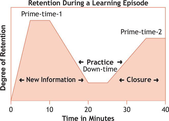
I've studied the cognitive psychology behind effective information retention in conference settings, and the findings are clear: our academic audiences process information differently than in other contexts. The high-cognitive load environment of conferences means we must be especially strategic about how we present complex ideas.
Cognitive Processing in Academic Settings
When I design academic presentations, I focus on balancing scientific rigor with accessibility. This means carefully considering what level of detail is necessary versus what might overwhelm the audience. I've found that how to make excellent presentations in academic contexts requires a fundamentally different approach than in business settings.
Key Differences: Academic vs. General Presentations
- Academic presentations require precise terminology and methodology transparency
- Citation and attribution are critical elements
- Data visualization must prioritize accuracy over simplification
- Audience questions often probe methodological details rather than conclusions
- Presentation success is measured by intellectual contribution rather than persuasiveness
Visual communication principles are especially powerful in academic contexts. When I leverage these principles correctly, I can enhance understanding of even the most complex research findings. The key is using visuals not merely as decoration but as integral components of the scientific narrative.
Structuring Your Scientific Narrative
I've found that crafting a compelling research story arc is essential for academic presentations. This doesn't mean sensationalizing findings—rather, it means organizing information in a way that creates cognitive momentum and builds understanding progressively.

Every effective academic presentation I create starts with a clear thesis statement that anchors the entire presentation. This isn't just about stating my hypothesis—it's about framing the intellectual contribution my research makes to the field. This anchoring helps audiences understand why they should care about the details that follow.
Narrative Flow Patterns by Research Type
flowchart TD
    subgraph Experimental
    E1[Problem Statement] --> E2[Hypothesis]
    E2 --> E3[Methodology]
    E3 --> E4[Results]
    E4 --> E5[Implications]
    end
    subgraph Theoretical
    T1[Conceptual Gap] --> T2[Theoretical Framework]
    T2 --> T3[Model Development]
    T3 --> T4[Model Testing/Validation]
    T4 --> T5[Theoretical Contributions]
    end
    subgraph Review
    R1[Field Overview] --> R2[Research Question]
    R2 --> R3[Literature Analysis]
    R3 --> R4[Synthesis]
    R4 --> R5[Future Directions]
    end
I always implement what I call the "tell them" framework: preview, present, and recap key findings. This structure is particularly important in academic settings where complex information needs reinforcement. When I've used this approach consistently, I've noticed significantly improved audience retention of key concepts.
The "Tell Them" Framework
- Tell them what you'll tell them - Preview key findings and their significance
- Tell them - Present detailed evidence, methodology, and analysis
- Tell them what you told them - Reinforce key takeaways and implications
Building effective transitions between complex scientific concepts is another area I focus on. These transitions aren't just verbal bridges—they're cognitive scaffolding that helps the audience follow the logical progression of ideas. When creating presentation ideas, I pay special attention to these crucial moments of cognitive shift.
Finally, I've learned the importance of incorporating strategic pauses in academic presentations. These deliberate moments of silence allow for cognitive processing of complex information. In my experience, a well-timed pause after presenting a complex concept can be more effective than additional explanation.
Data Visualization Strategies for Academic Impact
In my academic presentations, transforming complex datasets into intuitive visual representations is perhaps the most powerful tool for enhancing understanding. I've found that the right visualization can communicate in seconds what might take minutes to explain verbally.
Selecting the appropriate chart type based on data relationships and research questions is critical. I've developed a systematic approach to matching visualization types to specific data characteristics and research questions.
Chart Selection Guide by Data Relationship
I've learned that designing clear, accessible data visualizations requires careful consideration of conference lighting conditions. What looks perfect on my computer screen might be completely illegible in a dimly lit conference room. I always test my visualizations under various lighting conditions and ensure high contrast between elements.
Color theory principles are another area where I've refined my approach. I apply colors that enhance comprehension rather than distract. For scientific presentations, I recommend:
Sequential Palettes
Ideal for continuous data with natural progression. Shows intensity or magnitude differences clearly.
Diverging Palettes
Perfect for data with meaningful midpoint. Shows deviation from a central value.
Categorical Palettes
For discrete categories. Use colorblind-friendly options with high distinguishability.
I've also become adept at integrating visual hierarchies to guide audience focus toward key findings. This means using size, color, position, and contrast strategically to create a visual "roadmap" that leads the eye to the most important elements first.
When creating visually appealing presentations for academic contexts, I've found that PageOn.ai's AI Blocks feature is invaluable. It allows me to create dynamic data visualizations without specialized software knowledge, which is especially useful when preparing for conferences with tight deadlines.
From Text-Heavy to Visually Compelling
One of the biggest challenges I face when creating academic presentations is translating dense academic text into scannable visual formats. The key is not to simply reduce text, but to transform it into visual elements that convey the same information more efficiently.
I've developed specific techniques for converting complex methodologies into clear process diagrams and flowcharts. These visual representations make it much easier for audiences to understand the sequence and logic of research procedures.
Methodology Visualization Example
flowchart TD
    A[Research Question] --> B[Literature Review]
    B --> C[Hypothesis Formation]
    C --> D[Research Design]
    D --> E{Data Collection}
    E --> F[Quantitative Analysis]
    E --> G[Qualitative Analysis]
    F --> H[Statistical Testing]
    G --> I[Thematic Analysis]
    H --> J[Results Integration]
    I --> J
    J --> K[Conclusion]
    K --> L[Implications]
Transforming literature review findings into conceptual maps and relationship diagrams has been particularly effective in my presentations. These visual representations help audiences see connections between concepts that might be lost in traditional text formats.
Literature Review Visualization
flowchart LR
    A[Primary Theory] --> B[Supporting Study 1]
    A --> C[Supporting Study 2]
    A --> D[Contradictory Study]
    B --> E[Finding 1.1]
    B --> F[Finding 1.2]
    C --> G[Finding 2.1]
    D --> H[Alternative Theory]
    H --> I[Research Gap]
    I --> J[Current Study]
I've found that creating visual abstracts is one of the most powerful techniques for capturing research essence for immediate audience understanding. These concise visual summaries communicate the core of my research in seconds, making them perfect for conference settings where attention must be captured quickly.
Visual Abstract Components
- Research Question: Clear, concise statement
- Key Methods: Simple icons or minimal text
- Primary Findings: Data visualization or key numbers
- Implications: Brief takeaway statement
- Visual Cues: Arrows, colors, and icons to guide understanding
For my engaging project presentation needs, I've come to rely on PageOn.ai's Deep Search feature to find relevant scientific imagery and diagrams. This tool has been invaluable for elevating presentation quality beyond what I could create myself, especially for complex scientific concepts that benefit from specialized visualization.
Designing Slides for Scientific Clarity
In my experience, applying minimalist design principles while maintaining scientific depth is a delicate balance. I've learned that simplicity doesn't mean sacrificing complexity—it means presenting complexity in the clearest possible way.
Creating consistent visual systems that reinforce your research identity helps audiences connect the dots throughout your presentation. I develop a consistent color scheme, typography hierarchy, and iconography that become visual shorthand for my research concepts.
Elements of Scientific Slide Design
I've invested time in developing custom templates that accommodate scientific notation, formulas, and references. These templates save me significant time and ensure consistency across all my academic presentations.
Typography for Technical Content
- Sans-serif for headings and main text
- Monospace for code and data
- Minimum 24pt for slide text
- Maximum 3 font sizes per slide
- Consistent equation formatting
White Space Strategy
- Minimum 10% margins on all sides
- Group related elements with proximity
- Use white space to create visual hierarchy
- Maintain consistent spacing between elements
- Allow complex visuals more breathing room
Optimizing typography choices for technical terminology and readability has been crucial in my presentations. I use sans-serif fonts for better projection legibility and ensure sufficient contrast between text and background.
I've found that balancing white space with information density is essential for optimal cognitive processing. Too much information overwhelms; too little fails to communicate the necessary depth. The right balance depends on audience expertise, viewing conditions, and presentation duration.
For creating cohesive slide designs that match my research tone, I use PageOn.ai's Vibe Creation feature. This tool has helped me generate consistent visual themes that feel appropriate for academic settings while still being visually engaging.
Presentation Delivery Techniques for Academic Settings
Over the years, I've developed specific verbal techniques for explaining complex concepts with clarity. These include using concrete examples, creating analogies to familiar concepts, and breaking down complex ideas into digestible components.
Mastering the art of the academic Q&A session has been essential for my success. I prepare for likely questions, practice concise responses, and develop strategies for addressing questions outside my immediate expertise.
Academic Q&A Strategies
- Listen fully before responding to ensure you address the actual question
- Acknowledge limitations in your research when relevant
- Bridge to your expertise when questions drift outside your research focus
- Prepare concise explanations for complex methodological choices
- Have backup slides ready for anticipated technical questions
I always prepare effective handouts and supplementary materials for my academic presentations. These materials provide additional detail that might not fit within the presentation time constraints and serve as valuable references for attendees after the session.
Adapting Presentation Style by Academic Setting
| Setting | Time Frame | Focus Areas | Visual Emphasis |
|---|---|---|---|
| Conference Presentation | 15-20 minutes | Key findings, methodology highlights | Results visualization, visual abstract |
| Departmental Seminar | 45-60 minutes | Comprehensive methodology, detailed results | Process diagrams, detailed data visualizations |
| Thesis Defense | 30-45 minutes | Research journey, comprehensive findings | Conceptual framework, methodology visuals |
| Poster Session | 5-minute explanations | Visual summary, key takeaways | Infographics, compelling data visualization |
| Interdisciplinary Panel | 10-15 minutes | Accessible overview, broader implications | Conceptual diagrams, simplified visuals |
I've learned to practice strategic gestures and movement to reinforce key research points. This includes using hand gestures to indicate relationships, moving to different areas of the stage to signal transitions between topics, and using physical proximity to the screen to draw attention to specific visual elements.
Creating audience engagement strategies appropriate for academic contexts has been an ongoing focus in my conference presentations. I use techniques like posing thought-provoking questions, incorporating brief paired discussions, and using real-time polling when appropriate.
Technology Integration for Enhanced Scientific Communication
I've become adept at selecting appropriate multimedia elements to support research presentation. This includes determining when to use video demonstrations, animations, or interactive elements based on the specific concepts being communicated.

Incorporating interactive elements for demonstrating complex processes has significantly enhanced my presentations. Interactive models allow audiences to explore concepts from multiple perspectives, which is particularly valuable for spatial or multidimensional concepts.
Technology Integration by Research Field
I've been exploring AR/VR options for specialized scientific visualization needs. These technologies offer unique capabilities for visualizing complex spatial relationships, allowing audiences to literally step inside the data or model being presented.
Technology Contingency Planning
Always prepare for technology limitations at conference venues. I bring:
- Multiple adapter types for projector connections
- PDF backup of presentation (with animations converted to static images)
- USB drive with all presentation files and dependencies
- Screenshots of interactive elements as fallback visuals
- Printed handouts of key visualizations if technology fails completely
I've found that PageOn.ai's agentic capabilities are particularly valuable for transforming complex research concepts into interactive visual experiences. The platform allows me to create dynamic visualizations that respond to different inquiry paths, which is especially useful for presentations where audience questions might lead in various directions.
Case Studies: Exceptional Academic Presentations
I've analyzed numerous award-winning scientific presentations across disciplines to identify transferable techniques. These exemplary presentations share certain characteristics regardless of field: clear narrative structure, strategic visual emphasis, and thoughtful audience engagement.
From TED-style science communications, I've extracted valuable techniques that can be applied in academic contexts. These include strong opening hooks, strategic use of personal narrative, and simplified visual metaphors for complex concepts.
Before/After Transformation Example
Before
Results of Experiment 3: Effects of Treatment X on Cell Proliferation Rates
The application of Treatment X (concentration: 0.05mg/ml) resulted in statistically significant increases in cell proliferation rates across all three cell lines tested (p<0.001). Cell line A showed a 37.2% increase (±3.4%), cell line B showed a 42.1% increase (±2.8%), and cell line C showed a 29.7% increase (±4.2%) compared to control conditions. These results were consistent across all three experimental replicates. Statistical analysis was performed using two-way ANOVA with post-hoc Tukey test. These findings suggest that Treatment X has potential applications in regenerative medicine contexts, particularly for tissues with similar cellular compositions to cell lines A and B.
Further analysis of the molecular pathways involved indicated upregulation of...
After
Treatment X Boosts Cell Growth
All cell lines showed significant growth increase (p<0.001)
Key implication: Promising for regenerative medicine applications
I've identified discipline-specific best practices from successful conference presentations. For example, in molecular biology, effective presentations often use animation to show dynamic processes, while economics presentations benefit from interactive data dashboards.
Lessons from Bridging Academic-Public Divides
- Use concrete analogies that relate to everyday experiences
- Incorporate narrative elements while maintaining scientific accuracy
- Define technical terms visually before using them extensively
- Show real-world implications early in the presentation
- Use layered information design that allows both overview and depth
By studying these exceptional presentations, I've developed a better understanding of what makes academic communication truly effective across different contexts and disciplines.
Assessment and Continuous Improvement
I've developed specific criteria for evaluating academic presentation effectiveness. These include audience engagement metrics, comprehension checks, question quality, and post-presentation follow-up requests.
Creating systems for incorporating peer and audience feedback has been essential for my growth as a presenter. I use structured feedback forms, post-presentation surveys, and occasionally video recording with expert review.
Presentation Improvement Cycle
flowchart TD
    A[Design Presentation] -->|Deliver| B[Collect Feedback]
    B --> C[Analyze Metrics]
    C --> D[Identify Improvement Areas]
    D --> E[Research Solutions]
    E --> F[Implement Changes]
    F --> A
I implement iterative improvement processes for recurring presentations. Each time I deliver similar content, I make deliberate adjustments based on previous feedback and observed audience responses.
Engagement Metrics
- Audience questions per minute
- Note-taking behavior
- Post-presentation discussions
- Social media mentions
- Follow-up communications
Retention Metrics
- Key concept recall
- Accuracy of concept descriptions
- Application of presented methods
- Citations in subsequent work
- Collaboration requests
Over time, I've built a personal presentation style guide based on successful experiences. This living document captures what works specifically for my research area, presentation style, and typical audiences.
The process of continuous improvement has helped me develop a distinctive presentation approach that effectively communicates complex scientific ideas while maintaining audience engagement—a balance that's essential for academic impact.
Transform Your Academic Presentations with PageOn.ai
Ready to elevate your scientific communication? PageOn.ai provides powerful visualization tools specifically designed for academic contexts—helping you transform complex research into compelling visual narratives that engage and inform your audience.
Start Creating with PageOn.ai TodayFinal Thoughts on Academic Presentation Excellence
Throughout my academic career, I've discovered that truly exceptional scientific presentations achieve a delicate balance: they maintain rigorous scientific integrity while creating an engaging, visually compelling experience for the audience.
The techniques and strategies I've shared in this guide have helped me transform dense research into presentations that not only inform but inspire. By applying these principles—from crafting scientific narratives to designing clear visualizations to refining delivery techniques—you can significantly enhance the impact of your academic communications.
Remember that creating compelling academic presentations is both an art and a science. It requires technical skill, creative thinking, and a deep understanding of how audiences process complex information. With practice and the right tools, you can master this essential academic skill and ensure your valuable research receives the attention and understanding it deserves.
As you continue to refine your presentation approach, consider how visualization tools like PageOn.ai can help streamline the process of transforming complex concepts into clear visual expressions. The time you save on technical visualization tasks can be redirected toward deepening your research and refining your scientific narrative—ultimately creating presentations that advance both your career and your field.
You Might Also Like
Enhancing Audience Experience with Strategic Audio Integration | Create Immersive Brand Connections
Discover how strategic audio integration creates immersive brand connections across podcasts, streaming platforms, and smart speakers. Learn frameworks and techniques to transform your marketing.
Bringing Google Slides to Life with Dynamic Animations | Complete Guide
Transform static presentations into engaging visual stories with our comprehensive guide to Google Slides animations. Learn essential techniques, advanced storytelling, and practical applications.
Transform Your Google Slides: Advanced Techniques for Polished Presentations
Master advanced Google Slides techniques for professional presentations. Learn design fundamentals, visual enhancements, Slide Master, and interactive elements to create stunning slides.
Stock Photos in Presentations: Bringing Vibrancy and Depth to Visual Storytelling
Discover how to transform your presentations with strategic stock photography. Learn selection techniques, design integration, and visual consistency to create compelling visual narratives.