Transforming SharePoint Navigation into Visual Clarity
A Design Framework for Enterprise-Scale Sites
I've spent years working with large-scale SharePoint environments, and one thing has become abundantly clear: navigation can make or break the user experience. In this comprehensive guide, I'll share my framework for transforming complex SharePoint navigation systems into visually intuitive pathways that guide users effortlessly through your enterprise ecosystem.
The Navigation Challenge in SharePoint Ecosystems
When I first started working with enterprise-scale SharePoint environments, I was immediately struck by how quickly users could get lost. The challenge is multifaceted: sprawling site collections, inconsistent navigation patterns, and information architectures that reflect organizational charts rather than user needs.
The Three-Tier Navigation Architecture
SharePoint navigation is structured across three distinct levels, each serving a different purpose in the user journey. Research on SharePoint architecture shows that understanding this three-tier structure is fundamental to creating an effective navigation system:
graph TD
    A[SharePoint Navigation Structure] --> B[Global Navigation]
    A --> C[Hub Navigation]
    A --> D[Local Navigation]
    B --> B1[Corporate-wide resources]
    B --> B2[Main company sites]
    B --> B3[Shared repositories]
    C --> C1[Department-specific resources]
    C --> C2[Project-related content]
    C --> C3[Themed content collections]
    D --> D1[Site-specific content]
    D --> D2[Team resources]
    D --> D3[Contextual tools]
    style A fill:#FF8000,stroke:#333,stroke-width:2px,color:white
    style B fill:#FF9933,stroke:#333,stroke-width:1px
    style C fill:#FFB366,stroke:#333,stroke-width:1px
    style D fill:#FFD699,stroke:#333,stroke-width:1px
The cognitive load created by poorly designed navigation is substantial. Users in enterprise environments often report spending up to 25% of their time simply looking for information. This represents a significant productivity loss that can be addressed through thoughtful visual design.
Key Metrics for Navigation Effectiveness
In my experience, these are the critical metrics to monitor when evaluating SharePoint navigation:
These metrics provide a quantitative foundation for measuring improvements to your SharePoint navigation system. By establishing baselines and tracking changes over time, you can demonstrate the value of your design efforts to stakeholders.
When I work with clients on visual content strategy mapping, I always emphasize that navigation is not merely a technical implementation—it's a fundamental expression of how your organization thinks about and values information.
Foundational Elements of Effective SharePoint Navigation Design
Before diving into specific navigation tiers, I've found it essential to establish foundational principles that will guide the entire design process. These elements create cohesion across your SharePoint environment and provide users with a sense of predictability.
Creating a Consistent Visual Language
A consistent visual language is the backbone of intuitive navigation. This includes standardized iconography, color coding for different content types, and typographic hierarchies that clearly indicate relationships between navigation elements.

Metadata-Driven Navigation vs. Folder-Based Structures
One of the most impactful decisions you'll make is whether to organize content primarily through metadata or folders. This choice has profound implications for how navigation will be visualized and how users will discover information.
| Feature | Metadata-Driven Navigation | Folder-Based Navigation |
|---|---|---|
| Content Discovery | Multiple pathways to same content | Single linear path |
| Visual Representation | Tag clouds, faceted navigation | Hierarchical tree structures |
| User Familiarity | Requires learning | Immediately familiar |
| Flexibility | Highly adaptable | Rigid structure |
| Visual Design Potential | High - multiple visualization options | Limited - primarily hierarchical |
In my experience, the most successful SharePoint environments use a hybrid approach that leverages the strengths of both systems. The key is using CSS visual techniques for web design to make these navigation systems immediately understandable to users.
Designing for Cross-Device Coherence
Modern SharePoint environments must function seamlessly across devices. This presents unique challenges for navigation design, as touch interfaces and smaller screens require different approaches than traditional desktop experiences.
graph TD
    A[Cross-Device Navigation Strategy] --> B[Desktop Experience]
    A --> C[Tablet Experience]
    A --> D[Mobile Experience]
    B --> B1[Full navigation breadth]
    B --> B2[Hover states]
    B --> B3[Multiple navigation tiers visible]
    C --> C1[Collapsible navigation]
    C --> C2[Touch-optimized targets]
    C --> C3[Simplified global navigation]
    D --> D1[Hamburger menu]
    D --> D2[Search prominence]
    D --> D3[Context-specific navigation]
    style A fill:#FF8000,stroke:#333,stroke-width:2px,color:white
    style B fill:#42A5F5,stroke:#333,stroke-width:1px
    style C fill:#66BB6A,stroke:#333,stroke-width:1px
    style D fill:#EF5350,stroke:#333,stroke-width:1px
When designing for multiple devices, I've found that maintaining visual consistency while adapting to each form factor's constraints is essential for creating a coherent user experience. This approach requires careful planning but pays dividends in user satisfaction.
Global Navigation Strategies: The Enterprise Compass
Global navigation serves as the primary orientation system for your entire SharePoint environment. It should provide users with a consistent way to access major destinations regardless of where they are in the site hierarchy.

Designing Visual Landmarks
Effective global navigation relies on strong visual landmarks that users can easily recognize. These landmarks should be distinctive enough to serve as anchors for orientation while maintaining visual harmony with your overall design system.
I've found that creating visual distinctions between informational and transactional pathways significantly improves user efficiency. Users approach these different content types with different mindsets, and your navigation should reflect this distinction.
Case Study: Transforming Corporate Hierarchies
I recently worked with a global manufacturing company that was struggling with SharePoint adoption. Their navigation system mirrored their organizational chart—logical to executives but confusing to everyday users.
Our solution was to create a task-based global navigation system that reflected how people actually used the intranet rather than how the company was structured. This approach required close collaboration with stakeholders from across the organization but resulted in a 37% increase in content discovery and a 42% reduction in search fallbacks.
When designing global navigation, I always recommend balancing brand guidelines with navigation clarity. Your brand colors and typography should be present but never at the expense of usability. The most beautiful navigation system is worthless if users can't efficiently find what they need.
Creating interactive content for marketing strategy within your SharePoint environment can be particularly challenging, but a well-designed global navigation system can help users discover these valuable resources.
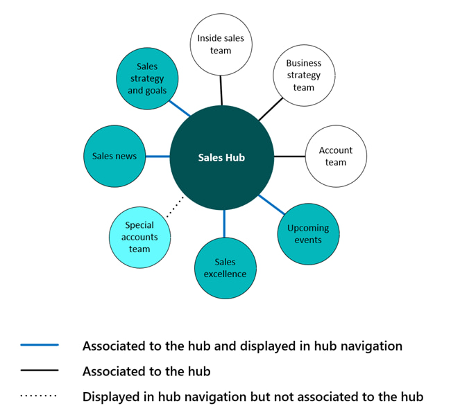
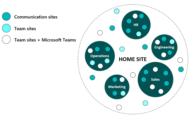
Hub Navigation: Creating Visual Context for Related Content
Hub navigation serves as the connective tissue between related sites in your SharePoint environment. It's particularly valuable for departmental portals, project collections, and thematic content groupings.
Visual Techniques for Establishing Thematic Connections
The primary challenge of hub navigation is communicating the relationships between content areas while maintaining a sense of place. Visual design plays a crucial role in helping users understand these connections.
I've found these visual techniques particularly effective for hub navigation:
- Color coding to indicate site categories or departments
- Consistent iconography that creates visual patterns across related sites
- Background elements that subtly reinforce thematic connections
- Typography variations that maintain hierarchy while creating distinction
- Visual transitions that indicate movement between related spaces
Visualizing Department-Specific Information Architecture
Different departments often have unique information needs and workflows. Your hub navigation should reflect these differences while maintaining overall system coherence.
flowchart TD
    HUB[IT Department Hub] --> SUPPORT[Support Requests]
    HUB --> KNOWLEDGE[Knowledge Base]
    HUB --> PROJECTS[Project Portfolio]
    HUB --> RESOURCES[IT Resources]
    SUPPORT --> S1[Submit Request]
    SUPPORT --> S2[Track Tickets]
    SUPPORT --> S3[Request History]
    KNOWLEDGE --> K1[Hardware Guides]
    KNOWLEDGE --> K2[Software Documentation]
    KNOWLEDGE --> K3[Policies & Procedures]
    PROJECTS --> P1[Active Projects]
    PROJECTS --> P2[Project Archives]
    PROJECTS --> P3[Resource Planning]
    RESOURCES --> R1[Software Downloads]
    RESOURCES --> R2[Equipment Requests]
    RESOURCES --> R3[Training Materials]
    style HUB fill:#FF8000,stroke:#333,stroke-width:2px,color:white
    style SUPPORT fill:#FFB366,stroke:#333,stroke-width:1px
    style KNOWLEDGE fill:#FFB366,stroke:#333,stroke-width:1px
    style PROJECTS fill:#FFB366,stroke:#333,stroke-width:1px
    style RESOURCES fill:#FFB366,stroke:#333,stroke-width:1px
Using PageOn.ai's AI Blocks, I've been able to quickly prototype different hub navigation structures and test them with users before implementation. This approach has saved countless development hours and resulted in more intuitive designs.
Hub Navigation as Storytelling
The most effective hub navigation systems tell a story about how information is related. They guide users through a narrative that reflects the department's mission and priorities.
For example, a marketing department hub might prioritize campaign assets and performance metrics, while an HR hub would emphasize employee resources and organizational information. These priorities should be immediately apparent through the visual hierarchy of the navigation system.
When designing hub navigation, I always consider how website page builders can be integrated to give department owners more flexibility in creating and organizing their content while maintaining navigational consistency.
Local Navigation: Site-Specific Visual Wayfinding
Local navigation is the most granular level of the SharePoint navigation hierarchy. It guides users through individual sites and helps them discover specific content and functionality within a defined context.
Creating Visual Consistency While Maintaining Site Individuality
The challenge with local navigation is balancing system-wide consistency with the unique needs of individual sites. Users should always know they're in the SharePoint environment, but each site should have its own identity.
Techniques for Visually Prioritizing High-Value Content
Not all content within a site deserves equal visual weight. I've found these techniques effective for highlighting what matters most:
I've found that position is consistently the most powerful visual prioritization technique. Users naturally pay more attention to content at the top and left of the screen, making these prime locations for your most important navigation elements.
Designing Contextual Navigation Elements
Contextual navigation responds to user behavior and content context. It appears when and where users need it, reducing cognitive load and streamlining the user experience.
Examples include:
- Document-specific action menus that appear on hover
- Related content suggestions based on current viewing patterns
- Quick access tools that follow users as they scroll through content
- Breadcrumb trails that expand to show sibling pages on interaction
- Content filters that adapt based on available metadata
Using PageOn.ai's Deep Search capabilities, I can quickly surface relevant visual assets that help communicate these contextual navigation concepts to stakeholders and developers. This visual communication is essential for ensuring that everyone understands the intended user experience.
When implementing local navigation, I always consider how ChatGPT vs traditional search engines might influence how users expect to find information within specific sites.
Advanced Visual Navigation Techniques for SharePoint
Beyond the standard navigation patterns, there are advanced techniques that can significantly enhance the user experience in complex SharePoint environments. These approaches require more development effort but can deliver substantial improvements in usability.
Creating Custom Visual Navigation Components
SharePoint's default navigation components are functional but often lack visual sophistication. Custom components can provide richer interactions and more nuanced visual cues.
Some of the most effective custom navigation components I've implemented include:
- Visual mega menus with category icons and featured content
- Interactive site maps that provide spatial orientation
- Content relationship visualizers that show connections between resources
- Role-based navigation adapters that highlight relevant content
- Visual breadcrumbs that show hierarchical position with graphical elements
Implementing Progressive Disclosure Techniques
Progressive disclosure is particularly valuable in complex information environments like SharePoint. It allows you to present only what users need at each stage of their journey, revealing additional options as they become relevant.
sequenceDiagram
    participant User
    participant L1 as Primary Navigation
    participant L2 as Secondary Navigation
    participant L3 as Tertiary Navigation
    participant Content
    User->>L1: Selects department hub
    L1->>L2: Reveals department-specific options
    User->>L2: Selects project area
    L2->>L3: Reveals project-specific options
    User->>L3: Selects document library
    L3->>Content: Displays content with contextual tools
    Note over L1,L3: Each level reveals only what's needed
This approach reduces cognitive load by presenting choices in manageable chunks. It's particularly effective for mobile experiences where screen real estate is limited.
Designing Visual Feedback Systems
Visual feedback helps users understand their location in the information space and confirms that their actions have been recognized. Effective feedback systems incorporate multiple visual cues:

Strong visual feedback is particularly important in SharePoint because users often perform complex tasks that span multiple pages. Without clear feedback, they can easily become disoriented or unsure if their actions have been completed successfully.
Dynamic Navigation Adaptation
The most sophisticated SharePoint navigation systems adapt to user roles, permissions, and behavior patterns. This personalization makes the environment feel responsive to individual needs.
For example, a finance team member might see financial reporting tools prominently displayed in their navigation, while a marketing team member would see content creation and campaign management tools instead. This adaptation can happen automatically based on permissions or user preferences.
Dynamic adaptation requires careful planning and robust user research to ensure that the system accurately anticipates user needs without creating confusion or hiding important content.
Implementation Strategies and Technical Considerations
Translating visual navigation concepts into functional SharePoint components requires careful planning and technical expertise. The platform offers both opportunities and constraints that must be considered during implementation.
Translating Visual Concepts into SharePoint Components
The gap between design vision and technical reality can be significant in SharePoint projects. I've found these approaches helpful for bridging that gap:
- Create functional prototypes that demonstrate key interactions
- Document design patterns that can be reused across the environment
- Develop a component library that implements your visual language
- Establish clear handoff processes between designers and developers
- Prioritize must-have visual elements vs. nice-to-have features
Balancing Customization with Platform Limitations
SharePoint imposes certain constraints on navigation design, particularly in the modern experience. Understanding these limitations is essential for creating realistic designs that can be implemented effectively.
| Navigation Element | Customization Options | Technical Approach | Limitations |
|---|---|---|---|
| Global Navigation | Limited visual styling, custom links | SPFx Application Customizer | Requires admin privileges, complex deployment |
| Hub Navigation | Link management, basic styling | Hub site settings, custom CSS | Limited to 2,000 sites per hub |
| Local Navigation | Site navigation settings, custom components | SPFx web parts, custom CSS | Permissions required for each site |
| Mega Menus | Full custom implementation possible | SPFx Application Customizer | Complex development, maintenance overhead |
| Search-Based Navigation | Highly customizable results display | Search API, custom web parts | Depends on search index quality |
Version Considerations
SharePoint Online and on-premises versions offer different capabilities and limitations for navigation design. It's essential to understand these differences when planning your implementation strategy.
graph TD
    A[SharePoint Navigation Implementation] --> B[SharePoint Online]
    A --> C[SharePoint Server]
    B --> B1[Modern Experience]
    B --> B2[Classic Experience]
    C --> C1[Modern Experience]
    C --> C2[Classic Experience]
    B1 --> B1a[SPFx Extensions]
    B1 --> B1b[Hub Site Navigation]
    B1 --> B1c[API Limitations]
    B2 --> B2a[Master Pages]
    B2 --> B2b[JavaScript Injection]
    B2 --> B2c[More CSS Freedom]
    C1 --> C1a[Limited SPFx Support]
    C1 --> C1b[Restricted Hub Features]
    C2 --> C2a[Full Server-Side Code]
    C2 --> C2b[Complete Customization]
    style A fill:#FF8000,stroke:#333,stroke-width:2px,color:white
    style B fill:#42A5F5,stroke:#333,stroke-width:1px
    style C fill:#66BB6A,stroke:#333,stroke-width:1px
Using PageOn.ai to prototype and test navigation concepts has been invaluable in my projects. It allows me to quickly visualize different approaches and gather feedback before committing to development work. This iterative process helps identify potential issues early and ensures that the final implementation meets user needs.
Measuring Success: Analytics and Continuous Improvement
Effective navigation design is never truly complete. It requires ongoing measurement, analysis, and refinement to ensure it continues to meet user needs as your SharePoint environment evolves.
Establishing Visual Navigation Effectiveness Metrics
To evaluate the success of your navigation design, you need clear metrics that focus specifically on navigation performance. I recommend tracking these key indicators:
- Navigation success rate: Percentage of users who find their target content through navigation vs. search
- Time to destination: Average time required to navigate to common destinations
- Navigation bounce rate: Percentage of users who leave a page immediately after arriving via navigation
- Navigation depth: Average number of clicks required to reach destination content
- Navigation engagement: Percentage of users who interact with different navigation elements
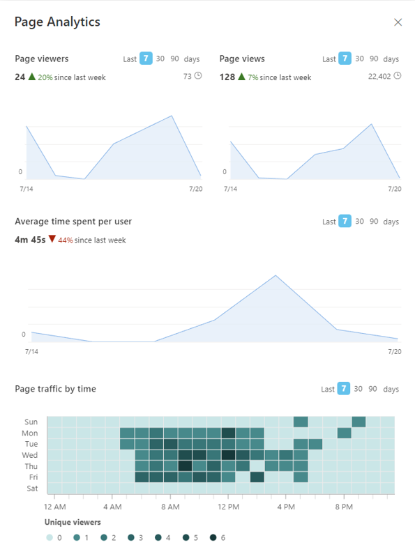
Heat Mapping and User Journey Visualization
Visual analytics tools provide powerful insights into how users interact with your navigation system. Heat maps and journey visualizations can reveal patterns that might not be apparent in traditional analytics.
These visualizations help identify which navigation elements are most effective and which might need redesign. They can also reveal unexpected user behaviors that suggest opportunities for improvement.
A/B Testing Methodologies
A/B testing is a powerful technique for evaluating navigation design changes. By showing different versions to different user groups, you can gather empirical data about which approach is more effective.
When conducting A/B tests for navigation design, focus on:
- Testing one variable at a time to isolate its impact
- Ensuring statistical significance before drawing conclusions
- Measuring both quantitative metrics and qualitative feedback
- Testing with representative user groups from across the organization
- Documenting findings to inform future design decisions
Creating an Iterative Improvement Framework
The most successful SharePoint environments have a structured process for continuously improving navigation based on user feedback and analytics. This framework should include:
graph LR
    A[Collect Data] --> B[Analyze Patterns]
    B --> C[Identify Opportunities]
    C --> D[Design Improvements]
    D --> E[Test Changes]
    E --> F[Implement Updates]
    F --> A
    style A fill:#FF8000,stroke:#333,stroke-width:1px
    style B fill:#FF9933,stroke:#333,stroke-width:1px
    style C fill:#FFB366,stroke:#333,stroke-width:1px
    style D fill:#FFD699,stroke:#333,stroke-width:1px
    style E fill:#FFECCC,stroke:#333,stroke-width:1px
    style F fill:#FFF5E6,stroke:#333,stroke-width:1px
By establishing this cycle as an ongoing practice rather than a one-time project, you can ensure that your navigation system evolves alongside your organization's needs and SharePoint's capabilities.
Future-Proofing SharePoint Navigation Design
SharePoint is a constantly evolving platform, and your navigation design needs to be flexible enough to accommodate these changes while maintaining consistency for users.
Preparing for SharePoint Feature Evolution
Microsoft regularly introduces new features and capabilities to SharePoint. A future-proof navigation design anticipates these changes and can adapt without requiring a complete redesign.

Key strategies for future-proofing include:
- Building on standard SharePoint components where possible
- Creating modular designs that can evolve incrementally
- Documenting design patterns rather than specific implementations
- Staying informed about Microsoft's development roadmap
- Planning for graceful degradation when features change
Designing for Organizational Growth
As organizations evolve, their information needs and structures change. Your navigation system should be designed to scale and adapt to these changes without requiring a complete overhaul.
When designing for growth, consider how your navigation system will handle increases in content volume, user base, and organizational complexity. Build in flexibility from the beginning rather than trying to retrofit it later.
Building Visual Navigation Literacy
The most sustainable approach to SharePoint navigation is to build visual literacy throughout your organization. When users and content creators understand navigation design principles, they become partners in maintaining an effective system.
Strategies for building this literacy include:
- Creating clear governance documentation with visual examples
- Offering training on navigation design principles
- Establishing a community of practice for SharePoint design
- Sharing success stories and case studies within the organization
- Providing templates and patterns that reinforce best practices
Using PageOn.ai's Agentic capabilities, I've been able to create intelligent assistants that help content owners make navigation decisions that align with overall design principles. This approach scales design expertise across the organization and ensures consistency even as the environment grows.
By investing in navigation literacy, you create a sustainable foundation for long-term success that can weather platform changes and organizational evolution.
Transform Your SharePoint Navigation with PageOn.ai
Create intuitive, visually stunning navigation systems that guide users effortlessly through your enterprise SharePoint environment.
Start Creating with PageOn.ai TodayBringing It All Together
Throughout this guide, I've shared my framework for transforming SharePoint navigation into visually intuitive pathways. By addressing the unique challenges of global, hub, and local navigation, you can create a cohesive system that helps users navigate even the most complex SharePoint environments.
Remember that effective navigation design is both an art and a science. It requires a deep understanding of user needs, organizational structure, and SharePoint's technical capabilities. But the investment pays dividends in improved productivity, reduced frustration, and increased adoption.
As you embark on your own SharePoint navigation design journey, I encourage you to think visually from the beginning. Use tools like PageOn.ai to prototype and test your ideas before implementation. This approach will save time, reduce development costs, and result in a better user experience.
The most successful SharePoint environments are those that balance organizational needs with user expectations. By creating navigation systems that are both visually appealing and functionally effective, you can transform your SharePoint environment from a complex repository into an intuitive digital workspace that users actually enjoy using.
You Might Also Like
Harmonizing Digital Innovation with Wilderness Wisdom: When Technology Meets Ancient Calls
Discover how visual storytelling bridges technology and wilderness wisdom, creating powerful tools for nature enthusiasts to document, preserve, and share ancient outdoor knowledge and skills.
Pop Mart's Global Expansion Strategy: From Chinese Toy Brand to Worldwide Phenomenon
Explore Pop Mart's strategic international expansion from China to global markets through Southeast Asia, North America, and Europe with data-driven insights on their multi-channel approach.
Wildlife Tourism's Half-Billion Dollar Connection to Wolf Conservation | PageOn.ai
Discover how wolf conservation generates over $500 million in tourism revenue, creating sustainable economic benefits for communities while protecting these iconic predators.
The Psychology Behind Artificial Scarcity: Designer Toys and Consumer Behavior
Explore the economics of artificial scarcity in designer toy markets, from psychological drivers and market dynamics to ethical considerations and future trends in collectible industries.