Transforming UX Metrics into Powerful Business Communication Visuals
Bridging the gap between user experience data and strategic business decisions through effective visualization
In today's data-driven business landscape, I've found that effectively communicating user experience metrics can make the difference between strategic innovation and missed opportunities. As organizations increasingly recognize the value of exceptional user experiences, the ability to translate complex UX data into clear, compelling visuals becomes a crucial skill for UX professionals, product managers, and business leaders alike.
Throughout my experience working with various organizations, I've observed that the most successful teams don't just collect UX metrics—they transform them into visual communication design that drives action. In this comprehensive guide, we'll explore how to bridge the gap between user experience measurements and business outcomes through effective visualization techniques.
Understanding the Foundations of UX Metrics in Business Context
When I work with business stakeholders, I always start by establishing the fundamental connection between user experience and business performance. UX metrics aren't just technical measurements—they're powerful indicators of business health and potential growth.
The Business-UX Connection
At its core, a UX metric is a specific, measurable indicator that reflects how users interact with a product or service and how they perceive its overall quality. These metrics capture different aspects of the user experience, such as efficiency, satisfaction, and ease of use, allowing teams to track improvements or identify problems over time.
                    flowchart LR
                        UX["UX Metrics"] --> BV["Business Value"]
                        UX --> BM["Better Experiences"]
                        BM --> CR["Customer Retention"]
                        BM --> CS["Cost Savings"]
                        BM --> RG["Revenue Growth"]
                        CR --> BV
                        CS --> BV
                        RG --> BV
                        classDef orange fill:#FF8000,stroke:#FF6000,color:white
                        classDef blue fill:#42A5F5,stroke:#1E88E5,color:white
                        classDef green fill:#66BB6A,stroke:#43A047,color:white
                        class UX orange
                        class BM blue
                        class BV green
                        class CR,CS,RG blue
The direct relationship between UX metrics and business value creation
Categories of UX Metrics
In my experience working with visual communication in media design, I've found it helpful to categorize UX metrics into two main groups:
Behavioral Metrics
Measure what users actually do when interacting with your product. These are objective measurements of user actions and system performance.
Attitudinal Metrics
Measure what users say and how they feel about their experience. These capture subjective perceptions and emotional responses.
The Communication Challenge
Despite their importance, I've observed that UX metrics often struggle to gain traction in business contexts because of communication barriers. Complex data points, technical jargon, and disconnected reporting formats can prevent stakeholders from seeing the business relevance of UX insights. This is where effective visualization becomes crucial—transforming raw numbers into compelling visual narratives that clearly demonstrate business impact.

Essential UX Metrics That Drive Business Decisions
In my work helping organizations improve their Visual Communication vs UI UX strategies, I've identified key metrics that consistently drive business value. Let's explore these critical measurements and how they connect to business outcomes.
Behavioral UX Metrics
These metrics reveal what users actually do when interacting with your product or service:
Task Success Rates
Measures the percentage of users who successfully complete a specific task. Directly correlates with reduced support costs and increased customer satisfaction.
Time on Task
Measures how long it takes users to complete a specific task. Shorter times typically indicate better efficiency and higher user satisfaction.
User Error Rates
Tracks how often users make mistakes while attempting tasks. Lower error rates translate to reduced support costs and higher completion rates.
Navigation vs. Search Behavior
Analyzes how users find information—through browsing or searching. Helps optimize information architecture for faster task completion.
Conversion Metrics
Measures the percentage of users who take desired actions. Directly ties to revenue generation and business growth.
Attitudinal UX Metrics
These metrics capture how users feel about their experience:
System Usability Scale (SUS)
A standardized questionnaire that measures perceived usability. Higher scores correlate with increased adoption and reduced training costs.
Net Promoter Score (NPS)
Measures user loyalty and likelihood to recommend. Directly predicts business growth through word-of-mouth and referrals.
Customer Effort Score (CES)
Measures how much effort users expend to complete tasks. Lower effort scores strongly correlate with customer loyalty and retention.
Customer Satisfaction (CSAT)
Measures overall satisfaction with the experience. Directly relates to retention rates and lifetime customer value.
Creating a UX Metrics Menu
One of the most effective tools I've used is the UX metrics menu—a framework that connects specific metrics to business goals and outcomes. This approach helps align UX efforts with strategic business priorities.
                    flowchart TD
                        BG[Business Goal] --> UD[User Desired Outcome]
                        BG --> BO[Business Desired Outcome]
                        UD --> BM[Behavioral Metrics]
                        UD --> AM[Attitudinal Metrics]
                        BM --> DV[Data Visualization]
                        AM --> DV
                        DV --> BI[Business Impact]
                        BI --> BO
                        classDef orange fill:#FF8000,stroke:#FF6000,color:white
                        classDef blue fill:#42A5F5,stroke:#1E88E5,color:white
                        classDef green fill:#66BB6A,stroke:#43A047,color:white
                        class BG,BO green
                        class UD,BI blue
                        class BM,AM,DV orange
The UX Metrics Menu Framework: Connecting metrics to business outcomes
| Business Goal | User Outcome | Key Metrics | Business Impact |
|---|---|---|---|
| Increase Revenue | Complete purchases faster | Checkout time, Cart abandonment rate | 15% higher conversion rate |
| Reduce Support Costs | Self-solve problems | Help article success rate, CES | 30% fewer support tickets |
| Increase Retention | Find value in product | Feature adoption rate, NPS | 25% higher renewal rate |
By creating a UX metrics menu tailored to your organization's specific goals, you can ensure that your UX measurement efforts directly support business priorities and demonstrate clear value.
Visualizing Complex UX Data for Maximum Impact
When I create visual communication for designers, I focus on transforming complex UX metrics into clear visual narratives that immediately communicate value to business stakeholders.
Transforming Raw Data into Visual Stories
The first step in effective UX metric visualization is converting raw data points into meaningful visual representations that highlight patterns, trends, and insights.
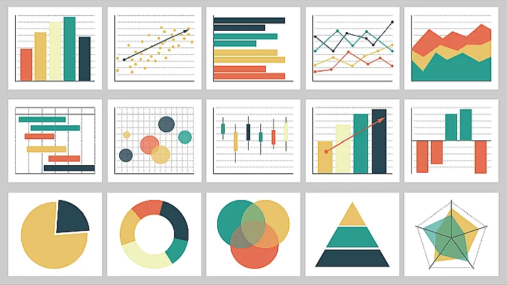
Visualization Techniques for Different Metrics
Trend Visualization
Best for showing changes in metrics over time, such as task completion rates or satisfaction scores across product iterations.
Line chart example
Comparative Visualization
Ideal for benchmarking against competitors or comparing before/after design changes.
Bar chart example
Funnel Visualization
Perfect for illustrating conversion paths and identifying drop-off points in user journeys.
Funnel chart example
Heatmap Visualization
Excellent for displaying user interaction patterns and identifying high-engagement areas.
Heatmap example
Creating Visual Hierarchies for Business Impact
When designing UX metric visualizations, I always establish a clear visual hierarchy that prioritizes business-critical insights. This ensures that stakeholders can quickly identify the most important information without getting lost in details.
                    flowchart TD
                        subgraph "Visual Hierarchy"
                            L1[Business Impact Metrics]
                            L2[Trend Indicators]
                            L3[Comparative Context]
                            L4[Supporting Details]
                            L1 --> L2
                            L2 --> L3
                            L3 --> L4
                        end
                        subgraph "Design Elements"
                            E1[Size & Position]
                            E2[Color & Contrast]
                            E3[Typography]
                            E4[White Space]
                            E1 -.-> L1
                            E2 -.-> L2
                            E3 -.-> L3
                            E4 -.-> L4
                        end
                        classDef orange fill:#FF8000,stroke:#FF6000,color:white
                        classDef blue fill:#42A5F5,stroke:#1E88E5,color:white
                        class L1,L2,L3,L4 orange
                        class E1,E2,E3,E4 blue
Visual hierarchy framework for UX metrics presentation
Using PageOn.ai for Metric Dashboards
I've found that PageOn.ai's AI Blocks feature is particularly powerful for constructing intuitive metric dashboards. By using this tool, I can quickly create customized visualizations that highlight the most important UX insights for different stakeholders.
PageOn.ai Advantage
With PageOn.ai's AI Blocks, you can create modular visualization components that automatically update as your UX metrics change. This ensures your stakeholders always have access to the most current data, presented in a consistent and visually appealing format.
By focusing on clear visual hierarchies and business-relevant metrics, these executive-friendly visualizations make it easy for decision-makers to see the direct connection between UX improvements and business ROI.
Building UX Metric Storytelling Frameworks
In my experience creating impactful product presentations, I've found that the most persuasive UX metric communications tell a compelling story. Let's explore how to build effective storytelling frameworks for UX data.
Connecting UX Metrics to Business KPIs
The most powerful UX metric stories establish clear connections between user experience measurements and key business performance indicators (KPIs).
                    flowchart LR
                        subgraph UXM[UX Metrics]
                            M1[Task Success]
                            M2[Time on Task]
                            M3[User Satisfaction]
                        end
                        subgraph BKPIs[Business KPIs]
                            K1[Customer Retention]
                            K2[Operational Efficiency]
                            K3[Revenue Growth]
                        end
                        M1 --> K1
                        M1 --> K3
                        M2 --> K2
                        M2 --> K3
                        M3 --> K1
                        M3 --> K3
                        classDef orange fill:#FF8000,stroke:#FF6000,color:white
                        classDef blue fill:#42A5F5,stroke:#1E88E5,color:white
                        classDef green fill:#66BB6A,stroke:#43A047,color:white
                        class UXM orange
                        class BKPIs green
                        class M1,M2,M3 orange
                        class K1,K2,K3 green
Direct connections between UX metrics and business KPIs
Developing a Consistent Visual Language
A consistent visual language helps stakeholders quickly recognize and understand UX metric reports, making the information more accessible and actionable.
Color Coding
Icons & Symbols
Layout Templates
Using PageOn.ai's Vibe Creation
PageOn.ai's Vibe Creation feature is an exceptional tool for transforming technical UX data into engaging visual stories. This capability allows me to maintain consistency while adapting the presentation style to different audiences and contexts.
Creating Templates for Different Stakeholders
Different stakeholders need different levels of detail and focus in UX metric reporting. I've developed specific templates for various audiences:
| Stakeholder | Primary Focus | Key Metrics | Visualization Type |
|---|---|---|---|
| Executive Leadership | Business Impact | NPS, Conversion Rate, Revenue Impact | Simple trend charts, ROI dashboards |
| Product Management | Feature Performance | Task Success, Time on Task, Feature Adoption | Comparative charts, heat maps |
| Marketing Team | User Acquisition & Conversion | Funnel Metrics, First-time User Experience | Funnel visualizations, journey maps |
| Engineering Team | Technical Performance | Error Rates, Load Times, Technical Friction | Detailed technical dashboards |
Integrating Qualitative Insights
The most compelling UX metric stories combine quantitative data with qualitative insights. I've found that incorporating user quotes, session recordings, or usability test highlights alongside metrics creates a more complete and persuasive narrative.
From Metrics to Strategic Decision-Making
The ultimate goal of UX metric visualization is to drive strategic business decisions. In this section, I'll share frameworks for connecting UX insights to strategic initiatives.
Visual Frameworks for Strategic Alignment
These frameworks help connect UX metrics directly to strategic business initiatives, making it easier for decision-makers to see the relevance and impact of UX investments.
                    flowchart TD
                        subgraph "Strategic Business Goals"
                            SBG1[Market Growth]
                            SBG2[Customer Retention]
                            SBG3[Operational Efficiency]
                        end
                        subgraph "UX Focus Areas"
                            UXF1[Acquisition Experience]
                            UXF2[Core User Journeys]
                            UXF3[Self-Service Capabilities]
                        end
                        subgraph "UX Metrics"
                            UXM1[First-time User Success]
                            UXM2[Feature Adoption Rate]
                            UXM3[Task Completion Rate]
                            UXM4[Support Ticket Reduction]
                        end
                        SBG1 --> UXF1
                        SBG2 --> UXF2
                        SBG3 --> UXF3
                        UXF1 --> UXM1
                        UXF2 --> UXM2
                        UXF3 --> UXM3
                        UXF3 --> UXM4
                        classDef orange fill:#FF8000,stroke:#FF6000,color:white
                        classDef blue fill:#42A5F5,stroke:#1E88E5,color:white
                        classDef green fill:#66BB6A,stroke:#43A047,color:white
                        class SBG1,SBG2,SBG3 green
                        class UXF1,UXF2,UXF3 blue
                        class UXM1,UXM2,UXM3,UXM4 orange
Strategic alignment framework connecting business goals to UX metrics
Using PageOn.ai's Deep Search for Context
PageOn.ai's Deep Search capability allows me to integrate relevant industry benchmarks and contextual data into my UX metric visualizations, providing crucial comparative information for strategic decision-making.
PageOn.ai Advantage
By leveraging Deep Search, you can automatically incorporate industry benchmarks, competitor data, and historical trends into your UX metric visualizations, creating richer context for strategic decisions.
Creating Decision-Support Visualizations
Decision-support visualizations go beyond reporting—they help stakeholders identify opportunity areas and make informed decisions about UX investments.
Visualizing Cost-Benefit Scenarios
One of the most powerful ways to support strategic decision-making is by visualizing the potential costs and benefits of UX improvements.
                    flowchart LR
                        subgraph "Current State"
                            CS1[Task Success: 65%]
                            CS2[Support Calls: 1,200/mo]
                            CS3[Conversion: 3.2%]
                        end
                        subgraph "UX Investment"
                            I1[Redesign: $120K]
                            I2[Testing: $45K]
                            I3[Implementation: $85K]
                        end
                        subgraph "Projected Outcomes"
                            PO1[Task Success: 85%]
                            PO2[Support Calls: 650/mo]
                            PO3[Conversion: 4.8%]
                        end
                        subgraph "Business Impact"
                            BI1[Support Savings: $330K/yr]
                            BI2[Revenue Increase: $1.2M/yr]
                            BI3[ROI: 345%]
                        end
                        CS1 & CS2 & CS3 --> I1 & I2 & I3
                        I1 & I2 & I3 --> PO1 & PO2 & PO3
                        PO1 & PO2 & PO3 --> BI1 & BI2 & BI3
                        classDef orange fill:#FF8000,stroke:#FF6000,color:white
                        classDef red fill:#EF5350,stroke:#E53935,color:white
                        classDef blue fill:#42A5F5,stroke:#1E88E5,color:white
                        classDef green fill:#66BB6A,stroke:#43A047,color:white
                        class CS1,CS2,CS3 red
                        class I1,I2,I3 orange
                        class PO1,PO2,PO3 blue
                        class BI1,BI2,BI3 green
Cost-benefit visualization for a UX investment decision
Communicating UX Investment Priorities
Clear visualization of UX investment priorities helps business stakeholders understand where to focus resources for maximum impact.
Implementing UX Metric Communication Systems
Creating effective UX metric visualizations is only part of the solution. To drive consistent business impact, you need to implement systematic approaches to UX metric communication.
Establishing Communication Cadence
A regular cadence of UX metric communications helps establish expectations and ensures that insights are consistently available for decision-making.
| Frequency | Audience | Focus | Format |
|---|---|---|---|
| Weekly | Product & UX Teams | Tactical Metrics & Immediate Issues | Interactive Dashboard |
| Monthly | Department Leaders | Trends & Emerging Patterns | Executive Summary + Detailed Report |
| Quarterly | Executive Leadership | Strategic Impact & ROI | Strategic Presentation |
| Ad Hoc | Project Teams | Specific Feature Performance | Focused Analysis Report |
Designing Adaptive Dashboards
Adaptive dashboards evolve with business priorities, ensuring that UX metrics remain relevant to current strategic initiatives.

Leveraging PageOn.ai's Agentic Capabilities
PageOn.ai's Agentic capabilities transform how we maintain UX metric visualizations, making them more consistent, current, and impactful.
PageOn.ai Advantage
With PageOn.ai's Agentic capabilities, your UX metric visualizations can automatically update with the latest data, adapt to changing business priorities, and maintain consistent visual standards across all communications.
                    flowchart TD
                        subgraph "Data Sources"
                            DS1[Analytics Platform]
                            DS2[User Research]
                            DS3[Customer Feedback]
                            DS4[Support Tickets]
                        end
                        subgraph "PageOn.ai Processing"
                            PP1[Data Integration]
                            PP2[Insight Generation]
                            PP3[Visualization Creation]
                            PP4[Template Application]
                        end
                        subgraph "Output Formats"
                            OF1[Executive Dashboards]
                            OF2[Team Reports]
                            OF3[Strategic Presentations]
                            OF4[Real-time Monitors]
                        end
                        DS1 & DS2 & DS3 & DS4 --> PP1
                        PP1 --> PP2
                        PP2 --> PP3
                        PP3 --> PP4
                        PP4 --> OF1 & OF2 & OF3 & OF4
                        classDef orange fill:#FF8000,stroke:#FF6000,color:white
                        classDef blue fill:#42A5F5,stroke:#1E88E5,color:white
                        classDef green fill:#66BB6A,stroke:#43A047,color:white
                        class DS1,DS2,DS3,DS4 blue
                        class PP1,PP2,PP3,PP4 orange
                        class OF1,OF2,OF3,OF4 green
PageOn.ai's automated UX metric visualization workflow
Integration Strategies
For maximum impact, UX metrics should be integrated into broader business reporting systems.
Business Intelligence Integration
Incorporate UX metrics into existing BI dashboards to place user experience alongside other critical business metrics.
Product Health Scorecards
Create product health scorecards that include UX metrics as key indicators of product performance and health.
OKR/KPI Frameworks
Integrate UX metrics into organizational OKR and KPI frameworks to ensure alignment with strategic goals.
Executive Reporting
Include key UX metrics in regular executive reporting to maintain visibility at the highest levels of the organization.
Building Communication Bridges
Creating effective communication bridges between UX teams and business units requires thoughtful planning and consistent execution.
Case Studies: UX Metrics Visualization Success Stories
Real-world examples demonstrate the power of effective UX metric visualization in driving business outcomes.
E-commerce Transformation
A major e-commerce retailer transformed their business by implementing clear funnel visualization techniques that highlighted critical drop-off points in their customer journey.
By visualizing their conversion funnel with clear metrics at each stage, the team identified that the checkout process was causing a significant drop-off. After implementing targeted UX improvements based on these insights, they achieved a 200% increase in conversion rate and a 150% increase in average order value.
SaaS Retention Improvements
A B2B SaaS company struggling with customer churn used intuitive UX metric dashboards to identify and address key pain points in their user experience.

By creating a comprehensive UX health dashboard that monitored key metrics like feature adoption rates, task completion times, and user satisfaction scores, they identified several critical UX issues that were causing customer frustration. After implementing targeted improvements, they reduced churn by 35% and increased customer lifetime value by 28%.
Financial Services Journey Visualization
A leading financial services company visualized complex user journeys to identify friction points and streamline critical processes.
                            flowchart TD
                                A[Account Research] -->|"Success: 92%"| B[Application Start]
                                B -->|"Success: 78%"| C[Identity Verification]
                                C -->|"Success: 65%"| D[Document Upload]
                                D -->|"Success: 58%"| E[Application Review]
                                E -->|"Success: 90%"| F[Account Approval]
                                A1[Pain Point: Confusing Options] -.-> A
                                C1[Pain Point: Verification Errors] -.-> C
                                D1[Pain Point: Format Issues] -.-> D
                                classDef process fill:#42A5F5,stroke:#1E88E5,color:white
                                classDef pain fill:#EF5350,stroke:#E53935,color:white
                                class A,B,C,D,E,F process
                                class A1,C1,D1 pain
Financial services customer journey with success rates and pain points
By creating visual journey maps with clear success metrics at each stage, the team identified three major pain points in their account opening process. After implementing targeted UX improvements, they achieved a 40% reduction in application abandonment and a 25% decrease in customer support calls.
B2B Lifetime Value Visualization
A B2B technology provider created compelling visualizations that connected UX improvements directly to customer lifetime value.
By creating visualizations that directly connected UX metrics to customer retention and lifetime value, this B2B company secured executive buy-in for a comprehensive UX improvement program. The result was a 167% increase in customer lifetime value and a 50% reduction in churn over a three-year period.
Future Trends in UX Metrics Communication
As technology and business needs evolve, so too will the approaches to UX metrics visualization and communication.
AI-Powered Predictive Visualizations
The future of UX metrics visualization will leverage AI to predict the business impact of potential UX changes before they're implemented.
AI prediction visualization
These tools will analyze historical UX data alongside business outcomes to forecast the likely impact of different UX improvements, helping teams prioritize efforts for maximum ROI.
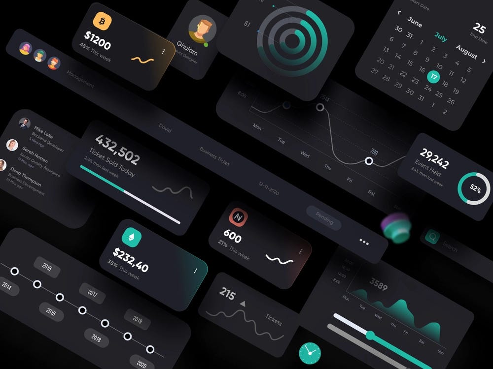
Interactive & Real-Time Visualizations
The next generation of UX metric visualizations will be interactive and real-time, allowing stakeholders to explore data dynamically.
Interactive dashboard visualization
These tools will enable on-the-fly filtering, segmentation, and analysis, making it easier to identify patterns and insights that might otherwise remain hidden in static reports.
Personalized UX Metric Dashboards
Future UX metric communication systems will automatically personalize visualizations based on the viewer's role, preferences, and information needs.
Role-based dashboard visualization
These systems will deliver the right level of detail and focus to each stakeholder, ensuring that everyone from executives to UX researchers gets exactly the information they need in the most effective format.
Emerging ROI Standards
Industry-wide standards for communicating UX ROI will emerge, making it easier to benchmark and compare UX investments across organizations.
Standardized ROI visualization
These standards will establish common metrics, calculation methodologies, and visualization formats, creating a shared language for discussing UX value across industries and organizations.
PageOn.ai's Evolving Capabilities
PageOn.ai is at the forefront of these trends, with evolving capabilities that will transform how organizations communicate UX-business value.
PageOn.ai's Future Vision
PageOn.ai is developing advanced capabilities that will automate the creation of personalized, context-aware UX metric visualizations. These tools will dynamically adapt to business priorities, audience needs, and emerging trends, ensuring that UX insights are always presented in the most impactful way possible.
                    flowchart TD
                        subgraph "Data Collection"
                            DC1[UX Metrics]
                            DC2[Business KPIs]
                            DC3[Industry Benchmarks]
                            DC4[User Feedback]
                        end
                        subgraph "AI Processing"
                            AI1[Pattern Recognition]
                            AI2[Insight Generation]
                            AI3[Impact Prediction]
                            AI4[Priority Identification]
                        end
                        subgraph "Personalized Visualization"
                            PV1[Executive Views]
                            PV2[Product Team Views]
                            PV3[UX Team Views]
                            PV4[Development Team Views]
                        end
                        subgraph "Business Action"
                            BA1[Strategic Decisions]
                            BA2[Resource Allocation]
                            BA3[Feature Prioritization]
                            BA4[UX Investment]
                        end
                        DC1 & DC2 & DC3 & DC4 --> AI1
                        AI1 --> AI2
                        AI2 --> AI3
                        AI3 --> AI4
                        AI4 --> PV1 & PV2 & PV3 & PV4
                        PV1 & PV2 & PV3 & PV4 --> BA1 & BA2 & BA3 & BA4
                        classDef blue fill:#42A5F5,stroke:#1E88E5,color:white
                        classDef orange fill:#FF8000,stroke:#FF6000,color:white
                        classDef purple fill:#AB47BC,stroke:#8E24AA,color:white
                        classDef green fill:#66BB6A,stroke:#43A047,color:white
                        class DC1,DC2,DC3,DC4 blue
                        class AI1,AI2,AI3,AI4 orange
                        class PV1,PV2,PV3,PV4 purple
                        class BA1,BA2,BA3,BA4 green
PageOn.ai's future vision for UX metrics communication
Transform Your UX Metrics into Business-Driving Visuals
Discover how PageOn.ai's innovative tools can help you create compelling visual narratives that connect UX insights to business outcomes.
Start Visualizing with PageOn.ai TodayConclusion: The Future of UX-Business Communication
Throughout this guide, I've shared my experience and insights on transforming UX metrics into powerful business communication visuals. As we've explored, effective visualization is the key to bridging the gap between user experience data and strategic business decisions.
By implementing the frameworks, techniques, and best practices outlined here, you can create UX metric visualizations that not only inform but inspire action. From establishing clear connections between UX metrics and business KPIs to designing adaptive dashboards that evolve with business priorities, these approaches will help you demonstrate the true value of user experience in driving business success.
As tools like PageOn.ai continue to evolve, the future of UX metric communication looks increasingly powerful and accessible. By embracing these innovations and focusing on creating clear, compelling visual narratives, you can ensure that UX insights take their rightful place at the center of strategic business decision-making.
You Might Also Like
Creating Impactful Cultural Presentations: AI-Driven Visual Storytelling for Cultural Expression
Discover how to create authentic cultural presentations using AI-driven visual storytelling techniques. Learn to transform cultural concepts into engaging visual narratives with PageOn.ai.
10 Hidden Google Workspace Marketplace Gems for Transforming Your Presentations
Discover 10 powerful Google Workspace Marketplace add-ons that will revolutionize how you create, deliver, and collaborate on presentations. Unlock hidden gems for presenters.
Creating Engaging Visual Process Guides: Transform Complex Workflows into Interactive Timelines
Learn how to create effective visual process guides using interactive timelines. Transform complex workflows into clear, engaging visual timelines that improve comprehension and drive better results.
Mastering Adobe Acrobat: Complete Visual Guide to Transform Your PDF Workflow
Step-by-step visual guide to Adobe Acrobat - learn to create, edit, secure, and collaborate on PDFs with expert tips, interactive elements, and PageOn.ai integration.