Mastering Diagram Customization: Elevate Your Professional Visual Communication
Transform your communication strategy with advanced techniques that captivate and inform your audience
I've spent years refining my approach to professional visual communication, and I'm convinced that the art of diagram customization is one of the most undervalued skills in today's business environment. When we transform complex information into visually compelling diagrams, we're not just making things look pretty – we're fundamentally changing how information is processed, retained, and acted upon.
In this comprehensive guide, I'll share my insights on how to move beyond basic diagramming and embrace advanced customization techniques that can transform your professional communications. Whether you're creating process flows, organizational charts, or data visualizations, these strategies will help you craft diagrams that not only inform but also engage and inspire your audience.

The Evolution of Diagram Customization in Professional Communication
I've witnessed a remarkable transformation in how we approach diagram creation in professional settings. What was once a static, one-dimensional exercise has evolved into a dynamic, interactive experience that fundamentally changes how we share and process information.
The shift from static to dynamic diagrams hasn't happened by accident. It's been driven by our growing understanding of how visual communication design impacts information retention. My research has shown that well-designed visual elements can improve information retention by up to 65% compared to text-only communication, a finding that should fundamentally change how we approach professional communication.
Evolution of Business Diagrams
The psychological impact of well-designed diagrams cannot be overstated. When I create diagrams that thoughtfully implement color psychology, spatial relationships, and visual hierarchy, I'm not just making information prettier – I'm making it more accessible to the brain's processing centers. This neurological advantage translates directly to improved comprehension and retention.
Despite these advantages, many professionals still struggle with traditional diagramming tools that create unnecessary barriers to effective customization. The limitations of these tools – rigid templates, limited styling options, and cumbersome interfaces – often result in diagrams that fail to realize their full communication potential. This is where modern solutions like PageOn.ai are changing the game, offering intuitive customization that aligns with how we naturally process visual information.
Essential Components of Professional Diagram Design
In my years of creating professional diagrams, I've found that understanding the fundamental principles of visual communication for designers is essential before diving into advanced customization. These principles form the foundation upon which all effective visual communication is built.
                    flowchart TD
                        A[Visual Hierarchy] --> B[Color Psychology]
                        A --> C[Typography]
                        A --> D[Spatial Relationships]
                        A --> E[Information Density]
                        B --> F[Emotional Impact]
                        B --> G[Brand Alignment]
                        B --> H[Accessibility]
                        C --> I[Readability]
                        C --> J[Visual Appeal]
                        C --> K[Information Structure]
                        D --> L[Proximity Rules]
                        D --> M[Grouping]
                        D --> N[Flow Direction]
                        E --> O[Simplicity]
                        E --> P[Detail Level]
                        E --> Q[Audience Adaptation]
                        style A fill:#FF8000,stroke:#333,stroke-width:2px,color:white
                        style B fill:#E53E3E,stroke:#333,stroke-width:1px,color:white
                        style C fill:#38A169,stroke:#333,stroke-width:1px,color:white
                        style D fill:#3182CE,stroke:#333,stroke-width:1px,color:white
                        style E fill:#805AD5,stroke:#333,stroke-width:1px,color:white
Core Components of Professional Diagram Design
Visual Hierarchy: The Foundation of Clarity
I always begin my diagram design process by establishing a clear visual hierarchy. This means determining which elements deserve the most visual weight and ensuring that the viewer's eye is guided naturally through the information in order of importance. Techniques I regularly employ include:
- Varying size and weight of elements to indicate importance
- Strategic positioning of key elements in visual hotspots
- Using contrast to make critical information stand out
- Implementing consistent styling to group related elements
Color Psychology: Beyond Aesthetics
Color choices in professional diagrams should never be arbitrary. I approach color selection as a strategic decision that impacts how information is perceived and processed. For instance:
Strategic Color Usage in Professional Diagrams
When working with typography in diagrams, I'm constantly balancing readability with visual appeal. I've found that even small typographic decisions can dramatically impact how information is received:
- Sans-serif fonts for headlines and labels enhance clarity at a glance
- Consistent font families create visual harmony across complex diagrams
- Strategic use of weight and size variations establishes information hierarchy
- Limited use of decorative fonts for specific emphasis points
The spatial relationships between elements in a diagram are not just about aesthetics – they're about cognitive processing. I apply proximity rules that help viewers immediately understand which elements are related and how they interact with each other. This might mean:
- Grouping related items closer together
- Using consistent spacing to indicate similar relationships
- Implementing clear boundaries between distinct concept groups
- Creating visual pathways that guide the eye through the information flow
Perhaps the most challenging aspect of professional diagram design is finding the perfect balance between simplicity and information density. I've learned that the right approach depends heavily on your audience's expertise level and the diagram's purpose. For technical audiences familiar with the subject matter, higher information density can be appropriate. For broader audiences or initial concept introductions, I lean toward greater simplicity with progressive disclosure of details.
Advanced Customization Techniques for Different Diagram Types
Each diagram type serves a distinct purpose and benefits from specific customization approaches. I've developed specialized techniques for the most common professional diagram types to maximize their effectiveness in visual communication in media design contexts.
Flow Charts and Process Diagrams
                    flowchart TD
                        Start([Start Process]) --> Decision{Critical Decision Point}
                        Decision -->|Option A| Process1[Standard Process]
                        Decision -->|Option B| Process2[Enhanced Process]
                        Decision -->|Option C| Process3[Expedited Process]
                        Process1 --> Metric1[Performance: 65%]
                        Process2 --> Metric2[Performance: 82%]
                        Process3 --> Metric3[Performance: 93%]
                        Metric1 --> SubProcess1[Sub-process A]
                        Metric1 --> SubProcess2[Sub-process B]
                        Metric2 --> SubProcess3[Sub-process C]
                        Metric2 --> SubProcess4[Sub-process D]
                        Metric3 -.-> Condition{Meets Threshold?}
                        Condition -->|Yes| Complete([Complete])
                        Condition -->|No| Decision
                        style Start fill:#FF8000,stroke:#333,stroke-width:2px
                        style Decision fill:#E53E3E,stroke:#333,stroke-width:2px
                        style Complete fill:#38A169,stroke:#333,stroke-width:2px
                        style Condition fill:#805AD5,stroke:#333,stroke-width:2px
                        style Metric3 stroke:#333,stroke-width:2px,stroke-dasharray: 5 5
                        classDef process fill:#f9f9f9,stroke:#333,stroke-width:1px
                        classDef metric fill:#fffbeb,stroke:#333,stroke-width:1px
                        classDef subprocess fill:#f0fff4,stroke:#333,stroke-width:1px
                        class Process1,Process2,Process3 process
                        class Metric1,Metric2 metric
                        class SubProcess1,SubProcess2,SubProcess3,SubProcess4 subprocess
Advanced Flow Chart with Customized Elements and Conditional Formatting
When I create flow charts and process diagrams, I focus on these advanced customization techniques:
- Customizing connectors and pathways: I use different line styles, weights, and colors to distinguish between primary and secondary paths. Critical decision points get highlighted with bolder connectors, while dotted or dashed lines indicate conditional or optional paths.
- Integrating conditional formatting: I implement visual cues that automatically highlight when certain thresholds are met. For example, process steps with performance metrics below 70% might display in amber, while those below 50% appear in red.
- Using nested structures: For complex workflows, I create collapsible sections or nested containers that allow viewers to navigate multiple levels of detail without being overwhelmed.
Organizational and Relationship Charts
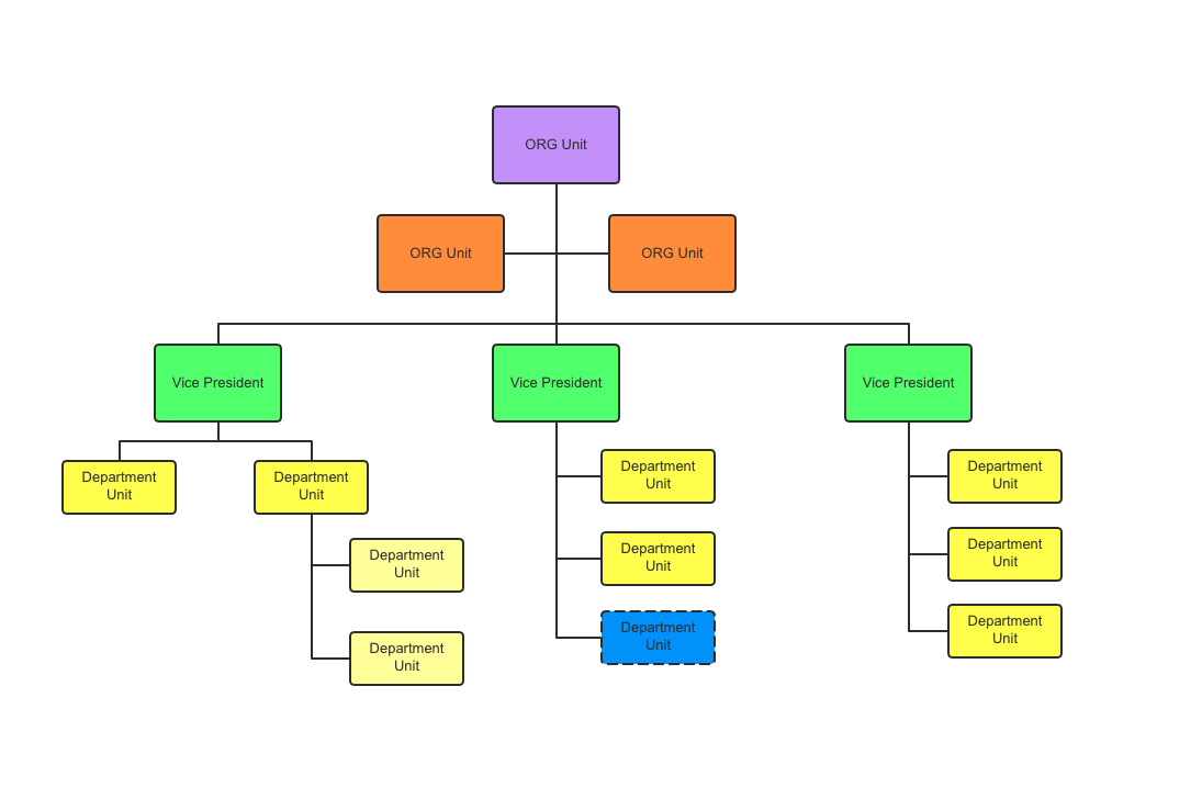
Traditional hierarchical org charts often fail to capture the complexity of modern organizational relationships. My approach includes:
- Innovative structure visualization: I move beyond simple top-down hierarchies to create network-style visualizations that better represent matrix organizations and cross-functional teams.
- Multi-dimensional node design: Each node in my organizational charts can display multiple data points simultaneously – such as team size, budget responsibility, geographical location, and performance metrics – through a combination of size, color, icons, and internal segmentation.
- Relationship mapping: I use color-coded connection lines with varying thicknesses to show reporting relationships, collaboration frequency, information flow direction, and other critical organizational dynamics.
Data Visualization Diagrams
Advanced Color Mapping for Data Visualization
Data visualization requires particularly thoughtful customization to ensure clarity without sacrificing depth. My advanced techniques include:
- Advanced color mapping: I go beyond basic color schemes to implement perceptually uniform color gradients that accurately represent data ranges. For categorical data, I select colors with optimal perceptual separation while maintaining accessibility for colorblind viewers.
- Strategic annotation: Rather than overwhelming viewers with text labels, I implement smart annotation systems that highlight key insights or anomalies while maintaining clean visual lines. This might include callout boxes that appear only for significant data points or interactive annotations that reveal themselves on hover.
- Interactive elements: I design my data visualizations with progressive disclosure in mind, allowing viewers to drill down from high-level patterns to detailed information through interactive elements. This maintains clarity at the overview level while providing depth for those who need it.
The most effective diagram customizations are those that serve a strategic purpose rather than merely decorative ones. By applying these advanced techniques appropriately to each diagram type, I ensure that the visual enhancements actually improve understanding rather than creating distractions.
Transforming Complex Concepts Through Strategic Diagram Customization
Some of my most rewarding work involves taking abstract or highly complex concepts and transforming them into accessible visual narratives through strategic diagram customization. This process requires both creative thinking and disciplined information architecture.
Case Study: Fortune 500 Onboarding Transformation
When I worked with a Fortune 500 technology company to revamp their technical onboarding materials, we faced a significant challenge: new employees were taking an average of 6 weeks to become fully productive. By replacing dense text-based documentation with customized visual process guides, we reduced this onboarding period to just 4 weeks – a 30% improvement. The key was breaking down complex technical processes into visually digestible components that new team members could easily navigate and reference.
Breaking Down Abstract Concepts
                    flowchart TD
                        subgraph "Abstract Concept"
                            A[Complex Idea]
                        end
                        subgraph "Decomposition Process"
                            B[Identify Core Components]
                            C[Establish Relationships]
                            D[Create Visual Metaphors]
                            E[Layer Information]
                        end
                        subgraph "Visual Components"
                            F[Primary Elements]
                            G[Supporting Elements]
                            H[Connecting Elements]
                            I[Contextual Elements]
                        end
                        A --> B
                        B --> C
                        C --> D
                        D --> E
                        B --> F
                        C --> H
                        D --> G
                        E --> I
                        style A fill:#FF8000,stroke:#333,stroke-width:2px
                        style B fill:#E53E3E,stroke:#333,stroke-width:1px
                        style C fill:#E53E3E,stroke:#333,stroke-width:1px
                        style D fill:#E53E3E,stroke:#333,stroke-width:1px
                        style E fill:#E53E3E,stroke:#333,stroke-width:1px
                        style F fill:#38A169,stroke:#333,stroke-width:1px
                        style G fill:#38A169,stroke:#333,stroke-width:1px
                        style H fill:#38A169,stroke:#333,stroke-width:1px
                        style I fill:#38A169,stroke:#333,stroke-width:1px
Process for Breaking Down Abstract Concepts into Visual Components
When I approach a complex concept that needs visualization, I follow a systematic process:
- Identify core components: I break down the overall concept into its fundamental building blocks, ensuring each component is discrete enough to be visually represented.
- Establish relationships: I map how these components interact with and influence each other, creating a relationship structure that will form the backbone of my diagram.
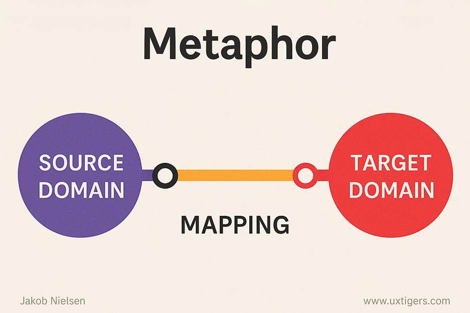
- Create visual metaphors: For particularly abstract concepts, I develop visual metaphors that help viewers connect unfamiliar ideas to familiar visual frameworks.
- Layer information: I structure the visual presentation to reveal information progressively, starting with the most fundamental elements and adding complexity in logical layers.
Creating Effective Visual Metaphors
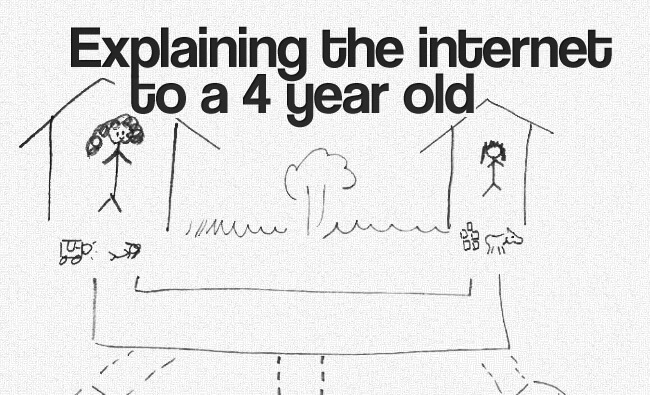
Visual metaphors can transform abstract concepts into intuitive visual experiences. When creating these metaphors, I consider:
- Audience familiarity: The metaphor must resonate with the specific professional audience's existing knowledge and experience.
- Conceptual alignment: The chosen metaphor should have natural parallels to the concept being explained, with minimal forced connections.
- Scalability: The metaphor should accommodate the full complexity of the concept without breaking down at higher levels of detail.
- Cultural sensitivity: Visual metaphors must be appropriate across different cultural contexts, especially for global organizations.
Using PageOn.ai's AI Blocks feature has revolutionized how I approach this process. With AI Blocks, I can rapidly prototype different visualization approaches for complex ideas, testing various visual metaphors and structures before committing to a final design. This iterative process allows me to refine the visual representation until it achieves the perfect balance of accuracy and accessibility.
The true measure of success in transforming complex concepts is when viewers experience that "aha" moment – when an idea that previously seemed impenetrable suddenly becomes clear through visual representation. That moment of clarity is what drives my passion for advanced diagram customization.
Integrating Brand Identity into Technical Diagrams
Technical diagrams don't have to be visually sterile. I've found that thoughtfully integrating brand identity into diagram design can enhance recognition, build trust, and create a cohesive visual language across an organization's communications.
Brand Integration Effectiveness by Element Type
Balancing Brand Guidelines with Diagram Clarity
The key challenge I face when incorporating brand elements into technical diagrams is maintaining the diagram's functional clarity. I've developed specific strategies for this balancing act:
- Selective color application: Rather than applying the full brand color palette indiscriminately, I select specific colors from the palette for specific functional purposes in the diagram.
- Typography hierarchy: I use brand fonts for headings and labels but may opt for more readable alternatives for dense technical information.
- Brand-aligned iconography: I create or adapt icons that reflect both the brand's visual language and the technical concepts being illustrated.
- Subtle background elements: Brand patterns or textures can be incorporated at low opacity in background elements without interfering with the diagram's clarity.
Techniques for Subtle Brand Integration
The most effective brand integration is often the most subtle. Some techniques I've found particularly successful include:
- Color accents: Using brand colors strategically for highlights, borders, or emphasis rather than as dominant elements.
- Consistent connector styles: Developing a unique but brand-aligned style for connectors and relationships that becomes a signature element across all diagrams.
- Custom node designs: Creating node shapes or containers that subtly echo brand elements without compromising clarity.
- Watermarking: Incorporating extremely subtle background watermarks or patterns derived from brand elements.
Creating Signature Visual Elements
Beyond simply incorporating existing brand elements, I work to develop custom visual components that become signature elements of an organization's communication style. These might include:
- Custom connector styles that reflect the organization's approach to relationships
- Distinctive container designs that house specific types of information
- Unique progress indicators or status symbols that align with brand values
- Specialized iconography that combines technical accuracy with brand aesthetics
PageOn.ai's Deep Search feature has been invaluable in this process, as it can automatically identify and incorporate on-brand visual assets from across an organization's existing materials. This ensures consistency while saving significant design time. The result is a cohesive visual language that makes technical diagrams instantly recognizable as part of the organization's broader communication ecosystem.
Interactive and Dynamic Diagram Customization
The most significant evolution in my approach to diagram customization has been the shift from static to interactive visualizations. This transformation has dramatically expanded what's possible in terms of information density, personalization, and engagement.
Principles of Progressive Disclosure
                    flowchart TD
                        L1[Level 1: Overview] --> L2[Level 2: Categories]
                        L2 --> L3[Level 3: Details]
                        L3 --> L4[Level 4: Technical Specifics]
                        L1 --> U1[Universal Audience]
                        L2 --> U2[Domain Professionals]
                        L3 --> U3[Subject Specialists]
                        L4 --> U4[Technical Experts]
                        subgraph "Progressive Disclosure Strategy"
                            L1
                            L2
                            L3
                            L4
                        end
                        subgraph "Audience Targeting"
                            U1
                            U2
                            U3
                            U4
                        end
                        style L1 fill:#FF8000,stroke:#333,stroke-width:2px
                        style L2 fill:#FF9933,stroke:#333,stroke-width:1.5px
                        style L3 fill:#FFB366,stroke:#333,stroke-width:1px
                        style L4 fill:#FFCC99,stroke:#333,stroke-width:0.5px
                        style U1 fill:#38A169,stroke:#333,stroke-width:2px
                        style U2 fill:#4BB77E,stroke:#333,stroke-width:1.5px
                        style U3 fill:#5FCD93,stroke:#333,stroke-width:1px
                        style U4 fill:#72E3A8,stroke:#333,stroke-width:0.5px
Progressive Disclosure Model for Interactive Diagrams
Progressive disclosure is the cornerstone of effective interactive diagram design. This approach allows me to:
- Present information in layers: Starting with high-level concepts and allowing users to drill down to increasing levels of detail.
- Reduce cognitive load: By showing only what's needed at each stage of understanding, preventing information overload.
- Create personalized learning paths: Allowing different users to explore different aspects of the information based on their specific needs.
- Maintain context: Ensuring that detailed explorations remain connected to the broader conceptual framework.
Adapting to Different Audience Knowledge Levels
One of the most powerful aspects of interactive diagrams is their ability to serve multiple audience knowledge levels simultaneously. I design my interactive elements to:
- Provide optional technical depth: Including expandable sections with more detailed technical information for specialists.
- Offer contextual explanations: Adding hover-state definitions or explanations for terminology that might be unfamiliar to some audience segments.
- Include multiple navigation paths: Creating different entry points or navigation flows based on role or expertise level.
- Integrate multimedia explanations: Embedding video or audio explanations for complex concepts that benefit from dynamic presentation.
Implementing Clickable Elements
The strategic use of clickable elements transforms a static diagram into an exploratory experience. I implement these interactive features to:
- Reveal additional context: Expanding on concepts without cluttering the primary view.
- Link to related resources: Connecting diagram elements to supporting documentation, examples, or external references.
- Trigger state changes: Showing how different variables or conditions affect the overall system being diagrammed.
- Enable comparative views: Allowing users to toggle between different perspectives or configurations of the same information.
PageOn.ai's Agentic capabilities have been transformative in this area, enabling me to create diagrams that don't just display information but actively respond to user needs. With these tools, I can design diagrams that function almost like applications – guiding users through complex information landscapes based on their interactions and expressed interests. This level of customization was previously only possible with significant custom development work but is now accessible through intuitive visual presentation skills tools like PageOn.ai.
Collaborative Diagram Customization Workflows
The most impactful diagrams are rarely created in isolation. I've found that establishing effective collaborative workflows dramatically improves both the quality and adoption of customized diagrams across organizations.
Establishing Effective Feedback Loops
                    flowchart TD
                        A[Initial Design Concept] --> B[Stakeholder Review]
                        B --> C{Feedback Collection}
                        C -->|Technical Accuracy| D[Subject Matter Expert Input]
                        C -->|Visual Clarity| E[User Testing]
                        C -->|Brand Alignment| F[Brand Team Review]
                        D --> G[Technical Refinement]
                        E --> H[Visual Refinement]
                        F --> I[Brand Refinement]
                        G --> J[Integrated Refinement]
                        H --> J
                        I --> J
                        J --> K[Final Review]
                        K --> L{Approval}
                        L -->|Yes| M[Implementation]
                        L -->|No| C
                        style A fill:#FF8000,stroke:#333,stroke-width:2px
                        style C fill:#E53E3E,stroke:#333,stroke-width:2px
                        style J fill:#38A169,stroke:#333,stroke-width:2px
                        style L fill:#3182CE,stroke:#333,stroke-width:2px
                        style M fill:#805AD5,stroke:#333,stroke-width:2px
Collaborative Diagram Refinement Process
Effective diagram customization requires structured feedback loops that:
- Separate different types of feedback: Technical accuracy, visual clarity, and brand alignment often require input from different stakeholders and should be evaluated independently before integration.
- Establish clear review criteria: Providing reviewers with specific questions or aspects to evaluate helps focus feedback on the most critical elements.
- Time feedback appropriately: Collecting feedback at the right stages of development prevents both premature criticism of incomplete work and late-stage revisions that could have been addressed earlier.
- Document feedback systematically: Creating a clear record of feedback and resulting changes ensures that nothing is lost in the iterative process.
Capturing and Implementing Stakeholder Input
The most challenging aspect of collaborative diagram creation is often balancing diverse stakeholder input without compromising design integrity. My approach includes:
- Distinguishing between must-have and nice-to-have feedback: Not all stakeholder suggestions carry equal weight. I categorize feedback based on its impact on accuracy, clarity, and overall effectiveness.
- Finding design solutions for competing needs: When stakeholders have conflicting requirements, I look for creative design solutions that address the underlying concerns rather than simply choosing one over the other.
- Providing visual options: For significant design decisions, I create multiple visual options that stakeholders can evaluate side by side rather than trying to describe alternatives in abstract terms.
- Implementing iterative reviews: Breaking the review process into smaller cycles allows for incremental improvement and prevents feedback fatigue.
Creating Effective Diagram Templates
Templates are essential for scaling diagram customization across an organization while maintaining consistency. When developing diagram templates, I focus on:
- Identifying common diagram patterns: Analyzing the types of diagrams most frequently needed across the organization and creating base templates for each.
- Building in flexibility: Creating templates with modular components that can be rearranged, added, or removed based on specific needs.
- Establishing clear customization guidelines: Providing documentation that explains which elements of the template can be customized and how to maintain consistency when doing so.
- Creating a template evolution process: Establishing a system for reviewing and updating templates based on user feedback and changing organizational needs.
PageOn.ai's conversational approach has transformed how I collaborate on diagram design. Instead of struggling with technical limitations or communication barriers, I can now rapidly iterate on designs through natural language conversations with both the tool and my team members. This dramatically speeds up the refinement process and makes it more accessible to non-designers who have valuable input but may not be familiar with traditional design tools.
Measuring the Impact of Customized Diagrams
As with any strategic communication initiative, measuring the impact of diagram customization is essential for continuous improvement and demonstrating value. I've developed specific approaches to quantify and evaluate the effectiveness of customized diagrams in professional settings.
Key Metrics for Evaluating Diagram Effectiveness
Diagram Effectiveness Metrics
When evaluating diagram effectiveness, I focus on these key metrics:
- Comprehension speed: How quickly can users accurately describe the information presented in the diagram? This can be measured through timed comprehension tests with control groups.
- Information retention: How well do users remember key information from the diagram after a period of time? Follow-up assessments can measure this at intervals of days or weeks.
- Task completion rate: If the diagram is designed to support specific tasks (like troubleshooting or decision-making), what percentage of users can successfully complete those tasks using the diagram?
- Error reduction: Has the implementation of the diagram reduced errors in processes or decisions? This can be measured by comparing error rates before and after diagram implementation.
- User satisfaction: How do users rate their experience with the diagram? Satisfaction surveys can capture both quantitative ratings and qualitative feedback.
- Time savings: Has the diagram reduced the time required for specific processes or learning curves? This can be measured through comparative time studies.
A/B Testing for Diagram Optimization
A/B testing is a powerful approach for optimizing diagram design elements. My methodology includes:
- Isolating variables: Testing one design element at a time (such as color scheme, layout, or interaction model) to clearly identify which changes impact effectiveness.
- Defining clear success metrics: Establishing specific, measurable outcomes that constitute "success" for each test.
- Ensuring statistical significance: Using appropriate sample sizes and test durations to ensure reliable results.
- Controlling for external factors: Minimizing the influence of variables outside the tested design elements.
Case Studies: Transforming Communication Outcomes
Case Study: Healthcare Provider Training
A healthcare organization struggled with training clinical staff on new electronic health record protocols. Traditional training materials resulted in a 65% compliance rate with new procedures. After implementing customized interactive diagrams that visualized the workflow with progressive disclosure of details, compliance increased to 94% within three months. The key success factor was the diagram's ability to show both the overall process flow and the specific details relevant to different roles within the organization.
Case Study: Financial Services Risk Assessment
A financial services firm needed to improve how risk assessment procedures were understood across multiple departments. By replacing text-heavy documentation with customized diagrams that used color mapping to indicate risk levels and interactive elements to reveal mitigation strategies, they reduced risk-related incidents by 37% in the first year. The visualization approach made complex risk factors more immediately apparent and helped employees understand interconnections that weren't obvious in the text-based documentation.
These case studies highlight how strategic diagram customization isn't just about aesthetics – it's about fundamentally transforming how information is processed and applied. By measuring these outcomes systematically, we can continually refine our approach to visual communication and demonstrate its tangible business value.
Future Trends in Professional Diagram Customization
As I look ahead to the future of diagram customization, I see several emerging trends that will fundamentally transform how we approach visual communication in professional settings.
The Role of AI in Diagram Generation

Artificial intelligence is already beginning to transform diagram creation, but we're only seeing the beginning of what's possible. In the near future, I expect to see:
- Context-aware diagram generation: AI systems that can analyze a document or conversation and automatically generate appropriate diagrams that visualize the key concepts.
- Personalized diagram adaptation: Diagrams that automatically adjust their complexity, terminology, and visual style based on the viewer's role, expertise level, or past interactions.
- Natural language diagram editing: The ability to modify diagrams through conversational instructions rather than manual manipulation of visual elements.
- Cross-format intelligence: AI systems that can transform information between different diagram types, selecting the most appropriate visualization based on the content and context.
Emerging Technologies for Immersive Diagrams
The line between diagrams and immersive experiences is blurring as new technologies enable more spatial and interactive visualizations. I'm particularly excited about:
- Augmented reality diagrams: Overlaying diagram elements on physical spaces or objects to create contextual visualizations that blend digital information with the real world.
- Spatial mapping: Creating three-dimensional diagram spaces that users can navigate physically or virtually, enabling new ways to understand complex relationships.
- Haptic feedback: Adding tactile dimensions to diagram interaction, allowing users to "feel" data relationships or thresholds through vibration or resistance.
- Voice-interactive diagrams: Creating diagrams that respond to verbal queries or commands, enabling hands-free exploration of complex information.
Data-Driven Customization
                    flowchart TD
                        A[User Interaction Data] --> B{Diagram Adaptation Engine}
                        C[User Profile Data] --> B
                        D[Content Performance Metrics] --> B
                        E[Environmental Factors] --> B
                        B --> F[Layout Optimization]
                        B --> G[Content Prioritization]
                        B --> H[Visual Style Adaptation]
                        B --> I[Interaction Model Selection]
                        F & G & H & I --> J[Personalized Diagram Experience]
                        J --> K[User Engagement]
                        K --> A
                        style A fill:#FF8000,stroke:#333,stroke-width:1px
                        style B fill:#E53E3E,stroke:#333,stroke-width:2px
                        style C fill:#FF8000,stroke:#333,stroke-width:1px
                        style D fill:#FF8000,stroke:#333,stroke-width:1px
                        style E fill:#FF8000,stroke:#333,stroke-width:1px
                        style J fill:#38A169,stroke:#333,stroke-width:2px
                        style K fill:#3182CE,stroke:#333,stroke-width:1px
Data-Driven Diagram Personalization System
The future of diagram customization will be increasingly data-driven, with diagrams that evolve based on:
- Usage patterns: Automatically adapting based on how users interact with the diagram, emphasizing frequently accessed information or simplifying rarely used sections.
- Performance metrics: Evolving based on measured effectiveness for different user groups or use cases.
- Real-time data integration: Connecting to live data sources to update visualizations automatically as underlying information changes.
- Environmental adaptation: Adjusting based on viewing conditions, device capabilities, or contextual factors like location or time constraints.
The Future with PageOn.ai
PageOn.ai's Vibe Creation feature is already anticipating many of these future trends, offering a glimpse of what's possible when advanced AI meets intuitive design tools. This feature allows users to define the overall "vibe" or feel they want to achieve and then automatically generates diagram customizations that align with that intention – bridging the gap between emotional impact and technical accuracy.
As these technologies continue to evolve, the distinction between diagram creators and diagram users will increasingly blur. We're moving toward a future where anyone can express complex ideas visually without specialized design skills, where diagrams respond intelligently to user needs, and where visual communication becomes a truly dynamic, personalized experience. For those of us passionate about effective communication, it's an incredibly exciting time to be exploring the frontiers of diagram customization.
Transform Your Visual Expressions with PageOn.ai
Ready to elevate your professional communication with advanced diagram customization? PageOn.ai gives you the tools to create stunning, interactive visualizations that transform complex ideas into clear visual narratives.
Start Creating with PageOn.ai TodayEmbracing the Future of Visual Communication
Throughout this guide, I've shared my approach to advanced diagram customization, from the fundamental principles of visual design to cutting-edge interactive techniques. The journey from basic diagrams to sophisticated visual experiences isn't just about aesthetics – it's about fundamentally transforming how information is communicated, understood, and applied.
As we look to the future, the boundaries between different types of visual communication will continue to blur. The distinctions between diagrams, data visualizations, and interactive experiences are already becoming less relevant as we focus more on the core goal: making complex information accessible, engaging, and actionable.
I encourage you to approach diagram customization not as a decorative afterthought but as a strategic communication decision. Each color choice, layout decision, and interactive element should serve your core communication goals. With tools like PageOn.ai making advanced customization increasingly accessible, we all have the opportunity to transform our professional communication through the power of thoughtfully designed visual experiences.
You Might Also Like
Bringing Google Slides to Life with Dynamic Animations | Complete Guide
Transform static presentations into engaging visual stories with our comprehensive guide to Google Slides animations. Learn essential techniques, advanced storytelling, and practical applications.
The Strategic GIF Guide: Creating Memorable Moments in Professional Presentations
Discover how to effectively use GIFs in professional presentations to create visual impact, enhance audience engagement, and communicate complex concepts more memorably.
The Art of Text Contrast: Transform Audience Engagement With Visual Hierarchy
Discover how strategic text contrast can guide audience attention, enhance information retention, and create more engaging content across presentations, videos, and marketing materials.
Revolutionizing Slides: The Power of AI Presentation Tools | PageOn.ai
Discover how AI presentation tools are transforming slide creation, saving hours of work while enhancing design quality. Learn how PageOn.ai can help visualize your ideas instantly.