Mastering Advanced Image Masking: Transform Ordinary Slides into Visual Masterpieces
Elevate your presentations with sophisticated masking techniques that captivate audiences and communicate ideas more effectively
Understanding the Power of Image Masking
I've always been fascinated by the transformative power of image masking in presentations. While many presenters settle for basic cropping, I've discovered that sophisticated masking techniques can elevate ordinary slides into visual masterpieces that truly engage audiences.
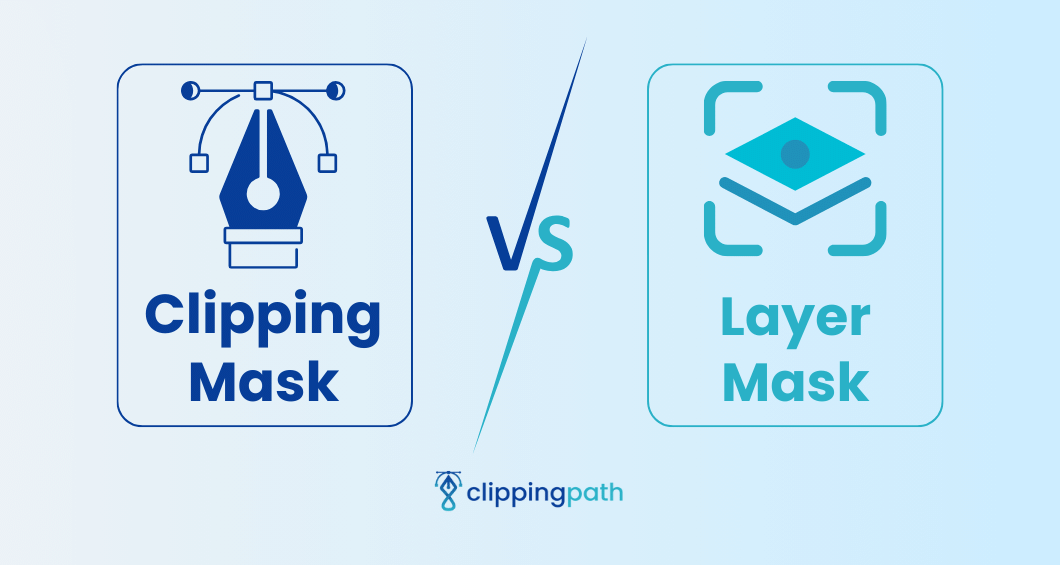
The fundamental difference between basic cropping and sophisticated masking lies in the level of control and the visual outcome. While cropping simply cuts an image along straight lines, masking allows me to isolate specific parts of an image with smooth transitions and intricate details. This technique gives me precise control over which parts remain visible and which parts are hidden.
I've found that the psychological impact of creative masking on audience engagement is significant. When I use thoughtfully masked images, my audience tends to focus more intently on the content and retain information better. This happens because well-executed masking directs attention exactly where I want it, creating visual pathways through my presentation.
Beyond Aesthetics: Masking as a Communication Tool
I don't just use masking to make my slides look prettier. I've learned to leverage it as a powerful visual communication tool that helps me emphasize key points, create emotional connections, and structure complex information in digestible ways.
When I'm planning my presentation design, I often turn to mask image in Google Slides techniques to help conceptualize designs that align with my presentation goals. PageOn.ai's Vibe Creation feature has been particularly helpful in this process, as it suggests masking approaches based on the emotional tone and objectives of my presentation.
The Image Masking Value Spectrum
I've mapped out how different masking approaches deliver increasing value to presentations:
                    flowchart LR
                        A[Basic Cropping] -->|Adds Structure| B[Shape Masking]
                        B -->|Adds Focus| C[Layered Masking]
                        C -->|Adds Depth| D[Interactive Masking]
                        D -->|Adds Engagement| E[Animated Masking]
                        style A fill:#FFF5E6,stroke:#FF8000
                        style B fill:#FFF0D9,stroke:#FF8000
                        style C fill:#FFEBD1,stroke:#FF8000
                        style D fill:#FFE0B3,stroke:#FF8000
                        style E fill:#FFD699,stroke:#FF8000
Essential Masking Techniques Across Presentation Platforms
Throughout my years designing presentations, I've worked with various platforms and discovered that each offers unique masking capabilities. Whether you're using Google Slides, PowerPoint, or Keynote, understanding the specific tools available to you is crucial for creating professional-looking slides.
The "Dupe-and-Mask" Technique
One of my favorite techniques is the "dupe-and-mask" approach, which I find particularly effective when presenting product features. This method involves duplicating an image, then masking different parts of each copy to create a focused highlight effect.
Dupe-and-Mask Process
                    flowchart TD
                        A[Original Image] --> B[Duplicate Image]
                        B --> C[Apply Mask to Original]
                        B --> D[Apply Different Mask to Duplicate]
                        C --> E[Layer Images]
                        D --> E
                        E --> F[Adjust Transparency/Effects]
                        style A fill:#FFF5E6,stroke:#FF8000
                        style B fill:#FFF0D9,stroke:#FF8000
                        style C fill:#FFEBD1,stroke:#FF8000
                        style D fill:#FFE0B3,stroke:#FF8000
                        style E fill:#FFD699,stroke:#FF8000
                        style F fill:#FFCC80,stroke:#FF8000

Shape-based masking is another essential technique I regularly employ. This method transforms rectangular images into custom forms like circles, stars, or even custom shapes that align with your brand identity. I've found that this simple transformation can dramatically enhance the visual appeal of slides.
When I'm working on more complex presentations, I often combine multiple masking techniques to create depth and dimension. By layering masked elements with varying opacity levels, I can create a sense of visual hierarchy that guides my audience through the content in a deliberate way.
For those looking to enhance their powerpoint slide designs, mastering these fundamental techniques can make a significant difference. I've found that PageOn.ai's AI Blocks feature simplifies this process considerably, allowing me to combine multiple masking approaches without getting bogged down in manual complexity.
Creating Advanced Visual Hierarchies Through Masking
I've learned that one of the most powerful applications of masking is creating deliberate visual hierarchies that guide audience attention. By strategically implementing masking techniques, I can ensure viewers focus on the most important information first, then naturally progress through secondary and tertiary content.
Masked Image Collages
When I need to tell a cohesive visual story, I often create masked image collages. This technique involves combining multiple masked images into a unified composition that communicates a complete narrative. The key is ensuring that each masked element contributes to the overall story while maintaining visual harmony.
I've also found that using transparency settings with masks creates subtle background elements that add depth without distracting from the main content. This technique is particularly effective when I want to incorporate branding elements or thematic visuals without overwhelming the slide.
Custom Stencil Effects Technique
One of my favorite advanced techniques involves creating custom stencil effects using subtract and merge shape operations. Here's my step-by-step process:
- Start with a full-bleed background image
- Draw a shape (like a rectangle) over the section you want to mask
- Create your stencil shapes (text, icons, or custom shapes)
- Use the "Subtract" merge operation to cut the stencil shapes from your rectangle
- Position the resulting mask over your image to create a "window" effect
When searching for the perfect images for masking projects, I rely on ai slide design tools to find visuals that will work well with my intended masking techniques. PageOn.ai's Deep Search has been invaluable for this purpose, helping me quickly locate images with the right composition, contrast, and content for effective masking.
Typography and Image Masking Integration
I've always been drawn to the creative possibilities that emerge when combining typography with image masking. This powerful technique allows me to create visually striking text elements that capture attention and communicate on multiple levels simultaneously.

One of my favorite approaches is masking images inside text elements. This technique creates a striking visual effect where the text shape acts as a window to the image behind it. I've used this method for impactful title slides, chapter dividers, and key concept introductions with great success.
Text-Image Masking Process
                    flowchart TD
                        A[Select Compelling Image] --> B[Create Text with Bold Font]
                        B --> C[Convert Text to Shape]
                        C --> D[Place Text Shape Over Image]
                        D --> E[Group Elements]
                        E --> F[Apply Mask]
                        F --> G[Add Shadow/Effects]
                        style A fill:#FFF5E6,stroke:#FF8000
                        style B fill:#FFF0D9,stroke:#FF8000
                        style C fill:#FFEBD1,stroke:#FF8000
                        style D fill:#FFE0B3,stroke:#FF8000
                        style E fill:#FFD699,stroke:#FF8000
                        style F fill:#FFCC80,stroke:#FF8000
                        style G fill:#FFC266,stroke:#FF8000
For chapter slides, I've found that masked text that incorporates background textures can transform what might otherwise be a simple divider into a memorable visual moment. This technique works particularly well when the texture or image relates thematically to the upcoming content section.
Standard Typography

Basic text presentation with limited visual impact
Masked Typography

Enhanced visual impact with image-masked typography
When presenting sequential information, I design custom number graphics using masking techniques. This creates a cohesive visual system that helps my audience track progress through the presentation while maintaining their engagement with the visual design.
I've also found that consistent masking techniques help develop branded visual elements that strengthen brand recognition throughout a presentation. By applying the same masking approach to different images while maintaining brand colors and shapes, I create a unified visual language.
When I'm looking for creative ways to draw on PowerPoint slides, I often combine drawing tools with masking techniques. PageOn.ai has been instrumental in helping me generate creative text-image masking combinations based on my presentation themes, saving me significant design time while maintaining a high level of visual sophistication.
Animation and Interactive Elements with Masked Images
I've discovered that combining animation with masked images creates some of the most engaging and memorable presentation moments. By thoughtfully animating masked elements, I can guide my audience's attention, build anticipation, and emphasize key points with precision.
Reveal Animations with Masked Components
One of my go-to techniques is implementing reveal animations with strategically masked image components. Instead of showing an entire image at once, I break it into meaningful segments using masks, then animate each segment to appear at the perfect moment in my narrative. This creates a sense of discovery and keeps the audience engaged.
I also create transition effects using masked layers that build progressively. This technique is particularly effective when explaining complex processes or showing before-and-after scenarios. By carefully choreographing how masked elements enter, move, and interact, I create a dynamic visual narrative that enhances understanding.
Spotlight Effect Technique
One of my favorite animation techniques is creating a "spotlight" effect using animated masks. I start with a dimmed or desaturated version of an image, then use a bright, animated mask to highlight specific areas as I discuss them. This creates a powerful focusing effect that ensures my audience looks exactly where I want them to.
When designing interactive elements, I've found that masking significantly enhances user engagement. For clickable presentations or interactive dashboards, masked elements can provide visual cues about interactivity while maintaining design cohesion. The visual distinction created by masking helps users intuitively understand which elements they can interact with.
For complex animated mask sequences, I rely on background removal in Google Slides and similar techniques to prepare my images. PageOn.ai's AI assistance has been invaluable for planning these sequences, helping me visualize how different animation approaches will work together before I invest time in implementation.
Practical Applications and Case Studies
Throughout my career, I've applied advanced masking techniques across various presentation contexts. Let me share some real-world applications that demonstrate the practical value of these approaches.
Product Presentations
When presenting products, I've found that strategic image masking creates more compelling visual narratives. By isolating specific product features with custom masks, I can direct attention precisely where I want it while maintaining a clean, professional aesthetic.

For example, when introducing a new smartphone design, I used a series of masked overlays to progressively highlight key features—the camera system, display technology, and interface elements—while temporarily dimming other areas. This approach allowed me to maintain context while focusing attention exactly where needed as I discussed each feature.
Data Visualization Enhancements
Data presentations benefit tremendously from creative masking approaches. I've used masking techniques to transform standard charts and graphs into more engaging, memorable visualizations that help audiences grasp complex information more easily.
Brand Storytelling
I've worked with several brands to leverage sophisticated masking in their presentation narratives. By creating a consistent visual language through masking techniques, these brands were able to strengthen recognition and emotional connection throughout their presentations.
For a fashion retailer's seasonal campaign presentation, I developed a distinctive masking style using organic, flowing shapes that reflected their brand personality. This visual approach was applied consistently across product images, trend analyses, and market positioning slides, creating a cohesive story that reinforced brand identity.
Educational Content
When presenting complex educational concepts, I've found that masking helps simplify information without losing depth. By progressively revealing components of complex systems through masked layers, I can build understanding in a structured, digestible way.
PageOn.ai has been instrumental in transforming slide designs with AI-powered masking suggestions. The platform analyzes content and recommends masking approaches that enhance clarity and engagement, saving significant design time while improving presentation effectiveness.
Troubleshooting Common Masking Challenges
Despite the powerful creative potential of advanced masking, I've encountered several technical challenges along the way. Here's how I address the most common issues to ensure professional results.
Image Resolution Issues
When applying complex masks, I sometimes notice that image resolution problems become more apparent. This happens because masking can draw attention to specific areas of an image, making any quality issues more noticeable.

My solution is to always start with high-resolution images (at least 2x the display size) and to test masked elements at their final display size. When working with stock images, I download the largest available size even if it seems excessive for my needs. This provides the flexibility to crop, mask, and zoom without quality loss.
| Common Issue | Cause | Solution |
|---|---|---|
| Jagged mask edges | Low resolution or improper anti-aliasing | Use vector shapes for masks; ensure anti-aliasing is enabled |
| Alignment problems | Inconsistent positioning of multiple masked elements | Use guides, grids, and alignment tools; group related elements |
| Color matching issues | Different color profiles between images | Apply subtle color adjustments; use overlay layers to unify palette |
| Platform compatibility | Different software handling masking differently | Test presentation on delivery platform; convert complex masks to images |
When working with multiple masked elements, I've encountered alignment challenges that can make the overall design look unprofessional. I solve this by using a consistent grid system and alignment tools, and by grouping related masked elements together before making positioning adjustments.
Platform limitations can be particularly frustrating when working with advanced masking techniques. I've developed several creative workarounds, such as preparing complex masked compositions in dedicated design software, then importing them as flattened images when a presentation platform doesn't support my desired masking effect.
Color matching between masked elements and backgrounds sometimes creates visual discontinuity. I address this by applying subtle color adjustments to create harmony, or by using semi-transparent overlay layers to unify the color palette across different elements.
PageOn.ai's intelligent assistance has been particularly helpful in identifying and resolving common masking issues. The platform analyzes my designs and suggests adjustments to improve alignment, resolution, and color harmony, helping me maintain professional quality across all masked elements.
Building a Consistent Visual System with Masking
I've found that the true power of masking emerges when it's applied systematically across an entire presentation. By developing a coherent masking strategy, I create visual consistency that strengthens the overall impact while making the design process more efficient.
Developing a Masking Strategy
When I begin a presentation design, I establish a clear masking strategy that defines how different types of content will be visually treated. This might include specific shape masks for different content categories, consistent positioning of masked elements, or a progressive masking approach that evolves throughout the presentation.
Consistent Visual System Components
                    flowchart TD
                        A[Master Masking Strategy] --> B[Title Slide Masking]
                        A --> C[Content Slide Masking]
                        A --> D[Data Visualization Masking]
                        A --> E[Section Divider Masking]
                        B --> F[Reusable Templates]
                        C --> F
                        D --> F
                        E --> F
                        F --> G[Consistent Brand Experience]
                        style A fill:#FFF5E6,stroke:#FF8000
                        style B fill:#FFF0D9,stroke:#FF8000
                        style C fill:#FFEBD1,stroke:#FF8000
                        style D fill:#FFE0B3,stroke:#FF8000
                        style E fill:#FFD699,stroke:#FF8000
                        style F fill:#FFCC80,stroke:#FF8000
                        style G fill:#FFC266,stroke:#FF8000
Creating reusable masking templates has dramatically improved my workflow efficiency. I develop a set of master slides with predefined masking elements that I can quickly adapt for different content needs. This approach ensures visual consistency while saving significant design time.
I've discovered that establishing visual rhythm through consistent masking patterns helps guide audiences through complex information. By using recurring masked elements as visual anchors, I create a sense of familiarity that helps viewers navigate the content more intuitively.
Balancing Masked Elements
Finding the right balance between masked elements and other design components is crucial for professional results. Here's my approach:
- Limit each slide to 2-3 distinct masking styles to avoid visual chaos
- Maintain consistent positioning of masked elements across similar slide types
- Use a visual hierarchy where primary content has more prominent masking treatment
- Balance complex masked elements with simpler design components
- Ensure adequate negative space around masked elements to prevent visual crowding
PageOn.ai has been instrumental in helping me maintain design consistency while exploring creative masking variations. The platform's AI analyzes my established design patterns and suggests masking approaches that align with my visual system while introducing fresh creative elements that keep the presentation engaging.
Transform Your Visual Expressions with PageOn.ai
Ready to elevate your presentations with advanced image masking? PageOn.ai's intelligent design tools make it easy to create stunning visual effects that captivate your audience and communicate your ideas with clarity and impact.
Start Creating with PageOn.ai TodayConclusion: Mastering the Art of Visual Communication
Throughout my journey with advanced image masking, I've discovered that these techniques are far more than just design tricks—they're powerful tools for visual communication that can transform how audiences receive and remember information.
By mastering the techniques we've explored—from shape-based masking and typography integration to animated reveals and systematic design approaches—you'll be able to create presentations that stand out visually while communicating with greater clarity and impact.
The most effective presentations balance technical mastery with creative vision. As you develop your masking skills, focus not just on how to apply these techniques, but on why and when they serve your communication goals.
I encourage you to experiment with these approaches in your next presentation project. Start with simpler techniques and gradually incorporate more advanced methods as your confidence grows. With practice and creative exploration, you'll develop a distinctive visual style that enhances your unique presentation voice.
Remember that tools like PageOn.ai can significantly accelerate your mastery of these techniques, providing intelligent assistance that helps you achieve professional results more quickly while encouraging creative exploration. The combination of your creative vision with AI-powered design support opens up exciting new possibilities for presentation excellence.
You Might Also Like
The Art of Instant Connection: Crafting Opening Strategies That Captivate Any Audience
Discover powerful opening strategies that create instant audience connection. Learn visual storytelling, interactive techniques, and data visualization methods to captivate any audience from the start.
Breaking the Ice: Transform Your Opening Minute from Predictable to Powerful
Discover how to transform the first 60 seconds of your presentation from cliché to compelling with visual hooks, interactive strategies, and storytelling techniques using PageOn.ai.
Mastering Visual Harmony: Typography and Color Selection for Impactful Presentations
Learn how to create professional presentations through strategic typography and color harmony. Discover font pairing, color theory, and design principles for slides that captivate audiences.
From Boardroom to Brilliance: Master Real Story Techniques for Corporate Speakers
Discover powerful real story techniques for corporate speakers that increase memorability by 22x. Learn authentic storytelling methods, visualization strategies, and delivery techniques for business impact.