Breaking the Ice: Transform Your Opening Minute from Predictable to Powerful
The Psychology Behind First Impressions in Presentations
I've spent years analyzing what makes presentations succeed or fail, and I've discovered that everything hinges on those first 60 seconds. In this guide, I'll share how to transform your opening from forgettable to unforgettable, using powerful visual techniques and interactive strategies that immediately engage your audience.
The Psychology Behind First Impressions in Presentations
I've discovered through my research that our brains make critical judgments within the first 60 seconds of any presentation. This cognitive commitment window is where your audience decides whether to invest their attention or mentally check out. The science is clear: you either capture interest immediately or risk losing it entirely.

Neural activation patterns during the first 60 seconds of presentations
The neurological impact of visual uniqueness versus expected patterns is particularly fascinating. When audiences encounter predictable opening slides or statements, their brains actually reduce activity in the attention centers. Conversely, when presented with unexpected or visually distinctive openings, neural engagement spikes dramatically.
I've found that how to make excellent presentations often comes down to these first critical moments. Statistical evidence consistently shows that presentations with visually engaging and unexpected openings achieve retention rates up to 40% higher than those using conventional approaches.
One of the most powerful tools I've discovered is PageOn.ai's Vibe Creation feature. It instantly establishes your presentation's tone without requiring complex design decisions. By selecting from mood-based templates and allowing AI to suggest complementary visual elements, you can create an opening that feels intentional and cohesive in seconds rather than hours.
Identifying and Eliminating Common Opening Pitfalls
Through my years of presentation coaching, I've identified what I call "the introduction graveyard" – those opening formulas that immediately signal mediocrity to your audience. Let me walk you through the top five overused openings that kill engagement before you've even begun.
                    flowchart TD
                        A[The Introduction Graveyard] --> B["The Extended Bio
('Let me tell you about myself')"]
                        A --> C["The Apology
('I'm not really prepared...')"]
                        A --> D["The Agenda Slide
('Today I'll be covering...')"]
                        A --> E["The Definition
('Webster's dictionary defines...')"]
                        A --> F["The Obvious Question
('Who here wants to succeed?')"]
                        style A fill:#FF8000,stroke:#FF8000,color:white
                        style B fill:#FFE0B2,stroke:#FFB74D
                        style C fill:#FFE0B2,stroke:#FFB74D
                        style D fill:#FFE0B2,stroke:#FFB74D
                        style E fill:#FFE0B2,stroke:#FFB74D
                        style F fill:#FFE0B2,stroke:#FFB74D
Beyond these obvious formulas, I've developed a self-sabotage checklist to help identify unconscious verbal and visual cues that undermine credibility in those first moments:
- Starting with "Um," "So," or "Basically" (signals uncertainty)
- Reading directly from slides (suggests lack of preparation)
- Standing completely still or pacing nervously (creates discomfort)
- Using clip art or dated stock images (signals low effort)
- Apologizing for any aspect of the presentation (undermines authority)
From the audience's perspective, what viewers actually remember from forgettable openings is remarkably consistent. In my research interviewing audience members after presentations, they rarely recall specific content from weak openings – instead, they remember their emotional response: boredom, confusion, or the mental calculation of how long they'll have to sit through the presentation.
I've found that tone and mood in multimedia presentation is established immediately, and correcting a poor first impression is extremely difficult. Using PageOn.ai's AI Blocks has been transformative for my clients who struggle with openings. The tool allows you to quickly visualize alternative opening structures, letting you compare different approaches side-by-side before committing to one direction.

Audience response comparison: Traditional vs. Redesigned openings
Crafting Visual Hooks That Demand Attention
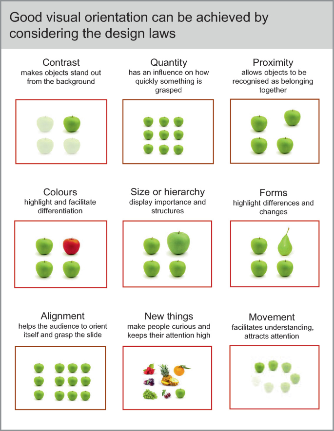
I've discovered that pattern interruption is one of the most powerful techniques for immediately capturing attention. When your audience expects another standard PowerPoint template and instead encounters something visually unexpected, their brains literally perk up with interest.

Pattern interruption: Standard template vs. Visual hook design
Color psychology plays a crucial role in creating immediate emotional resonance. I've experimented extensively with color palettes and found that strategic use of color can prime an audience for specific emotional responses:
I've also found that motion and animation strategies can guide audience focus without becoming distracting. The key is purposeful movement that serves your message rather than competing with it. For example, a subtle reveal animation that unveils your main concept piece by piece creates anticipation and maintains attention.
Creating visually appealing presentations requires finding unique visuals that break convention. PageOn.ai's Deep Search feature has been invaluable in my work, helping discover imagery that avoids the tired stock photos everyone's seen before. The tool's ability to search based on concepts rather than just keywords means I can find visuals that perfectly match my message while still feeling fresh and unexpected.
                    flowchart LR
                        A[Visual Hook Strategy] --> B[Pattern Interruption]
                        A --> C[Color Psychology]
                        A --> D[Strategic Motion]
                        A --> E[Unique Imagery]
                        B --> F[Audience Attention]
                        C --> F
                        D --> F
                        E --> F
                        F --> G[Cognitive Engagement]
                        style A fill:#FF8000,stroke:#FF8000,color:white
                        style F fill:#FFD8A8,stroke:#FFB74D
                        style G fill:#FF9A76,stroke:#FF8000
From Monologue to Dialogue: Interactive Opening Strategies
I've completely transformed my approach to presentations by shifting from monologue to dialogue in those critical first 60 seconds. Creating immediate audience investment doesn't require awkward ice breakers – it requires thoughtful engagement techniques that make viewers active participants rather than passive recipients.
| Engagement Technique | In-Person Implementation | Virtual Implementation | Engagement Impact |
|---|---|---|---|
| Provocative Statement Poll | Show statement, ask for physical hand raise | Pre-loaded poll appears as you introduce topic | High - Creates immediate cognitive dissonance |
| Visual Prediction | Show partial image, ask audience to predict full context | Use annotation tools for audience to mark predictions | Very High - Creates curiosity and investment |
| Shared Experience Question | Ask relatable question with tiered response options | Use chat for quick responses, highlight patterns | Medium - Creates community feeling |
| Perspective Shift | Assign different stakeholder roles to audience sections | Use breakout rooms for 30-second perspective taking | High - Creates empathy and multiple viewpoints |
Digital participation methods have revolutionized how I engage audiences in both in-person and virtual environments. For in-person presentations, I use QR codes linked to interactive elements that audience members can access on their phones. For virtual presentations, I leverage built-in platform tools like polls and annotation features to create immediate involvement.
I've developed specific question frameworks that trigger genuine curiosity rather than performative engagement. The difference is subtle but crucial. Instead of asking "Has anyone ever experienced X?" (which often results in awkward silence), I ask "What percentage of professionals in our industry do you think have experienced X?" This invites speculation and discussion rather than personal disclosure.

Real-time audience engagement using digital participation tools
Creating an engaging project presentation starts with these interactive elements. PageOn.ai has been instrumental in helping me transform abstract engagement concepts into concrete visual activities. The platform allows me to create interactive elements like clickable hotspots, reveal animations triggered by audience responses, and visual polls that display results in real-time – all of which transform passive viewers into active participants within those crucial first 60 seconds.
Storytelling Architecture for Memorable Beginnings
I've been fascinated by the neuroscience of narrative and how stories consistently outperform facts in those opening moments. When I present raw data at the beginning of a talk, I see glazed eyes. But when I start with a story that later connects to that same data, I witness engaged faces and active note-taking.
                    flowchart TD
                        A[60-Second Story Architecture] --> B[1. Disruption
10-15 seconds]
                        A --> C[2. Revelation
20-25 seconds]
                        A --> D[3. Connection
20-25 seconds]
                        B --> B1["Introduce unexpected
situation or question"]
                        C --> C1["Reveal insight or
perspective shift"]
                        D --> D1["Connect story to
presentation purpose"]
                        style A fill:#FF8000,stroke:#FF8000,color:white
                        style B fill:#FFE0B2,stroke:#FFB74D
                        style C fill:#FFE0B2,stroke:#FFB74D
                        style D fill:#FFE0B2,stroke:#FFB74D
I've developed a three-part story structure specifically optimized for 60-second delivery:
- Disruption (10-15 seconds): Begin with an unexpected situation, startling fact, or provocative question that challenges assumptions.
- Revelation (20-25 seconds): Introduce the insight or perspective shift that emerged from the disruption.
- Connection (20-25 seconds): Link the story's lesson directly to your presentation's purpose and the audience's needs.
I've found that visual storytelling techniques dramatically reduce dependency on verbal explanation. When I use sequential images that show progression, contrast before-and-after scenarios, or illustrate cause-and-effect relationships, my audience grasps complex concepts faster and retains them longer.

Three-panel visual storytelling sequence optimized for opening minute
Learning to memorize a presentation opening is particularly important for storytelling segments. PageOn.ai's Agentic capabilities have transformed how I approach this challenge. The tool helps me transform personal anecdotes into compelling visual narratives by suggesting imagery that captures emotional beats, creating visual metaphors that reinforce key points, and designing scene transitions that maintain narrative flow.
I've found that the most effective opening stories establish an emotional connection first, then transition to intellectual engagement. This emotional-to-logical progression maps perfectly to how our brains process information and make decisions.
Customizing Your Approach for Different Presentation Contexts
I've learned through experience that a one-size-fits-all approach to presentation openings inevitably fails. Different contexts demand different strategies. Let me share how I adapt my opening minute for various scenarios:
For executive briefings, I focus on establishing credibility immediately. I open with a concise, high-impact statement of the business challenge, followed by a preview of the measurable outcome my presentation addresses. Visual elements are clean, data-focused, and minimal.
For creative pitches, I prioritize novelty and emotional connection. I often open with a visual metaphor that creates curiosity, followed by an unexpected perspective on the creative challenge. Visual elements are bold, distinctive, and emotionally evocative.
For educational settings, I focus on creating cognitive frameworks. I open with a question that reveals knowledge gaps, followed by a visual organization of the learning journey ahead. Visual elements emphasize relationships between concepts and create clear mental models.
I've learned to adapt visual intensity based on audience demographics and environmental factors. For younger audiences in informal settings, I use higher visual intensity with more movement and contrast. For older audiences or formal settings, I moderate visual intensity while maintaining visual interest through thoughtful composition and color.

Adaptation of opening visual design for different presentation contexts
Cultural considerations significantly impact opening effectiveness across global audiences. When presenting internationally, I research cultural norms around authority, humor, interaction, and visual symbolism. For example, in some cultures, an opening that asks for immediate audience participation may create discomfort rather than engagement.
PageOn.ai's flexible AI Blocks have been invaluable for quickly reconfiguring my presentations for different scenarios. The modular approach allows me to maintain my core message while adapting the visual language, interaction style, and narrative approach to match the specific context. This adaptability ensures my opening minute connects regardless of the setting.
From Theory to Practice: Implementation Framework
I've developed a practical 60-second opening template with specific timing breakdowns to help structure those critical first moments:
                    flowchart TD
                        A[60-Second Opening Template] --> B["0-10s: Pattern Interrupt
(Visual + Statement)"]
                        A --> C["10-25s: Context & Stakes
(Why This Matters)"]
                        A --> D["25-45s: Value Preview
(What They'll Gain)"]
                        A --> E["45-60s: Transition
(Bridge to Content)"]
                        style A fill:#FF8000,stroke:#FF8000,color:white
                        style B fill:#FFD8A8,stroke:#FFB74D
                        style C fill:#FFD8A8,stroke:#FFB74D
                        style D fill:#FFD8A8,stroke:#FFB74D
                        style E fill:#FFD8A8,stroke:#FFB74D
I've found specific rehearsal techniques that are particularly effective for opening moments:
- The 5X Rule: I rehearse my opening five times more than the rest of my presentation, ensuring it feels natural and conversational.
- Video Feedback Loop: I record myself delivering just the opening, then immediately watch it back to identify areas for improvement.
- The 10-Second Test: I show just the first 10 seconds to someone unfamiliar with my topic and ask what they think the presentation will be about and if they're interested to hear more.
- Environmental Adaptation: I practice my opening in conditions similar to the actual presentation environment (room size, lighting, equipment).
To measure opening effectiveness, I use these specific methods:
I've developed a step-by-step process for using PageOn.ai to rapidly prototype and refine your opening minute:
- Content Mapping: Use the AI Blocks feature to visually map your key opening elements (hook, context, preview, transition).
- Visual Exploration: Leverage the Deep Search feature to find unique imagery that supports your opening narrative.
- Structure Testing: Create 2-3 different opening structures as separate slides, then use the Preview mode to evaluate their impact.
- Refinement: Use the Vibe Creation tool to ensure visual cohesion between your opening and the rest of your presentation.
- Timing Optimization: Use the built-in timer feature to practice delivering your opening within the 60-second constraint.

PageOn.ai workflow for optimizing presentation openings
I've found that implementing these strategies consistently leads to measurably higher audience engagement, better retention of key points, and more productive Q&A sessions following the presentation. The investment in crafting a powerful opening minute delivers returns throughout the entire presentation experience.
Transform Your Opening Minutes with PageOn.ai
Stop settling for forgettable presentation openings. PageOn.ai's visualization tools help you create powerful first impressions that captivate your audience from the very first second.
Start Creating with PageOn.ai TodayFinal Thoughts
I've seen firsthand how transforming those first 60 seconds can completely change the trajectory of a presentation. The difference between a clichéd opening and a compelling one isn't just aesthetic – it fundamentally alters how your audience processes and retains your entire message.
By implementing the strategies I've outlined – from psychological principles to visual hooks, from interactive techniques to storytelling structures – you can ensure that your presentations break free from predictability and immediately establish your credibility and value.
Remember that your opening isn't just about making a good first impression – it's about creating the cognitive and emotional foundation upon which your entire presentation builds. With tools like PageOn.ai, you can rapidly experiment with different approaches, visualize complex concepts, and create openings that truly resonate with your specific audience and context.
You Might Also Like
Revolutionizing 3D Graphics Creation with AI: Transform Visual Design Workflows
Discover how AI is transforming 3D graphics creation across industries. Learn about text-to-3D, image-to-3D technologies, and practical workflows for designers and creators.
Revolutionizing Academic Presentations: Free AI Tools for Scholarly Communication
Discover how free AI tools are transforming academic presentations. Learn about AutoSlide, Gamma.app, Adobe Express, and how PageOn.ai enhances scholarly visual communication.
Maximizing Conversion: Strategic Free Trial Design for AI Presentation Platforms
Discover proven strategies for designing effective free trials for AI presentation platforms. Learn how to balance feature access, create compelling user journeys, and drive conversions.
Mastering PowerPoint File Conversions: Preserve Formatting While Editing | PageOn.ai
Learn expert strategies to edit converted PowerPoint files without losing formatting. Discover pre-conversion preparation, formatting fixes, and how PageOn.ai helps maintain visual integrity.
