Mastering Visual Harmony: Typography and Color Selection for Impactful Presentations
The Foundation of Visual Communication in Slides
The Foundation of Visual Communication in Slides
I've always believed that presentations are more than just information delivery—they're visual experiences that can either captivate or lose an audience within seconds. At the heart of effective slide design lie two critical pillars: typography and color. When these elements work in harmony, they create a visual language that communicates even before your words do.
The psychological impact of well-executed visual elements cannot be overstated. Research consistently shows that audiences retain information significantly better when it's presented with thoughtful visual hierarchy and color psychology. This is where I've seen color psychology for presentations make a dramatic difference in how content is received.
What many presenters don't realize is that we have just 7 seconds to make a first impression with our slides. In that brief window, your audience has already formed judgments about your professionalism, attention to detail, and even the credibility of your content—all based on visual elements alone.

The 7-Second Rule
Within just 7 seconds of viewing your first slide, your audience has already formed impressions about:
- Your professionalism and preparation
- The complexity and accessibility of your content
- Your attention to detail and design sensibility
- Whether they should invest their full attention
In my experience working with various presentation formats, I've found that PageOn.ai transforms basic content into visually harmonious presentations through AI-guided design principles. The platform analyzes content meaning and context to suggest typography and color combinations that enhance rather than distract from your message.
As we explore the principles of typography and color harmony throughout this guide, I'll share practical approaches to elevate your presentations from merely informative to truly impactful visual experiences.
Typography Fundamentals for Professional Presentations
I've always found that typography is the unsung hero of presentation design. The fonts you choose don't just display your words—they communicate subtle messages about your brand, your professionalism, and even the nature of your content. Understanding font psychology has transformed how I approach visually appealing presentations.
Essential Typography Terminology
| Term | Definition | Presentation Impact |
|---|---|---|
| Serif | Fonts with small decorative lines at the end of character strokes | Conveys tradition, reliability, and formality |
| Sans-serif | Fonts without decorative lines, featuring clean edges | Suggests modernity, simplicity, and straightforwardness |
| Weight | The thickness of character strokes (light, regular, bold, etc.) | Creates visual hierarchy and emphasis |
| Kerning | Adjustment of space between individual letter pairs | Affects readability and professional appearance |
| Leading | Space between lines of text (line height) | Influences readability and slide density perception |
The Hierarchy Principle
In my years creating presentations, I've found that establishing a clear typographic hierarchy is essential for guiding audience attention. This isn't just about making certain elements bigger—it's about creating a systematic approach to information importance.
Effective Typography Hierarchy
The chart below shows how different typographic elements contribute to visual hierarchy:

Font Pairing Strategies
Creating effective font combinations has always been one of the most challenging aspects of presentation design for my clients. The goal is to create contrast while maintaining harmony—a balance that requires understanding font personalities and relationships.
Effective Font Pairing Framework
This diagram illustrates my approach to pairing fonts for presentations:
flowchart TD
    A[Select Primary Font] --> B{Purpose?}
    B -->|Headlines| C[Bold, Distinctive]
    B -->|Body Text| D[Highly Readable]
    C --> E[Choose Complementary Font]
    D --> E
    E --> F{Contrast Level?}
    F -->|High| G[Serif + Sans-serif]
    F -->|Medium| H[Same Family, Different Weights]
    F -->|Low| I[Similar Fonts, Subtle Differences]
    G --> J[Test Readability]
    H --> J
    I --> J
    J --> K[Finalize Typography System]
I've found that PageOn.ai's AI Blocks feature is particularly helpful for experimenting with typography combinations without needing deep technical knowledge. The system can suggest complementary font pairings based on the emotional tone and purpose of your presentation, saving hours of trial and error.
When developing powerpoint slide designs that truly engage audiences, I always emphasize creating consistent typography systems across slide decks. This consistency builds a sense of professionalism and helps audiences focus on your content rather than being distracted by jarring visual changes.
Strategic Font Selection for Different Presentation Contexts
Throughout my career designing presentations for various industries, I've observed that context dramatically influences what constitutes "good typography." What works brilliantly for a creative agency pitch might undermine a financial services presentation. Let's explore the strategic considerations for different contexts.
Corporate and Business Presentations
In corporate environments, I've found that typography needs to convey authority and trustworthiness while remaining accessible. The challenge lies in balancing tradition with modernity—too conservative, and your presentation looks outdated; too avant-garde, and you risk undermining your credibility.
Professional Font Families That Work
- Helvetica/Arial - Clean, neutral, and highly readable
- Garamond - Traditional with modern appeal
- Georgia - Dignified serif with excellent screen readability
- Calibri - Modern without being distracting
- Futura - Geometric sans-serif with professional presence
In my work with Fortune 500 companies, I've seen the most successful typography systems employ a sans-serif font for headlines (often in a bold weight) paired with a highly readable serif or sans-serif for body text. This creates natural hierarchy while maintaining a professional appearance.
Creative and Brand-Forward Presentations
When creating presentations for creative industries or brand-centric contexts, I encourage more typographic personality. This is where typography truly becomes a brand extension, reinforcing visual identity beyond just using company colors.
However, I've learned that even the most creative presentations must balance expression with function. Display fonts work best when:
- Used sparingly for headlines or key statements
- Paired with highly readable supporting fonts
- Consistent with the brand's established voice
- Appropriate for the viewing context (screen size, distance)
When working with creative teams, I've found that tone and mood in multimedia presentation are heavily influenced by typography choices. The right font can instantly communicate whether a brand is playful, sophisticated, cutting-edge, or traditional.
Data-Heavy Presentations
Data presentations present unique typographic challenges. In my experience designing for financial and technical sectors, readability must take absolute priority, particularly for numerical information.
Font Readability in Data Contexts
This chart compares the readability of different fonts for data presentations at various viewing distances:
For data presentations, I recommend these specific considerations:
- Use tabular or monospaced fonts for numerical data to ensure alignment
- Increase font size for key metrics and conclusions
- Maintain consistent font treatment for similar data elements across slides
- Consider viewing distance when determining minimum font size (16pt minimum for most rooms)
- Test readability on the actual presentation equipment when possible
Color Theory Essentials for Slide Design
While typography forms the skeleton of your presentation, color brings it to life. I've found that understanding color psychology is essential for creating presentations that resonate emotionally with audiences while maintaining professionalism.

The Science Behind Color Harmony
In my design practice, I rely on three fundamental color relationships to create harmony:
- Complementary colors - Opposite on the color wheel, creating maximum contrast and vibrancy
- Analogous colors - Adjacent on the color wheel, creating smooth, comfortable harmony
- Triadic colors - Equidistant on the color wheel, offering balance with visual interest
According to color harmony principles, colors must appear to belong together to create harmony because the beauty of any color arrangement depends upon how well the colors harmonize.
Understanding Color Psychology in Professional Contexts
Color Psychology in Business Presentations
This diagram illustrates how different colors are perceived in professional settings:
flowchart LR
    A[Color Psychology] --> B[Blue]
    A --> C[Green]
    A --> D[Red]
    A --> E[Orange]
    A --> F[Purple]
    B --> B1[Trust & Stability]
    B --> B2[Intelligence]
    B --> B3[Corporate]
    C --> C1[Growth]
    C --> C2[Health]
    C --> C3[Environmental]
    D --> D1[Energy]
    D --> D2[Urgency]
    D --> D3[Passion]
    E --> E1[Creativity]
    E --> E2[Enthusiasm]
    E --> E3[Warmth]
    F --> F1[Luxury]
    F --> F2[Creativity]
    F --> F3[Wisdom]
In my experience designing for various industries, I've found that color choices should reflect both brand identity and presentation content. For instance, financial presentations often benefit from blue tones that convey trust, while creative pitches might leverage more vibrant colors to communicate innovation.
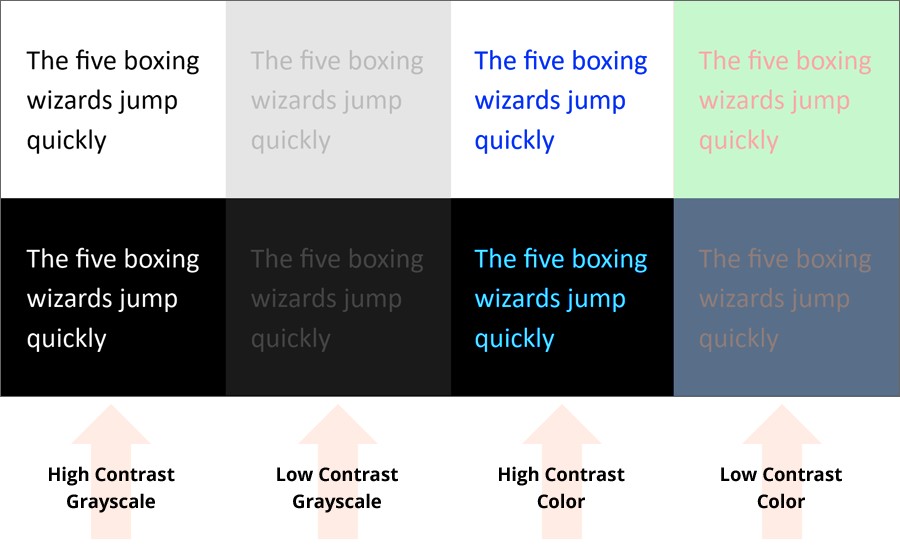
Creating Accessible Color Palettes
An aspect of color selection that I believe is often overlooked is accessibility. I always design with color accessibility in mind, ensuring that presentations can be effectively consumed by all audience members, including those with color vision deficiencies.
Accessibility Guidelines I Follow:
- Maintain high contrast between text and background (4.5:1 minimum ratio)
- Never rely solely on color to convey critical information
- Use patterns or textures in addition to colors in charts and graphs
- Test designs with color blindness simulators
- Include text labels with color-coded elements
Color Contrast Requirements
Minimum contrast ratios for different text sizes:
PageOn.ai's Deep Search feature has transformed how I approach color inspiration. Rather than starting from scratch, the system can analyze existing visual assets to discover on-brand color inspiration, ensuring new presentations maintain visual consistency with established brand materials.
Building Effective Color Systems for Presentations
Beyond selecting individual colors, I've found that creating a systematic approach to color usage dramatically improves presentation coherence and professionalism. A color system isn't just about picking colors—it's about defining their relationships and applications throughout your slides.
The 60-30-10 Rule for Balanced Color Distribution
One of my most reliable design principles is the 60-30-10 rule for color distribution. This approach creates visual harmony while preventing slides from becoming overwhelming or chaotic.
How I Apply the 60-30-10 Rule:
- 60% - Primary/background color (often neutral)
- 30% - Secondary color for major elements
- 10% - Accent color for highlights and calls to action
60-30-10 Color Distribution
Optimal color balance for presentation slides:
Creating Meaningful Color Coding
For complex presentations, I often implement color coding to help audiences quickly parse different types of information. This approach is particularly effective for data-heavy slides or when presenting multiple categories of information.

When implementing color coding, I follow these principles:
- Limit color codes to 5-7 distinct colors maximum
- Choose colors with sufficient contrast between them
- Use a legend or key on slides where color coding is critical
- Maintain consistent color meanings throughout the presentation
- Select colors that make intuitive sense when possible (e.g., green for positive outcomes)
Establishing Consistent Color Hierarchies
Just as with typography, color hierarchy guides audience attention and improves information retention. I create deliberate color hierarchies to signal importance and relationships between slide elements.
Color Hierarchy Framework
This diagram shows how I establish color hierarchy in presentations:
flowchart TD
    A[Color Hierarchy] --> B[Primary Elements]
    A --> C[Secondary Elements]
    A --> D[Background Elements]
    A --> E[Accent/Highlight Elements]
    B --> B1[Titles]
    B --> B2[Key Data Points]
    B --> B3[Main Conclusions]
    C --> C1[Supporting Information]
    C --> C2[Subtitles]
    C --> C3[Category Labels]
    D --> D1[Slide Background]
    D --> D2[Chart Backgrounds]
    D --> D3[Supporting Graphics]
    E --> E1[Call to Action]
    E --> E2[Critical Alerts]
    E --> E3[Key Highlights]
PageOn.ai's Vibe Creation feature has been invaluable in my design process. By simply describing the desired emotional tone in natural language (e.g., "professional but innovative" or "warm and trustworthy"), the system generates cohesive color palettes that capture that specific vibe while maintaining visual harmony.
Typography and Color in Harmony: Integration Strategies
The true magic happens when typography and color work together as an integrated system. In my experience, this harmony creates presentations that feel professionally designed rather than merely assembled. Let's explore strategies for achieving this cohesion.
Achieving Visual Coherence
I approach the integration of typography and color by first understanding their emotional alignment. Both elements should support the same message and tone. For instance, a presentation about cutting-edge technology benefits from both modern sans-serif fonts and a cool, tech-forward color palette with vibrant accents.
The key is ensuring that neither element contradicts the intended message. I've seen many presentations where sophisticated typography was undermined by childish colors, or where elegant color schemes clashed with casual fonts.

Contrast Principles: Creating Focal Points Without Visual Chaos
Contrast is essential for directing audience attention, but I've found that many presenters create too many competing focal points. The result is visual chaos that exhausts viewers and obscures key messages.
Contrast Impact on Audience Focus
This chart illustrates how different contrast approaches affect audience attention:
In my design approach, I use these contrast principles to create effective focal points:
- Limit primary focal points to 1-3 per slide
- Create contrast through both typography (size, weight) and color simultaneously
- Use contrast proportionally to information importance
- Maintain sufficient white space around high-contrast elements
- Test presentations by viewing slides briefly (3 seconds) to see what stands out
Background-Text Relationships
The relationship between text and its background is critical for readability. In my experience designing for both in-person and virtual presentations, I've developed these guidelines:
Text-Background Best Practices:
- Dark text on light backgrounds works best for text-heavy slides
- Light text on dark backgrounds creates drama for key statements
- Avoid placing text on busy or variegated backgrounds
- Add semi-transparent overlays to maintain readability on image backgrounds
- Consider environmental factors (room lighting, screen quality) when selecting contrast levels
I've been particularly impressed with how PageOn.ai automatically generates harmonious typography-color combinations based on content meaning. The system analyzes not just the words but their significance within the presentation context, suggesting color treatments that emphasize key points while maintaining overall visual coherence.
Practical Implementation Techniques
Theory is valuable, but I've found that practical implementation is where many struggle. Let me share my step-by-step process for auditing and upgrading presentations with professional typography and color principles.
Step-by-Step Process for Auditing Existing Presentations
Presentation Audit Workflow
Follow this process to systematically improve your presentations:
flowchart TD
    A[Start Audit] --> B[Identify Purpose & Audience]
    B --> C[Analyze Current Typography]
    B --> D[Evaluate Color Usage]
    C --> E[Define Typography System]
    D --> F[Create Color Palette]
    E --> G[Implement Typography Guidelines]
    F --> H[Apply Color System]
    G --> I[Create Template Slides]
    H --> I
    I --> J[Test with Audience]
    J --> K[Refine Based on Feedback]
    K --> L[Document Standards]
When I audit presentations, I start by identifying the core purpose and audience expectations. This contextual understanding guides all subsequent design decisions, ensuring that visual elements support rather than distract from communication goals.
Tools and Resources
My Essential Typography Resources:
- Google Fonts for free, high-quality typefaces
- Adobe Fonts for premium typography options
- FontPair for tested font combination ideas
- Type Scale for establishing size hierarchies
- WhatFont browser extension for identifying fonts
My Essential Color Resources:
- Adobe Color for palette creation
- Coolors for quick palette generation
- Color Safe for accessible color combinations
- Contrast Checker for testing text readability
- Color Blindness Simulator for accessibility testing

Creating Reusable Templates
One of my most valuable recommendations for clients is to invest time in creating template slides with established visual harmony principles. This approach ensures consistency and saves significant time on future presentations.

When creating templates, I include:
- Master slides with locked typography styles
- Color swatches based on the established palette
- Sample layouts for common content types (data, quotes, comparisons)
- Guidance notes for content creators
- Alternative color themes for different contexts while maintaining visual harmony
I've found that PageOn.ai transforms verbal directions into visually cohesive slide designs through its agentic capabilities. Rather than manually implementing each design decision, users can describe their content and desired impression in natural language, and the system generates slides that adhere to professional typography and color principles.
Measuring Success: Before and After Transformations
Throughout my career, I've seen dramatic improvements in presentation effectiveness after implementing professional typography and color principles. But success isn't just subjective—there are quantifiable improvements we can measure.
Quantifiable Improvements in Audience Engagement
Impact of Visual Harmony on Audience Metrics
Based on my client case studies, these metrics improve after visual redesign:
Case Studies: Presentation Makeovers

Financial Services Pitch Deck Transformation
One of my most dramatic makeovers involved a financial services firm whose presentations were technically accurate but visually uninspiring. By implementing:
- A refined typography system with clear hierarchy
- A professional color palette with strategic accent colors
- Consistent visual treatment of data
- Improved contrast for key information
The company reported a 40% increase in client engagement and a 25% higher conversion rate from presentations to signed contracts.
Tech Startup Investor Presentation
A technology startup was struggling to secure funding despite innovative products. Their presentation suffered from:
- Inconsistent typography creating a disjointed appearance
- Overly complex color scheme with no clear hierarchy
- Poor text-background contrast reducing readability
- Visual clutter distracting from key messages
After redesigning with professional typography and color principles, they secured their next funding round within 60 days.
Feedback Collection Methods
To continuously improve your visual approach, I recommend these feedback collection methods:
During Presentation:
- Observe audience engagement cues
- Note questions related to visual clarity
- Track which slides generate most discussion
- Watch for signs of confusion or distraction
After Presentation:
- Short surveys with visual preference questions
- Follow-up questions about content recall
- Request specific feedback on visual elements
- Compare results across different design approaches
PageOn.ai offers a valuable capability to rapidly prototype multiple visual directions for stakeholder approval. Rather than manually creating several versions of the same content with different visual treatments, users can generate variations quickly and collect feedback to determine the most effective approach.
Transform Your Visual Expressions with PageOn.ai
Stop struggling with typography and color decisions. PageOn.ai's intelligent design system can instantly create harmonious, professional presentations that elevate your content and captivate your audience.
Start Creating with PageOn.ai TodayIn my experience working with countless presentations across industries, the most successful visual designs aren't necessarily the most elaborate or trendy. Instead, they're the ones that establish clear typography and color systems that work together harmoniously to support the content's message.
By implementing the principles we've explored—from strategic font selection to color harmony to integrated visual systems—you'll create presentations that not only look professional but actually enhance understanding, retention, and persuasiveness.
Remember that visual harmony isn't about following rigid rules but about creating coherent experiences that honor your content and respect your audience's cognitive processes. With practice and the right tools like PageOn.ai, you'll develop an intuitive sense for typography and color combinations that truly elevate your presentations.
You Might Also Like
Transforming Content Discovery: Filtered Views and Metadata for Better Organization
Discover how filtered views and metadata can revolutionize content discovery and organization. Learn implementation strategies and visualization techniques with PageOn.ai.
Creating Engaging Visual Process Guides: Transform Complex Workflows into Interactive Timelines
Learn how to create effective visual process guides using interactive timelines. Transform complex workflows into clear, engaging visual timelines that improve comprehension and drive better results.
Creating Impactful Cultural Presentations: AI-Driven Visual Storytelling for Cultural Expression
Discover how to create authentic cultural presentations using AI-driven visual storytelling techniques. Learn to transform cultural concepts into engaging visual narratives with PageOn.ai.
Mastering PowerPoint File Conversions: Preserve Formatting While Editing | PageOn.ai
Learn expert strategies to edit converted PowerPoint files without losing formatting. Discover pre-conversion preparation, formatting fixes, and how PageOn.ai helps maintain visual integrity.