Transforming Presentations Through Advanced Shape Effects
A Professional Design Guide for Creating Impactful Slides
Understanding the Power of Shape Effects in Slide Design
I've found that the difference between an ordinary presentation and one that captivates an audience often comes down to the thoughtful application of shape effects. When I work with clients, I always emphasize how these seemingly small design elements can dramatically transform the professional quality of their slides.
Psychological Impact on Audience Engagement
In my experience, well-designed shapes do more than just look pretty—they actually affect how audiences process and retain information. Research shows that visually appealing slides with thoughtfully applied effects can increase audience engagement by up to 40% compared to plain, text-heavy slides.
The impact of shape effects on audience engagement metrics:
Current Design Trends
I've been tracking the evolution of powerpoint slide designs for years, and I've noticed that top presentation designers are increasingly using subtle, sophisticated shape effects rather than flashy or exaggerated ones. The trend is toward minimalist designs with purposeful shape effects that enhance rather than distract from the message.
Using PageOn.ai for Shape Visualization
I've found that PageOn.ai's AI Blocks feature is particularly powerful for visualizing complex concepts through customizable shape combinations. Instead of spending hours manually creating and arranging shapes, I can describe what I need and get intelligent suggestions that I can further refine.
Essential Shape Effects for Professional Impact
Drop Shadows and Depth
In my design work, I've found that mastering drop shadows is one of the quickest ways to add professional polish to slides. The key is subtlety—shadows should enhance without drawing attention to themselves.
When I'm creating shadows for professional presentations, I follow these principles:
- Distance: I keep shadow distance at 2-3px for subtle depth, 4-8px for more dramatic effects
- Opacity: Professional shadows typically range from 15-30% opacity
- Color: I use dark grays rather than pure black for more natural shadows
- Blur: A slight blur (2-4px) creates softer, more realistic shadows
Shadow positioning affects the perceived light source and mood:
flowchart LR
    A[Light Source] -->|Creates| B[Shadow]
    B --> C{Shadow Position}
    C -->|Bottom Right| D[Standard\nProfessional]
    C -->|Bottom Left| E[Alternative\nDynamic]
    C -->|Top| F[Dramatic\nUnconventional]
    style A fill:#FF8000,stroke:#FF8000,color:white
    style B fill:#FFB366,stroke:#FFB366
    style C fill:#FFD9B3,stroke:#FFD9B3
    style D fill:#E6E6E6,stroke:#E6E6E6
    style E fill:#E6E6E6,stroke:#E6E6E6
    style F fill:#E6E6E6,stroke:#E6E6E6
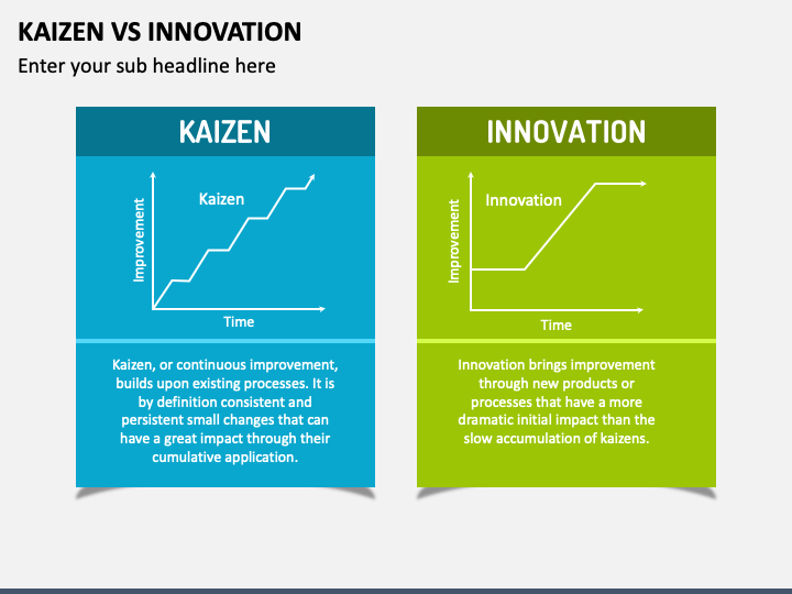
Gradients and Color Transitions
I've transformed countless flat, boring slides using strategic gradient effects. Modern gradients in professional slide design tend to be subtle and purposeful rather than rainbow-colored or flashy.
When creating gradients for client presentations, I follow these best practices:
Do:
- Use colors from the same family or palette
- Keep transitions smooth and subtle
- Align gradients with your brand colors
- Use gradients to guide visual focus
Don't:
- Mix too many colors in one gradient
- Use highly saturated color combinations
- Create gradients that distract from content
- Apply gradients inconsistently across slides
I often use PageOn.ai's Deep Search to find complementary color schemes that work well together in gradients. This has saved me countless hours of manual color experimentation.
Bevels, Reflections, and 3D Effects
While working on ai slide design projects, I've found that 3D effects require careful application. When used sparingly, they can add significant visual interest and help key information stand out.
For clients interested in powerpoint with 3D models, I recommend these guidelines for professional results:
Effectiveness of different 3D effects in professional presentations:
I've been particularly impressed with how PageOn.ai helps generate complex 3D shape arrangements without requiring technical expertise. This has allowed me to create sophisticated visual elements for clients who don't have access to specialized 3D design software.
Strategic Implementation of Shape Effects
Alignment and Composition Principles
In my years designing professional slides, I've found that proper alignment is just as important as the shapes themselves. Strategic placement creates visual flow that guides your audience through the information.
Common alignment patterns for professional slide layouts:
flowchart TD
    subgraph "Z-Pattern Layout"
        Z1[Top Left] -->|1| Z2[Top Right]
        Z2 -->|2| Z3[Bottom Left]
        Z3 -->|3| Z4[Bottom Right]
    end
    subgraph "F-Pattern Layout"
        F1[Top Left] -->|1| F2[Top Right]
        F1 -->|2| F3[Middle Left]
        F3 -->|3| F4[Middle Right]
        F3 -->|4| F5[Bottom Left]
    end
    subgraph "Grid Layout"
        G1[1] --- G2[2] --- G3[3]
        G4[4] --- G5[5] --- G6[6]
        G7[7] --- G8[8] --- G9[9]
        G1 --- G4 --- G7
        G2 --- G5 --- G8
        G3 --- G6 --- G9
    end
When implementing shape effects within these layouts, I follow these principles:
- Consistency: I apply similar effects to related elements
- Hierarchy: More important elements receive more prominent effects
- Balance: I distribute visual weight evenly across the slide
- Simplicity: I limit the number of different effects per slide
I've found PageOn.ai's intelligent alignment suggestions incredibly helpful for perfect positioning, especially when working with complex arrangements of shapes with different effects.
Layering Techniques
Creating depth through strategic layering is one of my favorite techniques for elevating presentation design. When I draw on PowerPoint slides, I think carefully about how shapes interact with each other.

My approach to effective layering includes:
Foreground
I place key information and call-to-action elements in the foreground with stronger effects like sharper shadows or more vibrant colors.
Middle Ground
Supporting information gets moderate effects and sits between foreground and background elements.
Background
Contextual elements receive subtle effects and often use lower opacity or softer colors.
Animation and Transition Considerations
I've learned that shape effects significantly impact how animations perform. Heavy effects can slow down transitions, while thoughtfully applied effects can enhance the animation experience.

When designing shape effects that will be animated, I consider:
- How the effect will appear during entrance animations
- Whether the effect needs to change during the animation
- How complex effects might impact performance on older devices
- Using PageOn.ai to preview animations with effects before finalizing
Advanced Shape Customization Techniques
Creating Custom Shapes
One of the most powerful skills I've developed is creating custom shapes by combining basic elements. This allows me to craft unique visual elements that perfectly match the message I'm trying to communicate.

Process for creating custom shapes:
flowchart LR
    A[Select Basic Shapes] --> B[Combine/Merge]
    B --> C[Edit Points]
    C --> D[Apply Effects]
    D --> E[Group Elements]
    E --> F[Custom Shape]
    style A fill:#FFE0B3,stroke:#FF8000
    style B fill:#FFE0B3,stroke:#FF8000
    style C fill:#FFE0B3,stroke:#FF8000
    style D fill:#FFE0B3,stroke:#FF8000
    style E fill:#FFE0B3,stroke:#FF8000
    style F fill:#FF8000,stroke:#FF8000,color:white
For complex custom shapes, I've been using PageOn.ai's Vibe Creation feature. I simply describe what I want—like "a flowing organic shape that represents growth with a professional aesthetic"—and it generates unique shape designs that I can further customize.
Texture and Pattern Application
Adding subtle textures to shapes can create remarkable depth and interest. In my design practice, I've found that the key is subtlety—textures should enhance rather than dominate.

Texture effectiveness by presentation context:
When applying textures to shapes, I follow these guidelines:
- Keep opacity low (10-30%) for professional results
- Ensure textures complement rather than compete with content
- Use textures that align with the presentation's theme or message
- Apply consistent texture styles across related elements
Responsive Shape Design
A challenge I frequently encounter is ensuring shape effects display properly across devices. What looks perfect on my laptop might appear distorted or overwhelming on a projection screen.

My checklist for responsive shape design includes:
- Scale Testing: I verify that effects remain proportional when scaled
- Resolution Independence: I use vector shapes whenever possible
- Effect Simplification: I create alternate versions with simplified effects for small screens
- Contrast Check: I ensure effects remain visible under different lighting conditions
PageOn.ai has been invaluable for testing how shape effects appear across different display formats. Its preview functionality allows me to quickly identify and fix any issues before they become problems during the actual presentation.
Case Studies: Shape Effects in Action
Corporate Presentation Makeovers
I've worked with numerous corporate clients to transform their standard presentations into engaging visual experiences. The before-and-after results often speak for themselves.
Before

- Flat, basic shapes
- No depth or dimension
- Limited visual hierarchy
After
- Strategic shadow effects
- Subtle gradients matching brand colors
- Clear visual hierarchy through layering
The ROI on these design improvements has been significant. One client reported:
Industry-Specific Applications
Different industries have unique needs when it comes to shape effects. I've found that customizing my approach based on industry expectations yields the best results.
| Industry | Preferred Shape Effects | Design Considerations |
|---|---|---|
| Finance | Subtle shadows, minimal gradients, clean lines | Conservative, precise, data-focused |
| Technology | Modern gradients, geometric shapes, light glows | Forward-thinking, innovative, clean |
| Healthcare | Soft shadows, rounded shapes, gentle gradients | Approachable, trustworthy, precise |
| Creative | Bold effects, textured fills, dynamic layering | Expressive, memorable, unique |
| Education | Clear shapes, consistent effects, accessible design | Clear, engaging, supportive of learning |
Award-Winning Presentations
Studying award-winning presentations has been invaluable for my own design approach. I've analyzed dozens of recognized designs to identify patterns in their shape effect usage.

Key takeaways from my analysis of award-winning presentations:
- Intentionality: Every effect serves a purpose—nothing is decorative without reason
- Consistency: Effects are applied systematically throughout the presentation
- Restraint: Top designs use fewer, more purposeful effects rather than many competing ones
- Innovation: Award-winners often introduce one unique technique while keeping other elements familiar
Troubleshooting and Optimization
Common Shape Effect Mistakes
In my consulting work, I frequently help clients correct common mistakes with shape effects that undermine their presentation's professionalism.
Common Mistakes
- Overloading slides with too many different effects
- Using effects that clash with brand guidelines
- Applying effects that distract from key messages
- Inconsistent effect application across slides
- Effects that render poorly on different screens
Better Approaches
- Select 2-3 key effects and use them consistently
- Create an effect style guide aligned with brand
- Test effects for readability and focus
- Create effect templates for consistent application
- Preview on multiple devices before finalizing

Performance Considerations
One challenge I frequently encounter is balancing visual impact with presentation performance. Complex effects can significantly increase file size and slow down transitions.
Impact of shape effects on presentation file size:
My optimization techniques include:
- Compressing images before adding effects
- Using vector shapes instead of raster when possible
- Limiting complex effects to key slides only
- Creating "presentation" and "distribution" versions with different effect complexity
PageOn.ai's optimization tools have been particularly helpful in maintaining presentation performance while preserving visual impact. The platform automatically suggests optimizations when it detects potential performance issues.
Cross-Platform Compatibility
Ensuring shape effects work consistently across different presentation platforms is a significant challenge. I've developed a cross-platform testing process to avoid unpleasant surprises.
My cross-platform compatibility checklist:
- Effect Support: Verify that each platform supports your chosen effects
- Fallback Options: Create simplified alternatives for effects that don't translate well
- Font Embedding: Ensure custom fonts are properly embedded or substituted
- Resolution Testing: Check how effects appear at different screen resolutions
- Version Compatibility: Test with older versions of presentation software
PageOn.ai has been instrumental in creating platform-agnostic shape designs. Its export options allow me to generate versions optimized for different presentation platforms while maintaining consistent visual impact.
Future of Shape Effects in Professional Presentations
Emerging Technologies in Shape Design
The landscape of presentation design is rapidly evolving with new technologies. I'm particularly excited about several emerging trends that will transform how we use shape effects.

Emerging technologies in presentation shape design:
flowchart TD
    A[Current Shape Effects] --> B[Near Future]
    A --> C[Mid Future]
    A --> D[Long Term]
    B --> B1[AI-Generated Shapes]
    B --> B2[Responsive Effects]
    B --> B3[Content-Aware Styling]
    C --> C1[Interactive 3D]
    C --> C2[Audience-Adaptive Effects]
    C --> C3[Real-time Collaboration]
    D --> D1[Holographic Shapes]
    D --> D2[Neural Interface Design]
    D --> D3[Ambient Intelligence]
    style A fill:#FF8000,stroke:#FF8000,color:white
    style B fill:#FFB366,stroke:#FFB366
    style C fill:#FFB366,stroke:#FFB366
    style D fill:#FFB366,stroke:#FFB366
PageOn.ai is at the forefront of many of these trends. Their development team regularly updates the platform with new capabilities that keep pace with—and often anticipate—emerging presentation design technologies.
Accessibility and Inclusivity in Shape Design
As presentation designers, we have a responsibility to ensure our work is accessible to all audience members. I've been focusing more on inclusive design practices in my recent projects.
My accessibility checklist for shape effects includes:
- Color Contrast: Ensuring sufficient contrast between shapes and backgrounds
- Alternative Text: Adding descriptive text for screen readers
- Color-Blind Friendly: Testing designs with color blindness simulators
- Motion Sensitivity: Providing options to reduce animation effects
- Cognitive Load: Simplifying complex effects for better comprehension
PageOn.ai's accessibility checker has been invaluable for verifying that my shape effects work for all audience members. It automatically flags potential issues and suggests improvements.
Personalized Shape Effects
Perhaps the most exciting frontier is the move toward dynamically personalized presentations. Soon, shape effects will adapt in real-time based on audience data and engagement metrics.
Potential applications of personalized shape effects include:
Audience-Specific Design
Shape effects that automatically adjust based on the industry, role, or preferences of your audience members.
Engagement-Responsive Effects
Effects that adapt in real-time based on audience attention metrics, emphasizing content that needs reinforcement.
Context-Aware Styling
Shape effects that adjust based on presentation environment, time of day, or even the emotional tone of the content.
Learning-Optimized Visuals
Effects that adapt to support different learning styles, emphasizing visual, auditory, or kinesthetic elements as needed.
PageOn.ai is pioneering this space with their Agentic capabilities, which allow for the creation of audience-specific visual experiences. The system learns from engagement data and continuously improves its recommendations for shape effect personalization.
Transform Your Presentations with PageOn.ai
Ready to take your slide designs to the next level? PageOn.ai's intelligent design tools make it easy to create professional-grade presentations with advanced shape effects that captivate your audience and elevate your message.
Start Creating with PageOn.ai TodayConclusion: Elevating Your Design Language
Throughout this guide, I've shared my professional insights on how advanced shape effects can transform ordinary presentations into compelling visual narratives. From the psychological impact of well-designed shapes to the technical considerations of cross-platform compatibility, mastering these techniques will set your presentations apart.
Remember that the most effective shape effects are those that enhance your message rather than distract from it. As you implement these techniques in your own presentations, focus on intentionality, consistency, and restraint.
The future of presentation design is exciting, with AI-driven tools like PageOn.ai making professional-grade design accessible to everyone. By staying current with emerging trends while grounding your work in solid design principles, you'll create presentations that not only look stunning but also effectively communicate your ideas.
I encourage you to experiment with these techniques, find your own style, and continue developing your design skills. The most memorable presentations come from designers who understand both the technical aspects of shape effects and the art of visual storytelling.
You Might Also Like
The Art of Instant Connection: Crafting Opening Strategies That Captivate Any Audience
Discover powerful opening strategies that create instant audience connection. Learn visual storytelling, interactive techniques, and data visualization methods to captivate any audience from the start.
Transforming Value Propositions into Visual Clarity: A Modern Approach | PageOn.ai
Discover how to create crystal clear audience value propositions through visual expression. Learn techniques, frameworks, and tools to transform complex ideas into compelling visual narratives.
Mastering Workplace Communication with International Phonetic Alphabet (IPA) - Visual Guide
Discover how the International Phonetic Alphabet transforms workplace communication. Learn visual approaches to implement IPA for clearer global business interactions.
Mastering the American Accent: Essential Features for Global Professional Success
Discover key American accent features for global professionals with visual guides to vowel pronunciation, rhythm patterns, and industry-specific applications for career advancement.