Achieving Harmony in Digital Design: Balancing Unity and Variety
The science and art of creating exceptional user experiences through visual balance
In the realm of digital product design, I've always been fascinated by the delicate dance between unity and variety. This fundamental principle—unity-in-variety—isn't just theoretical; it's backed by empirical research showing that products with an optimal balance between cohesion and diversity receive significantly higher aesthetic appreciation from users.
Throughout my career working with digital products, I've observed how this balance directly impacts user engagement metrics and overall product success. When executed well, unity provides the comfortable foundation that allows variety to shine without creating confusion or chaos.
In this comprehensive guide, I'll share my insights on how to achieve this critical balance in your digital product designs, backed by research and illustrated with practical examples that you can apply immediately.
Understanding the Unity-in-Variety Principle in Digital Product Design

The unity-in-variety principle isn't just an abstract concept—it's a scientifically validated approach to design aesthetics. Research has confirmed that product designs exhibiting an optimal balance between unity and variety are aesthetically preferred by users, with unity emerging as the dominant factor that facilitates appreciation of variety.
Defining Unity and Variety
Unity
The cohesive relationship between design elements that creates visual harmony and helps users feel at ease while navigating your product. Unity makes everything appear to be in its proper place.
Variety
The introduction of distinct elements that maintain user engagement and prevent monotony. Variety keeps your design interesting and prevents users from becoming bored or disengaged.
The Unity-Variety Balance Impact
Research shows that finding the optimal balance between unity and variety directly impacts user engagement and product success metrics.
In my experience working with product teams, I've found that unity provides the foundation that allows variety to be appreciated. When users can easily understand the underlying structure and patterns of a design, they're better able to appreciate the unique elements that add interest and engagement. This is why visual communication in media design emphasizes establishing clear systems before introducing variations.
The Psychology Behind Unity and Variety in User Experience

Understanding the psychological impact of unity and variety helps us design more effective digital products. I've seen firsthand how unity creates a sense of ease and comfort during user navigation, while variety stimulates interest and prevents user fatigue.
Cognitive Processing of Unity vs. Variety
Here's how our brains process these two design principles:
                    flowchart TD
                        A[Visual Perception] --> B{Design Element}
                        B -->|Unity Elements| C[Lower Cognitive Load]
                        B -->|Variety Elements| D[Higher Cognitive Load]
                        C --> E[Comfort & Ease]
                        D --> F[Interest & Stimulation]
                        E --> G[Extended Session Duration]
                        F --> H[Increased Focus & Attention]
                        G --> I[Overall Positive UX]
                        H --> I
                        style A fill:#FF8000,stroke:#FF8000,color:white
                        style I fill:#FF8000,stroke:#FF8000,color:white
                        style C fill:#42A5F5,stroke:#42A5F5,color:white
                        style D fill:#66BB6A,stroke:#66BB6A,color:white
The Cognitive Benefits of Consistency
Unity in design reduces cognitive load for users. When elements follow consistent patterns, users don't have to relearn how to interact with your product on each screen. This is particularly important for complex applications where reducing mental effort improves overall user satisfaction.
The Attention Economy: Strategic Variety
In today's attention economy, strategic variety becomes essential. I use controlled variation to direct user focus to key elements without disrupting the overall experience. For example, a call-to-action button might use a contrasting color within an otherwise unified color scheme.
Relationship Between Visual Complexity and Aesthetic Appeal
The relationship between motivational drives and design preferences is also fascinating. Users with a high need for cognition may appreciate more variety and complexity, while those seeking simplicity and efficiency may prefer higher unity. Understanding your user base helps determine the right balance for your specific product.
Creating Visual Unity in Digital Products

Creating visual unity is the foundation of effective digital product design. I've found that establishing a cohesive visual language is essential for building products that feel intuitive and trustworthy. This starts with several key components:
Color Palettes
Consistent color application creates immediate recognition and emotional connection. I recommend establishing primary, secondary, and accent colors with clear usage guidelines.
Typography Systems
A well-defined typographic hierarchy enhances readability while maintaining brand identity. Limit font families to 2-3 with clear rules for headings, body text, and UI elements.
Grid Systems
Consistent alignment and spacing create structural integrity that helps users predict where to find information. A defined grid system is essential for maintaining visual order.
Visual Motifs
Repeating visual patterns and motifs across interfaces creates a sense of familiarity and cohesion. These can be subtle but should be consistently applied.
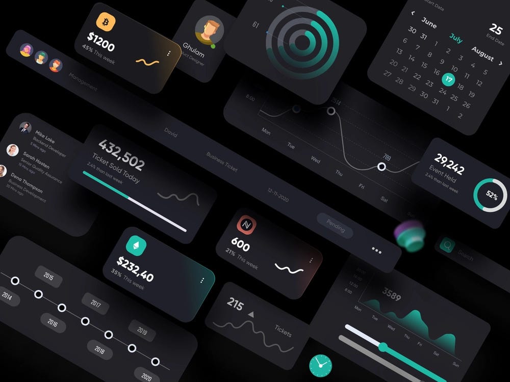
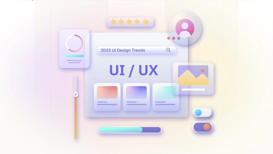
Elements of Visual Unity
Establishing Visual Consistency with PageOn.ai
One of the tools I've found invaluable for maintaining visual unity is PageOn.ai's AI Blocks feature. This powerful tool allows me to establish and maintain visual consistency across product interfaces by creating reusable design patterns.
PageOn.ai AI Blocks Workflow
                    flowchart TD
                        A[Design System Definition] --> B[Create AI Block Templates]
                        B --> C[Apply Consistent Components]
                        C --> D[Distribute Across Product]
                        D --> E[Monitor Visual Consistency]
                        E --> F{Consistency Issues?}
                        F -->|Yes| G[Update AI Block Templates]
                        G --> C
                        F -->|No| H[Maintain Design System]
                        style A fill:#FF8000,stroke:#FF8000,color:white
                        style H fill:#FF8000,stroke:#FF8000,color:white
With PageOn.ai's AI Blocks, I can create drag-and-drop components that maintain design system integrity while visualizing cohesive user flows with consistent interaction patterns. This approach to brand consistency ensures that all product interfaces share a unified visual language, strengthening the overall user experience.
Introducing Strategic Variety Without Sacrificing Cohesion
While unity creates a solid foundation, strategic variety is what makes a design memorable and engaging. I've developed several techniques for introducing variety without compromising the cohesive experience:
| Technique | Purpose | Implementation |
|---|---|---|
| Asymmetrical Layouts | Create visual interest while maintaining balance | Use grid systems with intentional asymmetry in content placement |
| Strategic Contrast | Highlight important elements | Apply contrast in color, size, or weight to draw attention |
| Unexpected Elements | Create focal points and delight | Introduce unique illustrations or interactions in key moments |
| Micro-interactions | Add delight without disruption | Subtle animations that respond to user actions |
Balancing Unity and Variety
                    flowchart TD
                        A[Establish Design Foundation] --> B[Identify Unity Elements]
                        A --> C[Determine Variety Opportunities]
                        B --> D[Define Core Patterns]
                        C --> E[Identify Focus Areas]
                        D --> F[Implement Unified System]
                        E --> G[Apply Strategic Variety]
                        F --> H[Balanced Design]
                        G --> H
                        style A fill:#FF8000,stroke:#FF8000,color:white
                        style H fill:#FF8000,stroke:#FF8000,color:white
Using PageOn.ai for Balanced Visual Diversity
PageOn.ai's Deep Search feature has transformed how I approach finding diverse yet appropriate visual assets. When I need to introduce variety into my designs, I can quickly locate contextually relevant imagery that maintains the overall design harmony.
This tool has been particularly valuable when working on impactful product presentations where I need to balance brand consistency with engaging visual diversity. The AI helps recommend complementary visual elements that enhance rather than disrupt the overall design.
Key Insight: The 80/20 Rule for Unity and Variety
In my experience, a good rule of thumb is to maintain about 80% unity (consistent elements) and 20% variety (unique elements) in your designs. This ratio provides enough consistency to create comfort while introducing enough variety to maintain interest and engagement.
Strategic Variety Implementation
When introducing variety, I always consider the visual communication for designers principles that ensure variations enhance rather than detract from the core message. This approach helps maintain the delicate balance between keeping users engaged and avoiding confusion.
Case Studies: Unity and Variety in Successful Digital Products
Looking at successful digital products provides valuable insights into effective unity-variety balance. Let's examine how leading companies have mastered this principle:
Duolingo's Approach
Duolingo exemplifies the strategic balance between unity and variety. The app maintains a consistent framework with its recognizable green color palette and friendly character illustrations, while introducing variety through bold colors and playful animations.
Key Takeaways:
- Consistent character style across all illustrations maintains unity
- Varied animations and rewards provide excitement and motivation
- Color-coding of different language courses adds variety within a unified system
- Clear progress indicators maintain consistent feedback mechanisms
Apple's Evolution
Apple's design language demonstrates how to maintain brand unity while introducing variety across product lines. Their approach to balancing consistency with contextual adaptation has evolved over time while maintaining their distinctive aesthetic.
Key Takeaways:
- Consistent typography and spacing across all products creates immediate recognition
- Product-specific UI elements introduce variety where contextually appropriate
- Gradual evolution rather than abrupt changes maintains user comfort
- Distinctive interaction patterns that remain consistent across product lines
Unity-Variety Balance in Leading Design Systems
Visualizing Case Studies with PageOn.ai
Using PageOn.ai, I've been able to create clear visual comparisons that transform complex design relationships into easily understandable graphics. This has been particularly valuable when explaining the unity-variety balance to stakeholders and team members.
The before-and-after visualizations highlight successful unity-variety balance implementations, making it easier to communicate design decisions and their impact on user experience. This approach to experience design ensures that everyone understands how these principles translate to real-world applications.
Practical Implementation: A Framework for Balancing Unity and Variety

Based on my experience implementing unity-variety balance across numerous digital products, I've developed a practical framework that teams can follow:
Unity-Variety Implementation Framework
                    flowchart TD
                        A[Establish Design Principles] --> B[Create Visual Inventory]
                        B --> C[Identify Unity Elements]
                        B --> D[Identify Variety Opportunities]
                        C --> E[Develop Design System]
                        D --> F[Create Variety Guidelines]
                        E --> G[Implement Core Components]
                        F --> H[Apply Strategic Variations]
                        G --> I[Test with Users]
                        H --> I
                        I --> J{Effective Balance?}
                        J -->|No| K[Refine Balance]
                        K --> I
                        J -->|Yes| L[Document & Scale]
                        style A fill:#FF8000,stroke:#FF8000,color:white
                        style L fill:#FF8000,stroke:#FF8000,color:white
1. Establish Design Principles
Start by defining clear design principles that will guide unity decisions. These principles should reflect your brand values and user needs, providing a foundation for all design choices.
2. Create a Visual Inventory
Conduct an audit of all existing design elements across touchpoints. This inventory helps identify inconsistencies and opportunities for both unification and strategic variety.
3. Develop a Hierarchy for Variety
Create a clear hierarchy of elements where variety can be safely introduced without compromising the overall experience. This might include:
- Primary elements (maintain strict unity)
- Secondary elements (limited variety allowed)
- Tertiary elements (greater variety permitted)
4. Test and Validate
Implement testing methodologies to validate the effectiveness of your unity-variety balance. User feedback is crucial for determining if you've struck the right balance for your specific audience.
Using PageOn.ai's Vibe Creation for Design Direction
PageOn.ai's Vibe Creation feature has been instrumental in helping me articulate design direction for teams. This tool allows me to transform abstract design concepts into clear visual guidelines that demonstrate the optimal unity-variety balance for specific products.
Pro Tip: Unity-Variety Matrix
Create a unity-variety matrix for your product that maps different interface elements against their required level of unity vs. permitted variety. This provides clear guidance for designers and helps maintain consistency while allowing creative freedom where appropriate.
The mood boards generated with PageOn.ai help visualize the perfect balance between consistency and variety, making it easier for team members to understand and apply these principles in their work.
Common Pitfalls and How to Avoid Them

In my years of design work, I've observed several common pitfalls that teams encounter when trying to balance unity and variety. Understanding these challenges can help you avoid them:
Over-Unification
When consistency becomes monotony, users lose interest and engagement drops.
Warning Signs:
- User feedback mentions "boring" or "predictable" experiences
- Declining engagement metrics despite functional improvements
- Difficulty distinguishing between different sections of your product
Excessive Variety
When diversity leads to chaos, users become confused and frustrated.
Warning Signs:
- Increased support tickets about navigation confusion
- Higher bounce rates and abandoned user journeys
- User testing reveals difficulty recognizing brand consistency
Misalignment with Brand Personality
A common mistake is adopting a unity-variety balance that doesn't align with your brand personality. A playful brand might need more variety, while a serious financial service might require more unity. Always ensure your balance reflects your brand values and user expectations.
Failing to Adapt Across Platforms
Different platforms and contexts may require different unity-variety balances. What works on a desktop web application might feel constraining on a mobile app. Consider how context affects user expectations and adjust accordingly.
Unity-Variety Balance Assessment
Conducting Effective Design Reviews
To avoid these pitfalls, I recommend implementing regular design reviews specifically focused on unity-variety assessment. These reviews should include:
- Comparative analysis against established design principles
- User feedback specifically targeting engagement and clarity
- Quantitative metrics tracking user behavior across different interface sections
- Regular team discussions about where unity might be too rigid or variety too chaotic
By regularly evaluating your unity-variety balance, you can make incremental adjustments that keep your product feeling fresh and engaging while maintaining the cohesion users need for confident navigation.
The Future of Unity and Variety in Digital Product Design
As we look to the future of digital product design, several emerging trends will impact how we approach the balance between unity and variety:
Adaptive Interfaces
The future will likely bring more adaptive interfaces that personalize the unity-variety balance based on user preferences and behavior. AI-driven systems will learn which users prefer more consistency and which thrive with more variety, adjusting the experience accordingly.
Cross-Platform Considerations
As products expand across more diverse touchpoints (wearables, AR/VR, voice interfaces), maintaining coherence while adapting to platform-specific needs will become increasingly challenging. Design systems will need to become more flexible while preserving core brand identity.
Global vs. Local Balance
For international products, balancing global design systems with local market variety needs will become more sophisticated. Cultural expectations around unity and variety differ significantly, requiring nuanced approaches to localization.
Future of Adaptive Design Systems
                    flowchart TD
                        A[User Interaction] --> B[AI Analysis]
                        B --> C{User Preference}
                        C -->|Prefers Unity| D[Increase Consistency]
                        C -->|Prefers Variety| E[Increase Variation]
                        D --> F[Simplified Layout]
                        D --> G[Consistent Colors]
                        E --> H[Dynamic Elements]
                        E --> I[Varied Visual Treatments]
                        F --> J[Personalized Experience]
                        G --> J
                        H --> J
                        I --> J
                        J --> K[User Feedback Loop]
                        K --> B
                        style A fill:#FF8000,stroke:#FF8000,color:white
                        style J fill:#FF8000,stroke:#FF8000,color:white
                        style K fill:#FF8000,stroke:#FF8000,color:white
Using PageOn.ai for Future-Forward Design Approaches
PageOn.ai's Agentic capabilities are particularly valuable for prototyping these future-forward design approaches. I've been using this tool to visualize how AI can help maintain unity while introducing contextually appropriate variety.
By creating simulations of adaptive interfaces that respond to user preferences, we can test different unity-variety balances and see how they might perform in real-world scenarios. This approach helps us stay ahead of emerging design trends while maintaining the core principles that make products successful.
Emerging Technologies Impact on Unity-Variety Balance
As technology continues to evolve, the principles of unity and variety will remain fundamental to great design. However, our ability to dynamically balance these elements based on context, user preferences, and platform capabilities will become increasingly sophisticated, leading to more personalized and engaging user experiences.
Transform Your Visual Expressions with PageOn.ai
Ready to achieve the perfect balance of unity and variety in your digital product designs? PageOn.ai provides the tools you need to create visually stunning, harmonious designs that engage users while maintaining brand consistency.
Conclusion: Finding Your Perfect Balance
Throughout this guide, I've explored the critical balance between unity and variety in digital product design. This balance isn't just about aesthetics—it directly impacts user engagement, brand perception, and ultimately, product success.
Remember that the optimal unity-variety balance will be unique to your product, brand, and users. What works for one product may not work for another. The key is to establish clear design principles, test with real users, and continuously refine your approach.
As you implement these principles in your own work, tools like PageOn.ai can help you visualize, articulate, and maintain the perfect balance between consistency and interest. By leveraging AI-powered visualization tools, you can create designs that are both cohesive and engaging, delighting users while reinforcing your brand identity.
The art of balancing unity and variety is an ongoing journey, not a destination. As user expectations evolve and new technologies emerge, continue to evaluate and adjust your approach to create digital products that are both visually harmonious and endlessly engaging.
You Might Also Like
Revolutionizing Slide Deck Creation: How AI Tools Transform Presentation Workflows
Discover how AI-driven tools are transforming slide deck creation, saving time, enhancing visual communication, and streamlining collaborative workflows for more impactful presentations.
The AI-Powered Pitch Deck Revolution: A Three-Step Framework for Success
Discover the three-step process for creating compelling AI-powered pitch decks that captivate investors. Learn how to clarify your vision, structure your pitch, and refine for maximum impact.
Mastering Visual Harmony: The Art and Science of Cohesive Slide Layouts
Discover how to create visually harmonious slide layouts through color theory, typography, and spatial design. Learn professional techniques to elevate your presentations with PageOn.ai.
Mastering Visual Flow: How Morph Transitions Transform Presentations | PageOn.ai
Discover how Morph transitions create dynamic, seamless visual connections between slides, enhancing audience engagement and transforming ordinary presentations into memorable experiences.