Beyond Numbers: Creating Impactful Data Visualizations That Drive Decision-Making
Understanding the Power of Visual Data Transformation
Understanding the Power of Visual Data Transformation
I've always been fascinated by how we can transform raw numbers into something that speaks to us intuitively. The fundamental shift from raw statistics to visual insights isn't just about making data pretty—it's about making it functional and actionable.
Our brains are wired for visual processing—in fact, we process visual information 60,000 times faster than text. This isn't just an interesting factoid; it's the foundation of why data visualization has become critical in modern decision-making processes.
When we transform complex datasets into visual representations, we're essentially creating a bridge between raw numbers and actionable knowledge. This transformation allows us to quickly identify patterns, recognize trends, and detect anomalies that might otherwise remain hidden in spreadsheets or databases.

Key Benefits of Data Visualization
The following chart illustrates how visualization impacts different aspects of data comprehension:
I've seen firsthand how effective data visualization techniques transform how teams operate. When we can quickly grasp what the data is telling us, we make better decisions faster. This is why visualization has moved from being a nice-to-have to an essential component of data analysis in virtually every industry.
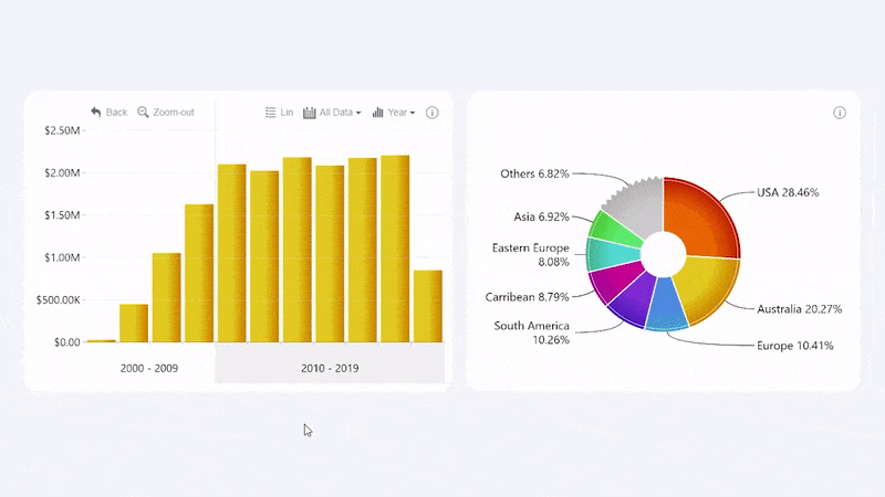
Selecting the Right Visualization for Your Data Story
Choosing the right type of visualization is like selecting the right tool for a job. Each chart type has its strengths and ideal applications. The key is matching your visualization to both your data structure and the story you want to tell.

When I'm deciding between time-series visualizations and comparative visualizations, I consider the primary question my visualization needs to answer. Is it about how something has changed over time? Or is it about comparing different categories against each other?
The psychology of visualization plays a crucial role too. Color choices can evoke emotional responses or highlight important data points. Shape and size variations can draw attention to specific elements or create visual hierarchies that guide the viewer's understanding.
Chart Selection Decision Flow
This flowchart helps determine which chart type is most appropriate based on your data and goals:
flowchart TD
    A[Start Chart Selection] --> B{What relationship
do you want to show?}
    B -->|Change over time| C[Time-Series Data]
    B -->|Comparison| D[Categorical Data]
    B -->|Composition| E[Part-to-Whole]
    B -->|Distribution| F[Statistical Data]
    B -->|Correlation| G[Multivariate Data]
    B -->|Geographic| H[Spatial Data]
    C --> C1[Line Chart]
    C --> C2[Area Chart]
    C --> C3[Timeline]
    D --> D1[Bar Chart]
    D --> D2[Column Chart]
    D --> D3[Radar Chart]
    E --> E1[Pie Chart]
    E --> E2[Treemap]
    E --> E3[Stacked Chart]
    F --> F1[Histogram]
    F --> F2[Box Plot]
    F --> F3[Density Plot]
    G --> G1[Scatter Plot]
    G --> G2[Bubble Chart]
    G --> G3[Heat Map]
    H --> H1[Choropleth Map]
    H --> H2[Point Map]
    H --> H3[Cartogram]
Chart Selection Framework
| Data Type | Recommended Charts | Best For |
|---|---|---|
| Temporal Data | Line charts, Area charts, Timeline visualizations | Showing trends, patterns, and changes over time |
| Categorical Comparisons | Bar charts, Column charts, Radar charts | Comparing values across different categories |
| Part-to-Whole Relationships | Pie charts, Treemaps, Stacked visualizations | Showing composition and proportional relationships |
| Correlations and Distributions | Scatter plots, Heat maps, Histograms | Revealing relationships between variables and data distribution |
| Geospatial Data | Maps, Choropleth visualizations, Cartograms | Displaying data with geographic components |
One of the most common pitfalls I see is choosing a complex visualization when a simple one would be more effective. PageOn.ai's AI Blocks feature has been invaluable in my workflow—it analyzes my datasets and suggests optimal chart types based on the specific patterns and relationships present in the data. This has saved me countless hours of trial and error while ensuring my visualizations actually communicate what I intend them to.
When working with data visualization charts, I always remind myself that the goal isn't to impress with complexity but to express with clarity.
Transforming Raw Data into Compelling Visual Narratives
Data without context is just numbers. To transform raw statistics into something meaningful, we need to craft a coherent narrative that guides viewers through the insights.
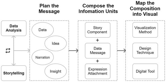
I approach data visualization as storytelling with a beginning, middle, and end. The beginning sets the context, the middle reveals patterns or anomalies, and the end leads to actionable insights.
One technique I've found particularly effective is thoughtful annotation. Labels, callouts, and explanatory text can transform a standard chart into a guided experience that highlights key takeaways without distorting the underlying data.
Elements of Visual Data Storytelling
flowchart LR
    A[Setting the Scene] -->|Context & Background| B[Building Tension]
    B -->|Patterns & Outliers| C[Creating Resolution]
    C -->|Actionable Insights| D[Driving Decisions]
    style A fill:#FFE6CC,stroke:#FF8000
    style B fill:#FFD699,stroke:#FF8000
    style C fill:#FFC266,stroke:#FF8000
    style D fill:#FFAD33,stroke:#FF8000
When crafting visual narratives, I balance simplicity with data integrity. The goal is to simplify without oversimplifying—to make the complex accessible without losing important nuance.
Case Study: Marketing Team Success
I recently worked with a marketing team that had years of customer data but couldn't see the forest for the trees. By creating a series of visualizations that progressed from broad demographics to specific behavioral segments, we identified three untapped customer segments that had been hidden in their spreadsheets. This visual approach led to a targeted campaign that increased conversion rates by 32% in just two months.
PageOn.ai's Vibe Creation feature has revolutionized how I transform statistics into visual stories. Rather than starting with a blank canvas, I can describe the story I want to tell, and the AI suggests visualization approaches that best communicate that narrative. This has not only saved me time but has also introduced me to visualization techniques I might not have considered otherwise.
The interactive visualizations for data exploration that PageOn.ai creates allow me to build narratives that evolve as the viewer engages with them. This creates a more personalized and impactful data story.
Design Principles for Maximum Impact and Clarity
Great data visualization isn't just about choosing the right chart type—it's about designing that chart for maximum clarity and impact. I've found that applying key design principles can dramatically improve how effectively a visualization communicates.

Visual Hierarchy: Guiding the Eye
I always establish a clear visual hierarchy in my visualizations to guide the viewer's attention to what matters most. This means using size, color, position, and contrast strategically to emphasize the most important elements while de-emphasizing secondary information.
Data-Ink Ratio: Eliminating Chart Junk
One principle I religiously follow is maximizing the data-ink ratio—a concept popularized by Edward Tufte. This means removing any element that doesn't directly contribute to understanding the data. Grid lines, decorative elements, and unnecessary labels often create visual noise that distracts from the core message.
Color Accessibility Comparison
The chart below shows how different color combinations perform for viewers with various types of color vision deficiency:
Typography and Labeling Best Practices
Clear, readable typography is essential for effective visualization. I choose fonts that are legible at various sizes and ensure sufficient contrast between text and background. Labels should be concise yet descriptive, positioned to clearly indicate what they're referencing without cluttering the visualization.
Accessibility Considerations
I always design with accessibility in mind, knowing that approximately 8% of men and 0.5% of women have some form of color vision deficiency. This means avoiding red-green color combinations, ensuring sufficient color contrast, and using multiple visual cues (not just color) to differentiate data.
PageOn.ai has been a game-changer for applying these design principles consistently. Its automated design engine applies best practices to raw visualizations, ensuring readable typography, appropriate color choices for accessibility, and a clean, professional appearance. This has allowed me to focus more on the insights I want to communicate rather than getting caught up in design details.
For more guidance on creating effective visuals, I often reference data visualization examples that demonstrate these principles in action.
Interactive Visualization Techniques for Deeper Exploration
Static visualizations are powerful, but interactive visualizations take data exploration to another level. When users can manipulate and explore data themselves, they develop deeper understanding and discover insights that might otherwise remain hidden.
I've found that the most effective interactive visualizations incorporate several key elements:
flowchart TD
    A[Interactive Elements] --> B[Filtering]
    A --> C[Sorting]
    A --> D[Drilling Down]
    A --> E[Tooltips]
    B --> F[User Control]
    C --> F
    D --> F
    E --> F
    F --> G[Deeper Insights]
    F --> H[Personalized Exploration]
    F --> I[Enhanced Engagement]
    style A fill:#FFE6CC,stroke:#FF8000
    style F fill:#FFD699,stroke:#FF8000
    style G fill:#FFC266,stroke:#FF8000
    style H fill:#FFC266,stroke:#FF8000
    style I fill:#FFC266,stroke:#FF8000
The key challenge with interactive visualizations is balancing guided narrative with user exploration. I want to provide enough structure to ensure users don't get lost, while still giving them the freedom to follow their curiosity.
Case Study: Executive Dashboard Impact
I worked with a leadership team that was struggling with slow decision-making due to data overload. By creating an interactive dashboard that allowed executives to filter by department, time period, and key metrics, we transformed their approach to data. The ability to quickly drill down into problem areas and explore potential causes improved decision-making speed by 40% and led to more targeted interventions.
Interactive Elements Effectiveness
This chart shows how different interactive elements impact user engagement and insight discovery:
PageOn.ai has made creating interactive visualizations much more accessible to me. Rather than writing complex code, I can quickly prototype interactive elements and see how they enhance the user experience. This has allowed me to experiment with different interactive approaches and find what works best for my specific audience and data story.
The beauty of interactive visualizations for data exploration is that they transform passive viewers into active participants in the data discovery process.
From Insight to Action: Making Visualizations Drive Decisions
The ultimate purpose of data visualization isn't just to inform—it's to drive action. A beautiful chart that doesn't lead to better decisions is merely decoration. I've developed strategies to ensure my visualizations bridge the gap between insight and action.
The most effective approach I've found is to design visualizations with the end decision in mind. Before I create a single chart, I ask: "What decision needs to be made, and what information is crucial for making it?" This helps me focus on the most relevant data and present it in a way that directly supports the decision-making process.
Another crucial strategy is connecting visual insights to specific action items. When I identify a trend or pattern, I explicitly link it to potential responses or interventions. This transforms abstract insights into concrete next steps.
Measuring Visualization Effectiveness
How do we know if our visualizations are actually driving better decisions? I use several metrics to evaluate effectiveness:
Creating visualization systems that evolve with changing data and questions is essential for long-term effectiveness. Rather than building static dashboards, I develop flexible frameworks that can adapt as business needs change and new questions emerge.
PageOn.ai's Agentic capabilities have transformed how I connect visualization to action. The AI can now understand my intent—whether I'm trying to identify anomalies, forecast trends, or compare performance—and automatically generate visualizations optimized for that specific decision context. This means I spend less time configuring charts and more time acting on the insights they reveal.
For those looking to create more impactful visualizations, exploring infographic data visualizations can provide inspiration for connecting insights to actions in visually compelling ways.
Practical Implementation: Tools and Workflows
Having the right tools and workflows is essential for efficient data visualization. I've developed a streamlined approach that helps me move from raw data to polished visualization with minimal friction.
Data-to-Visualization Pipeline
flowchart LR
    A[Raw Data] -->|Clean & Prepare| B[Structured Data]
    B -->|Explore & Analyze| C[Insights Identified]
    C -->|Design & Create| D[Draft Visualization]
    D -->|Review & Refine| E[Final Visualization]
    E -->|Share & Implement| F[Decision Action]
    style A fill:#FFE6CC,stroke:#FF8000
    style B fill:#FFD699,stroke:#FF8000
    style C fill:#FFC266,stroke:#FF8000
    style D fill:#FFAD33,stroke:#FF8000
    style E fill:#FF9900,stroke:#FF8000
    style F fill:#FF8000,stroke:#FF8000
I've found that collaborative approaches to visualization development yield the best results. By involving stakeholders early in the process—from defining key questions to reviewing draft visualizations—I ensure the final product actually meets their needs and answers their questions.
Finding the right balance between automation and customization is crucial for efficient visualization creation. I leverage automation for repetitive tasks like data formatting, initial chart creation, and applying consistent styling, while reserving manual customization for elements that require human judgment, like highlighting key insights or adding contextual annotations.
Best Practices for Visualization Maintenance
Visualizations aren't "set it and forget it" assets—they need regular maintenance as data evolves. I follow these practices to keep visualizations relevant and accurate:
- Document data sources, transformation methods, and update procedures
- Establish regular review cycles to evaluate if visualizations still answer relevant questions
- Create modular designs that can be easily updated when new data arrives
- Collect user feedback to identify areas for improvement
- Version control visualization designs to track changes over time
PageOn.ai has streamlined my workflow by integrating seamlessly with my existing data sources. I can connect to databases, spreadsheets, and APIs without complex setup, which means I spend less time wrangling data and more time creating meaningful visualizations. The platform's ability to remember my preferences and learn from my past visualizations also means each new project benefits from my previous work.
Future Trends in Data Visualization
The field of data visualization is evolving rapidly, with emerging technologies opening up exciting new possibilities. I'm particularly fascinated by several trends that are reshaping how we create and interact with visualizations.

AI-Assisted Insight Generation
AI is increasingly capable of not just visualizing data but actively identifying patterns, anomalies, and insights that might escape human notice. This doesn't replace human analysis but augments it, drawing attention to areas that warrant deeper investigation.
Immersive Data Experiences
Augmented and virtual reality are transforming data visualization from a 2D experience into an immersive 3D environment. This allows for more intuitive exploration of complex, multidimensional datasets and creates powerful spatial metaphors for understanding relationships between data points.
Emerging Visualization Technologies
This chart shows the projected adoption of various emerging visualization technologies over the next five years:
Real-time Visualization of Streaming Data
As businesses increasingly operate on real-time data, visualizations are evolving to handle continuous data streams rather than static datasets. This creates new challenges in designing visualizations that can update smoothly and highlight meaningful changes without becoming visually overwhelming.
Natural Language Interfaces
The ability to create and modify visualizations through natural language commands is democratizing data visualization. Instead of learning complex software, users can simply describe the visualization they want in plain language.
PageOn.ai is at the forefront of these trends, particularly in conversational creation. I can now have a dialogue with PageOn.ai about my data, asking questions and refining visualizations through natural conversation. This approach has dramatically lowered the technical barriers to creating sophisticated visualizations and allowed me to iterate much more quickly.
As we look to the future, the lines between data analysis, visualization, and storytelling will continue to blur. Tools like PageOn.ai that seamlessly integrate these elements are positioning themselves to lead the next generation of data communication.
Transform Your Data Visualization Journey with PageOn.ai
Turn complex statistics into compelling visual stories that drive better decisions. PageOn.ai's intuitive platform makes it easy to create professional-quality visualizations without technical expertise.
Start Creating Powerful Visualizations TodayBringing It All Together
Throughout this guide, we've explored how to transform raw statistics into compelling visual narratives that drive action. The journey from data to decision is not just about creating pretty charts—it's about crafting visual experiences that illuminate insights and motivate change.
I've found that the most successful visualizations combine technical excellence with storytelling skill. They're built on a foundation of sound data principles, designed with human perception in mind, and crafted to guide viewers toward meaningful conclusions.
As data continues to grow in volume and complexity, effective visualization becomes not just valuable but essential. The ability to distill complex information into clear, compelling visuals is increasingly a competitive advantage across industries.
PageOn.ai represents a new generation of tools that make sophisticated data visualization accessible to everyone. By combining AI-powered recommendations with intuitive design tools, it enables both data experts and non-technical users to create visualizations that truly communicate. Whether you're analyzing customer behavior, tracking performance metrics, or exploring scientific data, PageOn.ai can help you transform raw numbers into visual insights that inspire action.
You Might Also Like
The Visual Evolution of American Infrastructure: Canals to Digital Networks | PageOn.ai
Explore America's infrastructure evolution from historic canal networks to railroads, interstate highways, and digital networks with interactive visualizations and timelines.
Transforming Marketing Teams: From AI Hesitation to Strategic Implementation Success
Discover proven strategies to overcome the four critical barriers blocking marketing AI adoption. Transform your team from hesitant observers to strategic AI implementers with actionable roadmaps and success metrics.
The Science Behind Success: How AI-Powered Content Creation Delivers 25% Higher Success Rates
Discover why AI users report 25% higher content success rates. Learn proven strategies, productivity gains, and competitive advantages of AI-powered content creation.
Bridging Worlds: How Diffusion Models Are Reshaping Language Generation | PageOn.ai
Explore the revolutionary convergence of diffusion models and language generation. Discover how diffusion techniques are creating new paradigms for NLP, bridging visual and linguistic domains.