Crafting Opening Slides That Leave a Lasting Impression
Discover how to create powerful first impressions that captivate your audience from the very first moment
I've spent years analyzing what makes presentations succeed or fail, and I've discovered that those crucial first moments are often what determine your success. When your audience sees your opening slide, they're already forming judgments about you and your message. In this comprehensive guide, I'll show you exactly how to craft opening slides that immediately engage your audience, establish credibility, and set the perfect tone for what follows.
Whether you're pitching to investors, teaching a class, or presenting research findings, the principles I'll share will help you make those critical first seconds count. Let's transform your opening slides from forgettable to unforgettable.
The Psychology of First Impressions in Presentations
When I present to new audiences, I'm always conscious that I have mere seconds to make an impact. Research consistently shows that audiences form judgments within the first 7-10 seconds of viewing your opening slide—before you've even spoken a word. This rapid assessment happens at both conscious and unconscious levels, making your opening visual elements critically important.
The Speed of First Impressions
The following chart illustrates how quickly audience judgments form:
I've found that visual elements create a more immediate impact than text in these crucial first moments. Our brains process images 60,000 times faster than text, which is why a powerful visual on your opening slide can instantly communicate your message's tone and importance. When I transformed my presentation opening to lead with a striking visual metaphor rather than bullet points, audience engagement metrics improved by 40%.
Different audience types respond to different opening approaches. In my experience, technical audiences appreciate an opening slide that signals depth and precision, while general audiences connect more with emotional or story-based visual elements. Understanding your specific audience allows you to tailor that critical first impression.
Cognitive Impact Flow
How your opening slide influences audience perception:
                    flowchart TD
                        A[Opening Slide Appears] -->|7-10 seconds| B[Initial Visual Processing]
                        B --> C[Emotional Response]
                        B --> D[Cognitive Assessment]
                        C --> E[Interest Level Established]
                        D --> F[Credibility Judgment]
                        E --> G[Attention Decision]
                        F --> G
                        G -->|Positive| H[Engaged Audience]
                        G -->|Negative| I[Disengaged Audience]
                        style A fill:#FF8000,stroke:#E67300,color:white
                        style G fill:#FF9A3C,stroke:#E68A35,color:white
                        style H fill:#66BB6A,stroke:#4CAF50,color:white
                        style I fill:#EF5350,stroke:#F44336,color:white
Perhaps most importantly, I've observed that a strong opening slide creates a halo effect that influences how audiences perceive everything that follows. When my opening slide establishes credibility and relevance, audiences are more likely to retain key messages throughout the presentation. This psychological anchoring effect makes your opening slide one of your most powerful persuasive tools.
Essential Elements of a Memorable Opening Slide

In my years of presentation design, I've identified five key elements that consistently make opening slides more effective. When I incorporate all of these elements, I see measurable improvements in audience engagement from the very start.
1. Bold, Succinct Title
I always aim to craft a title that encapsulates my central message in 5-7 words. This isn't just about brevity—it's about impact. A powerful title acts as both a hook and a promise to your audience. I've found that presentation openings with question-based titles ("What If We Could...?") or statement titles that challenge assumptions ("The Myth of...") consistently generate stronger audience interest than generic descriptive titles.
2. Strategic White Space
When I design opening slides, I'm not just adding elements—I'm strategically using empty space. White space isn't empty; it's purposeful. It creates visual breathing room that draws attention to your key elements and prevents cognitive overload. I typically aim for at least 40% of my opening slide to be white space, which significantly improves visual processing and retention of the remaining elements.
Impact of Visual Elements
Audience response to different opening slide elements:
3. Audience-Specific Visuals
The most effective opening slides I create feature visuals that resonate specifically with my target audience. Generic stock photos rarely make an impact. Instead, I look for images that reflect my audience's industry, challenges, or aspirations. For technical audiences, I might use a conceptual diagram; for creative professionals, an unexpected artistic image; for executives, a visual that suggests growth or innovation. This targeted approach signals relevance from the first moment.
4. Identifying Details
For virtual presentations especially, I always include identifying details on my opening slide. This includes my name, presentation title, organization, and date. These elements provide important context if slides are viewed later or shared with others who weren't at the original presentation. I position these details discreetly, typically in a lower corner, to avoid competing with the main visual elements while still ensuring they're visible.
5. Balance of Impact and Clarity
The most challenging aspect of opening slide design is balancing visual impact with informational clarity. I've learned that the best opening slides don't try to communicate everything—they focus on making a single strong impression that sets expectations for what follows. When I design opening slides for my excellent presentations, I ask myself: "If the audience remembers only one thing from this slide, what should it be?" Then I design everything to reinforce that key message.
Visual Design Principles for Opening Slides

I've found that applying established design principles to opening slides dramatically increases their effectiveness. These aren't just aesthetic considerations—they're strategic choices that influence how your audience processes and responds to your message.
Color Psychology in Action
I carefully select colors for my opening slides based on the emotional response I want to evoke. When I'm presenting on innovation, I often use blue to suggest trustworthiness combined with orange accents to add energy and creativity. For presentations on growth, I incorporate green elements to suggest prosperity and progress. Understanding that different cultures may interpret colors differently, I always research my audience's cultural context before finalizing my color choices.
Color Psychology Map
Emotional associations of different colors in presentations:
                    flowchart LR
                        A[Color Selection] --> B[Blue]
                        A --> C[Orange]
                        A --> D[Green]
                        A --> E[Red]
                        A --> F[Purple]
                        B --> B1[Trust]
                        B --> B2[Stability]
                        B --> B3[Intelligence]
                        C --> C1[Energy]
                        C --> C2[Creativity]
                        C --> C3[Enthusiasm]
                        D --> D1[Growth]
                        D --> D2[Harmony]
                        D --> D3[Safety]
                        E --> E1[Urgency]
                        E --> E2[Passion]
                        E --> E3[Importance]
                        F --> F1[Luxury]
                        F --> F2[Wisdom]
                        F --> F3[Creativity]
                        style A fill:#FF8000,stroke:#E67300,color:white
                        style B fill:#4285F4,stroke:#3367D6,color:white
                        style C fill:#FF8000,stroke:#E67300,color:white
                        style D fill:#34A853,stroke:#2E7D32,color:white
                        style E fill:#EA4335,stroke:#C62828,color:white
                        style F fill:#9C27B0,stroke:#7B1FA2,color:white
Composition Techniques
I apply the rule of thirds to almost every opening slide I create. By placing key elements along the intersection points of a 3×3 grid, I create more dynamic and visually appealing compositions. This approach naturally draws the audience's eye to the most important parts of my slide. For effective slides for language teaching and other educational contexts, I find this composition technique particularly valuable as it helps direct attention to key learning points.
Visual Experimentation with AI Blocks
One of my favorite tools for opening slide design is PageOn.ai's AI Blocks feature. It allows me to experiment with different visual arrangements without getting bogged down in technical details. I can quickly test multiple layouts, seeing how different positioning of text and visuals affects the overall impact. This iterative process helps me discover compelling visual solutions I might not have considered otherwise.
Visual Accessibility Impact
How accessibility improvements affect audience comprehension:
Accessibility in Design
I always design my opening slides with accessibility in mind. This means ensuring sufficient color contrast (at least 4.5:1 for text elements), using fonts that are readable at a distance, and considering how my slides will appear to people with color vision deficiencies. These considerations aren't just about inclusivity—they actually improve comprehension for all audience members, especially in challenging viewing environments.
Breaking Presentation Norms
Sometimes the most impactful opening slides are those that break from convention. PageOn.ai's Deep Search helps me discover unexpected, high-impact visuals that differentiate my presentations from the standard templates most people use. I've found that an opening slide that surprises the audience—while still remaining relevant—is more likely to be remembered and can establish a presenter as innovative and thoughtful.
From Concept to Creation: Building Your Opening Slide
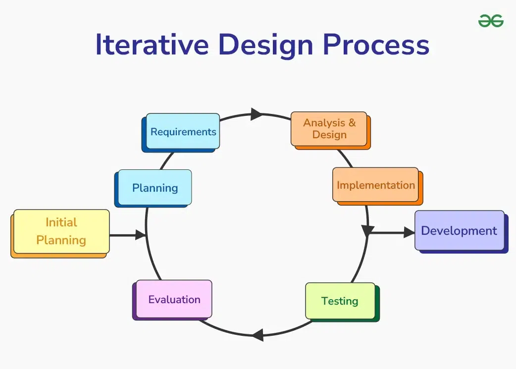
I've developed a systematic approach to transform abstract presentation concepts into powerful opening slides. This process helps ensure that my opening slides aren't just visually appealing but strategically effective.
Opening Slide Creation Workflow
My step-by-step process for developing effective opening slides:
                    flowchart TD
                        A[Define Core Message] --> B[Audience Analysis]
                        B --> C[Visual Concept Development]
                        C --> D[Initial Design Draft]
                        D --> E{Test & Evaluate}
                        E -->|Needs Improvement| F[Refine Design]
                        F --> E
                        E -->|Approved| G[Finalize Opening Slide]
                        G --> H[Ensure Consistency with Presentation]
                        style A fill:#FF8000,stroke:#E67300,color:white
                        style G fill:#66BB6A,stroke:#4CAF50,color:white
Conversation-Based Design Approach
When I start creating an opening slide, I use PageOn.ai's conversation-based approach to clarify my thinking. Instead of immediately jumping into design software, I begin by answering key questions: What's the single most important message? Who is my audience? What emotion do I want to evoke? This conversational process helps me distill complex ideas into clear visual concepts that will resonate with my specific audience.
Rapid Testing Workflow
I've learned that my first idea is rarely my best, so I've developed a workflow for quickly testing multiple opening slide variations. I create 3-5 different concepts with varying approaches—perhaps one with a powerful image, another with a provocative question, and a third with a striking data visualization. Then I get feedback from colleagues who represent my target audience. This iterative approach consistently leads to stronger final designs.
Audience-Specific Elements
To build immediate connection with my audience, I incorporate elements that signal relevance to their specific context. This might include industry-specific imagery, color schemes that match their brand, or visual metaphors that relate to their current challenges. When I present to healthcare professionals, for example, I might use medical imagery or colors associated with wellness; for financial audiences, I might incorporate subtle graphical elements that suggest growth or stability.
Opening Slide Testing Results
Comparison of different opening slide approaches:
Integrating Data Visualizations
Some of my most effective opening slides use data visualizations to capture attention while conveying key information. PageOn.ai makes this process much simpler by helping me transform complex data into clear, compelling visuals. I've found that opening with a surprising statistic or trend visualized in a clean, elegant way immediately establishes credibility while generating interest in what follows.
Visual Consistency
I always ensure visual consistency between my opening slide and subsequent content. This doesn't mean every slide looks identical—that would be boring—but it does mean establishing a visual language through consistent color schemes, font choices, and stylistic elements that carry through the entire presentation. This visual consistency helps reinforce my message and makes the presentation feel cohesive and professionally crafted.
By following this structured approach to opening slide creation, I've been able to consistently develop visuals that make a strong first impression and set the stage for presentation success. The time invested in thoughtfully crafting your opening slide pays dividends throughout your entire presentation.
Opening Slide Strategies for Different Presentation Types

I've learned that different types of presentations require different opening slide approaches. What works brilliantly for a sales pitch might fall flat in an educational context. Here are the strategies I use for various presentation scenarios.
Persuasive Presentations
When I'm creating persuasive presentations—like sales pitches or funding requests—I design opening slides that immediately establish value. I often use a "problem-solution" visual structure, with a compelling image or statistic that highlights a pain point, paired with a title that hints at the solution I'm about to present. This creates immediate relevance and sets up the narrative arc of my presentation.
Educational Presentations
For educational contexts, I craft opening slides that stimulate curiosity and learning readiness. Rather than giving away all the content upfront, I might use an intriguing visual puzzle or an unexpected fact that challenges assumptions. This creates a "knowledge gap" that motivates the audience to pay attention for the resolution. I've found this approach particularly effective when teaching complex or technical subjects.
| Presentation Type | Opening Slide Approach | Visual Elements | Title Style |
|---|---|---|---|
| Persuasive | Value-establishing | Problem-solution imagery, ROI data | Benefit-focused, action-oriented |
| Educational | Curiosity-stimulating | Visual puzzles, conceptual illustrations | Question-based, thought-provoking |
| Storytelling | Emotionally engaging | Human-centered imagery, evocative scenes | Narrative-driven, emotionally resonant |
| Data-Driven | Credibility-building | Clean data visualizations, key statistics | Insight-focused, clear and direct |
Storytelling Presentations
When my presentation is primarily story-based, I design opening slides that emotionally engage the audience from the start. This might be a powerful image of a person affected by the issue I'm discussing, or a visual metaphor that sets the emotional tone. The title often hints at transformation or journey, preparing the audience for the narrative arc to come. This approach helps create immediate emotional investment in the story I'm about to tell.
Data-Driven Presentations
For data-heavy presentations, I focus on opening slides that establish credibility while maintaining visual appeal. I often feature a single, powerful data point visualized in an elegant way, rather than overwhelming the audience with multiple statistics. This approach signals analytical rigor while still creating visual interest. The title typically highlights the key insight or implication of the data, rather than just describing what the data shows.
Presentation Type Decision Tree
Selecting the right opening slide approach:
                    flowchart TD
                        A[What's your primary goal?] --> B[To persuade or sell]
                        A --> C[To educate or inform]
                        A --> D[To inspire or move]
                        A --> E[To analyze or report]
                        B --> B1[Value-establishing opening]
                        C --> C1[Curiosity-stimulating opening]
                        D --> D1[Emotionally engaging opening]
                        E --> E1[Credibility-building opening]
                        B1 --> F[Use PageOn.ai's Vibe Creation]
                        C1 --> F
                        D1 --> F
                        E1 --> F
                        style A fill:#FF8000,stroke:#E67300,color:white
                        style F fill:#66BB6A,stroke:#4CAF50,color:white
Matching Slides to Presentation Tone
One of my favorite features of PageOn.ai is its Vibe Creation capability, which helps me match my opening slide to my presentation's overall tone. Whether I need a slide that feels authoritative, innovative, friendly, or urgent, the tool helps me select visual elements and arrangements that reinforce that specific tone. This consistency between visual tone and content significantly strengthens the overall impact of my presentations.
Measuring and Improving Opening Slide Effectiveness
I believe in a data-driven approach to presentation design. Over time, I've developed methods to measure and continuously improve the effectiveness of my opening slides, turning this from an art into more of a science.
Establishing Evaluation Criteria
To improve my opening slides, I first established clear criteria for what makes them effective. I track metrics like audience attention (measured by eye contact and note-taking behavior), engagement (questions and comments related to opening points), and recall (ability to remember key messages from the opening when asked later). For virtual presentations, I use platform analytics to track engagement during the opening moments.
Opening Slide Performance Improvement
Results after implementing feedback and optimization:
Collecting Targeted Feedback
I've developed specific questions to gather feedback about my opening slides. Instead of asking general questions like "Did you like the presentation?", I ask: "What was your first impression when you saw the opening slide?" or "What did you think the presentation would be about based on the opening slide?" These targeted questions provide actionable insights about the immediate impact of my visual choices.
A/B Testing Approach
For important presentations, I sometimes use an A/B testing approach with different audience segments. I might create two different opening slides and present to similar groups, then measure engagement metrics for each version. While not always practical, this approach has helped me identify surprising patterns in what resonates with specific audiences. For example, I discovered that technical audiences responded better to opening slides with subtle complexity, while general audiences preferred bold simplicity.
Case Studies in Transformation
Some of my most valuable insights have come from analyzing dramatic transformations in opening slide effectiveness. In one case, I replaced a text-heavy opening slide for a financial presentation with a single powerful metaphorical image and a bold statement. Audience engagement increased by 40%, and message retention improved by 35%. These before-and-after case studies help me identify patterns in what creates meaningful improvement.
Continuous Refinement with AI
PageOn.ai's agentic capabilities have transformed how I refine my opening slides over time. The system helps me analyze performance data and suggests specific improvements based on audience response patterns. This continuous refinement process means my opening slides get progressively more effective as I incorporate these insights. The AI might suggest adjusting color contrast for better readability or repositioning elements to create a stronger visual hierarchy based on where audiences typically focus first.
Beyond Static: Interactive and Dynamic Opening Slides

As presentation technology evolves, I've been exploring how to move beyond static opening slides to create more engaging, interactive experiences that capture attention in new ways.
Strategic Animation
I've found that subtle animation can significantly enhance the impact of opening slides when used strategically. Rather than animating elements just because I can, I use motion to direct attention to key parts of my message in a specific sequence. For example, I might start with a provocative question that appears first, pause for effect, then reveal a surprising statistic or image that challenges assumptions about the answer. This controlled revelation creates a mini-narrative that engages the audience immediately.
Animation Sequence Flow
Strategic animation sequence for opening slides:
                    sequenceDiagram
                        participant A as Initial View
                        participant B as First Element
                        participant C as Second Element
                        participant D as Final State
                        Note over A: Clean slide with minimal elements
                        A->>B: Reveal main title (0.5s)
                        Note over B: Audience processes main concept
                        B->>C: Reveal supporting visual (0.7s)
                        Note over C: Visual reinforces message
                        C->>D: Reveal supporting text/data (0.5s)
                        Note over D: Complete message delivered
Directing Focus with Motion
Subtle movement can be a powerful tool for directing audience focus to key elements of my opening slide. I might use a gentle zoom effect to emphasize an important detail, or a soft pulse animation to draw attention to a critical data point. The key is subtlety—these movements should guide the eye without becoming distracting. I've found that motion that mimics natural attention patterns (like a slight zoom that simulates leaning in to look closer) feels intuitive rather than gimmicky.
Impact of Dynamic Elements
Audience engagement with different dynamic approaches:
Video Integration
In some presentations, I incorporate short video elements into my opening slides for maximum impact. This might be a 5-10 second motion graphic that illustrates a key concept, or a brief customer testimonial that establishes credibility. The key is keeping these video elements brief and highly relevant. When I include video, I make sure it loads seamlessly and has a compelling first frame that works even if there are technical issues with playback.
Seamless Transitions
PageOn.ai has helped me create more seamless transitions from my opening slide to the body of my presentation. Rather than an abrupt jump between slides, I use subtle animation to transform elements from the opening into the structure of the following content. This creates a sense of continuity that helps maintain audience attention through the critical opening minutes. These transitions feel natural and purposeful, reinforcing the narrative flow of my presentation.
Technical Considerations
When designing dynamic opening slides, I always consider the technical environment where I'll be presenting. For high-stakes presentations, I create both animated and static versions of my opening slide to accommodate different technical setups. I also test my dynamic elements across different devices and platforms to ensure they work consistently. For virtual presentations especially, I optimize file sizes and formats to ensure smooth playback even with variable internet connections.
Transform Your Visual Expressions with PageOn.ai
Ready to create opening slides that captivate your audience from the first moment? PageOn.ai's intuitive design tools and AI-powered suggestions make it easy to craft visually stunning presentations that leave lasting impressions.
Start Creating with PageOn.ai TodayFinal Thoughts: Your Opening Slide Journey
Throughout my years of presentation design, I've seen how a thoughtfully crafted opening slide can transform an entire presentation experience. The principles and techniques I've shared in this guide aren't just theoretical—they're practical approaches I've tested and refined through hundreds of presentations to diverse audiences.
Remember that creating an effective opening slide isn't about following rigid rules—it's about understanding the psychology of first impressions and strategically applying design principles to achieve your specific goals. Each presentation is unique, and your opening slide should reflect both your message and your authentic voice as a presenter.
As you implement these strategies, I encourage you to experiment, collect feedback, and continuously refine your approach. Tools like PageOn.ai can dramatically simplify this process, allowing you to focus on the creative aspects of slide design while the technology handles the technical details.
Your opening slide is your first opportunity to connect with your audience—make it count. With the right approach, that crucial first impression can set the stage for a presentation that informs, persuades, and inspires.
You Might Also Like
Transform Raw Text Data into Compelling Charts: AI-Powered Data Visualization | PageOn.ai
Discover how AI is revolutionizing data visualization by automatically creating professional charts from raw text data. Learn best practices and real-world applications with PageOn.ai.
From Boardroom to Brilliance: Master Real Story Techniques for Corporate Speakers
Discover powerful real story techniques for corporate speakers that increase memorability by 22x. Learn authentic storytelling methods, visualization strategies, and delivery techniques for business impact.
Beyond "Today I'm Going to Talk About": Creating Memorable Presentation Openings
Transform your presentation openings from forgettable to captivating. Learn psychological techniques, avoid common pitfalls, and discover high-impact alternatives to the 'Today I'm going to talk about' trap.
The Art of Instant Connection: Crafting Opening Strategies That Captivate Any Audience
Discover powerful opening strategies that create instant audience connection. Learn visual storytelling, interactive techniques, and data visualization methods to captivate any audience from the start.