The Creative Edge: Harnessing Templates and Icons for Impactful Visual Design
Understanding the Foundation of Visual Shortcuts
I've spent years working with visual design elements, and I've come to appreciate how templates and icons serve as powerful visual shortcuts in the creative process. These elements aren't just time-savers—they're communication accelerators that allow us to focus on what truly matters: delivering impactful messages through thoughtful design.
Understanding the Foundation of Visual Shortcuts
In my experience as a designer, I've found that templates and icons are far more than simple design elements—they're sophisticated visual shortcuts that fundamentally streamline the communication process. When I use these pre-established frameworks, I can focus my creative energy on the unique aspects of each project rather than reinventing the wheel with every design.
I've observed that we humans process symbol visuals in art and design significantly faster than text. This psychological phenomenon is why icons have become such a universal language in our increasingly global digital landscape.
The Psychology of Visual Processing
Our brains process visual information 60,000 times faster than text. Here's how different visual elements compare in recognition speed:
When I balance efficiency with originality, I'm not sacrificing creativity—I'm enhancing it. By starting with templates or using established icons, I free up mental resources to focus on the unique aspects of each project that truly require innovation.
The Balance of Creativity and Efficiency
How templates and icons influence the creative process:
flowchart LR
    A[Raw Creativity] --> B[Design Frameworks]
    B --> C[Templates & Icons]
    C --> D[Creative Focus]
    D --> E[Unique Innovation]
    E --> A
    style A fill:#FF8000,stroke:#FF8000,color:white
    style B fill:#FF9E44,stroke:#FF9E44,color:white
    style C fill:#FFBC88,stroke:#FFBC88,color:black
    style D fill:#FFDBC8,stroke:#FFDBC8,color:black
    style E fill:#FF8000,stroke:#FF8000,color:white
I've found that PageOn.ai's Vibe Creation feature transforms basic template concepts into personalized visual stories. When I input my core message and desired emotional tone, the AI suggests visual frameworks that maintain efficiency while expressing my unique creative vision.
The Strategic Power of Design Templates
In my design practice, I've come to view templates not as creative limitations but as strategic springboards. Visual communication for designers is all about finding the right balance between structure and creativity. Templates provide that structure while preserving my creative energy for the elements that truly need it.
I've witnessed the evolution of templates from rigid structures to flexible frameworks. Modern templates are designed with customization in mind, offering a foundation that can be easily adapted to specific brand identities and communication goals.
Time Savings with Template Usage
Based on my research and experience, here's how templates impact design efficiency:
I've seen numerous cases where templates have enhanced rather than restricted creativity. For instance, when I worked with a marketing team on a rebrand, using templates for their social media content allowed them to maintain brand consistency while experimenting with messaging and imagery. The result was a cohesive yet dynamic brand presence.
With PageOn.ai's AI Blocks, I can customize templates through simple conversational commands. I might say, "Adjust this template to use our brand colors and add more space for product photography," and the system intelligently applies these changes while preserving the template's structural integrity.
Case Study: Creative Template Application
When I worked with a tech startup on their investor presentation, we used a template as our starting point. By focusing our creative energy on the unique aspects of their story rather than basic layout decisions, we created a presentation that was both visually cohesive and creatively distinctive. The template provided structure, but the final product was unmistakably original.
Template Categories and Organization
I've found that the most effective template libraries are organized with logical category structures. When I can quickly find templates based on purpose, industry, or design style, my workflow becomes significantly more efficient.
Effective Template Organization
A strategic approach to template categorization:
flowchart TD
    A[Template Library] --> B[By Purpose]
    A --> C[By Industry]
    A --> D[By Style]
    A --> E[By Format]
    B --> B1[Marketing]
    B --> B2[Education]
    B --> B3[Reporting]
    C --> C1[Healthcare]
    C --> C2[Technology]
    C --> C3[Finance]
    D --> D1[Minimalist]
    D --> D2[Vibrant]
    D --> D3[Corporate]
    E --> E1[Presentation]
    E --> E2[Social Media]
    E --> E3[Print]
    style A fill:#FF8000,stroke:#FF8000,color:white
    style B fill:#FF9E44,stroke:#FF9E44,color:white
    style C fill:#FF9E44,stroke:#FF9E44,color:white
    style D fill:#FF9E44,stroke:#FF9E44,color:white
    style E fill:#FF9E44,stroke:#FF9E44,color:white
I've experienced how pre-assembled structures dramatically improve my workflow and creative output. When templates are logically organized, I spend less time searching and more time creating.
Using PageOn.ai's Deep Search feature, I can instantly locate the perfect template based on my project needs. I might type, "Find me a template for a healthcare company's quarterly report with space for data visualizations," and the system will present me with relevant options that match these specific criteria.
Template Customization Techniques
In my design process, I've developed methods to personalize templates while maintaining their structural benefits. The key is identifying which elements serve the core purpose of the communication and which can be modified to align with brand identity or creative direction.
I approach template modification by asking: What should I keep, and what should I change? Elements like information hierarchy and proven layout structures often benefit from being preserved, while colors, typography, and imagery are prime candidates for personalization.
Elements to Preserve
- Information hierarchy
- Proven layout structures
- Functional navigation patterns
- Accessibility considerations
- Content-to-whitespace ratio
Elements to Customize
- Color schemes
- Typography
- Imagery and illustrations
- Iconography style
- Micro-interactions and animations
I've found that maintaining brand identity while leveraging pre-designed layouts requires a strategic approach. By establishing a clear brand style guide and applying it consistently to template elements, I create designs that feel both professional and uniquely branded.
With PageOn.ai, I can transform fuzzy creative concepts into structured visual templates. When I have a general idea but struggle to articulate it visually, I describe my concept conversationally, and the AI suggests template structures that align with my vision while providing the organization I need.
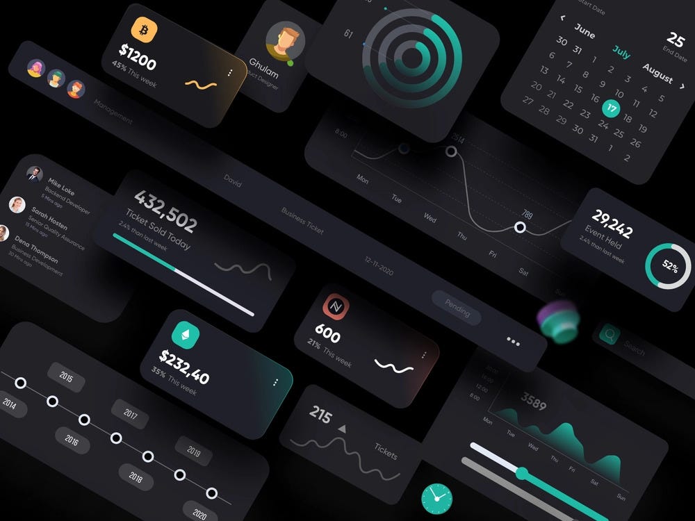
Iconic Communication: The Art and Science of Icon Design
Throughout my design career, I've been fascinated by the historical evolution of icons as communication tools. From ancient cave paintings to modern user interfaces, icons have consistently served as powerful visual shorthand for complex concepts.
I've seen firsthand how icons transcend language barriers in global design. When creating interfaces for international audiences, well-designed icons communicate function and meaning regardless of the user's native language, making them essential for visual communication in media design.
Evolution of Iconic Communication
The journey of icons through history:
timeline
    title Evolution of Icons in Communication
    section Ancient
        Cave Paintings : Simple representations
        Hieroglyphics : Standardized symbols
        Chinese Characters : Pictographic writing
    section Middle Ages
        Religious Symbols : Spiritual iconography
        Heraldry : Identity symbols
        Trade Signs : Commercial communication
    section Modern Era
        Road Signs : Universal guidance
        Computer Icons : Digital interfaces
        Emoji : Emotional expression
        UI Icons : Interactive elements
I'm particularly interested in the cognitive science behind effective icon recognition. Our brains process icons through a combination of pattern recognition, cultural context, and learned association. The most successful icons tap into these cognitive processes to create instant understanding.
In my design work, I constantly navigate the balance between universality and uniqueness in icon design. Too generic, and icons fail to distinguish a brand; too unique, and they risk being misunderstood. The sweet spot lies in creating recognizable icons with subtle brand-specific elements.
I've experienced how PageOn.ai can generate consistent icon sets that align with specific brand identities. By describing the brand's personality and the functional requirements of the icons, I receive suggestions that maintain visual consistency while perfectly representing the needed concepts.
Icon Design Best Practices
Through years of design experience, I've learned that visual communication design principles are essential for creating effective icons. Consistency in style, size, and color throughout a product builds visual harmony across the interface and reduces cognitive load for users.
Icon Style Consistency Matrix
How different style elements affect icon recognition:
I've learned through trial and error that finding the right balance between simplicity and detail is context-dependent. For small UI icons, I emphasize simplicity and clear silhouettes. For larger feature icons or illustrations, I might incorporate more detail while maintaining a consistent visual language.
In my icon design process, I pay special attention to visual metaphors. The most effective icons rely on clear, intuitive metaphors that users immediately understand. For example, a magnifying glass for search or a gear for settings are established metaphors that require minimal cognitive processing.
Icon Testing Strategy
When I design icon sets, I test them across different user groups and cultures to ensure universal recognition. My testing process includes:
- Quick recognition tests (showing icons briefly and asking users to identify them)
- Cultural association tests with international users
- Context-free identification (can users understand the icon without surrounding UI elements?)
- A/B testing of alternative designs for critical functions
- Accessibility testing with colorblind simulation tools
I've used PageOn.ai to maintain icon consistency while exploring creative variations. By uploading existing icons and requesting variations that preserve key style elements, I can expand my icon library while maintaining visual cohesion.
Icon Systems and Libraries
In my experience building comprehensive icon libraries, I've found that scalability is key. Starting with core icons that represent primary functions, then expanding to more specific use cases allows the system to grow organically while maintaining consistency.
I always establish icon guidelines for team-wide consistency. These guidelines typically include specifications for:
Technical Specifications
- Grid systems and pixel alignment
- Stroke weights and corner radii
- Size variations and scaling rules
- Padding and touch target considerations
- File formats and optimization
Style Guidelines
- Filled vs. outline approach
- Color usage and restrictions
- Level of detail appropriate for each size
- Metaphor selection principles
- Animation guidelines (if applicable)
I've seen the tremendous value of icon families in creating visual harmony. When icons share consistent visual attributes while representing different concepts, they create a cohesive system that enhances the overall user experience.
With PageOn.ai's AI, I can generate contextually relevant icon sets based on project descriptions. I simply describe the project's purpose, target audience, and desired style, and the system suggests a comprehensive set of icons that work together visually while addressing all the necessary functions.
Icon System Structure
How a comprehensive icon system is organized:
flowchart TD
    A[Icon System] --> B[Core Icons]
    A --> C[Extended Icons]
    A --> D[Specialized Icons]
    B --> B1[Navigation]
    B --> B2[Actions]
    B --> B3[Statuses]
    C --> C1[Content Types]
    C --> C2[User Roles]
    C --> C3[Categories]
    D --> D1[Industry-Specific]
    D --> D2[Feature-Specific]
    D --> D3[Seasonal/Temporary]
    style A fill:#FF8000,stroke:#FF8000,color:white
    style B fill:#FF9E44,stroke:#FF9E44,color:white
    style C fill:#FFBC88,stroke:#FFBC88,color:black
    style D fill:#FFDBC8,stroke:#FFDBC8,color:black
Integration: Combining Templates and Icons for Maximum Impact
Throughout my design career, I've discovered that the true power emerges when templates and icons work together to create cohesive visual experiences. This integration creates a visual language that's both efficient and expressive.
I've developed several strategies for embedding icons within templates effectively. Consistency in style between icons and template elements creates visual harmony, while strategic placement of icons guides the user's attention to key information or actions.
Integration Effectiveness by Design Context
How different contexts benefit from template and icon integration:
In my design process, I create visual hierarchies using both templates and icons. By assigning visual weight to different elements through size, color, and placement, I guide users through information in a logical and intuitive way.
Case Study: Financial Dashboard Redesign
I recently worked on redesigning a financial dashboard for a fintech company. By using a template structure for consistent data presentation and integrating a custom icon system for different transaction types and account statuses, we achieved:
- 38% improvement in user comprehension of complex financial data
- 42% reduction in time spent searching for specific information
- 91% positive feedback on the visual cohesion of the interface
- Significant reduction in support tickets related to interface confusion
The key was ensuring the icons and template elements shared consistent visual attributes while each serving their distinct purpose.
I've found that PageOn.ai makes it remarkably easy to seamlessly integrate icons into templates through simple commands. I can request adjustments like "Replace the bullet points in this template with icons that represent each concept" or "Create a consistent icon set that complements this template's visual style," and the system intelligently implements these changes.

Creating visual personal brand story elements requires thoughtful integration of templates and icons. When these elements work in harmony, they create a cohesive narrative that reinforces brand identity while clearly communicating information.
Future Trends: The Evolution of Templates and Icons in Design
As I look to the future of design, I'm particularly excited about AI-generated templates and icons. These technologies are rapidly evolving, offering designers new opportunities while also raising important considerations about originality and the human touch in design.
AI's Impact on Design Elements
How AI is transforming template and icon creation:
flowchart LR
    A[AI Design Tools] --> B[Content Analysis]
    A --> C[Style Learning]
    A --> D[Pattern Recognition]
    B --> E[Context-Aware Templates]
    C --> F[Style-Consistent Icons]
    D --> G[Adaptive Layouts]
    E --> H[Personalized Design]
    F --> H
    G --> H
    style A fill:#FF8000,stroke:#FF8000,color:white
    style H fill:#FF8000,stroke:#FF8000,color:white
In my recent projects, I've been exploring the role of animation and interactivity in modern template and icon design. Static elements are giving way to thoughtful motion that enhances understanding and engagement without becoming distracting.
Emerging Design Technologies Adoption
Tracking the adoption of new technologies in template and icon design:
As I design for increasingly diverse audiences, I've become more focused on accessibility considerations for template and icon systems. Ensuring that visual elements are perceivable and understandable by all users, regardless of abilities, is both an ethical imperative and a design challenge that pushes me to create better solutions.
I've experienced how PageOn.ai's agentic approach is transforming the way I work with templates and icons. Rather than simply providing static elements, the system understands my intent and collaborates with me to achieve my design goals, suggesting adjustments and alternatives that I might not have considered.
Looking ahead, I'm watching several emerging technologies that will impact template and icon usage:
AR/VR Integration
Templates and icons that adapt to spatial interfaces, providing consistent visual language across dimensions and contexts.
Adaptive Design Systems
Templates and icons that automatically adjust based on user behavior, preferences, and accessibility needs.
Voice-Driven Design
Creating templates and icons through voice commands, making design more accessible to non-designers and those with physical limitations.

Practical Implementation: From Theory to Application
Based on my experience, I've developed a step-by-step guide to selecting the right templates and icons for specific projects:
-
Define project goals and audience
Clearly articulate what the design needs to accomplish and who will be using it.
-
Identify key information and actions
Determine what content and functionality must be prioritized in the design.
-
Select templates based on information structure
Choose templates that naturally accommodate your content hierarchy.
-
Choose icon style based on brand personality
Match icon aesthetics to your brand's voice—playful, serious, technical, etc.
-
Customize with brand elements
Apply your color palette, typography, and other brand elements to the template and icons.
-
Test with representative users
Verify that your implementation achieves its goals with actual users.
-
Iterate based on feedback
Refine your implementation to address any issues discovered during testing.
In my design toolkit, I rely on several tools and resources for template and icon creation and customization:
Design Tool Effectiveness Comparison
How different tools perform for template and icon work:
To measure the effectiveness of template and icon choices, I track several key metrics:
User-Centered Metrics
- Task completion time
- Error rates
- User satisfaction scores
- Comprehension accuracy
- Engagement metrics
Business Metrics
- Design production time
- Resource utilization
- Brand consistency scores
- Conversion rates (if applicable)
- Feedback from stakeholders
I've experienced how PageOn.ai can transform abstract design concepts into concrete visual assets. Recently, I described a concept for visualizing data privacy principles, and within minutes, the AI generated a template with integrated icons that perfectly captured the complex relationships I was trying to express.
Workshop Exercise: Template Customization Challenge
Here's an exercise I often use in my design workshops:
- Select a generic template for a specific purpose (e.g., a product presentation)
- Identify 3 key brand attributes you want to express
- List the 5 most important pieces of information that need emphasis
- Customize the template by:
- Applying brand colors strategically (not everywhere)
- Replacing generic icons with ones that reflect your specific context
- Adjusting the information hierarchy to prioritize your key points
- Adding one unique design element that makes the template distinctly yours
- Get feedback from colleagues on whether your customizations enhanced or detracted from the message
Transform Your Visual Expressions with PageOn.ai
Take your template and icon design to the next level with AI-powered tools that enhance creativity rather than restrict it. Turn abstract concepts into stunning visuals in minutes.
Start Creating with PageOn.ai TodayThroughout my design career, I've found that templates and icons are not constraints but catalysts for creativity. When used thoughtfully, they free us from routine design decisions so we can focus our creative energy where it matters most. With tools like PageOn.ai, the process becomes even more powerful, allowing us to rapidly transform our ideas into visual expressions that communicate clearly and effectively.
The most successful designers I know don't see templates and icons as shortcuts or compromises—they see them as sophisticated tools in their creative arsenal. By mastering these tools and understanding when and how to customize them, we can create designs that are both efficient to produce and uniquely expressive.
You Might Also Like
Mastering Visual Harmony: Typography and Color Selection for Impactful Presentations
Learn how to create professional presentations through strategic typography and color harmony. Discover font pairing, color theory, and design principles for slides that captivate audiences.
From What to Why in Business Presentations: Purpose-Driven Storytelling Strategy
Transform your business presentations from data-heavy information delivery to purpose-driven storytelling that engages audiences and drives decisions with these expert strategies.
Circle of Knowledge Method: Creating Credible Visual Presentations That Resonate
Learn how to implement the Circle of Knowledge Method to create credible, visually stunning presentations that build authority and connect with your audience.
Multi-Format Conversion Tools: Transforming Modern Workflows for Digital Productivity
Discover how multi-format conversion tools are revolutionizing digital productivity across industries. Learn about essential features, integration strategies, and future trends in format conversion technology.