Generate Financial Charts from Excel in Under 30 Seconds
Transform complex financial data into stunning visualizations instantly with AI-powered chart generation
Introduction to Rapid Financial Chart Creation
In today's fast-paced business environment, the ability to quickly transform financial data into clear, compelling visualizations is no longer a luxury—it's a necessity. I've found that financial professionals spend up to 80% of their time preparing data and creating visualizations, leaving precious little time for actual analysis and strategic decision-making.
The traditional Excel chart creation process is fraught with challenges:
- Time consumption: Manually creating charts often takes 15-30 minutes per visualization
- Technical complexity: Requires deep knowledge of Excel's charting features
- Formatting inconsistencies: Creating visually consistent charts across reports is challenging
- Iteration difficulties: Making changes to existing charts often means starting from scratch
I'm excited to show you how PageOn.ai's AI-powered approach transforms this process entirely. By leveraging artificial intelligence, you can now generate professional-grade financial charts from your Excel data in under 30 seconds—no complex formatting, no technical barriers, just clear, compelling visualizations ready for your reports and presentations.
Did you know? Financial professionals spend an average of 4 hours per week just formatting charts and graphs for reports. That's over 200 hours per year that could be spent on higher-value analysis!
Throughout this guide, I'll walk you through the entire process—from preparing your Excel data to generating stunning visualizations and integrating them into your financial reports. Whether you're a CFO preparing board presentations, a financial analyst creating monthly reports, or a business owner seeking clarity on your financial performance, you'll discover how to create professional financial charts in seconds.
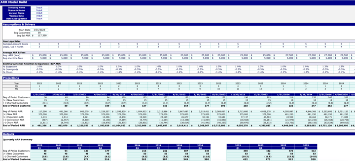
Setting Up Your Excel Data for Instant Visualization
Before we dive into creating charts, it's crucial to organize your financial data in a way that's optimized for visualization. Well-structured data not only makes chart creation faster but also ensures your visualizations are accurate and meaningful.
Best Practices for Data Organization
I recommend following these guidelines to ensure your financial data is ready for instant visualization:
- Use a tabular format: Organize your data in clear rows and columns with consistent headers
- Avoid merged cells: These can complicate data selection and chart creation
- Include time periods in a single column: For time-series data, keep dates or periods in one column rather than spreading across multiple columns
- Use consistent data types: Ensure numerical values are formatted as numbers, not text
- Create clean headers: Use clear, concise column headers without special characters
Creating Named Ranges
Named ranges in Excel make your data more accessible for visualization tools. Here's how to create them:
flowchart TD
    A[Select Data Range] --> B[Press Ctrl+Alt+F3]
    B --> C[Enter Range Name]
    C --> D[Click OK]
    A --> E[Alternative: Formulas Tab]
    E --> F[Name Manager]
    F --> G[New]
    G --> C
Pro Tip: When using PageOn.ai, you can refer to named ranges in your prompts: "Create a column chart using the 'QuarterlySales' range comparing actual vs budget."
Data Validation for Chart-Ready Data
Before visualization, validate your data to avoid errors:
- Check for missing values or zeros that might skew visualizations
- Ensure consistent formatting across similar data points
- Verify that time periods are in chronological order
- Confirm that calculated fields (e.g., percentages, variances) are accurate
By taking the time to properly structure your financial data, you'll dramatically reduce the time needed to create visualizations. With PageOn.ai, well-organized data can be transformed into professional charts in seconds rather than minutes or hours.
Leveraging AI to Generate Financial Charts Instantly
The game-changing power of AI lies in its ability to understand your visualization needs through natural language. Instead of navigating complex menus and options, you can simply describe the chart you want in plain English.

Using Natural Language Prompts
With PageOn.ai, I can simply describe what I want to see, and the AI handles the technical details. Here are some effective prompt examples:
"Create a column chart comparing quarterly revenue against budget for 2023, showing variance percentages."
"Generate a waterfall chart showing the breakdown of net income from revenue through all expenses."
"Show me a line chart of monthly cash flow over the past year with a forecast for the next quarter."
The key to effective prompts is to be specific about:
- Chart type: Specify the visualization you want (column, line, pie, waterfall, etc.)
- Data range: Indicate which data should be included
- Comparison: Clarify what you're comparing (actual vs. budget, this year vs. last year)
- Time period: Specify the relevant time frame
- Additional elements: Request specific features like trend lines, variance callouts, or annotations
From Vague Ideas to Specific Visualizations
One of the most powerful aspects of AI-driven chart creation is the ability to refine your request through conversation. If your initial chart isn't quite right, you can provide feedback:
Initial prompt:
"Show me sales performance by region."
Refinement:
"Change that to a horizontal bar chart and sort regions by performance."
Final refinement:
"Add year-over-year percentage change and highlight regions with negative growth."
Combining Multiple Data Sources
Traditional Excel charting requires manual data consolidation when working with multiple sources. PageOn.ai can intelligently combine data from different ranges or sheets:
flowchart LR
    A[Budget Data\nSheet 1] --> D[PageOn.ai\nData Processing]
    B[Actual Sales\nSheet 2] --> D
    C[Previous Year\nSheet 3] --> D
    D --> E[Comprehensive\nFinancial Chart]
Simply reference the different data sources in your prompt:
"Create a comparison chart using actual revenue from the 'Sales' sheet, budget figures from the 'Budget' sheet, and last year's performance from the 'Historical' sheet for all quarters of 2023."
PageOn.ai Insight: The AI can identify relationships between different data sets even if they're structured differently. For example, it can match monthly data with quarterly data, or align product codes across different naming conventions.
The true power of AI-driven chart creation lies in its ability to handle the complex technical details while you focus on the insights you want to communicate. With PageOn.ai, you're having a conversation about your data rather than fighting with formatting options.
Essential Financial Chart Types You Can Create in Seconds
Different financial analyses require different chart types. Let's explore the key chart types you can create instantly with PageOn.ai and when to use each one.
Comparative Financial Charts
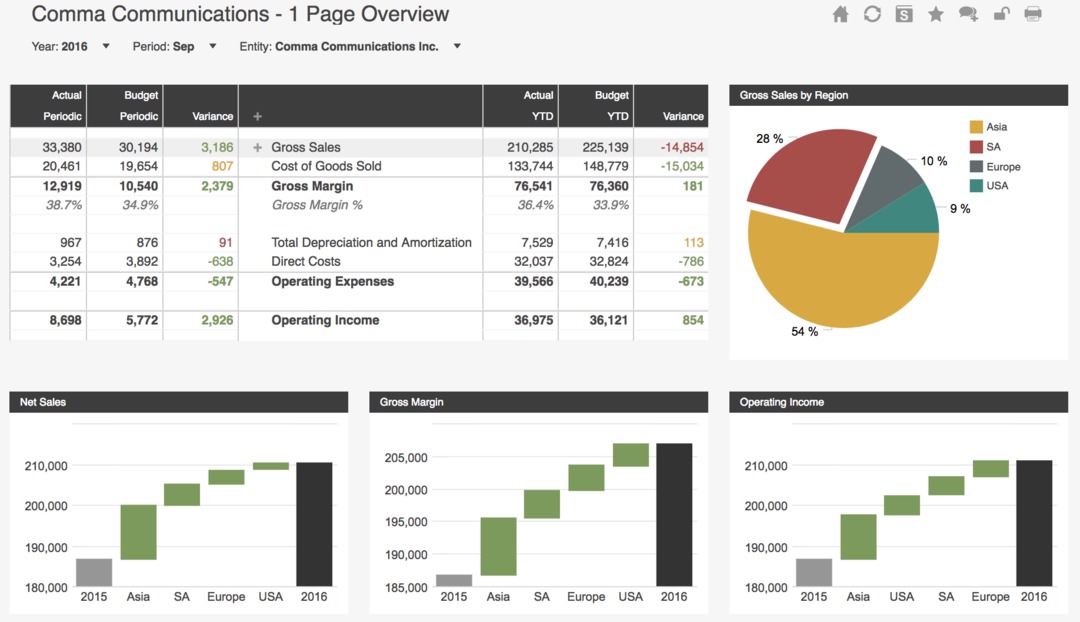
Bar and column charts are ideal for comparing distinct categories or time periods. They excel at showing budget vs. actual comparisons:
To create this type of chart with PageOn.ai, use a prompt like:
"Create a column chart comparing quarterly actual revenue against budget for the current fiscal year. Use orange for actual and a lighter shade for budget."
Trend Visualization
Line charts are perfect for showing how financial metrics change over time, making them ideal for tracking performance trends:
Generate this with a prompt like:
"Create a line chart showing monthly operating cash flow for the current year with a dashed line showing last year's performance for comparison."
Distribution Analysis
Pie and donut charts are excellent for showing how a whole is divided into parts, making them perfect for expense breakdowns:
Create this visualization with:
"Generate a pie chart showing the percentage breakdown of Q3 expenses by category, using a gradient of orange shades."
Advanced Visualizations: Waterfall Charts
Waterfall charts are powerful for showing how an initial value is affected by a series of positive and negative values, making them perfect for cash flow and variance analysis:

With PageOn.ai, creating this complex chart type is as simple as:
"Create a waterfall chart showing how we got from starting cash balance to ending balance, including operating cash flow, investing activities, financing activities, and dividends paid."
Combination Charts
Combination charts overlay different chart types to show relationships between different metrics:
Create this with:
"Generate a combination chart with columns showing monthly revenue and a line showing profit margin percentage. Use orange for revenue and blue for the profit margin line."
PageOn.ai Insight: When you're not sure which chart type would best represent your data, you can simply describe what you want to show, and the AI will suggest the most appropriate visualization: "Show me the best way to visualize how our expenses break down by department and how they've changed over the last four quarters."
With PageOn.ai, you don't need to be a visualization expert to create these chart types. The AI understands the appropriate chart types for different financial analyses and can generate them instantly from your Excel data.
Customizing Generated Charts Without Technical Complexity
One of the most powerful aspects of AI-generated charts is how easily they can be customized to meet your specific needs—without diving into complex formatting menus or writing custom code.

Refining Chart Aesthetics Through Conversation
With PageOn.ai, customizing your chart is as simple as having a conversation. Here are examples of how you can refine your visualizations:
"Change the color scheme to use blue for positive values and red for negative values."
"Make the title larger and center it at the top of the chart."
"Add data labels showing the actual values for each bar."
"Switch the chart orientation from vertical to horizontal."
Applying Corporate Branding
Maintaining visual consistency across all financial reports is crucial for professional presentations. PageOn.ai makes this simple:
"Apply our company colors: primary color #FF8000, secondary color #004080, and accent color #66CC99."
"Use our corporate font Helvetica for all text elements."
"Add our company logo to the top right corner of the chart."
You can even save these preferences as a template for future charts:
"Save this chart style as 'Quarterly Financial Report Template' for future use."
Adding Annotations and Callouts
Highlighting key insights directly on your charts helps guide your audience's attention to what matters most:
Create annotations with simple prompts:
"Add a callout to Q3 pointing out 'Supply chain disruption impacted revenue by 12%'."
Implementing Conditional Formatting
Conditional formatting helps instantly identify areas that need attention:
flowchart TD
    A[Define Condition] --> B{Is Value\nNegative?}
    B -->|Yes| C[Apply Red\nFormatting]
    B -->|No| D[Apply Green\nFormatting]
    C --> E[Add Warning\nIcon]
    D --> F[Add Success\nIcon]
With PageOn.ai, implementing conditional formatting is straightforward:
"Highlight any regions with sales decline in red, and regions exceeding targets by more than 5% in green."
Creating Interactive Elements
For stakeholder presentations, interactive elements can make your charts more engaging:
"Make this chart interactive so we can filter by region and toggle between quarterly and monthly views."
PageOn.ai Insight: You can create a chart once and then save multiple variations for different audiences. For example: "Save a detailed version of this chart for the finance team and a simplified version for the executive summary."
The beauty of AI-driven chart customization is that you don't need to know which menu contains which option or how to implement complex features. You simply describe what you want, and PageOn.ai handles the technical details, allowing you to focus on the story your data tells.
Integrating AI-Generated Charts into Financial Reports
Creating beautiful charts is just the beginning. The real value comes from seamlessly integrating these visualizations into your financial reporting workflow.
Exporting Charts in Various Formats
PageOn.ai offers flexible export options to suit different reporting needs:
Image Formats
- PNG (best for presentations)
- JPEG (smaller file size)
- SVG (scalable for print)
Document Integration
- Excel (embedded or linked)
- PowerPoint slides
- PDF reports
- Word documents
Export your chart with a simple command:
"Export this chart as a high-resolution PNG file for my presentation."
Maintaining Live Connections to Source Data
One of the most powerful features of PageOn.ai is the ability to maintain live connections to your Excel data:
flowchart LR
    A[Excel Source Data] <-->|Live Connection| B[PageOn.ai]
    B --> C[Generated Chart]
    D[Data Updates] --> A
    C -->|Auto-Updates| E[Financial Reports]
This means when your source data changes, your charts can automatically update, eliminating the need to recreate visualizations each reporting period.
"Create a live-linked chart that will automatically update when the source Excel data changes."
Creating Chart Templates for Consistent Reporting
For recurring financial reports, templates save enormous amounts of time:
With PageOn.ai, you can:
- Create a chart once with all your preferred settings
- Save it as a template with a descriptive name
- Reuse it for future reporting periods by simply pointing to the updated data
"Save this chart as 'Monthly P&L Performance Template' and apply it to next month's data when available."
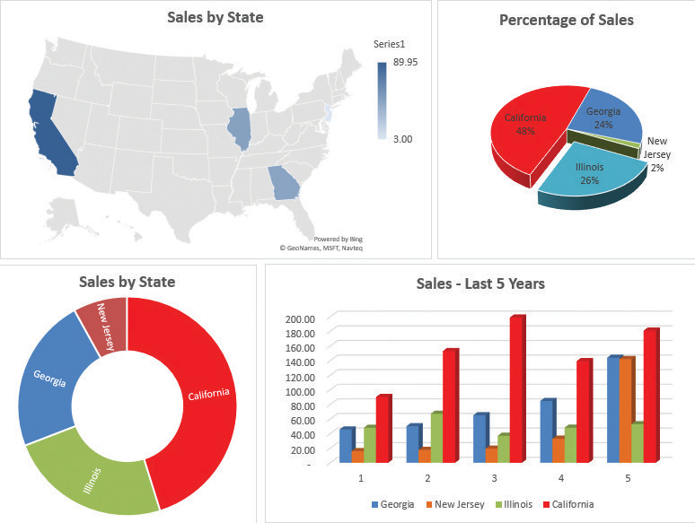
Building Comprehensive Financial Dashboards
Individual charts are powerful, but combining multiple visualizations into a dashboard provides a comprehensive view of financial performance:
Create a complete dashboard with a single prompt:
"Create a financial dashboard with four charts: 1) Revenue by quarter (actual vs. budget), 2) Expense breakdown by category, 3) Cash flow trend for the past 12 months, and 4) Key financial ratios compared to industry benchmarks."
Integrating Charts into Presentation Materials
For executive meetings and board presentations, PageOn.ai can directly integrate your financial visualizations:
"Create a PowerPoint slide with this chart and add key insights as bullet points on the right side."
PageOn.ai Insight: You can create presentation-ready charts that include annotations explaining key insights, saving you from having to add explanations separately in your presentation software.
By seamlessly integrating AI-generated charts into your financial reporting workflow, you not only save time but also ensure consistency across all your reports and presentations. The ability to maintain live connections to your data means your visualizations are always current, eliminating the risk of presenting outdated information.
Advanced Techniques for Financial Data Storytelling
Beyond basic chart creation, PageOn.ai offers advanced capabilities that transform financial reporting from simple data presentation to compelling data storytelling.
Using PageOn.ai's Deep Search for Relevant Benchmarks
One of PageOn.ai's most powerful features is its ability to find and integrate relevant benchmarks into your financial visualizations:
"Find industry average profit margins for the retail sector and overlay them on our profit margin chart."
This capability allows you to provide crucial context for your financial performance, showing not just how you're performing against your own targets, but how you stack up against competitors or industry standards.
Creating Narrative-Driven Financial Presentations
The most effective financial reports tell a coherent story. PageOn.ai helps you structure your visualizations to guide viewers through a logical narrative:
flowchart TD
    A[Set the Context:\nMarket Overview] --> B[Establish the Challenge:\nRevenue Decline]
    B --> C[Analyze Root Causes:\nCost Structure]
    C --> D[Present Solution:\nEfficiency Measures]
    D --> E[Show Expected Outcomes:\nMargin Improvement]
Create a narrative-driven presentation with:
"Create a sequence of charts that tells the story of our financial transformation: 1) Revenue challenges in Q1-Q2, 2) Cost-cutting measures implemented in Q3, 3) Resulting margin improvements in Q4, and 4) Projected financial impact for next fiscal year."
Developing Scenario Comparison Charts
For strategic planning, comparing different financial scenarios is invaluable:

Generate scenario comparison visualizations:
"Create a chart comparing three scenarios for our expansion plan: conservative, moderate, and aggressive growth, showing projected revenue and profit for each over the next 5 years."
Building Forecast Visualizations
PageOn.ai can combine historical data with AI-powered projections to create forward-looking visualizations:
Generate forecast visualizations with:
"Create a revenue forecast chart using our historical data from the past 4 quarters and project the trend for the next 2 quarters. Show the forecast with a dotted line and include confidence intervals."
Creating Executive Summaries
For busy executives, distilling complex financial data into actionable insights is crucial:
"Create an executive summary dashboard showing our top 3 financial achievements and top 2 challenges this quarter, with supporting visualizations for each point."
PageOn.ai Insight: The AI can analyze your financial data to automatically identify and highlight significant patterns, anomalies, or trends that might otherwise go unnoticed, bringing attention to insights that deserve focus.
These advanced techniques transform financial reporting from a routine presentation of numbers into a strategic communication tool. By leveraging PageOn.ai's capabilities, you can create visualizations that not only show what happened but explain why it matters and what actions should be taken as a result.
Case Studies: From Raw Data to Decision-Ready Visualizations
Let's explore how finance professionals across different roles and industries have leveraged instant chart generation to transform their financial reporting and decision-making processes.
How a CFO Identified Cost-Saving Opportunities
Sarah, the CFO of a mid-sized manufacturing company, needed to identify cost-saving opportunities quickly during an economic downturn. Using PageOn.ai, she transformed her complex cost structure data into a series of visualizations that revealed:
- Three facilities with significantly higher energy costs per unit produced
- A correlation between maintenance scheduling and production efficiency
- Supplier pricing inconsistencies across different regions
By generating these insights in minutes rather than days, Sarah was able to implement targeted cost-saving measures that reduced operating expenses by 12% within a quarter, without impacting production capacity.
How a Financial Analyst Reduced Reporting Time
Michael, a financial analyst at a retail chain, was spending three full days each month creating visualizations for the monthly financial review. His process involved:
- Collecting data from multiple systems
- Manually creating and formatting 15+ charts in Excel
- Updating the same charts in PowerPoint for executive presentations
- Making last-minute adjustments based on feedback
After implementing PageOn.ai, Michael set up templates that automatically generated all required visualizations as soon as the monthly data was available. The entire process now takes just 2 hours instead of 3 days, and the charts are more consistent, insightful, and visually appealing.
With his newly available time, Michael has been able to conduct deeper analysis and provide strategic recommendations that have helped improve inventory management decisions.
How an Investment Team Visualized Portfolio Performance
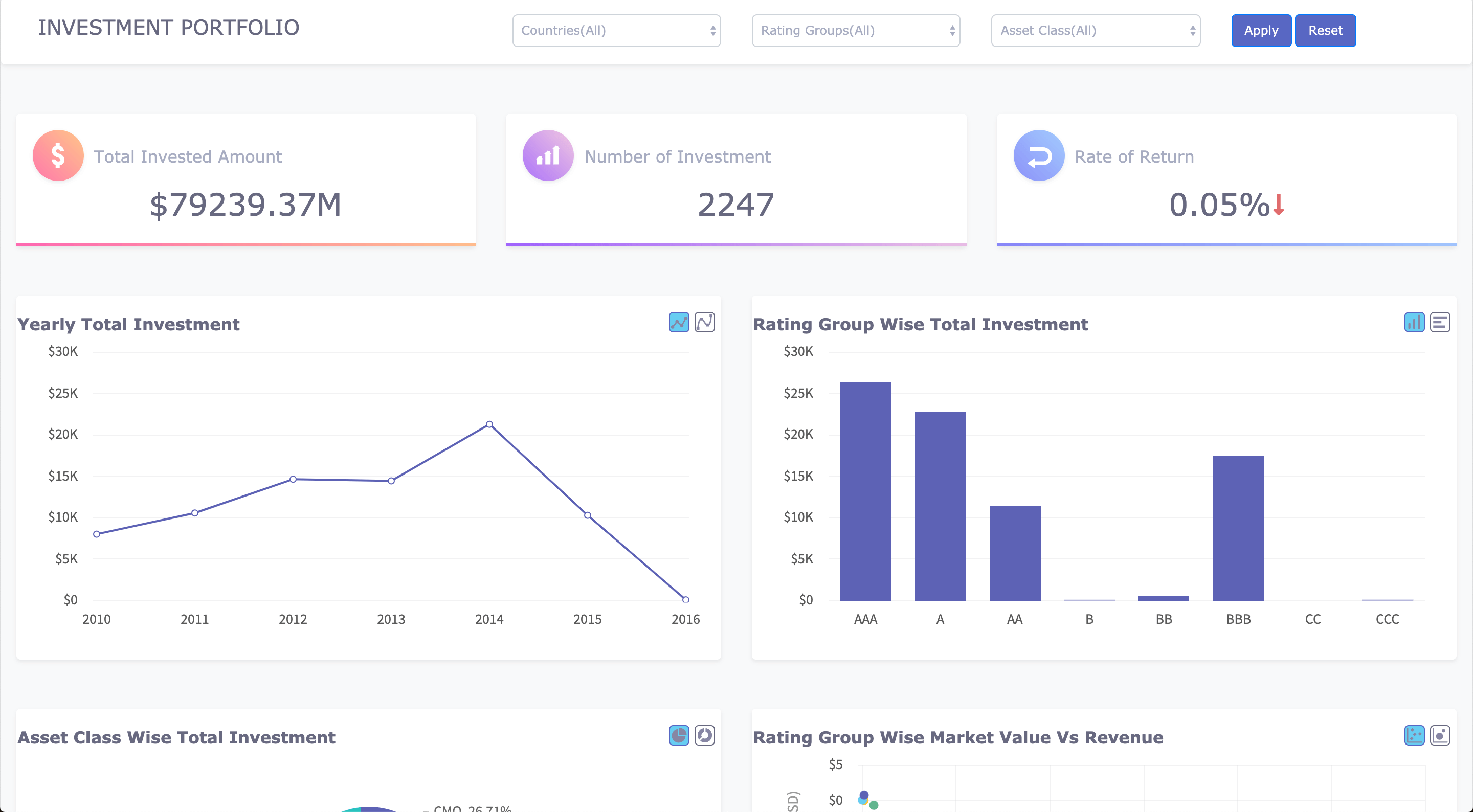
The investment team at a wealth management firm needed to create personalized portfolio performance reports for high-net-worth clients. Each report needed to show:
- Performance against benchmarks
- Asset allocation and diversification
- Risk-adjusted returns
- Future projections based on different market scenarios
Using PageOn.ai, the team created a template that could generate all required visualizations for any client portfolio in seconds. The interactive charts allowed advisors to walk clients through different scenarios during meetings, enhancing client engagement and understanding.
The firm reported a 35% increase in client satisfaction scores related to performance reporting and a 20% increase in assets under management as existing clients increased their investments.
How a Small Business Owner Gained Financial Clarity

David, the owner of a growing restaurant business with three locations, struggled to get a clear picture of his financial performance. His bookkeeper provided monthly P&L statements, but David found it difficult to extract meaningful insights from the numbers alone.
Using PageOn.ai, David was able to transform his Excel data into visual dashboards that clearly showed:
- Profitability by location and menu category
- Labor costs as a percentage of revenue throughout different times of day
- Seasonal trends in customer traffic and spending
- Impact of promotional campaigns on revenue and margin
These insights allowed David to optimize staffing schedules, adjust menu pricing, and better time his promotional activities. Within six months, his overall profit margin increased from 8% to 14%.
PageOn.ai Impact: Across these case studies, a common theme emerges—the ability to create professional financial visualizations in seconds doesn't just save time; it fundamentally transforms how financial professionals can contribute strategic value to their organizations.
Best Practices for Effective Financial Visualization
Creating impactful financial visualizations goes beyond just generating charts. Here are essential best practices to ensure your financial charts effectively communicate your data story.
Ensuring Data Accuracy and Integrity
Even the most beautiful chart is worthless if the underlying data isn't accurate. Before visualization:
- Verify data sources and collection methods
- Check for outliers that might skew visualizations
- Ensure consistent units and time periods across all data points
- Document any assumptions or adjustments made to the raw data
- Implement data validation checks before generating visualizations
"Before creating this chart, check for any outliers in the Q3 revenue data and flag any values that deviate by more than 20% from the quarterly average."
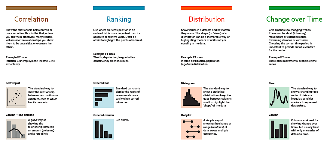
Choosing the Right Chart Type for Different Financial Metrics
For Comparing Categories
- Bar/Column Charts: Compare values across categories (e.g., revenue by product line)
- Radar Charts: Compare multiple variables for multiple categories (e.g., financial ratios across business units)
For Showing Trends Over Time
- Line Charts: Show continuous changes over time (e.g., monthly revenue trend)
- Area Charts: Emphasize volume changes over time (e.g., cash balance fluctuations)
For Part-to-Whole Relationships
- Pie/Donut Charts: Show composition (e.g., expense breakdown)
- Stacked Bar Charts: Show composition and comparison (e.g., revenue breakdown by product and region)
For Financial Flows
- Waterfall Charts: Show how an initial value is affected by intermediate values (e.g., bridge from gross to net profit)
- Sankey Diagrams: Show complex flows (e.g., cash movement between accounts)
With PageOn.ai, you can ask for guidance on the most appropriate chart type:
"What's the best chart type to show how our expense categories have changed in proportion to each other over the past 4 quarters?"
Maintaining Visual Clarity
Financial data is often complex, making visual clarity paramount:
DO
- Use consistent color coding (e.g., always use the same color for actual vs. budget)
- Label data directly when possible
- Use descriptive titles that convey the main insight
- Provide context through annotations or benchmark lines
- Focus on the most relevant data points
DON'T
- Use 3D effects that distort perception
- Include too many data series in a single chart
- Use overly decorative fonts or elements
- Rely on color alone to convey meaning (use patterns or labels too)
- Cut off axes in ways that exaggerate differences
Creating a Consistent Visual Language
Consistency across all financial reports helps viewers quickly understand your visualizations:
flowchart TD
    A[Define Visual Standards] --> B[Create Chart Templates]
    B --> C[Implement Color Coding System]
    C --> D[Standardize Labels and Annotations]
    D --> E[Document Guidelines]
With PageOn.ai, you can create and enforce a consistent visual language across your organization:
"Create a financial reporting style guide with standardized chart formats for our monthly financial package. Use our brand colors, consistent axis formatting, and standardized labels."
Balancing Detail and Simplicity
Different audiences require different levels of detail:
With PageOn.ai, you can easily create variations of the same chart for different audiences:
"Create three versions of this P&L performance chart: a detailed version for the finance team with all line items, a summarized version for department heads with category subtotals, and an executive version showing only key metrics with year-over-year growth rates."
PageOn.ai Insight: When in doubt, create interactive visualizations that allow users to drill down into details as needed, rather than overwhelming them with all information at once.
By following these best practices, you'll create financial visualizations that not only look professional but effectively communicate insights that drive better business decisions. PageOn.ai makes implementing these practices simple through natural language prompts, allowing you to focus on the story your data tells rather than the technical details of chart creation.
Future-Proofing Your Financial Reporting Process
As AI-powered tools like PageOn.ai continue to evolve, establishing efficient workflows and practices now will ensure your financial reporting process remains effective and adaptable in the future.
Establishing AI-Enhanced Workflows
The most effective approach combines AI capabilities with human expertise:
flowchart TD
    A[Data Collection & Validation] --> B{AI or Human?}
    B -->|Repetitive Tasks| C[AI: Generate Standard Charts]
    B -->|Strategic Analysis| D[Human: Interpret & Add Context]
    C --> E[AI: Apply Templates & Formatting]
    D --> F[Human: Review & Refine]
    E --> F
    F --> G[Final Financial Reports]
To implement this workflow:
- Identify which reporting tasks are routine and can be automated
- Determine where human analysis adds the most value
- Create clear handoff points between AI and human team members
- Establish review procedures to ensure accuracy and relevance
- Document the process to maintain consistency when team members change
Creating a Visualization Template Library
A comprehensive template library saves time and ensures consistency:
Standard Reports
- Monthly P&L dashboard
- Cash flow statement
- Balance sheet visualization
- Budget variance analysis
Specialized Reports
- Product profitability analysis
- Customer acquisition cost
- Working capital trends
- Sales performance by channel
Executive Reports
- KPI summary dashboard
- Strategic initiative tracking
- Market comparison charts
- Forecast scenario analysis
With PageOn.ai, you can create and manage this template library with ease:
"Create a template called 'Monthly P&L Dashboard' based on this chart, but make it adaptable to any month's data. Save it to our company template library."
Training Team Members
To maximize the benefits of AI-powered visualization, ensure your team understands how to leverage these tools effectively:
- Provide training on crafting effective prompts for PageOn.ai
- Share best practices for data preparation and organization
- Encourage experimentation with different visualization approaches
- Create a knowledge base of successful visualization examples
- Establish peer review processes to improve visualization quality
Measuring Time Savings and Decision-Making Improvements
Track the impact of your improved visualization process:
Track metrics such as:
- Time saved in report creation (hours per month)
- Reduction in reporting errors
- Improvement in decision-making speed
- Increased engagement with financial reports
- Financial impact of improved decisions
Staying Current with Visualization Best Practices
Financial visualization is an evolving field. Stay current by:
- Following thought leaders in financial visualization
- Participating in relevant professional communities
- Reviewing competitor and industry reports for inspiration
- Soliciting feedback from report consumers
- Regularly reviewing and updating your visualization templates
PageOn.ai Advantage: As visualization best practices evolve, PageOn.ai's AI models are continuously updated to incorporate the latest techniques and standards, ensuring your financial reports remain cutting-edge without requiring you to constantly retrain your team.
By implementing these future-proofing strategies, you'll create a financial reporting process that not only saves time today but continues to deliver increasing value as AI capabilities advance. The combination of AI-powered tools like PageOn.ai with human expertise creates a powerful approach to financial visualization that drives better, faster decisions throughout your organization.
Transform Your Financial Data Visualization Today
Stop spending hours creating financial charts manually. With PageOn.ai, you can transform your Excel data into stunning, insightful visualizations in seconds.
No credit card required. See the power of AI-driven financial visualization for yourself.
You Might Also Like
Unleashing Creative Potential: How ChatGPT and MCP Transform PowerPoint Creation
Discover how to create unlimited PowerPoint presentations using ChatGPT and Model Context Protocol (MCP). Learn step-by-step techniques, prompt engineering, and advanced features for AI-powered slides.
Vibe Coding: Transforming Ideas into Working Software Through Natural Language
Discover how vibe coding revolutionizes software development by using natural language to create working code. Learn the mechanics, workflow, and future of this AI-powered approach.
Achieving Visual Balance in Educational Interface Design | Expert Guide
Discover how to create harmonious educational interfaces through visual balance principles. Learn spatial organization, color dynamics, and typography techniques to enhance learning experiences.
Optimizing Websites for AI Agent Interaction: The Ultimate Guide
Learn how to prepare your website for AI agents and assistants. Discover technical foundations, content optimization strategies, and task completion enhancements for the AI revolution.