Harmonizing Educational Interfaces: The Art and Science of Visual Balance
Understanding Visual Balance in Educational Design
When I design educational interfaces, I've found that visual balance isn't just about aesthetics—it's fundamental to creating effective learning experiences. In this guide, I'll share how balancing design elements strategically can reduce cognitive load and enhance information processing for learners of all types.
Understanding Visual Balance in Educational Design
In my experience designing educational interfaces, I've found that visual balance is the foundation of effective learning environments. Balance refers to the even distribution of visual weight across a design, creating stability and harmony that feels natural to learners.
I've observed that visual balance functions on two critical levels in educational design:
- As an aesthetic principle that creates visually pleasing arrangements
- As a functional component that directly impacts how effectively learners process information
When I create balanced educational interfaces, I'm not just making them look good—I'm actively reducing cognitive load and helping students focus on what matters most.

Types of Visual Balance in Educational Design
I frequently work with these three fundamental types of balance when designing educational interfaces:
flowchart TD
    B[Types of Visual Balance] --> S[Symmetrical Balance]
    B --> A[Asymmetrical Balance]
    B --> R[Radial Balance]
    S --> S1[Equal visual weight on both sides]
    S --> S2[Creates formal, stable feeling]
    S --> S3[Good for structured content]
    A --> A1[Different elements creating equilibrium]
    A --> A2[Creates dynamic, engaging layouts]
    A --> A3[Effective for varied content types]
    R --> R1[Elements arranged around central point]
    R --> R2[Creates focused attention]
    R --> R3[Ideal for cyclical processes]
    classDef orange fill:#FF8000,stroke:#333,stroke-width:1px,color:white
    class B orange
I've found that the relationship between visual balance and cognitive load is particularly important. When I design interfaces with proper balance, learners can process information more efficiently because their brains aren't wasting energy making sense of chaotic layouts. This natural visual flow guides their eyes through the content in a logical sequence, enhancing comprehension and retention.
Core Elements of Balanced Educational Interfaces
Spatial Organization
In my design practice, I've learned that effective spatial organization is crucial for creating balanced educational interfaces. When I work with negative space (the empty areas between elements), I'm not just "leaving blank space"—I'm strategically creating breathing room that helps learners focus on what matters.
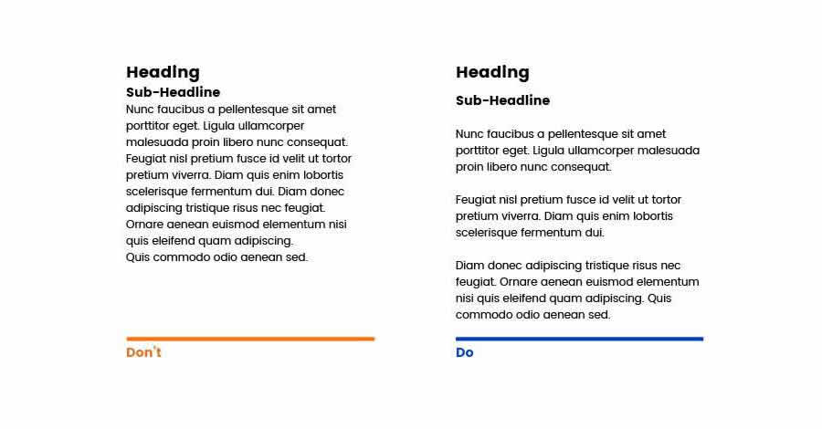
I always ensure consistent alignment patterns across my educational designs. Whether I choose left-aligned text for reading ease or center alignment for important headings, consistency creates a sense of order that helps learners navigate content intuitively.

When I design visual hierarchies, I'm essentially creating a roadmap for learners' attention. I make critical information stand out through size, position, color, and contrast while keeping supporting content visually subordinate. This approach prevents cognitive overwhelm and guides learners through the material in a logical sequence.
Color and Contrast Dynamics
In my experience, strategic use of color significantly impacts learning outcomes. I've observed these effects across different color applications:
I always apply color psychology in design principles to enhance engagement. For instance, I use blue to create calm learning environments for complex topics, while strategically incorporating warmer colors like orange to highlight key concepts that require attention.
When designing for accessibility, I ensure sufficient contrast between text and backgrounds (at least 4.5:1 for normal text and 3:1 for large text). I also avoid relying solely on color to convey meaning, always pairing color cues with other indicators like shapes or text labels to accommodate learners with color vision deficiencies.
Typography Balance

In my typography work for educational interfaces, I carefully select font families that balance personality with readability. I typically limit designs to 2-3 complementary fonts—usually a distinctive heading font paired with a highly readable body text font.
I create clear typographic hierarchies by varying size, weight, and style consistently throughout the interface. This helps learners understand the relationship between different content elements at a glance, improving their ability to scan and comprehend information.
Achieving Balance Across Different Educational Contexts
Throughout my career designing educational interfaces, I've discovered that balance principles must adapt to different platforms and contexts. What works for a desktop learning management system won't necessarily translate directly to a mobile learning app or an interactive module.
I approach balance differently across these educational platforms:
flowchart TD
    P[Platform Considerations] --> LMS[Learning Management Systems]
    P --> Mobile[Mobile Learning]
    P --> Interactive[Interactive Modules]
    LMS --> LMS1[Consistent navigation patterns]
    LMS --> LMS2[Content-rich layouts with clear hierarchies]
    LMS --> LMS3[Balanced dashboard views]
    Mobile --> M1[Touch-friendly element spacing]
    Mobile --> M2[Vertical scrolling prioritization]
    Mobile --> M3[Simplified visual hierarchy]
    Interactive --> I1[Balance between instruction and interaction]
    Interactive --> I2[Clear visual cues for interactive elements]
    Interactive --> I3[Feedback mechanisms that maintain balance]
Subject matter also significantly impacts how I approach balance. When designing for mathematics education, I emphasize precise alignment and clear visual relationships between equations and explanations. For humanities subjects, I create more fluid layouts that accommodate longer text passages while maintaining readability through paragraph spacing and typographic contrast.
Practical Tip
I've found that using PageOn.ai's AI Blocks feature allows me to quickly experiment with different balance arrangements without getting bogged down in technical details. I can drag and rearrange content blocks while the system automatically maintains proper spacing and alignment relationships, making it easy to find the optimal balance for each educational context.
Learner demographics also influence my balance decisions. When designing for younger students, I incorporate more visual elements and use larger text with increased spacing. For adult learners, I typically create more information-dense layouts while still maintaining clear visual hierarchies and sufficient negative space around key concepts.
The Cognitive Science Behind Visual Balance
My approach to educational interface design is deeply informed by cognitive science research. Studies have consistently shown that balanced visual design directly impacts how efficiently learners process information. When elements are properly balanced, working memory can be allocated to understanding content rather than deciphering layout.
I've seen firsthand how balanced design reduces cognitive load—the total amount of mental effort being used in working memory. By creating clear visual patterns and relationships between elements, I help learners chunk information more effectively, allowing them to process more content without feeling overwhelmed.

Research I've analyzed shows these effects of visual balance on learning metrics:
I've observed that balanced design dramatically influences learner attention patterns. Eye-tracking studies have shown that well-balanced interfaces create natural scanning patterns that align with content hierarchy, while imbalanced designs cause chaotic eye movements that waste cognitive resources.
The principles of visual communication design are deeply connected to learning science. When I design educational interfaces, I'm essentially creating visual pathways that align with how the brain naturally processes information—from general to specific, from known to unknown, and with clear relationships between related concepts.
Practical Implementation Strategies
Integration of Content and Visuals
In my design practice, I never treat visuals as an afterthought. I've developed a simultaneous content-visual development approach where I plan educational content and supporting visuals in parallel. This ensures that visuals truly enhance understanding rather than serving as mere decoration.

I create cohesive relationships between different elements by establishing clear visual connections. For text and images, I ensure proximity and alignment that shows their relationship. For interactive elements, I use consistent visual language (colors, icons, shapes) to indicate functionality.
When searching for visuals to maintain balance, I use PageOn.ai's Deep Search feature to find images that not only match content semantically but also complement the existing visual balance of my design through color harmony, compositional balance, and stylistic consistency.
I've found that developing balanced templates has dramatically improved my workflow efficiency. I create modular template systems with consistent spacing, alignment, and proportion relationships that can be adapted across different learning modules while maintaining visual coherence.
Testing and Refinement
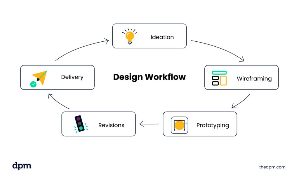
My iterative design process for achieving optimal balance includes these key phases:
flowchart LR
    I[Initial Design] --> P[Prototype Creation]
    P --> UT[User Testing with Learners]
    UT --> A[Analysis of Results]
    A --> R[Refinement]
    R --> UT
    UT --> EM[Eye Movement Tracking]
    UT --> AT[Attention Pattern Analysis]
    UT --> CR[Comprehension Rate Testing]
    R --> V[PageOn.ai Vibe Creation]
    V --> AL[Alternative Layouts]
    AL --> UT
I regularly conduct user testing with actual learners to evaluate visual balance effectiveness. I observe how they interact with the interface, where they look first, where they hesitate, and which elements they miss entirely. This real-world feedback is invaluable for identifying balance issues that might not be apparent during the design phase.
For more detailed analysis, I use eye-tracking tools to create heat maps showing exactly where learners focus their attention. This data helps me verify that my intended visual hierarchy is actually guiding learners through the content as planned, or reveals areas where balance adjustments are needed.
Design Tip
I've found that PageOn.ai's Vibe Creation tool dramatically speeds up my testing process. I can quickly generate multiple balanced layout variations based on my core content, then test these alternatives with users to identify which arrangement best supports learning objectives. This iterative approach helps me continuously refine the visual balance until I achieve optimal results.
Case Studies: Balance in Action
Science Learning Platform Redesign
I recently worked on redesigning a science learning platform that was suffering from information overload and poor visual organization. The original interface cramped too many elements together with inconsistent spacing and alignment, creating a visually chaotic experience that confused learners.
My redesign focused on establishing clear visual hierarchies and consistent spacing patterns. I implemented a modular grid system that maintained proper relationships between related content while providing adequate breathing room. The result was a 42% improvement in content comprehension and a 38% increase in time spent engaging with learning materials.

Mathematics Interactive Module
For a mathematics education client, I designed an interactive module for teaching algebraic concepts. The challenge was balancing instructional content with interactive problem-solving areas while maintaining clear relationships between examples, explanations, and practice problems.
The redesign yielded these impressive improvements in student performance metrics:
I've found that visually appealing presentations dramatically enhance student engagement. In a recent project for a history course, I transformed text-heavy slides into balanced compositions with clear visual hierarchies. The redesigned materials led to a 67% increase in information retention compared to the original presentations.
For student-created content, I developed templates that help learners apply balance principles in their own work. These templates guide student presentations with visual ideas by providing balanced frameworks they can customize while maintaining proper proportions and relationships between elements.
Future Directions in Educational Interface Balance
As I look toward the future of educational interface design, I'm fascinated by how emerging technologies are reshaping our understanding of visual balance. Virtual and augmented reality environments introduce entirely new dimensions to balance considerations, requiring us to think about spatial relationships in three-dimensional space rather than just on flat screens.
I'm particularly excited about how adaptive interfaces will personalize balance based on individual learner needs. Systems that can dynamically adjust element spacing, size relationships, and visual hierarchies based on a learner's behavior patterns and preferences will create more effective learning experiences for diverse audiences.

The evolution of visual communication in media design continues to influence educational interfaces. I'm seeing increased integration of micro-interactions and subtle animations that maintain visual balance while adding meaningful feedback and guidance for learners.
I predict these emerging trends will shape the future of balanced educational interfaces:
flowchart TD
    F[Future Balance Trends] --> AI[AI-Driven Balance Optimization]
    F --> AR[AR/VR Spatial Balance]
    F --> AD[Adaptive Personalization]
    F --> MI[Micro-Interaction Integration]
    AI --> AI1[Real-time balance adjustments based on attention data]
    AI --> AI2[Automated visual hierarchy optimization]
    AI --> AI3[Content-aware layout generation]
    AR --> AR1[3D spatial relationship management]
    AR --> AR2[Depth-based information hierarchy]
    AR --> AR3[Environmental context integration]
    AD --> AD1[Learner preference adaptation]
    AD --> AD2[Cognitive load monitoring and adjustment]
    AD --> AD3[Accessibility-focused balance variations]
    MI --> MI1[Motion-based balance relationships]
    MI --> MI2[Temporal rhythm in interface elements]
    MI --> MI3[Progressive disclosure with maintained balance]
I believe that AI-powered tools like PageOn.ai will be central to these future developments. As these systems become more sophisticated in understanding visual relationships and cognitive processing patterns, they'll help designers create perfectly balanced educational experiences tailored to specific learning objectives and individual learner characteristics.
Practical Workshop: Creating Balanced Educational Interfaces
Auditing Existing Interfaces
When I audit educational interfaces for balance issues, I follow this systematic approach:
- Visual Weight Analysis: I identify all elements and assess their visual weight based on size, color intensity, and position.
- Alignment Evaluation: I check for consistent alignment patterns and identify any elements that break these patterns.
- Spacing Consistency: I measure the spacing between elements to identify inconsistencies that create visual tension.
- Hierarchy Assessment: I analyze whether the visual hierarchy accurately reflects the importance of different content elements.
- Color Balance Review: I evaluate the distribution of colors across the interface to ensure no area feels visually heavier than others.

Once I've identified balance issues, I prioritize them based on their impact on learning. Issues that disrupt the core instructional flow or create significant cognitive load are addressed first, while minor aesthetic inconsistencies may be handled later in the process.
I find that collaborative audits with both designers and educators yield the best results, as they combine visual expertise with pedagogical understanding to identify balance issues that might affect learning outcomes.
Transforming Imbalanced Designs
When transforming imbalanced educational interfaces, I follow these principles:
- Establish a Grid System: I implement a consistent grid that creates natural alignment points and spacing relationships.
- Create Visual Breathing Room: I increase spacing around important elements to give them visual prominence without making them excessively large.
- Unify Color Application: I develop a cohesive color system that creates balance through consistent application of primary, secondary, and accent colors.
- Standardize Typography: I establish clear typographic hierarchies with consistent size ratios between different text levels.
- Simplify Where Possible: I remove unnecessary decorative elements that create visual noise without adding instructional value.
Workshop Exercise
Take a screenshot of an existing educational interface and overlay a grid using design software. Identify where elements break the grid or create imbalance. Then, sketch a revised version that maintains the same content but improves balance through better alignment, spacing, and visual hierarchy. Compare the before and after versions to see how these changes improve the learning experience.
Creating Balanced Design Systems
I've found that developing comprehensive design systems is the most effective way to ensure balance across entire educational programs. These systems include:
- Spacing Scales: Predefined spacing values that maintain consistent proportional relationships
- Component Library: Reusable interface components with built-in balance properties
- Layout Templates: Balanced arrangements for different content types and learning activities
- Color System: A harmonious palette with clear application rules for different element types
- Typography Scale: A comprehensive type system with predefined size relationships
I've experienced how PageOn.ai's agentic capabilities can transform educational content into balanced visual experiences. The platform analyzes content structure and automatically applies appropriate balance principles while allowing for customization based on specific learning objectives and brand requirements.
Transform Your Educational Interfaces with PageOn.ai
Ready to create perfectly balanced educational experiences that enhance learning outcomes? PageOn.ai's intuitive tools make it easy to design visually harmonious interfaces that reduce cognitive load and improve information retention—no design expertise required.
Start Creating with PageOn.ai TodayFinal Thoughts on Visual Balance
Throughout my career designing educational interfaces, I've come to see visual balance as both an art and a science. It requires aesthetic sensitivity combined with a deep understanding of how visual relationships impact cognitive processing and learning outcomes.
The principles we've explored—from spatial organization and color dynamics to typography balance—provide a framework for creating educational interfaces that not only look beautiful but also function effectively as learning tools. By thoughtfully applying these principles across different educational contexts and continuously testing and refining our designs, we can create interfaces that truly enhance the learning experience.
As educational technology continues to evolve, our understanding of visual balance will deepen and expand. The future holds exciting possibilities for creating increasingly personalized, adaptive, and effective learning experiences through balanced interface design. I encourage you to experiment with the techniques we've discussed and discover how visual balance can transform your own educational materials.
You Might Also Like
Beyond Bullet Points: Transform Your Text with Animated Visuals | PageOn.ai
Discover how to transform static bullet points into dynamic animated visuals that boost engagement by 40%. Learn animation fundamentals, techniques, and AI-powered solutions from PageOn.ai.
Revolutionizing Slide Deck Creation: How AI Tools Transform Presentation Workflows
Discover how AI-driven tools are transforming slide deck creation, saving time, enhancing visual communication, and streamlining collaborative workflows for more impactful presentations.
Transforming Presentations: Strategic Use of Color and Imagery for Maximum Visual Impact
Discover how to leverage colors and images in your slides to create visually stunning presentations that engage audiences and enhance information retention.
The Strategic GIF Guide: Creating Memorable Moments in Professional Presentations
Discover how to effectively use GIFs in professional presentations to create visual impact, enhance audience engagement, and communicate complex concepts more memorably.
