The Ultimate Guide to Element Alignment in Professional Learning Materials
Creating Visual Flow and Structure for Enhanced Learning Experiences
Discover how strategic element alignment can transform your learning materials from ordinary to exceptional, guiding your audience's attention and enhancing information retention through intentional visual design.
Understanding the Foundation of Visual Alignment in Learning Design
When I create professional learning materials, I've discovered that alignment isn't just about making things look neat—it's about how the human brain processes information. The psychological impact of properly aligned elements directly affects how well learners retain information and stay engaged with the content.
The Psychology of Alignment
I've found that our brains naturally seek order and structure. When elements are properly aligned, learners can focus on content rather than trying to make sense of chaotic layouts. This reduction in cognitive effort leads to better comprehension and retention of information.

Visual Hierarchy in Educational Content
In my experience designing learning materials, establishing a clear visual hierarchy through alignment helps learners understand the relationship between different concepts. When I align related elements, I create visual connections that reinforce conceptual relationships.
Key Principles of Visual Hierarchy
- Proximity: Elements placed close together are perceived as related
- Alignment: Creates visual connections between distant elements
- Contrast: Draws attention to important information
- Repetition: Establishes patterns that create cohesion
- Direction: Guides the eye through content in a meaningful sequence
Cognitive Load Comparison
The following chart illustrates how different alignment approaches affect cognitive load in learning materials:
Technical vs. Perceptual Alignment
In my work, I distinguish between technical alignment (using grid systems) and perceptual alignment (creating visual balance). While technical alignment provides structure, I've found that perceptual alignment creates harmony that feels right to the viewer, even when elements aren't perfectly aligned to a grid.
Visual Pathways Created by Alignment
How alignment guides the learner's attention through information:
flowchart TD
    A[Entry Point] -->|Aligned Heading| B[Key Concept 1]
    A -->|Visual Path| C[Key Concept 2]
    B -->|Consistent Margins| D[Supporting Detail 1.1]
    B -->|Grid Alignment| E[Supporting Detail 1.2]
    C -->|Visual Connection| F[Supporting Detail 2.1]
    C -->|Aligned Elements| G[Supporting Detail 2.2]
    D & E & F & G -->|Consistent Bottom Alignment| H[Learning Outcome]
    style A fill:#FF8000,stroke:#E67300,color:white
    style H fill:#FF8000,stroke:#E67300,color:white
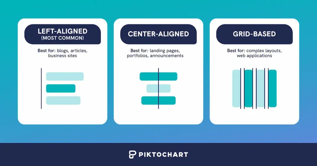
Essential Alignment Techniques for Learning Materials
Throughout my years of designing learning materials, I've developed a toolkit of alignment techniques that consistently produce professional, easy-to-follow layouts. Let me share these essential approaches that I use to create structure and flow in educational content.
Mastering Grid Systems
When I create cohesive slide layouts, I always start with a well-defined grid system. This invisible framework helps me maintain consistency across multiple learning assets, creating a sense of unity that keeps learners oriented.

Common Grid Structures I Use:
- Rule of Thirds: Dividing content into nine equal parts
- Column Grid: Using 2-4 columns for flexible content arrangement
- Modular Grid: Combining rows and columns for complex layouts
- Baseline Grid: Aligning text to consistent horizontal lines
I've found that establishing a grid at the beginning of a project saves countless hours of adjustments later and creates a more professional final product.
Using Alignment to Establish Relationships
One of my favorite techniques is using alignment to visually connect related concepts. When elements share alignment points, learners intuitively understand their relationship without needing explicit explanations.
Relationship Types Created Through Alignment
Creating Visual Rhythm
Visual rhythm is something I consciously craft in my learning materials. By establishing consistent spacing and alignment patterns, I create a predictable flow that helps learners navigate through information more efficiently.
Visual Rhythm Patterns
flowchart LR
    subgraph "Regular Rhythm"
    A1[Element] --- A2[Element] --- A3[Element] --- A4[Element]
    end
    subgraph "Progressive Rhythm"
    B1[Small] --- B2[Medium] --- B3[Large] --- B4[Larger]
    end
    subgraph "Alternating Rhythm"
    C1[Text] --- C2[Image] --- C3[Text] --- C4[Image]
    end
    Regular --> Progressive
    Progressive --> Alternating
    style A1 fill:#FF8000,stroke:#E67300,color:white
    style A2 fill:#FF8000,stroke:#E67300,color:white
    style A3 fill:#FF8000,stroke:#E67300,color:white
    style A4 fill:#FF8000,stroke:#E67300,color:white
    style B1 fill:#FF9933,stroke:#E67300,color:white
    style B2 fill:#FF9933,stroke:#E67300,color:white
    style B3 fill:#FF9933,stroke:#E67300,color:white
    style B4 fill:#FF9933,stroke:#E67300,color:white
    style C1 fill:#FFB366,stroke:#E67300,color:white
    style C2 fill:#FFB366,stroke:#E67300,color:white
    style C3 fill:#FFB366,stroke:#E67300,color:white
    style C4 fill:#FFB366,stroke:#E67300,color:white
Balancing Text and Visual Elements
In my learning materials, I often need to balance text-heavy content with visual elements. I've found that maintaining alignment between these different content types creates harmony and improves information processing.
My Text-Visual Balance Techniques:
- Align text blocks with the edges or key points of adjacent images
- Use consistent indentation for text that relates to specific visuals
- Create invisible alignment lines that run through both text and visuals
- Maintain consistent spacing between text blocks and their related visuals
- Use text wrapping that respects the shape and flow of visual elements
Alignment in Different Learning Formats
Each learning format demands its own alignment approach. When I work with lesson plan formats, I focus on creating clear visual hierarchies that help instructors quickly find the information they need.
| Learning Format | Primary Alignment Strategy | Key Considerations |
|---|---|---|
| Slide-based Presentations | Consistent edge alignment | Maintain visual continuity across slides; use strong left or center alignment |
| Document-based Materials | Hierarchical alignment | Create scannable patterns with indentation and consistent heading alignment |
| Digital Worksheets | Grid-based alignment | Ensure input fields and instructions maintain clear relationships |
| Lesson Plans | Section-based alignment | Create distinct visual areas for objectives, activities, and assessments |
When designing lesson plan templates for Google Docs, I pay special attention to creating alignment systems that work within the constraints of the platform while still providing clear visual structure.
Common Alignment Problems in Learning Design and Their Solutions
Throughout my design career, I've encountered recurring alignment challenges in learning materials. Let me share the most common problems I see and the solutions I've developed to address them.
"Floating Element Syndrome"
One of the most persistent issues I encounter is what I call "floating element syndrome"—when visual elements appear disconnected from the rest of the content, creating a disjointed learning experience.
My Solutions:
- Establish clear anchor points for each element
- Use invisible alignment lines that connect seemingly disparate elements
- Create visual relationships through consistent spacing
- Implement a modular grid system that accommodates different content types
- Use PageOn.ai's AI Blocks to automatically align related content
Inconsistent Margins and Padding
Inconsistent margins and padding create visual noise that disrupts the learning experience. I've found that establishing a consistent spacing system is essential for creating harmony in educational materials.
Consistent Margin System
flowchart TD
    subgraph "Consistent Spacing System"
        M1[Micro Spacing: 4-8px] --> M2[Small Spacing: 12-16px]
        M2 --> M3[Medium Spacing: 24-32px]
        M3 --> M4[Large Spacing: 48-64px]
    end
    subgraph "Application Areas"
        A1[Text Elements]
        A2[Visual Elements]
        A3[Sections & Cards]
        A4[Page Margins]
    end
    M1 --> A1
    M2 --> A1
    M2 --> A2
    M3 --> A2
    M3 --> A3
    M4 --> A3
    M4 --> A4
    style M1 fill:#FF8000,stroke:#E67300,color:white
    style M2 fill:#FF9933,stroke:#E67300,color:white
    style M3 fill:#FFB366,stroke:#E67300,color:white
    style M4 fill:#FFCC99,stroke:#E67300,color:white
I always create a spacing scale at the beginning of a project and apply it consistently throughout all learning materials. This simple practice eliminates the visual confusion caused by arbitrary spacing decisions.
Balancing Asymmetrical Content
Educational content often includes asymmetrical elements—like diagrams alongside text or videos with captions. I've developed specific techniques to maintain balance while accommodating these diverse content types.
Asymmetrical Balance Techniques
Managing Diverse Content Types
One of my biggest challenges is maintaining alignment consistency when incorporating diverse content types like charts, images, text, and interactive elements. Here's my approach:
My Content Alignment Framework:
- Create a primary alignment axis for each content section
- Establish consistent anchor points for different content types
- Use nested grids for complex content arrangements
- Apply proportional scaling to maintain alignment relationships
- Use PageOn.ai's AI Blocks to automatically maintain alignment consistency
I've found that PageOn.ai's AI Blocks feature is particularly helpful for maintaining alignment across complex learning materials. The system automatically adjusts element relationships while preserving the visual hierarchy I establish.
Creating Cohesive Slide Layouts Through Strategic Alignment
When I create slide-based learning materials, I focus on establishing visual continuity that helps learners navigate complex information. Strategic alignment is the foundation of this approach.
Establishing Visual Continuity
Consistent alignment patterns across slides create a sense of continuity that helps learners focus on content rather than adjusting to new layouts. I've developed specific techniques to maintain this visual thread throughout a presentation.

My Continuity Techniques:
- Consistent positioning of recurring elements (logos, page numbers, headers)
- Persistent alignment axes that carry through all slides
- Standardized spacing between content blocks
- Unified treatment of similar content types across slides
- Coherent animation entry/exit points that respect alignment
Creating Modular Alignment Systems
When designing cohesive slide layouts, I create modular alignment systems that can adapt to different content needs while maintaining visual consistency.
Modular Slide Layout System
flowchart TD
    subgraph "Master Layout Grid"
        MG[Base 12-Column Grid]
    end
    subgraph "Content Modules"
        CM1[Title Module]
        CM2[Text Module]
        CM3[Image Module]
        CM4[Data Module]
        CM5[Quote Module]
    end
    subgraph "Layout Templates"
        LT1[Title Slide]
        LT2[Content Slide]
        LT3[Comparison Slide]
        LT4[Data Slide]
        LT5[Summary Slide]
    end
    MG --> CM1 & CM2 & CM3 & CM4 & CM5
    CM1 & CM2 --> LT1
    CM1 & CM2 & CM3 --> LT2
    CM2 & CM3 & CM3 --> LT3
    CM1 & CM4 --> LT4
    CM1 & CM2 & CM5 --> LT5
    style MG fill:#FF8000,stroke:#E67300,color:white
    style CM1 fill:#FF9933,stroke:#E67300,color:white
    style CM2 fill:#FF9933,stroke:#E67300,color:white
    style CM3 fill:#FF9933,stroke:#E67300,color:white
    style CM4 fill:#FF9933,stroke:#E67300,color:white
    style CM5 fill:#FF9933,stroke:#E67300,color:white
This modular approach allows me to maintain alignment consistency while accommodating diverse content requirements. Each module follows the master grid but can be combined in different ways to create varied layouts.
Maintaining Alignment with Multimedia Elements
Incorporating videos, animations, and interactive elements can disrupt alignment if not carefully planned. I've developed specific strategies for integrating multimedia while preserving the overall alignment system.
My Multimedia Alignment Principles:
- Create dedicated content zones for multimedia elements
- Establish clear boundaries that respect the overall grid system
- Maintain consistent spacing around multimedia elements
- Align multimedia controls with the established grid
- Ensure that multimedia content respects key alignment axes
Using Alignment to Create Visual Cues
Strategic alignment can serve as a powerful visual cue that reinforces learning objectives. I intentionally use alignment to direct attention and create meaningful connections between concepts.
Visual Cue Effectiveness
With PageOn.ai's Vibe Creation feature, I can quickly generate cohesively aligned slide variations without manual adjustments. This allows me to experiment with different alignment approaches while maintaining overall visual consistency.
Advanced Element Alignment for Complex Learning Scenarios
As learning materials become more sophisticated, I've had to develop advanced alignment strategies to handle complex scenarios. These approaches help me maintain clarity and structure in challenging content situations.
Creating Responsive Alignment Systems
With learning increasingly happening across multiple devices, I design alignment systems that adapt to different screen sizes while maintaining visual integrity.
My Responsive Alignment Approach:
- Establish primary, secondary, and tertiary alignment points
- Create alignment hierarchies that preserve key relationships when space is limited
- Design modular content blocks that reflow while maintaining internal alignment
- Use proportional spacing that scales with screen size
- Prioritize alignment of key instructional elements on smaller screens
Techniques for Aligning Multilingual Content
When creating learning materials that need to work across multiple languages, I've developed specific alignment strategies that accommodate different text lengths and reading directions.
Multilingual Alignment Challenges
flowchart TD
    subgraph "Alignment Challenges"
        AC1[Text Expansion/Contraction]
        AC2[Reading Direction Differences]
        AC3[Character Height Variations]
        AC4[Cultural Layout Preferences]
    end
    subgraph "Solution Strategies"
        SS1[Flexible Container System]
        SS2[Bidirectional Layout Support]
        SS3[Variable Baseline Grids]
        SS4[Culturally Adaptive Templates]
    end
    AC1 --> SS1
    AC2 --> SS2
    AC3 --> SS3
    AC4 --> SS4
    style AC1 fill:#FF8000,stroke:#E67300,color:white
    style AC2 fill:#FF8000,stroke:#E67300,color:white
    style AC3 fill:#FF8000,stroke:#E67300,color:white
    style AC4 fill:#FF8000,stroke:#E67300,color:white
    style SS1 fill:#FFB366,stroke:#E67300,color:white
    style SS2 fill:#FFB366,stroke:#E67300,color:white
    style SS3 fill:#FFB366,stroke:#E67300,color:white
    style SS4 fill:#FFB366,stroke:#E67300,color:white
When working with multilingual content, I design with flexibility in mind, creating alignment systems that can accommodate the unique characteristics of different languages while maintaining visual coherence.
Managing Alignment in Data-Rich Learning Materials
Data visualizations and complex information displays present unique alignment challenges. I use specific techniques to maintain clarity without overwhelming learners.
Data Density vs. Alignment Complexity
When working with data-rich content, I focus on creating clear alignment hierarchies that help learners navigate complex information without getting lost in the details.
Alignment Systems for Accessibility
Creating accessible learning materials requires thoughtful alignment approaches that support different learning needs. I've developed specific techniques to ensure my alignment systems enhance rather than hinder accessibility.
My Accessibility Alignment Principles:
- Create strong visual hierarchies that work with screen readers
- Ensure alignment supports logical tab order for keyboard navigation
- Design alignment systems that work at different zoom levels
- Use alignment to reinforce relationships that may be described by alt text
- Create alignment patterns that support high contrast modes
PageOn.ai's Deep Search feature helps me find and integrate visually aligned supplementary materials that support accessibility requirements, saving me significant time in the design process.
Presentation Layout Design Techniques for Enhanced Learning Outcomes
When I design presentations for learning environments, I focus on alignment strategies that support information hierarchy and knowledge building. These techniques help me create presentations that not only look professional but also enhance learning outcomes.
Alignment Strategies for Information Hierarchy
In my presentation layout design techniques, I use alignment to create clear information hierarchies that guide learners through complex topics step by step.
My Hierarchy-Building Techniques:
- Use consistent indentation to show relationships between concepts
- Align headings to create clear content sections
- Position supporting content with deliberate alignment to main points
- Create visual pathways that guide the eye from primary to secondary content
- Use alignment to distinguish between different types of information
Creating Visual Tension Through Intentional Alignment Breaks
While consistency is important, I've found that strategic alignment breaks can create visual tension that emphasizes key points and increases engagement.
Strategic Alignment Breaks
flowchart LR
    subgraph "Consistent Alignment"
        CA1[Element] --- CA2[Element] --- CA3[Element]
    end
    subgraph "Strategic Break"
        SB1[Element] --- SB2[Element] --- SB3[EMPHASIS]
        style SB3 fill:#FF8000,stroke:#E67300,color:white,stroke-width:3px
    end
    subgraph "Return to Alignment"
        RA1[Element] --- RA2[Element] --- RA3[Element]
    end
    Consistent --> Strategic
    Strategic --> Return
When I want to draw attention to a critical concept, I intentionally break the established alignment pattern. This creates a moment of visual tension that signals importance to the learner.
Guiding the Learner's Eye Through Complex Processes
When explaining complex processes, I use alignment to create visual pathways that guide the learner's eye through each step in the correct sequence.
Eye Movement Patterns in Learning Materials
This chart illustrates how strategic alignment creates a more direct and efficient path through learning content compared to unaligned layouts, where the eye jumps around searching for the next relevant piece of information.
Alignment and Narrative Flow
I use alignment to support the narrative flow in educational presentations, creating visual continuity that reinforces the story being told through the content.
Narrative-Supporting Alignment Techniques:
- Consistent positioning of recurring elements to establish continuity
- Progressive disclosure through aligned reveal sequences
- Visual bookending with aligned opening and closing elements
- Parallel structure alignment for comparing and contrasting
- Transitional alignment patterns that signal topic shifts
When transforming lesson plan templates for Google Docs into visually aligned learning experiences, I pay special attention to how alignment can reinforce the narrative arc of the lesson, guiding both instructors and learners through the content journey.
Implementing Coaching Frameworks with Visual Elements
In my work with coaching and professional development materials, I've found that strategic alignment of visual elements significantly enhances the effectiveness of coaching frameworks and methodologies.
Aligning Visual Elements to Support Coaching Methodologies
When transforming coaching frameworks with visual elements, I align components to reflect the underlying structure and flow of the coaching process.
My Coaching Visual Alignment Approach:
- Map the coaching process flow to a consistent visual alignment structure
- Create clear visual relationships between coaching stages
- Use alignment to distinguish between coach and client elements
- Establish visual patterns that reinforce coaching methodologies
- Design aligned feedback loops that reflect coaching cycles

Creating Visually Balanced Feedback Tools
Effective coaching relies on clear feedback mechanisms. I design feedback and reflection tools with strategic alignment to enhance coach-client communication.
Aligned Feedback Framework
flowchart TD
    subgraph "Coach Input"
        CI1[Observations]
        CI2[Questions]
        CI3[Suggestions]
    end
    subgraph "Client Reflection"
        CR1[Self-Assessment]
        CR2[Insights]
        CR3[Action Items]
    end
    subgraph "Shared Space"
        SS[Collaborative Planning]
    end
    CI1 --> SS
    CI2 --> SS
    CI3 --> SS
    SS --> CR1
    SS --> CR2
    SS --> CR3
    style CI1 fill:#FF8000,stroke:#E67300,color:white
    style CI2 fill:#FF8000,stroke:#E67300,color:white
    style CI3 fill:#FF8000,stroke:#E67300,color:white
    style CR1 fill:#FFB366,stroke:#E67300,color:white
    style CR2 fill:#FFB366,stroke:#E67300,color:white
    style CR3 fill:#FFB366,stroke:#E67300,color:white
    style SS fill:#FFCC99,stroke:#E67300,color:white
This aligned feedback framework creates clear visual pathways between coach input and client reflection, with a shared collaborative space in the center. The alignment of elements reinforces the reciprocal nature of effective coaching relationships.
Aligning Progress Tracking Visuals
In coaching materials, tracking progress is essential. I use strategic alignment to create progress visualizations that clearly communicate growth and development.
Progress Tracking Alignment Effectiveness
When designing progress tracking visuals, I ensure that alignment reinforces the progression of development stages and allows for easy comparison of different metrics or individuals.
Using PageOn.ai's Agentic Capabilities for Coaching Visuals
PageOn.ai's Agentic capabilities have transformed how I create coaching visuals. The system helps me transform abstract coaching concepts into perfectly aligned visual assets that enhance understanding and engagement.
How PageOn.ai Enhances My Coaching Materials:
- Automatically generates aligned visual representations of coaching models
- Creates consistent visual systems across different coaching tools
- Maintains alignment integrity when adapting materials for different contexts
- Suggests optimal alignment patterns based on coaching content
- Generates variations that maintain visual consistency while exploring different approaches
The combination of strategic alignment and PageOn.ai's capabilities allows me to create coaching materials that not only look professional but also significantly enhance coach-client communication and understanding.
Practical Workflow for Achieving Professional Alignment in Learning Materials
Based on my experience, I've developed a systematic workflow for creating and maintaining professional alignment in learning materials. This practical approach can help you transform your educational content through strategic alignment.
Step-by-Step Alignment Audit Process
When improving existing materials, I follow a structured audit process to identify and correct alignment issues systematically.
Alignment Audit Workflow
flowchart TD
    A[Identify Core Content Structure] --> B[Establish Primary Alignment Axes]
    B --> C[Audit Horizontal Alignment]
    B --> D[Audit Vertical Alignment]
    C --> E[Document Inconsistencies]
    D --> E
    E --> F[Prioritize Fixes by Impact]
    F --> G[Create Alignment Template]
    G --> H[Apply Systematic Corrections]
    H --> I[Review and Refine]
    style A fill:#FF8000,stroke:#E67300,color:white
    style B fill:#FF9933,stroke:#E67300,color:white
    style G fill:#FFB366,stroke:#E67300,color:white
    style I fill:#FFCC99,stroke:#E67300,color:white
This systematic approach helps me transform chaotic materials into cohesive, professionally aligned learning content. The audit process identifies not just obvious misalignments but also subtle inconsistencies that can disrupt the learning experience.
Tools and Templates for Establishing Alignment Systems
I rely on specific tools and templates to create consistent alignment systems quickly and efficiently in new learning materials.

My Essential Alignment Tools:
- Master grid templates with predefined alignment points
- Spacing scale reference guides for consistent margins
- Content block templates with built-in alignment rules
- Visual relationship stencils for common learning patterns
- PageOn.ai's template library for quick, aligned starting points
Time-Saving Techniques for Maintaining Alignment
When working with large content sets, maintaining alignment consistency can be challenging. I've developed specific time-saving techniques to ensure consistency across extensive learning materials.
Time Saved with Alignment Systems
My Time-Saving Alignment Techniques:
- Create master slides with locked alignment guides
- Develop content block libraries with pre-aligned elements
- Use alignment presets for common content patterns
- Implement batch alignment corrections across multiple files
- Leverage PageOn.ai's automatic alignment maintenance features
Creating Style Guides for Alignment Consistency
When working in teams, alignment consistency becomes even more challenging. I develop comprehensive style guides that ensure everyone follows the same alignment principles.
Essential Style Guide Components:
- Grid system specifications with visual examples
- Margin and padding scales with usage guidelines
- Content block alignment rules for different content types
- Visual relationship patterns with implementation guides
- Common alignment problems and their solutions

A well-designed alignment style guide serves as both a reference and a training tool, helping team members understand not just what alignment patterns to use but why they matter for the learning experience.
PageOn.ai streamlines the entire alignment process through AI-powered visual organization. The system helps maintain consistency across large projects while reducing the manual effort required to create professionally aligned learning materials.
Transform Your Visual Expressions with PageOn.ai
Ready to take your learning materials to the next level with professional alignment and stunning visual design? PageOn.ai makes it easy to create perfectly aligned, visually engaging content that enhances understanding and retention.
Bringing It All Together: The Power of Strategic Alignment
Throughout this guide, I've shared my approach to creating visually aligned learning materials that enhance understanding and retention. From foundational principles to advanced techniques, strategic alignment is the key to creating professional learning layouts that truly work.
Remember that alignment isn't just about making things look neat—it's about creating visual pathways that guide learners through complex information, establishing meaningful relationships between concepts, and reducing cognitive load so learners can focus on what matters.
As you apply these techniques to your own learning materials, start with the fundamentals: establish a grid system, create consistent spacing patterns, and use alignment to reinforce relationships between content elements. Then build on this foundation with more advanced techniques as your confidence grows.
With tools like PageOn.ai at your disposal, creating professionally aligned learning materials is more accessible than ever. The system's AI-powered visual organization capabilities take the guesswork out of alignment decisions, helping you create materials that not only look professional but also significantly enhance the learning experience.
You Might Also Like
Revolutionizing Slides: The Power of AI Presentation Tools | PageOn.ai
Discover how AI presentation tools are transforming slide creation, saving hours of work while enhancing design quality. Learn how PageOn.ai can help visualize your ideas instantly.
The Strategic GIF Guide: Creating Memorable Moments in Professional Presentations
Discover how to effectively use GIFs in professional presentations to create visual impact, enhance audience engagement, and communicate complex concepts more memorably.
Revolutionizing Market Entry Presentations with ChatGPT and Gamma - Strategic Impact Guide
Learn how to leverage ChatGPT and Gamma to create compelling market entry presentations in under 90 minutes. Discover advanced prompting techniques and visual strategies for impactful pitches.
The Creative Edge: Harnessing Templates and Icons for Impactful Visual Design
Discover how to leverage the power of templates and icons in design to boost creativity, not restrict it. Learn best practices for iconic communication and template customization.