Mastering Image Cropping and Alignment
Creating Visual Harmony in Your Designs
I've always been fascinated by how a simple crop can completely transform an image's impact. Throughout my years as a designer, I've learned that mastering image cropping and alignment isn't just about technical skills—it's about understanding the psychology behind visual communication and making deliberate choices that enhance your message.
In this comprehensive guide, I'll share my insights on how cropping and alignment work together to create visual harmony in designs. Whether you're a beginner looking to understand the basics or a seasoned designer wanting to refine your approach, this guide will provide practical techniques to elevate your visual storytelling.
Before and after cropping showing dramatic improvement in visual impact
The Fundamentals of Image Cropping
I've found that successful image cropping begins with understanding its dual purpose. It's both a technical necessity—fitting images into specific dimensions—and a powerful creative decision that shapes how viewers interpret your visual content.
When I crop an image, I'm essentially telling a visual story. By choosing what to include and what to exclude, I'm directing the viewer's attention and emphasizing specific elements that support my narrative. This selective framing is the essence of visual storytelling through cropping.
                    flowchart TD
                        A[Original Image] --> B[Analyze Visual Elements]
                        B --> C{Purpose of Image?}
                        C -->|Information Focus| D[Crop to Highlight Key Data]
                        C -->|Emotional Impact| E[Crop for Dramatic Effect]
                        C -->|Brand Consistency| F[Crop to Match Brand Guidelines]
                        D & E & F --> G[Final Cropped Image]
Decision flow for purpose-driven image cropping
The psychology behind effective cropping is fascinating. When I remove distracting elements through cropping, I'm actually helping viewers process the image more efficiently. Our brains naturally seek patterns and focus points, and strategic cropping facilitates this process by eliminating visual noise.
Before diving into specific techniques, it's essential to understand key terminology. When I work with clients, I always explain these fundamental concepts:
- Aspect ratio: The proportional relationship between width and height (e.g., 16:9, 4:3, 1:1)
- Resolution: The detail an image holds, measured in pixels
- Composition: The arrangement of visual elements within the frame
- Focal point: The main subject or area where you want to direct attention
When exploring different cropping options, I often use AI Image Creation with ChatGPT to quickly visualize alternatives without having to manually edit each version. PageOn.ai's AI Blocks feature is particularly helpful for seeing how different crops might affect the overall composition before committing to a final decision.
Demystifying Aspect Ratios
In my experience, aspect ratios are often misunderstood yet critically important for maintaining image integrity. An aspect ratio is simply the relationship between an image's width and height, typically expressed as width:height (e.g., 16:9).
I've found that each aspect ratio has its ideal applications:
- 1:1 (Square): Perfect for Instagram posts, profile pictures, and designs where equal emphasis on horizontal and vertical dimensions is desired
- 4:3: Traditional TV and computer monitor format, good for presentations and standard photography
- 16:9: Ideal for videos, presentations, and website headers as it matches most modern screens
- 9:16: Optimized for mobile viewing and stories on Instagram, TikTok, etc.
- 3:2: Classic DSLR camera format, common for professional photography
When scaling images across different platforms, I always make it a priority to preserve aspect ratios. Free AI tools for high resolution images can be helpful, but they still require a good understanding of aspect ratio principles. Distorting an image by stretching it to fit a space is one of the most common mistakes I see, and it immediately signals amateurish work.
PageOn.ai provides visual guidance that helps maintain consistent aspect ratios across design elements. This is especially valuable when working with multiple images that need to present a unified look despite having different original dimensions.
Composition Techniques for Strategic Cropping
I've always believed that understanding composition principles is what separates casual cropping from strategic visual decisions. Let me share some techniques I've refined over the years that can dramatically improve your cropping approach.

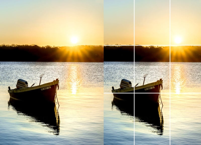
Rule of thirds grid showing optimal subject placement
The rule of thirds has been my go-to guideline for years. By dividing an image into nine equal parts using two horizontal and two vertical lines, I create four intersection points where I can place key elements for maximum impact. This simple approach immediately creates more dynamic and engaging compositions than centering everything.
Another technique I rely on is identifying and enhancing leading lines through cropping. When I spot natural lines in an image—roads, railings, shorelines, or architectural elements—I crop to emphasize how these lines guide the viewer's eye toward the main subject. This creates a more immersive viewing experience as the audience is subtly directed through the image.
I've also come to appreciate the power of negative space. Sometimes what you exclude is as important as what you include. By strategically cropping to create empty space around a subject, I can create a sense of isolation, emphasis, or breathing room that draws even more attention to the main element.
                    flowchart LR
                        A[Original Image] --> B{Composition Analysis}
                        B --> C[Rule of Thirds]
                        B --> D[Leading Lines]
                        B --> E[Negative Space]
                        B --> F[Visual Balance]
                        C --> G[Align Key Elements
with Intersection Points]
                        D --> H[Crop to Emphasize
Directional Elements]
                        E --> I[Create Breathing Room
Around Subject]
                        F --> J[Distribute Visual Weight
Across Frame]
                        G & H & I & J --> K[Optimized Composition]
When seeking inspiration for my cropping decisions, I often use AI image search tools to find examples of similar subjects with effective composition. PageOn.ai's Deep Search feature is particularly useful for this, as it helps me discover composition examples that might not have occurred to me otherwise.
Advanced Composition Strategies
As I've developed my design skills, I've incorporated more sophisticated composition approaches. The golden ratio (approximately 1:1.618) has been used by artists for centuries to create naturally appealing compositions. When I apply this principle to cropping, I'm essentially tapping into a mathematical relationship that humans instinctively find pleasing.

Comparison of symmetrical vs. asymmetrical composition approaches
The choice between symmetry and asymmetry is another important consideration in my cropping decisions. Symmetrical compositions create a sense of formality, stability, and elegance—perfect for architectural photography or formal portraits. Asymmetrical compositions, on the other hand, tend to feel more dynamic and casual, often creating more visual interest and tension.
I've found that "framing within the frame" is another powerful technique. By cropping to include natural frames—like doorways, windows, arches, or tree branches—I create additional layers of context that draw attention inward toward the main subject. This technique adds depth and helps direct the viewer's focus exactly where I want it.
Overlapping elements can create a sense of depth and connection between components in a design. When I crop images to maintain or create strategic overlaps, I'm establishing relationships between different elements that might otherwise feel disconnected. This is particularly effective when working with multiple images in a layout or creating collages.
These advanced composition techniques may seem complex, but with practice, they become intuitive parts of your visual thinking process. I recommend experimenting with different approaches to discover which ones resonate most with your personal style and the specific needs of your projects.
Alignment Principles That Transform Designs
In my design career, I've witnessed how proper alignment can instantly elevate an amateur design to a professional one. Alignment creates order, clarity, and connection between elements—it's the invisible structure that holds everything together.
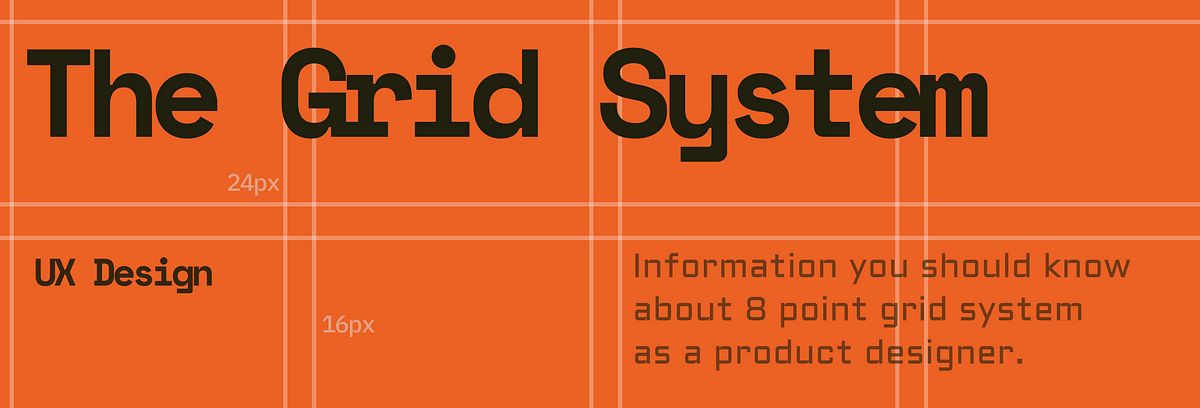
Grid system visualization with aligned elements
Grid systems form the invisible framework for professional alignment. When I'm working on complex layouts, I always establish a grid first—whether it's columns for a website, a modular grid for a publication, or a simple rule-of-thirds grid for a single image. This ensures that all elements have a logical relationship to each other and to the overall space.
The choice between edge alignment and center alignment significantly impacts the feel of a design. Edge alignment (aligning elements to the left, right, top, or bottom edges) typically creates a more structured, organized appearance. Center alignment often feels more formal or ceremonial. I choose between these approaches based on the tone I want to establish and the content I'm working with.
Creating visual rhythm through consistent alignment patterns is another principle I apply regularly. When multiple elements follow the same alignment pattern, they create a sense of unity and flow that guides the viewer through the content. This rhythm can be established through consistently aligned margins, equal spacing between elements, or repeating alignment points.
Sometimes, I deliberately break alignment to create productive tension. This technique, when used sparingly and intentionally, can draw attention to specific elements and add visual interest. However, I'm careful to ensure that these breaks in alignment feel purposeful rather than accidental—the difference between an interesting design choice and a mistake.
When exploring different alignment options, I find that AI image generation tools can help visualize alternatives quickly. PageOn.ai's conversational interface makes it especially easy to experiment with different alignment approaches without getting bogged down in technical details.
Tension and Balance in Alignment
Visual tension isn't always negative—it can create energy and interest when used deliberately. I've learned to identify when misalignment creates uncomfortable tension versus productive tension. The key is intention: random misalignments feel sloppy, while strategic breaking of alignment can feel bold and purposeful.
                    flowchart TD
                        A[Design Elements] --> B{Alignment Decision}
                        B --> C[Strict Grid Alignment]
                        B --> D[Intentional Misalignment]
                        C --> E[Creates Order & Stability]
                        D --> F[Creates Energy & Focus]
                        E --> G[Best for: Information-heavy
Content, Technical Data,
Formal Communications]
                        F --> H[Best for: Creative Projects,
Attention-grabbing Ads,
Artistic Expression]
                        G & H --> I[Balanced Design Solution]
Creating connections between elements through deliberate alignment choices is something I focus on in every project. When elements share alignment points, they establish a visual relationship even if they differ in other ways. This technique helps unify diverse components in a cohesive design.
Balancing text and images through thoughtful alignment decisions is particularly important in content-heavy designs. I pay special attention to how text wraps around images, how headings align with visual elements, and how the overall text block relates to nearby graphics. These relationships can either strengthen or weaken the overall communication.
PageOn.ai has been invaluable for experimenting with different alignment approaches without technical barriers. Its ability to quickly generate multiple layout options allows me to see how subtle alignment changes affect the overall design before committing to a direction.
Technical Implementation Across Platforms
Moving from theory to practice, I've found that each platform has its own cropping considerations. What works perfectly on one platform might be problematic on another, so I always plan my cropping strategy with the end destination in mind.

Cross-platform image cropping comparison
Social media platforms each have their own preferred image dimensions and aspect ratios. Instagram favors square (1:1) for standard posts and vertical (9:16) for stories. Twitter displays images at 16:9 in feeds. LinkedIn prefers 1.91:1 for link images. These differences mean I often need to create multiple crops of the same image for different platforms.
Websites present their own challenges, especially with responsive design. Images need to maintain their impact across device sizes, from large desktop monitors to small smartphone screens. I've learned to identify the critical portion of each image—the area that must remain visible regardless of cropping—and ensure that area is preserved across all viewport sizes.
| Platform | Optimal Aspect Ratio | Recommended Resolution | Special Considerations |
|---|---|---|---|
| Instagram Feed | 1:1 (Square) | 1080 × 1080px | Center focal point for thumbnail view |
| Instagram Stories | 9:16 (Vertical) | 1080 × 1920px | Keep key elements away from edges |
| Facebook Feed | 1.91:1 | 1200 × 630px | Text may overlay top/bottom portions |
| Twitter Image | 16:9 | 1200 × 675px | Center focus for timeline view |
| Website Header | 3:1 or 4:1 | 1920 × 480px | Consider responsive cropping on mobile |
| Print (8.5×11") | 8.5:11 | 2550 × 3300px (300dpi) | Include bleed area if needed |
Print materials have their own requirements, including higher resolution (typically 300dpi) and considerations for bleed areas if the image extends to the edge of the paper. When preparing images for print, I always account for how cropping might affect the final printed result, especially if the image contains critical details near the edges.
I've worked with various cropping tools, from the native features in online image cropping tools to professional software like Photoshop. Each has its strengths—Elementor is excellent for quick website image adjustments, while Photoshop offers more precise control for detailed work. The key is choosing the right tool for your specific needs and skill level.
For consistency across multiple images, I often create cropping automation workflows. Using actions in Photoshop or batch processing in Lightroom saves tremendous time when preparing large sets of images that need identical treatment. This approach ensures visual consistency while reducing repetitive manual work.
PageOn.ai has been helpful for visualizing how images will appear across different platforms. Its preview capabilities let me see how my cropping decisions will translate across various devices and contexts before finalizing my work.
Troubleshooting Common Cropping Issues
Image quality loss during cropping and resizing is one of the most common problems I encounter. To minimize this, I always start with the highest resolution image available and crop before resizing whenever possible. This preserves detail in the areas that remain after cropping.
                    flowchart TD
                        A[Identify Cropping Issue] --> B{Issue Type?}
                        B -->|Quality Loss| C[Start with Higher Resolution]
                        B -->|Distortion| D[Lock Aspect Ratio]
                        B -->|Poor Focal Point| E[Use Rule of Thirds]
                        B -->|Subject Cropping| F[Leave Breathing Room]
                        C --> G[Crop Before Resizing]
                        D --> H[Maintain Width:Height Ratio]
                        E --> I[Place Key Elements at Intersections]
                        F --> J[Consider Subject Movement Space]
                        G & H & I & J --> K[Resolved Issue]
Distortion problems occur when aspect ratios are compromised. I always lock the aspect ratio when resizing images to prevent stretching or squishing. If I need to fit an image into dimensions with a different aspect ratio, I crop first to match the target ratio, then resize.
Managing focal points becomes challenging when automatic cropping is applied, such as in responsive web designs or social media platforms that crop thumbnails automatically. I address this by ensuring the most important elements are centered or positioned according to the rule of thirds, making them less likely to be cropped out in automatic adjustments.
Different subjects present unique cropping challenges. For portraits, I'm careful not to crop at joints (like knees, elbows, or wrists) as this creates an awkward appearance. For landscapes, I ensure the horizon is straight and positioned according to composition principles. For products, I maintain consistent cropping across a product line to create visual cohesion.
When using CapCut AI image generation or similar tools, I've noticed they sometimes create unusual cropping artifacts. In these cases, I make sure to review the output carefully and make manual adjustments as needed to ensure professional quality.
Creative Applications Beyond Basic Cropping
While mastering the fundamentals is essential, I've found that exploring creative applications of cropping can truly set your work apart. Let me share some approaches I've developed that go beyond basic adjustments.

Creative cropping for marketing materials
Using creative cropping to direct attention in marketing materials is one of my favorite techniques. By cropping an image so that lines or elements point toward a product or call-to-action, I create a subtle visual guide that leads the viewer's eye exactly where I want it. This can be more effective than obvious arrows or explicit directions.
Storytelling through sequential cropping works wonderfully for presentations and social media carousels. I'll take a single image and create a series of progressively tighter crops that reveal details in a narrative sequence. This technique creates a journey of discovery that engages viewers more deeply than showing the entire image at once.
Creating custom image masks and shapes through advanced cropping is another technique that adds distinctive character to designs. Rather than standard rectangular crops, I sometimes use circular, triangular, or organic shapes that complement the content or brand identity. This approach can transform ordinary images into unique visual elements.
Combining cropping with other effects—like color adjustments, blurring, or overlays—creates distinctive visual styles. For example, I might tightly crop a portrait, convert it to black and white, and increase the contrast for a dramatic effect. These combinations create signature looks that can define a brand's visual identity.
PageOn.ai's AI-powered suggestions have been surprisingly helpful for discovering unexpected creative cropping approaches. The system sometimes proposes cropping options I wouldn't have considered, leading to fresh perspectives and innovative solutions. This collaboration between human creativity and AI assistance has produced some of my most interesting work.
Practical Workflow Integration
Turning theory into practice requires efficient workflows. Over the years, I've developed systematic approaches to image cropping that save time while ensuring consistent quality across projects.
                    flowchart TD
                        A[Image Selection] --> B[Define Output Requirements]
                        B --> C[Create Master Template]
                        C --> D[Batch Process Similar Images]
                        D --> E[Quality Check]
                        E -->|Issues Found| D
                        E -->|Approved| F[Export Final Versions]
                        F --> G[Organize by Platform/Purpose]
                        G --> H[Document Process for Team]
Efficient image cropping workflow process
Establishing efficient cropping protocols for consistent brand imagery starts with clear guidelines. I create documented standards that specify aspect ratios, composition approaches, and focal point priorities for different types of content. This ensures that anyone working on the brand's visuals can maintain consistency.
For recurring content needs, I develop cropping templates that can be applied efficiently. These might be Photoshop actions, Lightroom presets, or simply documented specifications. Templates are particularly valuable for social media content, product photography, team headshots, or any visual elements that appear repeatedly in a brand's communications.
Clear communication about cropping intentions with team members is essential for collaborative projects. I use annotation tools to mark intended crop areas and include notes about the reasoning behind specific cropping decisions. This prevents misunderstandings and ensures everyone understands the visual strategy.
:quality(75))
Professional cropping template with measurement guides
A cropping decision tree helps streamline the process for different content types and platforms. This flowchart guides decisions based on content purpose, platform requirements, and brand guidelines. For example, product photos might follow one branch of the decision tree, while team photos follow another, each with specific cropping parameters.
PageOn.ai has significantly streamlined my workflow by allowing me to quickly visualize and implement cropping decisions. Its ability to show multiple cropping options simultaneously helps me make faster, more confident choices, especially when working with clients who need to approve visual directions.
Measuring Success and Refining Your Approach
How do you know if your cropping decisions are effective? In my experience, measuring success and continuously refining your approach is essential for growth as a visual communicator.
A/B testing different cropping approaches has been invaluable for measuring audience engagement. By creating multiple versions of the same content with different cropping decisions and tracking which ones perform better, I gather concrete data about what resonates with my audience. This empirical approach removes some of the subjectivity from design decisions.
Heat maps provide fascinating insights into how cropping affects viewer attention. By analyzing where users look and click, I can see whether my cropping decisions are directing attention as intended. This data often reveals surprising patterns that inform future cropping strategies.
Gathering feedback from different stakeholders provides diverse perspectives on cropping effectiveness. I regularly solicit input from clients, colleagues, target audience members, and even people outside the target demographic. Each group notices different aspects of the visual presentation, providing a more complete picture of how my cropping choices are perceived.
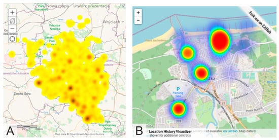
Heat map comparison of user attention on differently cropped images
Developing your "cropping eye" requires deliberate practice and analysis. I regularly study the work of photographers and designers I admire, analyzing their cropping decisions and trying to understand the reasoning behind them. I also review my own past work critically, identifying what worked well and what could be improved.
PageOn.ai has been particularly helpful for quickly generating multiple cropping options for testing and comparison. Its ability to produce variations based on different principles allows me to efficiently explore alternatives and select the most effective approach.
Future Trends in Image Cropping and Alignment
As technology evolves, so do the possibilities for image cropping and alignment. I'm particularly excited about several emerging trends that are changing how we approach these fundamental design tasks.

Next-generation AI-assisted cropping technology interface
AI-assisted cropping technologies are already transforming the field. These tools can analyze image content to identify optimal crop points based on subject recognition, composition principles, and even emotional impact. While they won't replace human judgment, they're becoming increasingly valuable as assistants that can suggest options and handle routine cropping tasks efficiently.
Responsive cropping that adapts to viewer behavior is another fascinating development. Imagine images that dynamically adjust their cropping based on how users interact with them or what aspects they show interest in. This personalized approach could significantly enhance engagement by tailoring visual content to individual preferences.
                    flowchart TD
                        A[Future Cropping Technologies] --> B[AI-Assisted Cropping]
                        A --> C[Responsive Dynamic Cropping]
                        A --> D[AR/VR Integration]
                        A --> E[Ethical AI Cropping]
                        B --> B1[Subject Recognition]
                        B --> B2[Composition Analysis]
                        B --> B3[Emotional Impact Prediction]
                        C --> C1[User Behavior Adaptation]
                        C --> C2[Context-Aware Adjustments]
                        C --> C3[Real-time Optimization]
                        D --> D1[Spatial Awareness]
                        D --> D2[Depth-Based Cropping]
                        D --> D3[Interactive Boundaries]
                        E --> E1[Diversity Representation]
                        E --> E2[Bias Detection]
                        E --> E3[Cultural Sensitivity]
Integration of cropping with augmented and virtual reality experiences introduces entirely new dimensions to consider. In these immersive environments, cropping becomes more about defining spatial boundaries and focal areas within three-dimensional spaces. Designers will need to develop new skills for guiding attention and creating composition in these emerging mediums.
Ethical considerations in automated cropping are becoming increasingly important. As AI systems make more cropping decisions, we must ensure they don't perpetuate biases or misrepresent content. Developing frameworks for ethical automated cropping is an important challenge the industry is beginning to address.
PageOn.ai's evolving capabilities are helping designers stay ahead of these emerging trends. Its combination of AI assistance with human control represents the balanced approach that I believe will define the future of image cropping and alignment—technology that enhances rather than replaces human creativity and judgment.
Transform Your Visual Expressions with PageOn.ai
Ready to take your image cropping and alignment skills to the next level? PageOn.ai provides intuitive tools that help you visualize multiple options, experiment with different approaches, and implement professional-quality cropping decisions—all without technical complexity.
Start Creating with PageOn.ai TodayConclusion: Developing Your Visual Mastery
As we've explored throughout this guide, mastering image cropping and alignment is both an art and a science. It combines technical understanding with creative intuition, and it's a skill that continuously develops through practice and experimentation.
I've found that the most successful approach is to start with solid fundamentals—understanding aspect ratios, composition principles, and alignment techniques—and then develop your own style through deliberate practice and analysis. Pay attention to how cropping choices affect the emotional impact and message of your images, and don't be afraid to break rules intentionally when it serves your purpose.
Remember that tools like PageOn.ai can significantly streamline your workflow and help you discover new possibilities. By leveraging AI assistance while maintaining creative control, you can achieve more sophisticated results in less time, freeing you to focus on the strategic aspects of your visual communication.
I encourage you to approach image cropping and alignment not just as technical tasks but as powerful storytelling tools. With practice and attention to detail, these fundamental skills will elevate all your visual communication, whether you're designing websites, creating marketing materials, or sharing your personal creative vision with the world.
You Might Also Like
Transform Raw Text Data into Compelling Charts: AI-Powered Data Visualization | PageOn.ai
Discover how AI is revolutionizing data visualization by automatically creating professional charts from raw text data. Learn best practices and real-world applications with PageOn.ai.
Transform Presentation Anxiety into Pitch Mastery - The Confidence Revolution
Discover how to turn your biggest presentation weakness into pitch confidence with visual storytelling techniques, AI-powered tools, and proven frameworks for pitch mastery.
Transform Any Content into Professional Slides: The Ultimate Conversion Guide
Learn expert techniques for converting documents, presentations, and visual content into professional slides with this comprehensive guide to content format transformation.
Mastering FOMO Psychology: Creating Irresistible Business Pitch Strategies | PageOn.ai
Learn how to leverage FOMO psychology in your business pitches to drive urgent action. Discover proven strategies for creating authentic scarcity, exclusivity, and urgency that converts.