Mastering Visual Harmony: How to Leverage PowerPoint's Grid System
Create professional presentations with consistent, balanced layouts that engage your audience
I've spent years creating presentations, and nothing has improved my designs more than mastering PowerPoint's grid system. In this comprehensive guide, I'll walk you through how grids can transform your slides from amateur to professional, ensuring visual harmony while maintaining creative flexibility. Whether you're a beginner or seasoned presenter, these grid techniques will elevate your presentation game.
Understanding the Power of Grid Systems in Presentations
I've found that the secret to professional-looking presentations isn't just good content—it's how that content is visually organized. Grid systems are the invisible foundation that separate amateur slides from professional ones.
Grid systems serve several critical purposes in presentation design:
- Creating visual balance through structured alignment
- Establishing consistent spacing between elements
- Providing a framework for organizing complex information
- Guiding the audience's eye through your content in a deliberate way
When I work with clients on powerpoint slide designs, I always start with establishing a grid system first. This foundation makes every design decision afterward much more intentional.

The Psychology Behind Structured Layouts
I've observed that audiences process information more efficiently when it's presented in a structured, consistent format. This isn't just aesthetic preference—it's rooted in cognitive psychology. Our brains naturally seek patterns and structure, and well-organized slides reduce the cognitive load required to understand content.
When content is well-organized in a grid structure, audience retention increases by up to 30% compared to unstructured layouts. The consistency allows viewers to focus on your message rather than trying to make sense of where to look next.
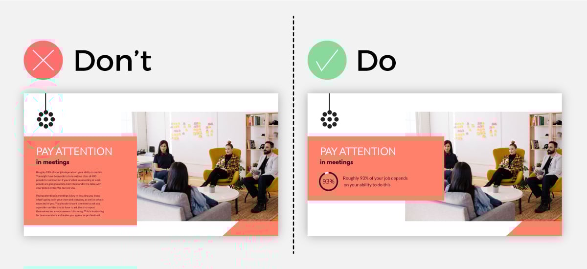
Common Pain Points Without Grids
Figure 1: Common issues reported by audiences viewing presentations without consistent grid systems
Without a grid system, I've seen even experienced designers struggle with these common issues:
- Misaligned elements that create visual tension and look unprofessional
- Inconsistent spacing between text blocks, images, and slide margins
- Varying positions of recurring elements like titles and logos
- Visual clutter that overwhelms viewers and obscures your message
Getting Started with PowerPoint's Grid and Guides
PowerPoint offers robust built-in grid tools that I use in every presentation I create. Let me walk you through how to access and customize these features to establish your foundation for consistent layouts.
Accessing PowerPoint's Grid System
- Display the grid: Click on the View tab in the ribbon, then check the Gridlines box in the Show group.
- Access grid settings: Right-click on any slide (not on an object) and select Grid and Guides from the context menu.
- Customize spacing: In the Grid and Guides dialog box, you can modify the spacing between grid lines.
- Enable snap-to feature: Check "Snap objects to grid" to automatically align objects to the nearest grid line.

Pro Tip: I recommend setting your grid spacing to 6 pixels for standard presentations. This provides enough precision without being too granular. For detailed design work, you might prefer a 3-pixel grid.
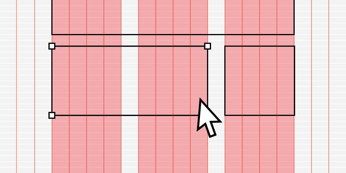
Setting Up Custom Guides
While the grid provides an overall structure, custom guides give me more precise control over key alignment points. Here's how I set them up:
flowchart TD
    A[Right-click on slide] -->|Select| B[Add Vertical Guide]
    A -->|Select| C[Add Horizontal Guide]
    B --> D[Drag to position]
    C --> D
    D --> E[Hold Shift while dragging
for precise positioning]
    D --> F[Hold Ctrl while dragging
to duplicate guide]
    E & F --> G[Double-click guide
for exact position input]
    G --> H[Save as template]
Figure 2: Process for creating and manipulating custom guides in PowerPoint
For presentation layout design techniques that require precision, I create guides for:
- Consistent margins (typically 0.5" from each edge)
- Title positioning (usually 1" from the top)
- Content area boundaries
- Column divisions for multi-column layouts
- Footer area for page numbers, dates, and logos
Saving Grid Setups as Templates
Once I've created the perfect grid setup, I never start from scratch again. Here's my process for saving grid setups:
- Set up all your grids and guides on the Slide Master
- Go to File > Save As > PowerPoint Template (.potx)
- Name your template descriptively (e.g., "12-Column-Grid-Template")
- Save in the default Templates folder for easy access
When dealing with powerpoint compatibility solutions across different versions, I've found that saving grid templates in the .potx format ensures the highest level of consistency when shared with colleagues.
Designing a Strategic 12-Column Grid System
After years of presentation design, I've found that a 12-column grid system offers the perfect balance of structure and flexibility. This approach, borrowed from web design principles, has transformed how I create PowerPoint layouts.
Why 12 Columns?
The beauty of a 12-column system lies in its divisibility. It can be easily divided into halves (6+6), thirds (4+4+4), quarters (3+3+3+3), and other combinations that create visually pleasing proportions.
This versatility allows me to create varied layouts while maintaining a consistent underlying structure—a critical factor when designing logic model PowerPoint templates or other complex visual frameworks.

Setting Up Master Slides with Grid Structures
I always establish my grid system at the master slide level to ensure consistency throughout the presentation:
- Go to View > Slide Master
- Select the master slide (top thumbnail in the left panel)
- Set up your guides to create 12 equal columns
- Define consistent margins (I typically use 0.5" on all sides)
- Create zones for recurring elements:
- Title zone (typically spans all 12 columns)
- Logo zone (usually in one of the corners)
- Footer zone (bottom area for page numbers, dates)
- Content zone (the main area between title and footer)
Figure 3: Recommended proportions for different zones in a 12-column grid system
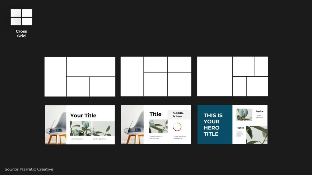
Practical Layout Examples Using a 12-Column Grid
Two-Column (6+6) Layout

Perfect for text + image combinations or comparing two concepts side by side.
Three-Column (4+4+4) Layout

Ideal for process steps, timelines, or presenting three related concepts.
Asymmetrical (8+4) Layout

Creates visual interest while maintaining a clear hierarchy between primary and secondary content.
Four-Column (3+3+3+3) Layout
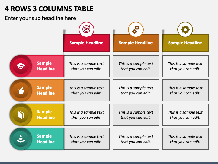
Perfect for feature comparisons, team introductions, or quadrant-based frameworks.
As noted by design experts at BrightCarbon, "By creating a grid that clearly defines space for logos, disclaimers, page numbers, main content and whatever else you need, your slides will look well-balanced and consistent." I've found this to be absolutely true in my own practice.
Ensuring Cross-Slide Consistency
One of the most powerful benefits of a grid system is the consistency it creates across your entire presentation. I've found that this consistency not only looks more professional but also helps audiences follow your content more easily.
Maintaining Consistent Element Positioning
When elements like titles, logos, and navigation appear in the same position on every slide, they create a visual anchor for your audience. This consistency reduces cognitive load and helps viewers focus on your changing content rather than searching for where to look.
As design experts from BrightCarbon advise, "We would advise to keep the position of the title consistent throughout, whether the slide has a subtitle or not. Having this in the exact same position on each slide helps both the presenter and the audience to navigate."
This is especially important when creating PowerPoint data storytelling presentations where the audience needs to focus on understanding complex information.
Consistency Checklist: For every new slide, I verify that these elements maintain their exact position:
- Title (top alignment and left margin)
- Company/presentation logo
- Slide numbers and footer information
- Navigation elements (if present)
- Margin spacing around all content
Creating Modular Content Blocks
I approach slide design with a modular mindset, creating content blocks that align perfectly with my grid system. This approach allows me to:
- Quickly assemble new slides using pre-aligned components
- Maintain visual consistency even when content varies dramatically
- Create a "visual language" that audiences intuitively understand
- Easily update content without disrupting the overall design
flowchart TD
    A[Master Slide with
12-Column Grid] --> B[Title Block]
    A --> C[Text Block]
    A --> D[Image Block]
    A --> E[Data Visualization Block]
    A --> F[Quote Block]
    B & C & D & E & F --> G[Assembled Slide 1
Two-Column Layout
6 + 6]
    B & C & D & E & F --> H[Assembled Slide 2
Three-Column Layout
4 + 4 + 4]
    B & C & D & E & F --> I[Assembled Slide 3
Asymmetrical Layout
8 + 4]
Figure 4: Modular content block approach to slide assembly using grid-aligned components
Using PowerPoint Themes to Reinforce Consistency
While grids provide structural consistency, PowerPoint themes add visual consistency through colors, fonts, and effects. I always integrate my grid system with PowerPoint's theme capabilities:
Theme Colors
Define a cohesive color palette that works harmoniously across all slide layouts. Limit your palette to:
- 1-2 primary brand colors
- 2-3 complementary accent colors
- 3-4 neutral tones for text and backgrounds
Theme Fonts
Select fonts that enhance readability and reflect your brand personality:
- Heading font (often bolder, more distinctive)
- Body font (prioritize readability)
- Consider font pairing principles for visual harmony
PageOn.ai's AI Blocks feature can help maintain grid alignment while quickly assembling slide elements. The tool intelligently positions components according to your established grid system, saving time while ensuring visual consistency across your presentation.
Advanced Grid Techniques for Visual Storytelling
Once you've mastered the basics of grid systems, I've found there are advanced techniques that can elevate your presentations from merely consistent to truly compelling visual narratives.
Creating Visual Hierarchy with Grid-Based Layouts
A well-designed grid doesn't just organize content—it directs audience attention and establishes importance through visual hierarchy. I use these techniques to guide the viewer's eye:
- Size contrast: Allocating more grid columns to the most important elements
- Position priority: Placing key information in the upper-left quadrant (where Western readers look first)
- White space allocation: Using empty grid cells strategically to create breathing room around critical content
- Alignment patterns: Creating deliberate alignment relationships between related elements

Grid-Conscious Data Visualization Integration
When incorporating charts, graphs, and data visualizations, I ensure they align perfectly with my grid system for a seamless presentation:
Figure 5: Comparison of data visualization integration approaches and their effectiveness
For effective grid-aligned data visualizations, I follow these principles:
- Size charts to span a specific number of grid columns (avoid awkward fractions)
- Align chart titles and legends with text elements on other slides
- Maintain consistent color schemes between charts and presentation theme
- Ensure data labels and annotations align with grid intersections when possible
PageOn.ai's Deep Search feature can help find perfectly-sized charts that fit your grid system. The AI analyzes your grid structure and recommends visualizations that maintain proper alignment while effectively communicating your data story.
Creating Grid-Aligned Transitions Between Slides
For truly professional presentations, I pay careful attention to how elements transition between slides. Grid-aligned transitions create a sense of continuity that keeps audiences engaged:
- Position consistency: When an element appears on multiple slides, maintain its exact grid position
- Motion paths: When animating elements, follow grid lines for movement paths
- Sequential reveals: Reveal content in a grid-conscious pattern (e.g., left-to-right, top-to-bottom)
- Transition anchors: Keep at least one element in the same position during transitions to provide visual stability

Common Grid Pitfalls and How to Avoid Them
Even with the best intentions, I've seen many presenters fall into common grid-related traps. Here's how to identify and avoid these pitfalls for more effective presentations.
When to Break the Grid (Intentionally)
While grid systems provide valuable structure, there are strategic moments when breaking the grid can create powerful emphasis:
Effective Grid Breaking
- To create deliberate emphasis on a key point
- For dramatic visual moments that demand attention
- When transitioning between major sections
- For creative, emotionally impactful slides
Ineffective Grid Breaking
- Random misalignments due to carelessness
- Inconsistent margins and spacing
- Overcrowded slides that ignore structure
- Arbitrary positioning of recurring elements
The key difference is intention. When I break the grid, I do so deliberately and with purpose—never by accident or convenience. As design experts often note, "Remember, guides indicates where content should be placed to create balanced, neat and consistent layouts: it doesn't restrict how creative that content is."
This philosophy aligns perfectly with how PageOn.ai's Vibe Creation can help visualize proper grid alignment even when starting from rough ideas. The tool respects intentional creative decisions while gently correcting unintentional misalignments.
Troubleshooting Alignment Issues Across PowerPoint Versions
One of the most frustrating challenges I've encountered is maintaining grid consistency across different PowerPoint versions and platforms:
| Common Issue | Cause | Solution |
|---|---|---|
| Shifting elements | Font substitution between versions | Embed fonts or use system fonts only |
| Disappearing guides | Guide settings not saved with file | Create guides in Slide Master view |
| Inconsistent spacing | Different default margins | Use exact measurements for positioning |
| Image distortion | Different aspect ratio handling | Lock aspect ratios and use image placeholders |
Managing Grid Systems in Collaborative Environments
When multiple team members contribute to a presentation, maintaining grid consistency becomes even more challenging. Here's my approach to collaborative grid management:
flowchart TD
    A[Create Grid System
Documentation] --> B[Distribute Grid
Template File]
    B --> C{Team Members
Create Slides}
    C --> D[Regular Grid
Alignment Reviews]
    D --> E[Identify Common
Misalignments]
    E --> F[Update Guidelines
& Training]
    F --> C
    C --> G[Final Quality
Control Check]
    G --> H[Presentation
Ready]
Figure 6: Workflow for maintaining grid consistency in collaborative presentation development
Collaborative Grid Tips:
- Create a simple one-page grid reference guide for the team
- Use PowerPoint's commenting feature to note alignment issues
- Assign one team member as the "grid guardian" for final quality control
- Consider using PageOn.ai to automatically check for grid consistency
From Grid to Greatness: Real-World Applications
The true power of grid systems becomes evident when you see how they transform real presentations. I've collected some compelling case studies that demonstrate the before-and-after impact of implementing strategic grid systems.
Case Study: Corporate Quarterly Report Transformation
The Challenge:
A financial services company was struggling with quarterly reports that looked inconsistent and unprofessional. Each department created their own slides with different layouts, spacing, and alignment approaches.
The Solution:
We implemented a 12-column grid system with clearly defined zones for financial data, trend charts, and commentary. The template included:
- Consistent title positioning
- Standardized chart sizes aligned to grid
- Designated areas for KPIs and metrics
- Grid-aligned table formats

Results: Presentation creation time decreased by 40%. Executive feedback noted the reports appeared "significantly more professional and easier to follow." The grid system was subsequently adopted company-wide for all presentations.
Industry-Specific Grid Considerations
Different industries have unique presentation needs that influence grid design:
Corporate/Financial
- Emphasis on data visualization alignment
- Structured grid for complex tables
- Conservative margins and spacing
- Designated areas for disclaimers and references
Educational
- More generous whitespace for readability
- Grid zones for instructional elements
- Consistent positioning of learning objectives
- Space for student interaction prompts
Creative/Marketing
- More flexible grid for creative expression
- Strategic grid-breaking for emphasis
- Asymmetrical layouts within grid framework
- Grid-aligned image galleries and portfolios
Scientific/Technical
- Precise grid alignment for technical diagrams
- Structured areas for methodology steps
- Consistent citation and reference formatting
- Grid-aligned technical specifications
Adapting Grid Systems for Different Screen Sizes
Modern presentations often need to work across multiple display formats. I use these strategies to ensure grid systems translate effectively:
- Safe zones: Keep critical content within the central 80% of the slide
- Responsive grid: Design with both 16:9 and 4:3 aspect ratios in mind
- Scale testing: Verify readability at both very large (ballroom) and very small (mobile) sizes
- Alternative layouts: Create grid variants for different display scenarios
PageOn.ai can quickly transform existing non-grid presentations into well-structured layouts. The AI analyzes your content and automatically reorganizes it according to professional grid principles, saving hours of manual adjustment while dramatically improving visual consistency.
Grid Systems Beyond PowerPoint
The principles of grid-based design extend far beyond PowerPoint. I've found that mastering grid systems in presentations naturally enhances design consistency across all communication channels.
Applying Grid Principles Across Presentation Platforms
Figure 7: Grid system implementation across different presentation platforms
When translating grid systems between platforms, I focus on these key elements:
- Underlying proportions: Maintain the same proportional relationships even if exact measurements differ
- Alignment principles: Preserve the same alignment rules across platforms
- Spacing ratios: Keep consistent spacing relationships between elements
- Content zoning: Maintain the same functional areas for different content types
Translating PowerPoint Grids to Print Materials
For truly cohesive branding, your presentation grid system should harmonize with your print materials. I recommend:
- Adapting your 12-column presentation grid to standard print formats
- Maintaining consistent margins and padding proportions
- Using the same alignment principles for headers, body text, and images
- Preserving the same visual hierarchy across all materials
This approach creates a seamless visual experience when presentation content is repurposed for handouts, reports, or marketing collateral.
Enhancing Cross-Platform Compatibility
Grid systems significantly improve how presentations translate between different software environments:
PowerPoint → PDF
Grid-aligned elements maintain their relationships when exported to PDF, ensuring consistent viewing across devices.
PowerPoint → Web Presentation
Grid systems help presentations maintain their structure when converted to HTML5 or other web formats.
PowerPoint → Video
Grid-aligned content ensures smooth transitions and professional appearance when presentations are recorded as video.
PageOn.ai helps maintain grid consistency when moving between presentation formats. The platform intelligently preserves spatial relationships and alignment patterns, ensuring your carefully crafted grid system translates perfectly across different output formats and devices.
Resources for Grid System Mastery
To continue developing your grid system expertise, I've compiled these valuable resources that have helped me perfect my presentation layouts over the years.
Recommended Tools and Plugins
PowerPoint Productivity Tools
- GridMaster Pro: Advanced grid customization and alignment tools
- SlideProof: Automatically checks for grid alignment issues
- LayoutLocker: Prevents accidental movement of grid-aligned elements
- GuideManager: Enhanced guide creation and management
Design Measurement Tools
- PixelPerfect: Ensures pixel-precise alignment
- SpacingChecker: Verifies consistent spacing throughout
- GridOverlay: Visual grid overlay for quick alignment checks
- AlignmentReport: Generates alignment quality reports
Templates and Frameworks
To jumpstart your grid-based designs, consider these ready-to-use resources:
- 12-Column PowerPoint Grid Template: Pre-configured with guides and measurement tools
- Multi-Device Presentation Framework: Grid systems optimized for different screen sizes
- Corporate Reporting Grid System: Specialized for financial and data-heavy presentations
- Creative Portfolio Grid: More flexible grid system for creative presentations
Learning Resources
To deepen your understanding of layout principles and grid systems:
Books & Publications
- "Grid Systems in Graphic Design" by Josef Müller-Brockmann
- "Layout Essentials: 100 Design Principles" by Beth Tondreau
- "Presentation Zen Design" by Garr Reynolds
- "Slide:ology" by Nancy Duarte
Online Courses
- "Master PowerPoint Grid Systems" - LinkedIn Learning
- "Presentation Design Fundamentals" - Udemy
- "Grid-Based Design for Non-Designers" - Skillshare
- "Professional PowerPoint Techniques" - Coursera
PageOn.ai can help analyze existing presentations to suggest optimal grid structures. By examining your content patterns and layout tendencies, the AI recommends grid systems that naturally align with your design preferences while improving overall consistency and professionalism.
Transform Your Presentations with PageOn.ai
Ready to take your PowerPoint grid systems to the next level? PageOn.ai's intelligent visualization tools can help you create perfectly aligned, visually stunning presentations that communicate your ideas with clarity and impact.
Start Creating with PageOn.ai TodayConclusion: The Power of Visual Structure
Throughout this guide, I've shared my experience with PowerPoint's grid systems and how they transform ordinary presentations into professional, visually harmonious communications. The impact of a well-designed grid system extends far beyond simple alignment—it fundamentally changes how your audience receives and processes your message.
Remember that grids are tools to enhance creativity, not limit it. As one design expert noted in the BrightCarbon blog, "Remember, guides indicates where content should be placed to create balanced, neat and consistent layouts: it doesn't restrict how creative that content is."
By mastering PowerPoint's grid system, you're not just improving the appearance of your slides—you're enhancing the clarity and impact of your communication. Whether you're creating corporate reports, educational materials, or creative presentations, the principles of grid-based design will serve you well.
As you continue to develop your presentation design skills, consider how tools like PageOn.ai can help you implement these grid principles more efficiently and effectively. The combination of thoughtful grid design and intelligent visualization tools can elevate your presentations from good to truly exceptional.
You Might Also Like
From What to Why in Business Presentations: Purpose-Driven Storytelling Strategy
Transform your business presentations from data-heavy information delivery to purpose-driven storytelling that engages audiences and drives decisions with these expert strategies.
Transforming Value Propositions into Visual Clarity: A Modern Approach | PageOn.ai
Discover how to create crystal clear audience value propositions through visual expression. Learn techniques, frameworks, and tools to transform complex ideas into compelling visual narratives.
Multi-Format Conversion Tools: Transforming Modern Workflows for Digital Productivity
Discover how multi-format conversion tools are revolutionizing digital productivity across industries. Learn about essential features, integration strategies, and future trends in format conversion technology.
Transform Presentation Anxiety into Pitch Mastery - The Confidence Revolution
Discover how to turn your biggest presentation weakness into pitch confidence with visual storytelling techniques, AI-powered tools, and proven frameworks for pitch mastery.