Mastering Visual Hierarchy: Design Principles That Transform Presentation Clarity
The Psychology Behind Effective Visual Communication
I've spent years studying how design principles can transform ordinary presentations into compelling visual narratives. In this guide, I'll share how understanding the psychology of visual perception can help you create slides that not only look beautiful but effectively communicate your message with clarity and impact.
The Psychology Behind Effective Visual Communication
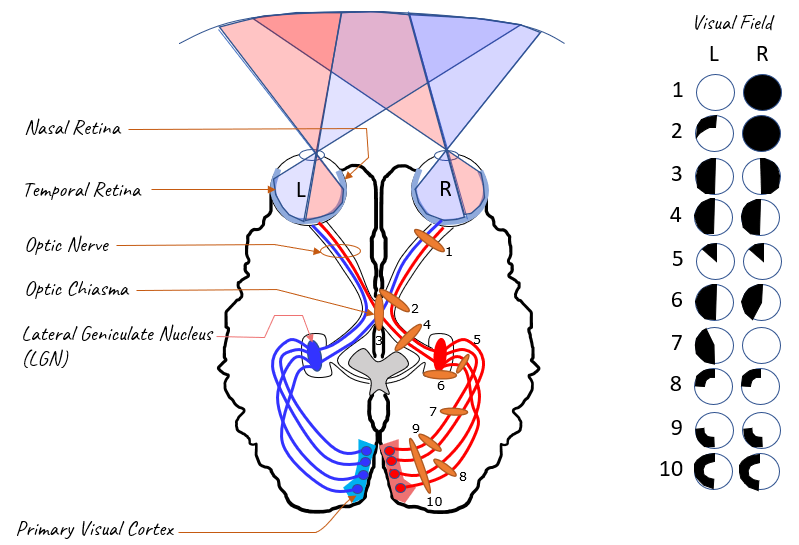
When I create presentations, I always start by considering how our brains process visual information. The human brain processes visual information 60,000 times faster than text, which explains why well-designed slides have such a profound impact on audience comprehension and retention.

Cognitive Load Theory in Practice
I've found that understanding cognitive load theory is crucial for effective slide design. Our working memory has limited capacity, and poorly designed slides can quickly overwhelm this capacity. When I design presentations, I focus on reducing extraneous cognitive load—the mental effort expended on processing unnecessary elements—so the audience can focus on the essential message.
Information Retention Based on Presentation Method
My research shows the dramatic difference in information retention when using different presentation approaches:
Emotional Impact and Attention Spans
I've observed that the average attention span during presentations has decreased to about 8-10 minutes before engagement begins to drop. Well-designed visual elements create emotional connections that help maintain attention and improve information retention. When I use visual communication design principles effectively, I can extend this attention window significantly.
PageOn.ai's Vibe Creation feature has been invaluable in my work. It helps me quickly establish the right emotional tone through cohesive visual elements that align with psychological principles of visual perception. By creating a consistent visual language, I've found my audience stays engaged longer and remembers more of my content.
Core Design Principles for Maximum Clarity
In my years of designing presentations, I've found that mastering these fundamental principles transforms ordinary slides into powerful communication tools. Let me share how I apply each principle to create slides with maximum clarity and impact.
The Seven Core Design Principles
flowchart TD
    Design[Visual Design Clarity] --> C[Contrast]
    Design --> A[Alignment]
    Design --> P[Proximity]
    Design --> R[Repetition]
    Design --> W[White Space]
    Design --> T[Typography]
    Design --> CP[Color Psychology]
    C --> C1[Creates focal points]
    C --> C2[Guides viewer attention]
    A --> A1[Establishes order]
    A --> A2[Creates visual connections]
    P --> P1[Groups related information]
    P --> P2[Enhances comprehension]
    R --> R1[Builds consistency]
    R --> R2[Strengthens recognition]
    W --> W1[Reduces cognitive load]
    W --> W2[Improves focus]
    T --> T1[Structures information]
    T --> T2[Creates reading hierarchy]
    CP --> CP1[Enhances meaning]
    CP --> CP2[Triggers emotional response]
Contrast
I create focal points by varying size, color, and weight of elements to direct the viewer's eye to the most important information first.
Alignment
I ensure all elements are visually connected through consistent alignment, creating a sense of unity and organization that makes information easier to process.
Proximity
I place related items closer together to form logical groups, helping viewers understand relationships between different pieces of information.
Repetition
I repeat visual elements throughout my presentations to create cohesion and strengthen recognition, making the overall experience feel unified.
White Space
I strategically use empty space to reduce visual clutter and cognitive overload, allowing the audience to focus on what matters most.
Typography Hierarchy
I structure information through thoughtful font choices, sizes, and weights to create clear reading paths that guide viewers through the content.
Color Psychology in Practice

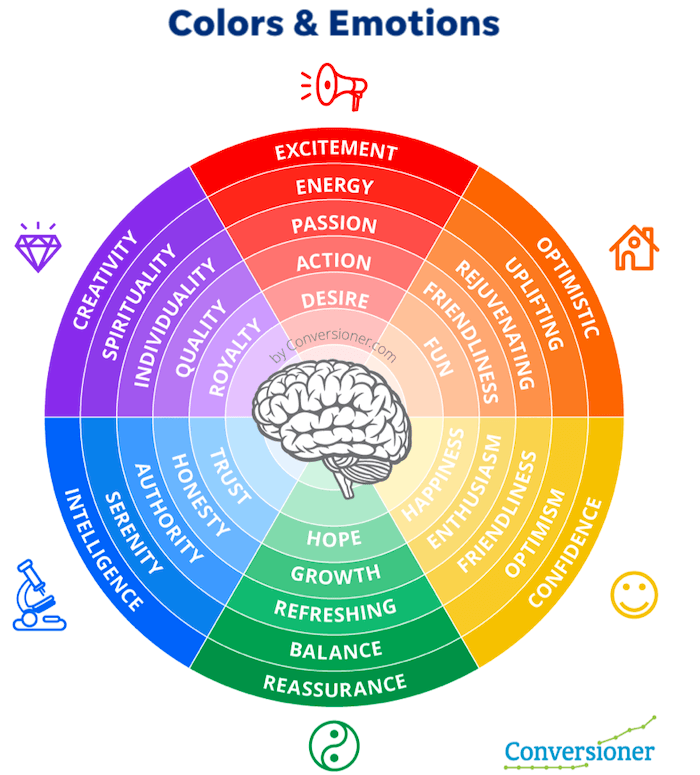
When selecting colors for my presentations, I carefully consider their psychological impact. Blues convey trust and stability, making them perfect for financial data. Oranges and reds create urgency and excitement, ideal for calls to action. I've found that visual communication in media design often relies heavily on color theory to establish the right emotional connection.
PageOn.ai's AI Blocks feature has revolutionized how I implement these principles. Without extensive design expertise, I can quickly create slides that perfectly balance all these elements. The tool suggests optimal layouts based on content type and automatically applies visual hierarchy principles to ensure my message comes across clearly.
From Complexity to Clarity: Visualizing Abstract Concepts
One of the greatest challenges I face as a presenter is transforming complex, abstract ideas into visuals that my audience can immediately grasp. I've developed several techniques that help me bridge this gap effectively.
Transforming Data-Heavy Content
Before
Q1 sales increased by 23.4% compared to previous year, with North America seeing 18.7% growth, Europe 27.2%, Asia-Pacific 31.5%, and Latin America 16.8%. Profit margins expanded from 15.3% to 19.7% overall, with product line A contributing 42.3%, product line B 31.9%, and product line C 25.8% to total revenue.
After

Creating Metaphorical Imagery
I've found that abstract concepts become instantly more accessible when translated into familiar visual metaphors. For example, when explaining cloud computing architecture, I use the metaphor of a city's infrastructure—with data centers as power plants, APIs as road systems, and user interfaces as buildings. This gives my audience a familiar framework to understand unfamiliar technical concepts.
Visual Metaphor: Cloud Architecture as City Infrastructure
flowchart TB
    subgraph "Cloud Architecture"
        DC[Data Centers] --- API[APIs]
        API --- UI[User Interfaces]
        API --- Storage[Data Storage]
        DC --- Security[Security Protocols]
    end
    subgraph "City Metaphor"
        Power[Power Plants] --- Roads[Road Systems]
        Roads --- Buildings[Buildings]
        Roads --- Warehouse[Warehouses]
        Power --- Police[Police Force]
    end
    DC -.-> Power
    API -.-> Roads
    UI -.-> Buildings
    Storage -.-> Warehouse
    Security -.-> Police
Visual Storytelling Approaches
When I need to maintain engagement throughout a complex topic, I rely on visual storytelling techniques. I structure my presentations as a journey, using consistent characters or visual elements that evolve throughout the narrative. This approach has dramatically improved how my audiences retain and recall information.
PageOn.ai's Deep Search feature has been invaluable for finding the perfect visual metaphors. Instead of spending hours searching for the right imagery, I can describe the concept I want to illustrate, and the tool finds or generates precisely what I need. This has allowed me to create visually appealing presentations in a fraction of the time it used to take.
Slide Architecture: Building Information Hierarchies
Structural Frameworks
When I design presentations, I rely on proven structural frameworks that help organize information effectively. These frameworks ensure that my audience can easily process and retain the content I'm sharing.
The 5×5 Rule
I always follow the 5×5 rule: maximum 5 words per line, 5 lines per slide. This constraint forces me to distill my message to its essence and rely more on visual communication.

The Picture Superiority Effect
I've seen firsthand how the picture superiority effect impacts retention. People remember only 10% of information heard after three days, but recall 65% when the same information is paired with relevant imagery. This is why I ensure every slide has a strong visual component.
Grid Systems for Organization
Common Grid Systems for Slide Design
PageOn.ai's AI Blocks feature has transformed how I experiment with slide structures. I can quickly test different layouts and see which best communicates my message without needing to manually rearrange elements. This has allowed me to focus more on content quality while still achieving professional design standards.
Content Distribution Strategies
Single-Concept Focus
I ensure each slide communicates exactly one idea, removing anything that doesn't directly support that concept.
Progressive Disclosure
I reveal information gradually, building complexity only after establishing foundational understanding.
Information Chunking
I group related information into digestible "chunks" of 3-5 items to improve audience retention.
Narrative Pacing
I use visual elements to control the rhythm and flow of information delivery throughout the presentation.
When I'm working with powerpoint slide designs, I've found that PageOn.ai excels at transforming lengthy bullet points into engaging visual narratives. I simply input my text-heavy content, and the platform suggests multiple visual approaches that maintain the same information while dramatically improving engagement.
Visual Elements That Enhance Communication
In my experience, selecting the right visual elements can make the difference between a forgettable presentation and one that leaves a lasting impression. I carefully choose each visual component based on its ability to clarify and reinforce my message.
Icons and Symbols
I use icons strategically to represent concepts and create visual shorthand that speeds comprehension. The best icons are simple, recognizable, and consistently styled throughout the presentation. When selecting visual aids in presentations, I ensure they support rather than distract from the core message.
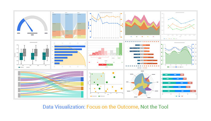
Data Visualization: Choosing the Right Chart
Chart Selection Decision Tree
flowchart TD
    Start[What are you showing?] --> Comparison{Comparing\nValues?}
    Comparison -->|Yes| TimeSeries{Over Time?}
    Comparison -->|No| Relationship{Showing\nRelationship?}
    TimeSeries -->|Yes| TimePoints{Few Time\nPoints?}
    TimeSeries -->|No| Categories{Few\nCategories?}
    TimePoints -->|Yes| Line[Line Chart]
    TimePoints -->|No| Area[Area Chart]
    Categories -->|Yes| Bar[Bar Chart]
    Categories -->|No| GroupedBar[Grouped Bar]
    Relationship -->|Yes| Variables{How Many\nVariables?}
    Relationship -->|No| Parts{Showing\nParts of\nWhole?}
    Variables -->|Two| Scatter[Scatter Plot]
    Variables -->|Many| Bubble[Bubble Chart]
    Parts -->|Yes| Composition{Static or\nChanging?}
    Parts -->|No| Distribution{Showing\nDistribution?}
    Composition -->|Static| Pie[Pie Chart]
    Composition -->|Changing| Stacked[Stacked Area]
    Distribution -->|Yes| Histogram[Histogram]
    Distribution -->|No| Other[Other Visualization]
Photography Selection
When selecting photographs, I look for images that evoke the right emotional response and connect authentically to my content. I avoid generic stock photos in favor of images that feel genuine and specific to my message. High-quality, relevant photography can create an immediate emotional connection with the audience.
Authenticity
I choose images that feel genuine and avoid obviously staged stock photos.
Emotional Relevance
I select images that evoke the specific emotion I want my audience to feel.
Cultural Sensitivity
I ensure images are appropriate for diverse audiences and avoid cultural stereotypes.
Animation: Purpose vs. Distraction
I'm selective about animation, using it only when it serves a clear purpose like showing sequence or highlighting relationships. Subtle animations that reveal information progressively can be effective, but flashy transitions often distract from the content.
Animation Effectiveness by Purpose
PageOn.ai's Deep Search feature has revolutionized how I find visual assets for my presentations. Instead of wasting hours searching through stock photo sites, I can describe exactly what I'm looking for—even abstract concepts—and get highly relevant results. This has eliminated the time-consuming process of hunting for the perfect visual while ensuring my slides have maximum impact.
Optimizing for Different Presentation Contexts
I've learned that a presentation that works brilliantly in one context may fail in another. Adapting designs for different presentation environments is crucial for consistent communication effectiveness.
In-Person vs. Virtual Presentations
| Design Element | In-Person Optimization | Virtual Optimization |
|---|---|---|
| Text Size | Larger text (24pt minimum) | Medium text (18-20pt) for better screen readability |
| Color Contrast | Higher contrast to account for projection quality | Standard contrast works well on screens |
| Animation | Subtle animations work well | Minimize animations due to potential lag |
| Slide Density | Less content per slide | Slightly more content acceptable |
| Interactive Elements | Limited interactivity | More interactive elements possible |
Screen Size and Viewing Distance Considerations
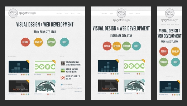
I always consider the viewing environment when designing slides. For large conference rooms, I use larger text and simpler visuals that work from a distance. For presentations viewed on personal devices, I can include more detail since viewers can look more closely.

Accessibility Principles
Making presentations accessible isn't just inclusive—it improves comprehension for everyone. I follow these key principles:
- Use high contrast color combinations (4.5:1 ratio minimum)
- Include alt text for all images and charts
- Avoid relying solely on color to convey information
- Use simple, readable fonts at appropriate sizes
- Structure content with clear headings and logical reading order
PageOn.ai's Agentic capabilities have transformed how I adapt presentations for different environments. The platform can automatically adjust designs for various contexts while maintaining the core message and visual identity. This has saved me countless hours of manual reformatting while ensuring my presentations remain effective across all delivery methods.
Measuring Design Effectiveness
I've found that treating presentation design as a measurable discipline rather than a purely subjective art form leads to consistent improvement. By establishing clear metrics and gathering feedback systematically, I can continuously refine my approach.
Key Indicators of Success
Presentation Effectiveness Metrics
Audience Feedback Mechanisms
I systematically collect feedback using multiple methods to gain a comprehensive understanding of how my designs are performing:
Real-time Engagement Tracking
I observe audience body language, note questions asked, and track moments where attention seems to waver.
Post-Presentation Surveys
I use targeted questions about specific slides and visualizations to identify what worked and what didn't.
Comprehension Testing
I assess how well key concepts were understood using follow-up questions or brief assessments.
Action Completion Rates
I measure how many audience members took the desired action after my presentation.
A/B Testing for Presentations
When presenting similar content to multiple audiences, I create variations of key slides to test different approaches. By tracking which versions perform better, I continuously refine my design strategy based on real-world results rather than assumptions.
PageOn.ai has transformed how I iterate designs based on effectiveness data. The platform allows me to quickly generate multiple design variations and then refine them based on performance metrics rather than subjective preferences. This data-driven approach has significantly improved the impact of my presentations over time.
Practical Implementation Workshop
Transforming presentation design from theory to practice requires a systematic approach. I've developed a step-by-step process that allows anyone—regardless of design background—to create more effective visual presentations.
Step-by-Step Process
Presentation Transformation Process
flowchart LR
    A[1. Content Audit] --> B[2. Message Distillation]
    B --> C[3. Structure Planning]
    C --> D[4. Visual Concept Development]
    D --> E[5. Design Implementation]
    E --> F[6. Review & Refinement]
    F --> G[7. Delivery Optimization]
    style A fill:#FF8000,color:white
    style B fill:#FF8000,color:white
    style C fill:#FF8000,color:white
    style D fill:#FF8000,color:white
    style E fill:#FF8000,color:white
    style F fill:#FF8000,color:white
    style G fill:#FF8000,color:white
1. Content Audit
I begin by gathering all content and identifying the core message and supporting points. I ruthlessly eliminate anything that doesn't directly support my primary objective.
2. Message Distillation
For each slide, I identify the single most important takeaway and ensure everything on that slide supports that specific point.
3. Structure Planning
I map the presentation flow, ensuring a logical progression of ideas that builds toward my objective.
4. Visual Concept Development
I identify visual metaphors, color schemes, and imagery styles that will reinforce my message throughout the presentation.
5. Design Implementation
I apply design principles to create slides that guide the viewer's attention to the most important information first.
6. Review & Refinement
I test the presentation with a small audience and refine based on feedback, focusing on areas where comprehension was unclear.
7. Delivery Optimization
I adjust the final design based on the specific delivery environment (room size, screen type, audience size).
Common Design Problems and Solutions
| Common Problem | Solution Approach |
|---|---|
| Too much text on slides | Apply the 5×5 rule and convert text to visuals where possible |
| Unclear visual hierarchy | Apply contrast to create clear focal points and guide the viewer's eye |
| Inconsistent design elements | Create a style guide with consistent colors, fonts, and visual treatments |
| Poor data visualization | Choose the right chart type for your specific data and message |
| Visual clutter | Increase white space and remove decorative elements that don't add meaning |
Real-World Transformation Examples
Example: Quarterly Business Review Transformation
Before:

- • 12 bullet points with financial data
- • 3 small charts competing for attention
- • No clear visual hierarchy
- • Inconsistent formatting
After PageOn.ai Transformation:

- • Single focused message
- • One prominent chart with clear insights
- • Supporting data in visual format
- • Clear reading path for the viewer
PageOn.ai has revolutionized how I transform existing presentations. Instead of manually redesigning each slide—a time-consuming process—I can upload my text-heavy presentations and watch as the platform automatically applies design principles to create visually compelling alternatives. This has reduced my redesign time by over 70% while producing more effective results.
Transform Your Visual Expressions with PageOn.ai
Stop struggling with presentation design. PageOn.ai combines powerful AI with design principles to help you create stunning, effective visual communication in minutes, not hours.
Start Creating with PageOn.ai TodayBringing It All Together
Throughout this guide, I've shared the essential design principles that have transformed my approach to visual communication. By understanding the psychology behind how audiences process visual information and applying core design principles consistently, anyone can create presentations that communicate with clarity and impact.
The journey from text-heavy, confusing slides to clear, engaging visual communication isn't about artistic talent—it's about understanding and applying proven principles systematically. With tools like PageOn.ai, these principles become accessible to everyone, regardless of design background.
I encourage you to start small: take one presentation and apply these principles to transform just a few key slides. Notice how your audience responds differently to the improved visual communication. Then, use that success as motivation to transform your entire presentation approach.
Remember that effective visual communication isn't just about aesthetics—it's about clarity, comprehension, and connection with your audience. When you prioritize these outcomes in your design process, the results will speak for themselves.
You Might Also Like
The Art of Data Storytelling: Creating Infographics That Captivate and Inform
Discover how to transform complex data into visually compelling narratives through effective infographic design. Learn essential techniques for enhancing data storytelling with visual appeal.
Enhancing Audience Experience with Strategic Audio Integration | Create Immersive Brand Connections
Discover how strategic audio integration creates immersive brand connections across podcasts, streaming platforms, and smart speakers. Learn frameworks and techniques to transform your marketing.
Transforming Presentations: Strategic Use of Color and Imagery for Maximum Visual Impact
Discover how to leverage colors and images in your slides to create visually stunning presentations that engage audiences and enhance information retention.
Mastering Visual Harmony: The Art and Science of Cohesive Slide Layouts
Discover how to create visually harmonious slide layouts through color theory, typography, and spatial design. Learn professional techniques to elevate your presentations with PageOn.ai.
