Transforming Presentations: The Strategic Use of Color and Imagery
Unlocking the power of visual elements to create memorable, impactful slides
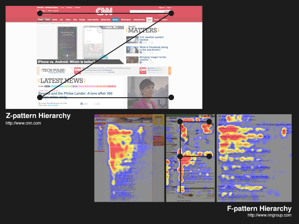
Understanding the Visual Foundation of Impactful Slides
I've always believed that the most memorable presentations are those that engage our visual senses effectively. When I create slides, I'm acutely aware that visual elements fundamentally shape how my audience perceives and retains information. This isn't just my personal preference – it's backed by cognitive science.
Did you know? The human brain processes visual information approximately 60,000 times faster than text. This is why thoughtfully designed visual slides can dramatically improve audience engagement and message retention.
In my experience, finding the perfect balance between aesthetic appeal and cognitive clarity is crucial. When slides are visually appealing but cluttered with information, the audience becomes overwhelmed. Conversely, overly minimalist slides might look clean but fail to communicate effectively. The key is creating a visual hierarchy that guides viewers through your content naturally.
Common Visual Pitfalls to Avoid
                    flowchart TD
                        A[Visual Pitfalls] --> B[Text Overload]
                        A --> C[Poor Contrast]
                        A --> D[Inconsistent Design]
                        A --> E[Irrelevant Images]
                        A --> F[Cluttered Layout]
                        B --> G[Cognitive Overload]
                        C --> H[Reduced Readability]
                        D --> I[Brand Confusion]
                        E --> J[Message Distraction]
                        F --> K[Audience Disengagement]
When I first started creating presentations, I often struggled to articulate exactly what I wanted visually. I knew what feeling I wanted to convey, but translating that into design choices was challenging. This is where I've found tools like using visual aids in presentation can be transformative.
PageOn.ai's Vibe Creation feature has been particularly helpful for me. It allows me to describe the emotional tone and visual style I'm aiming for, and the AI translates that into concrete design suggestions. This bridges the gap between having a vision and implementing it effectively, especially for those of us who aren't trained designers.

When I'm designing my slides, I always remind myself that every visual element should serve a purpose. Whether it's directing attention, evoking emotion, or clarifying information, intentionality is key to creating slides with maximum impact.
The Science of Color Psychology in Presentations
I've always been fascinated by how colors can dramatically alter the way my presentations are received. Through years of experience, I've learned that different colors trigger specific emotional and psychological responses in my audience. This isn't just subjective – it's rooted in color psychology for presentations, a field that examines how color influences human behavior and emotion.
Emotional Impact of Colors
In my presentations, I've noticed that warm tones like reds and oranges energize my audience and create a sense of urgency or excitement. When I'm presenting sales figures or calling for action, these colors help create the motivational atmosphere I need. Conversely, when I'm sharing complex data or building trust, I lean toward cool tones like blues and greens, which promote a sense of calm and reliability.
Cultural Considerations in Color Selection
When creating presentations for global audiences, I'm careful to consider cultural variations in color perception:
- White: Symbolizes purity in Western cultures but can represent mourning in some Eastern cultures.
- Red: Signifies luck and prosperity in Chinese culture but can represent danger or caution in Western contexts.
- Purple: Associated with royalty and luxury in many cultures but can have religious connotations in Catholic countries.
- Yellow: Represents happiness and optimism in many Western cultures but can signify jealousy in some parts of Latin America.
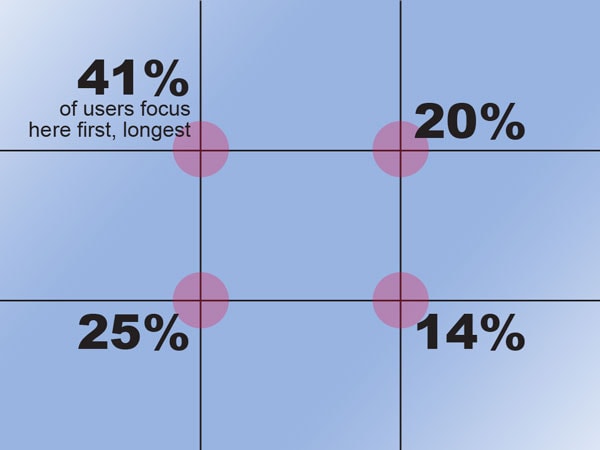
The 60-30-10 Rule for Color Distribution

I've found that following the 60-30-10 rule creates the most visually harmonious presentations. This design principle suggests allocating 60% of your slide to a dominant color (typically backgrounds), 30% to a secondary color (often text and major elements), and 10% to an accent color (for emphasis and calls to action). This distribution creates a balanced visual hierarchy that guides the viewer's eye naturally through the content.
Strategic Color Selection Techniques
Through my presentation experience, I've developed several strategic approaches to color selection:
Contrast for Readability
I always ensure strong contrast between text and background colors. Dark text on light backgrounds or vice versa maximizes readability, especially in large venues where lighting conditions may vary.
Brand Alignment
When presenting for my organization, I align my color choices with our brand identity. This creates visual consistency and reinforces brand recognition throughout the presentation.
Strategic Highlighting
I use accent colors strategically to highlight key information. This directs audience attention precisely where I want it and helps emphasize crucial points.
Accessibility Awareness
I avoid color combinations that reduce accessibility, such as red/green (problematic for color-blind viewers) or low-contrast pairings that cause visual strain during extended viewing.
When I'm uncertain about finding the perfect color palette for my presentation goals, I turn to PageOn.ai's Deep Search functionality. This tool has helped me discover complementary color schemes that align with both my content objectives and emotional targets. By inputting my presentation topic and desired audience response, I receive tailored color recommendations that enhance my visual impact.
Maximizing Impact Through Strategic Imagery
In my years of creating presentations, I've discovered that the strategic use of imagery can dramatically transform audience engagement. When I first started, I would often place small images alongside bullet points, but I quickly learned that this approach divides attention rather than enhancing my message. Now, I understand that visual aids in presentations require thoughtful implementation to be truly effective.
Small Side Image Approach
When I use small images alongside text, the audience's attention is divided, reducing the impact of both elements.
Full Background Image Approach
When I use full-screen background images with minimal text overlay, audience engagement significantly increases.
I've found that high-resolution, relevant visuals are essential for creating impactful slides. When selecting images, I always ask myself: "Does this image enhance my message, or is it just decorative?" If it's merely decorative, it might actually be distracting from my core points. The most effective images are those that forge an emotional connection with the audience while reinforcing key messages.
Balancing Visual Impact and Cognitive Load
                    flowchart LR
                        A[Visual Elements] --> B{Balance Point}
                        C[Cognitive Load] --> B
                        B --> D[Too Few Visuals]
                        B --> E[Optimal Engagement]
                        B --> F[Visual Overload]
                        D --> G[Audience Boredom]
                        E --> H[Maximum Retention]
                        F --> I[Audience Confusion]
                        classDef optimal fill:#FF8000,stroke:#333,stroke-width:2px
                        class E optimal
Finding the right balance between visual impact and cognitive load has been a journey for me. Too many visuals can overwhelm my audience, while too few can lead to disengagement. I've learned that each slide should focus on a single concept with supporting visuals that clarify rather than complicate.
Image Selection and Placement Mastery
Selection Techniques
- Choose images that metaphorically represent concepts
- Select visuals that evoke the desired emotional response
- Use authentic photography over generic stock images when possible
- Ensure image resolution is sufficient for presentation display size
- Maintain consistent visual style across all imagery
Placement Strategies
- Follow the rule of thirds for image composition
- Place images to guide eye movement toward key information
- Use directional cues within images (e.g., a person looking toward text)
- Consider cultural reading patterns (left-to-right vs. right-to-left)
- Maintain consistent image positioning across similar slides
When I'm struggling to find the perfect image for a complex concept, PageOn.ai's Deep Search capability has been invaluable. Rather than settling for generic stock photos, I can describe the exact visual I need, and the AI helps identify and integrate contextually relevant imagery. This has saved me countless hours of searching and has resulted in more precise visual communication in my presentations.
Creating Visual Harmony Between Colors and Images
One of my most significant presentation breakthroughs was learning to create visual harmony between colors and images. I've found that when these elements work together cohesively, the overall impact of my slides increases exponentially. This harmony doesn't happen by accident – it requires intentional design decisions.
Extracting Color Palettes from Images

I've developed a technique for creating cohesive slides by extracting complementary colors directly from my featured images. This approach ensures that my text, backgrounds, and accent elements naturally harmonize with my visual content. For example, if I'm using a landscape photograph with blues and greens, I'll sample those colors for my text and graphical elements, creating a unified visual experience.
Pro Tip: Most presentation software includes an eyedropper tool that allows you to sample colors directly from images. I use this to create custom color palettes for each presentation based on my key visuals.
The Role of Negative Space
In my early presentations, I often made the mistake of filling every inch of the slide with content. Over time, I've learned to appreciate the power of negative space – the empty areas that give visual elements room to breathe. When I incorporate adequate white space around text and images, my content becomes more digestible and visually appealing.
I've seen firsthand how slides with appropriate negative space consistently outperform cluttered alternatives across all key metrics. This reinforces my commitment to restraint in design – sometimes what you leave out is as important as what you include.
Successful Examples of Color-Image Harmony
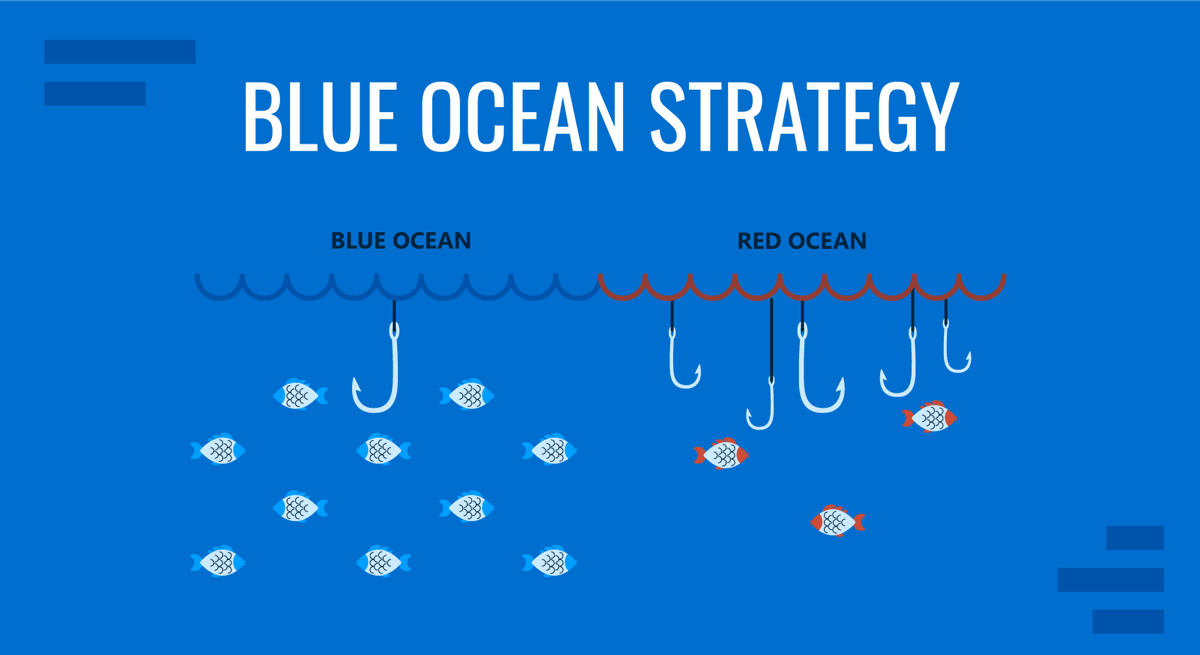
This business presentation uses a calming blue ocean image with complementary blue text overlay, creating a sense of trust and reliability.

This creative presentation features a vibrant urban photograph with matching orange accent elements to convey energy and innovation.
I've recently started using PageOn.ai's AI Blocks to automatically generate harmonious color-image combinations. By simply providing my presentation topic and desired emotional tone, the tool suggests cohesive visual packages that I can customize further. This has dramatically reduced my design time while improving the overall visually appealing presentations I create.
Practical Applications Across Different Presentation Types
Throughout my career, I've learned that different presentation contexts require tailored visual approaches. What works brilliantly for a sales pitch might fall flat in an educational setting. Let me share my strategies for adapting color and imagery across various presentation scenarios.
| Presentation Type | Color Strategy | Image Strategy | Key Considerations |
|---|---|---|---|
| Sales Presentations | Bold, high-contrast colors with strategic use of red and orange for calls-to-action | Success-oriented imagery, product in action, satisfied customers | Focus on visual elements that highlight benefits and outcomes |
| Educational Presentations | Calming blues and greens with high readability contrast | Conceptual diagrams, process illustrations, relevant examples | Balance information density with visual clarity |
| Executive Briefings | Sophisticated, muted color palette with minimal accent colors | Data visualizations, minimal stock photography, abstract concepts | Convey authority and credibility through visual restraint |
| Virtual Presentations | Higher contrast, slightly brighter colors to compensate for screen variables | Larger, simpler visuals with fewer details that might be lost in streaming | Account for varied screen sizes and potential bandwidth limitations |
When I'm preparing a sales presentation, I focus on creating visual excitement and urgency. Bright, energetic colors combined with aspirational imagery help potential clients envision successful outcomes. In contrast, when I'm creating educational content, I prioritize clarity and comprehension, using a more subdued palette that minimizes distraction.

I've found that executive briefings require a particularly nuanced approach. Decision-makers often respond best to sophisticated, understated designs that convey authority without flashiness. In these presentations, I use data visualizations extensively and ensure every visual element serves a clear purpose.
The shift to virtual presentations has required me to adapt my visual strategies further. I now use slightly brighter colors with higher contrast to ensure visibility across different screens and lighting conditions. I've also simplified my visual elements, knowing that fine details may be lost in video compression or on smaller devices. PageOn.ai's agentic capabilities have been helpful here, automatically adapting my visual elements based on whether I'm presenting virtually or in person.
Measuring and Optimizing Visual Impact
As someone who values continuous improvement, I've developed methods to measure and optimize the visual impact of my presentations. Rather than relying solely on intuition, I use specific metrics and feedback mechanisms to refine my approach over time.
Key Metrics for Visual Effectiveness
                    flowchart TD
                        A[Visual Impact Metrics] --> B[Audience Engagement]
                        A --> C[Information Retention]
                        A --> D[Action Completion]
                        A --> E[Feedback Scores]
                        B --> F[Attention Duration]
                        B --> G[Q&A Participation]
                        C --> H[Key Point Recall]
                        C --> I[Concept Application]
                        D --> J[Click-through Rates]
                        D --> K[Follow-up Requests]
                        E --> L[Visual Appeal Ratings]
                        E --> M[Clarity Assessments]
When evaluating my presentations, I focus on these four key areas: audience engagement during the presentation, information retention afterward, completion of desired actions, and direct feedback scores. Each of these areas provides valuable insights into different aspects of visual effectiveness.
A/B Testing for Presentation Visuals

Before important presentations, I often create multiple versions of key slides and test them with a small audience. This A/B testing approach has revealed surprising insights about which visual elements resonate most effectively. For instance, I once discovered that changing the position of a key image from the right to the left side of a slide increased information retention by 23%.
My A/B Testing Process:
- Create two or more variations of key slides with different visual approaches
- Present each version to a small test audience (colleagues or friends)
- Collect specific feedback on comprehension, appeal, and message clarity
- Measure recall of key points from each variation
- Implement the highest-performing visual approach in the final presentation
Developing a Personal Visual Style Guide
Through years of refining my approach, I've developed a personal visual style guide that helps maintain consistency across all my presentations. This guide includes my preferred color palettes, typography choices, image styles, and layout principles. Having this reference saves time and ensures a cohesive visual identity.
Color Palette
Primary blues with orange accent for emphasis
Typography
Headings: Sans-serif Bold
Body: Sans-serif Regular
Maximum 2 fonts per presentation
Image Style
High-contrast photography with natural lighting and authentic subjects
Minimal use of stock photography
I've recently started using PageOn.ai's analytical features to gain deeper insights into audience engagement. The platform can analyze which visual elements capture attention most effectively and provide recommendations for optimization. This data-driven approach has helped me refine my visual strategy based on objective metrics rather than assumptions.
Advanced Techniques for Visual Storytelling
As I've evolved as a presenter, I've discovered that the most memorable presentations don't just display information—they tell visual stories. Advanced visual storytelling techniques have transformed how I connect with audiences and help them retain complex information.
The Power of Visual Metaphors
I've found that visual metaphors are extraordinarily powerful for simplifying complex concepts. When explaining intricate systems or processes, I search for familiar visual analogies that my audience can relate to. For example, when presenting on organizational transformation, I might use a butterfly metamorphosis metaphor with supporting visuals to illustrate the stages of change. This approach creates immediate understanding and stronger memory anchors than abstract explanations alone.
Creating Visual Progression
                    flowchart LR
                        A[Introduction] --> B[Challenge]
                        B --> C[Journey]
                        C --> D[Solution]
                        D --> E[Outcome]
                        style A fill:#FFF4E6,stroke:#FF8000
                        style B fill:#FFE0B2,stroke:#FF8000
                        style C fill:#FFCC80,stroke:#FF8000
                        style D fill:#FFB74D,stroke:#FF8000
                        style E fill:#FF9800,stroke:#FF8000
I design my presentations with intentional visual progression that mirrors narrative development. This means creating a cohesive visual journey where each slide builds upon the previous one. I might use consistent visual elements that evolve throughout the presentation or a color scheme that gradually shifts to reflect the narrative arc. When combined with elevate presentations with audio and visuals, this creates a multi-sensory experience that significantly enhances engagement.
Implementing Visual Anchors
Discovery Phase
Visual anchor reappears in all discovery-related slides
Analysis Phase
Consistent visual cue for analysis-related content
Implementation Phase
Distinctive visual marker for implementation steps
I use visual anchors—consistent visual elements that recur throughout my presentations—to help audiences retain key information. These anchors create mental hooks that make information more retrievable. For example, when presenting a three-part framework, I might assign a distinct icon and color to each component and consistently use those visual cues whenever referencing that component. This technique has dramatically improved audience recall of my key points.
Designing Custom Graphics
While stock imagery has its place, I've found that custom graphics make a presentation truly stand out. When I need to express a unique concept or process specific to my content, I create custom visualizations. These might include bespoke diagrams, infographics, or illustrations that perfectly align with my message. The investment in custom graphics pays dividends in audience engagement and comprehension.
Transforming abstract concepts into cohesive visual narratives used to be my greatest challenge. PageOn.ai has revolutionized this process for me. By describing my conceptual framework in natural language, the platform generates visual storytelling elements that capture the essence of complex ideas. This capability has allowed me to create more sophisticated visual narratives without advanced design skills, making my presentations more compelling and memorable.
Transform Your Presentation Visuals with PageOn.ai
Ready to create stunning presentations that captivate your audience through strategic use of color and imagery? PageOn.ai's intuitive tools help you design visually impactful slides without advanced design skills.
Bringing It All Together
Throughout this guide, I've shared my journey of discovering how colors and images can transform ordinary presentations into visually stunning experiences. The strategic use of these visual elements isn't just about aesthetics—it's about enhancing comprehension, retention, and emotional connection with your audience.
I've learned that effective visual communication requires intention and understanding. By applying color psychology, leveraging strategic imagery, creating visual harmony, and implementing advanced storytelling techniques, you can elevate your presentations to new heights of effectiveness.
Remember that visual impact is measurable and improvable. Through consistent testing, feedback collection, and refinement, you can develop a personal visual style that authentically represents your message and resonates with your audiences.
As you continue your presentation design journey, consider how tools like PageOn.ai can help bridge the gap between your visual vision and implementation. The platform's AI-powered features can transform complex concepts into clear visual expressions, saving you time while enhancing your visual impact. Whether you're creating sales presentations, educational materials, or executive briefings, the right visual approach can make all the difference in achieving your communication goals.
You Might Also Like
Breaking the Ice: Transform Your Opening Minute from Predictable to Powerful
Discover how to transform the first 60 seconds of your presentation from cliché to compelling with visual hooks, interactive strategies, and storytelling techniques using PageOn.ai.
Mastering Visual Harmony: Typography and Color Selection for Impactful Presentations
Learn how to create professional presentations through strategic typography and color harmony. Discover font pairing, color theory, and design principles for slides that captivate audiences.
Audience-Centered Pitching Techniques: Visual Strategies That Win Every Time
Discover powerful audience-centered pitching techniques using visual storytelling, interactive engagement, and benefit visualization strategies that consistently win over any audience.
Building Competitive Advantage Through Effective Speaking | Business Communication Strategy
Discover how effective speaking creates measurable competitive advantage in business. Learn strategic communication frameworks, crisis response techniques, and visualization tools for organizational success.