Platform-Optimized Infographics: Tailoring Visual Content for Social Media Success
Understanding Platform-Specific Visual Requirements
I've found that creating truly effective infographics for social media isn't a one-size-fits-all approach. Each platform has its own visual language, technical specifications, and audience expectations. In this guide, I'll share how to tailor your visual content for maximum impact across Instagram, Pinterest, LinkedIn, Twitter, and Facebook.
Understanding Platform-Specific Visual Requirements
In my years of creating visual content, I've learned that each social media platform has its own unique ecosystem. Understanding these differences is crucial for infographic success.
When I create infographic content, I always start by examining how each platform handles visual content differently:
flowchart TD
    A[Platform-Specific
Infographic Requirements] --> B[Technical Specs]
    A --> C[Visual Language]
    A --> D[Algorithm Preferences]
    A --> E[Audience Expectations]
    B --> B1[Dimensions]
    B --> B2[File Size]
    B --> B3[Compression]
    C --> C1[Color Schemes]
    C --> C2[Typography]
    C --> C3[Layout Patterns]
    D --> D1[Engagement Metrics]
    D --> D2[Content Prioritization]
    D --> D3[Display Formats]
    E --> E1[Attention Span]
    E --> E2[Interaction Habits]
    E --> E3[Content Preferences]
Each platform has developed its own visual language that resonates with its user base. For example, Instagram emphasizes aesthetics and visual appeal, while LinkedIn prioritizes professional presentation and data credibility.
Technical Specifications Across Platforms
| Platform | Optimal Dimensions | Aspect Ratio | File Size Limit |
|---|---|---|---|
| Instagram Feed | 1080 × 1080px | 1:1 (square) | 30MB |
| Instagram Stories | 1080 × 1920px | 9:16 | 30MB |
| 1000 × 1500px | 2:3 to 1:3.5 | 20MB | |
| 1104 × 736px | 3:2 | 100MB | |
| 1200 × 675px | 16:9 | 5MB | |
| 1200 × 630px | 1.91:1 | 30MB |
I've also noticed that platform algorithms prioritize and display visual content differently. For instance, Pinterest rewards vertical content that encourages scrolling, while Twitter's algorithm favors images that can make an immediate impact in a crowded feed.
Understanding these technical specifications and algorithmic preferences is the foundation for creating stunning infographics that perform well across different platforms.
Designing for Instagram's Visual Ecosystem
Instagram presents unique challenges and opportunities for infographic designers. I've found that mastering its format requirements is essential for standing out in users' feeds.
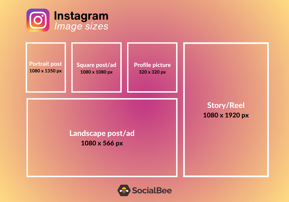
Critical Format Considerations
When designing for Instagram, I always consider these critical format requirements:
- Feed Posts: The 1:1 square format remains dominant for maximum visibility in the main feed.
- Stories: The 9:16 vertical format allows for immersive full-screen experiences.
- Carousel Posts: Perfect for breaking down complex infographics into digestible slides.
- Height Recommendation: Instagram recommends a height of 1350 pixels for optimal vertical scrolling.
Instagram Format Effectiveness
Segmentation Techniques
I've found that breaking complex infographics into carousel posts is highly effective on Instagram. This approach allows for:
- Progressive disclosure of information
- Increased time spent with your content
- Higher engagement through multiple interaction points
- Better retention of information through bite-sized pieces
flowchart LR
    A[Complex
Infographic] --> B[Slide 1:
Hook/Problem]
    B --> C[Slide 2:
Key Stats]
    C --> D[Slide 3:
Visual Data]
    D --> E[Slide 4:
Solutions]
    E --> F[Slide 5:
Call to Action]
    style A fill:#FFE6CC,stroke:#FF8000
    style B fill:#FFD6AA,stroke:#FF8000
    style C fill:#FFC988,stroke:#FF8000
    style D fill:#FFBC66,stroke:#FF8000
    style E fill:#FFAA44,stroke:#FF8000
    style F fill:#FF9922,stroke:#FF8000
Creating visually striking entry points is essential for stopping users from scrolling past your content. I recommend using bold colors, compelling typography, and intriguing visual hooks that demand attention.
PageOn.ai's AI Blocks feature has been invaluable for quickly restructuring my content to meet Instagram's unique format requirements. It allows me to take a single infographic design and efficiently adapt it to multiple Instagram formats without starting from scratch each time.
Pinterest: Optimizing for Discovery and Longevity
Pinterest offers unique advantages for infographic distribution due to its search-focused nature and extended content lifespan. I've developed specific strategies to maximize visibility on this platform.
Aspect Ratio Optimization
According to research from Stellar Content, Pinterest recommends aspect ratios between 2:3 and 1:3.5. In my experience, the most successful Pinterest infographics tend to be vertical with a 2:3 aspect ratio (1000 × 1500px), which provides enough space for content while remaining easily viewable.
Pinterest Pin Format Comparison
Text Overlay Strategies
When designing infographic data visualizations for Pinterest, I always ensure text remains legible when scaled down as pins by:
- Using larger font sizes (minimum 14pt for body text, 24pt+ for headings)
- Maintaining high contrast between text and background
- Limiting text to 30% or less of the overall image area
- Placing critical information in the top 60% of the infographic
Vertical Structure Benefits
Pinterest's interface naturally favors vertical scrolling. I structure my infographics to leverage this behavior by:
flowchart TD
    A[Eye-Catching Title
with Value Proposition] --> B[Visual Hook/Problem Statement]
    B --> C[Key Statistics & Data Points]
    C --> D[Main Content Sections]
    D --> E[Supporting Visuals & Examples]
    E --> F[Actionable Takeaways]
    F --> G[Brand Identity & Call to Action]
    style A fill:#FFE6CC,stroke:#FF8000
    style G fill:#FFE6CC,stroke:#FF8000
I've found that using PageOn.ai's Deep Search feature helps me identify trending visual styles and color palettes on Pinterest. This allows me to create infographics that align with current visual preferences while maintaining my brand identity.
Pinterest's visual search ecosystem also requires strategic color choices. I typically use bold, contrasting colors that stand out in Pinterest's grid layout and incorporate visual elements that align with popular search terms in my niche.
LinkedIn: Professional Infographics That Drive Engagement
LinkedIn presents a unique challenge: creating visually engaging content that maintains professional credibility. I've developed specific approaches for this business-focused platform.

Balancing Data Credibility with Visual Appeal
For LinkedIn audiences, I've found that data visualization charts must be both visually appealing and data-rich. My approach includes:
- Using professional color schemes (blues, grays, with strategic accent colors)
- Incorporating recognizable visualizing personal success metrics and business KPIs
- Citing credible sources for all data points
- Balancing visual simplicity with data depth
LinkedIn Engagement by Content Type
LinkedIn Feed Display Constraints
LinkedIn's feed has specific constraints that affect how infographics are displayed. I structure my content to work within these limitations:
- Optimal dimensions: 1104 × 736 pixels (3:2 aspect ratio)
- Critical information placed in the center of the image to avoid cropping
- Text large enough to read on mobile devices (minimum 14pt)
- Clear visual hierarchy that communicates core message even at a glance
I've found that incorporating brand elements that reinforce thought leadership positioning is particularly effective on LinkedIn. This includes:
flowchart LR
    A[Professional
LinkedIn
Infographic] --> B[Brand Elements]
    A --> C[Content Structure]
    A --> D[Visual Approach]
    B --> B1[Logo Placement]
    B --> B2[Consistent Typography]
    B --> B3[Brand Color Palette]
    C --> C1[Clear Headline]
    C --> C2[Sectioned Content]
    C --> C3[Concise Data Points]
    C --> C4[Strong CTA]
    D --> D1[Clean Design]
    D --> D2[Data Visualization]
    D --> D3[Professional Icons]
    D --> D4[White Space]
Creating sectioned infographics that prompt meaningful professional discussion has been a successful strategy for me on LinkedIn. I design content that naturally invites comments by:
- Posing thought-provoking questions
- Presenting contrasting viewpoints
- Sharing surprising statistics or counterintuitive findings
- Including a clear call-to-action for professional feedback
PageOn.ai's Vibe Creation feature has been instrumental in helping me transform complex business concepts into clear visual narratives that resonate with LinkedIn's professional audience while maintaining data integrity.
Twitter: Designing for Impact in Limited Space
Twitter's fast-paced environment demands infographics that make an immediate impact. I've developed techniques to create micro-infographics that capture attention in limited space.

The Art of Micro-Infographics
For Twitter's fast-paced environment, I focus on creating micro-infographics that:
- Communicate a single clear message or data point
- Use the optimal 16:9 aspect ratio (1200 × 675 pixels)
- Feature large, scannable text (minimum 16pt)
- Incorporate high-contrast colors for visibility in the feed
- Include a clear visual hook that stops scrolling
Twitter Visual Content Effectiveness
Creating Visual Hooks
I've found that creating strong visual hooks is essential for driving clicks to expanded content on Twitter. My most effective approaches include:
flowchart TD
    A[Twitter Visual Hook
Strategies] --> B[Surprising Statistics]
    A --> C[Provocative Questions]
    A --> D[Before/After Visuals]
    A --> E[Contrasting Colors]
    A --> F[Incomplete Information]
    B --> B1[Large Number
+ Context]
    C --> C1[Question That
Challenges Assumptions]
    D --> D1[Clear Visual
Transformation]
    E --> E1[High Contrast
Color Combinations]
    F --> F1[Teaser That
Promises More]
Designing for Both Light and Dark Mode
With many Twitter users preferring dark mode, I always test my infographics in both display settings to ensure visibility. My approach includes:
- Avoiding transparent backgrounds that might render differently in dark mode
- Using colors that maintain contrast in both light and dark environments
- Testing text legibility against both white and dark backgrounds
- Adding subtle borders to light elements that might blend into light mode
Text sizing strategy is particularly important for Twitter, where most users are on mobile devices. I follow these guidelines:
- Headlines: Minimum 24pt
- Subheadings: Minimum 18pt
- Body text: Minimum 16pt
- Data labels: Minimum 14pt
- Source citations: Minimum 12pt
I've found PageOn.ai's AI Blocks feature extremely helpful for quickly generating attention-grabbing visual summaries that work well in Twitter's limited space. The tool helps me distill complex ideas into concise visual messages without sacrificing impact.
Cross-Platform Adaptation Strategies
Creating effective infographics for multiple platforms can be time-consuming. I've developed systematic approaches to efficiently adapt content across different social media channels.

Modular Component Design
I've found that developing modular infographic components that can be reconfigured across platforms saves significant time and maintains consistency. My approach includes:
flowchart TD
    A[Master Infographic
Design] --> B[Core Components]
    B --> C[Platform-Specific
Adaptations]
    B --> B1[Header/Title]
    B --> B2[Key Statistics]
    B --> B3[Data Visualizations]
    B --> B4[Icon Sets]
    B --> B5[Text Blocks]
    B --> B6[CTA Elements]
    C --> C1[Instagram
Adaptations]
    C --> C2[Pinterest
Adaptations]
    C --> C3[LinkedIn
Adaptations]
    C --> C4[Twitter
Adaptations]
    C --> C5[Facebook
Adaptations]
    C1 --> D1[Square Feed
1:1]
    C1 --> D2[Stories
9:16]
    C1 --> D3[Carousel
Multiple 1:1]
    C2 --> E1[Vertical Pin
2:3]
    C2 --> E2[Long Pin
1:3.5]
    C3 --> F1[Feed Post
3:2]
    C3 --> F2[Document
Multiple Pages]
    C4 --> G1[In-Feed
16:9]
    C4 --> G2[Card Image
2:1]
    C5 --> H1[Feed Post
1.91:1]
    C5 --> H2[Link Preview
1.91:1]
Visual Templates for Brand Consistency
Creating visual templates that maintain brand consistency while adapting to platform requirements has been key to my efficient workflow. I develop:
- Master templates with consistent branding elements (logos, colors, typography)
- Platform-specific layout variations that maintain visual identity
- Flexible component placement that adapts to different aspect ratios
- Consistent visual language across all platforms
Platform-Specific Adaptation Requirements
Responsive Design Principles
Implementing responsive design principles for multi-platform infographics has helped me create adaptable content. My key approaches include:
- Designing at the highest resolution needed, then scaling down
- Creating text in separate layers for easy resizing and repositioning
- Using vector graphics whenever possible for scalability
- Testing legibility at various sizes before finalizing designs
Building a systematic approach to versioning infographics for different platforms has streamlined my workflow. I maintain:
- A master file with all components and variations
- Platform-specific export presets
- Naming conventions that track versions and platforms
- A content calendar that plans cross-platform releases
PageOn.ai's Agentic capabilities have revolutionized my workflow by automatically adapting infographics to platform-specific requirements. This has reduced my production time by approximately 60% while ensuring optimized performance across all platforms.
Measuring Visual Content Performance Across Platforms
To continuously improve my infographic strategy, I've developed comprehensive approaches to measuring performance across different social platforms.
Platform-Specific KPIs
I've found that each platform requires different key performance indicators to truly measure infographic success:
| Platform | Primary KPIs | Secondary KPIs | Benchmark Goals |
|---|---|---|---|
| Saves, Shares, Carousel Swipes | Comments, Profile Visits, Follows | Save Rate >5%, Completion Rate >70% | |
| Saves, Click-through Rate, Impressions | Close-ups, Outbound Clicks, Search Appearances | Save Rate >2%, CTR >0.8% | |
| Engagement Rate, Shares, Comment Quality | Profile Views, Connection Requests, Dwell Time | Engagement Rate >2.5%, Share Rate >1% | |
| Retweets, Link Clicks, Replies | Profile Clicks, Follows, Detail Expands | CTR >1.5%, Engagement Rate >1.8% | |
| Shares, Reactions, Comments | Click-through Rate, Page Likes, Reach | Share Rate >1%, Engagement Rate >3% |
Tracking Engagement Patterns
I track engagement patterns to optimize future infographic designs by analyzing:
Engagement by Infographic Type
Platform-Specific Audience Behaviors
Understanding platform-specific audience behaviors has helped me tailor my infographic designs more effectively:
- Instagram: Users typically spend 1-3 seconds deciding whether to engage with content; visual appeal is paramount
- Pinterest: Users are in "discovery mode" and more willing to engage with detailed, information-rich content
- LinkedIn: Users value credibility and professional insights; they're willing to spend more time with substantive content
- Twitter: Users are scanning quickly; content must make an immediate impact to gain engagement
- Facebook: Users respond to emotional and relatable content that encourages sharing
Testing and Iteration
I regularly test and iterate visual formats based on performance data. My testing approach includes:
- A/B testing different color schemes, layouts, and typography
- Comparing engagement between different infographic formats (e.g., statistical vs. process)
- Testing optimal posting times for each platform
- Analyzing which content sections receive the most interaction
- Evaluating the impact of different calls-to-action
By leveraging insights from performance metrics, I've been able to refine my visual strategies over time. This data-driven approach has consistently improved engagement rates across all platforms and helped me develop a deeper understanding of what resonates with different audience segments.
Case Studies: Platform-Specific Infographic Success Stories
I've analyzed brands that excel at platform-specific infographic adaptation to identify patterns and strategies that drive exceptional results.

Brand Excellence Examples
Case Study 1: Health & Wellness Brand
A leading health and wellness brand transformed their content strategy by creating platform-specific infographics:
- Instagram: Created carousel posts breaking down complex nutritional information into digestible slides, increasing engagement by 215%
- Pinterest: Developed tall, vertical recipe infographics optimized for Pinterest's visual search, generating 178% more saves
- LinkedIn: Produced data-rich industry reports as sectioned infographics, establishing thought leadership and increasing share rate by 86%
Case Study 2: Financial Education Platform
A financial education platform revolutionized their approach to visual content:
- Twitter: Created micro-infographics highlighting single shocking statistics about debt or savings, increasing click-through rates by 94%
- LinkedIn: Developed comparative analysis infographics between investment strategies, generating 3x more comments than text posts
- Instagram Stories: Produced interactive quiz-style infographics about financial literacy, resulting in 75% completion rates
Viral Infographic Analysis
I've analyzed viral infographics to identify platform-specific success factors:
flowchart TD
    A[Viral Infographic
Success Factors] --> B[Instagram
Success Factors]
    A --> C[Pinterest
Success Factors]
    A --> D[LinkedIn
Success Factors]
    A --> E[Twitter
Success Factors]
    B --> B1[Visual Appeal]
    B --> B2[Emotional Response]
    B --> B3[Carousel Format]
    B --> B4[Relatable Content]
    C --> C1[Vertical Format]
    C --> C2[DIY/How-To Content]
    C --> C3[Clear Typography]
    C --> C4[Seasonal Relevance]
    D --> D1[Data Credibility]
    D --> D2[Industry Insights]
    D --> D3[Professional Design]
    D --> D4[Actionable Takeaways]
    E --> E1[Surprising Facts]
    E --> E2[Cultural Relevance]
    E --> E3[Simplicity]
    E --> E4[Humor/Personality]
Before-and-After Optimization Results
I've documented significant improvements through platform-specific optimization:
Performance Improvement After Platform Optimization
Actionable Lessons from Successful Campaigns
From analyzing successful multi-platform infographic campaigns, I've extracted these key lessons:
- Design for the platform first, not the content: Start with platform constraints, then adapt your message to fit
- Create platform-specific hooks: Different elements grab attention on different platforms
- Test and iterate quickly: The most successful brands continuously refine their approach based on performance data
- Maintain visual brand consistency: While adapting formats, keep core brand elements consistent across platforms
- Focus on audience context: Consider how and why users are engaging with each platform
Using PageOn.ai's data visualization capabilities, I've been able to identify clear patterns in successful infographics across platforms. This has allowed me to develop more targeted strategies for each platform while maintaining a cohesive overall brand presence.
Future-Proofing Your Infographic Strategy
Social media platforms are constantly evolving. I've developed approaches to ensure my infographic strategies remain effective despite platform changes.
Staying Ahead of Platform Changes
To stay ahead of platform algorithm and format changes, I've implemented these practices:
- Following platform developer blogs and announcement channels
- Participating in beta testing programs when available
- Monitoring early adopter accounts for new format usage
- Setting up alerts for platform policy changes
- Regularly reviewing platform analytics for performance pattern changes
Preparing for Emerging Platforms
I'm constantly preparing for emerging visual platforms and formats by:
Emerging Platform Readiness Framework
flowchart LR
    A[Content
Foundation] --> B[Format
Adaptation]
    B --> C[Platform
Deployment]
    C --> D[Performance
Analysis]
    D --> E[Strategy
Refinement]
    E --> B
    A --> A1[Core Message]
    A --> A2[Brand Elements]
    A --> A3[Modular Assets]
    B --> B1[Technical Specs]
    B --> B2[Visual Language]
    B --> B3[User Context]
    C --> C1[Timing Strategy]
    C --> C2[Audience Targeting]
    C --> C3[Cross-Promotion]
    D --> D1[Engagement Metrics]
    D --> D2[Conversion Data]
    D --> D3[Audience Feedback]
    E --> E1[Format Adjustments]
    E --> E2[Content Emphasis]
    E --> E3[Distribution Timing]
Building Adaptable Visual Systems
Rather than creating one-off infographics, I focus on building adaptable visual systems that can evolve with changing requirements:
- Developing component libraries of reusable visual elements
- Creating flexible grid systems that can be reconfigured for different formats
- Establishing visual hierarchy principles that work across platforms
- Building modular data visualization components that can be updated easily
- Maintaining source files that preserve maximum editability
Efficient Production Workflows
I've developed workflows that efficiently produce platform-specific variations:
Time Investment by Production Approach
Creating flexible visual frameworks with PageOn.ai has transformed my ability to adapt to platform changes. The tool's AI-driven approach allows me to:
- Generate platform-optimized variations with minimal manual adjustment
- Quickly adapt to new aspect ratios and technical requirements
- Test multiple visual approaches simultaneously
- Maintain brand consistency while exploring new visual formats
- Reduce production time by up to 70% compared to traditional methods
By focusing on building systems rather than individual assets, I've created a more sustainable and adaptable approach to infographic creation that can evolve alongside changing platform requirements and audience preferences.
Transform Your Infographics with PageOn.ai
Ready to create platform-optimized infographics that drive engagement across all your social media channels? PageOn.ai's AI-powered tools make it easy to adapt your visual content for maximum impact on every platform.
Start Creating Platform-Perfect Infographics TodayYou Might Also Like
Visualizing Electronics Fundamentals: ROHM's Component Guide for Beginners to Experts
Explore ROHM's electronics basics through visual guides covering essential components, power semiconductors, sensors, automotive applications, and design resources for all skill levels.
How AI Saves Marketing Teams 5+ Hours Weekly While Boosting Productivity 83% | Visual Content Revolution
Discover how AI transforms marketing workflows, saving 5+ hours weekly and boosting productivity by 83%. Learn visual content strategies that eliminate manual tasks and accelerate campaigns.
The Visual Evolution of American Infrastructure: Canals to Digital Networks | PageOn.ai
Explore America's infrastructure evolution from historic canal networks to railroads, interstate highways, and digital networks with interactive visualizations and timelines.
Prompt Chaining Techniques That Scale Your Business Intelligence | Advanced AI Strategies
Master prompt chaining techniques to transform complex business intelligence workflows into scalable, automated insights. Learn strategic AI methodologies for data analysis.