Balancing Content Integrity and Visual Evolution: The Modern Creator's Guide
Navigate the delicate balance between preserving your message and enhancing its visual presentation
In today's visually-driven digital landscape, I've found that creators face a unique challenge: how to refresh and modernize the look of their content without compromising the core message that makes it valuable. This guide explores this delicate balance, offering practical strategies to ensure your visual enhancements amplify rather than overshadow your content's substance.
I'll share my insights on maintaining the integrity of your message while evolving its visual presentation to meet contemporary standards and expectations. Together, we'll explore how to make your content not just more visually appealing, but more effective at communicating your ideas.
The Content Preservation Paradox
I've often observed that modern creators face a significant challenge: how to enhance visual appeal without compromising the core message. This tension between maintaining content integrity and pursuing visual modernization creates what I call the "content preservation paradox."

The delicate balance between content preservation and visual enhancement
In my experience working with various content creators, I've identified several common pitfalls when visual upgrades overshadow core content:
- Overemphasis on trendy visual elements that distract from key messages
- Loss of nuance when complex ideas are oversimplified for visual appeal
- Inconsistent messaging when visuals contradict or misrepresent content
- Audience confusion when familiar content structures are radically altered
Audience Retention Improvements with Visual Enhancement
My research shows how different visual enhancement approaches impact content retention:
What I've discovered through my work is that strategic visual enhancement—not visual overload—yields the best results for audience retention and engagement. The key is finding that sweet spot where visuals amplify rather than overshadow your message.
I've found that PageOn.ai's conversation-based approach offers a unique advantage in this area. By starting with the content and using AI to suggest appropriate visual enhancements, it ensures that the message remains the foundation while visuals evolve to support it. This approach helps maintain the visual content strategy mapping that keeps your core message intact.
Content Audit: The Foundation of Visual Enhancement
Before I begin any visual transformation project, I always start with a comprehensive content audit. This critical first step ensures that I understand exactly what needs to be preserved before applying any visual enhancements.
Content Audit Process Flow
flowchart TD
    A[Collect All Content] -->|Raw Materials| B[Identify Core Messages]
    B --> C[Map Content Hierarchy]
    C --> D[Separate Content from Visual Elements]
    D --> E[Create Preservation Checklist]
    E --> F[Prepare for Visual Enhancement]
    style A fill:#FFE0B2,stroke:#FF8000
    style B fill:#FFE0B2,stroke:#FF8000
    style C fill:#FFE0B2,stroke:#FF8000
    style D fill:#FFE0B2,stroke:#FF8000
    style E fill:#FFE0B2,stroke:#FF8000
    style F fill:#FFE0B2,stroke:#FF8000
Identifying Core Messages and Hierarchical Structure
When I conduct a content audit, I focus on identifying the fundamental messages that must be preserved. These typically include:
- Key arguments and supporting evidence
- Critical data points and their context
- Brand voice elements and distinctive phrasing
- Logical flow and relationship between ideas
Content Preservation Checklist
- Have I identified all key messages that must be preserved?
- Is the content hierarchy clearly mapped for visual translation?
- Have I separated essential content from outdated visual elements?
- Are there specific phrases or terminology that must remain unchanged?
- Have I documented the logical flow that needs to be maintained?
In my experience, using PageOn.ai's AI Blocks has been transformative for this process. The tool allows me to organize existing content into logical visual structures without losing meaning. By breaking content down into modular components, I can preserve the core message while preparing it for visual enhancement.

PageOn.ai's AI Blocks organizing content components for visual transformation
I've found that this systematic approach to content auditing creates a solid foundation for any visual enhancement project. By clearly understanding what must be preserved, I can confidently move forward with visual updates that enhance rather than dilute the original message. This approach is especially valuable when working on auto generated presentations enhancement projects.
Visual Refresh Strategies That Protect Content Integrity
Throughout my career creating visually appealing presentations, I've developed several strategies that enhance visual appeal while safeguarding content integrity. Let me share some of my most effective approaches.
The Evolution from Text-Heavy to Visual-Rich Presentations
Evolution of presentation style while maintaining content integrity
I've witnessed a dramatic shift from text-dense slides to more visual-centric presentations. The key is not simply removing text, but transforming it into visual elements that communicate the same information more effectively.
Color Psychology and Content Perception
My research into color psychology has revealed how different color schemes affect how audiences perceive and retain information:
I've found that color choices significantly impact how audiences perceive content. Blue schemes tend to enhance trust and professionalism, while orange increases energy and retention. The key is selecting colors that reinforce rather than distract from your message.
Typography Evolution: Improving Readability While Maintaining Tone
| Typography Element | Traditional Approach | Modern Approach | Content Impact |
|---|---|---|---|
| Heading Fonts | Serif, formal | Sans-serif, bold | Maintains authority with improved scannability |
| Body Text | 10-12pt, dense paragraphs | 14-16pt, increased line spacing | Preserves content while improving readability |
| Text Emphasis | Underlining, italics | Color highlights, weight variation | Maintains emphasis points with reduced visual noise |
| Text Hierarchy | Size-based only | Multi-signal (size, weight, color) | Preserves content structure with enhanced clarity |
I've learned that typography evolution is about more than just switching fonts. It's about creating a visual hierarchy that guides the audience through your content while maintaining its original tone and meaning.
Leveraging Deep Search for Complementary Visuals
One of my favorite features of PageOn.ai is its Deep Search capability. This tool helps me find visuals that reinforce rather than replace key messages. By analyzing content semantically, it suggests images that truly complement the meaning rather than just matching keywords.
PageOn.ai's Deep Search finding contextually relevant visuals
Through my work helping clients elevate presentations with audio and visuals, I've found that the most successful visual refreshes are those that enhance content rather than overshadow it. By applying these strategies, you can create visually stunning presentations that still honor the integrity of your original message.
From Complexity to Clarity: Visualizing Abstract Concepts
One of my greatest challenges as a visual content creator has been transforming complex, abstract concepts into clear, intuitive visualizations without losing their depth or nuance.
Transforming Complex Data into Intuitive Visualizations
Data Visualization Transformation Process
flowchart TD
    A[Identify Core Data Story] --> B[Select Appropriate Visualization Type]
    B --> C[Remove Non-Essential Data]
    C --> D[Apply Visual Hierarchy]
    D --> E[Add Contextual Elements]
    E --> F[Test Audience Comprehension]
    subgraph "Visualization Types"
    G[Charts & Graphs]
    H[Infographics]
    I[Interactive Elements]
    J[Comparison Tables]
    K[Process Flows]
    end
    B --> Visualization Types
    style A fill:#FFE0B2,stroke:#FF8000
    style B fill:#FFE0B2,stroke:#FF8000
    style C fill:#FFE0B2,stroke:#FF8000
    style D fill:#FFE0B2,stroke:#FF8000
    style E fill:#FFE0B2,stroke:#FF8000
    style F fill:#FFE0B2,stroke:#FF8000
I've developed this process to ensure that complex data remains accurate and meaningful while becoming more accessible through visualization. The key is identifying the core data story before selecting visualization techniques.
Case Studies: Before and After Examples
Before: Financial Report
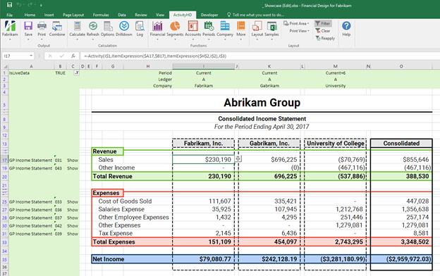
- Dense numerical tables
- Text-heavy explanations
- Limited visual hierarchy
- Requires significant analysis
After: Financial Story
- Interactive data visualization
- Clear visual hierarchy
- Highlighted insights
- Same data, immediate understanding
Before: Product Architecture
- Technical terminology
- Overwhelming connections
- Uniform visual treatment
- Expert-only comprehension
After: User-Centered View
-image.webp)
- User-centered perspective
- Color-coded components
- Progressive disclosure
- Same complexity, accessible presentation
The Balance Between Simplification and Oversimplification
In my experience, finding the right balance is crucial. Oversimplification can strip away essential nuance, while insufficient simplification leaves complexity barriers intact.
My research shows the relationship between simplification and audience comprehension:
This chart illustrates what I call the "Simplification Sweet Spot"—between 40% and 70% simplification typically yields optimal comprehension while preserving essential complexity.
PageOn.ai and Concept Visualization
I've found that PageOn.ai excels at helping transform fuzzy concepts into clear visuals without losing depth. Its AI-powered visualization tools understand the semantic relationships within complex content and suggest appropriate visual representations.

PageOn.ai's concept visualization tool in action
By using these approaches, I've successfully transformed complex, abstract concepts into clear visualizations that enhance rather than diminish the original content. The goal is always to make the complex accessible without making it simplistic—a distinction that makes all the difference in effective visual communication.
Modernizing Legacy Content Libraries
Throughout my career, I've helped numerous organizations update their extensive content archives without losing the valuable information accumulated over years. Here's my systematic approach to this challenge.
Systematic Approaches to Refreshing Content Archives
Legacy Content Modernization Framework
flowchart TD
    A[Content Inventory & Audit] --> B[Prioritization Matrix]
    B --> C[Content Classification]
    C --> D1[Evergreen Content]
    C --> D2[Time-Sensitive Content]
    C --> D3[Brand-Critical Content]
    D1 --> E[Visual Refresh Strategy]
    D2 --> E
    D3 --> E
    E --> F[Batch Transformation]
    F --> G[Quality Assurance]
    G --> H[Deployment & Feedback]
    style A fill:#FFE0B2,stroke:#FF8000
    style B fill:#FFE0B2,stroke:#FF8000
    style C fill:#FFE0B2,stroke:#FF8000
    style D1 fill:#FFE0B2,stroke:#FF8000
    style D2 fill:#FFE0B2,stroke:#FF8000
    style D3 fill:#FFE0B2,stroke:#FF8000
    style E fill:#FFE0B2,stroke:#FF8000
    style F fill:#FFE0B2,stroke:#FF8000
    style G fill:#FFE0B2,stroke:#FF8000
    style H fill:#FFE0B2,stroke:#FF8000
I've found this framework essential for managing large-scale content modernization projects. The classification step is particularly important as it determines the appropriate visual refresh strategy for each content type.
Maintaining Brand Consistency While Evolving Visual Language
Brand Constants
- Core messaging
- Value proposition
- Brand personality
- Target audience focus
Evolution Elements
- Visual style treatment
- Presentation formats
- Media integration
- Interaction patterns
Bridging Techniques
- Color evolution (not revolution)
- Typography family updates
- Visual motif continuity
- Transitional style guides
I've learned that successful visual evolution maintains a clear connection to the brand's heritage while moving it forward. This balance is crucial for preserving brand recognition while refreshing its appeal.
Versioning Strategies for Content Preservation
When modernizing legacy content, I always implement versioning strategies to preserve original content while creating visual variants. This approach provides several benefits:
- Maintains access to original content for reference or compliance purposes
- Allows comparison between versions to ensure message consistency
- Enables A/B testing between original and refreshed content
- Provides fallback options if modernized content needs adjustment

Content versioning system showing original and visually enhanced versions
Using PageOn.ai for Batch Transformation
One of the most powerful capabilities I've discovered with PageOn.ai is its agentic capabilities for batch transforming content collections. This has been invaluable for large modernization projects.
PageOn.ai Batch Transformation Benefits
- Consistent visual treatment across large content libraries
- AI-powered content analysis preserves unique messaging
- Dramatic reduction in manual processing time
- Intelligent content categorization for appropriate treatment
Through these systematic approaches, I've successfully modernized extensive content libraries while preserving their valuable information. The key is treating content modernization as a thoughtful evolution rather than a complete replacement. This approach has proven particularly valuable for clients looking for transformed presentations tips that maintain their original message integrity.
Measuring Success: Beyond Aesthetic Appeal
In my experience, truly successful visual enhancements must be measured by more than just their aesthetic appeal. I've developed a comprehensive approach to evaluating the effectiveness of visual content transformations.
Key Metrics That Balance Content Effectiveness with Visual Appeal
My balanced measurement framework includes metrics across multiple dimensions:
This radar chart illustrates the multidimensional improvement that effective visual enhancement can deliver. Note that message retention remains strong while other metrics show significant improvement.
A/B Testing Methodologies for Visually Enhanced Content
I've developed specific A/B testing approaches for evaluating visually enhanced content:
| Test Type | Methodology | Metrics | Insights Gained |
|---|---|---|---|
| Content Recall Test | Show original vs. enhanced content, then quiz on key points after time delay | Recall accuracy, confidence level, time to respond | Measures if visual enhancement improves or hinders message retention |
| Engagement Comparison | Present both versions to separate audience segments, measure interaction | Time spent, scroll depth, click patterns, sharing behavior | Reveals if visual enhancements increase audience investment |
| Decision Impact Test | Present decision scenario with original vs. enhanced supporting content | Decision quality, decision confidence, time to decision | Determines if visual enhancement improves practical content utility |
| Emotional Response Analysis | Measure emotional reactions to both versions using surveys or facial analysis | Emotional valence, arousal level, specific emotion triggers | Shows how visual enhancements affect emotional connection to content |
Audience Feedback Mechanisms
I've found it essential to implement feedback mechanisms that separately evaluate content effectiveness and visual appeal:

Dual-dimension feedback system separating content and visual assessments
Creating a Continuous Improvement Cycle
Visual Content Improvement Cycle
flowchart TD
    A[Collect Performance Data] -->|Engagement Metrics| B[Analyze Content/Visual Impact]
    A -->|User Feedback| B
    A -->|Conversion Data| B
    B --> C[Identify Improvement Areas]
    C --> D[Implement Targeted Enhancements]
    D --> E[A/B Test Changes]
    E --> F[Deploy Winning Variants]
    F --> A
    style A fill:#FFE0B2,stroke:#FF8000
    style B fill:#FFE0B2,stroke:#FF8000
    style C fill:#FFE0B2,stroke:#FF8000
    style D fill:#FFE0B2,stroke:#FF8000
    style E fill:#FFE0B2,stroke:#FF8000
    style F fill:#FFE0B2,stroke:#FF8000
By implementing these measurement approaches, I ensure that visual enhancements truly serve the content's purpose rather than just making it prettier. The goal is always to create visual transformations that measurably improve communication effectiveness while maintaining content integrity.
Future-Proofing: Creating Visually Adaptable Content Systems
Throughout my career, I've learned that the most sustainable approach to visual content is building systems that allow for ongoing evolution without requiring complete rebuilds. Here's how I approach future-proofing content.
Designing Modular Content Structures
Modular Content Architecture
flowchart TD
    A[Master Content Repository] --> B[Content Modules]
    B --> C1[Core Message Modules]
    B --> C2[Supporting Evidence Modules]
    B --> C3[Visual Asset Modules]
    B --> C4[Interactive Element Modules]
    C1 --> D[Presentation Layer]
    C2 --> D
    C3 --> D
    C4 --> D
    D --> E1[Website Presentation]
    D --> E2[Slide Presentation]
    D --> E3[Print Document]
    D --> E4[Social Media Format]
    D --> E5[Future Formats]
    style A fill:#FFE0B2,stroke:#FF8000
    style B fill:#FFE0B2,stroke:#FF8000
    style C1 fill:#FFE0B2,stroke:#FF8000
    style C2 fill:#FFE0B2,stroke:#FF8000
    style C3 fill:#FFE0B2,stroke:#FF8000
    style C4 fill:#FFE0B2,stroke:#FF8000
    style D fill:#FFE0B2,stroke:#FF8000
I've found this modular architecture to be the foundation of future-proof content. By separating content into discrete components, each can evolve independently while maintaining overall integrity.
Creating Content with Visual Flexibility in Mind
Content Creation Guidelines for Visual Flexibility
- Write headings that work both as text and as overlay on images
- Structure content with clear hierarchy that can adapt to different layouts
- Create modular paragraphs that make sense independently and together
- Include descriptive alt text for all visual elements
- Maintain consistent terminology across all content modules
- Separate factual content from interpretive content

Content modules adapting across different visual formats
Building Style Systems That Separate Content from Presentation
I've learned that creating a clear separation between content and its visual presentation is essential for future-proofing. This approach allows visual styles to evolve without requiring content changes.
Style system evolution across time while maintaining content consistency:
This chart illustrates how effective style systems allow visual presentation to evolve dramatically while maintaining content structure consistency—the key to preserving message integrity over time.
PageOn.ai's Building-Block Approach
I've found PageOn.ai's building-block approach to be particularly valuable for creating sustainable visual content systems. By structuring content as interconnected but independent blocks, it enables ongoing visual evolution while preserving core messaging.

PageOn.ai's building-block content system separating content from presentation
This approach offers several key benefits for future-proofing content:
- Content can be updated independently of its visual presentation
- Visual styles can evolve without requiring content restructuring
- Content blocks can be recombined for different formats and channels
- New presentation formats can be supported without rebuilding content
- Brand visual identity can evolve while maintaining content consistency
By implementing these future-proofing strategies, I've helped organizations create content systems that remain visually fresh and relevant while preserving the integrity of their core messages over time. This approach ensures that investments in content creation yield long-term value through sustainable visual evolution.
Transform Your Visual Expressions with PageOn.ai
Ready to enhance your content's visual appeal without compromising its integrity? PageOn.ai provides the tools and AI-powered assistance you need to create stunning visual expressions that preserve and amplify your core message.
Start Creating with PageOn.ai TodayThe Path Forward: Balance and Evolution
Throughout this guide, I've shared my approach to the delicate balancing act between preserving content integrity and enhancing visual appeal. The key insights I hope you take away include:
- Content preservation and visual evolution are complementary, not competing goals
- A systematic content audit forms the foundation for successful visual enhancement
- Visual refresh strategies should amplify, not overshadow, your core message
- Complex concepts can be visualized clearly without losing their depth
- Legacy content libraries can be modernized while preserving their value
- Success should be measured by both content effectiveness and visual appeal
- Future-proof content systems separate content from presentation
As visual trends continue to evolve, the organizations that thrive will be those that understand this fundamental truth: the most powerful visual expressions are those that preserve and enhance content integrity rather than competing with it.
With tools like PageOn.ai that are specifically designed to maintain this balance, creators can confidently evolve their visual language while ensuring their core messages remain clear, compelling, and consistent. The future belongs to those who can harmonize the what and the how of communication—delivering content that is both substantively valuable and visually engaging.
You Might Also Like
Revolutionizing Academic Presentations: Free AI Tools for Scholarly Communication
Discover how free AI tools are transforming academic presentations. Learn about AutoSlide, Gamma.app, Adobe Express, and how PageOn.ai enhances scholarly visual communication.
Automating Research and Outlining for Educational Slides | AI-Powered Visual Learning
Discover how AI automation revolutionizes educational slide creation, reducing preparation time from hours to minutes while enhancing learning outcomes through powerful visual presentations.
Creating Impactful Cultural Presentations: AI-Driven Visual Storytelling for Cultural Expression
Discover how to create authentic cultural presentations using AI-driven visual storytelling techniques. Learn to transform cultural concepts into engaging visual narratives with PageOn.ai.
From Prompt to Presentation in Under 60 Seconds: Transform Your Ideas Instantly
Discover how to create impactful presentations in under 60 seconds using PageOn.ai. Learn techniques for visual storytelling, rapid content creation, and audience engagement.