From Raw Data to Polished Reports: How to Transform Spreadsheets Using AI Without Coding Skills
Unlock the power of your spreadsheet data with intuitive AI tools that anyone can use
The Data Reporting Challenge: Why Spreadsheets Need Transformation
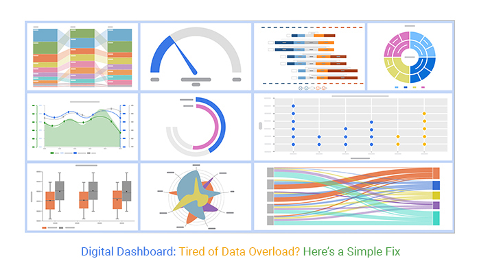
I've worked with countless businesses that struggle with the same fundamental problem: data overload. As companies collect more information than ever before, spreadsheets with 3,000+ rows have become the norm rather than the exception. Yet transforming this raw data into meaningful insights remains a significant challenge.
Common Pain Points with Large Spreadsheets
                    flowchart TD
                        A[Large Spreadsheet Data] --> B[Time-consuming Manual Analysis]
                        A --> C[Error Risk in Interpretation]
                        A --> D[Difficulty Extracting Insights]
                        A --> E[Inconsistent Reporting Formats]
                        B & C & D & E --> F[Decision-Making Delays]
The challenges of working with large spreadsheets are numerous and costly:
- Time drain: Manual analysis and visualization of large datasets can take hours or even days of valuable time.
- Error-prone: Human interpretation of extensive numerical data introduces a significant risk of mistakes.
- Insight barriers: Without proper visualization tools, important patterns and correlations remain hidden in the rows and columns.
- Format inconsistency: Different team members often create reports with varying formats, making comparison difficult.
This is precisely where generate excel reports with ai tools comes into play. PageOn.ai bridges the critical gap between raw spreadsheet data and actionable business insights by using artificial intelligence to transform complex numerical information into clear visual stories.
"The greatest value of a picture is when it forces us to notice what we never expected to see." — John Tukey, American mathematician
Understanding AI-Powered Spreadsheet Transformation
The journey from manual spreadsheet analysis to AI-assisted reporting represents a fundamental shift in how we interact with data. I've witnessed firsthand how this evolution has transformed businesses' relationship with their information assets.
Traditional vs. AI-Powered Reporting
| Factor | Traditional Method | AI-Powered Approach |
|---|---|---|
| Time Required | Hours to days | Minutes |
| Error Rate | High (human error) | Low (algorithmic precision) |
| Insight Depth | Limited by human analysis | Enhanced by pattern recognition |
| Customization | Time-consuming | Rapid through natural language |
| Scalability | Poor (manual effort increases with data) | Excellent (handles growing datasets) |
What makes PageOn.ai's approach unique is its conversation-based interface. Unlike template-based tools that force your data into predetermined formats, PageOn.ai allows you to shape your reports through natural language commands. This creates a fundamentally different experience – one where the technology adapts to your needs rather than forcing you to adapt to its limitations.
                    flowchart LR
                        A[Raw Spreadsheet Data] --> B[AI Data Processing]
                        B --> C[Natural Language Understanding]
                        C --> D[Pattern Recognition]
                        D --> E[Automated Visualization]
                        E --> F[Interactive Report]
                        style A fill:#FFE5CC,stroke:#FF8000
                        style F fill:#FFE5CC,stroke:#FF8000
The technology behind PageOn.ai's transformation capabilities combines several advanced AI components:
- Data understanding algorithms that comprehend the structure and relationships within your spreadsheet
- Natural language processing that interprets your requests in plain English
- Visualization intelligence that selects the most appropriate chart types for your specific data
- Design optimization that ensures your reports are both informative and visually appealing
This combination creates a system that can transform tabular data into visual stories with minimal input from you, regardless of your technical expertise or design skills.
Step-by-Step Process: Converting Your Spreadsheet Data to Visual Reports
I've guided many teams through their first AI report transformation, and the process is remarkably straightforward. Let me walk you through the exact steps to turn your spreadsheet data into compelling visual reports using PageOn.ai.
1. Preparing Your Spreadsheet Data
Before uploading your spreadsheet, a few simple preparation steps will significantly improve your results:
- Clean your data by removing duplicates and fixing inconsistencies
- Ensure column headers are clear and descriptive
- Format dates consistently throughout your spreadsheet
- Check for missing values and decide how to handle them
Pro Tip: Data Cleaning Checklist
- Remove duplicate entries
- Standardize text formatting (e.g., "USA" vs. "United States")
- Check for and handle outliers
- Ensure consistent number formatting
- Verify date formats are uniform
2. Uploading and Connecting Your Data
PageOn.ai makes the data connection process simple:
- Log in to your PageOn.ai account
- Click "New Project" and select "Data Visualization"
- Choose "Upload Spreadsheet" or connect to cloud storage
- Select your file (Excel, CSV, or other supported formats)
- Wait briefly while PageOn.ai analyzes your data structure
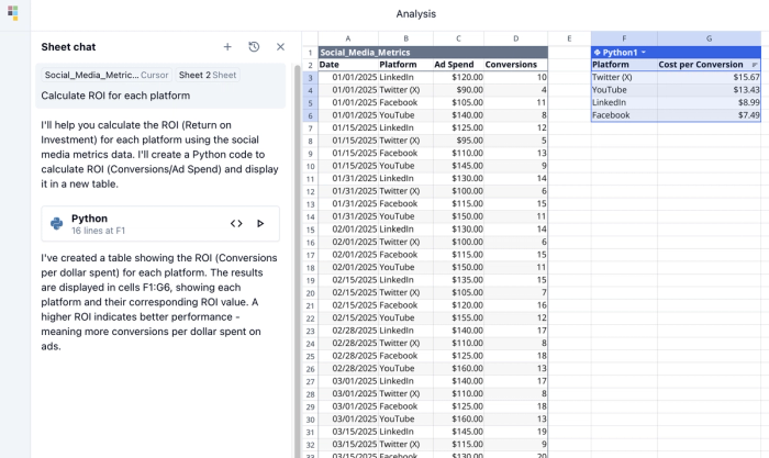
3. Using Natural Language Commands
This is where the magic happens. Rather than navigating complex menus and settings, you can simply tell PageOn.ai what you want to see using everyday language.
Effective Prompt Examples:
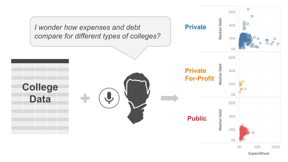
- "Show me monthly sales trends over the past year with a breakdown by product category"
- "Create a comparison of regional performance using a horizontal bar chart"
- "Visualize the correlation between marketing spend and customer acquisition"
- "Generate a dashboard showing key performance metrics with year-over-year comparison"
To refine your results, try these approaches:
- Be specific about time periods (e.g., "last 6 months" vs. "since January 2022")
- Name exact columns you want to analyze
- Specify visualization types if you have preferences
- Ask for comparisons between specific data segments
4. Customizing Your Visualizations
Once PageOn.ai generates your initial visualizations, you can refine them through additional conversational commands:
Try these customization requests:
- "Change the chart colors to match our brand palette"
- "Add a trendline to show the overall direction"
- "Switch this to a stacked bar chart instead"
- "Highlight the top three performing regions"
- "Add annotations to explain the January spike"
With each interaction, PageOn.ai learns your preferences and improves its understanding of your data, creating increasingly relevant visualizations that tell your data's story effectively.
This conversational approach to data visualization is what makes AI tools for creating reports so accessible to non-technical users. You don't need to understand complex chart properties or data manipulation techniques – you simply need to know what questions you want your data to answer.
Advanced Data Storytelling Techniques with PageOn.ai
Creating truly impactful reports goes beyond generating basic charts. It's about crafting a compelling narrative that guides your audience through the data and leads them to meaningful conclusions. PageOn.ai excels at helping you tell these data stories effectively.
Building Narratives with AI Blocks
One of PageOn.ai's most powerful features is AI Blocks – modular components that can be combined to create sophisticated data narratives. These blocks allow you to:
- Create reusable visualization templates that maintain consistency across reports
- Combine multiple data views to provide comprehensive context
- Build progressive disclosures that reveal insights in a logical sequence
- Integrate explanatory text that interprets the visualizations for your audience
                    flowchart TD
                        A[AI Block: Overview Dashboard] --> B[AI Block: Trend Analysis]
                        B --> C[AI Block: Segment Comparison]
                        C --> D[AI Block: Anomaly Highlights]
                        D --> E[AI Block: Recommendation Summary]
                        style A fill:#FFE5CC,stroke:#FF8000
                        style B fill:#FFE5CC,stroke:#FF8000
                        style C fill:#FFE5CC,stroke:#FF8000
                        style D fill:#FFE5CC,stroke:#FF8000
                        style E fill:#FFE5CC,stroke:#FF8000
To create your own AI Block, simply:
- Generate a visualization you'd like to reuse
- Click "Save as AI Block"
- Name your block and add descriptive tags
- Specify which elements should remain fixed and which should adapt to new data
These blocks can then be quickly applied to future reports, maintaining visual consistency while adapting to new data.
Implementing Interactive Elements
Static reports have their place, but interactive elements can dramatically enhance data exploration. With PageOn.ai, you can add powerful interactive features without writing a single line of code:
Common interactive elements you can implement include:
- Data filters that allow viewers to focus on specific segments
- Time period selectors for temporal data exploration
- Drill-down capabilities to move from overview to detail
- Comparative toggles to switch between different metrics
- Annotation tools that let viewers mark and comment on insights
To add these elements, simply tell PageOn.ai what you want: "Add a filter for department selection" or "Create a time slider for the date range."
Enhancing Reports with Deep Search
PageOn.ai's Deep Search capability allows you to enrich your reports with contextual information that may not be present in your original spreadsheet. This feature can:
- Add industry benchmarks for comparison
- Incorporate relevant news events that might explain data anomalies
- Suggest potential correlations with external factors
- Provide contextual definitions for technical terms
This contextual enhancement transforms raw data visualization into truly insightful business intelligence, helping your audience not just see what happened, but understand why it matters.
With these advanced storytelling techniques, PageOn.ai enables you to create reports that go far beyond simple charts and graphs. You can craft compelling narratives that guide your audience through complex data landscapes, highlighting the insights that matter most and prompting informed decision-making.
Real-World Applications: Transforming Different Types of Spreadsheet Data
Let's explore how different departments can leverage PageOn.ai to transform their specific spreadsheet data into actionable visual reports. I've worked with teams across various industries and have seen firsthand how this technology adapts to different use cases.
Financial Data Transformation
Finance teams often work with some of the most complex and sensitive spreadsheets in an organization. Here's how they're using AI-powered visualization:
Case Study: Mid-Size Manufacturing Company
A manufacturing firm was struggling with quarterly financial reviews that took their CFO team over a week to prepare. By implementing PageOn.ai, they:
- Reduced report preparation time from 40+ hours to under 3 hours
- Created consistent executive dashboards that highlighted key variances automatically
- Implemented scenario modeling visualizations for budget planning
- Established automated monthly reporting that maintained the same visual language
Financial teams are using PageOn.ai to create:
- Executive-ready financial summaries with clear variance highlighting
- Cash flow projections with scenario modeling
- Budget vs. actual comparisons with automatic anomaly detection
- Investment portfolio performance visualizations
AI financial report generators are particularly valuable when dealing with sensitive financial data, as they allow you to maintain control of your information while still benefiting from advanced visualization capabilities.
Marketing Analytics Visualization
Marketing teams often struggle with connecting campaign data to actual results. PageOn.ai helps bridge this gap:
Case Study: E-commerce Retailer
An online retailer was tracking campaign performance across 12 channels but struggling to identify which channels were truly driving profitable growth. Using PageOn.ai, they:
- Created multi-touch attribution visualizations that revealed hidden customer journey insights
- Built automated weekly performance dashboards comparing channels
- Developed ROI projections for different marketing budget allocations
- Implemented cohort analysis visualizations to track customer lifetime value by acquisition source
Marketing teams are using PageOn.ai for:
- Campaign performance comparisons across channels
- Customer journey mapping and funnel visualizations
- Content performance analytics
- Competitive positioning visualizations
- Market segmentation and targeting analysis
Operational Reporting Transformations
Operations teams often have the most data-heavy spreadsheets, tracking everything from inventory levels to production efficiency. PageOn.ai helps transform this data into decision-driving visuals:
Case Study: Logistics Company
A logistics provider was tracking thousands of shipments daily but struggling to identify optimization opportunities. After implementing PageOn.ai, they:
- Created route efficiency visualizations that identified 23% potential cost savings
- Built real-time delivery performance dashboards
- Developed inventory forecasting visuals that reduced stockouts by 37%
- Implemented supplier performance scorecards
Operations teams are using PageOn.ai for:
- Supply chain visibility dashboards
- Production efficiency tracking
- Quality control monitoring and analysis
- Resource allocation optimization
- Maintenance scheduling and performance tracking
Human Resources teams are also finding value in transforming their spreadsheet data:
HR applications include:
- Team performance dashboards
- Recruitment funnel analytics
- Employee satisfaction and engagement tracking
- Diversity and inclusion metrics
- Training effectiveness visualization
Across all these departments, the common thread is the transformation of complex tabular data into clear, actionable visual insights that drive better decisions. PageOn.ai adapts to each team's specific needs while maintaining a consistent visual language across the organization.
Maximizing Efficiency: Automation and Integration Capabilities
The true power of AI-powered report generation comes from automation and integration. I've helped teams move beyond one-off report creation to establish automated workflows that continuously transform their data into actionable insights with minimal oversight.
                    flowchart LR
                        A[Data Sources] --> B[Automated Collection]
                        B --> C[AI Processing]
                        C --> D[Report Generation]
                        D --> E[Distribution]
                        E --> F[Feedback Loop]
                        F --> C
                        subgraph "Data Sources"
                            A1[Spreadsheets]
                            A2[Cloud Storage]
                            A3[Database]
                            A4[APIs]
                        end
                        A1 & A2 & A3 & A4 --> A
Setting Up Recurring Report Generation
PageOn.ai allows you to establish automated reporting workflows that trigger whenever your source data is updated. Here's how to set this up:
- Create your base report template with the visualizations and insights you want to track
- Configure your data source connection (cloud spreadsheet, database, or API)
- Set your update frequency (daily, weekly, monthly, or triggered by data changes)
- Define distribution rules for who receives the updated reports and in what format
- Establish alert thresholds for automatic notifications when key metrics change significantly
Automation Best Practice
When setting up automated reports, include a "Key Changes Since Last Report" section at the top. This helps busy stakeholders quickly understand what's new and important without having to compare reports manually.
Integration Options
PageOn.ai offers flexible integration options to connect with your existing data ecosystem:

Direct Connections to Cloud Spreadsheets
PageOn.ai connects directly with:
- Google Sheets (with real-time sync capabilities)
- Microsoft Excel Online
- Airtable
- Smartsheet
API Connections
For more advanced setups, PageOn.ai can connect to:
- REST APIs with custom authentication
- Database connections (SQL, NoSQL)
- Data warehouse solutions (Snowflake, BigQuery, Redshift)
- Business intelligence platforms (Tableau, Power BI, Looker)
Export and Sharing Options
Once reports are generated, they can be:
- Exported as PDF, PNG, or interactive HTML
- Embedded in websites or internal portals
- Shared via secure links with granular permission controls
- Scheduled for automatic email distribution
- Posted to collaboration tools like Slack, Microsoft Teams, or Notion
Using PageOn.ai's Agentic Capabilities
One of PageOn.ai's most powerful features is its ability to act as an autonomous agent that maintains your reports with minimal oversight. These agentic capabilities include:
- Anomaly detection that automatically flags unusual patterns or outliers
- Insight generation that identifies key trends and correlations without human guidance
- Format optimization that adjusts visualizations based on the data's changing characteristics
- Data quality monitoring that alerts you to potential issues in your source data
- Contextual enhancement that automatically adds relevant external information
These agentic capabilities mean your reports don't just update with new numbers – they evolve and improve over time, adapting to changing data patterns and business needs.
Collaborative Features
PageOn.ai facilitates team-based report development and sharing through:
- Shared workspaces where teams can collaborate on report creation
- Version control that tracks changes and allows rollback if needed
- Comment and annotation tools for feedback and discussion
- Role-based permissions that control who can view, edit, or share reports
- Activity tracking that shows who viewed reports and for how long
With these automation and integration capabilities, PageOn.ai transforms from a simple visualization tool into a comprehensive reporting ecosystem that continuously delivers insights with minimal manual effort.
By leveraging AI business report generators, teams can establish consistent reporting workflows that free up valuable time for analysis and strategic thinking rather than report creation.
Measuring Success: The Impact of AI-Transformed Reports
To ensure you're getting maximum value from your investment in AI reporting tools like PageOn.ai, it's important to measure the impact systematically. I've helped organizations establish frameworks for evaluating their AI reporting initiatives and have seen how proper measurement drives continuous improvement.
Key Metrics to Track
When evaluating the success of your AI reporting implementation, focus on these key metrics:
- Time savings: Compare the hours spent on report creation before and after implementing PageOn.ai
- Data utilization rate: Track what percentage of your available data is actually being used in decision-making
- Decision velocity: Measure how quickly decisions are made after receiving reports
- Report accuracy: Monitor for errors or misinterpretations in AI-generated visualizations
- User adoption: Track how many team members actively use and reference the reports
- Insight generation: Count the number of actionable insights identified from reports
Success Measurement Tip
Create a simple "insight tracker" where team members can log actionable insights they've gained from reports and the business impact of decisions made based on those insights. This creates a direct link between your reporting efforts and business outcomes.
Improving Data Comprehension
One of the most significant benefits of PageOn.ai's visual approach is improved data comprehension across teams with varying levels of data literacy. This improvement can be measured through:
- Comprehension testing: Ask team members to extract key insights from both traditional spreadsheets and visual reports
- Meeting efficiency: Track how much time is spent explaining data in meetings before and after implementing visual reports
- Cross-functional alignment: Measure agreement on data interpretation across different departments
- Retention testing: Check how well team members remember key data points after viewing different report formats
Organizations consistently find that well-designed visual reports lead to:
- 40-60% faster comprehension of complex data
- 25-35% better retention of key information
- 50-70% reduction in misinterpretation
- 30-45% improvement in cross-team alignment on data meaning
Building a Data-Driven Culture
The ultimate measure of success is how PageOn.ai helps build a more data-driven organizational culture. Signs of progress include:
- Increased data requests: Teams proactively seek data to inform decisions
- Data-backed proposals: New initiatives consistently include supporting data
- Expanded data literacy: More team members can confidently discuss and interpret data
- Testing culture: Increased use of A/B testing and experimentation
- Reduced "opinion-based" decisions: Fewer instances of decisions made solely on intuition
By tracking these cultural indicators alongside more quantitative metrics, you can build a comprehensive picture of how PageOn.ai is transforming your organization's relationship with data.
Remember that the goal isn't just prettier reports – it's better decisions made faster with greater confidence. When measuring success, always connect your reporting improvements back to these fundamental business outcomes.
By using ai tools for excel charts, organizations can dramatically improve how they visualize and understand their data, leading to better business outcomes across the board.
Getting Started: Your First AI-Powered Report
Ready to transform your spreadsheet data into compelling visual reports? I've guided hundreds of users through their first PageOn.ai experience, and I've distilled the process into a simple quick-start guide to help you succeed from day one.
                    flowchart TD
                        A[Select a Spreadsheet] --> B[Clean & Prepare Data]
                        B --> C[Upload to PageOn.ai]
                        C --> D[Create First Visualization]
                        D --> E[Refine Through Conversation]
                        E --> F[Share & Collect Feedback]
                        F --> G[Iterate & Improve]
                        style A fill:#FFE5CC,stroke:#FF8000
                        style G fill:#FFE5CC,stroke:#FF8000
Quick-Start Guide
-
Choose the right first project
Start with a spreadsheet that has clear value but isn't mission-critical. Aim for data that's relatively clean with 500-3000 rows – complex enough to demonstrate value but not overwhelming.
-
Prepare your data
Ensure column headers are clear and descriptive. Remove any summary rows or extraneous formatting. Check for missing values and decide how to handle them (remove, replace with zeros, or use averages).
-
Define your goals
What specific questions do you want this report to answer? What decisions should it inform? Having clear objectives will help you focus your first report.
-
Create your PageOn.ai account
Sign up at PageOn.ai and explore the interface before uploading your data. Familiarize yourself with the basic navigation and features.
-
Upload your spreadsheet
Follow the upload prompts and verify that PageOn.ai has correctly interpreted your data structure.
-
Start with a simple request
Begin with a straightforward visualization request like "Show me monthly trends for [your key metric]" or "Compare performance across [your main categories]."
-
Refine through conversation
Use follow-up requests to refine your visualization: "Add a trendline," "Sort by performance," "Change to a different chart type," etc.
-
Build your complete report
Once you're comfortable with individual visualizations, start building a complete report with multiple views and contextual explanations.
-
Share and gather feedback
Share your report with a small group of colleagues and collect their feedback on clarity, insights, and usability.
-
Iterate and expand
Use the feedback to refine your report, then consider how to expand it or create additional reports for other data sets.
Common Pitfalls to Avoid
Watch Out For These Common Mistakes
- Data overload: Trying to visualize too many metrics at once, creating cluttered reports
- Unclear objectives: Creating reports without specific business questions in mind
- Ignoring context: Failing to provide necessary background information for data interpretation
- Poor data preparation: Uploading messy spreadsheets with inconsistent formatting
- Overly complex requests: Starting with extremely complex visualization requests before mastering basics
Resources for Expanding Your AI Reporting Capabilities
As you become more comfortable with PageOn.ai, these resources will help you advance your skills:
- PageOn.ai Knowledge Base: Comprehensive tutorials and best practices
- Prompt Gallery: Examples of effective prompts for different visualization needs
- Template Library: Pre-built report templates for common business scenarios
- User Community: Forums where you can share ideas and learn from other users
- Webinar Series: Regular training sessions on advanced features and techniques
Measuring ROI from Your Initial Projects
To demonstrate the value of your AI reporting initiative, track these metrics from your very first project:
- Time comparison: Track how long it takes to create your first AI report vs. how long it would have taken manually
- Insight count: Document specific insights discovered through your visualizations
- Decision influence: Note any decisions that were influenced by your new reports
- Engagement metrics: Track how many team members viewed and interacted with your reports
- Feedback quality: Collect qualitative feedback on report clarity and usefulness
By documenting these metrics from the start, you'll build a compelling case for expanding your use of PageOn.ai across more data sets and teams.
Success Story
"We started with just one marketing performance spreadsheet as our test case for PageOn.ai. The time savings were so dramatic (from 4 hours of manual work to 15 minutes) and the insights so valuable that we quickly expanded to all our marketing data. Six months later, we're using PageOn.ai across sales, finance, and operations, saving over 40 hours per week while making better decisions."
— Marketing Director, SaaS Company
Remember that your first AI-powered report is just the beginning. With each project, you'll discover new ways to transform your spreadsheet data into valuable insights that drive better business decisions.
The journey from spreadsheets to stunning visual reports doesn't have to be complicated. With PageOn.ai's intuitive interface and powerful AI capabilities, anyone can create professional-quality data visualizations without coding skills or design expertise.
Transform Your Visual Expressions with PageOn.ai
Stop struggling with complex spreadsheets and start creating beautiful, insightful reports in minutes. PageOn.ai's intuitive AI tools make data visualization accessible to everyone, regardless of technical skill.
Start Creating with PageOn.ai TodayConclusion: Embracing the Future of Data Visualization
Throughout this guide, I've walked you through the process of transforming complex spreadsheet data into clear, actionable visual reports using PageOn.ai. The ability to convert 3000-row spreadsheets into compelling visual stories without coding skills represents a fundamental shift in how we interact with business data.
The benefits of this approach are clear:
- Dramatic time savings that free up your team for higher-value work
- Improved data comprehension across all levels of technical expertise
- More consistent reporting that builds a shared visual language
- Deeper insights through AI-powered pattern recognition
- Faster decision-making enabled by clear, actionable visualizations
As data volumes continue to grow exponentially, the ability to quickly transform raw numbers into meaningful insights will become an increasingly critical competitive advantage. PageOn.ai provides this capability without requiring specialized data science skills or design expertise.
I encourage you to start your own transformation journey today. Upload a spreadsheet, ask a simple question, and watch as PageOn.ai helps you see your data in an entirely new light. The insights waiting to be discovered in your spreadsheets could transform your business decisions – and now they're just a conversation away.
"The goal is to turn data into information, and information into insight." — Carly Fiorina
You Might Also Like
Streamlining AI Integration: How MCP Transforms the N×N Challenge into a Manageable Solution
Discover how the Model Context Protocol (MCP) solves the complex N×N integration challenge in AI ecosystems, transforming it into a simpler N+N equation for enterprise AI adoption.
The Strategic Power of Verbal Pauses: Command Prospect Attention and Drive Action
Master the art of strategic verbal pauses to control prospect focus, create urgency, and drive sales conversions. Learn timing techniques, avoid common pitfalls, and develop your personal strategy.
Tracking Presentation Engagement: Transform Your Impact With Built-in Analytics
Discover how built-in analytics transforms presentation engagement. Learn to track audience behavior, implement data-driven strategies, and maximize your presentation impact.
Mastering Visual Weight in Design: Creating Hierarchy, Balance, and Impact
Explore the principles of visual weight in design and learn how to create compelling hierarchies, perfect balance, and maximum impact in your visual compositions.