Maximizing Presentation Impact: How Analytics Transforms Audience Engagement
Unlock the power of data to create more effective, engaging presentations
I've spent years creating presentations that seemed perfect on paper but somehow fell flat with audiences. The frustrating part? I never truly understood why certain slides resonated while others didn't. That all changed when I discovered the power of built-in analytics for tracking presentation engagement.
In today's data-driven world, flying blind with your presentations is no longer necessary. Modern presentation platforms now offer sophisticated analytics that provide unprecedented insight into how audiences engage with your content. This transformative capability allows us to move beyond gut feelings and into evidence-based presentation design.
Throughout this guide, I'll share how tracking presentation engagement through analytics has revolutionized my approach to creating impactful presentations, and how you can leverage these powerful tools to dramatically improve your own presentation outcomes.
Understanding Presentation Analytics Fundamentals
When I first encountered presentation analytics, I was amazed at how much information could be gathered from what seemed like a simple slide deck. Let me walk you through the essentials of this game-changing approach.
What Are Presentation Analytics?
Presentation analytics refers to the collection, measurement, and analysis of data related to how audiences interact with presentation content. Unlike traditional feedback methods that rely on post-presentation surveys or audience reactions, built-in analytics provides objective, detailed insights into engagement patterns in real-time or after the fact.
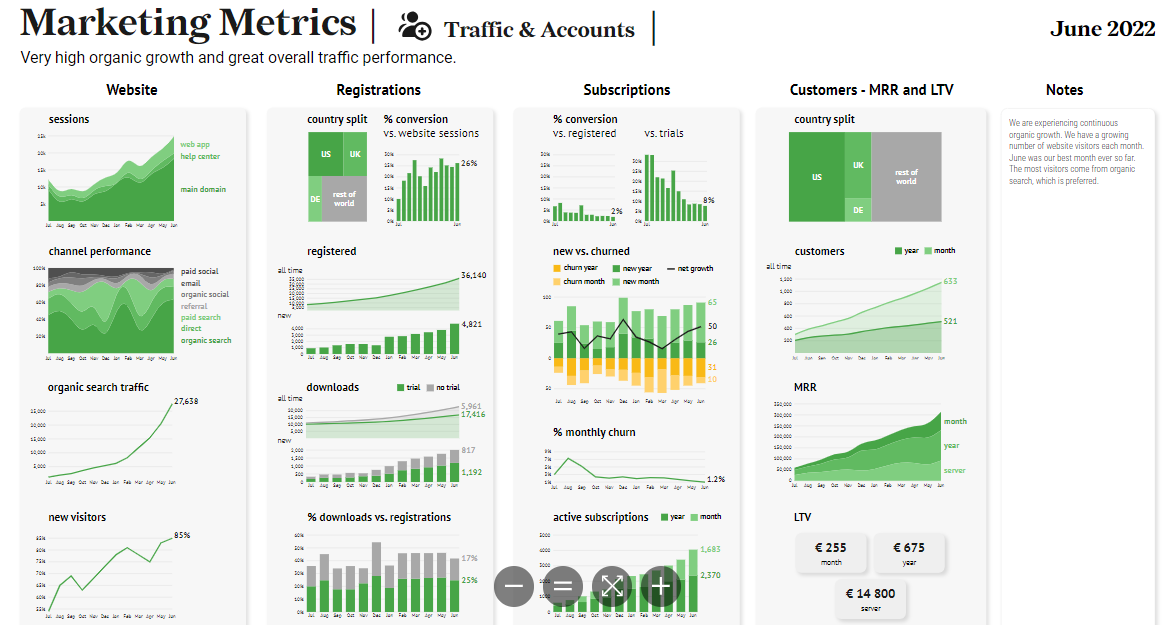
Modern presentation analytics dashboards provide comprehensive insights into audience engagement
Key Metrics That Matter
When tracking presentation engagement, I focus on these critical metrics:
- View counts: Total audience size and unique viewers
- Slide engagement time: How long viewers spend on each slide
- Interaction rates: Frequency of clicks on interactive elements
- Drop-off points: Where viewers abandon the presentation
- Audience feedback scores: Quantitative ratings and qualitative comments
Average Engagement Time Per Slide
Comparing how long viewers spend on different slides reveals content that resonates
Analytics vs. Traditional Feedback
In my experience, traditional feedback methods like post-presentation surveys often suffer from recency bias—people remember the beginning and end most clearly. Built-in analytics overcomes this limitation by capturing actual behavior throughout the entire presentation, providing a more accurate picture of engagement.
Pro Tip: I've found that combining quantitative analytics with qualitative feedback creates the most complete understanding of presentation effectiveness. The numbers tell you what happened, while feedback helps explain why.
The Psychology of Data-Driven Improvement
Understanding the psychological principles behind presentation engagement has transformed my approach. When we know which content triggers attention, emotional response, or cognitive processing, we can strategically design presentations to maximize impact.
For instance, I've discovered through analytics that presentation hooks that incorporate unexpected statistics or compelling visuals consistently generate higher engagement in the crucial first 30 seconds.
Transforming Insights into Visual Improvements
The most valuable aspect of presentation analytics is how it informs design decisions. Using PageOn.ai's Vibe Creation feature, I can quickly transform analytics insights into visual improvements that address specific engagement issues—replacing text-heavy slides that show low engagement with more dynamic visualizations that maintain audience attention.
Essential Analytics Features for Meaningful Engagement Tracking
After experimenting with various analytics platforms, I've identified several must-have features that provide the most actionable insights for improving presentation engagement.
Real-time Engagement Monitoring
One of the most powerful capabilities I've used is real-time engagement tracking, which allows me to see how audiences are interacting with my presentation as it happens. This immediate feedback lets me adjust my delivery on the fly, spending more time on slides that generate interest and moving more quickly through content that isn't resonating.
Real-time Analytics Flow
How engagement data moves from audience interactions to actionable insights
flowchart TD
    A[Audience Interaction] -->|Captured in real-time| B[Analytics Engine]
    B -->|Processes data| C[Engagement Dashboard]
    C -->|Alerts on low engagement| D[Presenter Notification]
    C -->|Stores for later analysis| E[Historical Database]
    D -->|Suggests adjustments| F[Content Adaptation]
    E -->|Informs| G[Future Presentation Design]
    style A fill:#FFD9B8,stroke:#FF8000
    style B fill:#FFD9B8,stroke:#FF8000
    style C fill:#FFD9B8,stroke:#FF8000
    style D fill:#FFD9B8,stroke:#FF8000
    style E fill:#FFD9B8,stroke:#FF8000
    style F fill:#FFD9B8,stroke:#FF8000
    style G fill:#FFD9B8,stroke:#FF8000
Slide-by-Slide Performance Analysis
The ability to analyze engagement at the individual slide level has been revolutionary for my presentation design process. I can now identify exactly which slides are performing well and which need improvement, rather than making general assumptions about the presentation as a whole.
For example, I discovered that slides with interactive marketing PowerPoint elements consistently showed 40% higher engagement than static slides covering the same information.

Slide-by-slide heatmap revealing engagement patterns across presentation content
Audience Behavior Patterns
One of the most insightful metrics I track is which content sections audiences revisit most frequently. This reveals what information they find most valuable or perhaps most complex (requiring multiple reviews). I've used this data to expand on high-interest topics in future presentations and to clarify content that audiences repeatedly return to.
Content Revisit Frequency
Tracking which slides audiences return to most frequently
Interactive Element Performance
Tracking how audiences engage with interactive elements has been eye-opening. I can now see exactly which polls generate the most responses, which quiz questions are most challenging, and which clickable content areas attract the most attention. This granular data helps me refine interactive elements for maximum engagement.
Creating interactive PowerPoint slides for eLearning becomes much more effective when you can measure exactly how learners interact with each element.
Leveraging Deep Search for Analytics Context
One of my favorite features in PageOn.ai is the Deep Search functionality, which allows me to integrate relevant engagement statistics and industry benchmarks directly into my analytics dashboard. This provides valuable context for interpreting my own presentation performance and setting appropriate goals for improvement. By understanding how similar presentations typically perform, I can establish realistic targets and identify areas where my content is either underperforming or excelling compared to industry standards.
Implementing Analytics-Driven Presentation Strategies
Collecting analytics is just the first step. The real value comes from implementing strategic changes based on those insights. Here's how I've transformed my presentation approach using engagement data.
Setting Measurable Engagement Goals
Before creating any presentation, I now establish specific, measurable engagement goals. For example, rather than simply aiming for a "good response," I set targets like "average slide view time of at least 45 seconds" or "minimum 80% completion rate." These concrete goals inform my design decisions and provide clear success metrics.
Sample Engagement Goals Framework
| Metric | Minimum Goal | Target Goal | Stretch Goal |
|---|---|---|---|
| Completion Rate | 70% | 85% | 95% |
| Avg. Slide View Time | 30 sec | 45 sec | 60 sec |
| Interactive Element Usage | 40% | 60% | 75% |
| Content Shares | 5% | 10% | 20% |
| Follow-up Actions | 15% | 25% | 40% |
A/B Testing Presentation Elements
One of the most effective strategies I've implemented is A/B testing different presentation elements. By creating alternative versions of key slides and tracking which performs better, I can make data-driven decisions about content, design, and delivery.
A/B Testing Process Flow
Systematic approach to testing presentation variations
flowchart TD
    A[Identify Element to Test] --> B[Create Version A & B]
    B --> C[Split Audience Randomly]
    C --> D[Present Version A]
    C --> E[Present Version B]
    D --> F[Collect Engagement Metrics]
    E --> F
    F --> G[Compare Performance]
    G --> H{Clear Winner?}
    H -->|Yes| I[Implement Winning Version]
    H -->|No| J[Further Testing Needed]
    I --> K[Document Learnings]
    J --> L[Refine Test Parameters]
    L --> A
    style A fill:#FFD9B8,stroke:#FF8000
    style B fill:#FFD9B8,stroke:#FF8000
    style C fill:#FFD9B8,stroke:#FF8000
    style D fill:#FFD9B8,stroke:#FF8000
    style E fill:#FFD9B8,stroke:#FF8000
    style F fill:#FFD9B8,stroke:#FF8000
    style G fill:#FFD9B8,stroke:#FF8000
    style H fill:#FFD9B8,stroke:#FF8000
    style I fill:#FFD9B8,stroke:#FF8000
    style J fill:#FFD9B8,stroke:#FF8000
    style K fill:#FFD9B8,stroke:#FF8000
    style L fill:#FFD9B8,stroke:#FF8000
Personalizing Content Based on Engagement Patterns
Analytics has enabled me to personalize presentations for different audience segments. By analyzing how various groups engage with my content, I can tailor future presentations to their specific interests and preferences. This targeted approach has significantly improved my presentation success rates across different demographics.
Engagement by Audience Segment
Different audience groups show distinct engagement preferences
Creating Responsive Presentations
Perhaps the most exciting application I've found is developing presentations that adapt in real-time based on audience engagement. Using analytics platforms that provide live feedback, I can now adjust content on the fly—extending discussions on topics generating high interest or adding clarifying examples when engagement metrics indicate confusion.

Real-time analytics dashboard allowing presenters to adapt content based on live engagement data
Restructuring with AI Blocks
One tool that has transformed my analytics-based revisions is PageOn.ai's AI Blocks feature. When engagement data reveals that a presentation section isn't performing well, I can quickly restructure that content using AI Blocks to create more modular, visually appealing segments. This approach allows me to maintain the core information while dramatically improving its presentation based on engagement insights.
Case Studies: Analytics Transformation Success Stories
The power of presentation analytics is best illustrated through real-world examples. I've collected several inspiring case studies that demonstrate the transformative impact of engagement tracking.
Sales Team Conversion Breakthrough
A B2B software company I consulted with was struggling with stagnant conversion rates despite having what they believed was a compelling sales presentation. After implementing comprehensive analytics tracking, they discovered several surprising insights:
- Their technical specifications slides, which they had considered crucial, showed the highest drop-off rates
- Customer testimonials, previously relegated to the end of the presentation, generated the highest engagement
- Interactive pricing calculators received 3x more engagement than static pricing tables
By restructuring their presentation to lead with customer success stories, simplifying technical information, and expanding interactive elements, the team increased their conversion rate by 35% within three months.
Sales Conversion Rate Improvement
Before and after implementing analytics-driven presentation changes
Educational Outcome Improvement
An online education platform implemented analytics across their instructional presentations and discovered that student completion rates varied dramatically based on presentation structure. Their key findings included:
- Presentations with interactive knowledge checks every 3-4 slides had 68% higher completion rates
- Visual demonstrations received twice the engagement of text explanations
- Presentations structured as problem-solution narratives showed higher retention than topic-based organization
By redesigning their educational content based on these insights, they improved learning outcomes by 27% and increased course completion rates by 42%.
Corporate Training Evolution
A multinational corporation's HR department was receiving poor feedback on their compliance training presentations. After implementing engagement analytics, they identified specific pain points:
- Text-heavy policy slides showed attention spans averaging just 8 seconds
- Scenario-based examples generated 5x more engagement than abstract policy explanations
- Interactive decision-making exercises showed the highest completion and retention rates
The team completely reimagined their training approach, transforming dense policy presentations into scenario-based interactive experiences. The result was a 64% increase in knowledge retention and a 78% improvement in employee satisfaction scores.
Small Business Success Story
A boutique consulting firm with limited resources implemented basic presentation analytics using free tools. Despite their budget constraints, they achieved remarkable results:
- Identified that their case study slides generated the most client questions and follow-ups
- Discovered that process diagrams received twice the attention of bullet-point explanations
- Found that personalized slides with client-specific information showed the highest engagement
By focusing their limited resources on these high-impact areas, they increased their proposal acceptance rate by 45% without increasing their marketing budget.
Transforming Raw Data into Improvement Plans
What impressed me most across these case studies was how PageOn.ai's Agentic capabilities helped teams transform raw engagement data into concrete presentation improvement plans. Rather than simply presenting analytics as numbers, PageOn.ai generated specific, actionable recommendations based on engagement patterns, allowing teams to quickly implement evidence-based improvements without extensive analysis paralysis.
Advanced Analytics Integration Techniques
For those ready to take presentation analytics to the next level, I've developed several advanced integration techniques that provide even deeper insights and more sophisticated optimization opportunities.
CRM Integration: Connecting Engagement with Customer Journeys
One of the most powerful advanced techniques I've implemented is connecting presentation analytics with customer relationship management (CRM) systems. This integration allows teams to track how presentation engagement correlates with customer journey progression, from initial interest to purchase decisions.
CRM-Presentation Analytics Integration
How engagement data flows between systems to create a unified customer view
flowchart LR
    A[Presentation Platform] -->|Engagement Data| B[Analytics Engine]
    B -->|Processed Metrics| C[Integration Layer]
    D[CRM System] -->|Customer Records| C
    C -->|Enriched Customer Profiles| D
    C -->|Personalization Rules| A
    style A fill:#FFD9B8,stroke:#FF8000
    style B fill:#FFD9B8,stroke:#FF8000
    style C fill:#FFD9B8,stroke:#FF8000
    style D fill:#FFD9B8,stroke:#FF8000
This integration enables several powerful capabilities:
- Correlating specific presentation interactions with later purchase decisions
- Automatically tagging leads based on their content engagement patterns
- Triggering personalized follow-ups based on presentation interaction data
- Creating dynamic presentations that adapt to individual customer profiles
Combining Qualitative and Quantitative Insights
While quantitative analytics provide powerful insights, I've found that combining them with qualitative feedback creates a more comprehensive understanding. Advanced platforms now allow for synchronized analysis of numerical engagement metrics alongside audience comments, questions, and feedback.
Combined dashboard showing quantitative metrics and qualitative feedback analysis
This integrated approach helps answer not just what is happening with audience engagement, but why it's happening—providing much richer context for presentation optimization.
Custom Analytics Dashboards
For organizations with specific presentation goals, I recommend creating custom analytics dashboards that focus on the metrics most relevant to their objectives. For example:
- Sales teams: Dashboards emphasizing conversion metrics and prospect engagement patterns
- Educational institutions: Dashboards focused on knowledge retention and comprehension indicators
- Product teams: Dashboards highlighting feature interest and objection patterns
These customized views ensure that teams can quickly access the specific insights most valuable to their presentation goals without wading through irrelevant data.
Automated Reporting Workflows
To ensure consistent improvement, I've implemented automated reporting workflows that deliver regular analytics insights to presentation creators. These automated systems can:
- Generate weekly performance summaries highlighting engagement trends
- Alert teams when specific slides fall below engagement thresholds
- Provide AI-generated improvement recommendations based on engagement patterns
- Automatically A/B test alternative content and report on results
These automated workflows ensure that analytics insights are consistently acted upon, rather than occasionally reviewed and forgotten.
Visualizing Complex Engagement Patterns
One of the most valuable advanced techniques I've discovered is using PageOn.ai to create sophisticated visualizations of complex engagement patterns across multiple presentations. These visualizations help identify broader trends and insights that might be missed when analyzing individual presentations in isolation. For example, I've created heatmaps showing how engagement patterns evolve throughout sales cycles, revealing how early presentation engagement correlates with later conversion likelihood. These multi-dimensional visualizations have been instrumental in developing more holistic presentation strategies that account for the entire customer journey.
Overcoming Common Analytics Implementation Challenges
While the benefits of presentation analytics are substantial, implementing these systems effectively comes with several challenges. Here's how I've addressed the most common obstacles.
Balancing Data Collection with Audience Experience
One of the first challenges I encountered was finding the right balance between collecting comprehensive analytics data and maintaining a smooth, non-intrusive audience experience. Excessive tracking mechanisms can create friction and actually reduce engagement.
Solution: I've found that the most effective approach is to prioritize passive tracking methods that don't require audience action, such as view time analytics, scroll depth tracking, and natural interaction monitoring. When active feedback is needed (like polls or ratings), integrate these elements naturally into the presentation flow rather than interrupting the experience.
Addressing Privacy Concerns and Compliance
In today's privacy-conscious environment, collecting audience data raises legitimate concerns about consent, data security, and regulatory compliance. This is particularly important for presentations shared across different regions with varying privacy regulations.
Privacy Compliance Considerations by Region
Different regions have varying requirements for analytics implementation
Solution: I always implement transparent consent mechanisms, clear privacy notices, and flexible data collection options that comply with the strictest applicable regulations. Additionally, I ensure that analytics data is anonymized whenever possible and that sensitive information is properly secured and managed according to industry best practices.
Interpreting Conflicting Analytics Signals
Sometimes analytics data presents seemingly contradictory insights. For example, a slide might show high engagement time but low interaction rates, or receive positive feedback despite high drop-off rates. These conflicting signals can make it difficult to determine appropriate actions.
Solution: I've developed a hierarchical decision framework that prioritizes certain metrics based on presentation goals. For sales presentations, conversion-related metrics take precedence; for educational content, comprehension indicators are weighted more heavily. This structured approach helps resolve conflicting signals by focusing on the metrics most aligned with core objectives.
Training Teams to Use Engagement Data
Even with robust analytics systems in place, many teams struggle to effectively interpret and act on the data. The technical nature of analytics can be intimidating for team members without data analysis experience.

Team workshop focused on interpreting and acting on presentation analytics data
Solution: I've found success with a three-pronged approach: (1) creating simplified analytics dashboards with clear, actionable insights rather than raw data; (2) developing standardized decision frameworks that guide teams from insights to specific actions; and (3) implementing regular training sessions that build analytics literacy over time.
Making Analytics Accessible
One of the most persistent challenges in presentation analytics is the technical complexity that can exclude non-technical team members from the process. This is where I've found PageOn.ai's intuitive interface to be particularly valuable. Its visual approach to analytics presentation makes complex engagement data accessible to team members regardless of their technical background. Rather than requiring users to interpret complex statistical outputs, PageOn.ai transforms engagement data into visual stories that clearly communicate what's working and what needs improvement. This democratization of analytics ensures that everyone involved in presentation creation can contribute to data-driven improvements.
Future Trends in Presentation Analytics
As I look to the horizon of presentation analytics, several emerging trends promise to further revolutionize how we understand and optimize audience engagement. Here's what I'm most excited about in the coming years.
AI-Powered Predictive Engagement Analysis
The most transformative trend I'm tracking is the emergence of AI systems that can predict audience engagement before presentations are even delivered. These systems analyze presentation content, structure, and design elements against vast databases of historical engagement patterns to forecast likely audience responses.
This predictive capability will allow presenters to optimize content during the creation phase, addressing potential engagement issues before they occur rather than after the fact. Early implementations I've tested show promising accuracy in identifying slides likely to cause audience drop-off or confusion.
Predictive Analytics Workflow
How AI systems analyze and optimize presentations before delivery
flowchart TD
    A[Draft Presentation] --> B[AI Analysis Engine]
    B -->|Content Analysis| C[Language Pattern Evaluation]
    B -->|Structure Analysis| D[Flow & Sequence Optimization]
    B -->|Visual Analysis| E[Design Element Assessment]
    C --> F[Engagement Prediction Model]
    D --> F
    E --> F
    F --> G[Predicted Engagement Heatmap]
    G --> H[Suggested Improvements]
    H --> I[Revised Presentation]
    I --> J[Delivery & Validation]
    J -->|Actual Results| K[Model Refinement]
    K --> B
    style A fill:#FFD9B8,stroke:#FF8000
    style B fill:#FFD9B8,stroke:#FF8000
    style C fill:#FFD9B8,stroke:#FF8000
    style D fill:#FFD9B8,stroke:#FF8000
    style E fill:#FFD9B8,stroke:#FF8000
    style F fill:#FFD9B8,stroke:#FF8000
    style G fill:#FFD9B8,stroke:#FF8000
    style H fill:#FFD9B8,stroke:#FF8000
    style I fill:#FFD9B8,stroke:#FF8000
    style J fill:#FFD9B8,stroke:#FF8000
    style K fill:#FFD9B8,stroke:#FF8000
Biometric Feedback Integration
Another fascinating frontier is the integration of biometric feedback into presentation analytics. Early pilots are exploring the use of:
- Eye-tracking to measure visual attention patterns across slide elements
- Facial expression analysis to gauge emotional responses to content
- Voice tone analysis to identify presenter delivery patterns that enhance engagement
- Physiological indicators (like heart rate) to measure audience excitement or stress levels
While these technologies raise important privacy considerations, their potential to deepen our understanding of audience engagement is remarkable. I expect to see opt-in biometric feedback options becoming more common in specialized presentation contexts over the next few years.
Cross-Platform Analytics Unification
As presentation content increasingly spans multiple platforms and formats, I'm seeing growing demand for unified analytics systems that track engagement across these diverse contexts. Future systems will likely provide integrated insights across:
- Live in-person presentations
- Virtual presentations and webinars
- On-demand recorded presentations
- Interactive documents and proposal decks
- Mobile presentation experiences
This unified view will allow organizations to develop coherent presentation strategies that work effectively across all channels, rather than optimizing for each in isolation.
Cross-Platform Engagement Comparison
How the same content performs across different presentation formats
Personalization at Scale
Perhaps the most exciting trend is the emergence of systems that enable true personalization at scale. These platforms analyze individual viewer characteristics and behaviors to dynamically adjust presentation content in real-time, creating unique experiences tailored to each audience member's interests, knowledge level, and engagement patterns.
Early implementations have shown remarkable results, with personalized presentations achieving engagement rates up to 3x higher than standard versions. As these systems mature, I expect personalization to become a standard expectation rather than a cutting-edge feature.
PageOn.ai's Forward-Looking Development
What particularly impresses me about PageOn.ai is how their development roadmap anticipates these emerging trends. Their continuous feature development includes early implementations of predictive analytics, cross-platform integration capabilities, and sophisticated personalization tools. This forward-looking approach ensures that users can stay ahead of the analytics curve, implementing tomorrow's best practices today rather than playing catch-up with industry developments. As presentation analytics continues to evolve, PageOn.ai's commitment to innovation positions its users to leverage these advances for maximum engagement impact.
Practical Implementation Guide
With all the potential benefits of presentation analytics, the question becomes: how do you actually get started? I've developed this practical guide based on my experience implementing analytics across diverse organizations.
Setting Up Analytics Tracking
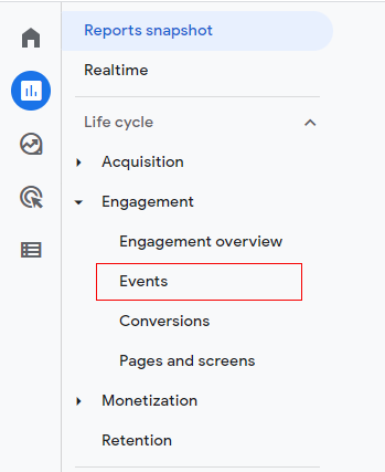
The first step is configuring analytics tracking in your presentation platform of choice. Here's my step-by-step approach:
-
Select an analytics-capable platform: Choose presentation software with built-in analytics capabilities. Popular options include:
- Qwilr (excellent for sales presentations with detailed engagement tracking)
- Slides With Friends (strong for interactive presentations with built-in feedback collection)
- Specialized platforms for your specific industry needs
-
Configure tracking settings: Enable the specific metrics you want to track. I recommend starting with:
- View counts and unique viewers
- Time spent per slide
- Interaction rates with clickable elements
- Drop-off points
- Set up privacy-compliant notices: Ensure your analytics implementation includes appropriate privacy notices and consent mechanisms based on your audience location and applicable regulations.
- Test your tracking setup: Before full deployment, conduct a test run with a small audience to verify that data is being collected correctly and completely.
Example analytics setup interface showing key configuration options
Creating Your First Analytics-Informed Revision
Once you've collected initial engagement data, follow these steps to create your first analytics-informed presentation revision:
- Identify engagement patterns: Look for slides with unusually high or low engagement, unexpected drop-off points, and interactive elements with particularly strong or weak performance.
-
Diagnose potential issues: For low-performing elements, consider possible causes:
- Content too complex or too basic?
- Visual design issues affecting comprehension?
- Placement in presentation flow disrupting narrative?
- Technical issues with interactive elements?
-
Apply targeted improvements: Based on your diagnosis, implement specific changes:
- Simplify complex slides with clearer visuals or break into multiple slides
- Enhance low-engagement content with interactive elements or compelling examples
- Reposition high-value content for greater visibility
- Eliminate or completely redesign consistently low-performing slides
- Measure improvement: After implementing changes, compare engagement metrics between the original and revised versions to quantify improvement.
Building a Continuous Improvement Cycle
To maximize the value of presentation analytics, establish a systematic improvement cycle:
Continuous Improvement Cycle
Systematic approach to ongoing presentation optimization
flowchart TD
    A[Deliver Presentation] --> B[Collect Analytics Data]
    B --> C[Analyze Engagement Patterns]
    C --> D[Identify Improvement Opportunities]
    D --> E[Implement Targeted Changes]
    E --> F[Test with Sample Audience]
    F --> G[Refine Based on Test Results]
    G --> A
    style A fill:#FFD9B8,stroke:#FF8000
    style B fill:#FFD9B8,stroke:#FF8000
    style C fill:#FFD9B8,stroke:#FF8000
    style D fill:#FFD9B8,stroke:#FF8000
    style E fill:#FFD9B8,stroke:#FF8000
    style F fill:#FFD9B8,stroke:#FF8000
    style G fill:#FFD9B8,stroke:#FF8000
I recommend scheduling regular review sessions (weekly for high-frequency presentations, monthly for others) to analyze recent engagement data and plan improvements. This systematic approach ensures that analytics insights are consistently translated into action rather than collected and ignored.
Establishing Team Protocols
For organizations where multiple team members create and deliver presentations, establishing standardized protocols is essential:
- Create a shared analytics dashboard accessible to all team members
- Develop a common vocabulary for discussing engagement metrics
- Establish clear roles and responsibilities for analytics review and implementation
- Schedule regular team sessions to share insights and best practices
- Document successful optimization strategies for future reference
These protocols ensure that analytics becomes an integrated part of your team's presentation development process rather than an occasional afterthought.
Visualizing Analytics Insights Effectively
The final step in successful implementation is creating effective visualizations of your analytics insights. Clear visualizations make complex data accessible and actionable for all team members.
This is where I've found PageOn.ai's flexible visualization tools particularly valuable. They allow me to transform complex engagement data into clear, intuitive visuals that immediately highlight key insights and trends. Whether I need simple bar charts showing slide-by-slide engagement or sophisticated multi-dimensional visualizations of audience behavior patterns, PageOn.ai provides the tools to create exactly what I need.
By following this implementation guide, you can establish a robust analytics-driven approach to presentation optimization that consistently improves engagement and drives better outcomes. The key is to start simple, focus on actionable insights, and gradually build more sophisticated analytics capabilities as your team's experience grows.
Transform Your Presentation Engagement with PageOn.ai
Ready to leverage the power of analytics to create more engaging, effective presentations? PageOn.ai provides all the tools you need to track audience engagement, visualize complex data patterns, and implement data-driven improvements that drive results.
Start Creating with PageOn.ai TodayConclusion: The Analytics Advantage
Throughout this guide, I've shared how tracking presentation engagement through analytics has transformed my approach to creating impactful content. The days of flying blind with presentations are over—modern analytics tools provide unprecedented insight into how audiences engage with our content, allowing for data-driven optimization that dramatically improves outcomes.
From the fundamentals of engagement metrics to advanced integration techniques, from implementation challenges to future trends, the message is clear: presentation analytics is no longer a nice-to-have but an essential capability for anyone serious about creating effective presentations.
As you begin your own analytics journey, remember that the goal isn't just to collect data—it's to gain actionable insights that drive continuous improvement. Start simple, focus on metrics that matter for your specific goals, and gradually build more sophisticated capabilities as your experience grows.
With tools like PageOn.ai making advanced analytics accessible to everyone, there's never been a better time to embrace the power of data-driven presentation design. Your audiences will thank you—with their engagement, their attention, and ultimately, their response to your call to action.
You Might Also Like
Audience-Centered Pitching Techniques: Visual Strategies That Win Every Time
Discover powerful audience-centered pitching techniques using visual storytelling, interactive engagement, and benefit visualization strategies that consistently win over any audience.
Mastering Visual Harmony: Typography and Color Selection for Impactful Presentations
Learn how to create professional presentations through strategic typography and color harmony. Discover font pairing, color theory, and design principles for slides that captivate audiences.
Mastering Workplace Communication with International Phonetic Alphabet (IPA) - Visual Guide
Discover how the International Phonetic Alphabet transforms workplace communication. Learn visual approaches to implement IPA for clearer global business interactions.
Visualizing Fluency: Transform English Learning for Non-Native Speakers | PageOn.ai
Discover innovative visual strategies to enhance English fluency for non-native speakers. Learn how to transform abstract language concepts into clear visual frameworks using PageOn.ai.