From Spreadsheets to Stunning Slides: Transform Excel Data into Professional Presentations
Overcome the data presentation challenge with AI-powered solutions
I've spent countless hours transforming Excel spreadsheets into presentations that executives actually want to look at. In this guide, I'll show you how to turn complex data into compelling visual stories in minutes, not hours, using modern AI tools and proven design techniques.
The Data Presentation Challenge
I've noticed a growing trend in professional environments: the increasing need to communicate Excel data effectively. Whether you're a financial analyst presenting quarterly results or a marketing specialist showcasing campaign performance, translating spreadsheets into compelling visuals is now an essential skill.
The frustration of manually converting complex Excel data into presentation-ready formats
Common Pain Points
When I work with clients, they consistently share these frustrations about manually converting Excel data:
flowchart TD
    A[Excel Data] --> B[Time-Consuming
Formatting]
    A --> C[Inconsistent
Visual Styles]
    A --> D[Difficulty Highlighting
Key Insights]
    A --> E[Data Accuracy
Concerns]
    B --> F[Hours of
Manual Work]
    C --> G[Unprofessional
Appearance]
    D --> H[Lost Business
Impact]
    E --> I[Potential
Errors]
    style A fill:#FF8000,stroke:#333,stroke-width:2px
    style B fill:#f9f9f9,stroke:#333,stroke-width:1px
    style C fill:#f9f9f9,stroke:#333,stroke-width:1px
    style D fill:#f9f9f9,stroke:#333,stroke-width:1px
    style E fill:#f9f9f9,stroke:#333,stroke-width:1px
- Time-consuming formatting and design work: I've spent entire afternoons just trying to make Excel charts look presentable in PowerPoint.
- Inconsistent visual styles: Maintaining visual consistency across slides when copying from different Excel sheets is remarkably difficult.
- Difficulty highlighting key insights: Excel is great for data storage but doesn't easily guide viewers to the most important takeaways.
- Data accuracy risks: Every manual copy-paste operation introduces the possibility of errors in your presentation.
These challenges are precisely why I've been exploring AI-powered solutions like PageOn.ai. By analyzing your Excel data and automatically generating visually appealing presentations, these tools can convert Excel to PowerPoint presentations in minutes rather than hours, while ensuring visual consistency and data accuracy.
Preparation: Setting Your Excel Data for Presentation Success
Before diving into visualization, I've found that proper preparation of your Excel data is crucial. A well-structured spreadsheet dramatically simplifies the transformation process.
Organizing Your Spreadsheet Data
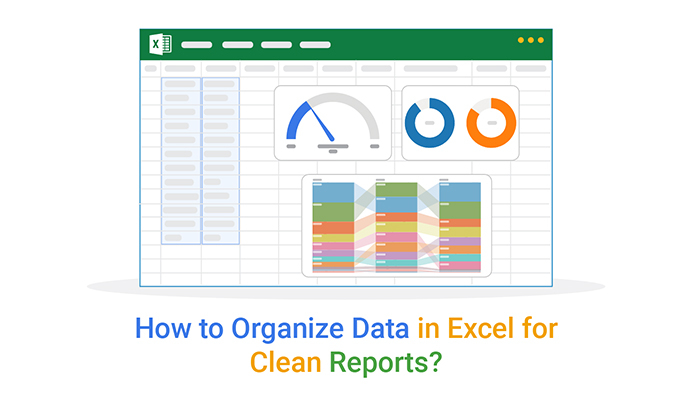
A well-organized Excel sheet ready for visualization
When I present data with Excel, I always follow these organizational principles:
- Structure tables for clear visual hierarchy: Use consistent headers, avoid merged cells, and separate data into logical groupings.
- Identify key metrics worth highlighting: Not all data deserves equal prominence. I mark my most important insights with conditional formatting or notes.
- Create named ranges: This simple Excel feature makes it much easier to reference specific data sets when creating charts.
Determining Your Presentation Goals
Different audiences require different approaches to data presentation:
I always ask myself these questions before starting:
- Who is my primary audience? Executives need high-level insights and clear takeaways, while technical teams often require deeper data exploration.
- What decisions need to be made from this data? This helps me select which metrics deserve emphasis.
- What's the story I want my data to tell? Data without narrative is just numbers.
PageOn.ai's AI Blocks feature has been invaluable for me in quickly structuring presentation flows. By analyzing my Excel data, it suggests logical groupings and presentation sequences that highlight the most important insights while maintaining the narrative thread.
Visualization Techniques: Bringing Your Excel Data to Life
The right visualization can transform confusing numbers into compelling insights. I've learned that choosing the appropriate chart type is both an art and a science.
Selecting the Optimal Chart Types
flowchart TD
    A[Chart Selection] --> B{What are you
comparing?}
    B -->|Parts of a whole| C[Pie/Donut Chart]
    B -->|Changes over time| D[Line Chart]
    B -->|Items side by side| E[Bar/Column Chart]
    B -->|Correlations| F[Scatter Plot]
    B -->|Multiple variables| G[Radar Chart]
    B -->|Geographic data| H[Map Visualization]
    C --> C1[Use when: <5 categories]
    D --> D1[Use when: Trends matter]
    E --> E1[Use when: Precise comparisons]
    F --> F1[Use when: Finding relationships]
    G --> G1[Use when: Performance metrics]
    H --> H1[Use when: Regional analysis]
    style A fill:#FF8000,stroke:#333,stroke-width:2px
    style B fill:#f9f9f9,stroke:#333,stroke-width:1px
When I present data in Excel or transform it for presentations, I follow these principles:
- Bar and column charts: My go-to for comparing discrete items or categories.
- Line charts: Perfect for showing trends and changes over time.
- Pie charts: I only use these when comparing parts of a whole with few categories (ideally 5 or fewer).
- Scatter plots: Ideal for showing relationships between two variables.
- Heat maps: Great for showing patterns in complex data sets.
Color Psychology and Design Principles

Strategic color use in data visualizations
Color isn't just decorative—it's functional. When creating a professional visual presentation in PowerPoint, I follow these color principles:
- Consistency: I use a limited color palette that aligns with brand guidelines.
- Contrast: Key data points get highlighted with contrasting colors.
- Meaning: Red for negative, green for positive, and neutral colors for baseline data.
- Accessibility: I ensure sufficient contrast and avoid problematic color combinations for colorblind viewers.
PageOn.ai's Deep Search feature has been a game-changer for me. It automatically discovers and integrates relevant visual assets that complement my data story, saving me hours of searching for the right images or icons to enhance my presentations.
From Static to Dynamic: Interactive Data Presentations
Static charts have their place, but I've found that dynamic, interactive presentations create much stronger engagement and understanding.
Progressive reveal technique for complex data
Techniques for Creating Engaging Presentations
Here are some techniques I regularly use to transform static Excel data into dynamic presentations:
- Progressive reveals: I introduce complex data points sequentially rather than all at once.
- Animation sequences: Showing how data changes over time through animated transitions.
- Interactive elements: Adding clickable regions that reveal additional details or insights.
- Comparison slides: Before/after or with/without scenarios that demonstrate impact.
Storytelling with Data
flowchart LR
    A[Hook:
Why This Matters] --> B[Problem:
Data Context]
    B --> C[Insight:
Key Findings]
    C --> D[Impact:
Business Implications]
    D --> E[Action:
Recommended Next Steps]
    style A fill:#FF8000,stroke:#333,stroke-width:2px
    style E fill:#FF8000,stroke:#333,stroke-width:2px
Numbers alone rarely inspire action. I always structure my data presentations as narratives with these elements:
- Opening with the "so what": I immediately establish why this data matters to the audience.
- Setting the context: What business question or challenge does this data address?
- Building tension: Revealing the problem or opportunity the data uncovers.
- Providing resolution: Showing how the insights lead to clear next steps.
PageOn.ai's conversational interface has transformed how I work with Excel data. I can simply tell it what story I want to tell, and it automatically transforms my static charts into dynamic presentation sequences that follow a compelling narrative arc.
Time-Saving Workflows: Minutes, Not Hours
The traditional workflow for creating presentations from Excel data is painfully inefficient. I've developed a streamlined approach that leverages AI to cut the time investment dramatically.
Step-by-Step Process
flowchart LR
    A[Upload Excel
File] --> B[AI Analysis
& Structure]
    B --> C[Automated Chart
Creation]
    C --> D[Theme
Application]
    D --> E[Review &
Refine]
    E --> F[Export
Presentation]
    style A fill:#f9f9f9,stroke:#333,stroke-width:1px
    style B fill:#FF8000,stroke:#333,stroke-width:2px
    style C fill:#FF8000,stroke:#333,stroke-width:2px
Here's my rapid Excel-to-presentation transformation process:
- Prepare your Excel file: Ensure clean data with proper headers and formatting.
- Upload to PageOn.ai: The AI immediately analyzes the structure and content.
- Select presentation goals: Indicate your audience and key objectives.
- Review AI-generated charts: The system automatically creates optimal visualizations.
- Apply theme and styling: One-click application of professional design templates.
- Refine and export: Make any final adjustments and export to your preferred format.
Time Comparison
The difference is striking. What used to take me over two hours can now be accomplished in under ten minutes with comparable or even better results. PageOn.ai's agentic approach—which plans, searches, and acts to transform Excel data into presentation-ready visuals—eliminates the repetitive manual work that consumes so much time in traditional workflows.
Advanced Data Presentation Strategies
Once you've mastered the basics, these advanced techniques will help you tackle even the most complex data visualization challenges.
Simplifying Complex Data

Simplification of multi-variable data through visual hierarchy
When dealing with complex datasets, I use these techniques to maintain clarity:
- Layer complexity: Start with high-level insights, then progressively reveal details.
- Use small multiples: Break one complex chart into several simpler ones that can be compared.
- Create visual hierarchies: Use size, color, and position to indicate importance.
- Employ abstraction: Sometimes a simplified representation communicates more effectively than showing every data point.
Incorporating Contextual Elements
Data rarely exists in isolation. I enhance understanding by adding:
- Benchmarks and reference points: Industry averages, historical performance, or targets.
- Annotations: Brief explanations of anomalies or important events that affected the data.
- Trend indicators: Visual cues that show direction and magnitude of change.
- Contextual timeframes: Showing seasonal patterns or business cycles relevant to the data.
PageOn.ai excels at generating insightful annotations and callouts that highlight key takeaways from Excel data. It can identify patterns and correlations that might be missed in manual analysis, then create visual elements that draw attention to these insights.
Real-World Success Stories
The impact of transforming Excel data into compelling visualizations goes far beyond aesthetics. Here are real examples of how this approach has driven business results.
Financial Analyst Case Study
Transformation of quarterly financial reporting process
Sarah, a financial analyst at a Fortune 500 company, was spending nearly two full days each quarter creating executive presentations from their financial data. After adopting an AI-powered approach:
- Time reduction: Reporting preparation time dropped from 16 hours to just 2.5 hours—an 85% improvement.
- Error reduction: Manual data transfer errors were eliminated completely.
- Decision impact: Executives reported better understanding of financial trends, leading to faster decision-making.
- Key visualization: A waterfall chart showing contribution margin by product line became the centerpiece for strategic planning.
Marketing Team Case Study
A digital marketing team was struggling to communicate the complex ROI of their multi-channel campaigns:
- Visualization breakthrough: Transforming spreadsheets of channel performance into an interactive funnel visualization.
- Executive clarity: For the first time, the C-suite could clearly see which channels were driving conversions vs. just generating traffic.
- Budget impact: Based on the clear visualizations, the team secured a 20% budget increase for their highest-performing channels.
- Time saved: Weekly reporting time decreased from 5 hours to 30 minutes.
In both cases, PageOn.ai's visualization capabilities helped transform confusing Excel data into clear visual narratives that drove business decisions. The combination of time savings and improved decision-making delivered measurable ROI beyond just the presentation aesthetics.
Best Practices and Common Pitfalls
Even with powerful tools, there are important principles to follow when transforming Excel data into presentations.
Data Integrity Considerations
Key data integrity checkpoints in the visualization process
When I'm making a presentable table in Excel or converting data for presentations, I follow these integrity guidelines:
- Maintain data accuracy: Verify that automated transformations haven't altered the underlying data.
- Provide proper context: Include time periods, sample sizes, and data sources.
- Disclose limitations: Be transparent about margin of error or data gaps.
- Cite sources: Always reference the origin of external data used in your presentations.
Design Mistakes to Avoid
flowchart TD
    A[Common
Presentation
Mistakes] --> B[Data
Overload]
    A --> C[Misleading
Visualizations]
    A --> D[Poor
Accessibility]
    A --> E[Inconsistent
Design]
    B --> B1[Too many data
points per slide]
    C --> C1[Truncated axes
Distorted scales]
    D --> D1[Low contrast
Small text]
    E --> E1[Mixed fonts
Clashing colors]
    style A fill:#FF8000,stroke:#333,stroke-width:2px
I've learned to avoid these common pitfalls:
- Overcrowding slides: Limit each slide to one main insight or message.
- Using inappropriate chart types: 3D pie charts and other decorative but hard-to-read visualizations.
- Neglecting accessibility: Small text, poor color contrast, and complex visuals without explanation.
- Inconsistent formatting: Mixing fonts, colors, and styles across slides.
- Misleading scales: Truncated axes or manipulated scales that exaggerate differences.
PageOn.ai helps prevent these common errors through intelligent data analysis and visualization recommendations. Its design templates ensure consistency, while its accessibility features promote readability and clarity. The system also flags potentially misleading visualization choices, helping you maintain data integrity.
Beyond Basic Charts: Taking Your Data Presentations to the Next Level
Once you've mastered the fundamentals, these advanced techniques will help your Excel data truly stand out in presentations.
Advanced Visualization Techniques

Advanced visualization techniques for specialized data types
For specialized data types, I've found these advanced visualizations particularly effective:
- Geographical data mapping: Heat maps, choropleth maps, and interactive location data.
- Time-series animations: Showing how data changes over time through animated transitions.
- Sankey diagrams: Visualizing flow and transformation processes.
- Tree maps: Displaying hierarchical data with nested rectangles.
- Network graphs: Showing relationships and connections between data points.
Incorporating Multimedia Elements
To create truly memorable presentations, I enhance my data visualizations with:
- Strategic imagery: Photos, illustrations, or icons that reinforce the data narrative.
- Video elements: Short clips that demonstrate concepts or show real-world applications of the data.
- Visual metaphors: Using familiar concepts to explain complex data relationships.
- Interactive elements: Clickable regions that reveal additional details or insights.
PageOn.ai's Vibe Creation feature has been invaluable for transforming technical Excel data into compelling visual narratives. It analyzes the emotional and conceptual elements of your data story, then suggests visual metaphors and multimedia elements that will resonate with your specific audience.
Transform Your Excel Data into Stunning Presentations Today
Stop spending hours manually creating slides from spreadsheets. PageOn.ai's intelligent visualization tools can transform your Excel data into professional, impactful presentations in minutes.
Start Creating with PageOn.ai TodayConclusion: From Data to Decisions
Throughout this guide, I've shared my approach to transforming Excel data into professional presentations that drive understanding and action. The days of spending hours manually formatting charts and copying data are behind us.
With tools like PageOn.ai, you can now:
- Transform complex Excel data into clear, compelling visuals in minutes
- Create consistent, professional-looking presentations without design expertise
- Highlight the most important insights from your data through intelligent visualization
- Tell powerful data stories that inspire action and drive decisions
I encourage you to apply these techniques to your next data presentation. The difference in both process efficiency and audience impact will be remarkable. Your Excel data holds valuable insights—now you have the tools to make those insights shine.
You Might Also Like
Building New Slides from Prompts in Seconds | AI-Powered Presentation Creation
Discover how to create professional presentations instantly using AI prompts. Learn techniques for crafting perfect prompts that generate stunning slides without design skills.
Transform Your Google Slides: Advanced Techniques for Polished Presentations
Master advanced Google Slides techniques for professional presentations. Learn design fundamentals, visual enhancements, Slide Master, and interactive elements to create stunning slides.
Transforming Presentations: Strategic Use of Color and Imagery for Maximum Visual Impact
Discover how to leverage colors and images in your slides to create visually stunning presentations that engage audiences and enhance information retention.
Mastering Visual Harmony: The Art and Science of Cohesive Slide Layouts
Discover how to create visually harmonious slide layouts through color theory, typography, and spatial design. Learn professional techniques to elevate your presentations with PageOn.ai.