Transforming Population & Geographic Data into Dynamic Visual Stories
Unlock the power of geographic data visualization to create compelling, interactive narratives
The Power of Geographic Data Visualization
I've always been fascinated by how interactive visualizations can transform complex population datasets into intuitive visual narratives. When working with geographic data, I've found that the right visualization doesn't just present information—it tells a compelling story that resonates with viewers on an intuitive level.
Over the years, I've witnessed a fundamental shift from static maps to dynamic, explorable geographic representations. This evolution has revolutionized how we understand population patterns and geographic relationships. With interactive visualizations for data exploration, users can now engage with information in ways that were previously impossible.
The Evolution of Geographic Visualization
flowchart LR
    A[Static Paper Maps] -->|Digitization| B[Digital Static Maps]
    B -->|Add Interactivity| C[Basic Interactive Maps]
    C -->|Add Real-time Data| D[Dynamic Data Visualizations]
    D -->|Add AI Integration| E[Intelligent Geographic Storytelling]
    style A fill:#f9f9f9,stroke:#ccc
    style B fill:#f3f3f3,stroke:#ccc
    style C fill:#e6e6e6,stroke:#ccc
    style D fill:#d9d9d9,stroke:#ccc
    style E fill:#FF8000,stroke:#FF6000,color:white
The cognitive advantages of spatial data visualization are significant. Our brains are wired to process visual information efficiently, especially when it has spatial components. This makes geographic visualizations particularly powerful for pattern recognition and insight discovery. I've seen stakeholders grasp complex demographic trends in seconds through a well-designed map that would have taken hours to understand through tables or text.
What's truly exciting is how PageOn.ai's conversation-based approach eliminates technical barriers to creating sophisticated geo-visualizations. Rather than wrestling with complex GIS software or coding libraries, I can simply describe the visualization I want to create, and PageOn.ai handles the technical implementation. This democratizes access to powerful visualization capabilities, allowing anyone to create compelling geographic narratives regardless of their technical background.
Essential Elements of Effective Population Data Visualization
When I create visualizations for population and geographic data, I focus on selecting the right visualization type for the specific insights I want to convey. Each type has its strengths and ideal use cases.
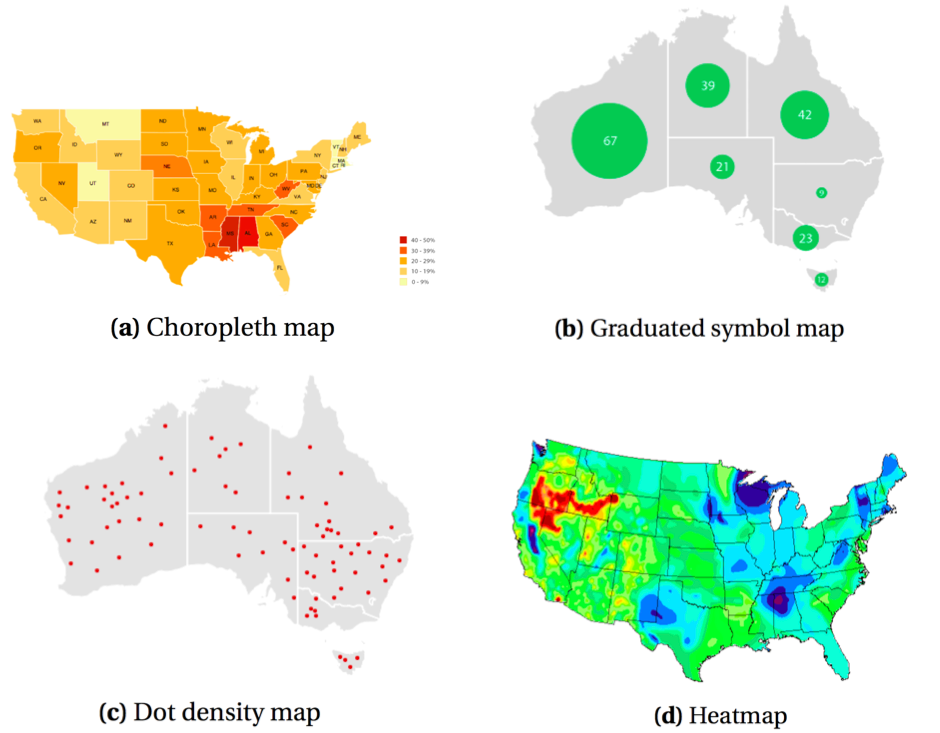
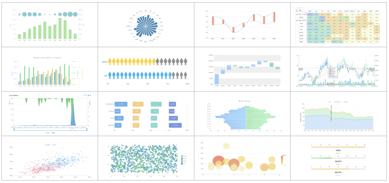
Key Visualization Types for Demographic and Geographic Data
Choropleth Maps
Perfect for visualizing population density and distribution patterns across defined geographic areas. Colors represent data values.
Flow Maps
Ideal for migration patterns and movement visualization. Lines of varying thickness show direction and volume of movement.
Dot Density Maps
Provides precise population distribution visualization. Each dot represents a specific number of people or entities.
3D Terrain Visualizations
Combines geographic and demographic data. Elevation can represent population metrics on actual terrain.
Color theory plays a crucial role in creating effective map data visualization basics. I've learned that selecting appropriate color schemes isn't just about aesthetics—it directly impacts how viewers interpret the data. Sequential color schemes work well for continuous data like population density, while diverging schemes help highlight deviations from a central value.
Color Schemes for Different Data Types
One of the biggest challenges I face when creating population visualizations is balancing information density with accessibility. Too much data can overwhelm viewers, while too little might not tell the complete story. I've found that data visualizations are most effective when they provide progressive disclosure—starting with a high-level overview and allowing users to drill down for more details.
Using PageOn.ai's AI Blocks has revolutionized how I approach complex geographic data. I can now combine multiple data layers without creating visual overwhelm. For instance, I recently created a visualization that layered population density, income levels, and access to public services—all while maintaining clarity through intelligent layer management and contextual highlighting that PageOn.ai provided automatically.
From Raw Data to Interactive Geographic Storytelling
The journey from raw population data to compelling interactive visualizations requires careful preparation and transformation. I've developed a systematic approach that helps me create more meaningful geographic stories.
Data Transformation Process
flowchart TD
    A[Raw Data Collection] --> B[Data Cleaning & Normalization]
    B --> C[Geographic Encoding]
    C --> D[Data Aggregation]
    D --> E[Visual Mapping]
    E --> F[Interactive Element Integration]
    F --> G[Performance Optimization]
    G --> H[Final Interactive Visualization]
    style A fill:#f9f9f9,stroke:#ccc
    style B fill:#f3f3f3,stroke:#ccc
    style C fill:#e6e6e6,stroke:#ccc
    style D fill:#d9d9d9,stroke:#ccc
    style E fill:#cccccc,stroke:#bbb
    style F fill:#c0c0c0,stroke:#aaa
    style G fill:#b3b3b3,stroke:#999
    style H fill:#FF8000,stroke:#FF6000,color:white
Creating effective legends and contextual elements is essential for improved data comprehension. I've found that legends should not only explain what colors or symbols represent but also provide context about the data's significance. For instance, when visualizing population density, I include reference points (e.g., "New York City: 27,000 people per square mile") to help viewers interpret the values meaningfully.
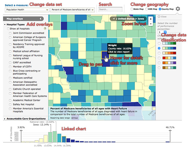
Interactive Elements That Enhance User Engagement
Hover States
I implement hover tooltips that display detailed information when users interact with specific geographic areas. This allows for exploration without cluttering the main visualization.
Timeline Sliders
For temporal data exploration, I incorporate timeline sliders that allow users to see how population patterns change over time, revealing migration trends and growth patterns.
Zoom and Pan Functionality
Multi-scale analysis is essential for geographic data. I implement smooth zoom and pan controls that allow users to examine both broad patterns and granular details.
Filtering Capabilities
Demographic segmentation becomes intuitive with filtering tools that allow users to focus on specific population subgroups or characteristics, revealing patterns that might otherwise remain hidden.
One of the most powerful features I've discovered is PageOn.ai's Deep Search functionality. It automatically integrates relevant geographic datasets and boundary files, saving me countless hours of manual data hunting. Recently, I needed to create a visualization of educational attainment across different counties, and PageOn.ai automatically located and integrated the most current census boundary files with the relevant educational data—a task that would have taken me days to complete manually.
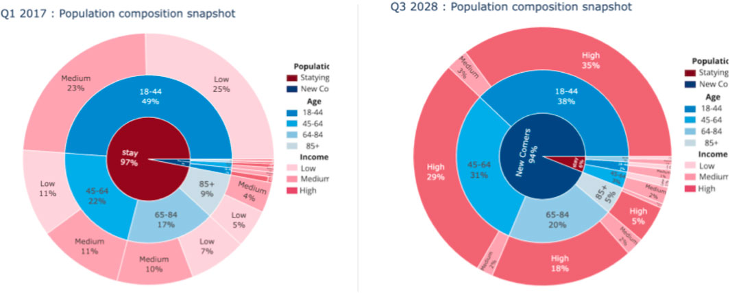
Case Study: Census Visualization Transformation
I recently worked on transforming raw census data into an interactive visualization for a public policy research group. The process began with identifying key population metrics worth visualizing—in this case, we focused on age distribution, household income, and educational attainment as the primary metrics.
One of the biggest challenges was handling missing or incomplete geographic data. Some rural counties had incomplete reporting, which could have created misleading gaps in our visualization. I developed a technique to estimate these values using nearest-neighbor averaging, clearly marking estimated values with pattern overlays to maintain transparency about data quality.
What truly transformed our workflow was using PageOn.ai's agentic capabilities to automate the entire process from data import to final visualization. After an initial conversation about our goals, PageOn.ai automatically cleaned the data, matched geographic identifiers, created appropriate color schemes based on the data distribution, and generated an interactive visualization with filtering capabilities. What would have taken our team weeks was completed in hours, with superior results.
Advanced Techniques for Population Data Visualization
As I've grown more experienced with geographic data visualization, I've learned that integrating multiple data sources creates richer geographic storytelling. By combining census data with economic indicators, health statistics, and infrastructure information, I can create multi-dimensional visualizations that reveal complex relationships between population characteristics and their environments.
Visualizing change over time in population data presents unique challenges. I've developed several effective techniques for showing temporal patterns:
Small Multiples
Creating a series of small maps showing the same geographic area at different time periods, allowing for easy comparison.
Animated Transitions
Using smooth animations to show how population patterns evolve over time, highlighting areas of growth and decline.
Change Maps
Creating visualizations that specifically highlight the delta between time periods rather than absolute values.
Trend Indicators
Adding directional symbols or sparklines to indicate trajectory of change for each geographic area.
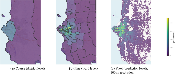
Uncertainty Visualization Techniques
Creating responsive visualizations that work across different devices and screen sizes has become increasingly important as users access data on various platforms. I've adopted a mobile-first approach to ensure my visualizations are accessible regardless of device. This includes simplifying complex interactions for touch interfaces and adjusting information density based on screen size.
What's been transformative in my work is leveraging interactive data visualization tools like PageOn.ai to seamlessly combine satellite imagery, boundary data, and population statistics. In a recent project examining urban growth patterns, PageOn.ai automatically aligned historical satellite imagery with current population density data, creating a compelling visualization that showed the relationship between urban expansion and demographic shifts. The platform handled all the complex geospatial transformations that would typically require specialized GIS expertise.
Making Population Visualizations Accessible and Impactful
I believe strongly that effective data visualizations should be accessible to everyone. When designing visualizations, I consider color blindness and other visual accessibility needs. This means avoiding problematic color combinations (like red/green) and ensuring sufficient contrast between elements.
Creating alternative representations for screen readers and assistive technologies is equally important. I include descriptive alt text for all visual elements and provide data tables as alternatives to purely visual representations. This ensures that insights are available to all users regardless of how they access the content.
Ethical Considerations in Demographic Visualization
When visualizing demographic data, I'm always mindful of ethical implications. Population data often reflects sensitive social issues, and visualization choices can inadvertently reinforce stereotypes or lead to misinterpretations. I strive to present data in ways that are factually accurate while being sensitive to the communities represented.
I've developed several strategies for avoiding misleading representations of population statistics:
- Using appropriate geographic units that don't artificially cluster or separate populations
- Choosing color scales that don't exaggerate or minimize differences
- Including contextual information that helps interpret the data accurately
- Clearly indicating data sources, collection methods, and limitations
- Providing multiple views of the same data to reveal different patterns
Accessibility Considerations by Visualization Type
I've found PageOn.ai's Vibe Creation feature particularly valuable for ensuring visualizations maintain appropriate tone and context for sensitive demographic data. When working on a project visualizing health disparities across different communities, PageOn.ai helped me create a visualization style that presented the data clearly while maintaining respect and dignity for the affected populations. The platform suggested color schemes, terminology, and contextual elements that avoided stigmatization while still communicating important patterns in the data.
Tools and Technologies for Interactive Geographic Visualization
Throughout my career working with geographic data, I've used a variety of specialized geographic information systems (GIS). These powerful platforms offer comprehensive tools for spatial data analysis and visualization, though they often come with steep learning curves.
Web-based frameworks have revolutionized interactive map creation, making it possible to create sophisticated visualizations that run in any modern browser. These frameworks offer a balance of power and accessibility, though they still require programming knowledge.
Visualization Tools Comparison
| Tool Type | Technical Expertise Required | Customization Level | Time Investment | Best For |
|---|---|---|---|---|
| GIS Software | High | High | High | Detailed spatial analysis |
| Web Frameworks | Medium-High | High | Medium | Interactive web applications |
| Programming Libraries | High | Very High | High | Custom visualization solutions |
| No-Code Platforms | Low | Medium | Low | Quick visualization needs |
| PageOn.ai | Very Low | High | Very Low | Sophisticated visualizations without technical barriers |
For those with programming expertise, various libraries offer unprecedented control over every aspect of geographic visualization. These tools provide the highest level of customization but require significant technical knowledge and development time.
The emergence of no-code and low-code alternatives has been a game-changer for non-technical users. These platforms offer template-based approaches to visualization that can produce professional results without requiring programming skills, though they typically offer less customization than code-based solutions.
What I find most exciting is how PageOn.ai integrates with existing data visualization workflows while eliminating technical complexity. I can now import data from traditional GIS systems, refine it using PageOn.ai's intuitive interface, and export the results in formats compatible with web publishing platforms. This hybrid approach gives me the best of both worlds—the analytical power of specialized tools and the accessibility of AI-powered assistance. The ability to simply describe what I want to create and have PageOn.ai generate the appropriate visualization code or configuration has dramatically accelerated my workflow.
From Visualization to Action: Driving Decisions with Geographic Insights
The ultimate goal of any data visualization is to drive informed decision-making. I've developed several techniques for extracting actionable insights from population visualizations that help stakeholders move from understanding to action.
Creating visualization dashboards for ongoing population monitoring has proven invaluable for organizations that need to track demographic changes over time. These dashboards combine multiple visualization types to provide a comprehensive view of population dynamics, with alerts for significant changes or emerging patterns.
From Insight to Action Process
flowchart LR
    A[Data Visualization] --> B[Pattern Recognition]
    B --> C[Insight Generation]
    C --> D[Hypothesis Formation]
    D --> E[Decision Options]
    E --> F[Impact Assessment]
    F --> G[Action Implementation]
    G --> H[Outcome Measurement]
    H -.-> A
    style A fill:#FF8000,stroke:#FF6000,color:white
    style B fill:#f3f3f3,stroke:#ccc
    style C fill:#e6e6e6,stroke:#ccc
    style D fill:#d9d9d9,stroke:#ccc
    style E fill:#cccccc,stroke:#bbb
    style F fill:#c0c0c0,stroke:#aaa
    style G fill:#b3b3b3,stroke:#999
    style H fill:#a6a6a6,stroke:#888
Sharing interactive visualizations with stakeholders effectively is crucial for driving action. I've found that providing multiple entry points to the data—from high-level summaries for executives to detailed explorations for analysts—ensures that everyone can engage with the insights at their preferred level of detail.
Measuring the impact and effectiveness of geographic data presentations helps refine future visualization efforts. I track metrics like stakeholder engagement, decision influence, and outcome alignment to continuously improve how I communicate geographic insights.
One of the most powerful capabilities I've discovered is using PageOn.ai to rapidly iterate visualization designs based on stakeholder feedback. After presenting initial visualizations to decision-makers, I can describe their feedback directly to PageOn.ai, which then generates refined versions that address specific concerns or highlight particular insights of interest. This rapid iteration process has dramatically improved how quickly we can move from data to decisions.
By creating infographic data visualizations that are both informative and visually compelling, I've been able to help organizations transform complex geographic data into clear action plans. The combination of rigorous data analysis and intuitive visual presentation creates a powerful foundation for evidence-based decision-making.
Transform Your Geographic Data with PageOn.ai
Turn complex population and geographic data into compelling visual stories without technical barriers. Create interactive visualizations that drive understanding and action with PageOn.ai's intuitive, conversation-based platform.
Start Creating with PageOn.ai TodayYou Might Also Like
Building New Slides from Prompts in Seconds | AI-Powered Presentation Creation
Discover how to create professional presentations instantly using AI prompts. Learn techniques for crafting perfect prompts that generate stunning slides without design skills.
Beyond Bullet Points: Transform Your Text with Animated Visuals | PageOn.ai
Discover how to transform static bullet points into dynamic animated visuals that boost engagement by 40%. Learn animation fundamentals, techniques, and AI-powered solutions from PageOn.ai.
The Strategic GIF Guide: Creating Memorable Moments in Professional Presentations
Discover how to effectively use GIFs in professional presentations to create visual impact, enhance audience engagement, and communicate complex concepts more memorably.
Transform Your Presentations: Mastering Slide Enhancements for Maximum Impact
Learn how to elevate your presentations with effective slide enhancements, formatting techniques, and visual communication strategies that captivate audiences and deliver powerful messages.