Transforming Raw Data into Compelling Visual Stories with Cloud AI
Bridging the gap between data collection and effective communication
I've seen firsthand how the explosion of available data has created both opportunities and challenges for organizations. In this guide, I'll walk you through the journey of transforming raw, complex datasets into visually stunning presentations that drive understanding and action—all powered by the latest cloud AI technologies.
The Data-to-Presentation Challenge
In my years working with data, I've witnessed a remarkable paradox: as organizations collect more data than ever before, they often struggle more with effectively communicating those insights. The gap between raw data collection and meaningful presentation continues to widen for several reasons.

The exponential growth of data collection across industries
The Growing Data Deluge
We're now generating over 2.5 quintillion bytes of data daily. Organizations have access to customer interactions, operational metrics, market trends, and competitive intelligence at unprecedented scales. However, this wealth of information often becomes overwhelming rather than illuminating.
Common Pain Points in Traditional Workflows
- Time consumption: Manual data processing and visualization can take days or weeks, delaying critical decision-making.
- Technical barriers: Creating compelling data visualizations traditionally requires specialized skills in both data analysis and design.
- Visual inconsistency: When multiple team members create presentations, maintaining brand and visual coherence becomes challenging.
- Static outputs: Traditional presentations quickly become outdated as new data emerges.
flowchart TD
    A[Raw Data Collection] -->|Traditional Process| B[Manual Data Processing]
    B --> C[Manual Analysis]
    C --> D[Manual Visualization]
    D --> E[Static Presentation]
    A -->|Cloud AI Process| F[Automated Processing]
    F --> G[AI-Driven Analysis]
    G --> H[Intelligent Visualization]
    H --> I[Dynamic Presentation]
    style A fill:#FF8000,stroke:#333,stroke-width:1px
    style E fill:#f9f9f9,stroke:#333,stroke-width:1px
    style I fill:#66BB6A,stroke:#333,stroke-width:1px
I've found that ai-powered presentation creation is fundamentally changing this landscape. Cloud AI technologies now enable us to bridge the gap between raw data and compelling visual stories, democratizing the ability to create professional presentations regardless of technical expertise.
Cloud AI Fundamentals for Presentation Creation
Before diving into specific techniques, I want to explore the technological foundation that's making this transformation possible. Cloud AI systems have evolved dramatically in recent years, bringing sophisticated capabilities that were once limited to specialized data scientists into user-friendly presentation tools.

Cloud AI architecture powering modern presentation tools
Key Cloud AI Capabilities
Natural Language Processing (NLP)
Modern presentation tools use NLP to interpret both your data and your intentions. I can now simply describe what I want to communicate, and the AI understands the context, identifies relevant data points, and suggests appropriate visualization formats.
Computer Vision
AI systems can now analyze visual assets, understand their content, and intelligently select or create images that complement your data story. This eliminates hours of searching for the perfect supporting visuals.
Machine Learning for Pattern Recognition
Perhaps most impressively, cloud AI can identify patterns, correlations, and outliers in your data that might otherwise go unnoticed. These insights become the foundation for compelling data stories.
The Evolution of Presentation Creation
We've moved from completely manual presentation creation to template-based systems, and now to truly intelligent AI-generated presentations. PageOn.ai exemplifies this evolution with its conversational approach that eliminates technical barriers to data visualization.
When I first used these ai presentation tools, I was amazed at how I could simply have a conversation about my data and objectives, and watch as the system crafted visualizations that would have previously required hours of manual work.
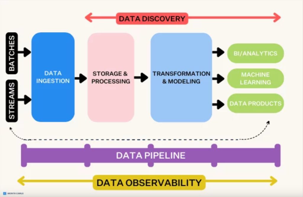
Data Processing & Preparation Techniques
Before any visualization can begin, raw data needs to be processed and prepared. This traditionally tedious step has been transformed by cloud AI technologies that can automatically clean, normalize, and structure data for presentation.
Automated data preparation workflow powered by cloud AI
Organizing Unstructured Data
One of the biggest challenges I've faced is making sense of unstructured data—think customer feedback, social media mentions, or open-ended survey responses. Cloud AI excels at categorizing and extracting insights from these unstructured sources through:
- Automatic categorization: Identifying themes and topics across text data
- Sentiment analysis: Determining emotional tone and opinion polarity
- Entity extraction: Identifying people, organizations, products, and other key elements
- Relationship mapping: Understanding connections between different data elements
flowchart TD
    A[Raw Unstructured Data] --> B{AI Processing Engine}
    B --> C[Automatic Categorization]
    B --> D[Sentiment Analysis]
    B --> E[Entity Extraction]
    B --> F[Relationship Mapping]
    C --> G[Structured Data Output]
    D --> G
    E --> G
    F --> G
    G --> H[Visualization-Ready Dataset]
    style A fill:#FF8000,stroke:#333,stroke-width:1px
    style B fill:#42A5F5,stroke:#333,stroke-width:1px
    style G fill:#66BB6A,stroke:#333,stroke-width:1px
    style H fill:#66BB6A,stroke:#333,stroke-width:1px
Automated Data Cleaning
Cloud AI systems can now detect and correct common data issues that would otherwise compromise your visualizations:
| Data Issue | AI Solution | Impact on Presentation |
|---|---|---|
| Missing values | Intelligent imputation based on patterns | Complete visualizations without gaps |
| Outliers | Automatic detection and optional handling | More representative trends and patterns |
| Inconsistent formatting | Format standardization across datasets | Visually consistent presentation elements |
| Duplicate entries | Automatic deduplication | Accurate representation of data volume |
Identifying Key Insights
Perhaps most impressively, cloud AI can now identify the most presentation-worthy insights within complex datasets. PageOn.ai's AI Blocks feature exemplifies this capability, allowing me to structure data relationships visually without manual formatting.
When I work with ai presentation creation tools like PageOn.ai, I'm consistently impressed by how they identify narrative threads within my data that I might have overlooked. The system automatically highlights correlations, causal relationships, and emerging trends that become the foundation for compelling presentation stories.
Data Visualization Strategies for Maximum Impact
With clean, processed data in hand, the next challenge is selecting the right visualization approach. Cloud AI has transformed this process by intelligently matching visualization types to specific data stories and objectives.
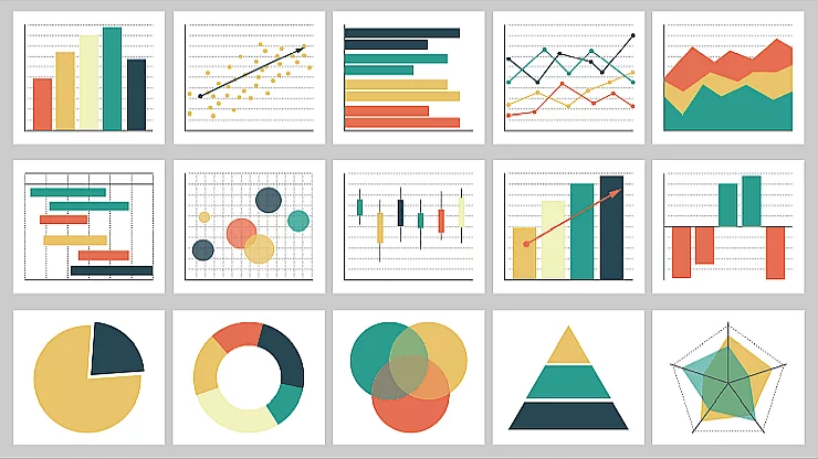
Various visualization types matched to different data storytelling needs
Matching Visualizations to Data Stories
I've learned that the most effective presentations match visualization types to specific storytelling objectives:
Color Theory and Visual Hierarchy
Cloud AI systems now incorporate sophisticated understanding of color theory and visual hierarchy principles. When I use AI online presentations tools, they automatically:
- Select color palettes that evoke appropriate emotional responses for the data story
- Apply contrast principles to highlight the most important data points
- Maintain accessibility standards for color-blind viewers
- Create visual pathways that guide the viewer's eye through the data in a logical sequence
.webp)
Color theory principles applied to data visualization
PageOn.ai's Deep Search Capability
One of the most powerful features I've encountered is PageOn.ai's Deep Search capability, which analyzes your specific dataset and presentation objectives to identify the most effective visualization techniques. This eliminates the guesswork from visualization selection and ensures your data story is told through the most impactful visual medium.
By leveraging these advanced visualization strategies, I've been able to transform complex datasets into immediately understandable visual stories that drive engagement and comprehension.
From Numbers to Narratives: Crafting the Story
Data visualization alone isn't enough—the most compelling presentations transform raw numbers into meaningful narratives that resonate with audiences on both intellectual and emotional levels.

The narrative arc of effective data storytelling
Transforming Statistical Insights into Stories
Cloud AI now excels at identifying narrative patterns within data and structuring presentations to follow classic storytelling arcs:
flowchart LR
    A[Data Context] --> B[Problem/Challenge]
    B --> C[Rising Insights]
    C --> D[Key Revelation]
    D --> E[Solution/Opportunity]
    E --> F[Call to Action]
    style A fill:#FF8000,stroke:#333,stroke-width:1px
    style D fill:#42A5F5,stroke:#333,stroke-width:1px
    style F fill:#66BB6A,stroke:#333,stroke-width:1px
Building Presentation Flow
I've found that the most effective data presentations guide audiences through complex information in a carefully structured sequence:
- Establish context - Help the audience understand why the data matters
- Present the big picture - Show the overall trend or main finding
- Dive into key details - Highlight the most important specifics
- Address counterpoints - Acknowledge limitations or alternative interpretations
- Connect to outcomes - Link the data to real-world implications
- Provide clear next steps - Guide the audience on how to act on the insights
Creating Emotional Connections
The most memorable presentations forge emotional connections with otherwise abstract information through:
Relatable Examples
Translating abstract metrics into concrete, everyday scenarios that resonate with the audience's experience.
Human-Centered Stories
Incorporating individual stories that put a human face on statistical trends.
Surprise Elements
Highlighting unexpected findings or counterintuitive insights that challenge assumptions.
Interactive Moments
Creating opportunities for audience engagement with the data through questions or interactive elements.
Leveraging PageOn.ai's Vibe Creation
One of the most impressive capabilities I've seen is PageOn.ai's Vibe Creation feature, which helps transform analytical findings into audience-appropriate narratives. The system can adapt the tone, language complexity, and storytelling approach based on your specific audience—whether you're presenting to technical experts, executive decision-makers, or general stakeholders.
By combining these narrative techniques with powerful visualizations, I've been able to create presentations that don't just inform, but inspire action and drive meaningful change within organizations.
Cloud Integration: Seamless Data Pipeline to Presentations
One of the most transformative aspects of modern presentation creation is the ability to establish direct connections between data sources and visual outputs through cloud integration.
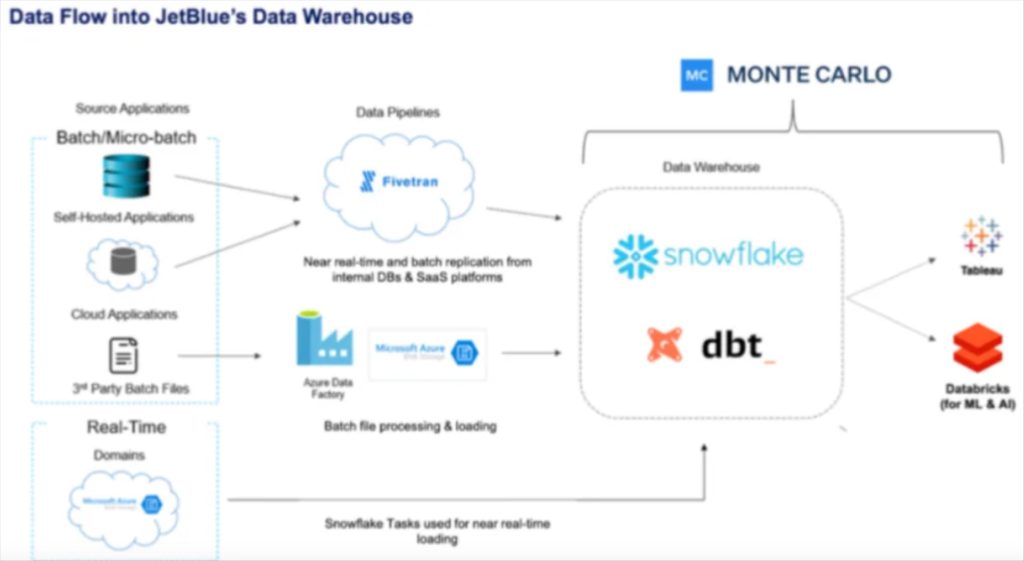
Cloud integration architecture for real-time data presentations
Setting Up Data Sources and APIs
Modern cloud AI presentation platforms can connect directly to a wide range of data sources:
flowchart TD
    A[Cloud Data Sources] --> B{API Integration Layer}
    C[CRM Systems] --> B
    D[Analytics Platforms] --> B
    E[IoT Sensors] --> B
    F[ERP Systems] --> B
    G[Social Media] --> B
    B --> H[Data Processing Engine]
    H --> I[Presentation Generation]
    I --> J[Live Presentation Dashboard]
    style A fill:#FF8000,stroke:#333,stroke-width:1px
    style B fill:#42A5F5,stroke:#333,stroke-width:1px
    style H fill:#66BB6A,stroke:#333,stroke-width:1px
    style J fill:#FF8000,stroke:#333,stroke-width:1px
Automating the Refresh Cycle
One of the most powerful capabilities of cloud-integrated presentations is the ability to automatically refresh with the latest data. This ensures that your presentations are always current, eliminating the need for manual updates.
Security Considerations
When integrating cloud data with presentation platforms, I always emphasize these security best practices:
- Data encryption both in transit and at rest
- Role-based access controls to limit data visibility based on user permissions
- Audit logging to track who accesses presentation data and when
- Compliance verification to ensure adherence to regulations like GDPR, HIPAA, etc.
- Data minimization to include only necessary information in presentations
PageOn.ai's Agentic Capabilities
What particularly impresses me about PageOn.ai is its agentic capabilities that can maintain presentation freshness with minimal human intervention. The system can be configured to:
- Monitor data sources for significant changes
- Automatically update visualizations when new data arrives
- Alert presenters to emerging trends or anomalies
- Suggest narrative adjustments based on changing data patterns
These cloud integration capabilities transform presentations from static documents into living, breathing information resources that continuously reflect the latest data insights.
Advanced Techniques for Data-Rich Presentations
Beyond the fundamentals, cloud AI enables sophisticated presentation techniques that were previously available only to specialized data visualization experts.

Advanced interactive data presentation with multiple dimensions
Interactive Elements for Audience Exploration
Modern ai presentation tools can incorporate interactive elements that allow audiences to explore complex datasets on their own terms:
Filterable Data Views
Allowing audience members to focus on specific data segments most relevant to their interests.
Drill-Down Capabilities
Enabling viewers to start with high-level insights and explore underlying details as needed.
What-If Scenarios
Providing tools to adjust parameters and immediately see how outcomes might change.
Custom Comparison Views
Allowing side-by-side comparison of different data segments or time periods.
Progressive Disclosure of Data Complexity
One of the most effective techniques I've adopted is progressive disclosure—revealing data complexity in layers that prevent audience overwhelm:
flowchart TD
    A[Layer 1: Key Message] --> B[Layer 2: Supporting Data Points]
    B --> C[Layer 3: Contextual Details]
    C --> D[Layer 4: Methodology & Assumptions]
    D --> E[Layer 5: Raw Data Access]
    style A fill:#FF8000,stroke:#333,stroke-width:1px
    style B fill:#FFA726,stroke:#333,stroke-width:1px
    style C fill:#FFB74D,stroke:#333,stroke-width:1px
    style D fill:#FFCC80,stroke:#333,stroke-width:1px
    style E fill:#FFE0B2,stroke:#333,stroke-width:1px
Presenting Multi-Dimensional Data
Cloud AI has dramatically improved our ability to visualize multi-dimensional data without overwhelming viewers:
Using PageOn.ai for Layered Visualizations
PageOn.ai excels at creating layered visualizations that reveal insights progressively. This approach allows me to start with a clear, high-level message and then reveal supporting details in a structured way that maintains audience engagement without causing information overload.
These advanced techniques have transformed how I present complex data, enabling me to create presentations that are both sophisticated in their data handling and accessible to diverse audiences.
Case Studies: Transformative Data Presentation Success Stories
To illustrate the real-world impact of cloud AI integration for data presentations, I'd like to share several case studies where organizations transformed their approach to communicating complex information.

Before and after transformation of financial data presentations
Financial Services Transformation
A global investment firm struggled with quarterly reporting that was both time-consuming to produce and difficult for clients to interpret. By implementing cloud AI integration:
- Report generation time decreased from 3 weeks to 2 days
- Client comprehension of complex financial data improved by 64%
- Advisors reported spending 40% more time discussing strategy rather than explaining data
- Client retention increased by 18% in the first year after implementation

Educational research data made accessible through visual storytelling
Educational Research Accessibility
A leading research university needed to make complex educational outcome data more accessible to policymakers and the public. After implementing cloud AI for their presentations:
- Media coverage of research findings increased by 215%
- Policy citations of research data grew by 87%
- Public engagement with online research presentations increased 10-fold
- Research funding increased by 32% as a result of improved communication
Healthcare Outcomes Visualization
A healthcare network needed to better communicate patient outcomes and treatment efficacy to both medical staff and patients. Their cloud AI integration resulted in:
Additional outcomes included:
- 30% improvement in treatment adherence
- 25% reduction in follow-up questions from patients
- 42% increase in patient satisfaction scores
- 18% improvement in clinical outcomes for complex treatments
Measurable Impact on Decision-Making
Across all case studies, organizations reported significant improvements in key decision-making metrics:
| Metric | Average Improvement | Range |
|---|---|---|
| Decision speed | 64% | 42-85% |
| Stakeholder alignment | 58% | 35-72% |
| Decision confidence | 47% | 28-65% |
| Implementation success | 52% | 33-70% |
These case studies demonstrate that the impact of cloud AI integration for data presentations goes far beyond aesthetics—it fundamentally transforms how organizations make decisions and drive outcomes.
Implementation Roadmap: Getting Started with AI-Powered Data Presentations
If you're ready to transform your approach to data presentations, I recommend following this implementation roadmap to ensure success.
Step-by-step implementation roadmap for cloud AI presentation integration
Assessing Your Current Workflow
Begin by documenting your current data-to-presentation process, identifying key bottlenecks and pain points:
flowchart TD
    A[Map Current Process] --> B{Identify Bottlenecks}
    B --> C[Data Collection Issues]
    B --> D[Processing Delays]
    B --> E[Visualization Challenges]
    B --> F[Distribution Problems]
    C --> G[Define Requirements]
    D --> G
    E --> G
    F --> G
    G --> H[Select AI Solutions]
    style A fill:#FF8000,stroke:#333,stroke-width:1px
    style B fill:#42A5F5,stroke:#333,stroke-width:1px
    style G fill:#66BB6A,stroke:#333,stroke-width:1px
    style H fill:#FF8000,stroke:#333,stroke-width:1px
Selecting the Right Cloud AI Tools
When evaluating cloud AI presentation tools, consider these key factors:
Data Source Compatibility
Ensure the platform can connect to your existing data repositories and formats.
Visualization Flexibility
Look for tools that offer a wide range of visualization types appropriate for your data.
Learning Curve
Consider how quickly your team can become proficient with the new tools.
Integration Capabilities
Evaluate how well the platform integrates with your existing technology ecosystem.
Training Teams for AI Collaboration
For successful adoption, focus on these key training areas:
- Data literacy: Ensuring team members understand basic data concepts
- Prompt engineering: Teaching effective ways to communicate with AI systems
- Visual literacy: Developing skills to evaluate and refine AI-generated visualizations
- Narrative development: Building capability to craft compelling stories around data
Measuring ROI
Track these key metrics to measure the success of your implementation:
Starting Your Journey with PageOn.ai
Based on my experience implementing AI-powered presentation systems across various organizations, I recommend PageOn.ai as an excellent starting point for transforming complex data into clear visual stories. The platform's intuitive interface and powerful AI capabilities make it accessible even for teams with limited technical expertise.
By following this implementation roadmap and leveraging the right cloud AI tools, you can dramatically transform how your organization communicates data insights, leading to better decisions, increased engagement, and improved outcomes.
Transform Your Visual Expressions with PageOn.ai
Ready to revolutionize how you transform raw data into compelling visual stories? PageOn.ai's powerful cloud AI integration makes it simple to create stunning, data-driven presentations that drive understanding and action.
Start Creating with PageOn.ai TodayConclusion: The Future of Data Storytelling
Throughout this guide, I've shared how cloud AI integration is transforming the journey from raw data to stunning presentations. We've explored everything from data processing techniques to advanced visualization strategies, narrative development, and real-world case studies that demonstrate the tangible benefits of this approach.
As data continues to grow in volume and complexity, the ability to transform it into clear, compelling visual stories will become an even more critical competitive advantage. Cloud AI tools like PageOn.ai are democratizing access to sophisticated data visualization capabilities, allowing anyone—regardless of technical background—to create professional-quality, data-driven presentations.
I encourage you to begin your own journey toward AI-powered data presentations. Start small, perhaps with a single presentation or report, and experience firsthand how these tools can transform both your process and your results. The gap between data collection and effective communication doesn't have to be a challenge—with the right approach and tools, it can become your organization's greatest opportunity.
You Might Also Like
Mastering Visual Harmony: The Art and Science of Cohesive Slide Layouts
Discover how to create visually harmonious slide layouts through color theory, typography, and spatial design. Learn professional techniques to elevate your presentations with PageOn.ai.
Transforming Presentations: Strategic Use of Color and Imagery for Maximum Visual Impact
Discover how to leverage colors and images in your slides to create visually stunning presentations that engage audiences and enhance information retention.
Beyond Bullet Points: Transform Your Text with Animated Visuals | PageOn.ai
Discover how to transform static bullet points into dynamic animated visuals that boost engagement by 40%. Learn animation fundamentals, techniques, and AI-powered solutions from PageOn.ai.
Revolutionizing Market Entry Presentations with ChatGPT and Gamma - Strategic Impact Guide
Learn how to leverage ChatGPT and Gamma to create compelling market entry presentations in under 90 minutes. Discover advanced prompting techniques and visual strategies for impactful pitches.