Transforming Written Content into Eye-Catching Social Media Graphics
A Visual Communication Guide
In today's fast-paced digital world, I've found that transforming written content into visually appealing graphics isn't just a nice-to-have—it's essential for cutting through the noise. This guide explores how we can leverage the power of visual communication to make our social media content more memorable, engaging, and effective.
The Visual Communication Advantage
In my experience working with content creators, I've consistently seen how powerful visual communication can be. The research backs this up: when information is presented orally, people typically remember only about 10% of it after 72 hours. However, when that same information is paired with relevant images, retention skyrockets to 65%. This stark difference highlights why I'm so passionate about transforming written content into compelling visuals.
Information Retention Comparison
The dramatic difference in how we remember information based on presentation format:
What I find most fascinating is the speed at which our brains process visual information. It takes just 50 milliseconds—that's half a tenth of a second—for someone to form an initial impression of your visual content. In today's world where the average attention span has dwindled to merely 8 seconds, this lightning-fast visual processing becomes crucial for capturing audience attention.
When I first started creating content for social media, I struggled with transforming lengthy articles into engaging visual posts. That's when I discovered how text to graphic AI tools could simplify this process. PageOn.ai's Vibe Creation feature has been particularly game-changing for me—it analyzes written content and transforms it into visually compelling graphics that match your brand's aesthetic without requiring advanced design skills.
The Visual Processing Timeline
flowchart LR
    A[Visual Exposure] -->|50ms| B[Initial Impression Formed]
    B -->|1-3 sec| C[Conscious Processing]
    C -->|Under 8 sec| D[Attention Decision]
    D -->|Engaged| E[Content Interaction]
    D -->|Not Engaged| F[Scrolls Away]
    style A fill:#FF8000,stroke:#E67300,color:white
    style B fill:#FF8000,stroke:#E67300,color:white
    style C fill:#66BB6A,stroke:#43A047,color:white
    style D fill:#42A5F5,stroke:#1E88E5,color:white
    style E fill:#66BB6A,stroke:#43A047,color:white
    style F fill:#EF5350,stroke:#E53935,color:white
The science behind this is clear: our brains have evolved to process visual information more efficiently than text. When I create content now, I always remember that visuals aren't just decorative—they're fundamental to how we comprehend and remember information. This evolutionary advantage explains why social media platforms have become increasingly visual-centric, and why I've found that my engagement rates consistently improve when I prioritize high-quality visual elements.
Essential Elements of Effective Social Media Graphics
Text-to-Visual Balance
In my experience creating social media content, I've learned that finding the right balance between text and visuals is crucial. The most effective approach I've found is embracing minimalism with text—letting the images do most of the heavy lifting. As design principles experts suggest, the copy in your post can provide the explanation, while your graphic creates the emotional impact.
"Keep text to a minimum on your graphics and let the images do the talking. Often the copy in the post accompanying your graphic will do the explaining anyway. Leave them wanting more!"

When I use PageOn.ai's AI Blocks feature, I'm able to create perfect harmony between text and images. The system intelligently arranges visual elements to support the minimal text I include, creating a composition that feels balanced rather than cluttered. This is especially important considering what I call the "postage stamp principle"—most people view social media on smartphones, making your carefully designed graphic roughly the size of a postage stamp.
Visual Hierarchy Principles
Creating effective visual hierarchy has transformed how my social media graphics perform. I've found that establishing clear focal points directs viewer attention exactly where I want it. This isn't just about aesthetic preference—it's about guiding the eye strategically to ensure my message gets across in those crucial first few seconds.
Elements of Visual Hierarchy
flowchart TD
    A[Visual Hierarchy] --> B[Size & Scale]
    A --> C[Color & Contrast]
    A --> D[Positioning]
    A --> E[Whitespace]
    B --> F[Larger elements draw
attention first]
    C --> G[Contrasting colors
create focus points]
    D --> H[Top-left placement
for primary elements]
    E --> I[Strategic spacing
isolates important elements]
    style A fill:#FF8000,stroke:#E67300,color:white
    style B fill:#42A5F5,stroke:#1E88E5,color:white
    style C fill:#42A5F5,stroke:#1E88E5,color:white
    style D fill:#42A5F5,stroke:#1E88E5,color:white
    style E fill:#42A5F5,stroke:#1E88E5,color:white
I've found that size and positioning are particularly powerful techniques. When I make my key message 30-50% larger than supporting elements, it immediately establishes dominance in the visual hierarchy. Similarly, I've learned that color psychology plays a significant role in creating emotional connections with viewers. For instance, when I use AI social media post generators to create content, I make sure to select color schemes that align with the emotional tone I want to convey.
Legibility Factors
Typography choices have a profound impact on how my brand is perceived. I've learned to select fonts that reflect my brand personality while maintaining perfect legibility—even when viewed on the smallest screens. This means avoiding decorative fonts for body text and saving distinctive typography for headlines and key messages only.
Typography Legibility Factors
One crucial lesson I've learned is the importance of color contrast for readability. When I design social media graphics, I ensure there's at least a 4.5:1 contrast ratio between text and background colors. This not only improves accessibility but also ensures my message remains legible across different devices and viewing conditions.
I've also discovered the hard way to avoid free, novelty fonts. While they might seem fun initially, they often look unprofessional and can seriously damage brand perception. Professional font selection maintains brand value and ensures consistency across all my visual communications.
From Written Content to Visual Story
Content Analysis Process
When I'm transforming written content into visuals, my first step is always a thorough content analysis. I've developed a systematic approach to identify which key messages deserve visual emphasis. This process helps me extract the most impactful elements from longer content pieces.
Content Analysis Workflow
flowchart TD
    A[Original Written Content] --> B{Identify Key Messages}
    B --> C[Extract Statistics & Data Points]
    B --> D[Identify Quotable Moments]
    B --> E[Find Emotional Hooks]
    C --> F[Transform into Charts/Infographics]
    D --> G[Create Quote Graphics]
    E --> H[Develop Emotional Visual Elements]
    F --> I[Final Visual Assets]
    G --> I
    H --> I
    style A fill:#FF8000,stroke:#E67300,color:white
    style I fill:#66BB6A,stroke:#43A047,color:white
I've found that using AI image generator from text tools has significantly enhanced this process. PageOn.ai's Deep Search feature has been particularly valuable for finding relevant supporting visuals that align with my content themes. Rather than spending hours searching stock photo sites, I can quickly generate visuals that perfectly complement my written content.
When analyzing content for visual transformation, I look for these key elements:
- Statistical data that could be visualized as charts or graphs
- Memorable quotes or statements that would make impactful quote graphics
- Step-by-step processes that could be transformed into visual workflows
- Conceptual relationships that would benefit from visual mapping
- Emotional themes that could be reinforced through color and imagery
Narrative Structure Techniques
I've found that different types of content require different visual narrative approaches. For complex ideas, I often use sequential graphics—a series of connected visuals that guide viewers through a process or concept step by step. This approach works particularly well for educational content or explaining complicated procedures.

For immediate engagement, I've learned that single-impact visuals with one clear focal point are most effective. These work well for announcements, quotes, or simple statistics that need to grab attention quickly. The key is creating a visual hierarchy that directs the eye immediately to the most important element.
Creating visual consistency across multiple posts has been crucial for building brand recognition. I maintain consistent color schemes, typography, and visual elements across my content series, while introducing enough variation to keep viewers engaged. This balance between consistency and freshness is what keeps audiences coming back for more content.
Platform-Specific Optimization Strategies
Size and Format Considerations
One of the most important lessons I've learned is that size really does matter when it comes to social media graphics. Each platform has its own specific dimension requirements, and ignoring these can result in cropped images or poor display quality that undermines your message.
Optimal Image Dimensions by Platform
I've found that responsive design principles are essential for cross-platform sharing. When I create graphics, I ensure that the most important elements are positioned in the center of the image, as this "safe zone" will be visible regardless of how the image might be cropped on different platforms.
PageOn.ai has simplified this process tremendously for me—its automatic resizing feature allows me to create a graphic once and then optimize it for different platforms with a single click. This saves hours of manual resizing and reformatting work while ensuring optimal display quality across all channels.
Platform-Specific Visual Engagement
Each social platform has its own visual language and audience expectations. Through trial and error, I've developed specific approaches for each major platform to maximize engagement.
For Instagram, I focus on high-quality, visually stunning images with minimal text. The platform's visual-first approach means aesthetics often trump information density. I use turn images into text with AI tools to ensure my captions perfectly complement the visuals.
On LinkedIn, I maintain a more professional aesthetic with clean, corporate-friendly designs. I've found that data visualizations and infographics perform particularly well, especially when they provide clear business insights or professional development value.
For Twitter, I create scroll-stopping visuals with bold colors and high contrast. Given the fast-paced nature of the platform, I ensure my message is immediately clear and can be understood in seconds.
I've learned that adapting to each platform's unique visual culture is essential for success. What works on Instagram often falls flat on LinkedIn, and Twitter requires a different approach entirely. By tailoring my visual strategy to each platform's specific audience expectations, I've been able to significantly increase engagement across all channels.
Advanced Visual Transformation Techniques
Content Expansion Methods
One of my favorite techniques is transforming simple bullet points into engaging visual sequences. Rather than presenting a list of information, I create a series of connected graphics that tell a cohesive story. This approach has consistently generated higher engagement than text-heavy alternatives.
Bullet Point to Visual Transformation
flowchart LR
    A[Bullet Point List] --> B[Identify Visual Potential]
    B --> C[Group Related Points]
    C --> D[Select Visual Format]
    D --> E1[Timeline]
    D --> E2[Process Flow]
    D --> E3[Comparison Chart]
    D --> E4[Icon Series]
    E1 --> F[Finalized Visual Asset]
    E2 --> F
    E3 --> F
    E4 --> F
    style A fill:#FF8000,stroke:#E67300,color:white
    style F fill:#66BB6A,stroke:#43A047,color:white
Converting statistics into compelling infographics has been another game-changer for my content strategy. I've found that numbers presented visually are not only more engaging but also more memorable and shareable. Using AI create charts from text tools has made this process much more efficient.
PageOn.ai's AI Blocks feature has been particularly valuable for building complex data visualizations from simple text. I can input a paragraph describing data relationships, and the system generates a professionally designed visualization that clearly communicates the information. This has allowed me to create sophisticated graphics without advanced design skills.
Content Expansion Example
Original Bullet Points:
- User engagement increased 45% after redesign
- Mobile users account for 78% of traffic
- Average session duration: 3.5 minutes
- Conversion rate improved by 23%
Visual Transformation:
These bullet points become an engaging infographic with percentage-based visualizations, device icons showing the mobile/desktop split, and a timeline showing session duration improvements—all unified by consistent branding elements.
Visual Consistency in Brand Storytelling
Creating template systems for ongoing content has been one of my most effective strategies for maintaining visual consistency. By developing a set of flexible templates that align with my brand guidelines, I can quickly create new content while ensuring it remains visually cohesive with previous posts.

I've developed comprehensive color and style guides that define my visual brand language. This includes primary and secondary color palettes, typography hierarchies, and rules for image treatment. Having these guidelines in place ensures that anyone creating content for my brand can maintain visual consistency.
The challenge I've always faced is maintaining brand identity while keeping content fresh and engaging. My solution has been to establish a 70/30 rule: 70% of visual elements remain consistent (colors, fonts, logo placement), while 30% can vary to keep content interesting (imagery, layouts, graphic elements). This approach has allowed me to build strong brand recognition while avoiding visual monotony.
Measuring Visual Content Performance
Key Metrics for Social Graphics
In my experience, measuring the performance of visual content requires looking beyond standard engagement metrics. When I compare my visual posts to text-only content, I consistently see 2-3x higher engagement rates across all platforms. However, I've found that different types of visuals perform differently depending on the platform and content goals.
Visual vs. Text-Only Content Performance
I've found share velocity to be a particularly valuable metric for assessing visual impact. This measures how quickly content is shared within the first few hours of posting. High-impact visuals typically generate a sharp initial spike in shares, indicating strong resonance with the audience.
Tracking conversion metrics tied specifically to visual content has revealed interesting patterns. While text-heavy educational content might drive more immediate conversions, visually striking content often leads to higher brand recall and delayed conversions. I now use attribution models that account for these different conversion patterns.
A/B Testing Frameworks
I've developed a systematic approach to A/B testing different visual interpretations of the same content. This involves creating 2-3 visual variations of a key message while keeping the core content identical, then measuring which version generates the strongest response.
My Visual A/B Testing Framework
-
Identify a single variable to test
Focus on one element at a time: color scheme, image style, typography, layout, etc.
-
Create variants with minimal differences
Keep all other elements identical to isolate the impact of your test variable.
-
Deploy to similar audience segments
Ensure you're comparing performance across similar audience demographics.
-
Measure both immediate and delayed metrics
Some visual elements impact immediate engagement while others influence longer-term metrics.
-
Document findings in a visual performance library
Build a reference guide of what works for different content types and goals.
Through rigorous testing, I've discovered which visual elements drive the most engagement for different types of content. For example, I found that data visualizations with a maximum of three data points perform best for quick consumption, while comparison graphics with clear "before and after" structures generate the highest share rates. These insights have allowed me to continually refine my visual content strategy based on actual performance data rather than assumptions.
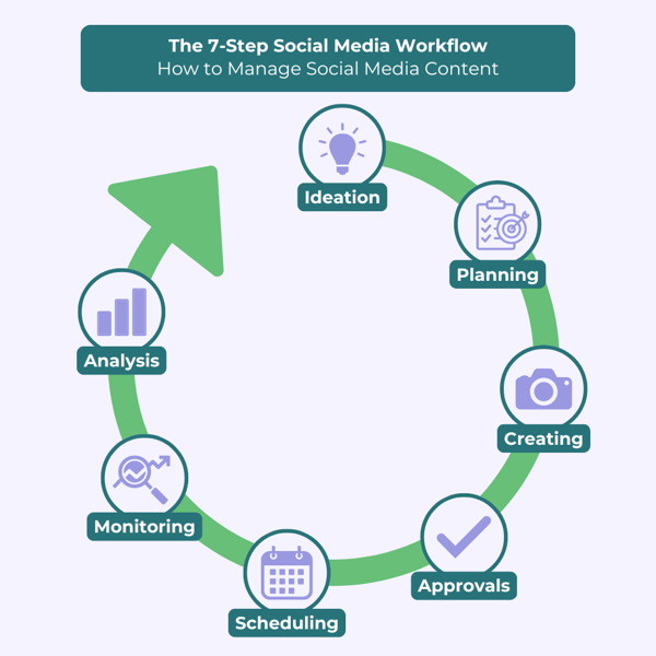
Practical Implementation Guide
Workflow Integration
Converting existing content libraries into visual assets was initially overwhelming until I developed a systematic approach. I now categorize content by type (educational, promotional, inspirational) and prioritize transformation based on performance potential and resource requirements.
Content-to-Visual Workflow
flowchart TD
    A[Written Content Library] --> B[Content Audit & Categorization]
    B --> C[Prioritization Matrix]
    C --> D[Content Selection]
    D --> E[Visual Strategy Development]
    E --> F[Template Creation]
    F --> G[Batch Production]
    G --> H[Platform-Specific Optimization]
    H --> I[Scheduled Publishing]
    I --> J[Performance Analysis]
    J --> K[Strategy Refinement]
    K -.-> D
    style A fill:#FF8000,stroke:#E67300,color:white
    style G fill:#66BB6A,stroke:#43A047,color:white
Building a visual content calendar from my written content strategy has helped me maintain consistency and strategic focus. I now plan visual content themes in advance, aligning them with my overall marketing objectives while leaving room for timely, responsive content.
PageOn.ai has streamlined my text-to-visual transformation process tremendously. I can now upload a blog post or article and receive multiple visual asset options based on the content's key points. This automation has reduced my production time by approximately 60% while improving the quality and consistency of my visual assets.
Efficiency Techniques
Batch creation has been a game-changer for my content production workflow. Rather than creating one-off graphics, I now dedicate specific time blocks to producing multiple related visuals with consistent themes. This approach not only improves efficiency but also enhances visual consistency across my content series.
I've developed several repurposing strategies to extend the life of my visual content. For example, I'll create a comprehensive infographic, then break it down into individual social media graphics, each focusing on a specific data point or insight. This approach maximizes the value of each piece of content while maintaining a consistent visual narrative.
Leveraging PageOn.ai's Agentic capabilities has allowed me to generate multiple visual variations quickly. The system can produce different style interpretations of the same content, which I can then test with my audience to determine which performs best. This data-driven approach to visual content optimization has significantly improved my overall engagement metrics.
Future of Written-to-Visual Content Transformation
Emerging Technologies
I'm particularly excited about AI-driven personalization of visual content. Soon, we'll be able to create dynamic visuals that adapt based on individual viewer preferences, behavior patterns, and demographic information. This level of personalization will dramatically increase engagement by delivering precisely the visual style that resonates most with each viewer.
Emerging Visual Communication Technologies
Dynamic Content Adaptation
AI systems that monitor content performance in real-time and automatically adjust visual elements to optimize engagement. If certain colors, layouts, or image styles are performing better, the system makes subtle adjustments to maximize impact.
Multimodal Content Creation
Advanced AI that can simultaneously generate complementary visual, audio, and text content from a single prompt, creating cohesive cross-channel experiences that maintain consistent messaging while optimizing for each medium's strengths.
PageOn.ai is at the forefront of these developments, continuously integrating new capabilities that make visual content creation more intuitive and powerful. Their approach to dynamic content adaptation is particularly impressive—the system learns from performance data and suggests optimizations based on actual audience response.
Cross-Platform Visual Storytelling
Creating cohesive visual narratives across multiple channels will become increasingly important as audiences fragment across platforms. I'm developing strategies to maintain visual consistency while adapting to the unique requirements and audience expectations of each platform.
Cross-Platform Engagement by Visual Style
Building recognition through consistent visual language will be essential in an increasingly crowded digital landscape. I'm focusing on developing distinctive visual signatures that make my content immediately recognizable regardless of where it appears.
As new visual platforms emerge, I'll continue adapting my written content transformation strategies to leverage their unique capabilities. The key will be maintaining core brand elements while embracing platform-specific visual opportunities. PageOn.ai's forward-looking development roadmap gives me confidence that I'll have the tools needed to excel in this evolving landscape.
Transform Your Written Content into Stunning Visuals with PageOn.ai
Stop struggling with complex design tools and start creating professional-quality social media graphics in minutes. PageOn.ai's intuitive platform helps you convert your written content into eye-catching visuals that drive engagement and build your brand.
Start Creating with PageOn.ai TodayBringing It All Together
Throughout my journey of transforming written content into social media graphics, I've discovered that the most successful visual content strikes a perfect balance between information and aesthetic appeal. By applying the principles and techniques we've explored, you can significantly enhance your social media presence and audience engagement.
I've found that PageOn.ai has revolutionized this process by making sophisticated visual creation accessible to everyone—not just professional designers. The platform's ability to analyze written content and suggest appropriate visual interpretations has saved me countless hours while improving the quality of my social media graphics.
As visual communication continues to dominate social media, the ability to transform written content into compelling graphics will become an increasingly valuable skill. By embracing these techniques and leveraging the right tools, you can ensure your message not only reaches your audience but also makes a lasting impression.
You Might Also Like
Mastering Workplace Communication with International Phonetic Alphabet (IPA) - Visual Guide
Discover how the International Phonetic Alphabet transforms workplace communication. Learn visual approaches to implement IPA for clearer global business interactions.
Breaking the Ice: Transform Your Opening Minute from Predictable to Powerful
Discover how to transform the first 60 seconds of your presentation from cliché to compelling with visual hooks, interactive strategies, and storytelling techniques using PageOn.ai.
Beyond "Today I'm Going to Talk About": Creating Memorable Presentation Openings
Transform your presentation openings from forgettable to captivating. Learn psychological techniques, avoid common pitfalls, and discover high-impact alternatives to the 'Today I'm going to talk about' trap.
Transforming Value Propositions into Visual Clarity: A Modern Approach | PageOn.ai
Discover how to create crystal clear audience value propositions through visual expression. Learn techniques, frameworks, and tools to transform complex ideas into compelling visual narratives.